|
| Group |
Round |
C/R |
Comment |
Date |
Image |
| 18 |
Sep 24 |
Reply |
I'm glad that you like it.
I'm confused - I consider my image Photographic Art (or Digital Photographic Art), created with a camera and software. You call it Graphic Art Illustration. Are all 3 categories the same, or do they differ - if so - how?
Never heard of Nagy - so a very quick Google search I found that he created Photograms - basically using photo paper vs a camera. Looking at a few examples, I did not see any that could not be produced with a digital camera and software. So that makes me think that the 'Creative' aspect of his work is not really all so unique - i.e. it's all about composition and tonal values, not the tools. What am I missing?
Thanks for taking the time to make me ponder!
And don't get me started on Ai and Photographic Art!!!
|
Sep 17th |
| 18 |
Sep 24 |
Reply |
I wish you all the best, especially good health. I'm 84, and hope to have your level of enthusiasm as my journey continues. |
Sep 17th |
| 18 |
Sep 24 |
Reply |
Sorry, forgot to attach my idea of an AR image with cars as the subject. The category is so broad - from a little alteration to lots of alteration - it's easy to get caught up in trying to define it - so my suggestion is to keep the PSA definition in mind, but make sure you have fun in playing with this category, and show us the altered image that you like. |
Sep 17th |
 |
| 18 |
Sep 24 |
Reply |
Chan - have a look at my reply to Bob Wills - you'll find a copy of the PSA definition of Creative. Actually, I think a Salvador Dali style would work, as long as one can still identify what the original image is. |
Sep 17th |
| 18 |
Sep 24 |
Reply |
Chan - just to clarify - my version was only to point out one example what could be done with the original. One is not better or worse than the other - it's just different. For me, my version differs as it's more in line with the changes that the category stands for.
One thing I've learned about images for the Altered Reality category - having a vision of what you want to create is all well and good, but for many of us, experimenting and 'playing' with different creative tools often produces excellent and surprising results.
At the end of the day, if you are happy with the image you created (fulfilling your vision or not) is the only thing that is important.
One more point - when we post our images, all we know about the makers vision is the artist statement (About The Image) and the title. We critique with these in mind, and if they do not communicate the vision of the maker, we go with what we see and the impact the picture has on us. Hope that helps - sorry for the length of my reply - I I do tend to go on..... |
Sep 16th |
| 18 |
Sep 24 |
Comment |
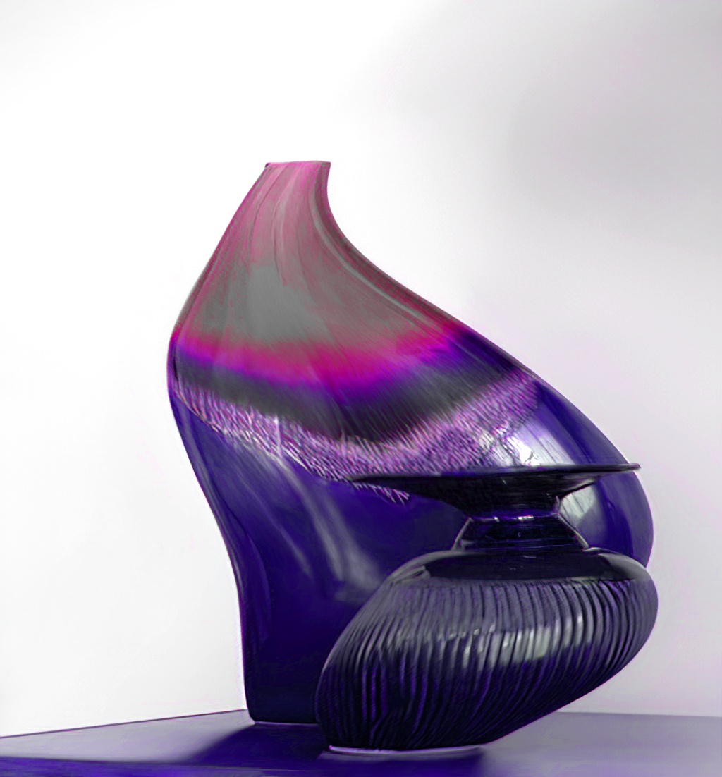
Chan - an interesting conversion. However, in my view, desaturation the original and adding a black stroke is not a sufficient enough change to meet the intent of the "Creative - Altered Reality" category. But just one persons view.
Hope you don't mind, but I had a crack at what I might be tempted to do with the vases - did not spend much time and used Ps tools - Shear Distortion, Colour Negative Curve, and Hue/Saturation Adjustments. See what you think |
Sep 16th |
 |
| 18 |
Sep 24 |
Reply |
I think it's unfortunate that our groups category is "Creative" - PSA defines Creative as "Altered Reality" - which I think explains it a bit more. I'm going to try to attach their definition for AR.
As I understand it, PSA does allow us to use tools that have Ai components - i.e. Topaz Ai Sharpening. What PSA does not allow, nor do most camera clubs is "Generative Ai" that creates pixels/pictures not from your camera. An example is - "Add a bridge to this picture that has 3 spans" - and that is what gets added to your image. The bridge was not created by you, in your camera. The origin of the bridge was from millions of bridge pictures that Ai has captured, manipulated, and presented to your image.
Here is one of my car based AR pictures - just as a reference.
|
Sep 16th |
 |
| 18 |
Sep 24 |
Comment |
I like how you simplified the background - which makes the car POP. A bit of a dark area at the top is a bit distracting. I think it is sufficiently sharp, and the light is also fine. The way I understand the definition of Altered Reality, I don't think there is sufficient alteration going on here - just my take. |
Sep 15th |
| 18 |
Sep 24 |
Comment |
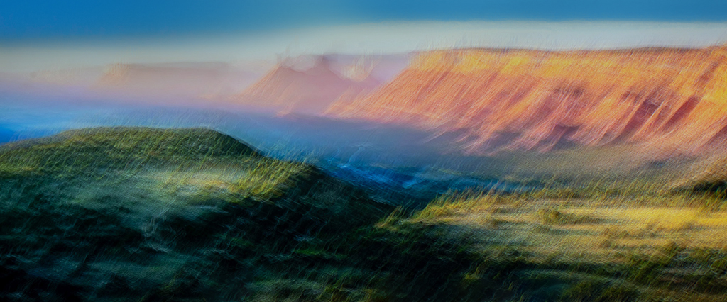
I like this Abstract-Like image quite a lot. The ICM process worked really well. The colours are very interesting and impactful. If it were my picture (wish it was!) I would make one change. I would like to see a bit of a blue sky at the top to prevent the eyes from going to the light part of the image, and keep the focus on the main feature - the flowing colours. See my version attached. |
Sep 15th |
 |
| 18 |
Sep 24 |
Comment |
An interesting image - technically well constructed. I'm struggling trying to find the relationship of the 'many handed astronomical clock' and the background.
As well, the "Altered Reality" clock does not really grab my interest - i.e. What is the story or message? What are you, the artist trying to communicate with this image?Sorry, not my cup of tea! |
Sep 15th |
| 18 |
Sep 24 |
Reply |
MirrorLab is a free app for the Android platform. Many filters from minor changes to "way out there". I tend to use those that still keep most of the original image. |
Sep 8th |
4 comments - 7 replies for Group 18
|
| 29 |
Sep 24 |
Reply |
Someone told me this trick years ago - it's simple.
In Ps, go to Size - change the measurement to %, change the width to 110%, leave height at 100%, save, repeat up to 3 times in total, if required.
After 3, you lose noticeable picture quality. |
Sep 18th |
| 29 |
Sep 24 |
Reply |
I used Ps Lens Correction for this. It's normally used to compensate for very wide angle shots, to reduce the curvature effect - but can be used for other misalignment issues. |
Sep 17th |
| 29 |
Sep 24 |
Reply |
I like it - thanks
|
Sep 16th |
| 29 |
Sep 24 |
Reply |
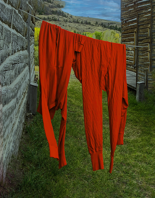
It's a Gunter nature study, nothing to do with PSA Nature classification.
What do you think of my version? |
Sep 13th |
| 29 |
Sep 24 |
Comment |
Like this picture a lot - a nice story. Technically well shot - nice colours and composition. I agree that the sky is a bit bright. The only other thing I would suggest is to straighten the left wall a bit. See my version attached. |
Sep 12th |
 |
| 29 |
Sep 24 |
Comment |
I like it - but have no idea why! I'm happy to hear that you might do more of these, to help me understand the universe a bit more. A question - why change the colour of the moon? Is it to better see the details in the surface? For my take, would also like to see the moon in the real colours. Thanks for sharing. |
Sep 12th |
| 29 |
Sep 24 |
Comment |
In my opinion, technically well shot - reasonably sharp, nice colours and an effective composition. Having said that, I don't find the subject matter compelling. The title Summers End does not describe what I see. The petals, although maybe a little past their prime, are far from their 'end'. The 'end' of something in Nature might be better served with a darker background. |
Sep 12th |
| 29 |
Sep 24 |
Comment |
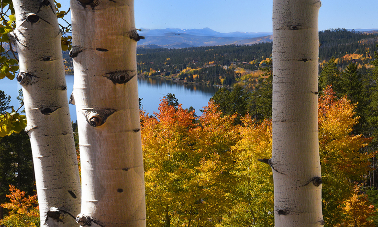
A gorgeous autumn image - I agree with lowering the highlights on the 2 birches on the left. My other suggestion is to 'stretch' the image format, to put more 'scape in this very nice landscape. See what you think of my version. |
Sep 12th |
 |
| 29 |
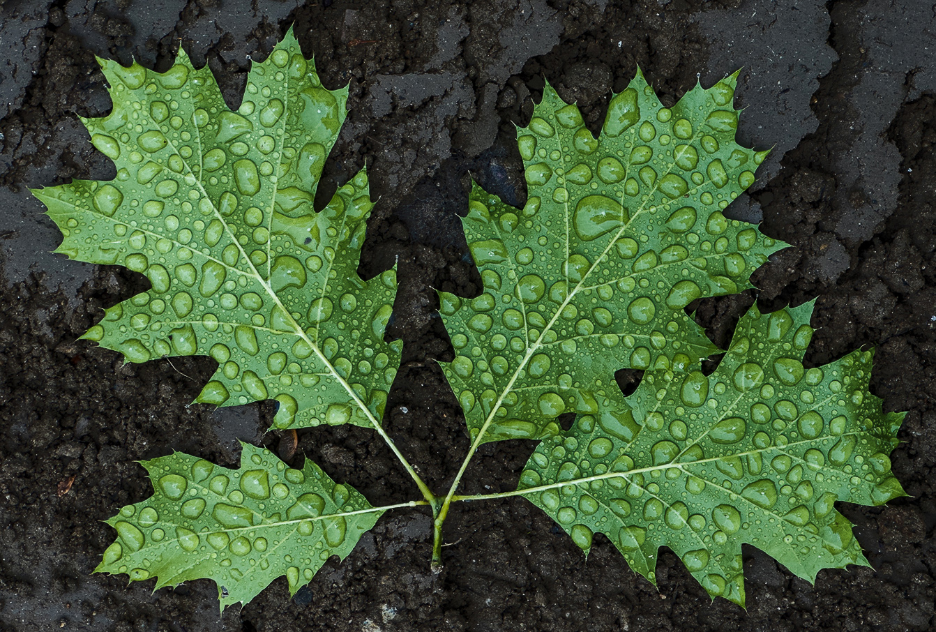
Sep 24 |
Comment |
Nice nature study - beautiful leaves and raindrops. I'm not overly fond of the background - a bit too light for my taste. See my version, which for me makes a leaves pop a bit more.
|
Sep 12th |
 |
| 29 |
Sep 24 |
Comment |
|
Sep 12th |
 |
| 29 |
Sep 24 |
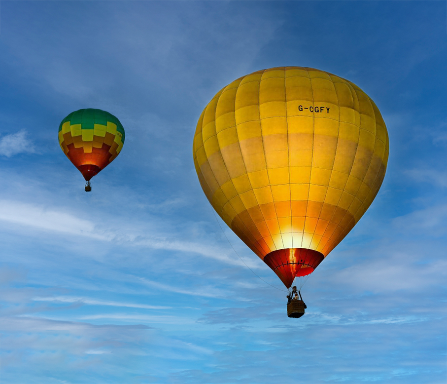
Comment |
I'm really fond of balloon pictures - great subjects to showcase colours and composition. As already mentioned, the halo is a bit distracting. My other suggestion, is to use a sky replacement that does not take the eyes away from the main subject - as this one does. It's competing with the balloons - at least for me.
See my version attached - I used one of my own sky's, and also gave the balloons a bit more space. See what you think. |
Sep 12th |
7 comments - 4 replies for Group 29
|
| 34 |
Sep 24 |
Comment |
Mike - well seen, photographed, and presented. So much to see and enjoy. As a matter of fact, maybe too much to see! A little overwhelming. I think 3 by 3 would be enough - at least for my tired, old eyes. Just a nit. |
Sep 15th |
| 34 |
Sep 24 |
Comment |
What a beautiful and creative image - so well constructed. You're a master of these kinds of images. My only suggestion is to add a bit of colour to the sky - there is quite a lot of white in the picture. In this version, I added one of my skies with Ps. |
Sep 15th |
 |
| 34 |
Sep 24 |
Comment |
Very nice Documentary series of pictures. What a great way to celebrate Independence Day. Thank you for enabling future generations to appreciate the art of the traditional outfits. |
Sep 15th |
| 34 |
Sep 24 |
Comment |
Very nice water lily image - really like the composition - easy on the eyes, not cluttered. Have no suggestions to improve this picture. |
Sep 15th |
| 34 |
Sep 24 |
Comment |
I like this composite very much - not only the history, but the supporting picture. So much to see and explore. I have a couple of suggestions - for my taste, I would remove the compass - as it makes the picture a bit too busy. Also maybe back off the opacity of the clouds, especially on the left side, to allow a better view of the ship. |
Sep 15th |
5 comments - 0 replies for Group 34
|
16 comments - 11 replies Total
|


