|
| Group |
Round |
C/R |
Comment |
Date |
Image |
| 18 |
Aug 24 |
Reply |
Thanks for your suggestions. I don't remember my thought process to use a B&W layer - sorry. I'm not a huge fan of vignettes - always had trouble in making them soft enough so that they are not obvious. I do use the radial tool, but did not think that the focal point needed it.
Your alternate version is interesting, but challenging from a composition perspective - my perspective! |
Aug 18th |
| 18 |
Aug 24 |
Comment |
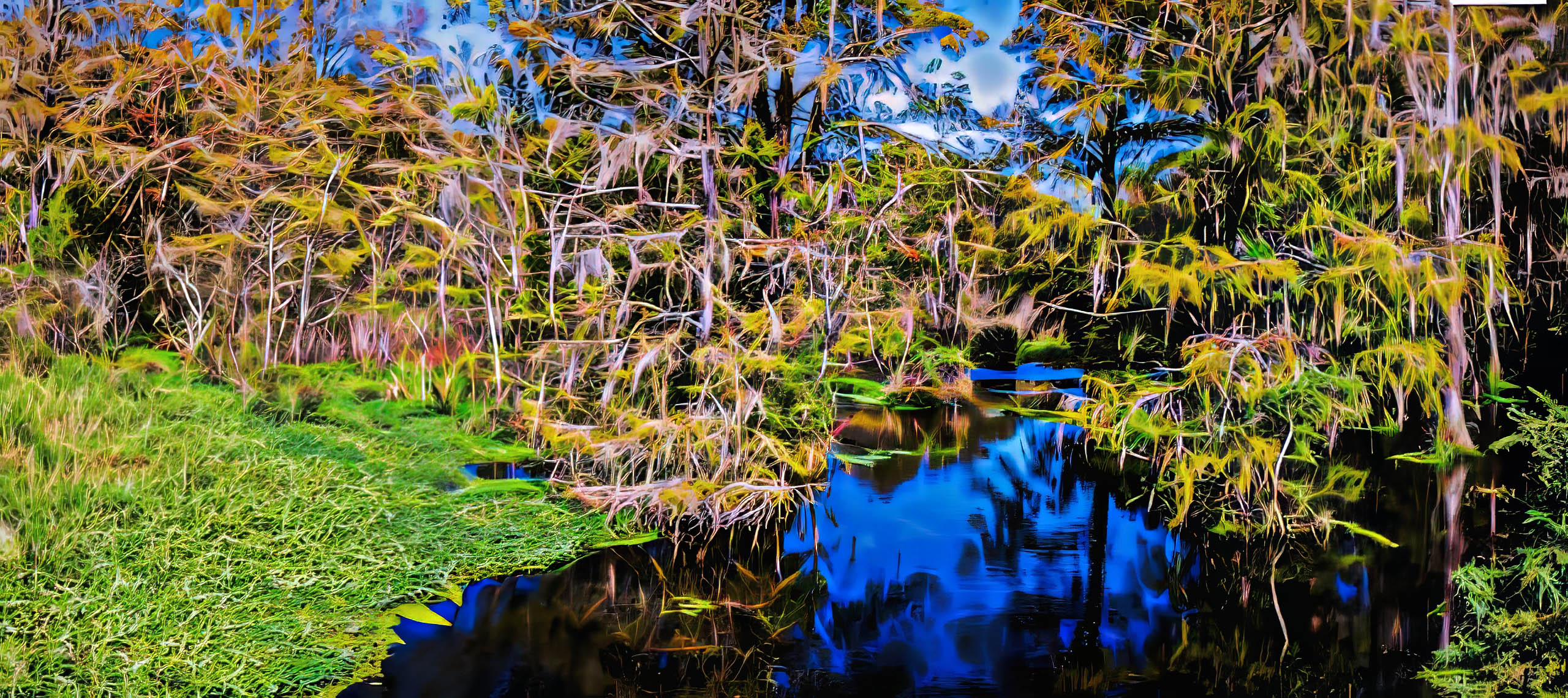
Very nicely done. Like the effect quite a lot. As a matter of fact, also like Bobs version. They are quite different, and both keepers. My only suggestion is to provide more room on the sides and top - the trees look a little cramped to me. |
Aug 18th |
| 18 |
Aug 24 |
Comment |
Great story, beautifully told. Would not change a thing. |
Aug 18th |
| 18 |
Aug 24 |
Comment |
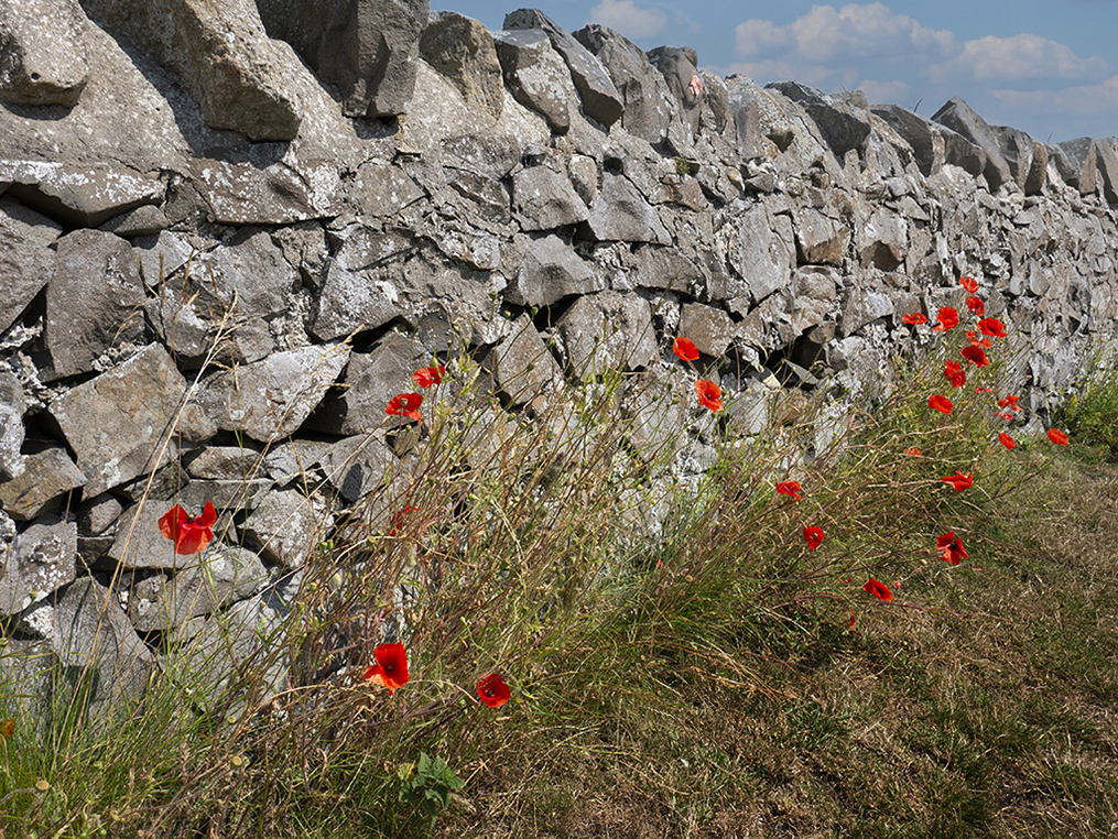
Nicely done. I like the light-touch use of the filter, although the wall on the right edge looks wonky. Why remove the sky? For my taste, I prefer the sky included. I added one of my skies to the original to see what I mean. It defines the wall, and also helps lead the eyes from left to right. See what I mean |
Aug 18th |
 |
3 comments - 1 reply for Group 18
|
| 29 |
Aug 24 |
Reply |
Thanks, Bob
As per Tim's note, since this is a documentary image, the smoke needs to stay.
This is a perfect example regarding my email. If you had mentioned in the description that this is a documentary picture, I would not have suggested removing the smoke. In my opinion, it's a waste of time and effort to base my opinion on the fact that the picture is a documentary, when I assumed it to be photo/digital art. That is not to say that a documentary image cannot also be considered photo/digital art, which the viewer will decide in any case. But knowing what the intent of the maker was, makes it easier to provide useful feedback. End of sermon! |
Aug 21st |
| 29 |
Aug 24 |
Comment |
Sorry, Ron, but this one does not work for me. I suspect that the original (without the Topaz adjustments) is likely an interesting image - from what I can see. I'm not familiar with the HDR pano mode. See my version. I tried to tease out some more detail, but not much of an improvement, if any. Used a couple of Topaz Ai filters. |
Aug 18th |
 |
| 29 |
Aug 24 |
Comment |
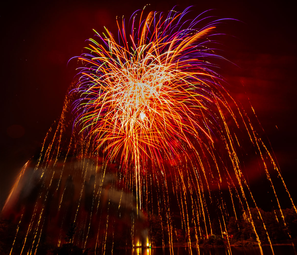
Nice fireworks image - I personally don't mind the saturated look - as I think that fireworks are all about - over the top colours and light. I do have a bit of an issue with the red smoke - attracts the eyes away from the fireworks. See my version - I took a quick and dirty approach to remove it - far from perfect, but you get the idea. Used Ps colour and saturation tool, using a mask, removed the red, and then painted in the original top part of the fireworks. See what you think. |
Aug 18th |
 |
| 29 |
Aug 24 |
Comment |
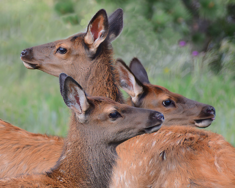
Another great shot - super composition and nice colours. Just one nit - I prefer the back elk to be a bit sharper. See my version - Just a light touch with Topaz Photo Ai, one of my favourite tools. |
Aug 18th |
 |
| 29 |
Aug 24 |
Reply |
I like it - I'm still struggling with my post processing quality control |
Aug 17th |
| 29 |
Aug 24 |
Comment |
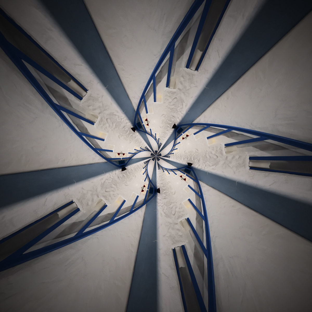
Another one of the "stair" series. If I remember the last one, I liked the original very much. No exception with this one - not to say that the altered reality version is not very interesting as well. I took the opportunity to add a bit more depth to the image, mostly using the Ps curves tool. Also added a small radial blur, to draw the eyes to the centre. See what you think. |
Aug 16th |
 |
| 29 |
Aug 24 |
Comment |
Very nice motion capture. Well done. My only minor suggestion - suggest darkening the small areas below the wheel that tend to attract the eyes a bit - no biggie! |
Aug 16th |
| 29 |
Aug 24 |
Comment |
Very nice bird picture - nice and sharp, beautiful colours, and strong composition.
The only issue I have, is the background - much too distracting for my old eyes. I like Elaines version very much.
|
Aug 16th |
6 comments - 2 replies for Group 29
|
| 34 |
Aug 24 |
Reply |
Thanks Mike and Jan. My intent was to break up the dominant colours. My guru, Blake Rudis, suggests this technique, to provide the eyes with a rest stop as they move around the image. |
Aug 21st |
| 34 |
Aug 24 |
Comment |
Very seasonal - I also like the original very much. I use this same Expressionism filter a lot, but find that I need to be very careful in its use. I take the slider back to zero, and work my way up to 5 or so in most cases. But if I want a full blown Expressionist look I go much higher. In this case, I would prefer to stay very close to the original - my taste. |
Aug 18th |
| 34 |
Aug 24 |
Comment |
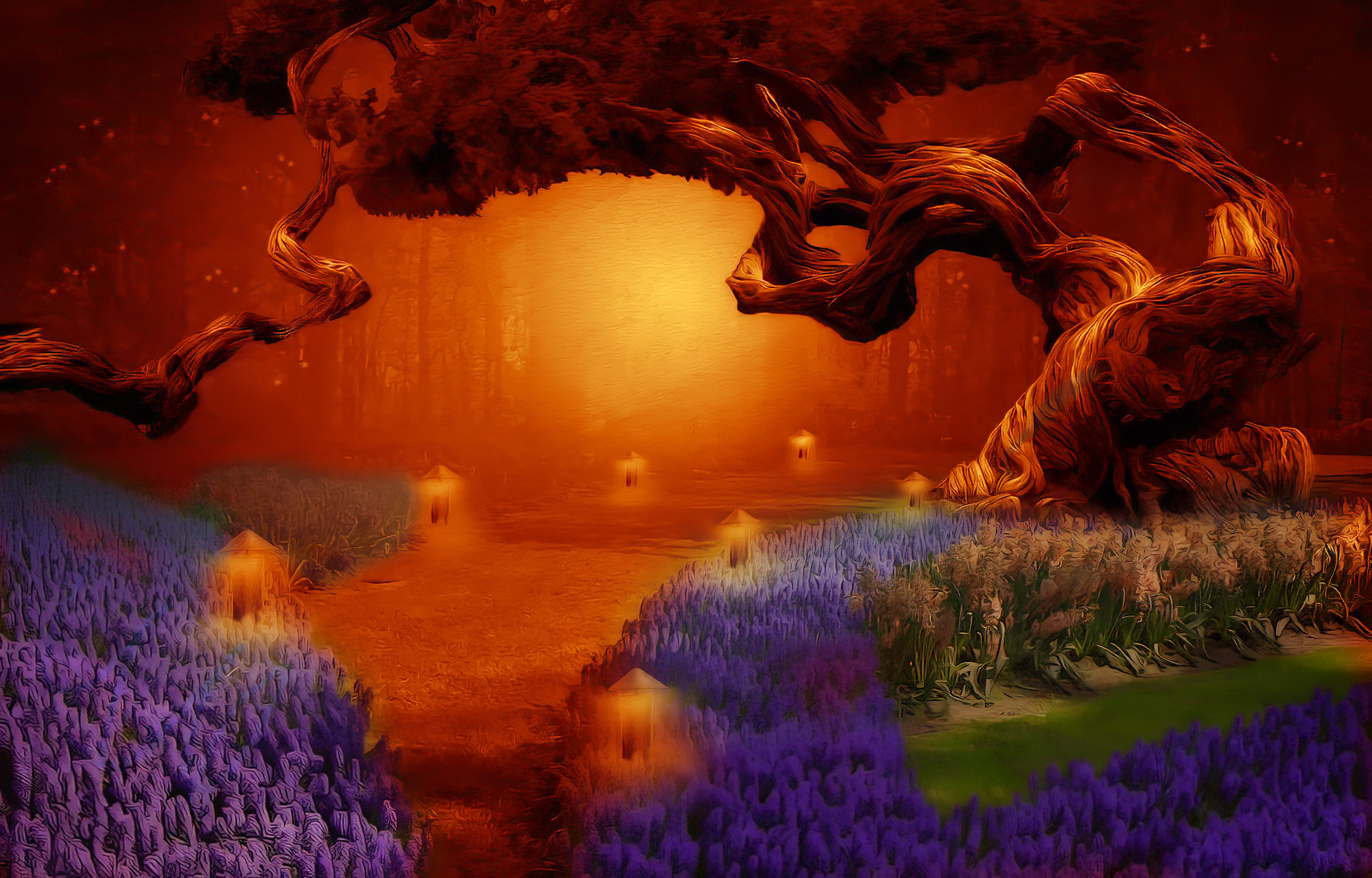
WOW - great job - love everything about the image. The tree is spectacular.
The only change I would suggest is to change the title to Forest of Nightmares. The colour choice, the dark tones, and the threatening gnarled tree do not say 'dreams' to me. For fun - see my version
|
Aug 18th |
 |
| 34 |
Aug 24 |
Comment |
As always, creative and fun. Love the look of concentration on your granddaughters face. I concur with Jan's suggestions - although I think she needs a bit more space to move around it. I don't think the 2nd dancer is required, and actually takes the focus away from the star.
BTW - I followed 4 of my granddaughters through their dance recital periods. But most did not allow pictures from the audience - so I played the cat and mouse game with the organizers and did grab some shots. |
Aug 18th |
| 34 |
Aug 24 |
Comment |
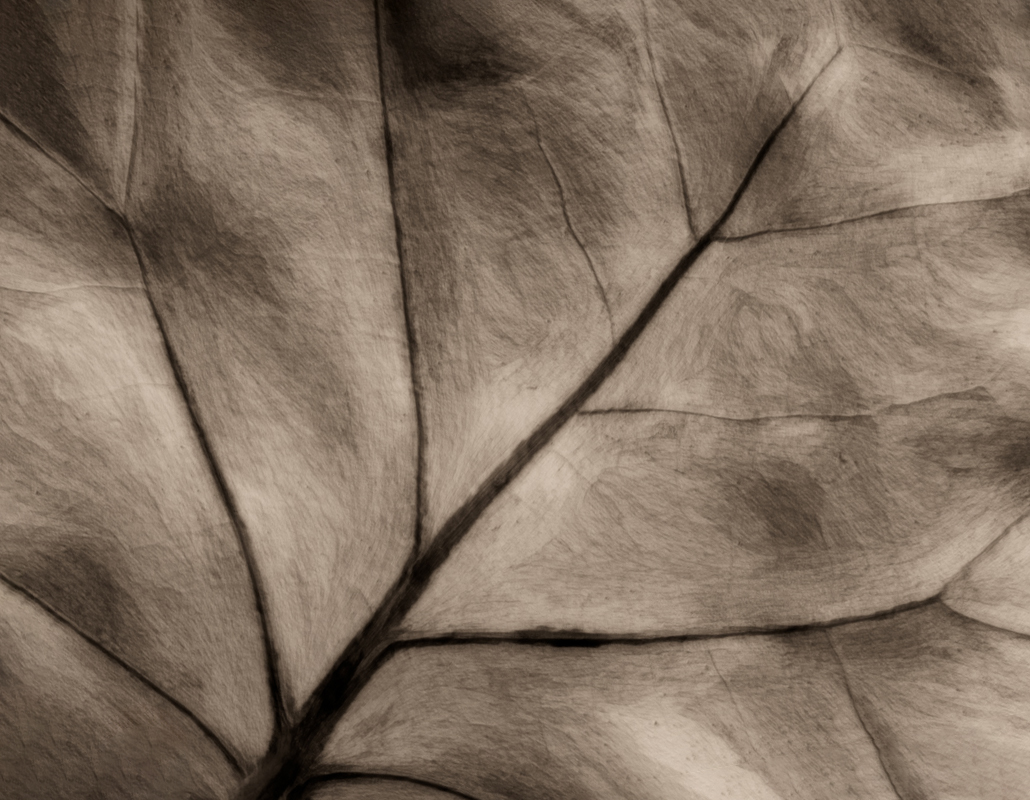
Nice close up - beautiful muted sepia treatment. For me, there is not enough going on to focus on. The leaf veins are nice to help the eyes travel through the image, but the textures don't grab me. Sorry.
Personally, I also try to avoid having the main feature of the image go from corner to corner - very subjective. See my version. |
Aug 18th |
 |
| 34 |
Aug 24 |
Comment |
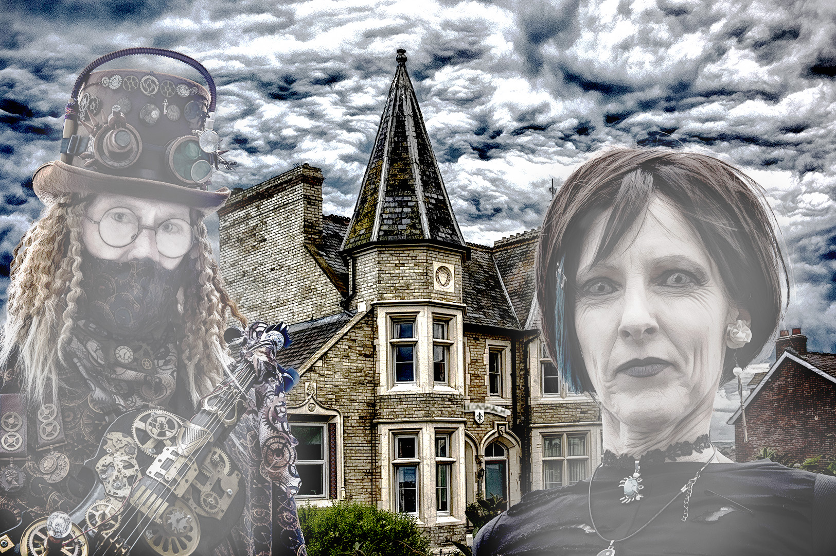
Another creative, interesting Steampunk image. I really like the house and cloud portion - the people, not so much. The title "The House", tells me that the house is the main focal point. However, when I look at the picture it's the people that jump out at me, and the house is a supporting actor. See my version. Desaturated the people, so they take a less important role in the story. But not really much of an improvement, as the amount of space used up by the people. |
Aug 18th |
 |
5 comments - 1 reply for Group 34
|
14 comments - 4 replies Total
|


