|
| Group |
Round |
C/R |
Comment |
Date |
Image |
| 18 |
Apr 24 |
Reply |
Thanks, Melissa
See my comments to Joan above. "MirrorLab is only available for Android devices, unfortunately.
Drop by anytime |
Apr 11th |
| 18 |
Apr 24 |
Reply |
Thanks, Joan
The "shape-changing" software MirrorLab, has many presets, from this simple one to exremely complicated ones. I use very few, mostly simple/minimalist versions.
The colours were my selection, and applied with Ps Gradient Maps. Used what most people called happy, joyful colours. |
Apr 11th |
| 18 |
Apr 24 |
Comment |
Beautiful picture - nicely photographed and processed. Like the muted background that helps the car stand out and makes it an Altered Reality image. |
Apr 7th |
1 comment - 2 replies for Group 18
|
| 29 |
Apr 24 |
Reply |
Hi Bob
Like you, I use Ps exclusively for my editing. At the end of the process I decide whether I should use my plug in's. If I think the colours need some help, I go to Nik Colour Effects. If I want to turn the image to Altered Reality, I use Topaz Studio or MirrorLab. But in all cases, I use their presets - which makes the learning curve really easy - compared to learning Ps.
Just my experience. |
Apr 22nd |
| 29 |
Apr 24 |
Comment |
Thank you Judy
Like your sky very much |
Apr 22nd |
| 29 |
Apr 24 |
Reply |
Thanks, Bob
The dark area was in heavy shade, as I remember it. |
Apr 15th |
| 29 |
Apr 24 |
Reply |
Thanks, Ron
Yes, I replaced the original, boring sky with another one of mine. In hindsight, I should have used a lighter blue sky to go with the scene |
Apr 15th |
| 29 |
Apr 24 |
Reply |
Taken June, mid-afternoon. Since I shoot with Auto White Balance, I end up adjusting colour quite often, so date/time lose their meaning. |
Apr 11th |
| 29 |
Apr 24 |
Comment |
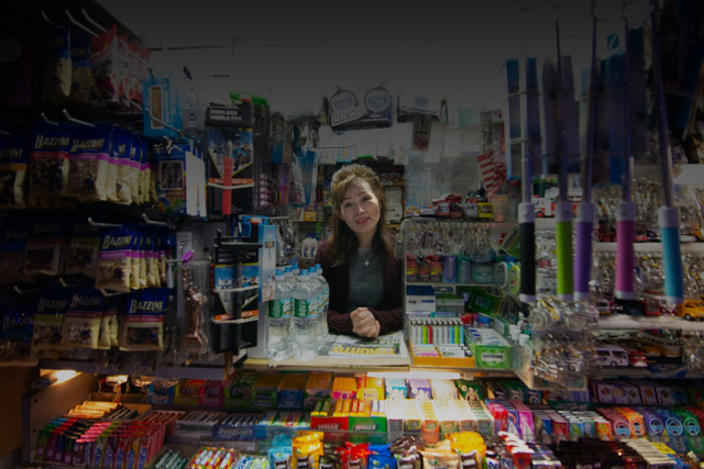
Very nice street photography example. Nice focus on the smiling lady, although for me, the lightened face is just a tad too light. Hope you don't mind, but I took another approach to this picture - I like and focused on the business of the store, rather than the lady. Darkened the top a bit and lightened the lady a little. Certainly no better than your image, but just a different approach. |
Apr 8th |
 |
| 29 |
Apr 24 |
Comment |
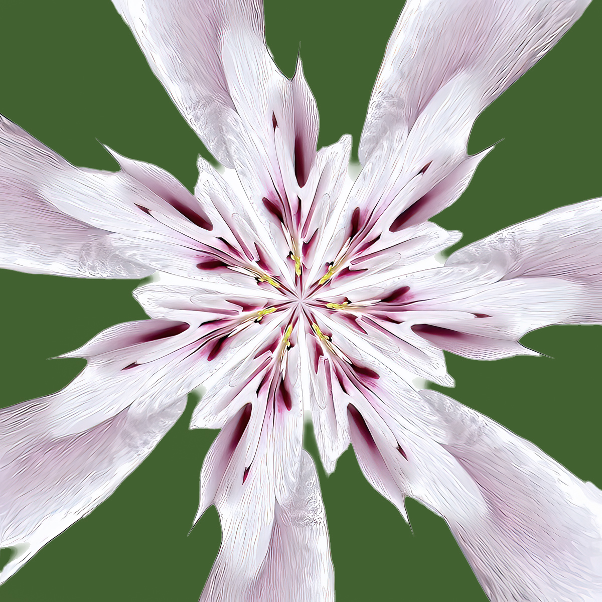
Beautiful abstract - love the colours and is nice and sharp. The only thing that bothers me a little is the white background - for my eyes the white distracts from the flower which is very light itself. See a version attached - although I think a lighter green (or other colour) would work better. See what you think. |
Apr 8th |
 |
| 29 |
Apr 24 |
Comment |
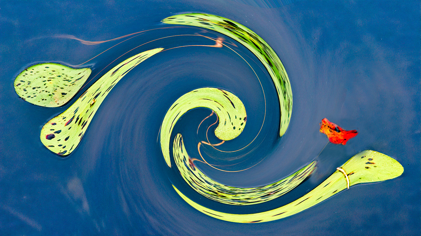
I quite like the swirl effect and the contrasting colours. Not fond of the swirl effect on the flower. See another version attached.
|
Apr 8th |
 |
| 29 |
Apr 24 |
Comment |
Very creative - like it very much. The green and blue colour combination works well, and certainly would serve for a basis for a series, using different real butterfly colour combinations. |
Apr 7th |
| 29 |
Apr 24 |
Comment |
Beautiful scenery, nicely captured and processed. I especially like your light touch of the Topaz filter. Would not change a thing. |
Apr 7th |
| 29 |
Apr 24 |
Comment |
Like the look on his face and gesture. Nicely photographed. Without your description, my interpretation would have been "Thoughtful". Funny story. |
Apr 7th |
7 comments - 4 replies for Group 29
|
| 34 |
Apr 24 |
Comment |
I agree, Jan - More depth certainly improves this picture - thanks for the suggestion |
Apr 17th |
| 34 |
Apr 24 |
Reply |
Thanks, Jan
Vignetting, in my opinion, is helpful if you want the viewer to look at a specific area of the image.
My intent in this picture is to let the eyes travel along the "waves", edge-to-edge. Also, as a matter of personal taste, I often see vignettes over saturated that draws the attention to them. |
Apr 15th |
| 34 |
Apr 24 |
Comment |
Nicely done - so much to see and enjoy. Personally I struggle with these kind of images, as my eyes and attention feel being pressured to move to the next image, before I can appreciate what I'm looking at. Weird I know. Thanks for your effort to put this together. |
Apr 11th |
| 34 |
Apr 24 |
Comment |
A lot of effort and creativity payed off with this "Small World" picture. Like everything about it, especially the composition, colours, and detail. A nit, but maybe fewer flowers would make the beautiful buildings and features stand out more. Well done. |
Apr 11th |
| 34 |
Apr 24 |
Comment |
Sorry, Steve
Not a fan of this filter. Do like the original a lot |
Apr 11th |
| 34 |
Apr 24 |
Comment |
Very nicely done. I like the minimalistic look. Would not change a thing. |
Apr 11th |
| 34 |
Apr 24 |
Comment |
Thanks Steve.
I selected the colours, as they apparently are perceived as happy, joyful colours - and applied them with Ps Gradient Maps. |
Apr 11th |
6 comments - 1 reply for Group 34
|
14 comments - 7 replies Total
|


