|
| Group |
Round |
C/R |
Comment |
Date |
Image |
| 18 |
Mar 24 |
Reply |
Thanks for your notes - much appreciated.
I love Davis work with translucency. Have done a few and really enjoy them. But must confess that I think Davis has kept a step or two to himself, because when I follow his recipe, the results are not the same. It's like my mother giving my wife a family recipe, but leaving out an ingredient so her baby boy will always come to her place for a meal for the real thing! So I think Davis would like for me to come to one of his workshops - maybe I'm being a tad cynical? |
Mar 17th |
| 18 |
Mar 24 |
Reply |
Got it - thanks.
Agree it would also rork |
Mar 16th |
| 18 |
Mar 24 |
Reply |
Thanks, Ian
Actually did use Topaz Expressionism filter on my image, but probably 10 or 15% opacity. It's one of my favourite filters, but not a fan of the high opacity effect. Appreciate your feedback |
Mar 16th |
| 18 |
Mar 24 |
Reply |
Thanks, Jim
A great idea and improvement. |
Mar 16th |
| 18 |
Mar 24 |
Reply |
Sorry, Chan
I don't understand your comment. My picture is a composite of the three Originals.
Please clarify - thanks |
Mar 16th |
| 18 |
Mar 24 |
Comment |
I "kind of like it" as well, not sure why! My eyes travel around the image, but never land on a point that peaks my interest. Individually the bits and pieces are pleasing, but together, not so much - at least for me. |
Mar 8th |
| 18 |
Mar 24 |
Comment |
I can't decide which "Look" I prefer. I remember seeing this before, and do like the image quite a bit. I like the Original 2, for the soft, airy feel - the colours jump out.
The new one feels much different - very dramatic. I think what would be really neat, is to do a mirror image of the two. Get the best of both contrasting worlds. |
Mar 8th |
| 18 |
Mar 24 |
Comment |
Nice picture of the house. You've "cleaned it up" very nicely, and enjoy the textures for a nice, moody feel. For me the new sky is a bit harsh, and does not support the soft, dreamy feel of the house. Unfortunately for me, I can't see a story or an interesting focal point. |
Mar 8th |
| 18 |
Mar 24 |
Comment |
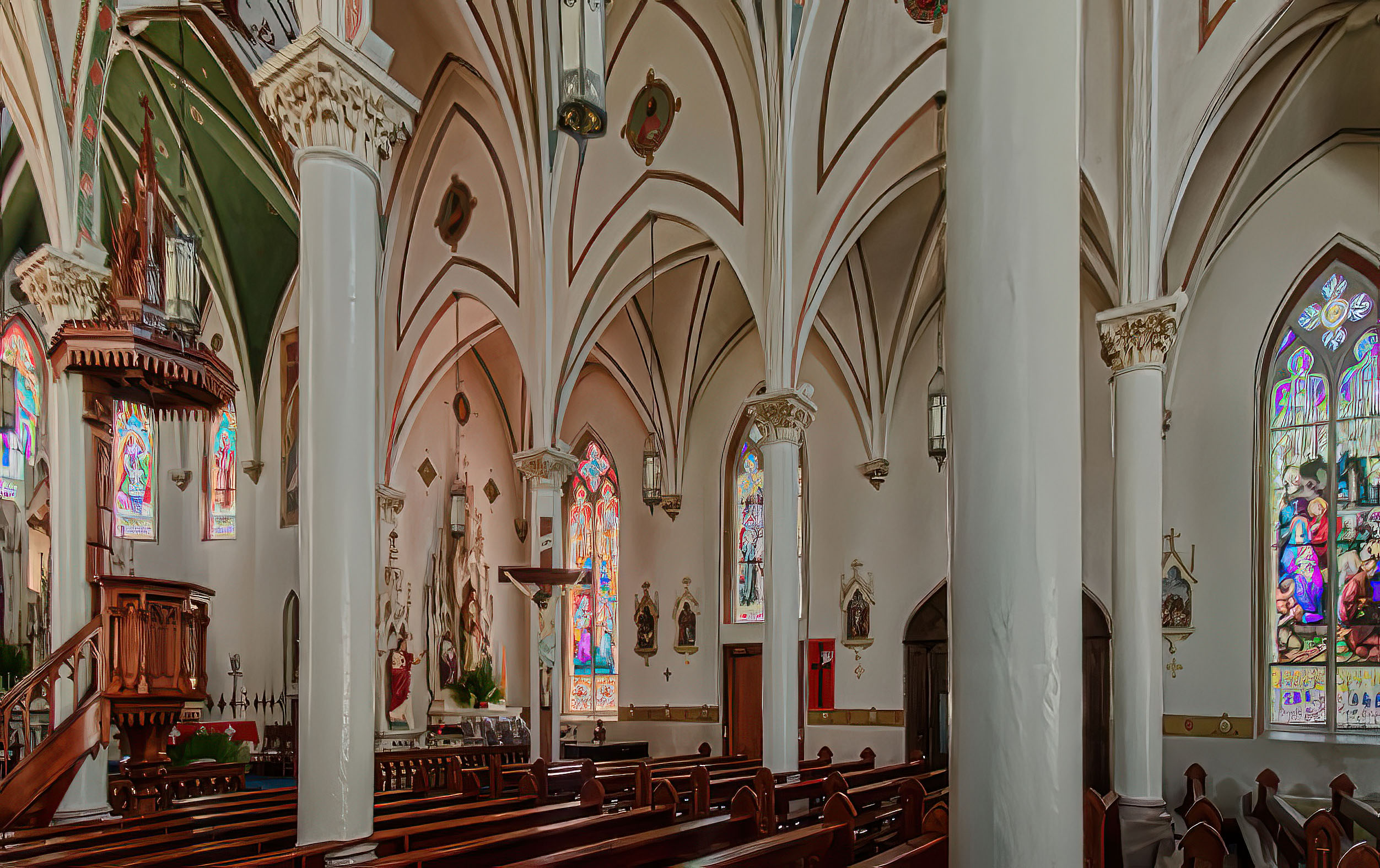
I quite like the watercolour effect - especially on the building details. The story for me when viewing this is "Soldier-looking-at-car". The filter has minimized the war memorial too much to be the story - for me, in any case - however a nice creative image. |
Mar 8th |
4 comments - 5 replies for Group 18
|
| 29 |
Mar 24 |
Comment |
A really nice subject - so much to see and enjoy. Not sure what your shutter speed was, but it looks a bit blurry - especially in the background. Did you use a tripod? The wide angle perspective distortion is interesting - it will put a lot of folks off, but I consider it an Altered Reality image -so OK with it.
My NIK collection has a Perspective correction filter - hardly ever get to use it, so not very good at it - but gave a whirl anyway. See attached. Lose a lot off the top of the image (bummer!), but the perspective has been corrected. Also the image is very small, so difficult to process without losing a lot of sharpness. See what you think |
Mar 8th |
 |
| 29 |
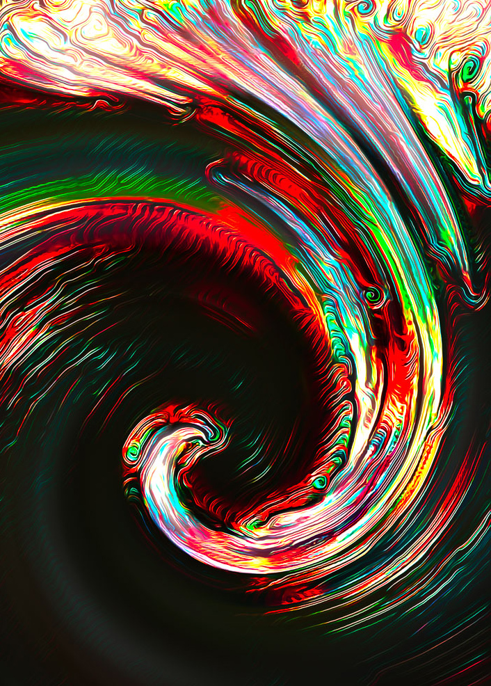
Mar 24 |
Comment |
Another very nice 'swirl' - love the colours and shapes. Only have one suggestion - would crop it a bit to accentuate the swirl - see my version attached. Would also work in Portrait format. |
Mar 8th |
 |
| 29 |
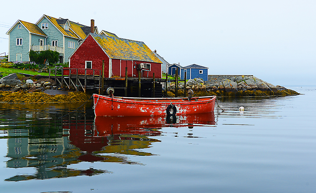
Mar 24 |
Comment |
Another beautiful picture of one of our national treasures - love everything about this image, but the sky. Having said that, I would not replace the sky, but just minimize it - see my version attached - also added a wee bit of a gradient filter. |
Mar 8th |
 |
| 29 |
Mar 24 |
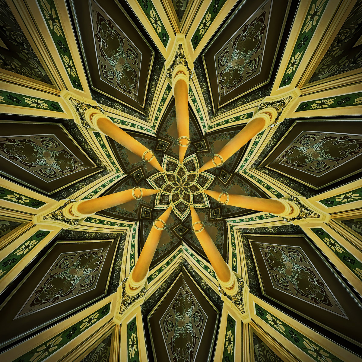
Comment |
Another interesting abstract - you have a good imagination - always enjoy your creations. My only suggestion would be to make the colours and tones pop a bit more. I used a luminosity mask to do the version attached. |
Mar 8th |
 |
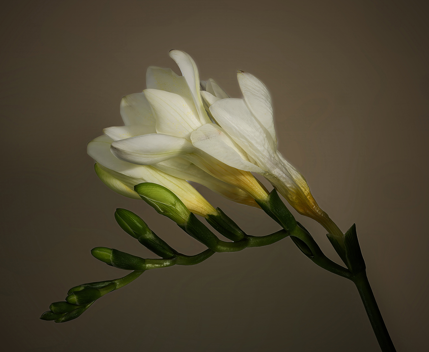
| 29 |
Mar 24 |
Comment |
Nice, simple flower study. Colours are nice, but the white petals are not very sharp. As already mentioned, f18 should have given a bit more sharpness. I like the alternative of stacking - 5 or so exposures - maybe at f8. Need a tripod to do this.
My other suggestion involves the background - I find it a bit too light, to make the flower pop. In my version I darkened it a bit and used the radial gradient to darken the edges - maybe a bit too much, but something like that. |
Mar 8th |
 |
| 29 |
Mar 24 |
Reply |
Thanks, Tim
Agree, sloppy composite - tree and horizon. Need to do a much better job of final quality control, before going public. |
Mar 7th |
| 29 |
Mar 24 |
Reply |
Thanks for your comments. Actually the center of interest for me are the colours - the eagle and trees are just co-stars. Left the front intentionally dark, as there is very little of interest, and would distract. Appreciate your point of view, and gives me something to think about. |
Mar 7th |
| 29 |
Mar 24 |
Comment |
Thank you, Elaine
Love it! |
Mar 6th |
| 29 |
Mar 24 |
Comment |
I like this image as is, but with a minor addition. The wheels are in sharp focus, and make the car look like it's standing still. In Ps add Motion Blur, to just the wheels. For me, I would experiment with Topaz Studio, and see what might be possible - as an example some grunge filters might prove interesting. |
Mar 5th |
7 comments - 2 replies for Group 29
|
| 34 |
Mar 24 |
Reply |
Thank you Steve. Love the new crop a lot. Not so much the white vignette - especially in the top right corner - removes too much of the hair for my taste.
I'm going to take a look at Portrait Pro, as I do very few portraits, and could likely learn a lot - thanks again |
Mar 12th |
| 34 |
Mar 24 |
Reply |
��.and the dialogue continuous! Please don't stop sharing the intent of your images. It would not deter those that want to interpret, but it would greatly reduce the learning that we get from artists like yourself. My main reason for joining a group such as this, is to learn to make better pictures. Without knowing what story the maker is trying to tell, we would not learn why she used the tools and techniques involved in the creation. I enjoy art galleries a lot as well, but mainly to see what is it that makes me go WOW - composition, colour, etc. Unfortunately, art gallery displays most often don't share the story behind the image, although titles sometimes shed some light on the intent. |
Mar 3rd |
| 34 |
Mar 24 |
Comment |
How "1984"ish - big brother is watching! Nicely composited. Very creative, Mike. One suggestion - make the ""Eye" piece a bit larger to block out more of the top of the tower. As well, to support your Be Afraid message, you could also replace the happy, blue sky with something more threatening. |
Mar 3rd |
| 34 |
Mar 24 |
Comment |
Another very strong Altered Reality image. A great job in combining all the bits and pieces. The end result is a very moody, foreboding scene. Unfortunately for me, it does not support the "prospect of sunny and warmer days". I appreciate that this image is Altered Reality, and I just don't get it (very likely!) |
Mar 3rd |
| 34 |
Mar 24 |
Comment |
Your creations always force me to think and "tease" the story out of them - which is challenging, which I really like. This one is no exception. Am I seeing a 3D image, or a 3D wannabe? I like the mirror effect quite a bit. Unfortunately the faces of the smaller individuals are badly distorted and off putting for me. As always you put a lot of work in your pictures and shows your passion for this art form. |
Mar 3rd |
| 34 |
Mar 24 |
Comment |
Another beautiful dance image. Love the colours and the lighting, as well the overall texture of this image. I only have one suggestion - would prefer the dance pairs to overlap a bit more, to reinforce the fact that there are only 2 dancers, in different poses. Skillful job of cut/paste. |
Mar 3rd |
| 34 |
Mar 24 |
Comment |
I like this abstract-like image quite a bit. You captured the "rust" aspect very nicely - especially the colours. Compositionally the image is very busy, but supports the randomness of the rust. Must say, I prefer the rust texture in original 2, but it is after all "Altered Reality". |
Mar 3rd |
| 34 |
Mar 24 |
Comment |
As always a very nice job of compositing. I understand the intent of the message, but not sure it translates for me. The faces are nicely presented, but do not say "Steampunk" to me - while the atmospheric aspects do. |
Mar 3rd |
6 comments - 2 replies for Group 34
|
17 comments - 9 replies Total
|


