|
| Group |
Round |
C/R |
Comment |
Date |
Image |
| 18 |
Feb 24 |
Comment |
WOW - really like this whimsical image. Great composition. Would not change a thing. |
Feb 18th |
| 18 |
Feb 24 |
Comment |
Jim, great idea and intent. From personal experience, judges are brutal on these types of pictures. They seem relatively simple, and that gives them time to look at every small detail. I have a few suggestions - the story is the wine levels in each glass - so the reflection at the bottom is a distraction and does nothing to add to the main theme - my opinion. The overlapping glasses also are a bit of an issue, in that the bases are not straight - ideally they should sit on a straight surface - like a table. For me, the plain white background works really well. See my version - although still not aligned on the bases (beyond my ability to change!) |
Feb 18th |
 |
| 18 |
Feb 24 |
Comment |
I like the story very much - (does one of my kids live at your house?). Also like the composition. The overall colour and tone are also very effective, but unfortunately the bin and the stuff on the floor are too dark and hard to identify. One other suggestion, would also add a bit more space on the left, to reinforce that it's a window. Great job. |
Feb 18th |
| 18 |
Feb 24 |
Reply |
I agree, Ian. For me Creative is a range from small enhancements to major redo. At the end o the day, the maker decides it it's creative or not. |
Feb 18th |
| 18 |
Feb 24 |
Comment |
Nice little scenic landscape - like the composition, as well as the Topaz filter you applied. Hope you don't mind, but I played with it a little. Added one of my skies in Ps, to give it bit more of sinister, lighthouse kind of feel. As much as I liked the filter, on the buildings, I thought the original grass in front was more appealing - so I replaced it with the original. See what you think. |
Feb 18th |
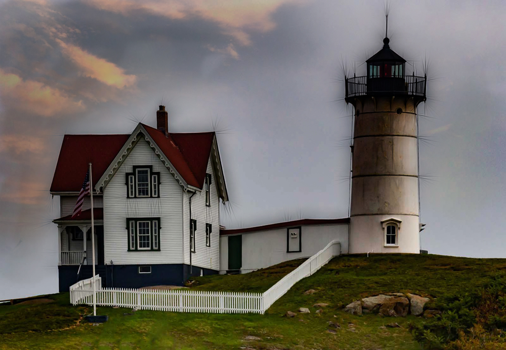 |
| 18 |
Feb 24 |
Comment |
Interesting image - I'm not a big fan of using someone else's art as a photo subject, unless the changes made are significantly different from the original. The changes you made add more interest for me - well done. One small suggestion - would remove the 2 stubby things at the middle, bottom as they are a bit distracting - or make them match the colouring of the faces. |
Feb 18th |
| 18 |
Feb 24 |
Reply |
Joan and Chan
Agree with both of you re: more whites
I played with it quite a bit, mostly to bring out the shading. I will add some more witness in specific areas, which I know will make this picture more impactful.
Thank you both |
Feb 12th |
5 comments - 2 replies for Group 18
|
| 29 |
Feb 24 |
Reply |
Thanks, Judy
I like your version as well |
Feb 25th |
| 29 |
Feb 24 |
Comment |
Nice Valentines abstract - like the light touch with the filter - still see some detail of the roses. I'm not a fan of the contrasting colours around the outside. They take too much attention away from the red roses - and that's why there is vanilla and chocolate ice cream! |
Feb 6th |
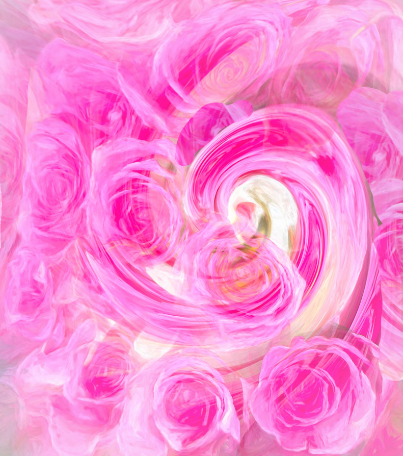 |
| 29 |
Feb 24 |
Comment |
Great documentary image - what a great subject. Nice job of shooting it. I also Karens adjustments - brings it up a notch. |
Feb 6th |
| 29 |
Feb 24 |
Comment |
WOW - what a beautiful flower study. Great job in shooting this. Love the lines, shapes, patterns in the pods. Would not change a thing. I have to remember this image, as I think a Macro shot of the individual pods would also be a real eye opener.
Thanks for sharing. |
Feb 6th |
| 29 |
Feb 24 |
Comment |
Nice architectural image - great location and very interesting architectural features.
I like the job that the filter did to the windows - certainly adds interest. On the downside. it added some weird colour artifacts throughout the image - see the yellow lights on the top, right. I find the yellow/gold lights a bit overexposed throughout as well. As for the people, I agree with chopping them off (need to change the title!). But a better solution for me would be to show more of the people, as they add more to the scene. |
Feb 6th |
| 29 |
Feb 24 |
Reply |
Not to be nitpicky, but here in Canada the rule is the same for public places. We differ however, in that we need not ask for permission to make money from the image. But in a non-public place, a model release is required. |
Feb 6th |
| 29 |
Feb 24 |
Comment |
I like this street-photo very much. Nice to see that he did not look into your lens, and we can only speculate what he is thinking about. The slogan on the bag seems very appropriate as well, since "Reuse, repeat" has likely been part of his history. Would not change a thing. |
Feb 6th |
| 29 |
Feb 24 |
Comment |
Nicely photographed, Karen. Nice and sharp and perfect exposure. The composition is a bit of a problem for me - the first 2 blooms are out of proportion with the rest, taking away the uniformity of the series. |
Feb 6th |
| 29 |
Feb 24 |
Reply |
As I understand it, legally you can take the picture, if the subject is in a public space. Morally, the answer is a bit different - since you're encroaching on the persons privacy, it's suggested that one ask for permission. When I do this I tell the person why I would like to take her/his picture and what I was planning to do with it. Most are ok with it. |
Feb 5th |
6 comments - 3 replies for Group 29
|
| 34 |
Feb 24 |
Comment |
Daft is good! Need more of this in our messed up world. Well thought out and executed. Would not change a thing |
Feb 12th |
| 34 |
Feb 24 |
Comment |
Really like the hand coming out of the water in this seascape - very serene. For my taste, a smaller tree in the palm, with the bird on the fingers, would be very impactful. The zebra and the writing take away from the simplicity that is the strength of this composition. In any case, well executed |
Feb 12th |
| 34 |
Feb 24 |
Comment |
I really like the middle piece (the selfie) quite a bit. Unfortunately for me, the light area to the left of the face is quite distracting. The colour explosion works well. |
Feb 12th |
| 34 |
Feb 24 |
Comment |
Thank for sharing the story. I like the idea of adding something next to the dancers, however for me, these particular pieces take too much attention away from the dancers. The light paintings of the dancers as Jan is showing them could stand alone, without the additions. |
Feb 12th |
| 34 |
Feb 24 |
Comment |
An interesting conversion, but not my "cup of tea". My tired old eyes are challenged as I don't find the composition or the colours particularily interesting. Glad that you are happy with it. |
Feb 12th |
5 comments - 0 replies for Group 34
|
16 comments - 5 replies Total
|


