|
| Group |
Round |
C/R |
Comment |
Date |
Image |
| 18 |
Dec 23 |
Comment |
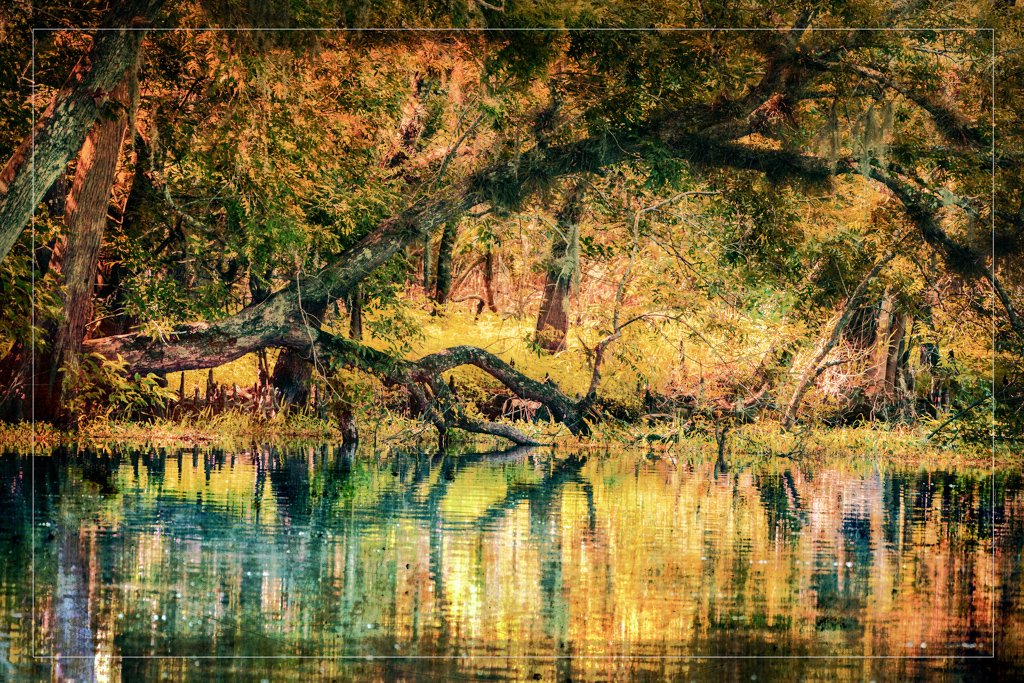
I like this image quite a lot - but maybe not enough Altered Reality/Creative content. I really like the adjustments you made to the original - beautiful tones, colours and textures. Certainly a super story telling shot. |
Dec 16th |
| 18 |
Dec 23 |
Comment |
A very nice image - nice composition, and lots for the eyes to see. Like the colours as well and the overall texture of the scene. One suggestion - would prefer to see more of a tonal separation, so I took the liberty to darken it a bit. See what you think. |
Dec 16th |
 |
| 18 |
Dec 23 |
Comment |
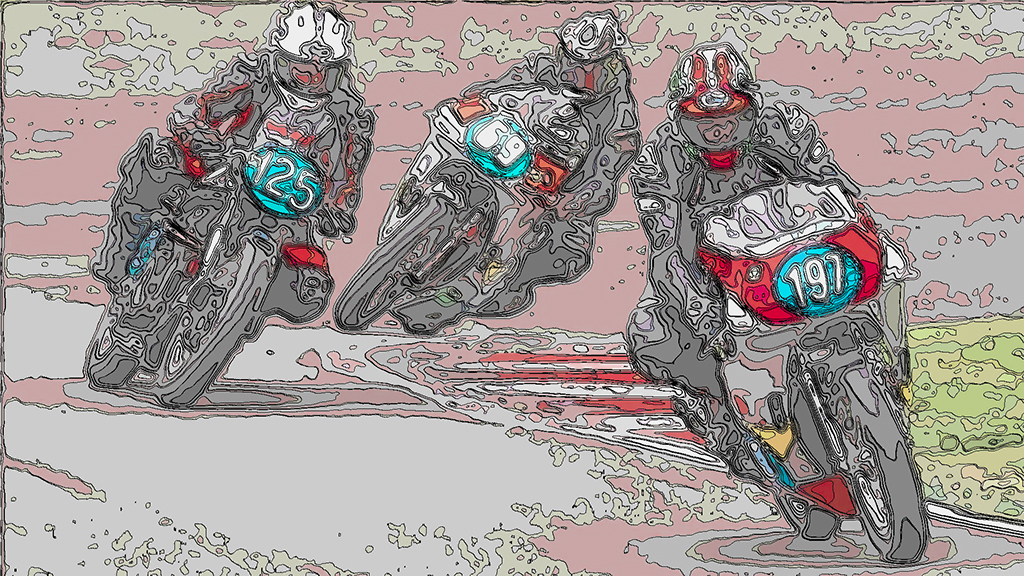
I like this quite a lot. The filter worked very nicely and is suited to this picture. Nice work. I only have one suggestion - for me the image is quite flat, so I pumped up the red and blue colours a bit. Just a personal preference. |
Dec 16th |
 |
| 18 |
Dec 23 |
Comment |
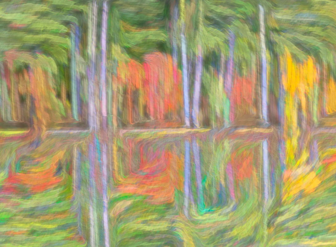
Certainly eye-catching - but does not really work for me. Abstracts are really a very personal thing -if you like it, it works. Landscapes, portraits and other popular themes have features that are well understood and used a lot of the time. Abstracts not so much - but do have some key attributes that are the same. Is it relatively easy for the eyes to travel through the image? Is it visually appealing? Is there a nice balance of shapes, colours, leading lines? Those are the things that I look for.
I do like the right side of the circle (colourful squiggles), but not the left - too much going on for me. As I said, abstracts are very personal, so take my observations as just one opinion. |
Dec 16th |
4 comments - 0 replies for Group 18
|
| 29 |
Dec 23 |
Reply |
I did not spent too much time withe the changes and they are not 100% (lines not straight). But adding stripes is relatively easy by using the clone tool, and take the samples from above. A little finecky. |
Dec 10th |
| 29 |
Dec 23 |
Reply |
Hi Judy
Glad you liked it. The "sun" I created in Photoshop. The eagle is from one of my nature shots a while back. The cloud is also from one of my pictures. I don't participate in any PSA, or any other organization contests, because the rules are too limiting for my liking. I also do not use "creative Ai" tools. |
Dec 10th |
| 29 |
Dec 23 |
Reply |
Interesting how we all view images through our individual personal lens. I know when I looked at your picture, I did not notice the background at all. It's not that I did not see it, but took for granted that this is the natural environment of a race like this. But most importantly for me, I focused on the horses/riders which I think was your intention, and the busy background di not come into play at all for me. |
Dec 10th |
| 29 |
Dec 23 |
Comment |
Thank you Ron for showing me what Cicada actually looks like. Little wonder that they squawk a lot! Although the head is reasonably sharp, for me there is too much that is out of focus. Maybe crop a bit of the out-of-focus area out - but that would take away the overall shape as well. Conundrum!
|
Dec 10th |
| 29 |
Dec 23 |
Comment |
Very interesting Abstract/Altered Reality image. Like the colours, shapes and textures. Also really like the original. I took the liberty to tweak it a bit - cropped it a bit to help focus on the middle part of the picture - and also flipped it to help the eyes travel from left to right to the yellow portion - all personal preferences, as the image is solid to begin with - nice job of using the abstract filter judiciously. |
Dec 10th |
 |
| 29 |
Dec 23 |
Comment |
Another very interesting and eye-catching image. Nice B&W tones and it's sharp throughout. Also liked the amount of 'pinch' you used, as I often tend to go overboard with these kind of filters - still learning 'less is more'! Well done. |
Dec 10th |
| 29 |
Dec 23 |
Comment |
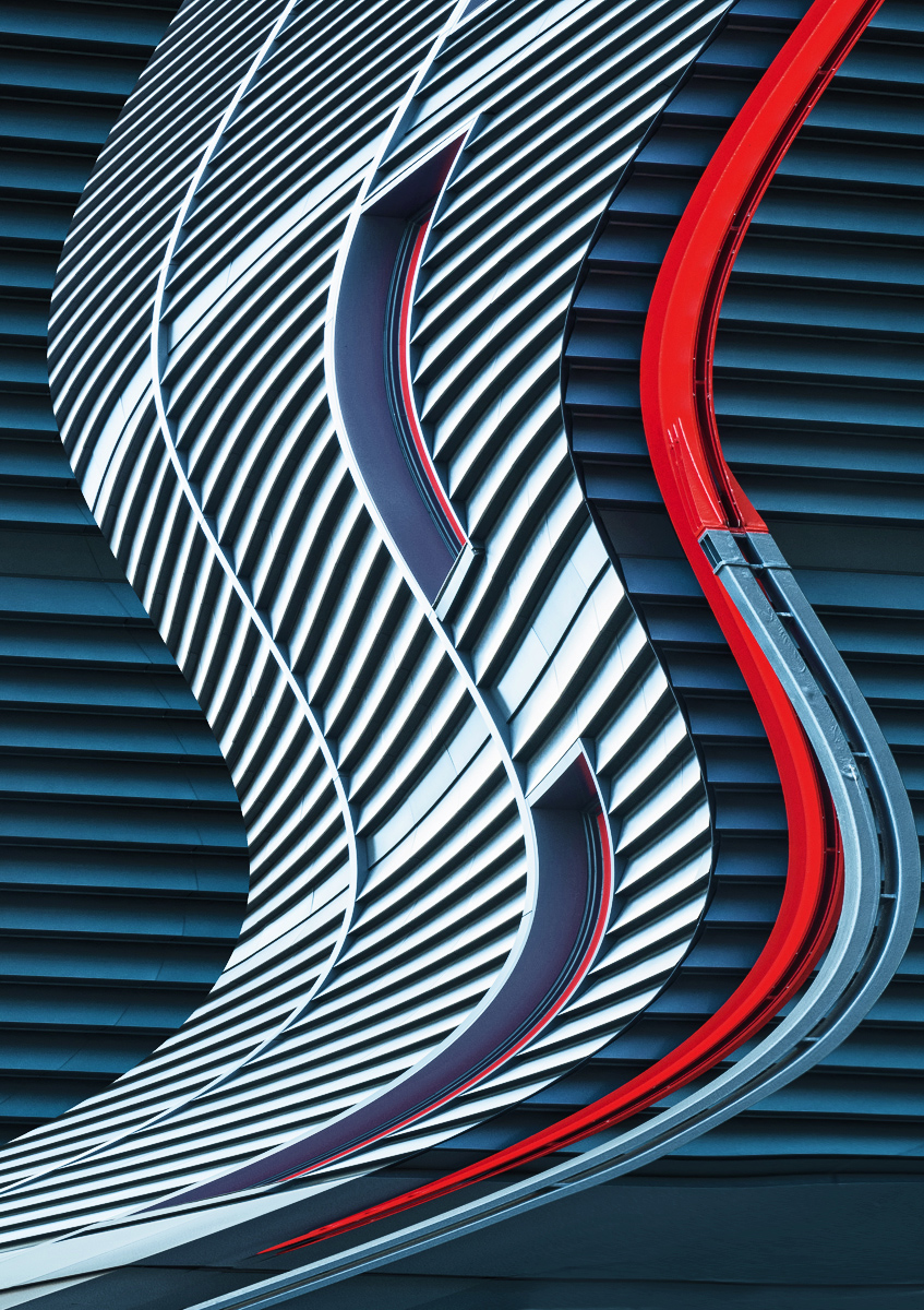
I really like this Altered Reality image - great composition, colours, curves, and patterns. I agree with Elaine re: bottom right corner. Took the liberty to remove it and also at the same time darkened the background a bit, to make the "S" curve pop out a bit more. See what you think |
Dec 10th |
 |
| 29 |
Dec 23 |
Comment |
Good catch, Elaine. Very interesting shapes, textures, and muted colours. My only suggestion would be to crop off a bit off the right, so as to concentrate the viewer on the more interesting aspects on the left - this would also be a great start for an altered reality/abstract version. Well done. |
Dec 9th |
| 29 |
Dec 23 |
Comment |
I really like this picture a lot - like the tight crop to concentrate on the story and the action. For my tired old eyes, I think that maybe the increased contrast introduced some dark splotches on the chest and front leg of the white horse. Not a big deal - a great action shot. |
Dec 9th |
6 comments - 3 replies for Group 29
|
| 34 |
Dec 23 |
Reply |
Thanks Frans |
Dec 24th |
| 34 |
Dec 23 |
Reply |
Thanks, Angela
FYI MirrorLab is only available for Androit |
Dec 24th |
| 34 |
Dec 23 |
Comment |
WOW, love everything about it. Really well constructed and a beautiful story. Strong composition, great colours, and judicious use of the Topaz filters. |
Dec 10th |
| 34 |
Dec 23 |
Comment |
Jan, you're right - love it and love it not so much. I love what you did with Original 1, and 3 - beautiful feast for the eyes. So much to see and enjoy. Also like the small birds in flight.
The robin - not so much. I know and appreciate that this is an Altered Reality image, but adding the robin does not work for me. Not even sure why, but it only detracts from the rest of the gorgeous background for me. But am happy that your enjoyed this creative journey. |
Dec 10th |
| 34 |
Dec 23 |
Comment |
Another unusual and interesting image. I really like the middle image of the Triptych and I think it would stand out all by itself. The other two supporting images are interesting as they share the same colours, but really don't add anything for me.
I'm curious about the original - what is it? |
Dec 10th |
| 34 |
Dec 23 |
Comment |
Thank you for this beautiful Christmas card and story. Love everything about it - really well constructed composite - 'you do great work'! Happy Holidays! |
Dec 10th |
| 34 |
Dec 23 |
Comment |
Very nicely constructed composite - technically very well done - sharp, nice composition, nice colours. As far as the story goes, I'm afraid it does not resonate for me. A fire dancer in a canoe? Could happen, but a stretch for me. I know it's Altered Reality, but a "bridge too far" for me. |
Dec 10th |
5 comments - 2 replies for Group 34
|
15 comments - 5 replies Total
|


