|
| Group |
Round |
C/R |
Comment |
Date |
Image |
| 18 |
Nov 23 |
Reply |
Thanks Andrew - Actually had not considered it, but I think I prefer the black for a more creative/non-wordly feeling. |
Nov 17th |
| 18 |
Nov 23 |
Reply |
Thanks Ian - good point |
Nov 17th |
| 18 |
Nov 23 |
Reply |
I think titles are mostly undervalued. I agree that in some judging environments, titles are not seen or referred to. From my experience, having an appropriate title adds to the enjoyment of viewers and judges. The value add of a title that tells the viewer what the maker wants you to see in the image. It's very helpful where it's not clear or well defined. I also believe we should make it as easy as possible for someone to appreciate the image and the story - and titles help that. Some people enjoy exploring and trying to figure it out, but most people really don't want to do this extra work. My 2 cents worth. |
Nov 10th |
| 18 |
Nov 23 |
Comment |
Beautiful use of the Urban Grit filter- nice touch - enhances the story quite dramatically. Is the structure to the right of the tower related to the tower? If not, would suggest to tone it down or remove it completely. Love the tower and surrounding area. |
Nov 7th |
| 18 |
Nov 23 |
Comment |
I like your idea of showing the people in B&W and colour - denotes that maybe they are not in synch at the moment. I also like the overall treatment of the picture. Title could also be "Distracted". Great commentary of our times. |
Nov 7th |
| 18 |
Nov 23 |
Comment |
I like the original and the Shadows story. The painterly effect does not enhance the story for me. I have seen a similar picture, which was turned to a B&W version, with the people almost silhouetted and the shadows really popped out. |
Nov 7th |
| 18 |
Nov 23 |
Comment |
I like your choice of the Swirly filter - it ages the building nicely, and does not mess up the vegetation and other objects. However for me, the Car Spares title and story are a bit iffy - no cars visible. The barge looks like it is passing by in a canal of sorts and is more of the story as I see it. |
Nov 7th |
4 comments - 3 replies for Group 18
|
| 29 |
Nov 23 |
Comment |
You certainly did - I like it lot - talk about 'in your face'!!! Thanks, Bob |
Nov 12th |
| 29 |
Nov 23 |
Comment |
It's different, so I like it. Like it a lot, actually. Know nothing about lens baby lenses, and what their aim is, but like this very dreamy effect. My suggestion would be to eliminate the top right corner (I painted it greenish) and the thing on the middle, left edge. I was curious what the Topaz DeNoise and Gigapixel would do to the nice dreamy effect - and must admit I like yours much better. Anyway, have a look and see what you think. |
Nov 6th |
 |
| 29 |
Nov 23 |
Comment |
Another bright and sassy image from Bob. Nice swirling effect, and super colour combinations. My only suggestion is to crop the sides a bit to accentuate the middle swirl, where all the action is. In my version I also put a bit of a circular gradient to darken the outsides a bit. See what you think |
Nov 6th |
 |
| 29 |
Nov 23 |
Comment |
I love our Maple Leafs - trees and hockey team. Beautiful arrangement, nicely photographed. Colours and tones are beautiful. I actually like the blemishes as it makes the subject real for me. The only change I would make, is turn the leafs about 20 degrees or so - makes the composition a bit more interesting. Another option is to turn it one turn to the right, and you have the bunch of leafs take on the shape of a single leaf. |
Nov 6th |
 |
| 29 |
Nov 23 |
Comment |
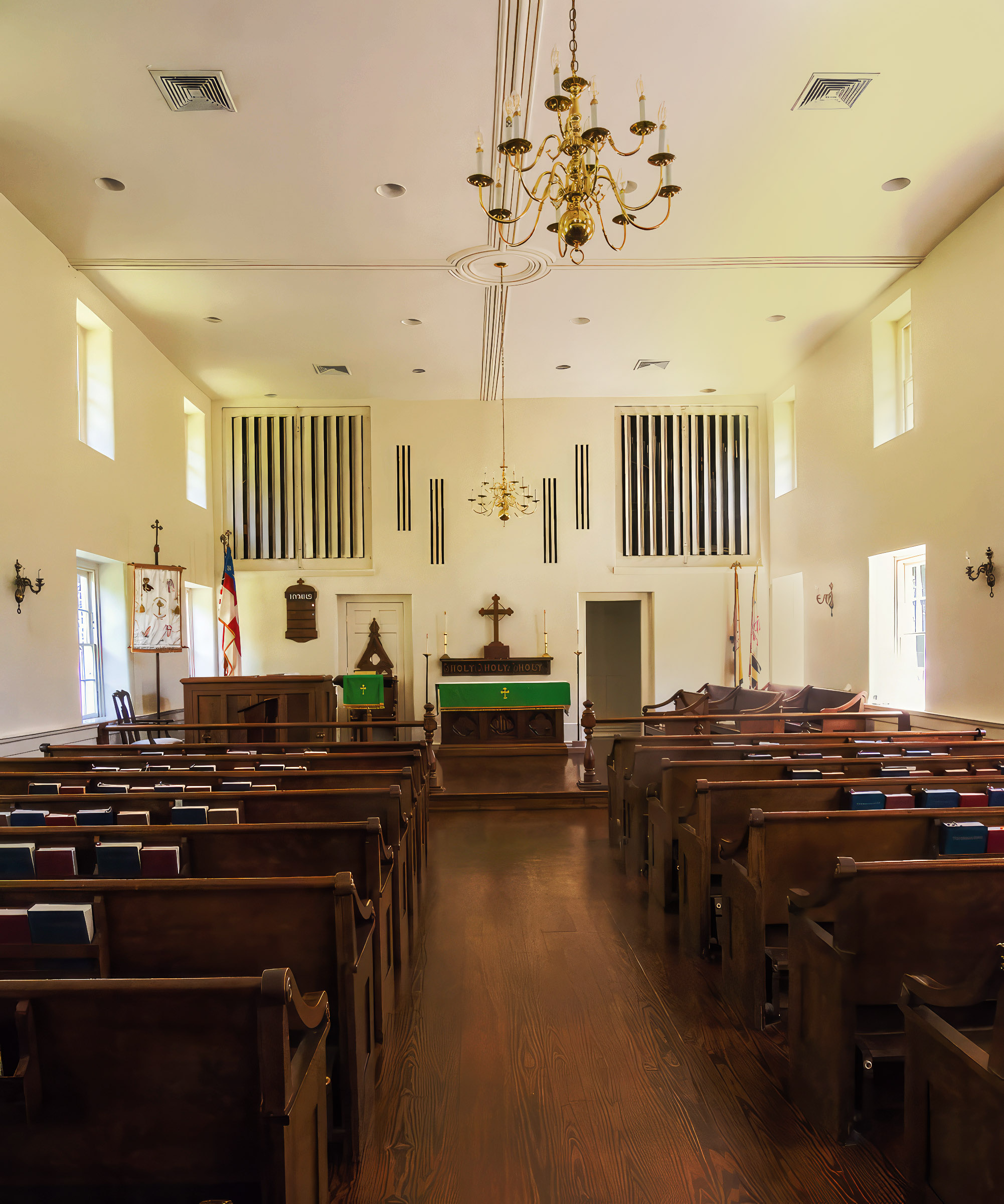
Very nice architectural image - like the subject matter, and your treatment - colours and composition. Unfortunately the chandelier front and centre seems to indicate that something is not straight. If it were not there, I'm not sure I would notice. In any case, I tried the Nik Effex app and tried to straighten the walls, windows, etc - no luck - it's great software, somewhat complicated, but do not get a chance to use it much. I also punched up the tones and colours just a bit, as it looks little flat to me. See what you think.
|
Nov 6th |
 |
| 29 |
Nov 23 |
Comment |
Very nice flower image - sharp, nice colours, nicely exposed. Wold not change a thing. |
Nov 6th |
| 29 |
Nov 23 |
Comment |
An interesting PJD image - Black and White version does bring out the details without distraction of colour. Building on Bob's comment of '..dimly lit areas", another idea would be to 'age' the picture, as Blacksmiths also take us back in times. So I added the Nik Antique filter and darkened the outside of the picture a bit as well.
Another version of your rendition. See what you think. |
Nov 6th |
 |
7 comments - 0 replies for Group 29
|
| 34 |
Nov 23 |
Reply |
Thanks Mike. |
Nov 16th |
| 34 |
Nov 23 |
Reply |
My hat off to you - WOW, that's all I can say |
Nov 16th |
| 34 |
Nov 23 |
Reply |
Thanks, Candy - great suggestion - will try it out. |
Nov 16th |
| 34 |
Nov 23 |
Reply |
Thanks, Jan well done.
Are you using the PS Ai feature a lot, and how is it working for you. Certainly worked well in this example. |
Nov 16th |
| 34 |
Nov 23 |
Reply |
Thanks, Steve
I tried to fix the upper left corner, but my PS skills are not yet there to do that.
Good suggestion |
Nov 16th |
| 34 |
Nov 23 |
Comment |
An interesting 'garden' image - Like the idea and story. For my eyes, the saturated yellow is a bit over the top - would prefer if it were toned down quite a bit. The bee could be more saturated as it is does not stand out against the yellow. Also the bee seems to be a bit small compared to the stamen. |
Nov 7th |
| 34 |
Nov 23 |
Comment |
What a beauty! Love everything about this picture. Gorgeous colours and tones. Very effective composition and texture. Really like how the light, yellow sun draws the eyes. Would not change a thing. |
Nov 7th |
| 34 |
Nov 23 |
Comment |
What a beautiful tribute - nicely imagined and created. My only very minor issue are the halos (or frisbee's!) that are free floating without the angels - I would remove them. Just a nit! |
Nov 7th |
| 34 |
Nov 23 |
Comment |
Interesting image, and the overall 'look' you achieved. Lovely composition, colours, and tones. Not a big fan of the identical leaves - lacks interest for me. Even differentiation the leaves with colour or size would give it more of an impact for me.
|
Nov 7th |
| 34 |
Nov 23 |
Comment |
Another great compositing job - well done. Great story: Autumn - and so nicely presented. Love everything about it, specially the Goth model. The processing procedures were not too little or too much - just right, my opinion. Would not change a thing. |
Nov 7th |
5 comments - 5 replies for Group 34
|
16 comments - 8 replies Total
|


