|
| Group |
Round |
C/R |
Comment |
Date |
Image |
| 18 |
Oct 23 |
Comment |
Thanks, Chan - glad you like it - I often wrestle with when to stop processing |
Oct 22nd |
| 18 |
Oct 23 |
Reply |
Ian - Mirror Lab is an Ilixa product. Unfortunately, only available for Android |
Oct 12th |
| 18 |
Oct 23 |
Reply |
Ian, thanks for your thoughts on this old chestnut - but it's a bit of a thing for me.
I specifically have an issue with using someone's art - painting, sculpting, photography, etc (anything that is specifically created for artistic purposes)- cars, cathedrals are different as they were created for transportation and worship, but also have artistic characteristics.
Adding or changing something to someone else's art is a bit trickier. In any case, none of this matters - if you think your image is art, it's art. |
Oct 12th |
| 18 |
Oct 23 |
Comment |
Like the swirl composition. Also the colours in general work well together. My only suggestion would be to tone down the yellow a bit - a bit too contrasty for my tired, old eyes. |
Oct 10th |
| 18 |
Oct 23 |
Comment |
A sad story - I visited Detroit quite often on business in the '70s, and even then the overall feel was one of deterioration. I like the picture quite a lot. Good choice of the filter and your touches to show bits of the house as it might have looked in better days. One minor thing - don't care for the tire - stands out too much - maybe "age" it a bit more. Overall, well done. |
Oct 9th |
| 18 |
Oct 23 |
Comment |
I really like this whimsical subject and image. Nice job of compositing. My only suggestion would be to move the birds closer to the dog - almost make it look like they are all flying in formation. Thanks for making me chuckle! |
Oct 9th |
| 18 |
Oct 23 |
Comment |
I struggle with this image. Not sure what I'm seeing (not unusual in the creative world!) Even with the Abstract genre, composition is important so that the eyes can easily move through the image - whether it's colour, shapes, textures, lines etc. I find image Original2 much more pleasing. |
Oct 9th |
| 18 |
Oct 23 |
Comment |
Unfortunately not my cup of tea. I might be an exception in this, but taking a picture of someone else's artwork does not translate to creativity. I recognize that with the dawn of AI the ownership of the final image gets even more blurred. |
Oct 9th |
6 comments - 2 replies for Group 18
|
| 29 |
Oct 23 |
Comment |
Judy - thanks for the reminder. Yes, monochromatic means one colour only, with shades, tones, or tints. |
Oct 22nd |
| 29 |
Oct 23 |
Comment |
Judy - thanks for the reminder. Yes, monochromatic means one colour only, with shades, tones, or tints. |
Oct 21st |
| 29 |
Oct 23 |
Reply |
Ron - I forgot to mention re: blown out sky. As most everyone, have tried various methods to deal with this. What works best for me is, painting in a very light, low opacity colour close to the blown out area. Works most of the time, and has the advantage of keeping my own sky. Does not work for large blow outs, where I replace it with another sky from my own Sky folder. |
Oct 19th |
| 29 |
Oct 23 |
Reply |
Thanks, Tim
I'm actually playing with it - trying B&W version. The original colours are taken from the out-of-camera shot, but obviously juiced up quite a bit. |
Oct 19th |
| 29 |
Oct 23 |
Reply |
Thanks, Ron
Actually my camera club did not like it - same issues as almost everyone who has seen it - colour selection and saturation. Still remains in my Favourite folder! |
Oct 19th |
| 29 |
Oct 23 |
Comment |
Nice simple shot. Would not change a thing. Like the expression, and the picture is nice and sharp. |
Oct 19th |
| 29 |
Oct 23 |
Reply |
To confirm: I will almost always push the boundaries towards bold colours. Evident by my yellow/green entry this month. FYI - my best friend told me to resend it to him when it was finished! Today a prominent photo teacher and educators told me that "��.the colours are distracting and screaming!"
As Popeye said "I likes what I likes!", and so it remains in my favourite listing. |
Oct 10th |
| 29 |
Oct 23 |
Comment |
Ron, a beautiful scenic. Great composition, the mountains leading our eyes to the tree. The foreground and mountain colours are beautiful.
For me however, the HDR effects on the mountains, and especially in the sky, do not work - way too "hdr crunchie" . The sky also has lots of coloured artifacts showing. |
Oct 10th |
| 29 |
Oct 23 |
Comment |
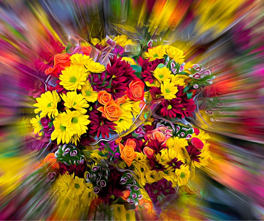
Certainly impactful for me - great colours and sharp. Not overcooked for me, except the yellow flowers could be toned down a wee bit. The only suggestion I have is that one could crop some of the side-zooms a bit - as for me, the flowers are the star of the show. The Expressions filter is probably my most often used filter - in most cases at 5 to 15% opacity. It makes the subject look sharper without an excess of expressionism. |
Oct 10th |
 |
| 29 |
Oct 23 |
Comment |
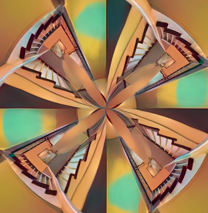
I like the use of this filter - interesting end result. Since the picture is about the stairway, it's unfortunate that so little of it is seen. Lightening them, and surrounding them with dark, might make them pop. (Dodge/Burn), but don't have much experience with it. Another suggestion would be to crop off some of the outside -see attached. All in all, an interesting image. |
Oct 10th |
 |
| 29 |
Oct 23 |
Comment |
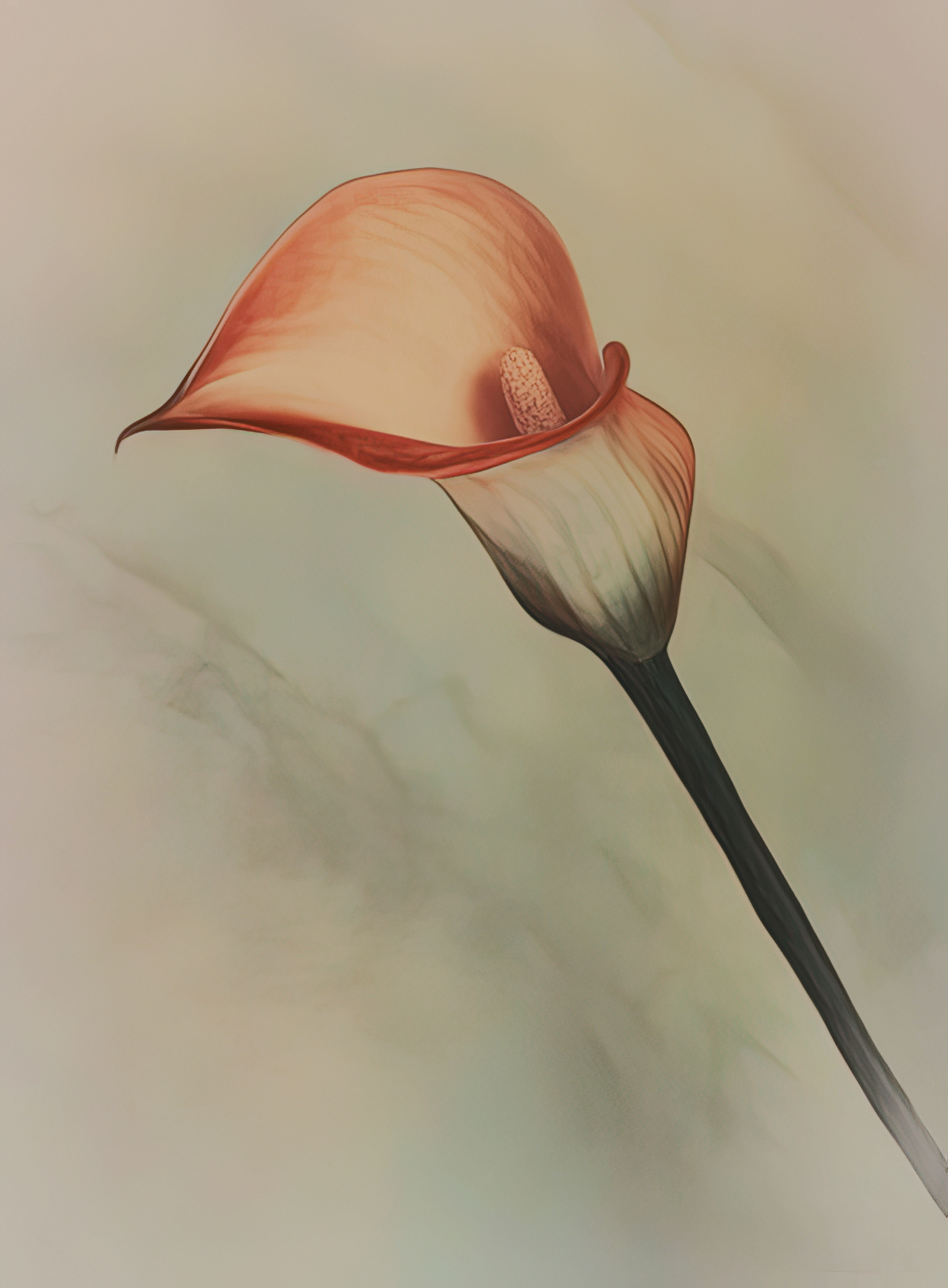
I like this picture quite a bit. Nice position of the head and nice and sharp. Would not change a thing. Just curious, why convert it to B&W? |
Oct 10th |
| 29 |
Oct 23 |
Comment |
Tim, you caught this action shot at the perfect time. The posture of the birds tells the story. Well done. Unfortunately, for my eyes, the birds are not very sharp. Camera setting appear to be ok for this kind of shot. FYI - I use Topaz DeNoise a lot, but also Sharpening. I've found that DeNoise causes a bit of a problem with sharpness. |
Oct 10th |
8 comments - 4 replies for Group 29
|
| 34 |
Oct 23 |
Reply |
Thanks, Steve - glad you liked it. |
Oct 25th |
| 34 |
Oct 23 |
Reply |
Just read my reply again, and I need to clarify. I don't want you to think my comments were addressing your image, but we're meant to describe my feelings in dealing with the Ikea strategy of "assemble it yourself".
When it comes to viewing photographic art, like a gallery visit, I'm not a fan of " make up your own story" - but this is just my take, one voice out of the wilderness.
|
Oct 19th |
| 34 |
Oct 23 |
Reply |
Sorry, Steve. - thought you had the band members on individual layers or cut out. |
Oct 12th |
| 34 |
Oct 23 |
Reply |
Sorry Jan, but I'm not one of those viewers.I also resent buying things from IKEA that I have to assemble - don't like it, have better things to do with my time, and frankly not my job, man! |
Oct 12th |
| 34 |
Oct 23 |
Comment |
A nice floral, but I don't see much Altered Reality content.
I really like the background you created. For me the bloom has a nice soft feel to it, and nice muted colours, but seems a bit flat. Just for the fun of it, I used a Luminosity Mask to bring out some tonal variance - maybe too much?
See attached
|
Oct 12th |
 |
| 34 |
Oct 23 |
Comment |
A whimsical, fun image - a nice departure from the more formal/serious pieces we mostly deal with. Would not change a thing. |
Oct 12th |
| 34 |
Oct 23 |
Comment |
A beautiful crafted composite - strong composition, great colours and tones. Love everything about it, except for the story. There are 5 birds in the image, and only one seems to be even curious about what is beyond the portal. Without a compelling and visible story, the beautiful image falls a bit flat for me. |
Oct 12th |
| 34 |
Oct 23 |
Reply |
Thanks, Steve
I prefer the darker version, as it provides more contrast - I felt that the dark swirls were every bit as important as the flowers. |
Oct 11th |
| 34 |
Oct 23 |
Reply |
Thanks, Mike - appreciate the feedback |
Oct 11th |
| 34 |
Oct 23 |
Reply |
Thanks, Candy
Appreciate your thoughts and your suggestion |
Oct 11th |
| 34 |
Oct 23 |
Comment |
Thanks, Jan
Your iteration is also very interesting.
I was very concerned with creating contrasting tonal values - light, dark, and mid tones, as well as an overall balance. |
Oct 11th |
| 34 |
Oct 23 |
Comment |
Sorry, Steve, but this image does not work for me - overall colours are weird, and the bee is hardly recognizable. I know this is a creative group, and your image is certainly that, and it works for you, so all is good.
I do like the original. |
Oct 10th |
| 34 |
Oct 23 |
Comment |
Again great craftsmanship in this picture. Certainly very impactful for me at first glance. Unfortunately as my eyes travelled through the image I got lost. Beautiful foliage, and love the tiger. I seem to remember seeing an image similar to yours, but it had many more animals in it, to the point where there was little to see of the foliage. The story was, if I remember correctly, the multitude of animal life. The other thing I remembered was how the animals all worked together. In your picture I see wildlife that does not work together. The white swan. The red fish. The large monkeys. The whimsical frog. Hard to describe, but for me it does not work - very subjective, for sure.
I do love the tiger and foliage. |
Oct 9th |
| 34 |
Oct 23 |
Comment |
You've put a lot of work into this image, and it payed of for me. Also like the story and message. My only suggestion would be to move the musicians a bit, as they feel a bit crowded on the right for me. Would not change anything else. Well done, as always. |
Oct 9th |
7 comments - 7 replies for Group 34
|
21 comments - 13 replies Total
|


