|
| Group |
Round |
C/R |
Comment |
Date |
Image |
| 18 |
Aug 23 |
Reply |
Thanks, Andrew
Yes the guard rails are a bit too bright, and I still struggle with not examining the whole image for this kind of obvious defect. |
Aug 15th |
| 18 |
Aug 23 |
Comment |
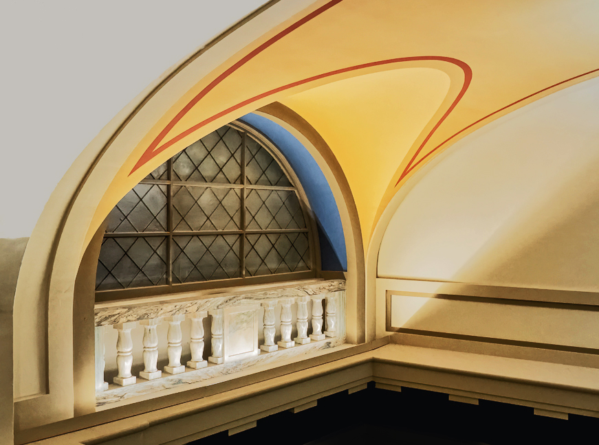
A very interesting and unusual look - like it a lot. Lots to see. My only suggestion is that for me there is just a bit too much texture detail - would prefer if the buildings were more easily seen - not by much, but a bit. Good image for line-drawing application. As for 'no centre of interest' you're spot on - it's the whole scene for your eyes to explore. |
Aug 14th |
| 18 |
Aug 23 |
Comment |
Lots to see and appreciate in this image. I like the Expression filter application, and it's well suited to this scene. As for the retaining wall, I think the filter has made it too noticeable for me - prefer the original wall, just a bit lighter. The floating boat looks a bit odd to me, without the filter - not cohesive with the other boats. |
Aug 14th |
| 18 |
Aug 23 |
Comment |
I really like the soft, dreamy colour palette. Nicely calming in our busy world! The grasses unfortunately don't resonate with me - mostly the composition. There is just not enough to see for me. My opinion only, making grasses into an interesting abstract is a bit of a challenge. |
Aug 14th |
| 18 |
Aug 23 |
Comment |
I really like this subject matter - I also think the composition is spot-on. The colours are very pleasant as well. The abstract filter also adds to this image. For me however, the background is much too busy, taking the attention away from the main subject. I personally wrestle with this situation quite a lot (too much!) - where I want the background a bit interesting, but at the same time not compete with the main subject. |
Aug 14th |
| 18 |
Aug 23 |
Reply |
Thanks, Ian - see my response to Jim. |
Aug 13th |
| 18 |
Aug 23 |
Reply |
Thanks Jim - I agree that your version is also very nice, however my intent was to focus on the colourful jockey attire, and did not want any other aspects take away from that - i.e. more detail. Personal preference, for sure. |
Aug 13th |
4 comments - 3 replies for Group 18
|
| 29 |
Aug 23 |
Comment |
OOOps - another seniors moment!!! I remember doing a response to this beautiful image a few days after posting - but obviously it did not make it.
I like this image very much - beautiful colours, great lines, and an impactful image.
Well seen and photographed.
My only small issue is the composition. For my eyes, I don't see too much to see on the right side, so in my version I did a crop - to also keep extra focus on the window section. At the same time I also punched up the colours a wee bit. See what you think. |
Aug 25th |
 |
| 29 |
Aug 23 |
Reply |
Thanks, Angela
I think the Gradient Map application had a lot to do with the colours. |
Aug 15th |
| 29 |
Aug 23 |
Reply |
No don't use a rail (mostly because I can't justify the cost for the # of images I take) - just a tripod and a remote shutter release. Glad you like it. |
Aug 15th |
| 29 |
Aug 23 |
Comment |
WOW, this picture jumps right off the page for me. Well done. I'd love to see the original - as the only issue I have is with the intensity of the colours. For me, it's a bit over the top. I don't see it as a moon image, but as an Altered Reality moonscape. In any case, it certainly is impactful. |
Aug 11th |
| 29 |
Aug 23 |
Comment |
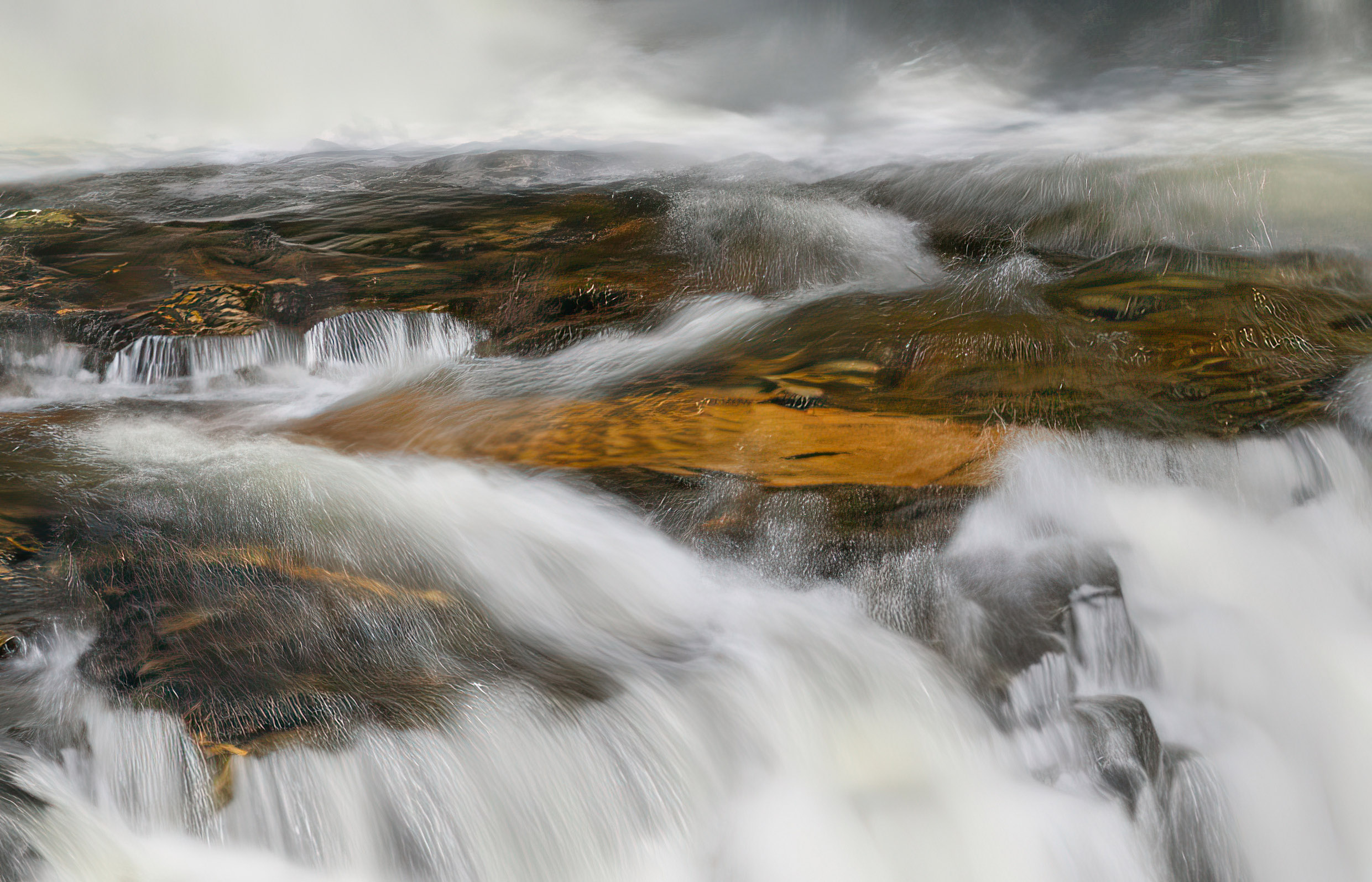
I really, really like this picture. For me it's not just the waterfall, but the whole scene - especially the background and sky. It makes me think of a 'restless and wild nature story'. The composition is terrific - it's not a simple one, but it invites your eyes to room around the scene. My only suggestion is that it could use a bit more sharpness. See what you think about my version. A highly impactful image for me - thanks for sharing. |
Aug 11th |
 |
| 29 |
Aug 23 |
Comment |
Another one of your beautiful nature images - nicely photographed - sharpness, exposure, and composition. My only suggestion would be to tone down/eliminate the orangy/yellows in the background - I find it a bit distracting. If this were to be entered in a Nature category exhibition/contest I would obviously leave it as it is. |
Aug 11th |
| 29 |
Aug 23 |
Comment |
A nice documentary image - nicely exposed and sharp. My only suggestion would be to show what they're looking at. On the other hand, not showing it makes one think about what it could be that caught their attention - another point of view, so to speak. |
Aug 11th |
5 comments - 2 replies for Group 29
|
| 34 |
Aug 23 |
Comment |
Hello Frans
Glad that you liked this picture. The rims were part of the original, and the composting picked up the background automatically. |
Aug 27th |
| 34 |
Aug 23 |
Reply |
Thanks. Steve - good catch - Does Jan's version do this, or is there another way to show more depth? |
Aug 13th |
| 34 |
Aug 23 |
Comment |
Mike - great suggestion - I'm definitely play with it. Thanks |
Aug 13th |
| 34 |
Aug 23 |
Reply |
As always, very insightful suggestion - improves the image a ton - thanks |
Aug 13th |
| 34 |
Aug 23 |
Comment |
Another terrific Altered Reality image and story. The composition is really strong and makes it easy for the eyes to explore the scene. Just a very minor suggestion (I love the original of the clockwork) - I'd like to see a bit more detail of the clockwork, without compromising the overall very effective moodiness - a great piece of work. |
Aug 12th |
| 34 |
Aug 23 |
Comment |
Obviously a lot of thought has gone into this piece. Really an interesting Altered Reality image. I find the colours really effective - cannot suggest anything that would improve it for me - well done |
Aug 12th |
| 34 |
Aug 23 |
Comment |
WOW, again. Great composite - subject matter and the composition. Have no suggestions on how to improve. Your work is sooooo good! |
Aug 12th |
| 34 |
Aug 23 |
Comment |
Very creative and well put-together - like everything about it - would not change a thing. I like the little antennas on the aliens head - obviously trying to figure out what it was seeing. Well done |
Aug 12th |
6 comments - 2 replies for Group 34
|
15 comments - 7 replies Total
|


