|
| Group |
Round |
C/R |
Comment |
Date |
Image |
| 18 |
Jul 23 |
Comment |
Thanks, Andrew
Good idea - I'll give it a try. |
Jul 19th |
| 18 |
Jul 23 |
Reply |
That is exactly whit I was thinking, but did not want to change your original that much. Square would work much better. |
Jul 14th |
| 18 |
Jul 23 |
Comment |
A beautiful Altered Reality image. The composition is very strong and the colours all work well together. I would not change a thing - great job. |
Jul 14th |
| 18 |
Jul 23 |
Comment |
I really like the warehouse aspect of this image - colours, texture, abstract treatment, and of course the new view from the windows. The dancing woman looks a bit odd to me - splotches in the face especially as her out-of-focus hair. (Am I nitpicking?) Overall an interesting picture |
Jul 14th |
| 18 |
Jul 23 |
Comment |
A nice painterly creative - like the colours and the 'not too heavy' expressionist touch. I'm not sure about the person and bicycle - on the one hand, it's good to have a person in this picture, but showing this person in the expressionist style does not work for me. A suggestion, I find that titling an image is really important, especially in the creative area - it's often difficult to determine what the maker is considering the main area of interest is for him/her. I think in this case, your point of interest is not the boat, but the person in front. |
Jul 14th |
| 18 |
Jul 23 |
Comment |
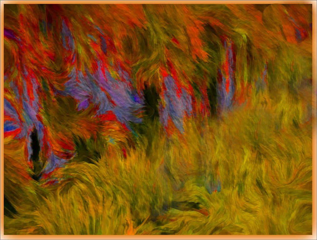
Ian, I really like the colours and the overall textures. As for the composition, my eyes had a bit of a struggle - the 3 blue things in the front break up my exploration of the picture from left to right. As well, the dark upper corner is also a bit of a distraction. I took the liberty to mess with it a bit, to demonstrate what I mean. But certainly a very strong eye catching abstract.
|
Jul 13th |
 |
| 18 |
Jul 23 |
Reply |
Thanks, Ian
I agree that the white overlay could be darkened a wee bit, and the flowers within it a bit brighter - will try it, thanks |
Jul 13th |
| 18 |
Jul 23 |
Reply |
Thanks, Jim
Appreciate your feedback and your suggestion of making the flowers more prominent - will certainly try it.
The subject I had in mind is the title of piece, and the intent was to contrast the forms in nature and non-nature (geometric form in this case) |
Jul 13th |
5 comments - 3 replies for Group 18
|
| 29 |
Jul 23 |
Comment |
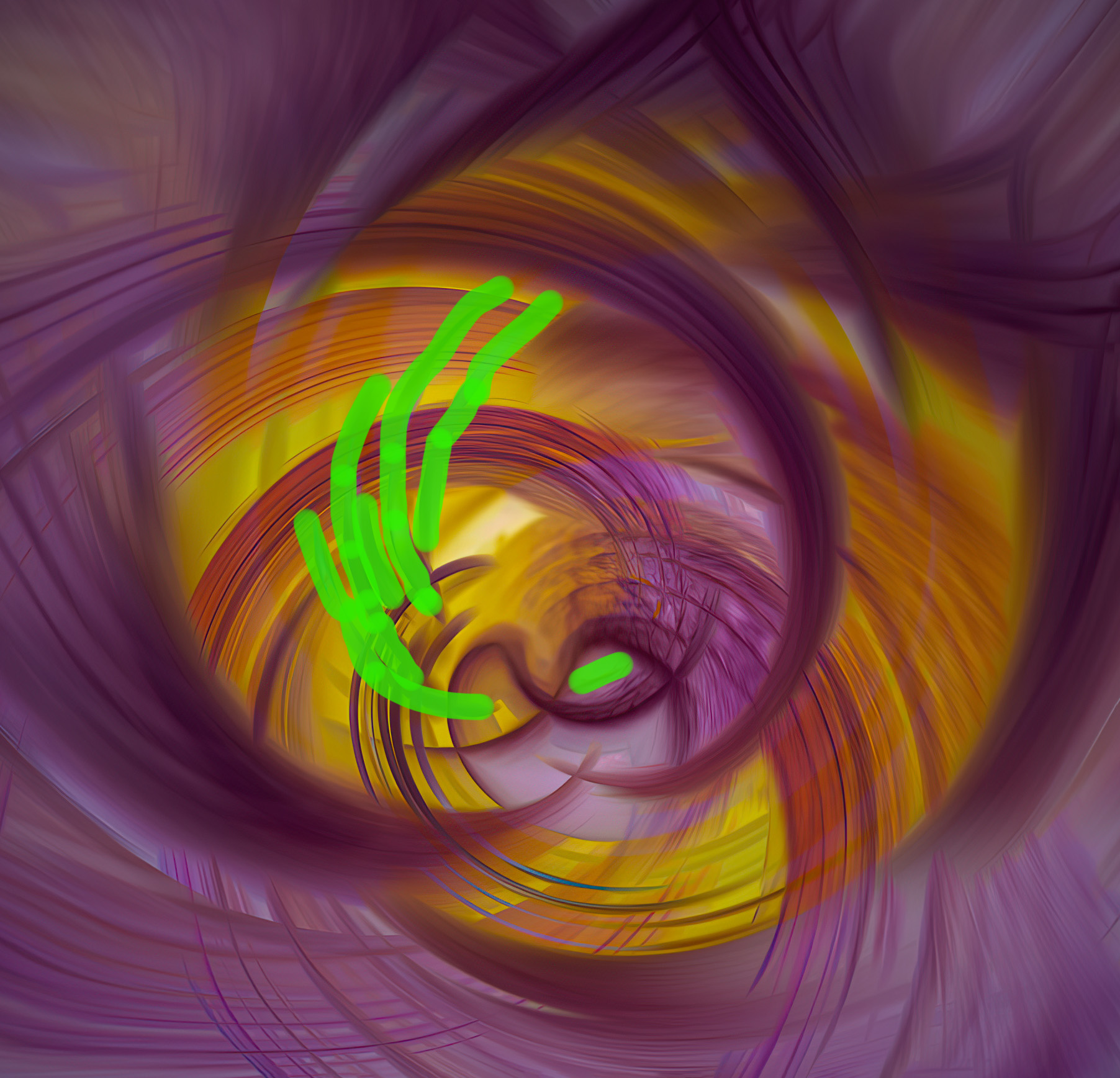
If it were my picture, I would still crop it (a big part of composition) but I would also attempt to "clean up" the centre. It's not that I mind that the centre is busy, but what bothers me is there are too many lines crossing others, that are hard confusing me. I tried to remove them, but again made aware how much more I have to learn in Photoshop. Tried the Healing Brush and made a total mess - so I highlighted the area in green that I would like to see removed. For me there is a very nice flow of lines and shapes in the original, except for the ones marked in green. That's my 2 cents worth, Bob |
Jul 10th |
 |
| 29 |
Jul 23 |
Reply |
Thanks, Karen
I agree that the poppies need to be just a little bit lighter - not too much, because they tend to lose the texture of the petals. However, the grasses need to stay dark, to contrast the light and bright poppies. |
Jul 9th |
| 29 |
Jul 23 |
Comment |
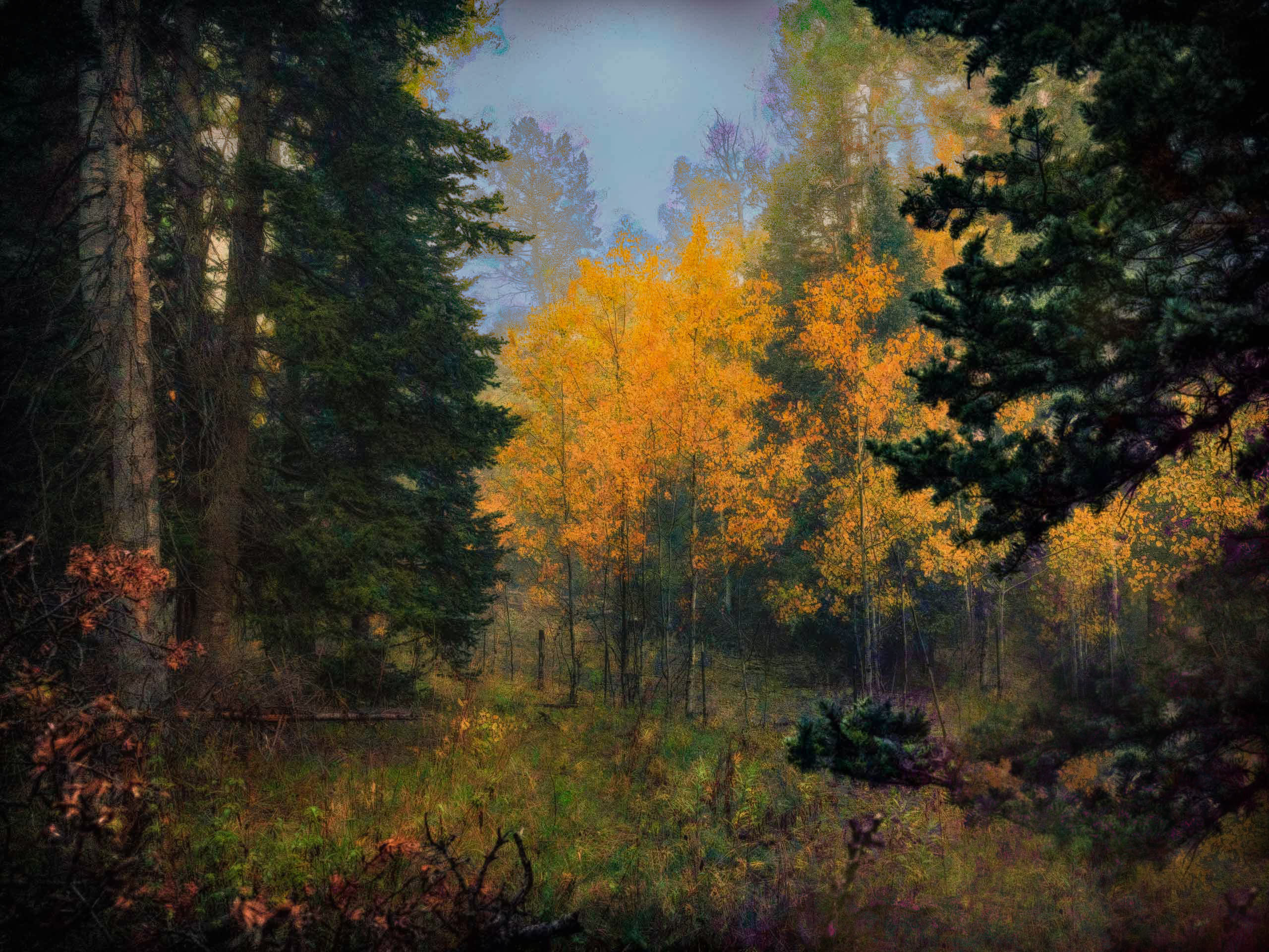
I really like this image - very painterly and moody. The colours are terrific, especially the yellows (aspens?). The composition is also terrific - nothing fancy, but allows the eyes to navigate through this image in a nice, easy way. Unfortunately the bottom right hand corner looks a bit odd, and keeps drawing my eyes. See my attempt to tone it down - with one of my favourite tools - the clone tool. See what you think. |
Jul 8th |
 |
| 29 |
Jul 23 |
Comment |
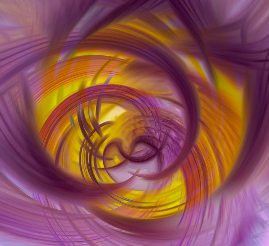
I like this abstract - great colours and nice movement of the lines and shapes. For me, I would prefer to see a tighter crop - although the eyes do tend to move to the centre, they also go to the light part at the bottom, which is a bit of a distraction. See my version. |
Jul 8th |
 |
| 29 |
Jul 23 |
Comment |
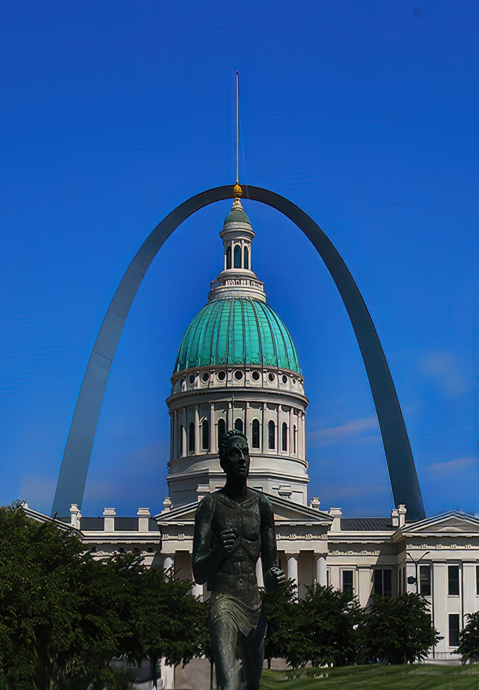
I think this is a strong documentary image - lots to see, nicely photographed. The Hyatt is leaning a bit and could be straightened, other than that I have no suggestion. Well, I guess I actually do. Just for fun, I took a crack of making a more 'artsy' version, featuring the courthouse and the arch, and leaving out the rest. Have seen a few images of the arch, but I really like this one as it's from a very interesting perspective.
See what you think |
Jul 8th |
 |
| 29 |
Jul 23 |
Comment |
Certainly a story-telling documentary image. You did a good job with your phone. The red certainly focuses the eye quickly, however the surrounding area is also interesting to see.
|
Jul 8th |
| 29 |
Jul 23 |
Comment |
I like this street photography image - interesting subject and like the background as well. Personally I think the patches of gum would make the picture even more complete and realistic. I'd be interested in knowing what the reaction of the person was when you took the shot. I tend to be overcautious in taking this kind of photo. |
Jul 8th |
6 comments - 1 reply for Group 29
|
| 34 |
Jul 23 |
Reply |
Thanks for passing on this link.
Very well done. I do a fair # of B&W conversions. I always ask my self the question -"Does colour or b&w make the important features pop that you want to emphasize" i.e the picture of the older woman with the pronounced wrinkles - if the wrinkles are the story, it is much more impactful than the colour version. If the story is - here is an older attractive woman, colour would be my choice. My take |
Jul 19th |
| 34 |
Jul 23 |
Reply |
My vote - selective colour - over the other 2. The colours make the image. The B&W image is ok, but does not have the impact. |
Jul 19th |
| 34 |
Jul 23 |
Comment |
I'm afraid the title sums up my enjoyment of viewing this image. I realize that the category is Altered Reality, but for me the focal points need to somehow work together. I don't see a connection between the birds and the bridge, and the dominant abstract background also does not seem to connect. For me, there is no story here. I think this another situation where personal taste of the viewer and the creator are not in synch - most often seen in the creative category of photography. |
Jul 8th |
| 34 |
Jul 23 |
Comment |
A very powerful image - with the appropriate title. Very nice touch with the blur tool. I can get happily lost with my thoughts in this moody, simple image. Would not suggest any changes. Well done! |
Jul 8th |
| 34 |
Jul 23 |
Comment |
Another very creative image. I like the colours quite a lot, but the background does not work for me - competes with the ball-image too much. If this were my image, I would also use more of the circle for the selfie, without the face being distorted. |
Jul 8th |
| 34 |
Jul 23 |
Comment |
A very creative image - love the idea of the dancer (beautifully photographed) in front of the dark buildings. If you did not make me aware of the very dramatic lighting of the building, I would have thought that they were created in post processing. Although very interesting and dramatic, I think they overpower the dancer quite a bit - conflict, rather than support/enhance the dancer. Just one persons taste. |
Jul 8th |
| 34 |
Jul 23 |
Comment |
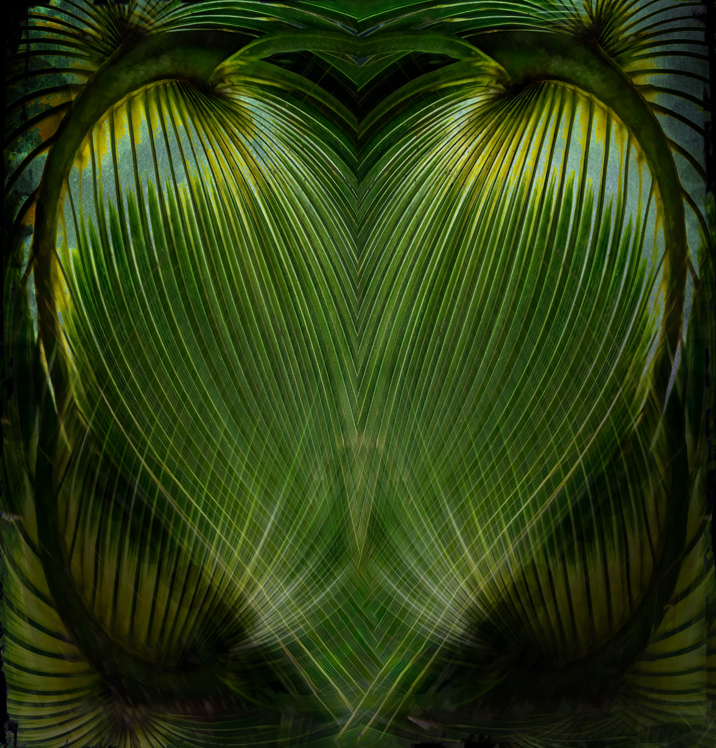
Lots of work went into this image and it shows. "My heart goes out to you.." as I really like that heart shape in this abstract. I must admit, for my taste, I liked Original 2 a lot, but the 'empty areas' at the bottom are not too pleasing. Anyway, great colours, lines and tones. For me the frame does not really work, as it takes the eyes away from the heart shape - for me anyway. See another version attached. I darkened some of the areas around the heart to accentuate the shape. See what you think.
|
Jul 8th |
 |
5 comments - 2 replies for Group 34
|
16 comments - 6 replies Total
|