|
| Group |
Round |
C/R |
Comment |
Date |
Image |
| 18 |
May 23 |
Comment |
A beautiful creation - love the geometric design - a feast for my eyes! Great lines, shapes and tones. I would only have 2 suggestions - darken the outer areas just a bit with the gradient tool, as it appears a bit bright for me. I hope it's not my monitor, but I see some smudging in the blue in the middle - contrasts with the beautiful clean design in general. Well done. |
May 21st |
| 18 |
May 23 |
Comment |
I really like this story - and you made this image a beautiful tribute to a great General.
Only one minor suggestion - assume that this Eisenhower is his 'ghost', and with this in mind it might be interesting to use an even lower opacity for a more ghost-like effect. In any case, well done |
May 21st |
| 18 |
May 23 |
Comment |
Another interesting image. For my eyes however, this filter does not offer enough of a creative touch. It does not really enhance the image for me - just my opinion. The original is very well photographed - nice and sharp and nicely exposed. |
May 21st |
| 18 |
May 23 |
Reply |
Brian - brilliant by flipping the image - what a difference - have to remember this among the other 1,000 things to look out for in this hobby! |
May 21st |
| 18 |
May 23 |
Comment |
Really like this creative image - an interesting subject, with great colours, and an effective composition. The Expression filter works well and you have given it a nice touch. Love the shadows in the water as well. My only suggestion would be to eliminate the 5th boat on the left, for somewhat 'cleaner' image - for my eyes at least. |
May 21st |
4 comments - 1 reply for Group 18
|
| 29 |
May 23 |
Reply |
Thanks, Bob.
Yes the flowers were on a stone walkway, that ended at a 6ft wall (in front, in shade). Your suggestion is right on the mark - I think I've mentioned this before, but my "final quality control" process needs to be more consistent. |
May 14th |
| 29 |
May 23 |
Comment |
Well done, Ron - not only because you used your phone, but for a great picture. Nice and sharp, nice exposure and colours. From a composition point of view, I think it could be improved by adding a bit more canvass, top and bottom - but not a big deal. |
May 13th |
| 29 |
May 23 |
Comment |
An interesting image - I think it is a unique way of looking at flowers, as embossing is not often used with flowers. For me the gray background is a bit dark . Also would suggest that the stems should reach the bottom border, unless you meant for them to be floating. Nice job of the colour work as well. |
May 13th |
| 29 |
May 23 |
Comment |
"Wowzer" what a great image! Love everything about it, and specially the colours. Have seen quite a few water drop photos, and this one ranks right up there. Having seen the process on YouTube, I also admire your patience in making this image! |
May 13th |
| 29 |
May 23 |
Comment |
Technically a very solid photo - sharp, well exposed, nice muted colours. My only suggestion is, to "move" the pole more to the left I.e. shoot it a bit more from the right side. For me the pole is much less interesting than the stairway - but that's just me |
May 13th |
| 29 |
May 23 |
Comment |
I think I've seen this before, but maybe a slightly different position. In any case, like this image quite a lot. Good decision to convert it to B&W. Helps focus on the horses and riders. Would not change a thing. Well done. |
May 13th |
5 comments - 1 reply for Group 29
|
| 34 |
May 23 |
Reply |
Thanks, Jan. Love your edits, especially the texture. I feel I should send you all my work for you to "play with"! - Thanks for all your suggestions, and your contribution to making me a better photographer. |
May 14th |
| 34 |
May 23 |
Comment |
A very creative set of images - bringing up the contrast and brightness makes this a perfect Altered Reality example - still see lots of the reality, but the colours adds creativeness. The images fit very well with each other. Love the top right image - reminds me of the famous painting The Scream. Well done. |
May 9th |
| 34 |
May 23 |
Comment |
An interesting image - unfortunately I don't know what "Tetris" is, but the end result is not my cup of tea - my head can't get around what I should be seeing. If the blocked-out pieces could be individually selected, I would certainly not place one next to the mouth. I applaud your journey to make this happen, but I don't get the purpose of the Tetris approach. |
May 9th |
| 34 |
May 23 |
Comment |
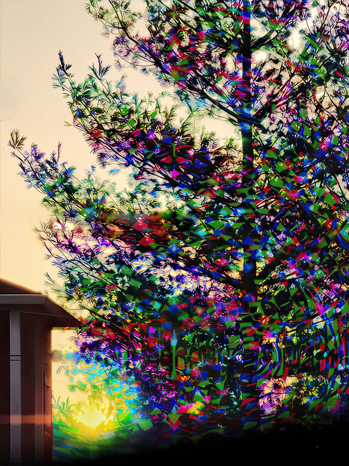
I like the challenge you set out for yourself, and your end result is pretty well on the mark. I attempted to pick up in the vibrancy a bit in the attached. Also removed the wire and the edge of the house as they are a bit distracting. Hope you like my version of Tree On Acid. |
May 9th |
 |
| 34 |
May 23 |
Comment |
What a great picture - love everything about it, and especially that there is so much to see and enjoy. My only suggestion would be to desaturate the greenery a bit, so that it does not compete with the birds - but not a big deal. A beauty! |
May 9th |
| 34 |
May 23 |
Comment |
Nice job of compositing the 3 images. For me there are a couple of things that do not work well - the number of flowers dominate the picture, and for me, the person should stand out more and the flowers less - personal taste, I guess. |
May 9th |
5 comments - 1 reply for Group 34
|
| 82 |
May 23 |
Comment |
Another very nice image - nice contrast between the flower and the tree, nicely exposed, and sharp. My only suggestion would be to show a bit more of the tree , to show it's "hugeness", and also emphasize the big/small relationship with the flower. |
May 18th |
1 comment - 0 replies for Group 82
|
15 comments - 3 replies Total
|


