|
| Group |
Round |
C/R |
Comment |
Date |
Image |
| 18 |
Apr 23 |
Reply |
Thanks, Andrew |
Apr 28th |
| 18 |
Apr 23 |
Reply |
Certainly another option - I'll keep it in mind, thanks |
Apr 21st |
| 18 |
Apr 23 |
Comment |
Joan, thanks for your feedback. Why these 2 images? I'm a car guy, as well as loving nature - so I wanted to enjoy both in one image. Also, I create images for myself and only share them to get other points of view. There is nothing growing out of the car, only my imagination. I don't think your comments are negative at all, as you're describing your altered reality vision which is just a bit more realistic. No, I did not keep the original when I made the one that you see. The original was just a picture of a Ferrari I took at the Toronto Auto Show - and there are a million car pictures - so why keep it. |
Apr 21st |
| 18 |
Apr 23 |
Comment |
What a great image - super concept, and congratulations for hanging in to make it happen. Love everything about it. One suggestion I would have, is to make the 'cat and dog drops' more in the shape of a water drop and maybe a greater variety of sizes - the faces don't need to be be as big as they are as long as we can recognize the cat or dog. Anyway, not a big deal - well done, congratulations. BTW - I'm just learning PS, and my limit for layers right now is 5! |
Apr 12th |
| 18 |
Apr 23 |
Comment |
Great picture, and title. I like the composition, as well as the idea of isolating the newspaper dispensers by creating the new 'unreal" background. For my taste, I would like to see contrasting colours in the background (no change to the stripes).
This to make the boxes pop out of the scene a bit more - ideally a dark/cold colour.
This would be another version of a very interesting image. |
Apr 12th |
| 18 |
Apr 23 |
Reply |
Thanks, Ian
A couple of the groups I belong to, can't deal with borders, so I 've just gotten lazy, and stopped all together, which is not a good idea, because they make a big difference. Thanks for your advise. |
Apr 12th |
| 18 |
Apr 23 |
Comment |
Certainly an interesting image - you started off with a very challenging image (as it appears to be Altered Reality as well). I do like the shapes and colours, but the subject matter is difficult to determine. I think your end result has some features of abstract photography, except for the lack of effective composition. At the end of the day, this category (AR) has 'personal taste' as it's guiding principle, and other peoples opinion is of little value. Thanks for sharing your workflow. |
Apr 12th |
| 18 |
Apr 23 |
Comment |
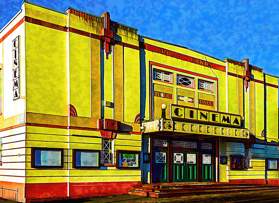
Art Deco - one of my favourite art styles. I like this one quite a bit - great choice for colours and nicely exposed. Have a couple of suggestions - I would prefer the left side wall to be in colour as well and the textures on the front wall take away a bit from the Art Deco style for me. The leaning-back of the building also looks a bit off for me - see my straightening effect attached. But overall, a striking picture. |
Apr 12th |
 |
| 18 |
Apr 23 |
Comment |
Thanks Ian - what is a key line, please. |
Apr 11th |
6 comments - 3 replies for Group 18
|
| 29 |
Apr 23 |
Reply |
Bob, for what it's worth, I prefer the "second later" version. Personally I value the story of the image more than a tiny bit of softness. |
Apr 20th |
| 29 |
Apr 23 |
Comment |
Thanks, Tim and Judy.
I think there are 2 camps - those that like simplicity, with a clearly defined focal point, and those that are willing to spend some time and enjoy the exploration of the "busy scene" images. For me "busy" often works, as long as the busyness supports the theme being communicated. |
Apr 20th |
| 29 |
Apr 23 |
Comment |
Like the flower very much, but the position of the butterfly in a landing position is a bit strange. But in nature you sometimes have to take what you get. Have you tried shooting these subjects in "sequential mode"? I've had reasonable success with some sports pictures, shooting at 10 frames a second. |
Apr 11th |
| 29 |
Apr 23 |
Comment |
Very nice, creative work - really like the finished product, but also think the Original would make a real nice picture as well. You made great choices for the creative filters. I only have one suggestion - for me, I would prefer a bit more punch - there are so many nice details in your final that could be emphasized. So in the version attached, I used the Hue/Saturation application in Photoshop to bring some of that out - might have gone too far, but anyway, hope you like it as well. |
Apr 11th |
 |
| 29 |
Apr 23 |
Comment |
Very nicely done - like it very much. Your processing is right on the mark and would not change a thing. |
Apr 11th |
| 29 |
Apr 23 |
Comment |
I like this picture a lot - would not suggest any changes. Great idea to change it to B&W to focus the attention on the runner, and specifically on the face. The carriage in the background is perfect for this story. |
Apr 11th |
5 comments - 1 reply for Group 29
|
| 34 |
Apr 23 |
Reply |
Thanks, Frans. Good idea, but don't have a clue how to make that happen. There is lots going on already, I'd be afraid of overdoing it. Appreciate your suggestion. |
Apr 23rd |
| 34 |
Apr 23 |
Reply |
Thanks, Candy. Yes, it would emphasize the car, but for me I like the idea of the light coming from the top, and I think the car as is does draw sufficient attention. But will keep your idea in mind for future endeavours. |
Apr 23rd |
| 34 |
Apr 23 |
Reply |
WOW - Now that's a great version of a great original. Congrats. Not for the fact of adding a focal point (as I think this is one of those images that does not need a single focal point- my way of thinking) - but for your choice of the Ram and Goth adds - now that's Alternate Reality +.
|
Apr 23rd |
| 34 |
Apr 23 |
Reply |
Thanks Jan.
You're 100% correct - I actually juiced up the white in the headlights, as I didn't think there was enough light to draw the eyes. |
Apr 12th |
| 34 |
Apr 23 |
Comment |
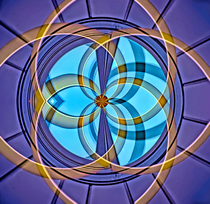
A very nice abstract image - the colours and circular shapes are very pleasing. Like the effect of duplicating, turning, opacity change to add more interest. I've used a Polar filter a bit, and I'm always a bit disappointed with the the corner lead ins - they don't seem to fit with the inside shapes - probably have not explained it to well, but see my version attached - where I've removed the corners. Obviously another very subjective approach
|
Apr 7th |
 |
| 34 |
Apr 23 |
Comment |
For my way of thinking, it certainly meets AR requirements - as it still has some recognizable features showing from the original - windows, beams. I like this version quite a lot - lovely colours and an effective composition. Although very busy (normally not to my liking) the details are really interesting. Another interesting version might be to rotate it to have the windows in the corners, which would add another level of AR. Great image. |
Apr 7th |
| 34 |
Apr 23 |
Comment |
I really like this picture - I find the story very impactful, and really convincingly told. You also created a very supportive tonal/colour palette. My only suggestion is to have more of the city background show through the overall image. I find it's often a difficult decision of how much emphasis to give each layer. As a side point, I have a personal hang up of using someone else's art in my work - it's a complicated subject and sorry I brought it up! Please ignore! |
Apr 6th |
| 34 |
Apr 23 |
Comment |
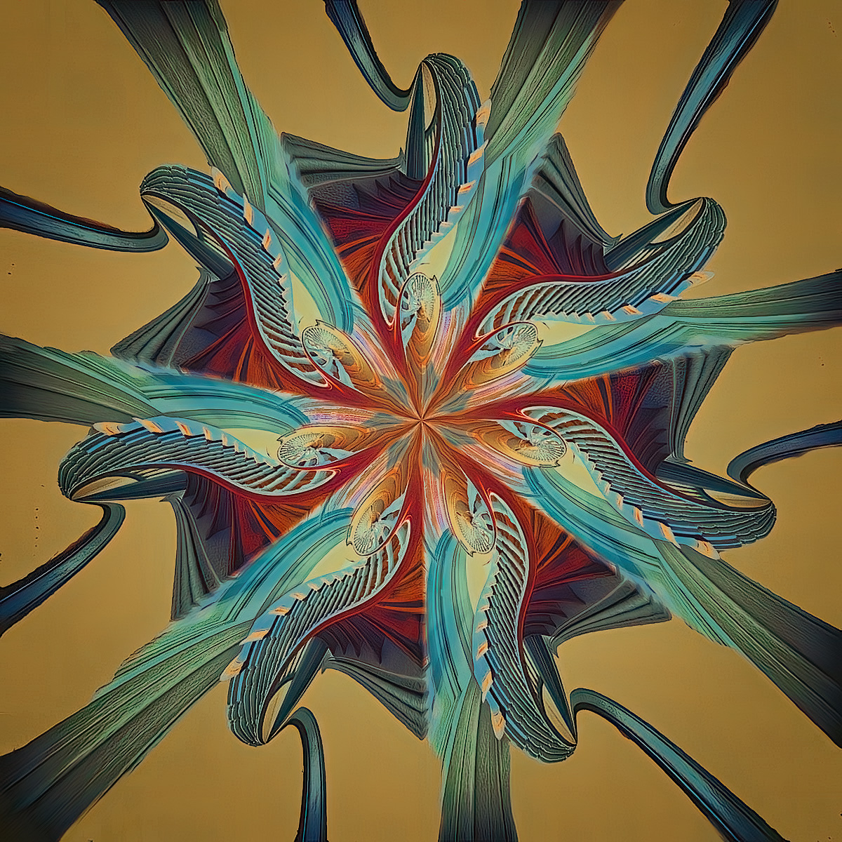
I like your abstract image. Although not a fan of kaleidoscope images in general, I do like the your colour selections. However, like most kaleidoscopes, my eyes have a difficult time to find a focal point, and consequently I only just get a general sense of what I'm seeing - just my take. |
Apr 6th |
| 34 |
Apr 23 |
Comment |
Unfortunately not my cup of tea. I appreciate the work that went in to it, but the end result does not catch my interest. A lovely flower, but the sketch approach does not enhance the subject - just my opinion. |
Apr 6th |
| 34 |
Apr 23 |
Comment |
A very interesting and impactful picture for me. The treatment of the background buildings are terrific. So much to see and enjoy. I also agree with your decision to add the fish wives - as much as I like the townscape, I think it needs another focal point. I would like to see the fish wives not quite so prominent and maybe in another location - and that's a problem as I have no idea where. They also appear to be standing in water. I know it's altered reality, so maybe from that perspective it works. Just one mans opinion! |
Apr 6th |
6 comments - 4 replies for Group 34
|
| 82 |
Apr 23 |
Comment |
From groups 29 & 34
I really like this image - especially the composition and the colours. The composition might look odd to some - lots of negative space and the horizon in the middle, but I think it's perfect for this subject and how you felt when you took the shot. The muted colours also contributes to the moodiness and vastness of the scene. Would not change a thing - well done, Keith |
Apr 24th |
1 comment - 0 replies for Group 82
|
18 comments - 8 replies Total
|


