|
| Group |
Round |
C/R |
Comment |
Date |
Image |
| 29 |
Mar 23 |
Reply |
Thanks Tim. I actually produced this picture for an assignment by another critique group I belong to - the subject was Architectual Minimalism. |
Mar 26th |
| 29 |
Mar 23 |
Reply |
Thanks Judy - certainly another take on this scene, but for me the clouds added some additional context to the image |
Mar 26th |
| 29 |
Mar 23 |
Reply |
Thanks, Bob
Almost everyone suggests that the clouds need some work - and I agree, but in the opposite direction. My intent was to make them just as they are, so they would not draw attention from the highlighted parts of the picture. Obviously did not work this time. Lesson learned. |
Mar 26th |
| 29 |
Mar 23 |
Comment |
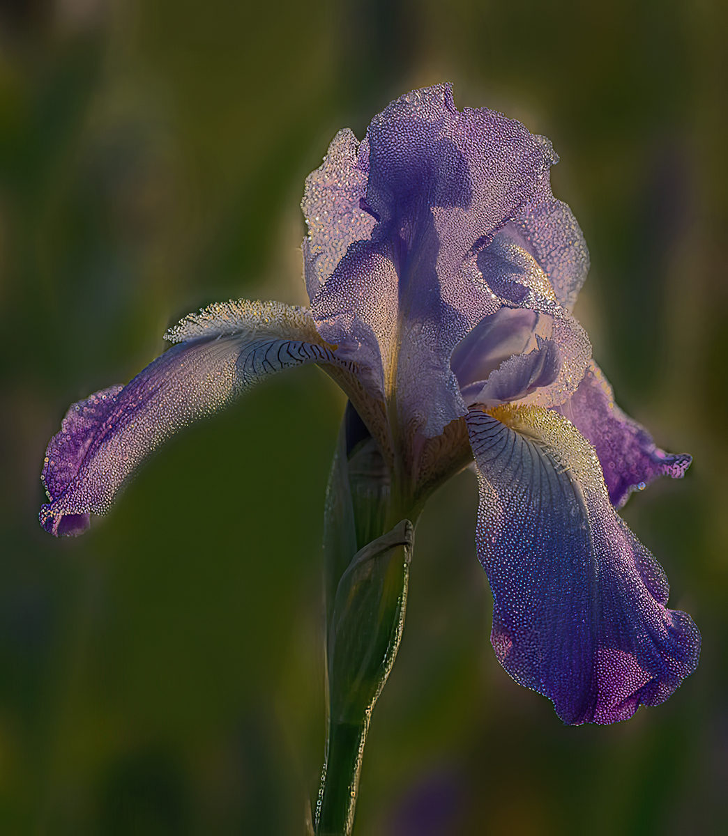
What a beauty - nice composition, and gorgeous colours. The only thing I would suggest is to remove Iris in the background on the left side. My eyes are drawn to it a bit. Well done, Bob |
Mar 21st |
 |
| 29 |
Mar 23 |
Comment |
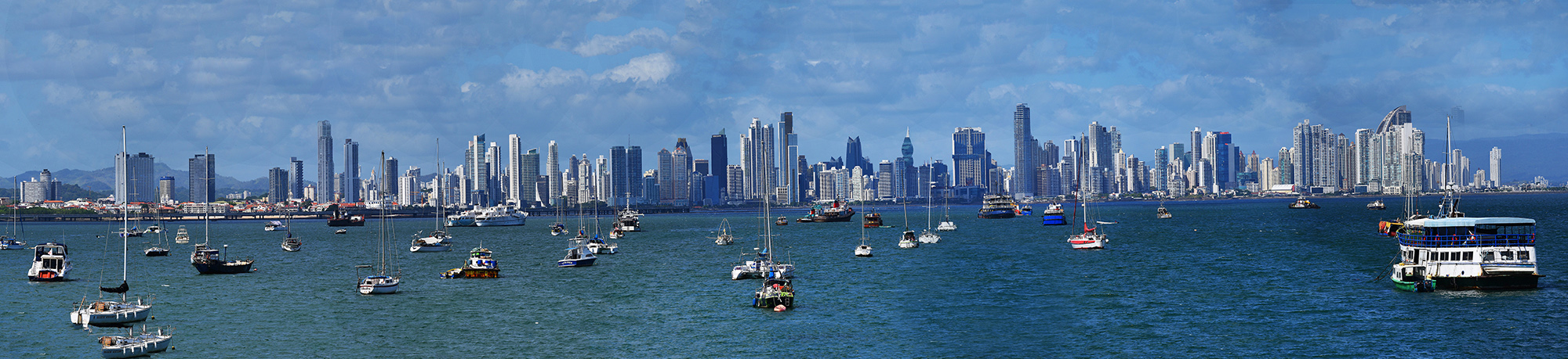
What a beautiful cityscape - amazing quality in spite of the finicky (for me) Photomerge PS feature. 8 images, without a tripod!!! The only two areas that showed some Photomerge quality problems were the sky on the right, and the darkened water - both easy to fix with the Clone tool. Congratulations - this one would make it to my wall, but unfortunately don't have one long enough to do this picture justice.
|
Mar 21st |
 |
| 29 |
Mar 23 |
Reply |
Sorry Ron, it's actually called Abstract (not in Looks, but in adjustments). Glad you like it. |
Mar 19th |
| 29 |
Mar 23 |
Comment |
Have seen these shapes of trees before - always fascinating. This is a difficult composition to do something with, as it shows the feature trees darker than the large trees in front - which attract the eyes first. Removing the large trees is also a problem, as they show the contrast with the strange shaped subject trees.
Anyway I took a crack at it - see attached - mostly done in Topaz studio. I used the simplifier filter to take away some of the detail to show off the bent trunks. Also did remove the middle tree, but left the ones on the right. Anyway, it's just another version. Would be interested in your comments.
|
Mar 19th |
 |
| 29 |
Mar 23 |
Comment |
Kudos for your terrific image pasted on the Members Showcase (the selectors certainly have good taste!)
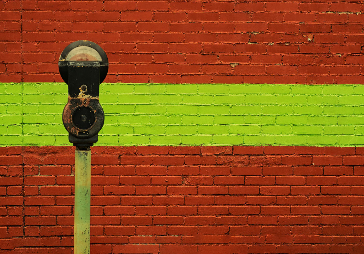
Really like the Parking Meter image a lot - very creative - nice geometric design. Also really like the colours and the exposure. I took the liberty to straighten it a titch, but like the original composition. For me, the wall is a very important aspect of the picture, and the parking meter offset also makes the overall picture less static.
|
Mar 18th |
 |
| 29 |
Mar 23 |
Comment |
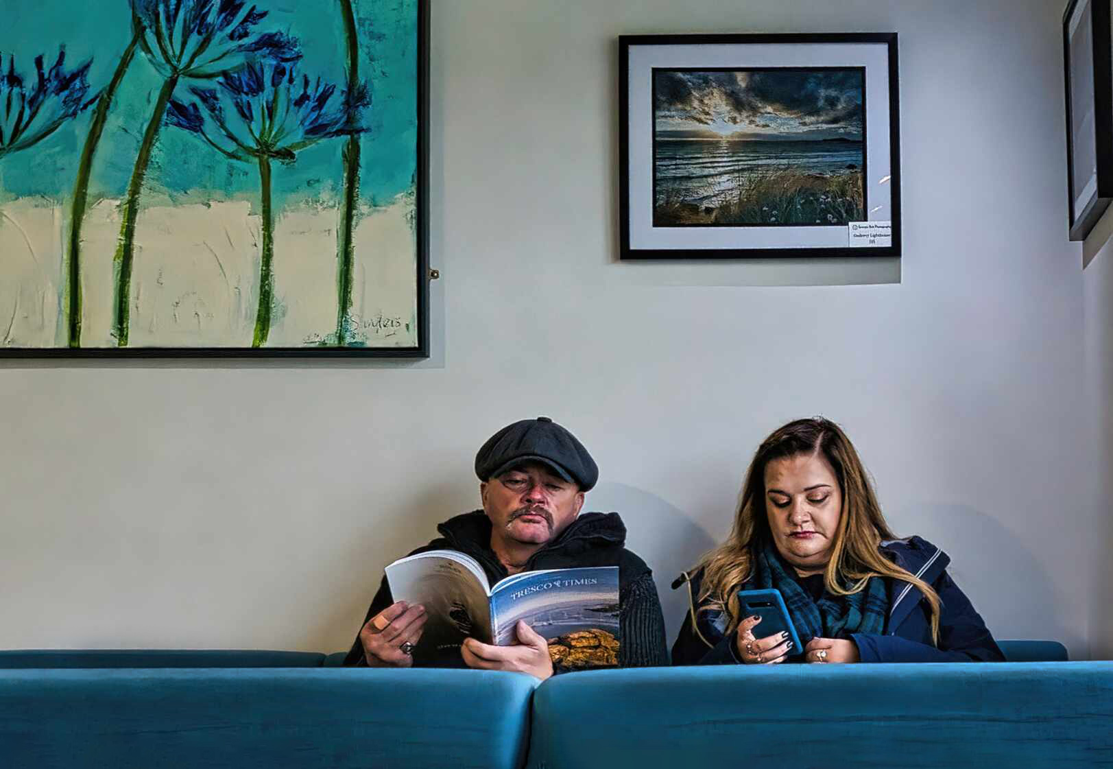
Love this shot - great story, beautiful and real expression on the subjects faces, and nicely photographed & processed. I like Lance's crop as well.
One very minor suggestion - I think I would prefer just a bit more visibility of the seats in front - to help me better identify what they are. |
Mar 18th |
 |
5 comments - 4 replies for Group 29
|
| 34 |
Mar 23 |
Reply |
Thanks for your suggestion - I'm going to give it a try. Missing piece of the wing - still reminds me that my outgoing final quality control process is still not up to par. |
Mar 19th |
| 34 |
Mar 23 |
Reply |
Thanks,Steve. Not to belabour the point (but will), I did see the eye in your finished image, but not in the original, so I agree the eye makes this A.R.. I don't know, but I suspect a picture of an abstract shirt pattern, where we have no idea that it is a real shirt, is not what the gurus at PSA consider "reality". To me It's like going to an art gallery and taking a picture of an abstract image, and calling it "reality". I know I'm overthinking it, so disregard this whole note - on to next months creations! |
Mar 19th |
| 34 |
Mar 23 |
Comment |
Yes, Steve - kind of what I had in mind. It melds the background with the foreground for me. Thanks for doing that, and the "recipe". |
Mar 19th |
| 34 |
Mar 23 |
Comment |
I like this image quite a bit - strong composition, beautiful colours . My only suggestion would be to add a touch more of Altered Reality features - looks too "real" for my eyes. |
Mar 19th |
| 34 |
Mar 23 |
Comment |
Well,well,well - so glad to be in this group!
Food For Thought - what a great idea. Happy you enjoyed putting this complicated tableau together. I had a great time as well travelling through the scene - identified most of the food items, but for me the highlight is the composition and colour scheme. Would not change a thing - kudos. |
Mar 19th |
| 34 |
Mar 23 |
Comment |
Unfortunately, not my cup of tea. Abstracts are so personal, I find it often difficult to comment on them. The best I can do is to view them in terms of impact on me, composition, colours, tones, and other technical aspects - and try to remember that the maker is happy with the result - which is really the most important criteria.
Speaking of criteria, I don't think this image meets the PSA definition of Altered Reality, as there does not appear to be "reality" in the original
|
Mar 19th |
| 34 |
Mar 23 |
Comment |
Patience pays off again - great picture. A really well done composite. The variety of positions of the birds make it special for me. There are a couple of things I would suggest if it were my image (wish it were!) I would not convert it to B&W, as the colours of the birds are more attractive for me. I would also add a bit more space at the top and sides, as it feels a bit cramped. And finally I would be tempted to flip it horizontally, as I think it would enhance the idea of progression in time. Just one man's ideas! |
Mar 19th |
| 34 |
Mar 23 |
Comment |
Interesting, but does not grab me. Technically very well done as always. My confusion centres around the title and what I'm seeing. For my eyes the leaf and the frog don't work "cosmically". |
Mar 19th |
| 34 |
Mar 23 |
Comment |
An interesting picture - not sure what the story is, but never the less, nice to look at. As always, technically really well done. I wonder what it would look like if some of the background were to bleed through the models. Sorry, my PS skills are not good enough to attempt to demonstrate. |
Mar 19th |
7 comments - 2 replies for Group 34
|
| 82 |
Mar 23 |
Comment |
What a gorgeous image. Love the composition and the great muted colours. Have a couple of suggestions - the darks are just a wee bit too dark for me, and I think there is more detail available. I would leave the "not door" door as is, as it adds some additional mystery to the scene. The white trailing plants could be darkened just a bit so as not to take the attention away from the main subject.
Kudos to you for this moody feast for my eyes. |
Mar 21st |
1 comment - 0 replies for Group 82
|
13 comments - 6 replies Total
|


