|
| Group |
Round |
C/R |
Comment |
Date |
Image |
| 29 |
Dec 22 |
Reply |
Judy - what are PT rules? |
Dec 22nd |
| 29 |
Dec 22 |
Reply |
Stephen - re: riders position - was the first thing that struck me, and then I thought that might explain his last place finish! He does seem a long way to the rear
|
Dec 15th |
| 29 |
Dec 22 |
Comment |
WOW - this is a terrific picture. Thanks for the recipe. Would never guess that this was not taken with Hubble. Love everything about it, and would not change a thing. BTW, I love your use of language - "Tarted up" - so colourful and true many times, but not in this case - this is purely excellent workmanship. Congratulations
|
Dec 13th |
| 29 |
Dec 22 |
Comment |
Another great shot - Although Calgary is a couple of thousand miles west of where I live, I've never seen this bridge, never mind pictures of this bridge. Great subject, well executed.My only very minor suggestion is crop a bit of the tree on the left - just a tad big for my eyes. |
Dec 13th |
| 29 |
Dec 22 |
Comment |
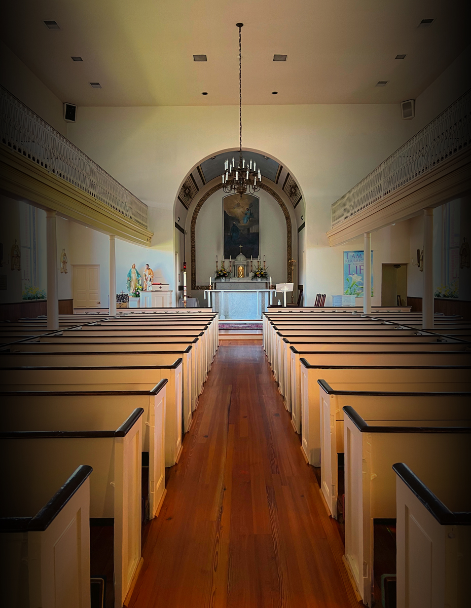
A very nice Architechtual image, with an iPhone no less - congratulations. I'm certainly one of those who underestimate the quality from these camera-phones. Nice and sharp and well exposed - nice soft colours and effective composition. I would only suggest one change (very subjective - different, not better) - I used the dodge and burn tool and lightened the front of the church, and darkened everything else (light touch) - in this version there is more of an emphasis on the altar area, instead of the pews. Be interested in your comments.
|
Dec 13th |
 |
| 29 |
Dec 22 |
Comment |
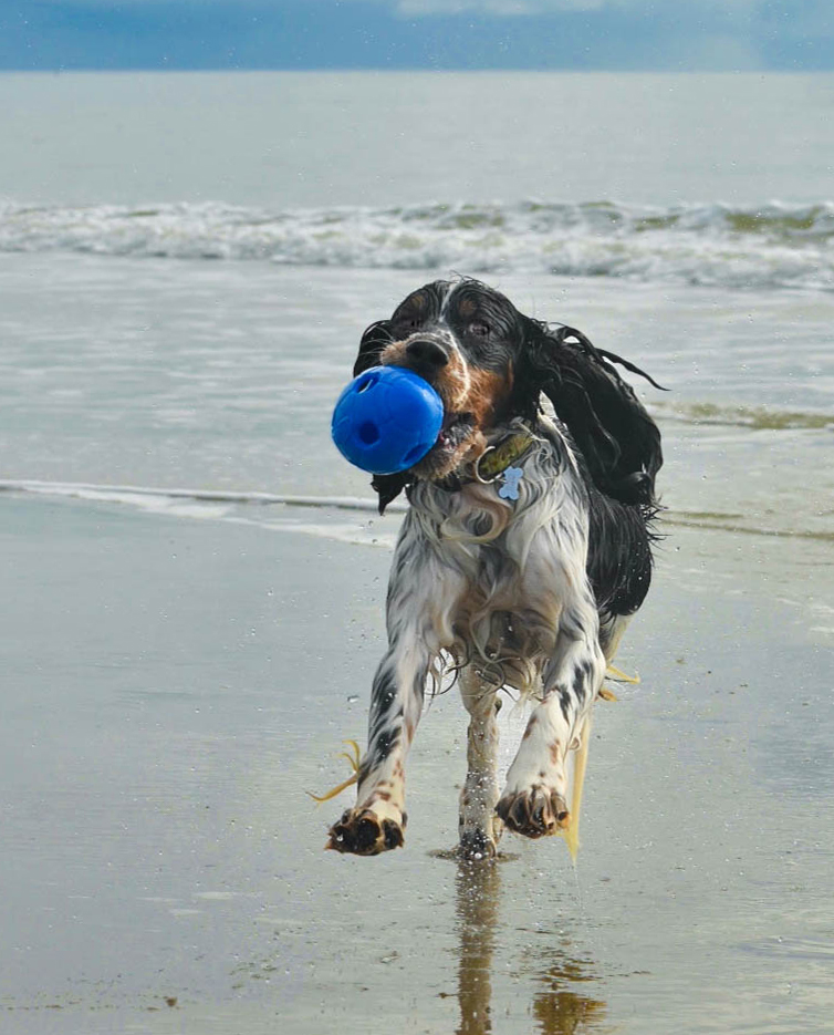
What's not to love - kids and pets! Very nice capture. Love the detail in the fur and her pose - well seen. Also like the background, a good set up for the "star of the show". Took the liberty to make a couple of adjustments (somewhat subjective) - lightened the eye just a bit more (NIK Viveza), cropped it a little tighter, and straightened the horizon. See what you think. |
Dec 13th |
 |
| 29 |
Dec 22 |
Comment |
Like this image a lot - especially the horse and rider - sharp and good definition. Also shows the movement really well. One minor point - the background area in front of the horses head looks a little strange (wind?) - everything else seems sharp. |
Dec 13th |
5 comments - 2 replies for Group 29
|
| 34 |
Dec 22 |
Comment |
|
Dec 20th |
| 34 |
Dec 22 |
Reply |
Actually, I don't like your idea, but LOVE it. White-on-black brings out even more detail. Thank you |
Dec 20th |
| 34 |
Dec 22 |
Reply |
Thanks, Mike. Good idea - like it. Actually will redo this one sometime, as I'm not that happy with the upper, right quadrant. |
Dec 20th |
| 34 |
Dec 22 |
Comment |
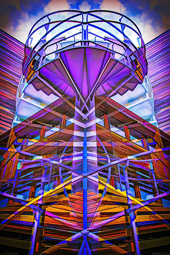
Welcome, Mike - nice to have you on board. I certainly like and appreciate this "Altered Reality" picture. You did a great job of introducing more colour to the original. A great new structure, providing us with so much to see. For my taste, I'd like to see more oomph - I likely went too far (as Steve says - some people don't know when to stop!) Anyway, another version attached. See what you think.
|
Dec 13th |
 |
| 34 |
Dec 22 |
Comment |
What a great image - love everything that you've created. Nice and moody. Good composition and colour/tonal treatments. To continue my often nitpicky suggestions - since the pears appear to be ripe, why not drop one on the ground behind the partridge. |
Dec 13th |
| 34 |
Dec 22 |
Comment |
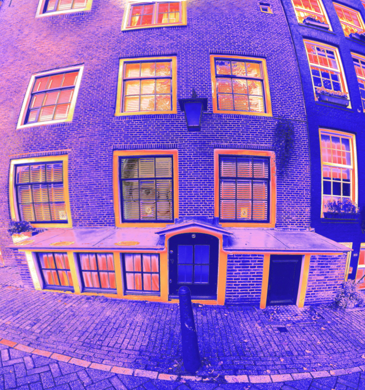
Welcome to our group, Steve. Really like the contrasting colours and the work you have done with the windows. Also like the idea of putting yourself into the scene.
Took the liberty to create another version - no better, but different. I cleaned up the left side a bit (the white column kept grabbing my eyes) and also to make it more symmetrical with the right side. Also cropped a bit off the bottom - all very subjective changes. |
Dec 13th |
 |
| 34 |
Dec 22 |
Comment |
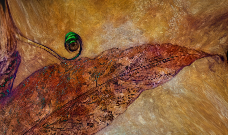
What an eye-popping image. Your adjustments in post processing worked really well. Love the overall 'feel' of this picture, especially the antiquing aspects. I only have one suggestion - would prefer the leaf at an angle, rather than straight across.
It makes the image a bit too static for my taste. My idea attached, although it does need the border and frame - which is beyond my skill level. Be interested in you thoughts.
|
Dec 13th |
 |
| 34 |
Dec 22 |
Comment |
Another well constructed Goth image - beautiful colours and nice overall tones. Love the expression of the ladies. A talented and skilled post processing person at work! Maybe this goes against the whole Goth image idea/criteria, but for my eyes the faces take too much of the window space. Look more like "looking in a mirror" kind of thing. Just one mans point of view. |
Dec 13th |
6 comments - 2 replies for Group 34
|
11 comments - 4 replies Total
|


