|
| Group |
Round |
C/R |
Comment |
Date |
Image |
| 29 |
Nov 22 |
Reply |
Bob - interesting discussion - that's what I like about these groups.
Back to the Bus - Since I first saw it, I have changed my mind - I now like your initial B&W image more than anything else I've see, including my version. Probably would change my mind again if the bus was captured whole i.e. with roof and a bit more space. I tried to do this, but unfortunately my post processing skills are not up to it.
The more I get into the Altered Reality genre, the more I recognize my biases - mainly that I don't care for effects that are solely to look "different". I like changes that make sense to me, as the viewer - i.e what is the message or story, is the composition strong to help me navigate through the scene, do the colours work in combinations, etc. (Much the same criteria as a "reality" image).Sorry for the long note - hope it makes some sense. |
Nov 15th |
| 29 |
Nov 22 |
Comment |
Beautiful landscape in a great location. Would not change a thing, except eliminate the flares on middle right. Well done. |
Nov 12th |
| 29 |
Nov 22 |
Comment |
An interesting experiment, but also like the colour version a bit more. I think more colour might work, but for me the big issue after cropping is "what is it?". I really appreciate the colours, tones, but without knowing what it is, I spent too much time trying to work it out, I lose interest. Might just be me - likely is. See colour version cropped attached. |
Nov 12th |
 |
| 29 |
Nov 22 |
Comment |
A very nice nature study - nice and sharp and good exposure. Have only one suggestion - I find the composition a bit static - so I rotated it slightly - personal taste. (Sorry, Ron!). Keep the critter pictures coming! |
Nov 12th |
 |
| 29 |
Nov 22 |
Comment |
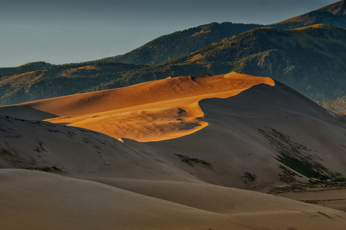
A gorgeous landscape. Beautiful composition and great colours in the highlighted area. If this were my image (wish it were so!) I would make a couple of changes. See attached - darkened the background and sky a bit, and 'warmed' up the sand in front, although I realize that in the shade it would look more like your original - just another version of a beautiful image. Keep 'em coming! |
Nov 12th |
 |
| 29 |
Nov 22 |
Reply |
Bob - thanks for your recipe to remove the lines - certainly more effective than cloning. |
Nov 12th |
| 29 |
Nov 22 |
Comment |
Beautiful portrait - love everything about it - from lighting to pose. Of course the lines need to go. |
Nov 12th |
| 29 |
Nov 22 |
Comment |
What an eye popping image! Super sharp, great exposure, and an effective composition. The busy background is a bit disconcerting, but in sports photography you often get what you get. Have been in this position quite a bit myself - f15 for sharpness, f5.6 for sharpness & muted background? I generally would go for the f15, to ensure the sharpness is there. I think one needs a lot of experience in this type of photography to know how low you can go, and still get sharpness. Well done! |
Nov 12th |
6 comments - 2 replies for Group 29
|
| 34 |
Nov 22 |
Comment |
I love this image - the composition is extremely strong, as the chessboard, tree, stairs. man, and clock are placed so that the eyes can easily travel from one to the other. The colours and textures and the overall mood are all very well done. I do not care for the keys, and the tree filter does no do this image justice.
The man is obviously a secret agent, coming from a secret entrance going to a secret midnight meeting. He is early, as he has to make sure he is not walking into a secret trap. Meeting agenda:Secret |
Nov 12th |
| 34 |
Nov 22 |
Comment |
An interesting, colourful image. I like the bottom half quite a lot - still some reality retained, and the colours, lines, and textures are pleasing to the eye. Unfortunately the abstract sky replacement does not work for me. My eyes can't seem to find a rhythm in the colours and shapes. |
Nov 12th |
| 34 |
Nov 22 |
Comment |
A very striking image - well put together. Would prefer if the dancer did not stand out quite so much - as Steve suggested. Just to give you another idea - I thought the right side of the picture was a bit redundant, so I cropped it, darkened it a bit - also giving the dancer more importance. See what you think. |
Nov 12th |
 |
| 34 |
Nov 22 |
Comment |
What a well constructed image. Love everything about it, especially the mood you've created. Have no suggestions on how to improve, and thanks for saving Tom, the turkey. |
Nov 12th |
| 34 |
Nov 22 |
Comment |
Love the colours - the image is quite sharp and beautifully lit. Also really like the background you created. If this were my picture (wish it was!) I would make a couple of changes - I think the background is a touch too dark and it competes with the glads, especially on the right. And secondly when I think of glads, I think of tall, willowy flowers - so I stretched them a bit. |
Nov 12th |
 |
5 comments - 0 replies for Group 34
|
11 comments - 2 replies Total
|


