|
| Group |
Round |
C/R |
Comment |
Date |
Image |
| 29 |
Oct 22 |
Reply |
The jury is in! - from this group and others in my camera club - approximately 75% agree that a greenish sky is not to their liking. So yes, this picture is not for mass consumption, but is on my top 100 list. Interesting about the colour - the Aurora Borealis has shades/tints of green, and that's what gave me the idea. Thanks to you all for your comments. |
Oct 25th |
| 29 |
Oct 22 |
Reply |
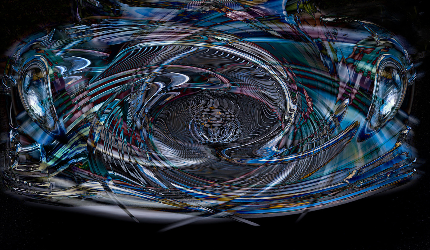
Hi Bob - the matching headlights just reinforces the original car - artistic choice. I cut out the right headlight - put it on another level - flipped it over and pasted it on the left side - oops, step 1 I cloned out the left headlight, to make room for the copy of the right light one. I also struggle a bit with this procedure and often end up with a not-so elegant result! ...and with my experience level it is also a bit time consuming.
|
Oct 16th |
| 29 |
Oct 22 |
Comment |
It's always a wonder what nature creates, when you're not looking. The colours are very interesting and there are areas that I find very attractive. Unfortunately for me there is too much out of focus. As I'm currently playing with Abstract and Altered Reality, I could not help myself to "steal" some of the in-focus pieces and mirrored them. I left the colours much as they were. Not sure if this works, but I enjoyed the "playing" - thanks. |
Oct 15th |
 |
| 29 |
Oct 22 |
Comment |
A very nice Altered Reality image. I find the filter effects very suitable for this subject. Well done. A couple of suggestions - clone out the 'extra pieces' in the upper right corner and match the headlights to maintain the balance of the front of the car.
|
Oct 15th |
 |
| 29 |
Oct 22 |
Comment |
Another signatory nature shot for Karen. Like everything about it, especially the expression of the moose. Looks like she is in the midst of speaking, and rolling the eyes for emphasis. Nicely fits in the frame, sharp, and beautiful colour tones.
Would not touch a thing.
|
Oct 15th |
| 29 |
Oct 22 |
Comment |
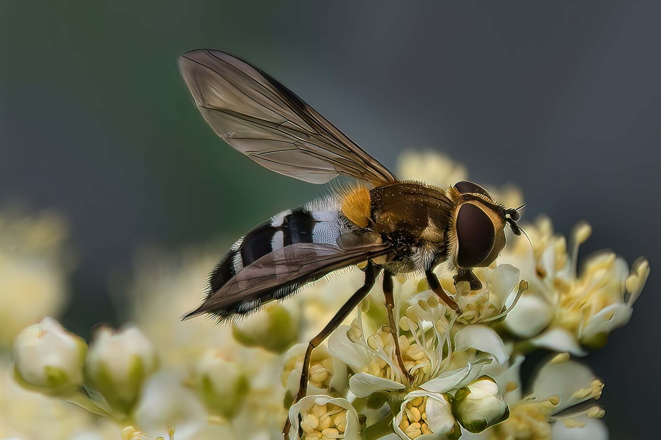
An interesting documentary picture that tells a story. I really like the strong composition as it makes it easy for the eyes to explore. Also really like the wood grain that runs in different directions. Well done - no suggestions. |
Oct 15th |
| 29 |
Oct 22 |
Comment |
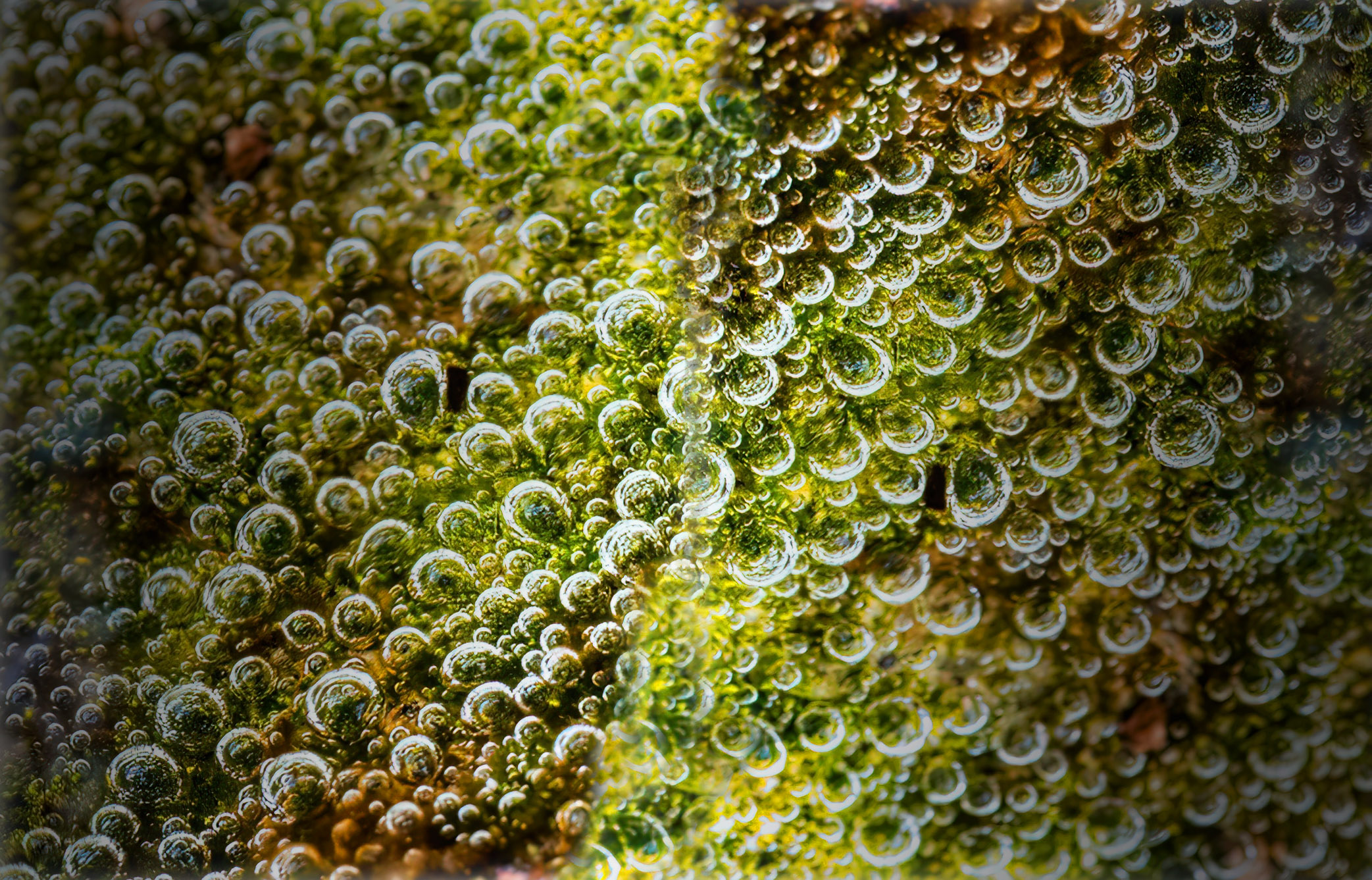
Beautiful Macro image - nice and sharp, great colours. A couple of suggestions - tone down the whites just a titch, and as a personal taste, reduce some of the negative space to make the image a little less static. See attached
|
Oct 15th |
 |
5 comments - 2 replies for Group 29
|
| 34 |
Oct 22 |
Reply |
I think I viewed your image as you had imagined - after an initial quick overview, the colours mainly, the first thing I focused on were the objects front and centre. Since I could not identify what they were, I then looked around for something real and identifiable, which were the flowers? and the eyes. Had little interest in devoting more time to identify the other objects - all very personal and subjective choices. Thanks again for sharing your image.
|
Oct 17th |
| 34 |
Oct 22 |
Reply |
Sorry Steve, but not sure what diagonal line you're referring to - is it the 2 tips on the outer edges? Thanks for your comment.
|
Oct 16th |
| 34 |
Oct 22 |
Reply |
You're 100% correct - re diagonals - must keep that in mind for many future images - thanks |
Oct 16th |
| 34 |
Oct 22 |
Reply |
Thanks, Jan - good idea - keep them coming! |
Oct 16th |
| 34 |
Oct 22 |
Reply |
Thanks for your suggestion - will keep in mind |
Oct 16th |
| 34 |
Oct 22 |
Comment |
WOW Jan - gorgeous, moody image. Love everything about it, even the cat! You're certainly showing your post processing chops and your creative mind. Would not change a thing.
|
Oct 16th |
| 34 |
Oct 22 |
Comment |
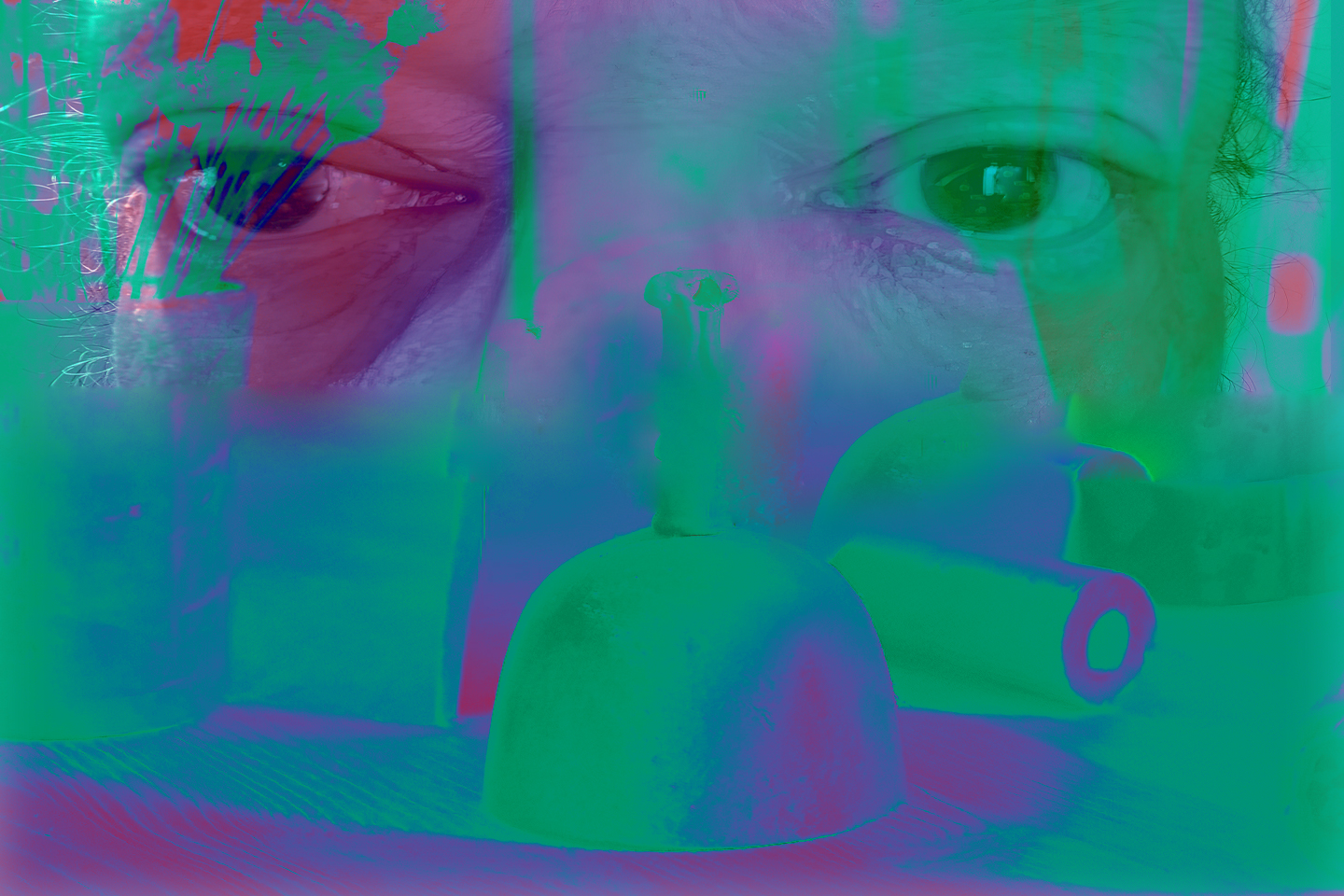
An interesting "Altered Reality" image - the contrasting colours certainly grab one's attention. As my eyes moved through the image, I found pieces that were intriguing (face) and others not so much (the mid face objects). As many creative subjects, this one has likely more meaning to you the maker than the general audience - i.e. you know what the objects on the shelf are and have a connection. It's your image and you're happy with it, so that is all that matters.
Here is another version - hope you don't mind me using your image.
Used mostly Gradient Maps and Blending modes.
Welcome to our group - looking forward to more of your work.
|
Oct 16th |
 |
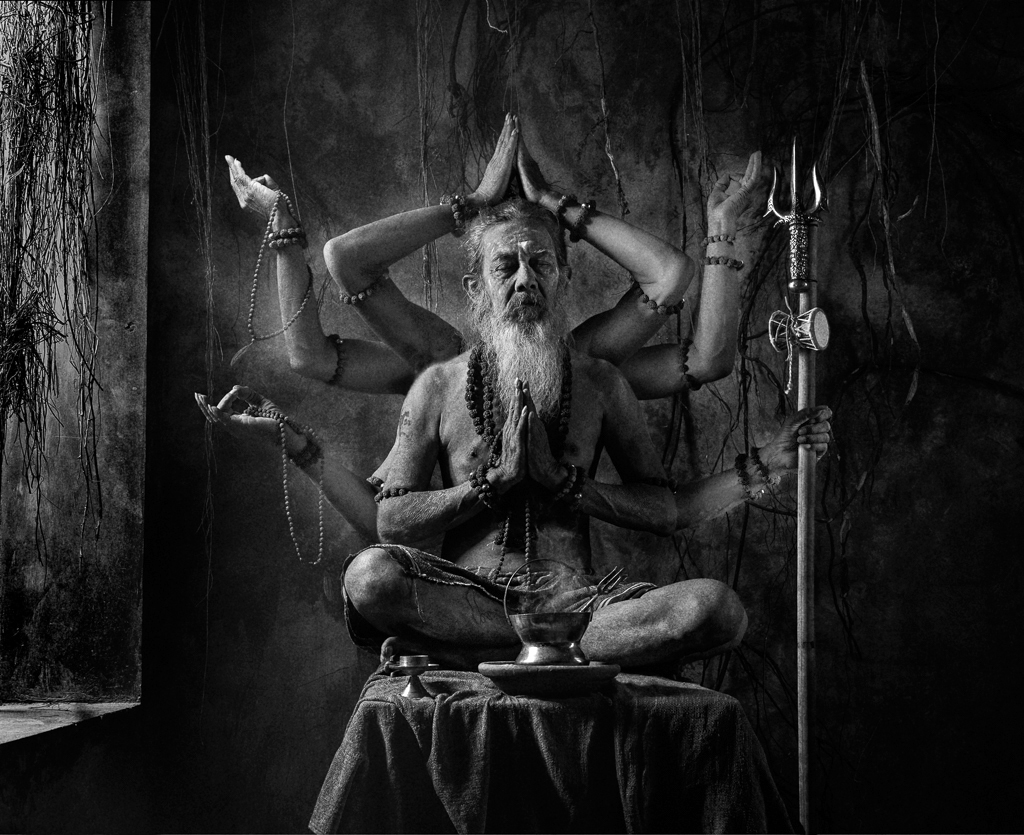
| 34 |
Oct 22 |
Comment |
I really like this picture - so much to see and enjoy. Beautiful colours and tones. The side lighting is very effective, and carried through to the extra arms. I think some of the arms could be lightened just bit to blend in with the body, and the window light could be darkened a titch to prevent the eyes leaving the main subject. I wondered how this would look in B&W, so I used the luminosity blend mode to create it. The focal point being the extra arms, does the colour detract a bit ? - anyway very subjective point of view.
|
Oct 15th |
 |
| 34 |
Oct 22 |
Comment |
A beautiful fall wreath created from the 2 originals - gorgeous colours and sharp and nicely lit. Kudos for your processing and designing skills. Like it a lot - but not in the category of "Altered Reality" as defined by PSA. For my eyes, It looks too real - but beautiful non the less. |
Oct 15th |
| 34 |
Oct 22 |
Comment |
Certainly a unique and different kind of image - and quite creative. Must admit that my knowledge of 'steam punk' and the characters displayed is sorely lacking, so I'm at a disadvantage in critiquing this picture. Assume over-the-top saturation of colours and tones are part of this genre. Sorry I can't add to the discussion.
|
Oct 15th |
5 comments - 5 replies for Group 34
|
10 comments - 7 replies Total
|


