|
| Group |
Round |
C/R |
Comment |
Date |
Image |
| 29 |
Jul 22 |
Comment |
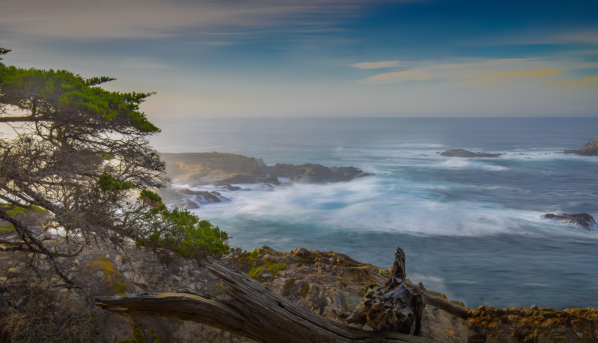
What a beautiful spot for photography. Gorgeous colours and textures. Although the bright blue sky at the top, right - looks a bit off on my monitor, but no biggie. As far as the composition is concerned, I see 2 major points of interest - the waves/water and the foreground. For my eyes, they compete a bit with each other. I took the liberty to play with it a bit, and cropped it to focus more on the water and waves - personal taste. What do you think? |
Jul 9th |
 |
| 29 |
Jul 22 |
Comment |
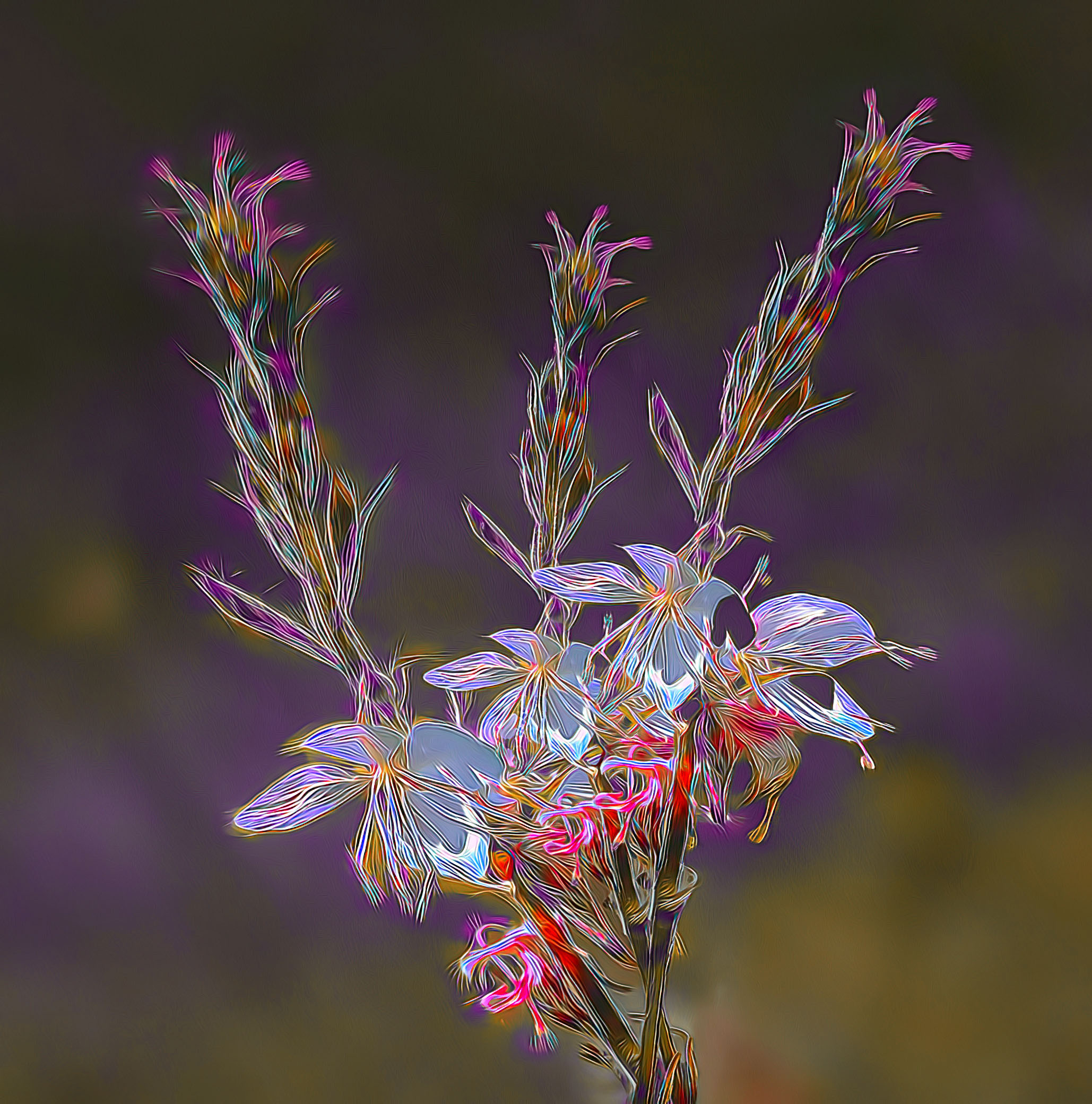
Can I join your club of "Layers Anonymous"? Already belong to "Selections Anonymous"!!! Struggle with both.
I like your subject matter a lot - looks like an interesting subject to work with. I like your picture, however I would prefer a different background - something darker, to make the flowers pop. I had a crack at it, however with little success. So I went to my Go-To application - Blending modes to see what I could do. See attached.
Used a white background and the Difference blending mode - worked OK, but changed all the colours - i.e. magenta turned to green, etc. So off to Topaz Studio 2 - played with HSL to get the magenta back, which I did, but other colours were still different from your image. That's where I stopped. See what you think. Sorry for the departure from your picture.
|
Jul 8th |
 |
| 29 |
Jul 22 |
Comment |
Really like this image - great composition, and kudos to you for seeing it and capturing it. Colours are eye popping and well suited to the subject. Only one suggestion: would like to see a bit of a frame at the bottom to show where the picture ends - actually when I look carefully it might be there, but my monitor is not picking it up. |
Jul 8th |
| 29 |
Jul 22 |
Comment |
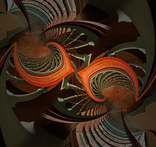
Abstracts - Really enjoying my first tentative steps into this genre. Challenge for me to understand why I like certain works, and not others. So far I am finding that composition and colour are the most important criteria - followed closely with simplicity. Abstracts, like other forms, have to be pleasing to the eye. I really like the colours in this picture. The composition is a too complicated for me - my eyes are having a hard to time to travel through this image - too much going on, especially in the middle, which I think is the focal point. In my attached version, I tried to focus in on the stairs, and I think it helps. What do you think?
|
Jul 8th |
 |
| 29 |
Jul 22 |
Comment |
An interesting subject, for sure. Like the contrasting colours of the log. The log is reasonably sharp and well lit. Also did a nice job with the background and adding just a bit of blue to the sky. A couple of suggestions: If possible to reshoot this, suggest showing just a bit of the log, without losing too much of the main feature - tricky. I would also suggest that the saturation of the colours are a bit too much for my eyes - prefer the original. Thanks for capturing this interesting subject. |
Jul 8th |
| 29 |
Jul 22 |
Comment |
I know almost nothing about Street Photography, except I often have a difficult time appreciating it. This one I do like. Like the graffiti guy looking at the runner and smiling. Love the contrasting colours of red and yellow, drawing the eyes to the main characters in this picture. Since it's a documentary/street photograph, I don't have a problem with the garbage can and other real. life stuff. Assume Street Photography is strictly out of camera, with only very minor post processing? In any case, Tim, nicely seen and captured.
|
Jul 8th |
6 comments - 0 replies for Group 29
|
| 34 |
Jul 22 |
Reply |
Steve - Excellent idea - what a difference. With 20-20 vision, maybe leave a touch of red and yellow in the surrounding area, as it is still a big part of the story for me. |
Jul 7th |
| 34 |
Jul 22 |
Comment |
Mission accomplished - you captured everything you set out to do. So much to see, and see, and see. Like the composition a lot, as the bridge leads the eyes from left to right. Vibrant colours and good exposure. The only thing I would suggest, is to take some of the noise out of this image - especially the sky. Well done, Brian |
Jul 5th |
| 34 |
Jul 22 |
Comment |
WOW - another impactful, creative image. Great job in combining these 4 images - flawless, my opinion. Love the colours, tones, and the overall 'feel' of this picture. My only suggestion - remove the crucifix in the background. Mainly as it 'grows out of her head' and I find it distracting. Hopefully it would not change the story you're telling.
|
Jul 5th |
| 34 |
Jul 22 |
Comment |
Nice creative image - really like the composition as the lines help the eyes explore the image. Also find the patterns interesting. If it were my picture, I think I would add a touch of colour for added interest - without taking away from the details, such as the patterns. See what you think. Added it with the Gradient Radial tool. |
Jul 5th |
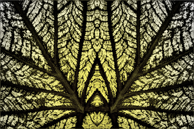 |
| 34 |
Jul 22 |
Comment |
WOW - love it. What an eye catcher - impactful or what! Great composition and colours. Also your skill in 'melting' all the layers together. I just have to learn this process. A question - what does "....stamped up" mean?
One suggestion only - would suggest cropping about 10% or so off the right side to eliminate most of the white petal - as is, it draws my eyes away from the main feature and distorts the face a bit. Would at the same time, move the face a bit off the middle. |
Jul 5th |
4 comments - 1 reply for Group 34
|
10 comments - 1 reply Total
|


