|
| Group |
Round |
C/R |
Comment |
Date |
Image |
| 29 |
Apr 22 |
Reply |
Ron, thanks for the feedback. Some of my intentions are in the "About the image" - the 'true self' in this case is the coloured version - looking to a bright future as a full member of society. Happy with the progress, but still a ways to go. The monochrome
version is to demonstrate how in the past many women were not valued as equal partners - so a darker period. It's not a mirror reflection, but can be easily assumed.
|
Apr 18th |
| 29 |
Apr 22 |
Reply |
Judy - thanks for your comments. If you find anything out about MirrorLab on Non-Android devices, would yo please let me know. Right now it's a pain in the butt.
Re:"My True Self" - Creative (altered reality/abstract) is like 'beauty' - in the eye of the beholder. I don't think it went over that well - I received a few questions after the event, wanting clarification. If only the title is shown, it can be a bit of a mystery what the maker had in mind. Another learning experience. |
Apr 18th |
| 29 |
Apr 22 |
Reply |
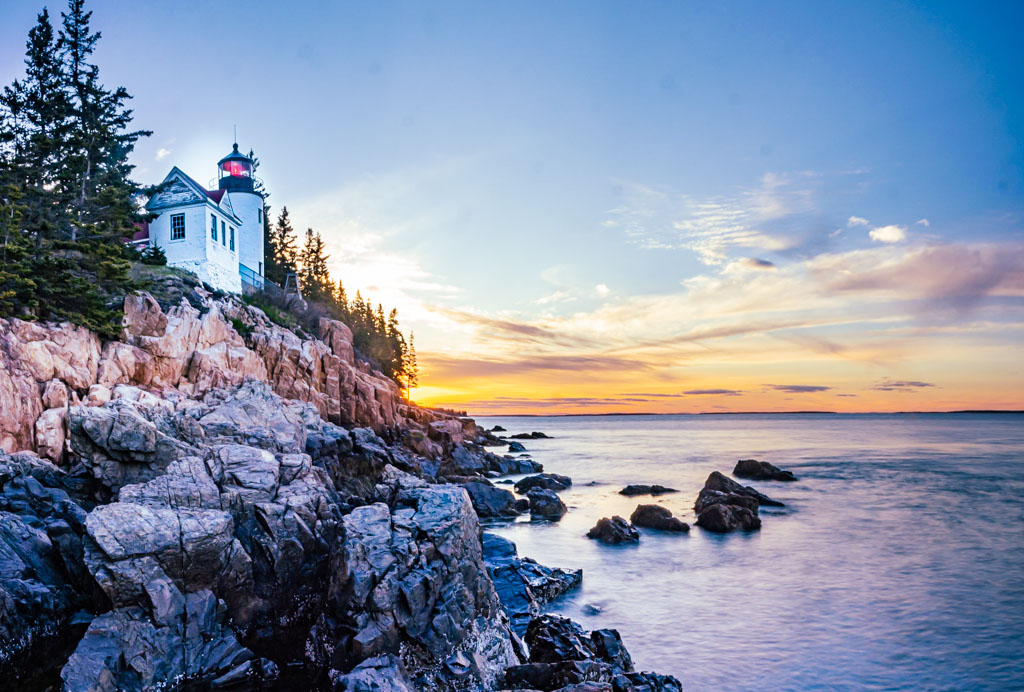
I think that would be an excellent idea - I still find it surprising how many good ideas come from outside critiques - as well as confirmation of what they love about the image. This is also true of the PSA Study and Dialogue groups, but unfortunately we're often a bit too sensitive to suggest areas for improvement. I know you're aware of the risk of removing the most highly exposed image from the stack - impact on the picture as a whole. From my point of view, the blown out area is no so noticeable, and actually maybe helps draw the eye to the tree and lighthouse. I've followed Blake Rudis for a while now, and I notice that he has backed off on fixing every blow out as long as it's not too distracting. And that's why there is Chocolate and Vanilla ice cream! Good luck
|
Apr 16th |
| 29 |
Apr 22 |
Comment |
What a beautiful picture - love the colours, tones, textures. The exposure is 'spot-on', as I think the lighting conditions were not the most favourable. The HDR application worked very well. I have just a bit of an issue with the composition - the best way I can describe it, is that's a bit awkward. Almost all the 'visual weight' is on the right side. Maybe our eyes have become used to a bit more balance. But the scene is what it is, and it's still a great photo. I flipped it horizontally to see if it made any difference, and I think it actually did. What do you think?
|
Apr 11th |
 |
| 29 |
Apr 22 |
Comment |
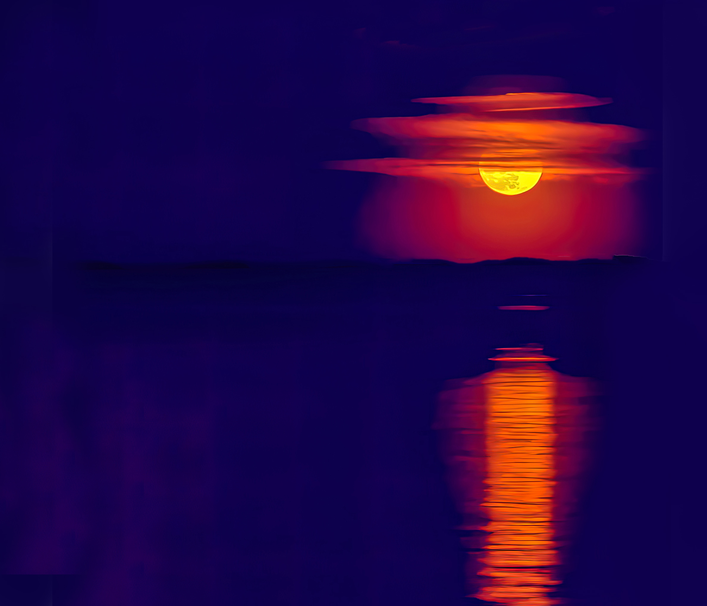
Another very impactful image - love the simplicity, including the colours. The clouds certainly differentiate it from many similar shots - adds a ton of interest for me. I took the liberty to move it away from the edge just a bit - also removed a wee bit of noise.
|
Apr 9th |
 |
| 29 |
Apr 22 |
Comment |
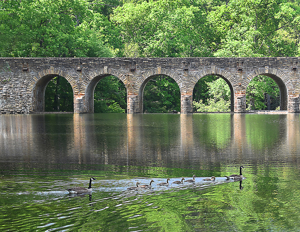
What a beautiful image - It makes me really want to be there, sitting in a chair by the water, and just be. Love the composition - eyes first 'see' the bridge, and then move to the ducks. The colours and textures of the bridge are really nice. The greenery provides a good contrast. Also congratulations for getting the ducks reasonably sharp at 1/100 - suspect if you had the time you would have upped it a bit. I only suggest 1 small change - not a big deal at all. I would clone out the light colour in the bottom right corner, as it is a wee bit distracting.
Beautiful job.
|
Apr 9th |
 |
| 29 |
Apr 22 |
Comment |
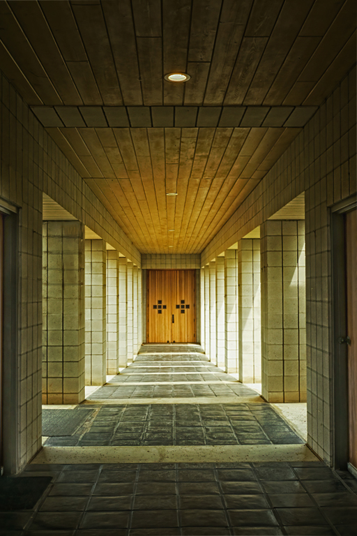
I like this image quite a bit - effective composition, reasonably sharp. I would prefer if the waterstain? were cleaned up a bit. I also think that for my eyes, I would prefer to see a bit more contrast, from front to back. See attached - put a fill radiant gradient on the image to darken the front, and make the lit up area more pronounced. Just another version. |
Apr 8th |
 |
| 29 |
Apr 22 |
Comment |
A nice, simple little nature study - nicely exposed, sharp, and well composed. I have no suggestions as to how to improve this image.
For me, the very small "almost-blown-out" area is of no concern as it does not distract me from the flow of the water, |
Apr 8th |
| 29 |
Apr 22 |
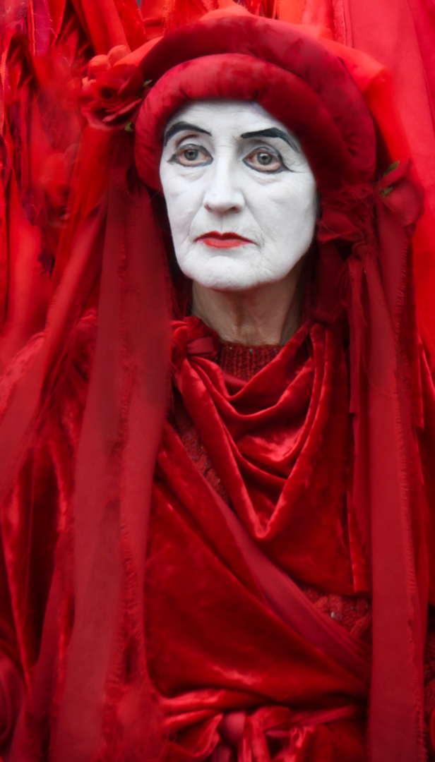
Comment |
What an eye-catching image - very impactful. The colours and textures are very effective. Also like the expression on the model. My only suggestions would be to remove the "hand"? next to the face. Made an attempt, but needs a bit more work.
There appears a bit of noise or lack of sharpness in the red, but not an issue as the face draws the eye for the most part - well done. |
Apr 8th |
 |
| 29 |
Apr 22 |
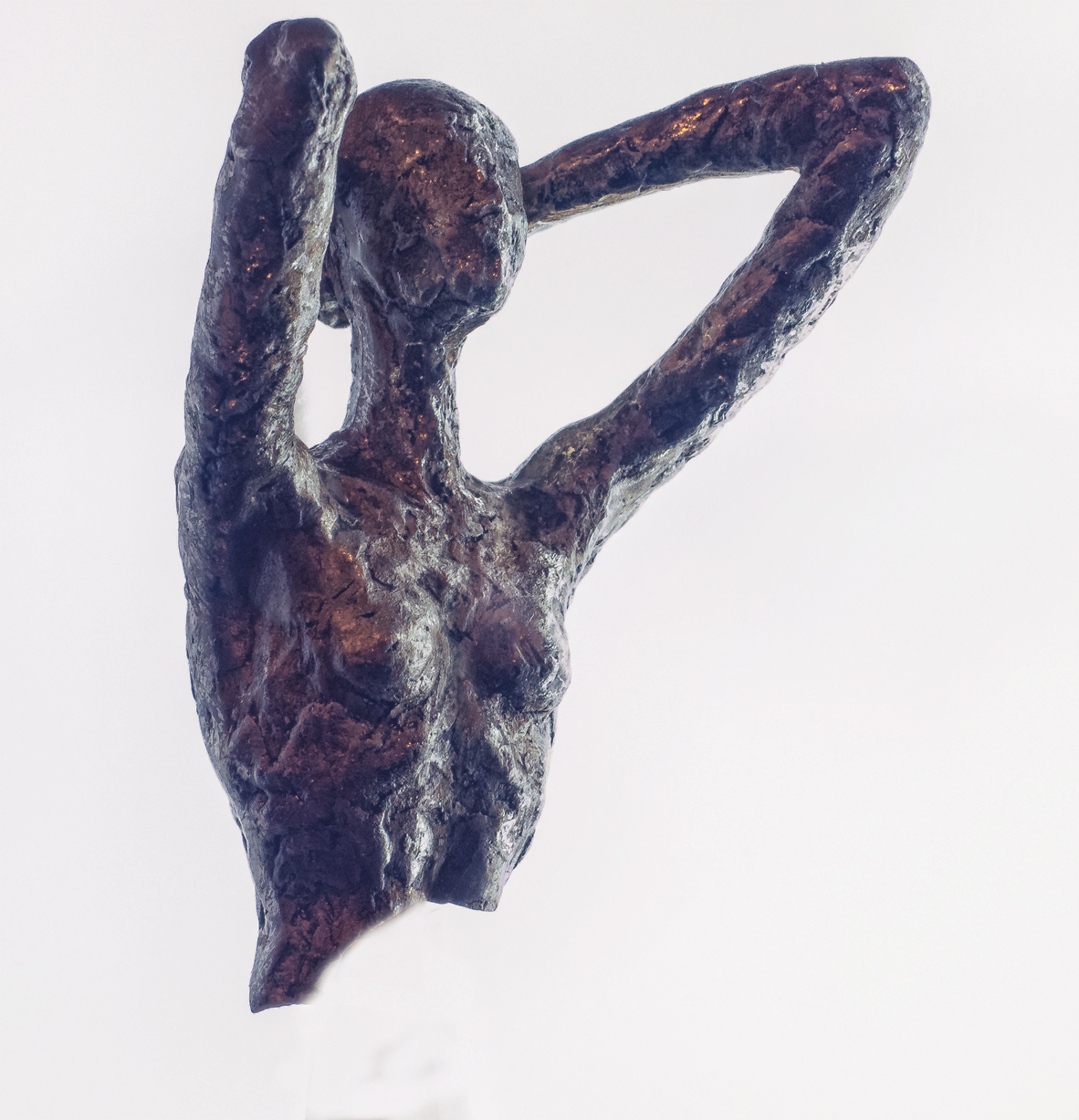
Comment |
Thanks for your input. Attached find the original image of the broken statue.
Post processing done in ACR, Elements, Topaz Studio, and MirrorLab. I use MirrorLab quite a bit as I'm going through my Creative/Abstract period. Unfortunately it is only available for Android, so I had to use my phone for that part of the process. MirrorLab is a really neat program, and it provided me with the textures for the 'model'. Colours from Topaz Studio Look. Hope that helps.
Also, I use MirrorLab very 'gently' as most of the filters are way out there. In most cases, I only use a small portion of the image, and blow it up in Topaz Gigapixel.
|
Apr 8th |
 |
7 comments - 3 replies for Group 29
|
| 34 |
Apr 22 |
Reply |
My title would be "Still Reaching For Liberty"
This statue reminds me of the ideals of Liberty, Freedom, Democracy - not just for America, but worldwide - still with more clouds in the forecast.
|
Apr 25th |
| 34 |
Apr 22 |
Reply |
Thanks, Candy. Looking forward to seeing this talented groups images. I'm really enjoying my newfound interest in abstract/altered reality images - have along way to go, but enjoying the journey so far.
|
Apr 25th |
| 34 |
Apr 22 |
Reply |
Brian, thanks for your comments - sorry to hear you're in isolation - hopefully not for long. You actually reminded me of a technique that I often forget about - flipping and turning. So I had another look at this image, and did flip it horizontally and must say I like it better - easier for the eyes to follow the highlighted route from left to right. Thanks for sharing your version as well |
Apr 25th |
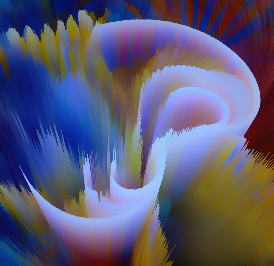 |
| 34 |
Apr 22 |
Comment |
Jan - thanks so much for spending some time with my image - appreciate your comments very much. As I'm experimenting with Abstract and Altered Reality, it's becoming more clear what I like and don't like. Overall, I like my picture quite a bit, however, like you, it's a bit too busy for me as well. I find my self enjoying the journey through this image following the light shape, curves - but once my eyes are at the end, they really get confused where else to look - too much to take in. So i need to work on Simplicity - at least for my taste.
You're more than welcome to 'play' with any of my images - I like your "Alternate" image, but have the same issue with where to look. I do like the diagonals.
Thanks again |
Apr 11th |
| 34 |
Apr 22 |
Comment |
Certainly an eye-catching image - really like the background effects. From a personal taste perspective, I would like to see something that delineates
the separation between the statue and its reflection.
|
Apr 6th |
| 34 |
Apr 22 |
Comment |
This is a difficult one for me to get my head around. The first thing I notice are the whites and highlights, both vertically and horizontally. They certainly lead my eyes around the image. Next are the houses/barns and cows and that's where I get stuck, as I can't find how they connect or what the story or message is. I know that often creative images are not the easiest to comprehend, and the makers intentions not all that evident. Sorry I can't be more helpful.
|
Apr 5th |
| 34 |
Apr 22 |
Comment |
I applaud you for honouring the Aboriginals in this image - if it's anything similar to our Native Peoples in Canada, history has not been kind them, to say the least. Your image certainly fits the 'creative' category. A very nice job of fitting the patterns of the carving into the mountain - maybe a bit too well, as they look very real to me. I can make out the face, but would prefer to see it bit more pronounced - so that it's easier to pick out. Somewhat subjective. My only other suggestion is to crop quite a bit off the foreground, as there is not much going on.
|
Apr 5th |
| 34 |
Apr 22 |
Comment |
I like this image quite a lot. Beautiful background that highlights the osprey. The osprey is also very nicely photographed and processed. Knowing very little about birds in general, I don't know if ospreys come in this darker colour - I assume not, hence 'creativity'. My only suggestion is to expand the canvass a bit to provide more room at the wingtips.
|
Apr 5th |
| 34 |
Apr 22 |
Comment |
Certainly lots of 'creativity' going on. Like the concept of flowers taking on human traits - this one about ageing. I think the background is really well done and very appropriate to the story. The ageing amaryllis certainly is starting to show its age.
My only suggestion is to show the daffodils in a younger period - for me the current treatment is also making them look older. Like the story. |
Apr 5th |
6 comments - 3 replies for Group 34
|
13 comments - 6 replies Total
|


