|
| Group |
Round |
C/R |
Comment |
Date |
Image |
| 29 |
Mar 22 |
Reply |
My Canadian group leader actually picked this as the image that most closely met the requirements of the assignment. I think it was likely the subject matter of the picture - as it was unusual and original. I've had other informal feedback, although mostly positive, that included calling the image "disturbing" - which for me meant, Mission Accomplished. |
Mar 13th |
| 29 |
Mar 22 |
Reply |
Thanks, Bob for your comments. Appreciate that there often are many questions that a picture does not answer - and I think that's often a positive, as it allows the viewer to think about what is going on and make up their own story - or just move on to the next picture. When I made this picture I wanted to show the 2 blues - the depressed feeling of the subject, and the blue pill(s). The extra bottles are just part of the scene, and as is often the case with depression, more that one medication is needed. A question left unanswered - is he contemplating to do harm by taking more than the one pill prescribed? |
Mar 13th |
| 29 |
Mar 22 |
Comment |
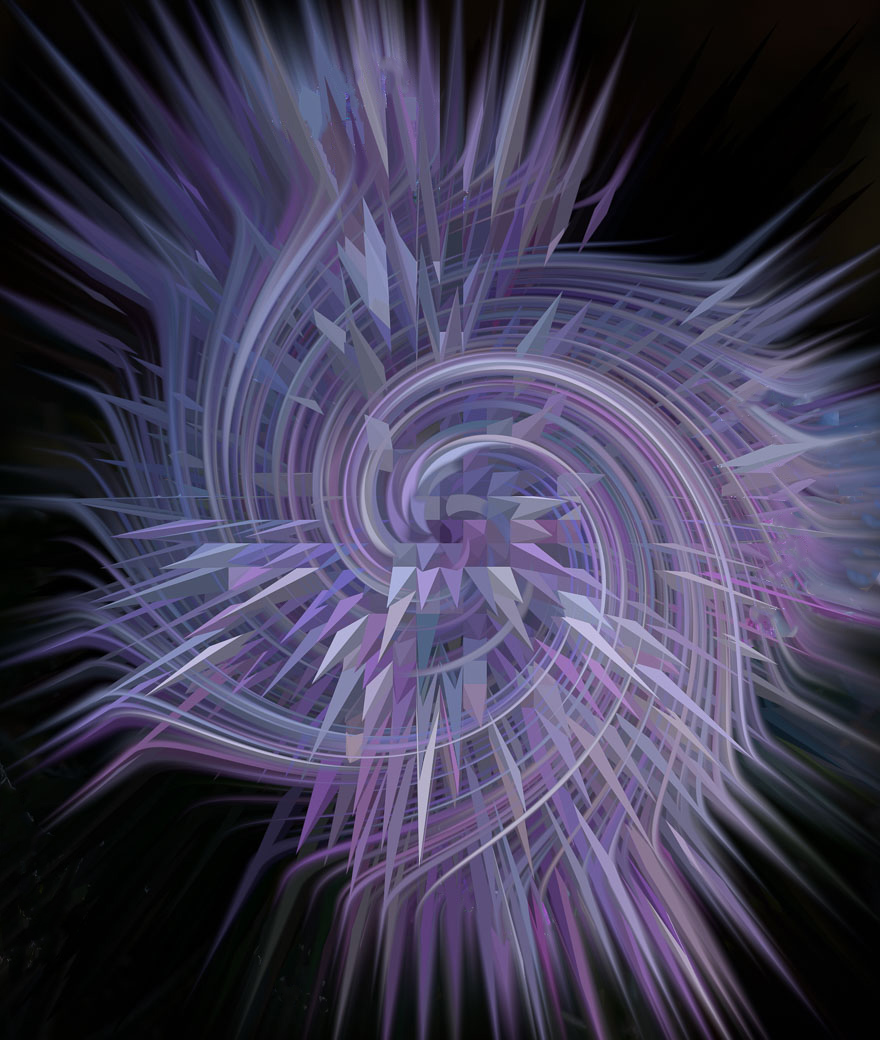
What a gorgeous colour combination on the black background. Happy to see your and Judy's images as I'm now in an "Altered Reality/Abstract" phase of my photographic journey. I like the composition very much as it's easy for my eyes to follow the lines and patterns. This would be a 'wall-hanging' candidate for me. My only suggestion would be a bit of a "clean-up" of the white specks that disturb the uniformity of the image as whole - I did a quick, and not too careful clean-up, attached. |
Mar 13th |
 |
| 29 |
Mar 22 |
Comment |
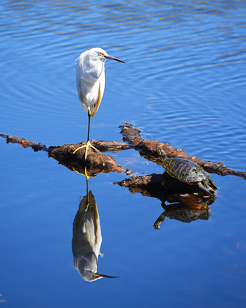
What a nice nature shot - like everything about it - nice composition, sharp, beautiful colours. I get a kick out of seeing something in the picture on my monitor that I did not see when I clicked the shutter - especially when it makes the picture better. Love the selection as well. The only suggestion I have - would be to 'clean-up' the image a bit, to keep the viewers eyes from drifting away from the subject - see my suggestion attached. Hope you had a nice vacation in Florida. |
Mar 13th |
 |
| 29 |
Mar 22 |
Comment |
An interesting "Altered Reality" image - the boxcar worked very well and I like the pattern you created. The green also makes a good contrast with the yellow. Not a big fan of Kaleidoscope-like images in general - mostly that the centre does not support the outer sides - which is the case here. This is a personal bias, as they're quite popular.
|
Mar 13th |
| 29 |
Mar 22 |
Comment |
Very nice image - great composition - easy for the eyes to follow the bridge and the buildings. Beautiful reflection and colours in general. Reasonably sharp, but a titch contrasty. The sky looks a bit 'odd', but not a big deal. You life in a very beautiful and picturesque community - lucky you! |
Mar 13th |
4 comments - 2 replies for Group 29
|
| 34 |
Mar 22 |
Comment |
Brian - very nice creative image - like the composition and the overall colour scheme.
For my eyes, I would prefer a bit more contrast - a personal bias. Also wanted to emphasize the Vortex a bit more. As usual, my version is a titch over the top - just an idea.
|
Mar 16th |
| 34 |
Mar 22 |
Comment |
Jan - this image hooked me at first glance - beautifully moody manor house and countryside. Nicely composited. I like Steves version as the leprechaun was a bit soft on the original. Great, descriptive title.
|
Mar 16th |
| 34 |
Mar 22 |
Comment |
Hi Fran - a very eye-popping image - great colours and strong composition. If I did not see in your description that the 'coral' is made up sunflower leaves, I would have mistaken them for the real thing. Not sure how the title fits in with the image? For my made-up story, I see fish swimming past a predator (coral). |
Mar 16th |
| 34 |
Mar 22 |
Comment |
Candy, this a beautiful image - great colours, nice and sharp with a muted background. I assume the "altered reality" is that cats don't eat danish! Mine does not, and in fact does not like treats, but eats lots of food, and weighs in at 22 lbs.
Very effectively composited. A small suggestion - for my taste I would crop out the "band"(?) next to the danish, as it's a bit distracting.
|
Mar 16th |
| 34 |
Mar 22 |
Comment |
Looking forward to 'playing' with you all.
Steve, I find this image very impactful - it's eye-catching, and it speaks to me. Although the title does not describe your story displayed in this scene - for me the sailor is challenging the 'bad guys', with a twinkle in his eyes and an assurance that he will conquer - at least this time. Technically extremely well done - only one suggestion - would like to see the eyes more clearly in the skeleton guy. |
Mar 16th |
5 comments - 0 replies for Group 34
|
9 comments - 2 replies Total
|


