|
| Group |
Round |
C/R |
Comment |
Date |
Image |
| 25 |
Sep 23 |
Reply |
I also do not much like to add things. That particular sky gave that specific light to the scene, whereas another sky might have rendered the lighting differently. I think one easy solution would be to simply reduce the amount of sky by cropping down from the top to give less negative space that would still be harmonious with the scene. |
Sep 21st |
| 25 |
Sep 23 |
Comment |
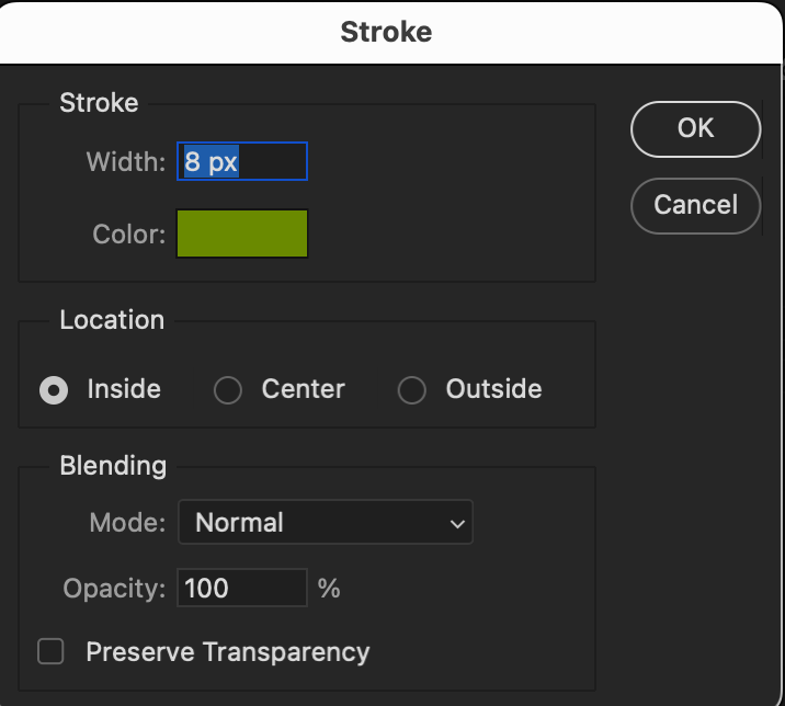
Here's the method I use: In Photoshop it's called a stroke. It will not work on the background, but if you create a new layer, you can then go to Edit>Stroke which will bring up a box where you can choose the width of the frame, the color, and whether you want it inside (works best for this purpose). Our group member Ruth also uses this feature a lot, so she might have advice on how she accomplishes it. |
Sep 11th |
 |
| 25 |
Sep 23 |
Reply |
I definitely agree with Brian's idea of increasing the tonal range. And Thanks Brian for finding a way to illustrate the changes by including some black "background" - I was at a loss how to show the thin stroke, because with the gray background of the reply section, subtle changes are lost.
Another tip is that if you command (or control) click on any image in any reply, it opens in a separate window with the normal (black) background, which allows you to view the amended image full size and compare it with the maker's original. |
Sep 11th |
| 25 |
Sep 23 |
Comment |
I like how this photo conveys the distance to the horizon by having the tractor in the foreground and the trees in the very far distance. And I am amazed that you could get such a broad field and such definition from your car. I wonder what the settings were on your camera, and whether you did any post-processing. |
Sep 9th |
| 25 |
Sep 23 |
Comment |
Growing up in the south, crepe myrtle was always a favorite, and they always seemed like a cloud of blossoms. Your photo gives them a bit more definition while still keeping the softness. I do think the sky could be softened to "cloudy grey" color. |
Sep 9th |
| 25 |
Sep 23 |
Reply |
Here's the other image with the stroke. Turns out the only way to view them on the black background is to open them in a new window. In any case, I'm not sure either is really "better".
|
Sep 9th |
 |
| 25 |
Sep 23 |
Comment |
I really like the texture and detail of this image, as well as the many shades of grey from nearly white to black. I do find the right-hand edge blends into the black background of the site. I tried a thin stroke to separate it, as well as trying to desaturate the strip at the edge. Seems I can't attach two images at the same time, so here's the one with the desaturation, and I'll send the one with the desaturation next to see how they look. |
Sep 9th |
 |
4 comments - 3 replies for Group 25
|
4 comments - 3 replies Total
|