|
| Group |
Round |
C/R |
Comment |
Date |
Image |
| 25 |
Feb 21 |
Reply |
A good example of how a small correction like the keystoning as you did can really make a difference. It seemed to me that it was too slight to matter, but when I see your result I am really impressed. |
Feb 23rd |
| 25 |
Feb 21 |
Reply |
I agree the towers needed to be straightened. Just haven't had time to try it myself - thanks for showing how it looks when fixed. I also surprisingly like the crop from left and top. I find I'm a "big sky" photographer, but so often when someone points it out I realize how true it is that less is more. |
Feb 23rd |
| 25 |
Feb 21 |
Reply |
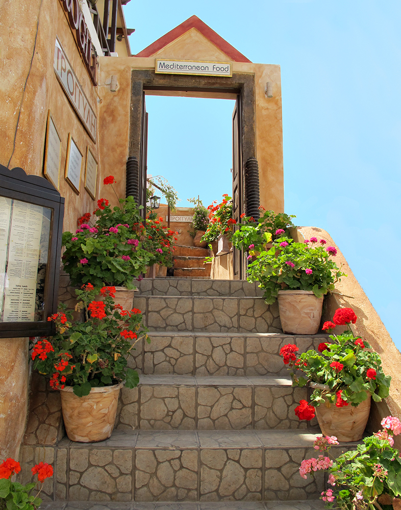
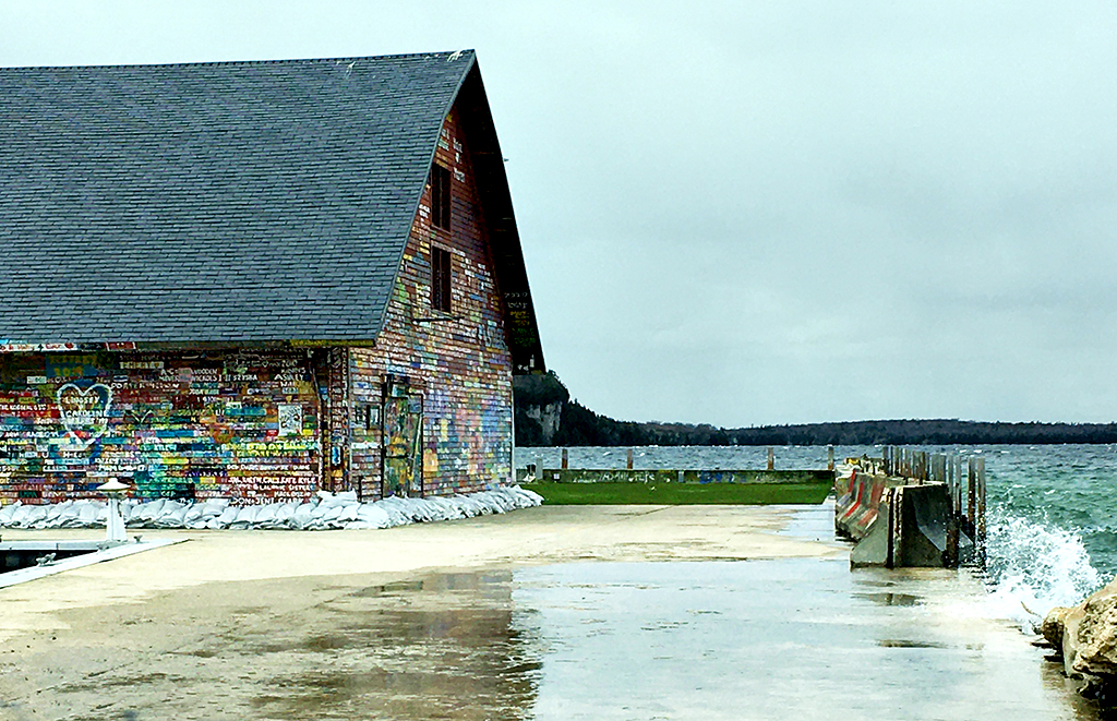
Bill Provost Bill Provost
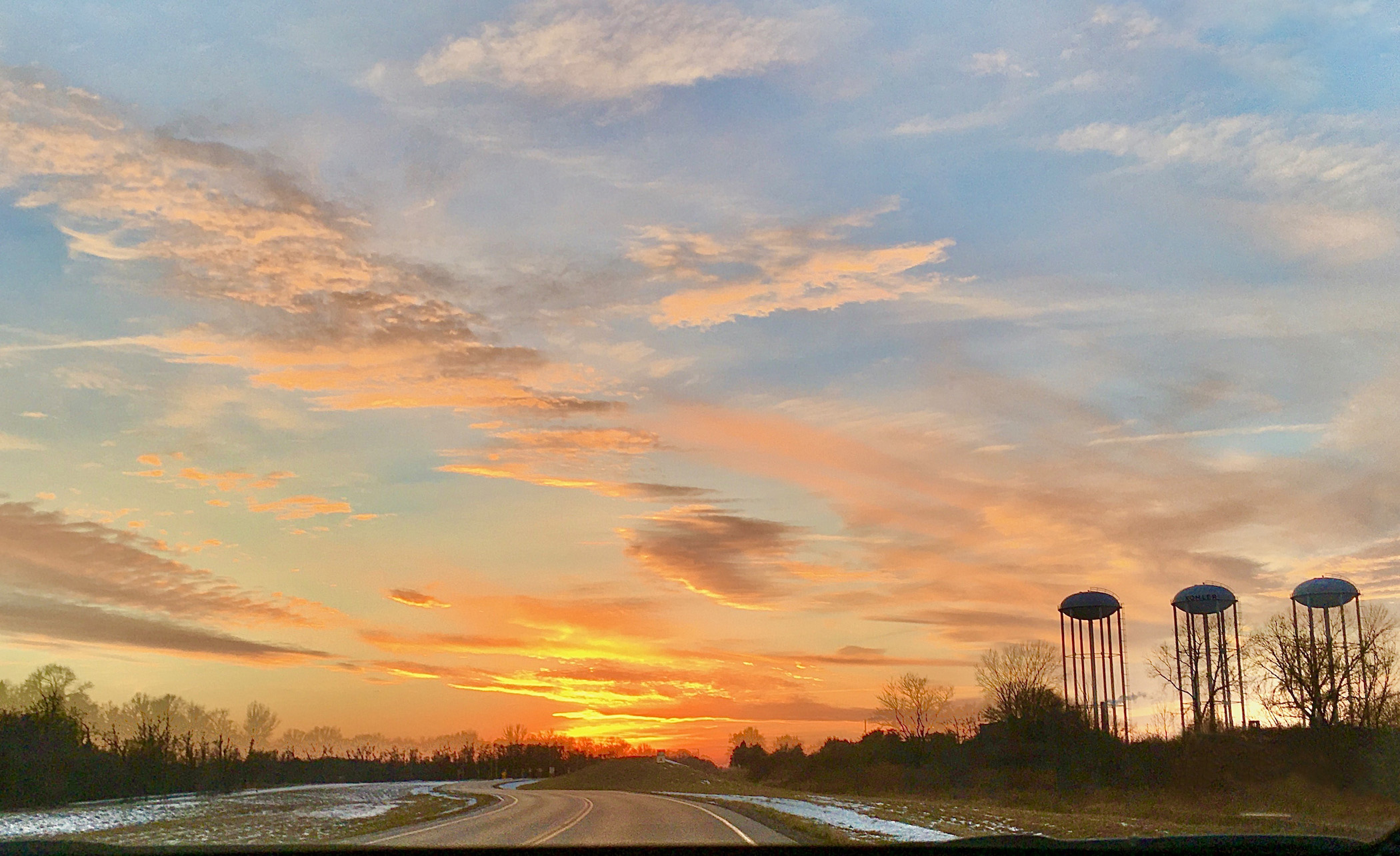
Audrey, What a nice image you have for us. I really like the water towers, I think they give substance to your image. That being said as I see it they are tilting a little. Your second image seems to have eliminated that tilt. I would not have taken them out as they add to the story of you image. The colors are warming and I like how the road seems to move through the image. Posted: 02/16/2021 18:21:23 |
Feb 21st |
| 25 |
Feb 21 |
Comment |
Oops! I accidentally deleted Bill's comment and when I tried to get it back it came in with my bio-photo. Sorry about that, but Bill's name is still at the top of the comment.
|
Feb 21st |
| 25 |
Feb 21 |
Reply |
I'm surprised that works so well. I really like it that way. |
Feb 21st |
| 25 |
Feb 21 |
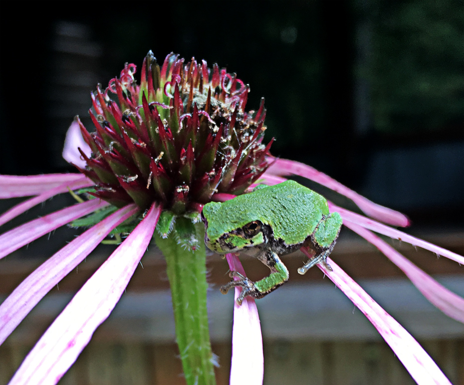
Reply |
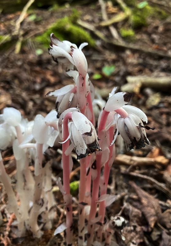
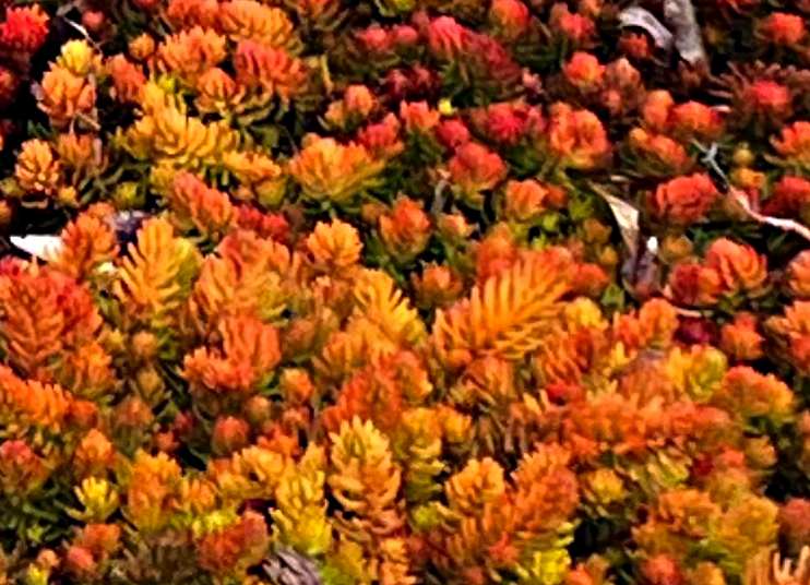
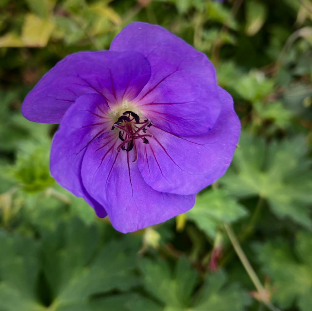
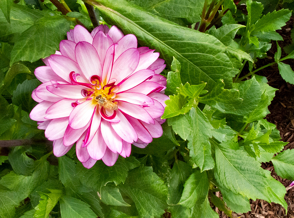
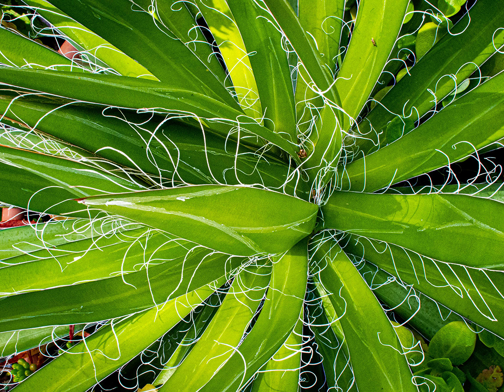
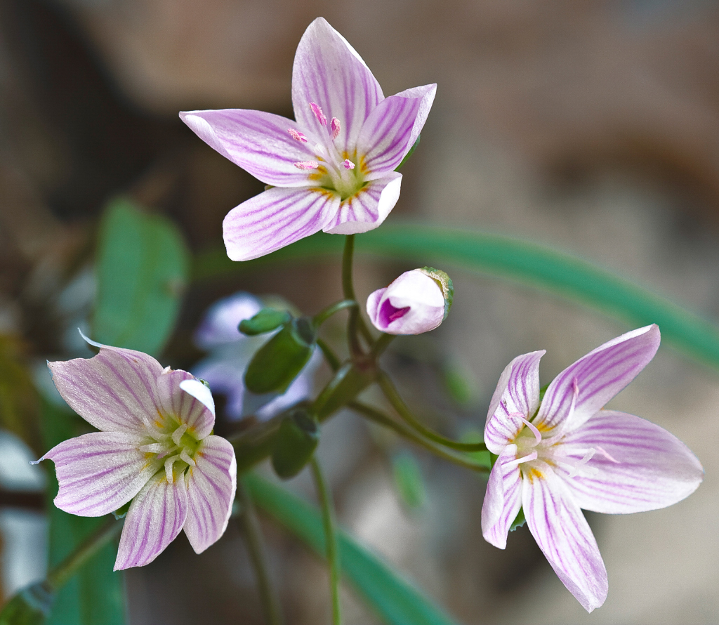
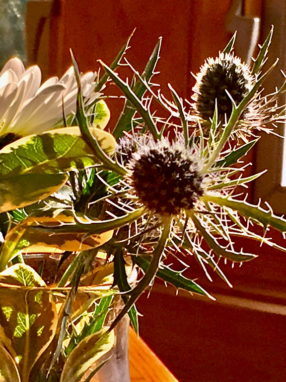
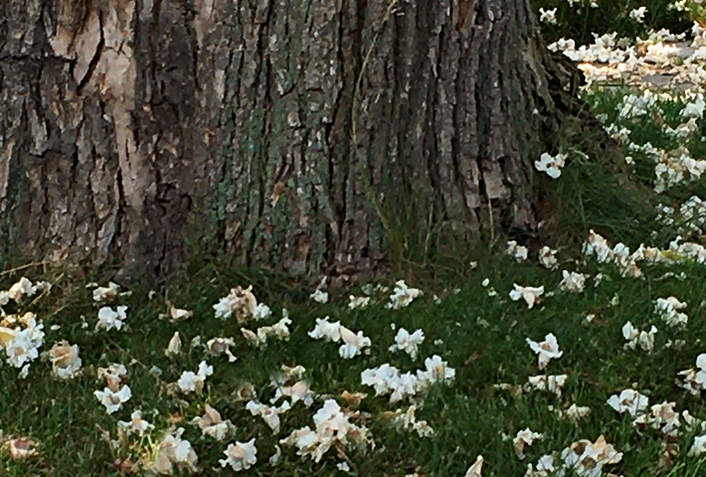
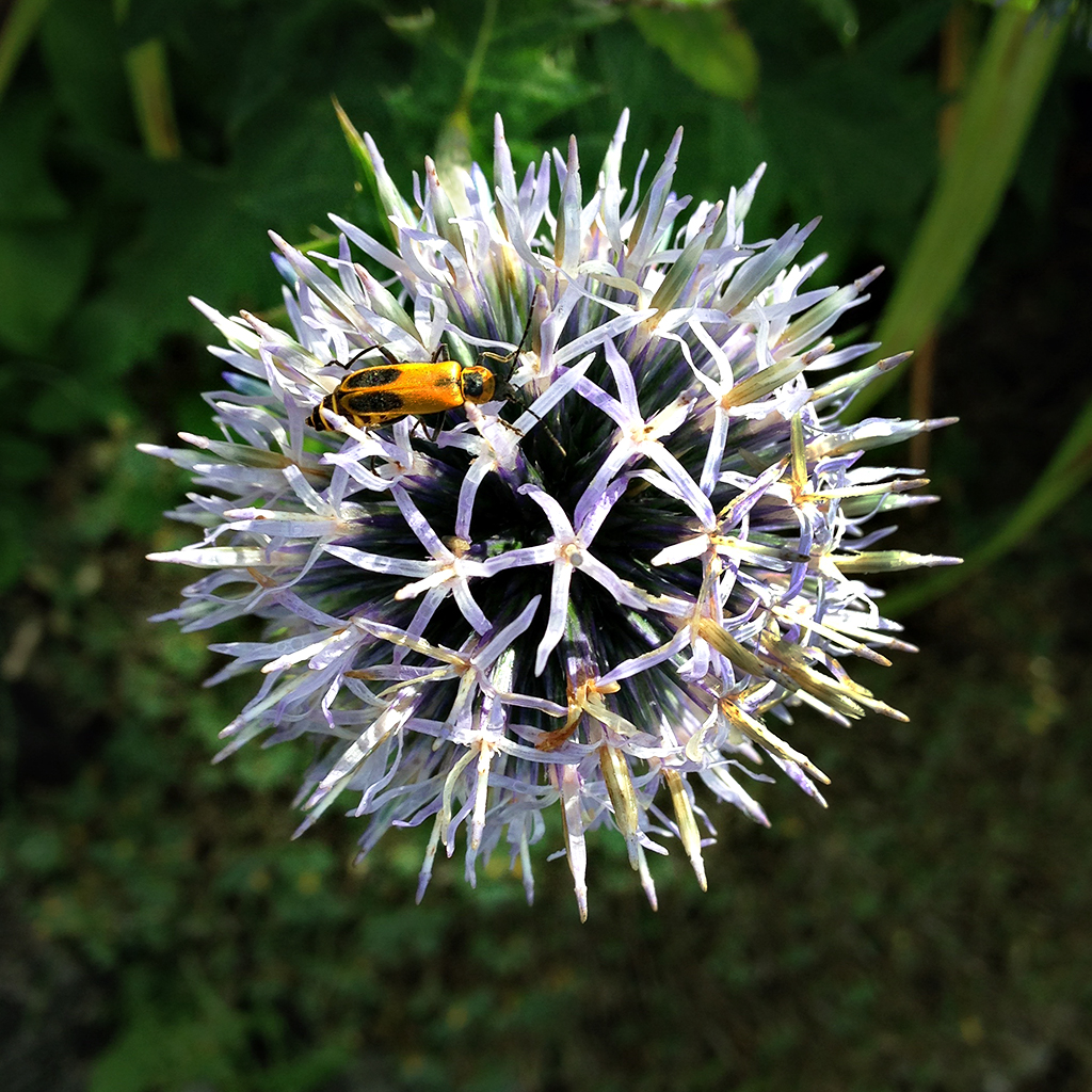
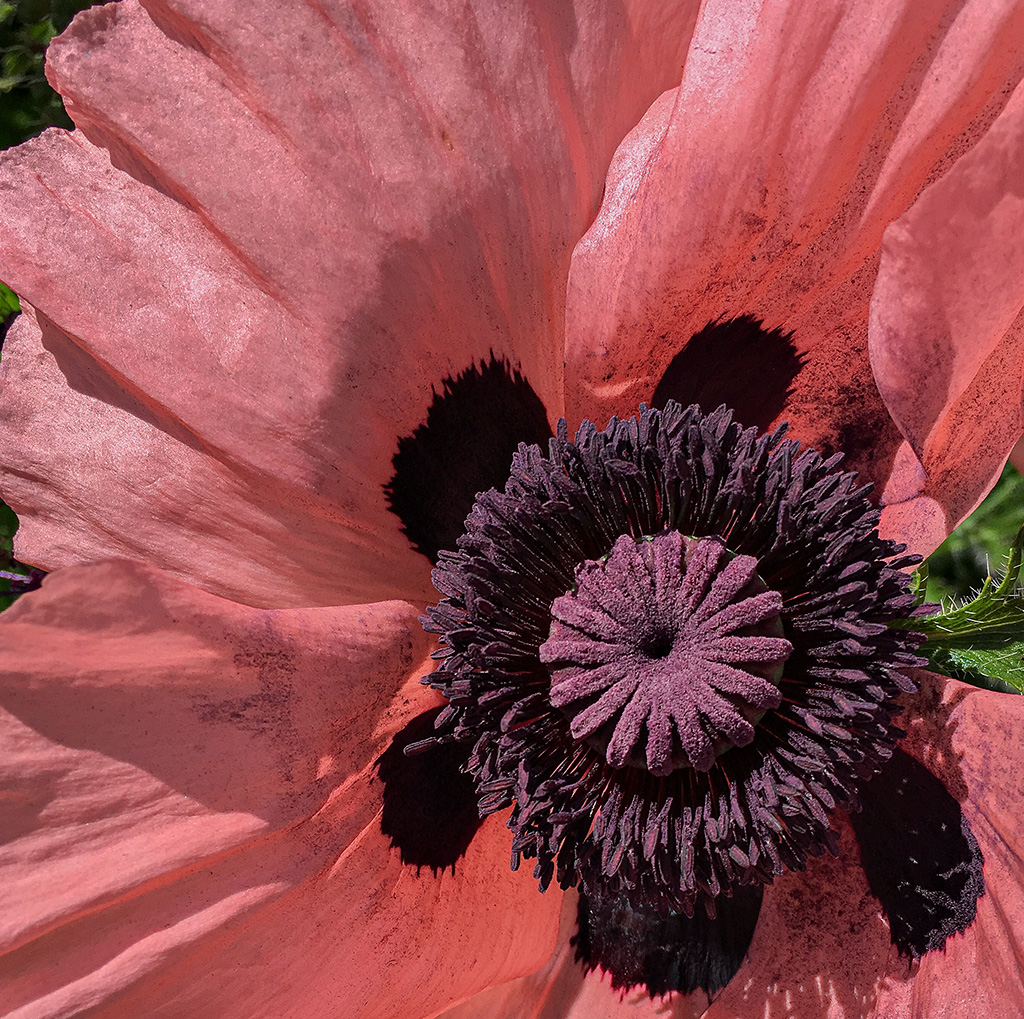
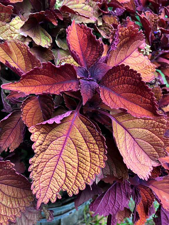
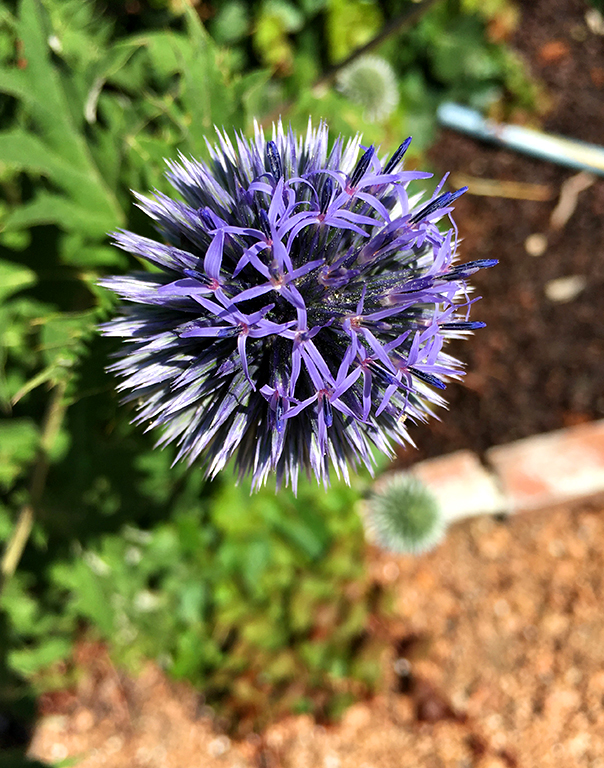
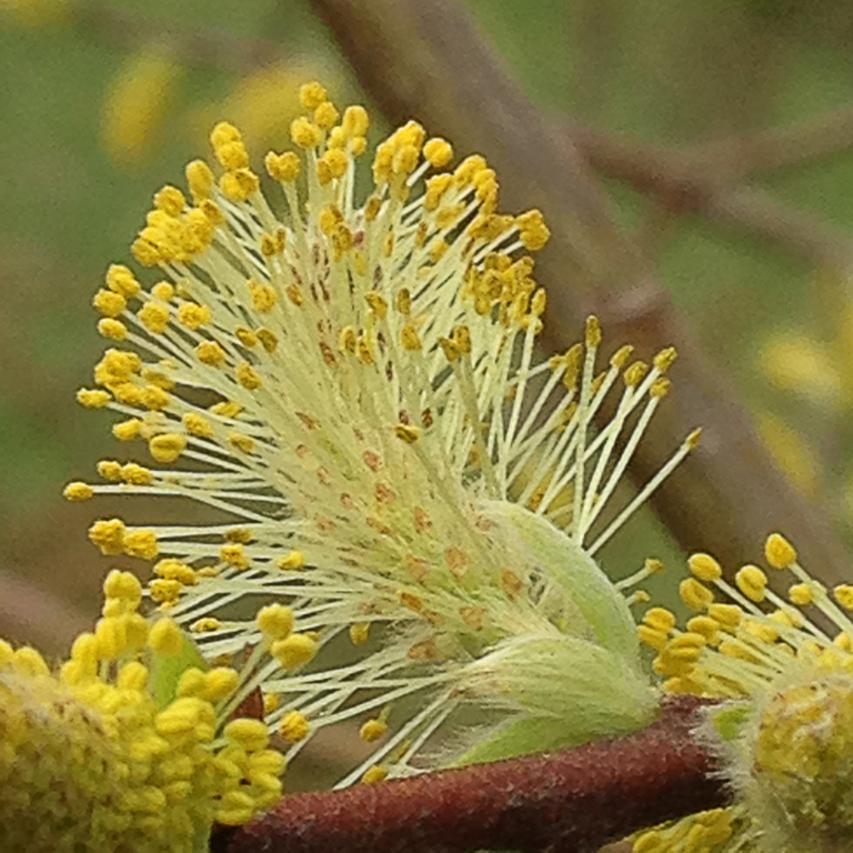
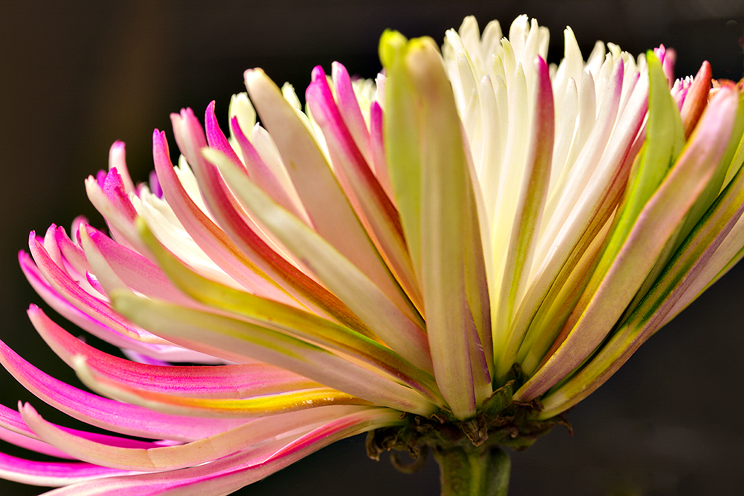
I'm really impressed with the richness of the color and the sharpness throughout. As for the white spot on the flower to the right, it is actually the stigma of the flower, which can be seen in the left flower since it extends out from the petals. In the case of the flower on the right, it is lying along the petal so that the red style that holds the stigma in nearly invisible. I've circled the two so you can see what I'm describing. |
Feb 20th |
 |
| 25 |
Feb 21 |
Comment |
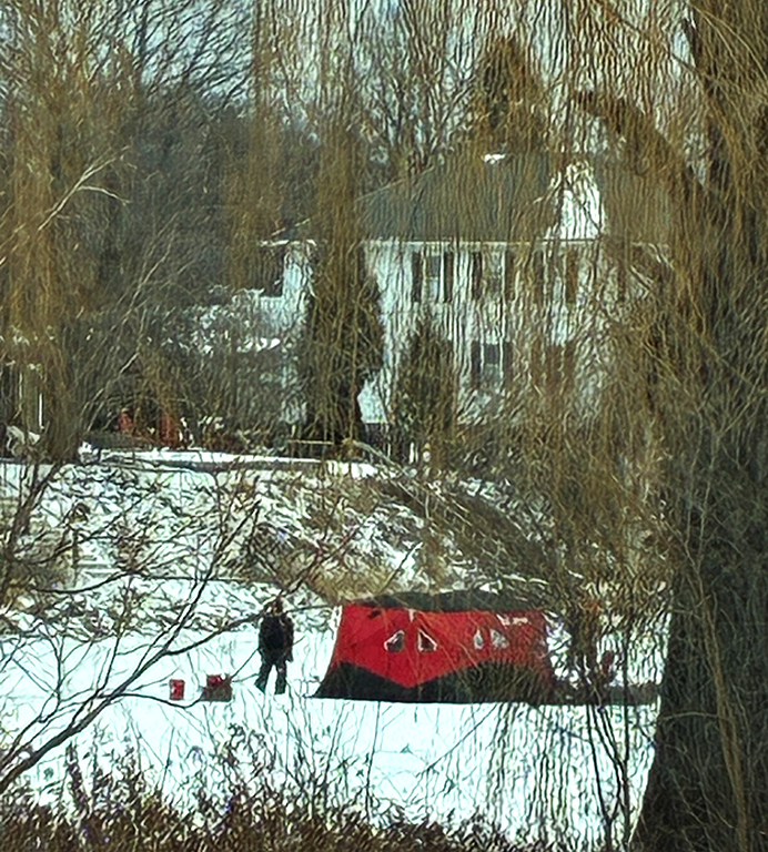
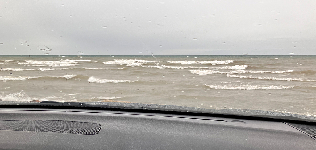
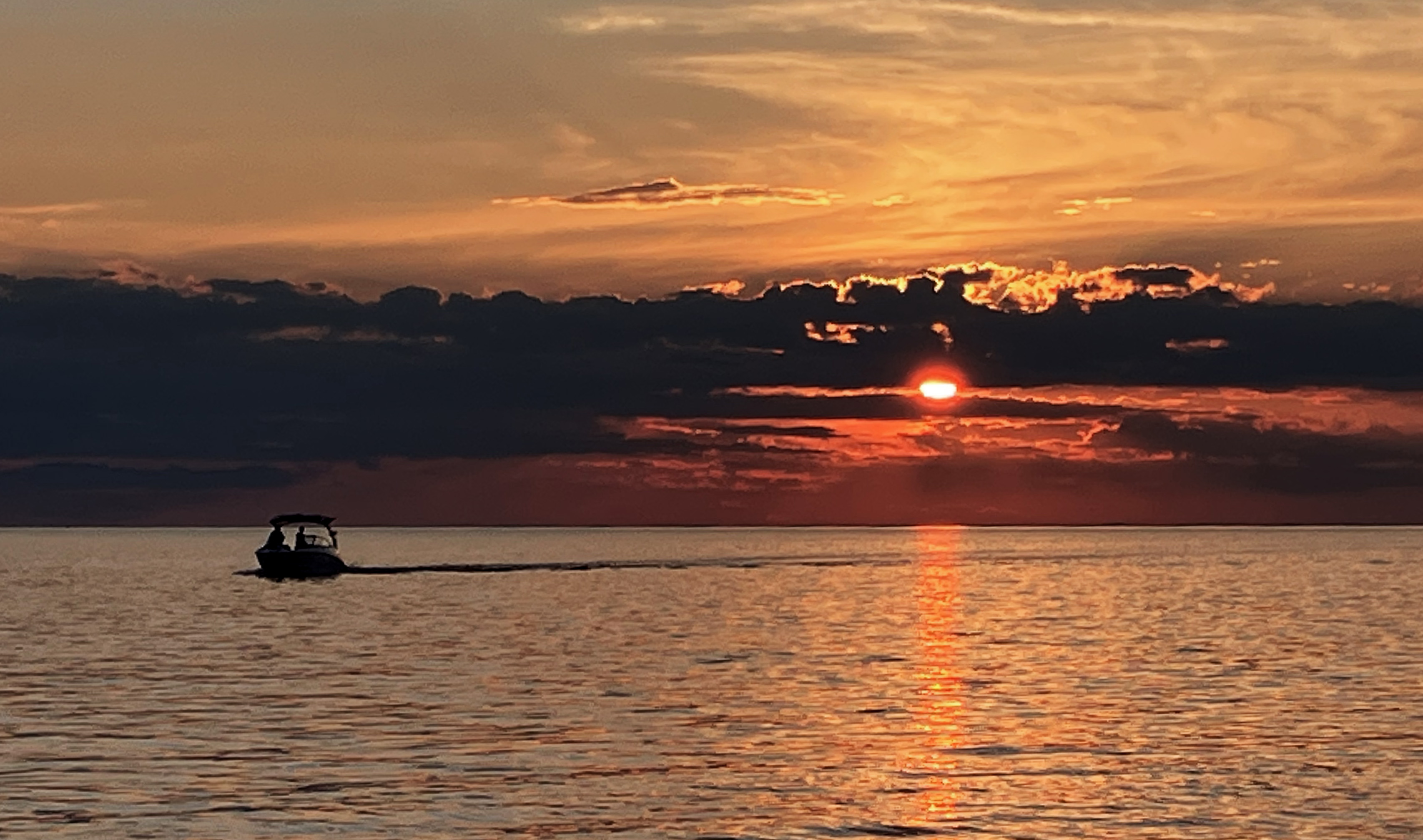
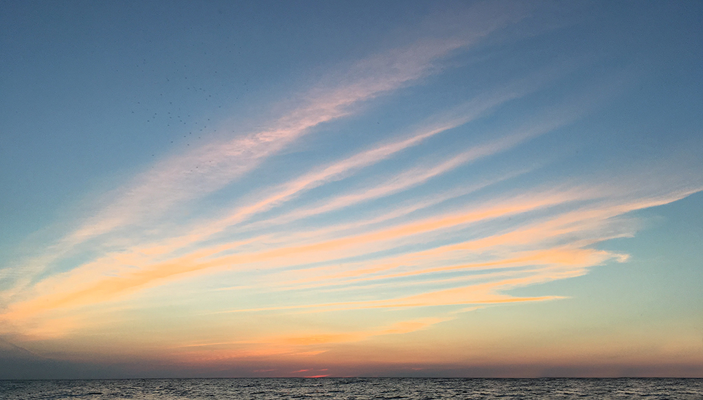
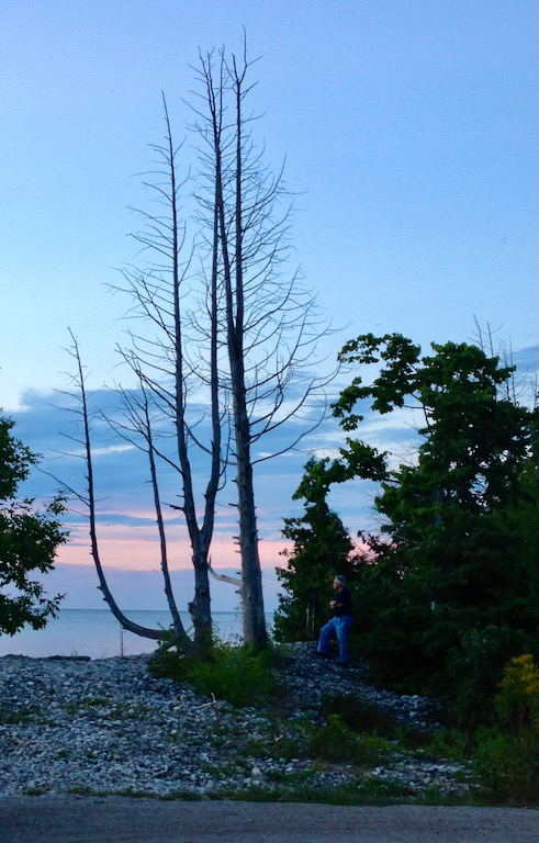
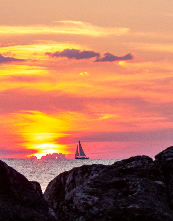
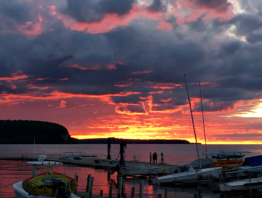
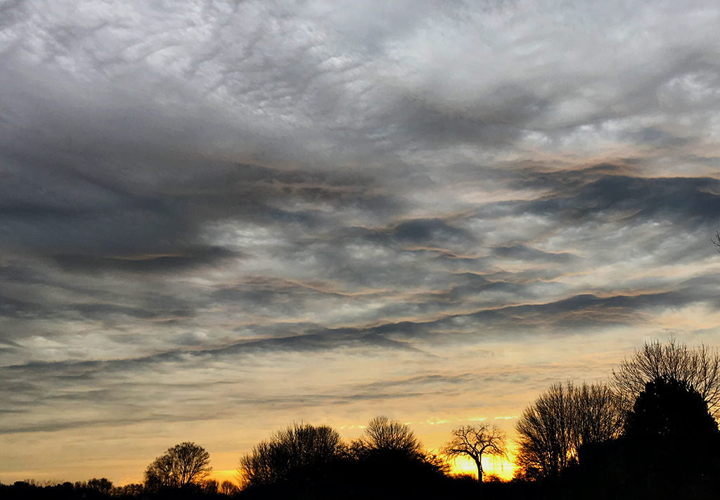
I like the feeling of isolation this gives, while at the same time conveying the feeling of safety that a lighthouse give the mariner. I like the placement of the horizon, and I think it's okay to crop down a bit. I would like the transition zone between the sunset and the evening sky to be without the green band. |
Feb 19th |
| 25 |
Feb 21 |
Comment |
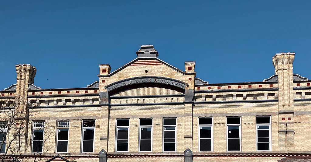
I think this is a beautiful capture of the subject. Everything seems to be sharp and the colors are stunning. Since I did not know this subject, and also wondered why the top was cut off, I looked at many other versions online. The fact is that the top would include nothing more than a very tall thin "wire" holding up a thin cross-piece, and would have, for me, the effect of minimizing the building for the sake of seeing a lot more sky with a relatively uninteresting cross. As for the slight keystoning, I suppose you could tweak the perspective to straighten things, but I don't think it would make a meaningful difference. |
Feb 19th |
| 25 |
Feb 21 |
Comment |
I definitely agree with the flip. It gives the photo a more stable presentation. Being that we mostly "read" a photo from left to right, flipping puts the shadow in the background and overcomes the feeling I had that everything was sliding down the slope. |
Feb 19th |
| 25 |
Feb 21 |
Comment |
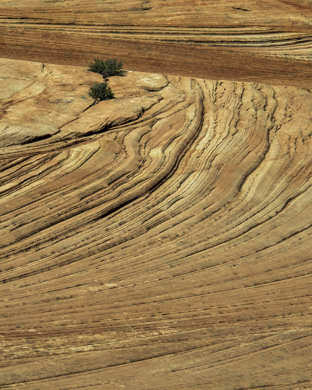
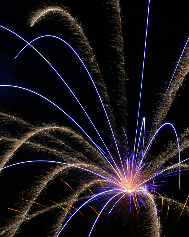
I like the way you caught the action at just the right time. I definitely agree with Abe's treatment, especially the straightening. |
Feb 19th |
5 comments - 5 replies for Group 25
|
5 comments - 5 replies Total
|