|
| Group |
Round |
C/R |
Comment |
Date |
Image |
| 25 |
Jan 17 |
Reply |
Thanks a bunch, Eric. I like all the crops, and definitely agree with the color and shadow balancing. In addition, I find the aspect ratio much more complimentary for the subject. I'm almost always guilty of settling for "good enough" with my photos. This group is a constant reminder that I need to take the time (first I have to find the time of course) to take them to the next level. |
Jan 23rd |
| 25 |
Jan 17 |
Comment |
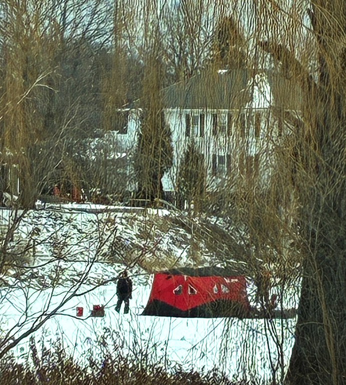
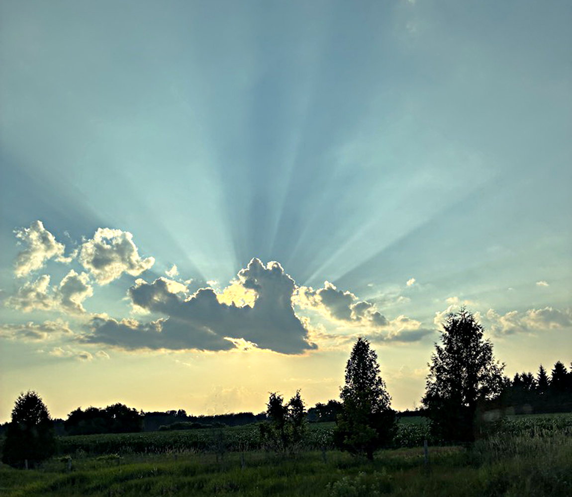
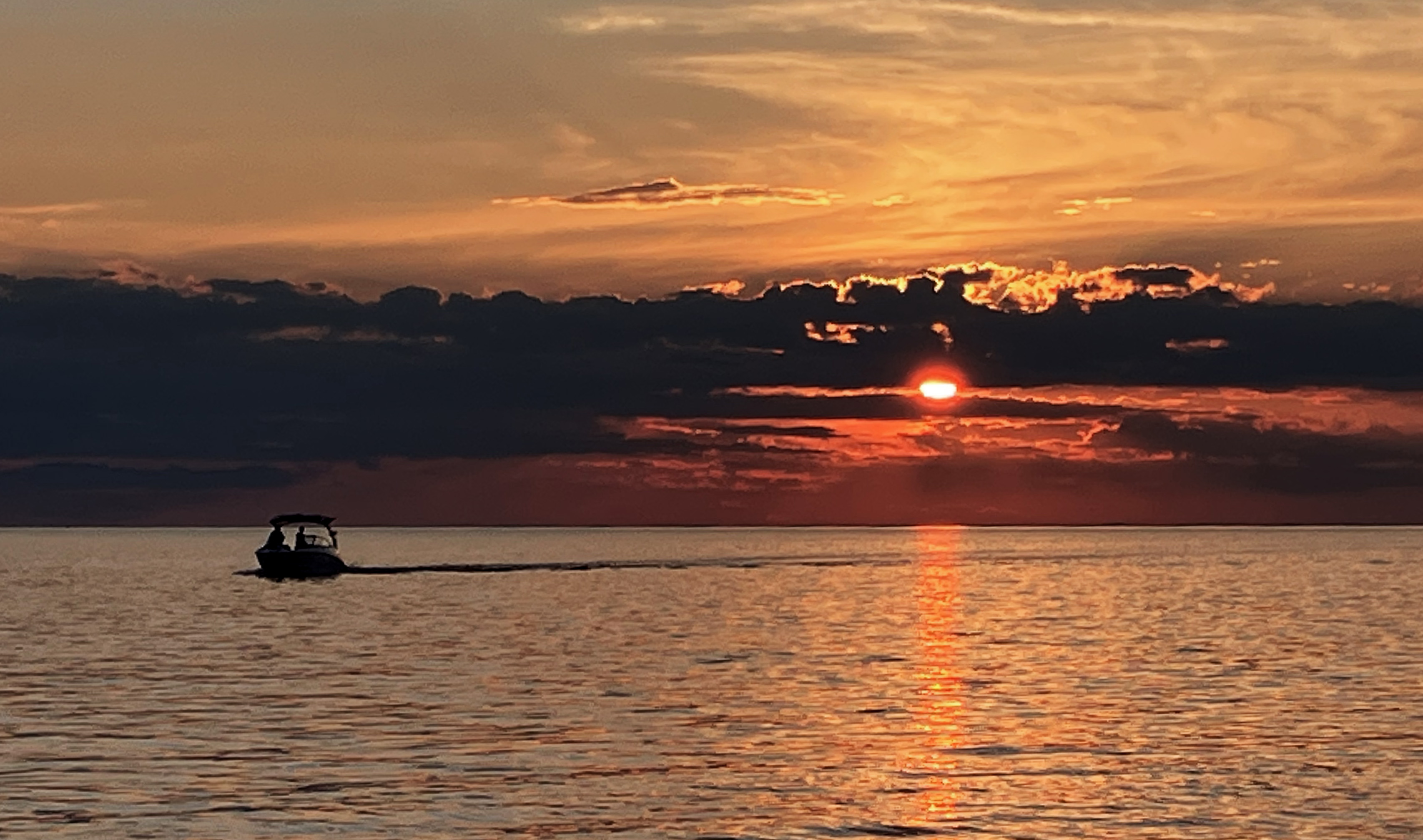
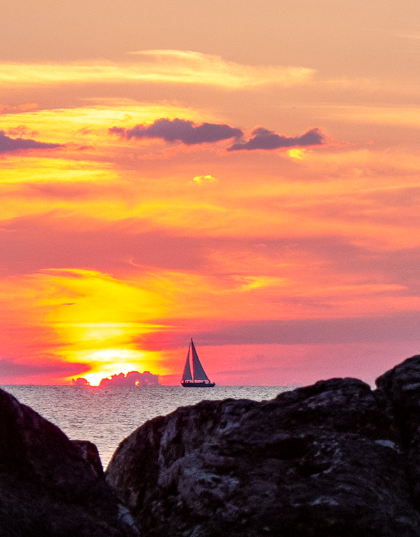
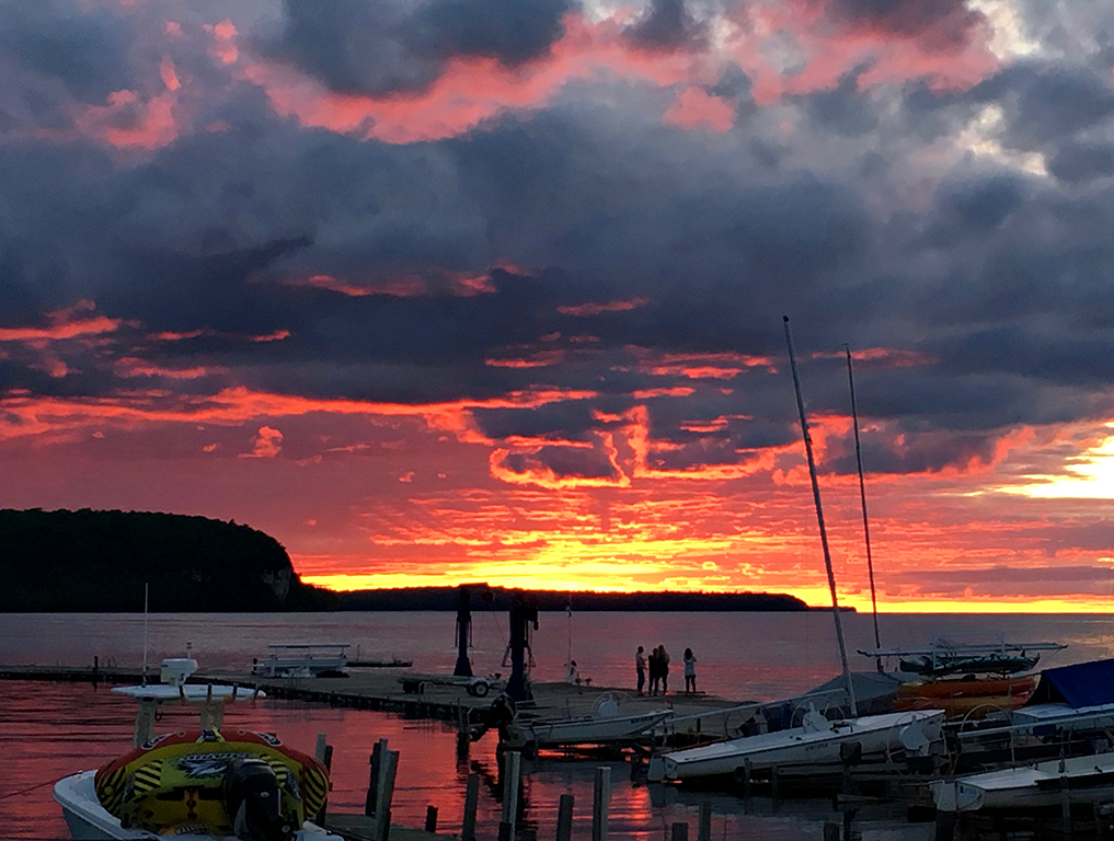
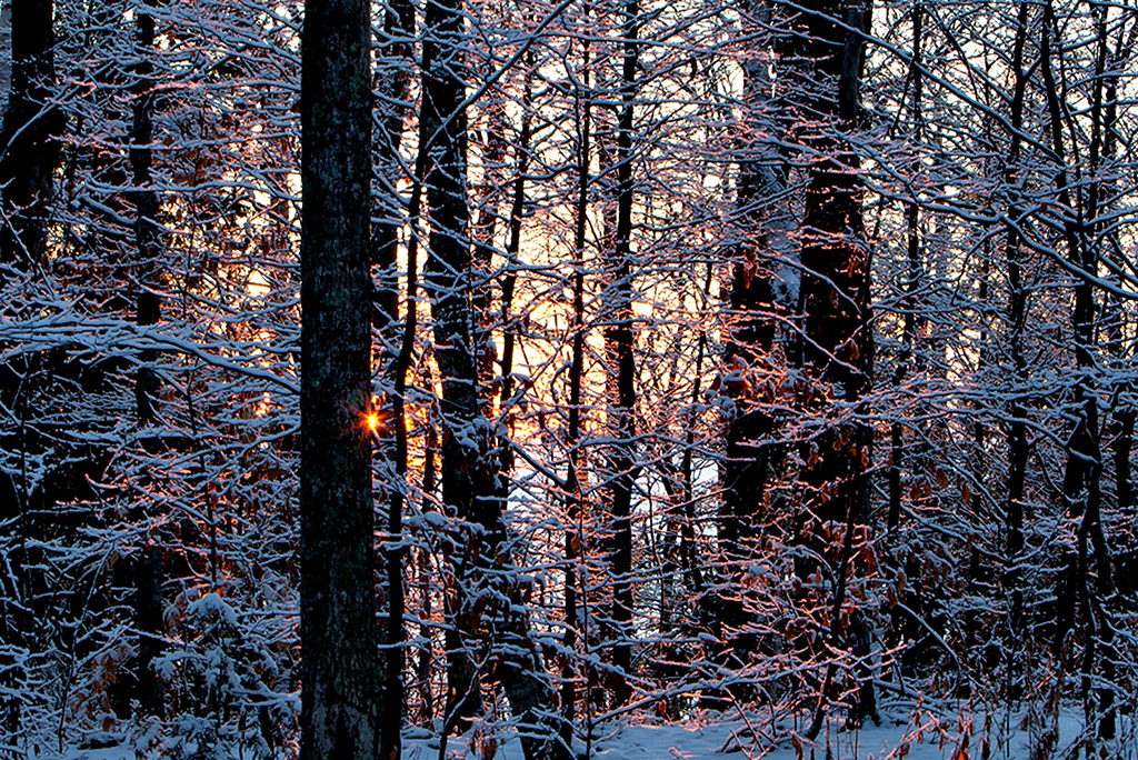
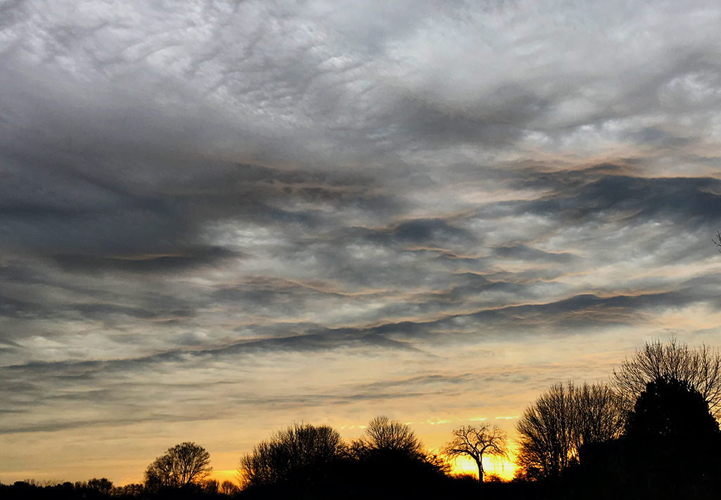
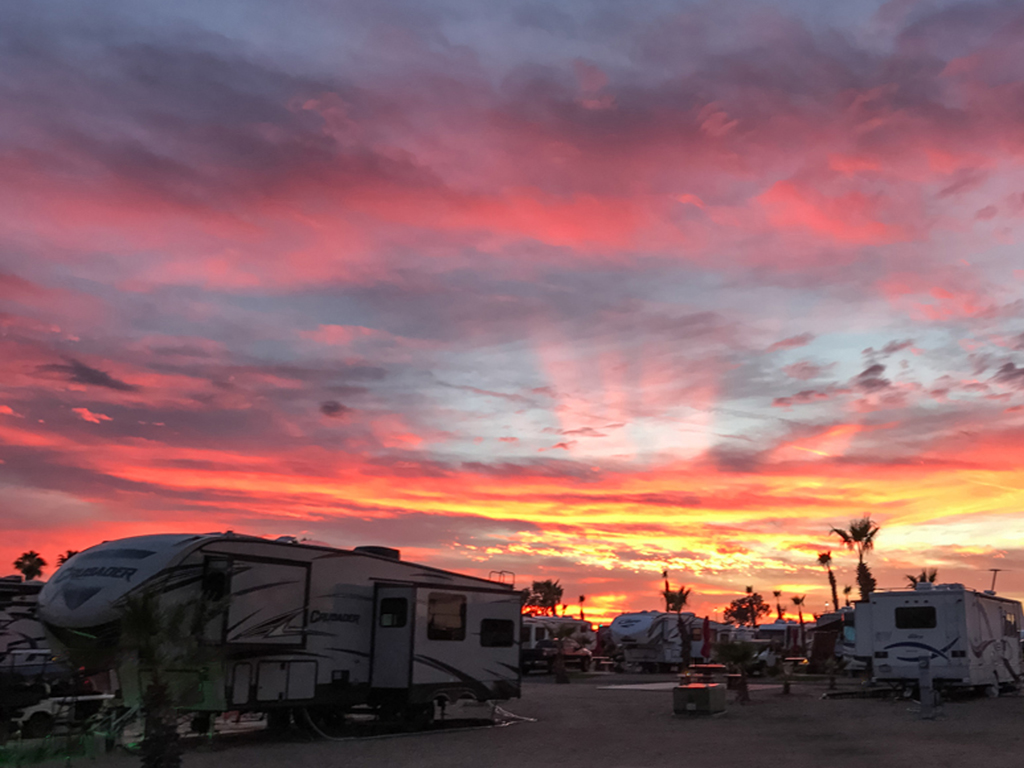
At first I felt the light rays were almost a distraction, but as I looked they did become the special feature of this particular sunset. I kind of like the palm tree for the sense of place it lends, but Vince's crop definitely has merit - now the sunset stands alone as the focal point. I felt there were several distractions in the foreground. I cloned out the trailer lights in the lower left, and reduced or eliminated several bright spots such as taillights and a window reflection. While I was at it, I decided to try leaving more of the foreground by cloning out the shiny pad in the center. I use my cell phone a lot, and it's often not possible to "get it right in the camera," but with the post-processing at our disposal many improvements and corrections are possible. This was a beautiful photo to practice on. |
Jan 13th |
 |
| 25 |
Jan 17 |
Reply |
Thanks for sending the original. It seems to me that we get a lot of information just from comparing the before and after to see what was enhanced, cropped, etc. to bring out elements or feelings that would have been missed without the post-processing. |
Jan 10th |
| 25 |
Jan 17 |
Reply |
Wow! You guys are incredible. I have to go back to checking horizons. You're right it's only a tiny bit, but the horizon is indeed not straight. Had I entered this in competition and done poorly, I would not have guessed this had counted against me. Thanks. |
Jan 10th |
| 25 |
Jan 17 |
Comment |
What an absolutely fascinating story. I've been a typist most of my life (I think my mother taught me to type before I could talk), so I fondly recall those wonderful manual typewriters. I took several years of German in college, but this is the first time I have seen the keyboard of a German typewriter. I am mesmerized by the familiar German characters and the slight variances of the typical QWERTY layout we are accustomed to.
I think the choice of sepia is perfect for this photo, giving it a very period look. I like the crop, especially that you left in just enough of the striker bars to truly show the vintage machine. |
Jan 7th |
| 25 |
Jan 17 |
Reply |
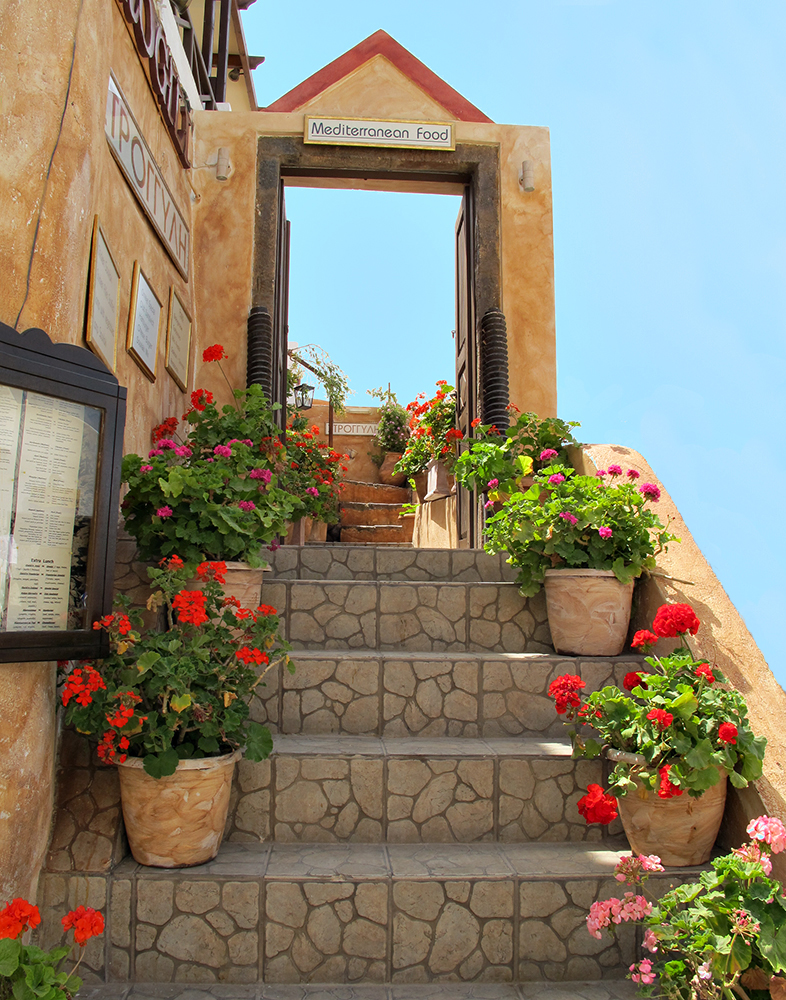
The photo you sent with the border is now posted as "Original 2" above. That was the only way I could have it shown against the black background so the border could be seen. As you can see it does show where the photo ends and the website frame begins. A wider border (I'd guess maybe 2 or 3 pixels more) would do an even better job. |
Jan 7th |
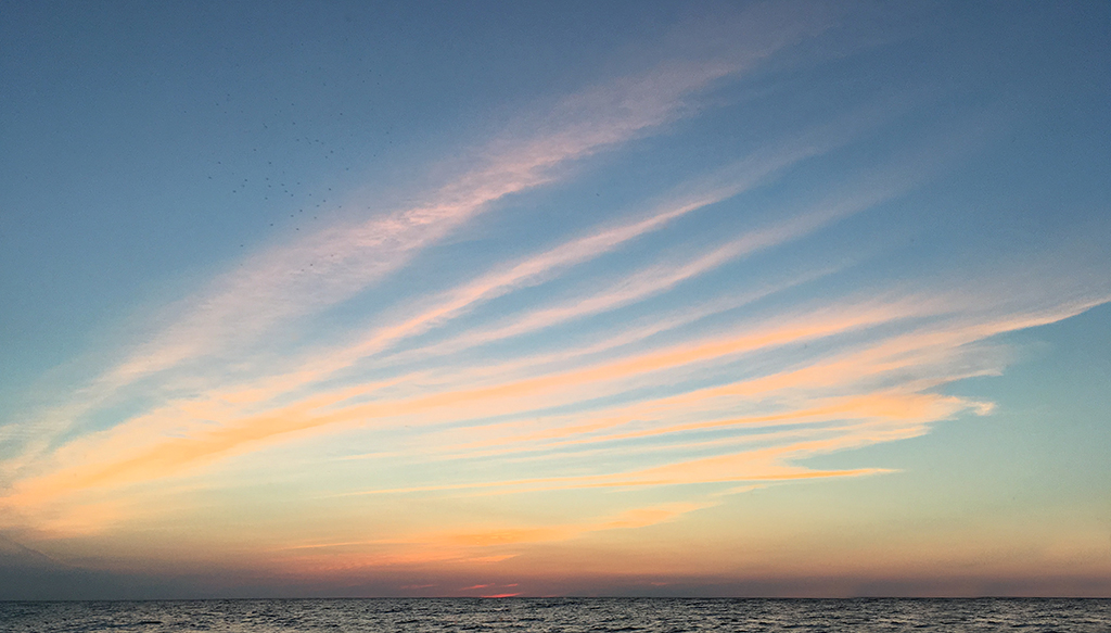
| 25 |
Jan 17 |
Comment |
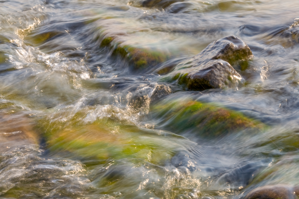
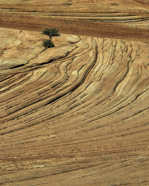
This is a scene I missed at Bryce. One can get so carried away with the wonderful formations, that this scene could easily be overlooked. I really like the positioning of the tree in the upper right third of the photo, allowing for great detail in the foreground, as well as the grand sweep of the park in the background. I would like to see where the tree goes both at the bottom of the frame and the right side, and am left to wonder whether that would have been another possible interpretation of the scene or, as if often the case, this is the best possible presentation of the subject. |
Jan 6th |
| 25 |
Jan 17 |
Comment |
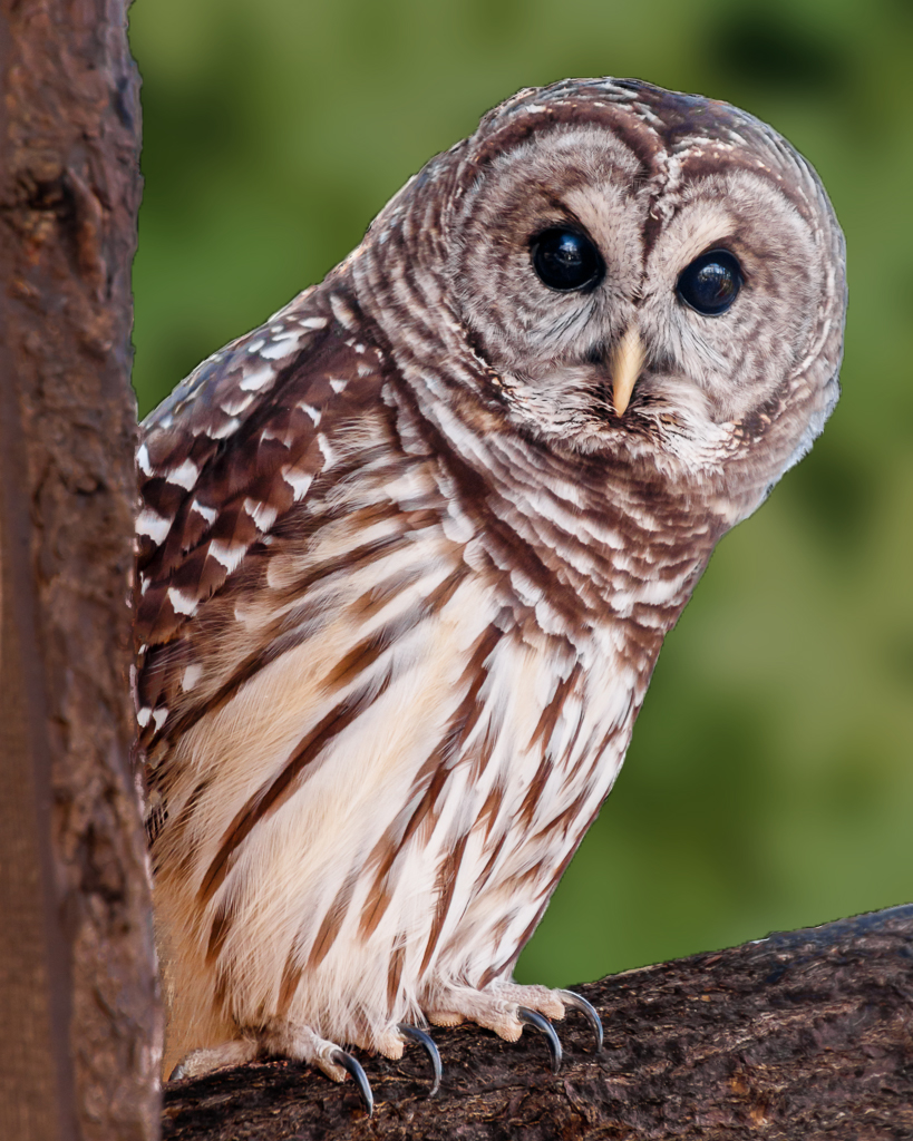
I think you did a great job with the owl, getting everything sharp and the catch light in the eyes. And I really like the way the owl is leaning into the frame. I agree the background is less than ideal, but I think the choice to go to black takes away from the naturalness of the presentation. I took the photo into Elements and replaced the background with one of their standard leaf patterns, played with the color, saturation, lightness, and blur until it looked somewhat natural, and saved it for the thumbnail. If you prefer the black background, I think it would help for displaying on our website to put a stroke around the photo to separate it from the background. |
Jan 6th |
 |
4 comments - 4 replies for Group 25
|
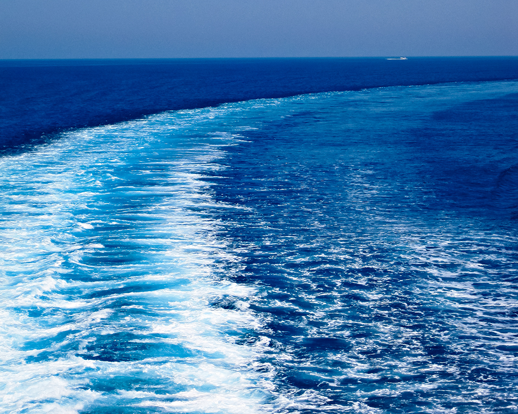
| 52 |
Jan 17 |
Comment |
Hello John, thanks for the comment on my photo. Good to hear from you - we are well. I agree your image is wonderful as it is. The colors in the Caribbean are spectacular and I think you captured them beautifully. |
Jan 27th |
1 comment - 0 replies for Group 52
|
5 comments - 4 replies Total
|