|
| Group |
Round |
C/R |
Comment |
Date |
Image |
| 41 |
Mar 18 |
Comment |
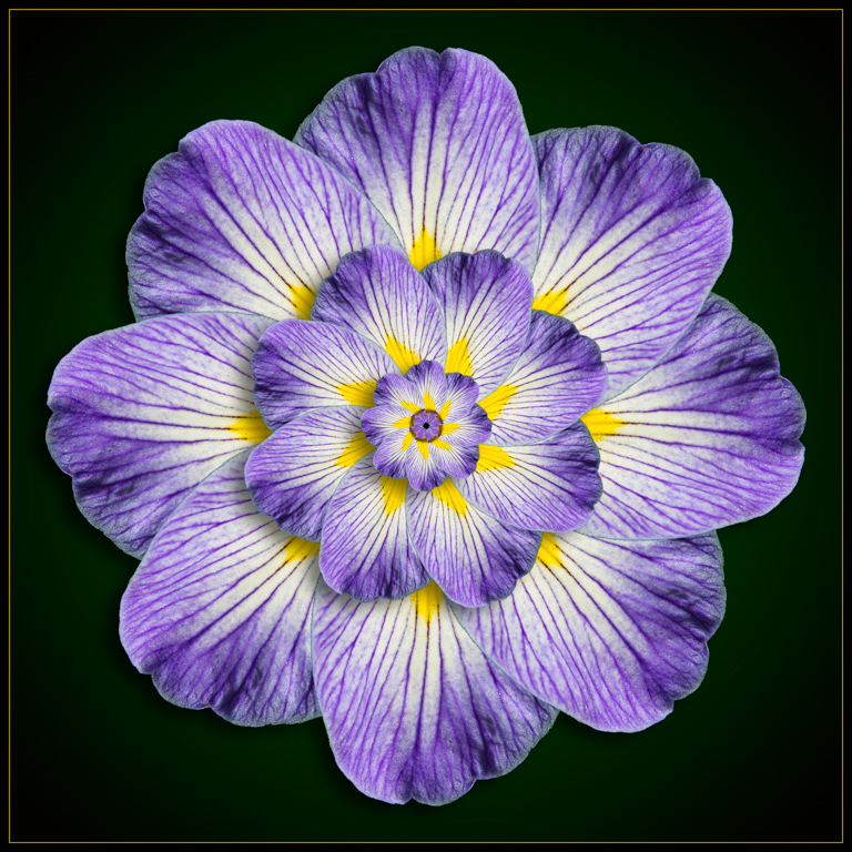
The blue and yellow work well together and I like the way they are refracted by the ridges in the glass. |
Mar 25th |
| 41 |
Mar 18 |
Comment |
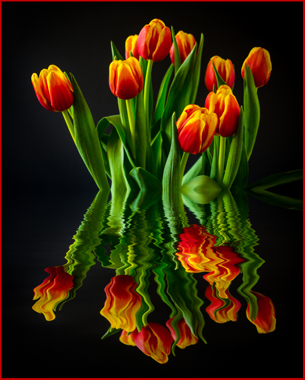
Interesting how the shadows in the rocks in your Original image #2 blend with the top image to make it appear as though the doorway and balcony have been severely damaged. |
Mar 25th |
| 41 |
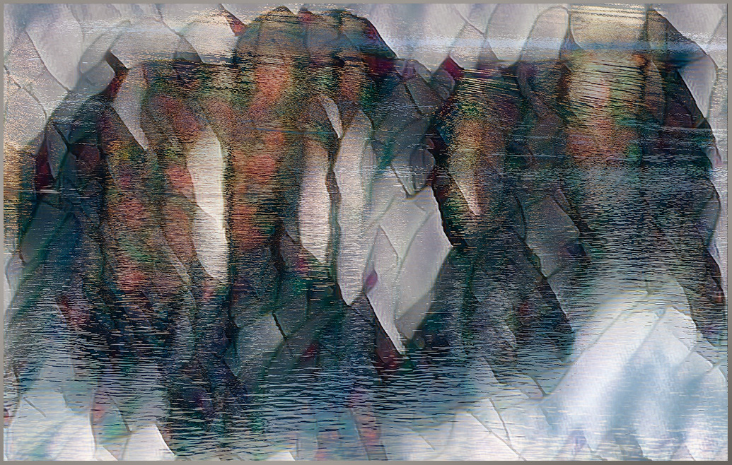
Mar 18 |
Comment |
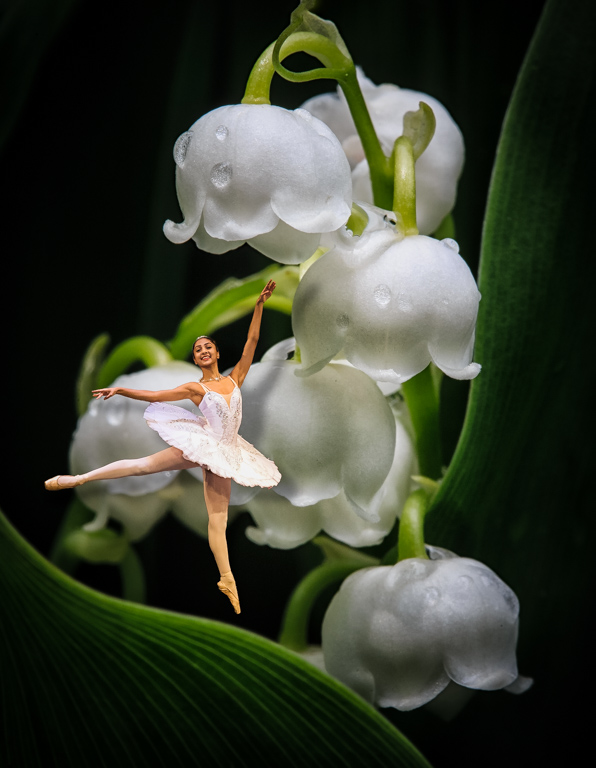
I'm not sure of what this is. I can see the water through what looks like maybe stained glass or sheets of broken ice? I think maybe it would be more exciting if the color and contrast were boosted. I used the Pro-Contrast preset in Nik Color-Efex to give it the boost I thought it needed here. |
Mar 25th |
 |
| 41 |
Mar 18 |
Comment |
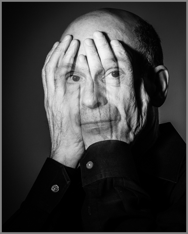
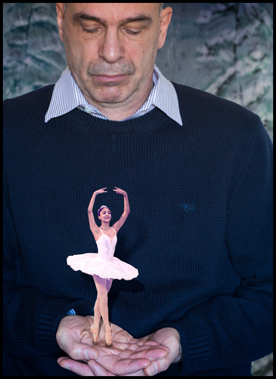
I like the composite but I agree that it would be better if you eliminated the top hat. The top hat just leaves me confused as to what it is, why is it there and how does it support the other elements? The sepia tone works well and the bearded gentleman looks very soulful. |
Mar 25th |
| 41 |
Mar 18 |
Comment |
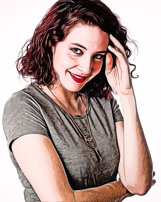
Thanks Lisa for your helpful advice. I didn't realize how rough the arms looked until you pointed it out. |
Mar 13th |
5 comments - 0 replies for Group 41
|
5 comments - 0 replies Total
|