|
| Group |
Round |
C/R |
Comment |
Date |
Image |
| 41 |
Oct 17 |
Comment |
I like how you've extracted the fighting knights and placed them into a much more pleasing background. The flare at the end of the sword adds a touch of magic. The whole image seems a bit dark and muddy to me though. I suggest that you increase brightness and contrast and try to remove what seems to be a green cast from the knights. |
Oct 13th |
| 41 |
Oct 17 |
Comment |
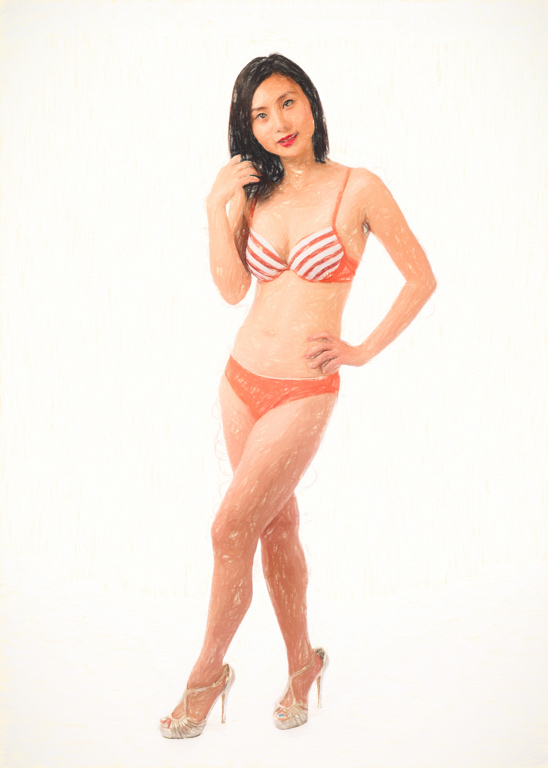
The bright lights in the original image are a problem to me. I like the way you've brought back the curtain detail in the windows. I suggest that you eliminate the bright diagonal line in the original image and bring back the curtains in the windows as you have done. No need to transform the image into a circle. |
Oct 13th |
| 41 |
Oct 17 |
Comment |
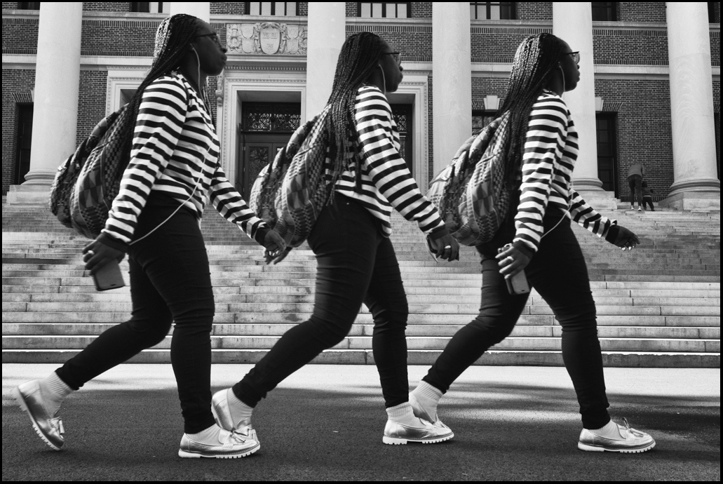
It seems a bit busy to me. Not sure that I like the way the horizontal and vertical lines cross through the bird, especially the line that goes through the bird's eye. I like all three images individually, especially the painting, but the blending of the three does not work for me. |
Oct 13th |
| 41 |
Oct 17 |
Comment |
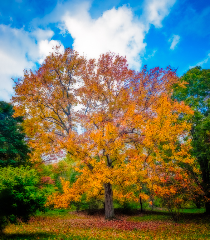
I like the effect of the lens flare and textured sky. Makes it look more interesting than the original image. |
Oct 13th |
| 41 |
Oct 17 |
Comment |
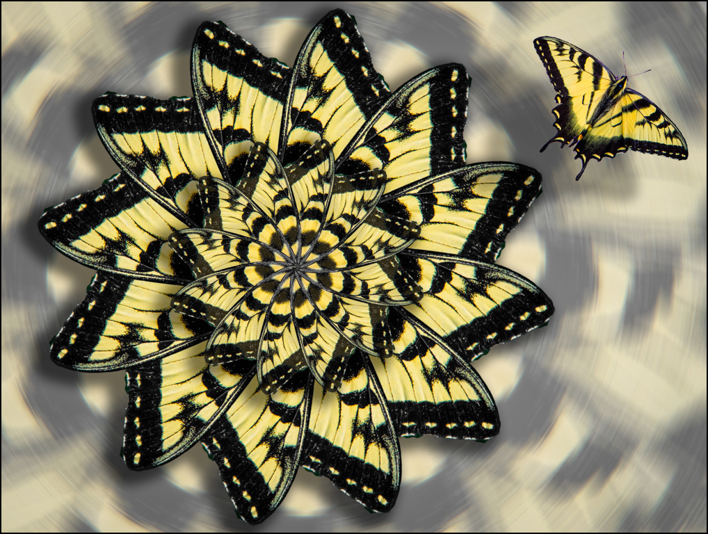
I like the watercolor effect. I'm having trouble though with your perspective adjustment which seems to make everything shorter and the buildings loose some of their grandeur. This can be resolved by simply transforming the vertical scale of the image after the perspective adjustment has been applied, as I've done in the attached image. Here, I've increased the vertical scale from about 2.5" to 3". Then you can apply the watercolor action. |
Oct 13th |
 |
5 comments - 0 replies for Group 41
|
5 comments - 0 replies Total
|