|
| Group |
Round |
C/R |
Comment |
Date |
Image |
| 41 |
Aug 17 |
Comment |
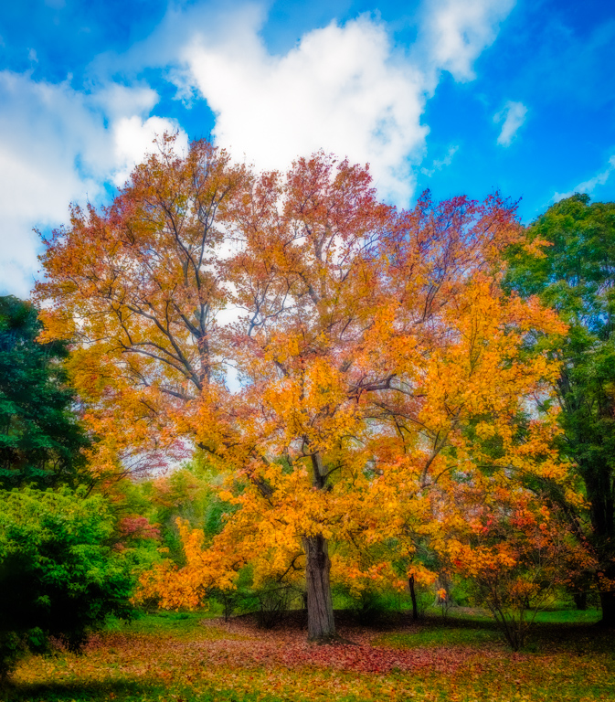
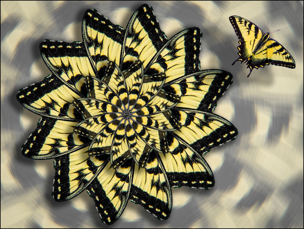
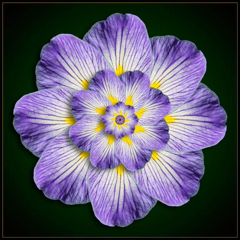
Very nice effect. Reminds me of a windy day. I think you could loose the stem on the flower. Normally I would say that the stem is needed to anchor the flower, but here I think it just breaks up the swirl. |
Aug 14th |
| 41 |
Aug 17 |
Comment |
Its a great shot of the horses and carriage, but the background trees are a distraction. The cloning of the background is noticeable. The treatment of the road seems a bit overdone and I see quite a bit of noise there. I agree with Charles in that the gray road is better left as is. If you can replace the background trees with something else entirely, I think you might have a better image.
Wishing you a speedy recovery. You've done very well to work through this. Keep up the good spirit! |
Aug 14th |
| 41 |
Aug 17 |
Comment |
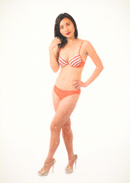
This has a nice soft feel to it. Almost like a watercolor painting. You used a good recipe. I think you could crop a little more on the left side, but it looks good as is also. |
Aug 14th |
| 41 |
Aug 17 |
Comment |
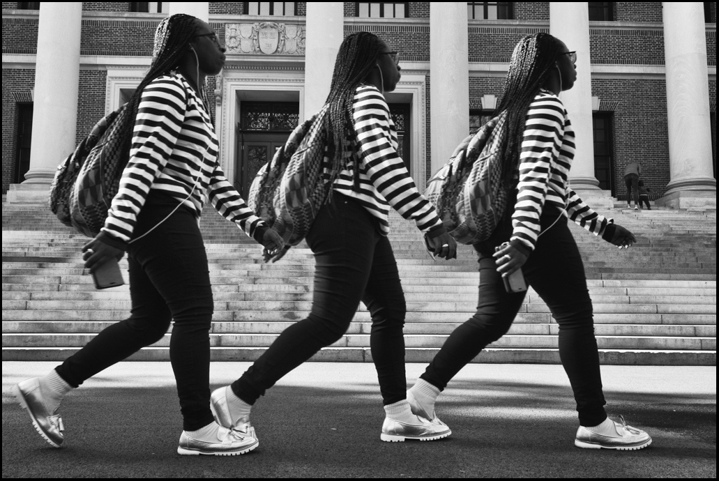
I would have never thought to blend these particular images, but somehow it all works out. The lines, shapes, colors and texture are blended into a pleasing mix of rich toned architecture. Great idea for an abstract image. |
Aug 13th |
| 41 |
Aug 17 |
Comment |
This is a great idea and well executed. I am drawn in by the "light" at the end of the tunnel. The man at the rear is in perfect position, looking like he is angling the boat into the tunnel. I would love to see the article, but the Photoshop Creative magazine is very hard to get and expensive here in the US. |
Aug 13th |
| 41 |
Aug 17 |
Comment |
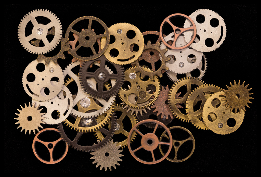
Carol, I'm having a tough time with this because I see some problems with your original image that I don't think can be overcome. The lighting has produced some blown-out reflections that I don't think you can recover with any post-processing technique. I think the lighting should have been softer and perhaps coming from different (lower) angles. I also think that the watch gears need to be arranged more neatly - there is too much chaos in the arrangement that you have here. I want to see the details in the gears, but the lighting and arrangement are not allowing me to do so. I attach an arrangement of gears that I photographed at a macro photo conference a few years ago - I cannot take credit for the arrangement that was done by someone else, but perhaps this can be used as an example of a more interesting way to do this, if you still have the watch gears. I think I used a diffuser to soften the overhead light that I had to work with. |
Aug 13th |
 |
6 comments - 0 replies for Group 41
|
6 comments - 0 replies Total
|