|
| Group |
Round |
C/R |
Comment |
Date |
Image |
| 3 |
Aug 19 |
Comment |
To me this image is all about the relationships of the subjects. The chairs are the primary subject. But each featured subject is distinct. Blue sky, white railing, red deck and yellow chairs. I like the color contrast of blue and red with the white dividing lines. The splash of yellow draws obvious attention to the chairs. Three chairs create interest more effectively than two or four chairs might. The lines are the glue that draw these distinct subjects together (deck, railing and horizon).
The cropped version eliminates the shadow which helps but it causes the primary subject to be more centered which isn't as interesting to me. The center chair impinges on the line of the railing. A slightly higher perspective would create a separation between the chair and rail causing even more distinction for the chairs as primary subject. seeing this image and visualizing your photo on the spot is an admirable skill. Nice capture! |
Aug 29th |
| 3 |
Aug 19 |
Comment |
Beautiful. Tack sharp within the desired depth of field, perfect detail of the pollen on the bee. The bee is positioned well so the viewer sees the face. The shallow depth of field draws attention perfectly to the bee and the stamen. Really nice. |
Aug 29th |
| 3 |
Aug 19 |
Comment |
Kieu Hanh You always take full advantage of the opportunities in DC. I am sooooo jealous... :-) Exposure, focus, aperture setting, white balance, ISO and shutter speed all came together well. Your composition is great. Not only do you get great reflection of color in the water, you capture the experience of the boaters. Really nice. The only feedback I might have is the fireworks on the left side of the frame are slightly crowded. I realized with a display like this you can't predict the best composition in advance. Would there have been a way to exclude the two smaller, lower bursts on the right edge of the frame and allow for more space on the left side of the frame?? |
Aug 29th |
| 3 |
Aug 19 |
Comment |
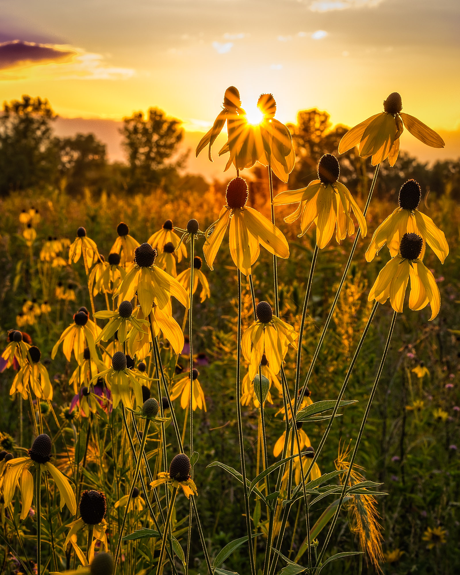
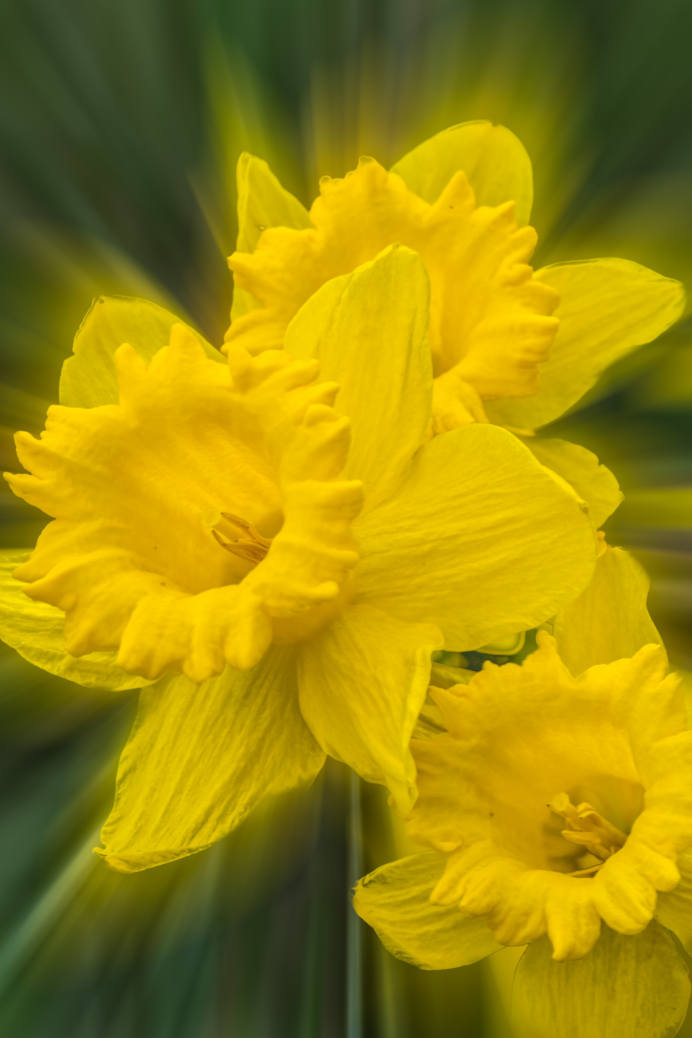
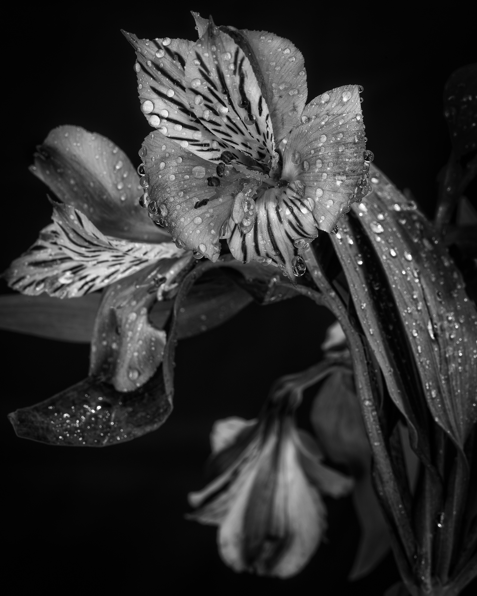
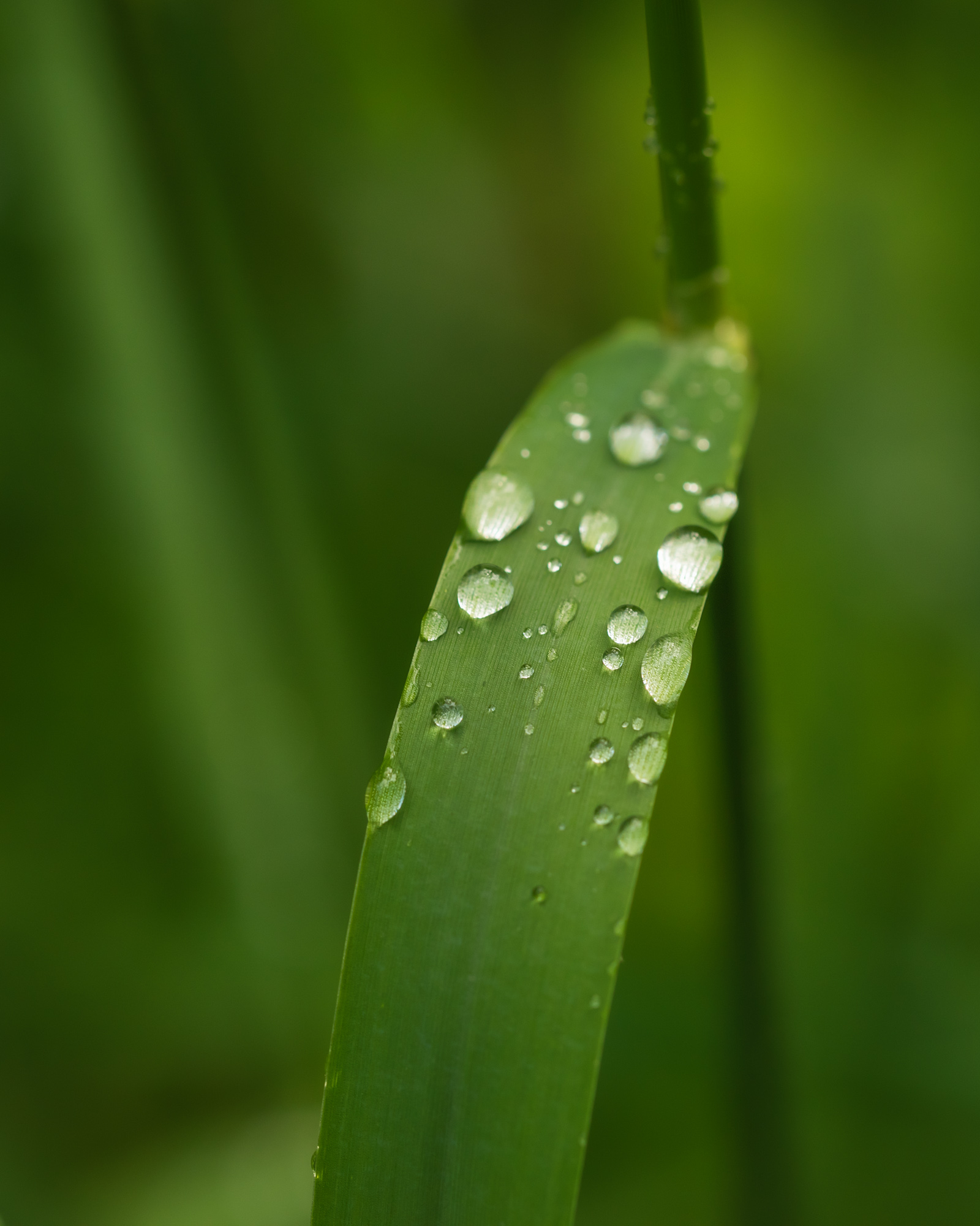
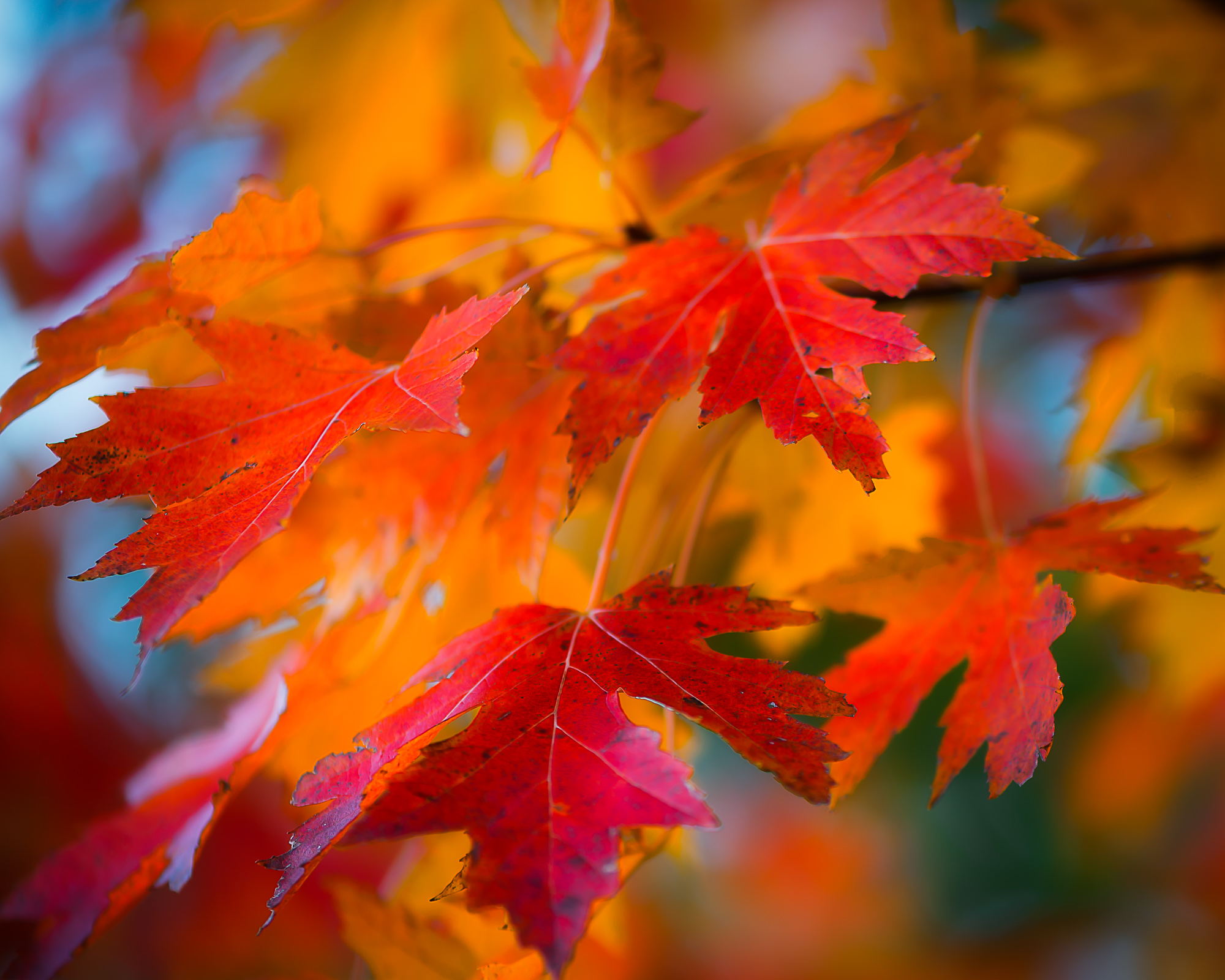
I enjoy the rich color and the shallow depth of field that still allows for a sense of place, relationship or environment. The vertical line clearly fit well with a portrait format. Composition is good. While the leaf in focus at the bottom left of the frame fills space and creates balance, because it is in focus I find it just a bit distracting. The top left corner has an area of negative space but I don't have a good suggestion on how to address that... The blur is nice.. There is a glow tool I use frequently in OnOne Photo Suite that has a similar effect. |
Aug 29th |
| 3 |
Aug 19 |
Comment |
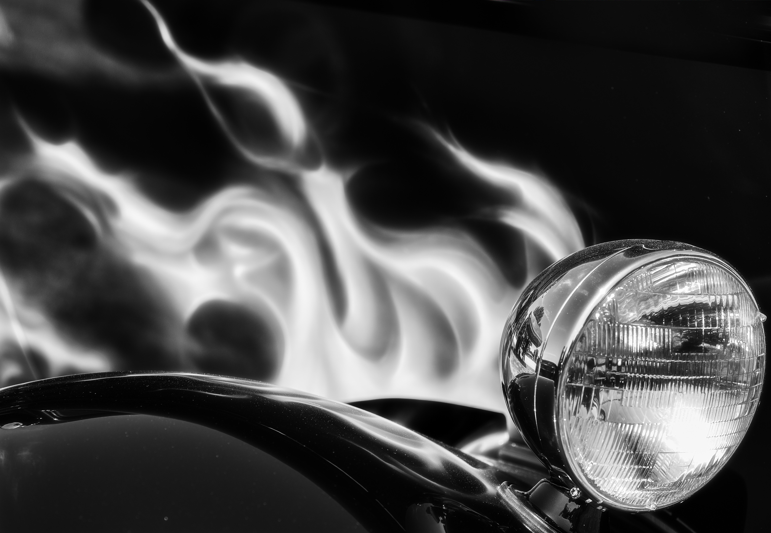
The neon colors and sharp contrast to the dark background make this image stand out. I agree it almost looks like a model. The light spilling into the foreground takes slightly away from the isolated geometry and color of the building but all in all this is a fun, unique shot. |
Aug 29th |
| 3 |
Aug 19 |
Comment |
I am all about symmetry, leading lines and vanishing point. The way you stacked the geometry in this photo is great. While the bottom portion of the image does create a bit of negative space and I can see the benefit of cropping, I believe that portion of the image creates a sense of environment that isn't present in a cropped version. The full image makes me feel like I'm standing at the gate looking in. |
Aug 29th |
6 comments - 0 replies for Group 3
|
6 comments - 0 replies Total
|