|
| Group |
Round |
C/R |
Comment |
Date |
Image |
| 3 |
Feb 19 |
Comment |
Wow! This is a really cool image. The strength is obviously color and composition; more so composition. You fill the frame with the peacock in an interesting, eye catching way. The head on perspective with the offset subject balanced by the splayed feathers creates primary interest with continuity across the frame. Just the fact that the head of the bird is "cocked" between spots adds character. The spots of the tail feathers are well balance and create a comfortably patterned blanket across the image. The line of spots at the base create a frame that keeps my eye inside the image. The foliage at the bottom of the frame is ok but perhaps a more shallow depth of field or darkening the area would eliminate clutter.. |
Feb 24th |
| 3 |
Feb 19 |
Comment |
I'm learning a lot from your still life project. This has the style of the Dutch Golden Age of painting. Your composition is very good. Clearly you're studying the relationships of shapes and subjects in conveying the story within your images. The lighting is nuanced and delicate. I'd like just a slight bit more depth and less shadow at the top of the image to reveal the containers. The muddle has a slight glare but that surface is difficult to control. I wonder if powder such as cinnamon or nutmeg dusted on the surface of the muddling bowl would help.. ?? |
Feb 24th |
| 3 |
Feb 19 |
Comment |
I like the lines within the image. My eye starts low in the bottom left corner and follows the dragon up to the right. Then I look at the people and my eye sweeps across the top to the left. I can feel the movement and excitement of this event. It feels a bit crowded at the bottom of the image. I think leaving more space at the bottom and slightly more at the left side would help with the sense of environment or total experience. |
Feb 24th |
| 3 |
Feb 19 |
Comment |
These two have provided fun subjects for your images before. They always make me smile. Yes the eyes are a bit dark. Catch lights in the eyes always bring a bit more interest and character to portraits. I am by no means a lighting expert; I wonder if a slight fill flash or reflector might have eliminated the shadows. Your depth of field / bokeh is good. The white / colorless sky at the top creates an abrupt transition for me but it does allow for a good outline of the girls. I don't think I'd necessarily make it darker but a different color or variety of colors might help me... This definitely says loving playful young girls. |
Feb 24th |
| 3 |
Feb 19 |
Comment |
This is an interesting shot accompanied by your explanation. The quality of your image is very good. The color contrast and center placement draws the viewer's eye directly to the grasshopper. This image would be great for a brochure or insect book. A different perspective, slightly different composition or capturing movement might create even more interest and tell the story of the grasshopper. |
Feb 24th |
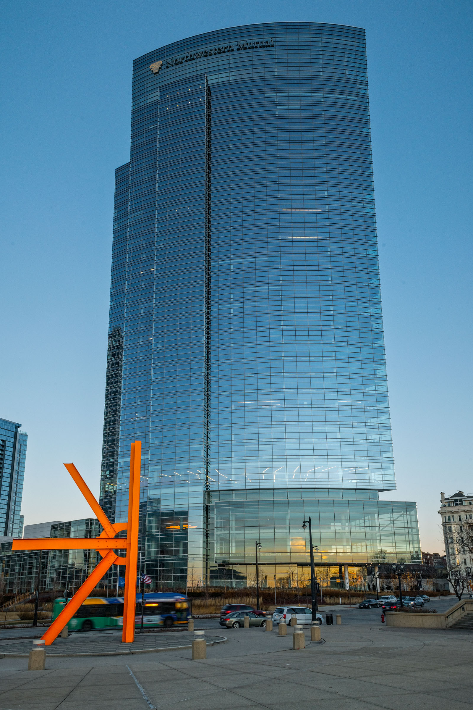
| 3 |
Feb 19 |
Comment |
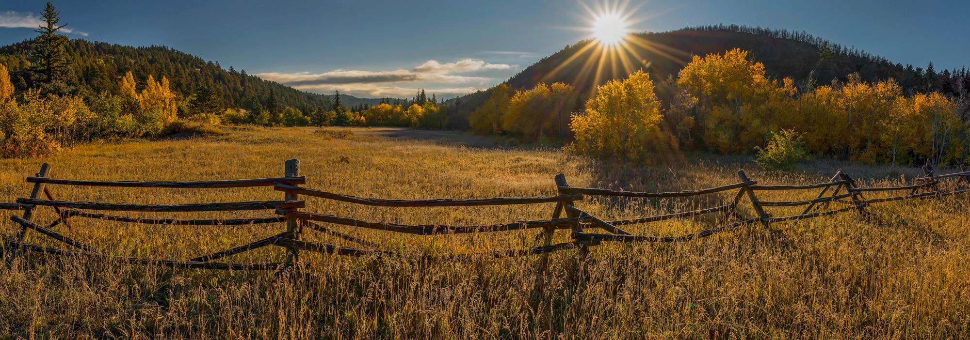
This is a beautiful cityscape. Your composition is well balanced both horizontally and vertically. The colors provide nice variety and interest. The f stop with a sharp focus creates nice star burst effects to add interest. A tighter crop at the bottom or a more upward perspective might reduce the bit of dark negative space in the water at the bottom.. |
Feb 24th |
| 3 |
Feb 19 |
Reply |
Thank you Mark. I might give that a try... |
Feb 24th |
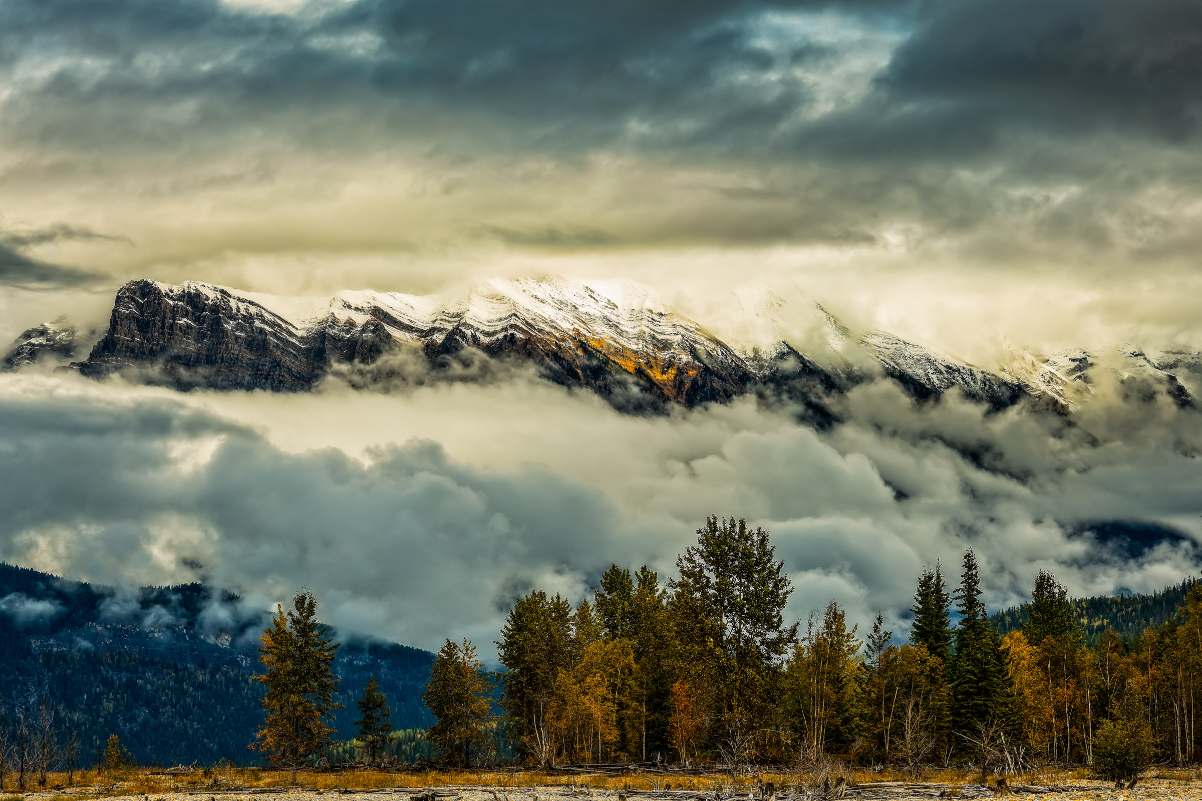
| 3 |
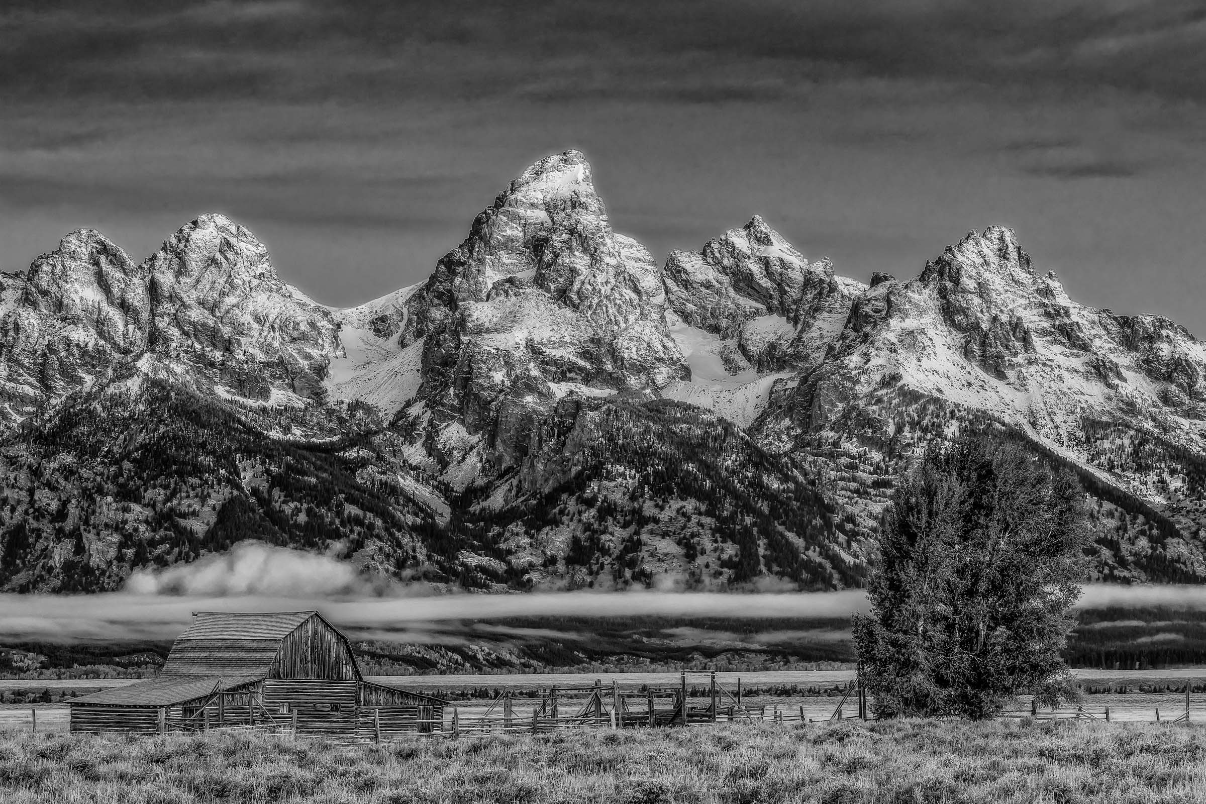
Feb 19 |
Reply |
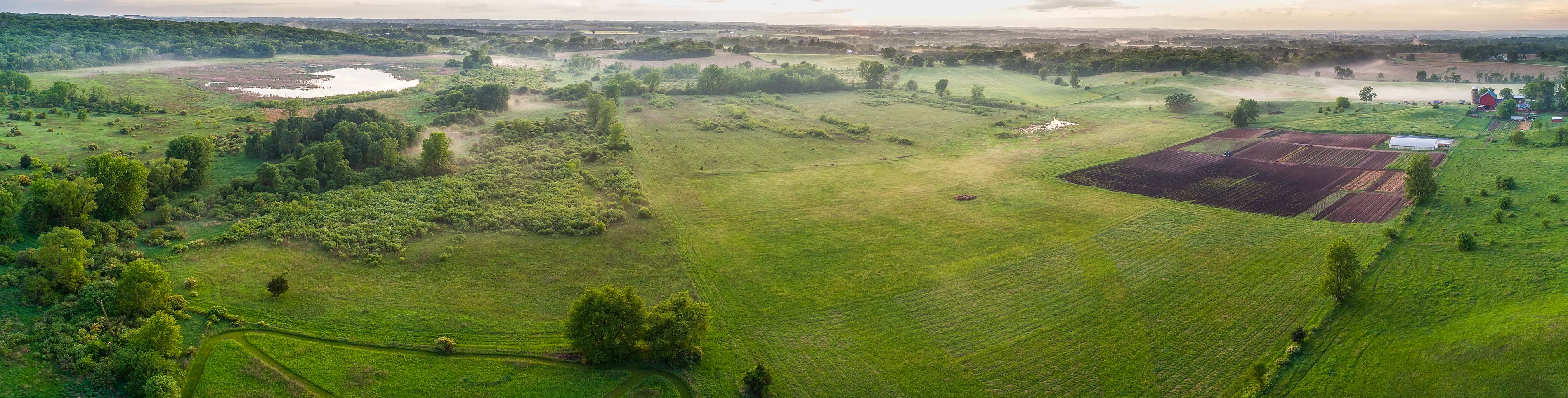
Randy, The gold color is an area of low ground cover bushes right the tree line. Yes the valley goes all the way to the base of the mountain. During last fall in British Columbia the mist wouldn't clear from the mountains at least until noon. |
Feb 24th |
6 comments - 2 replies for Group 3
|
6 comments - 2 replies Total
|