|
| Group |
Round |
C/R |
Comment |
Date |
Image |
| 3 |
Jan 19 |
Comment |
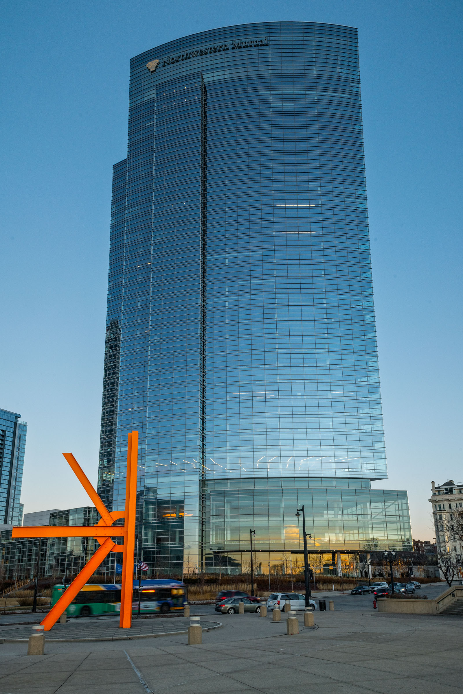
I tend to like the blue sky version better; perhaps with a bit less shadow on the building itself. As I think about it your original and Ruth's edit may make a better fit with the mood and story of your overall exhibit. Focus is good, composition is good, balance, contrast and lighting are all good. It's a neat concept for an exhibit. |
Jan 30th |
| 3 |
Jan 19 |
Comment |
I agree with the comments about the bike and the line of the bridge taking my eye to the center. What i feel makes this special is the fact that I can explore three ways in the image - over the bridge and to the center, the left down the canal and then back right down the canal. I see the benefit of the crop Kieu Hanh recommended. Little touches like that make a big difference. I'm also glad you explained the architecture of the buildings in the center. At first they look compressed almost due to lens distortion but that shouldn't be the case considering your focal length and angle. |
Jan 30th |
| 3 |
Jan 19 |
Comment |
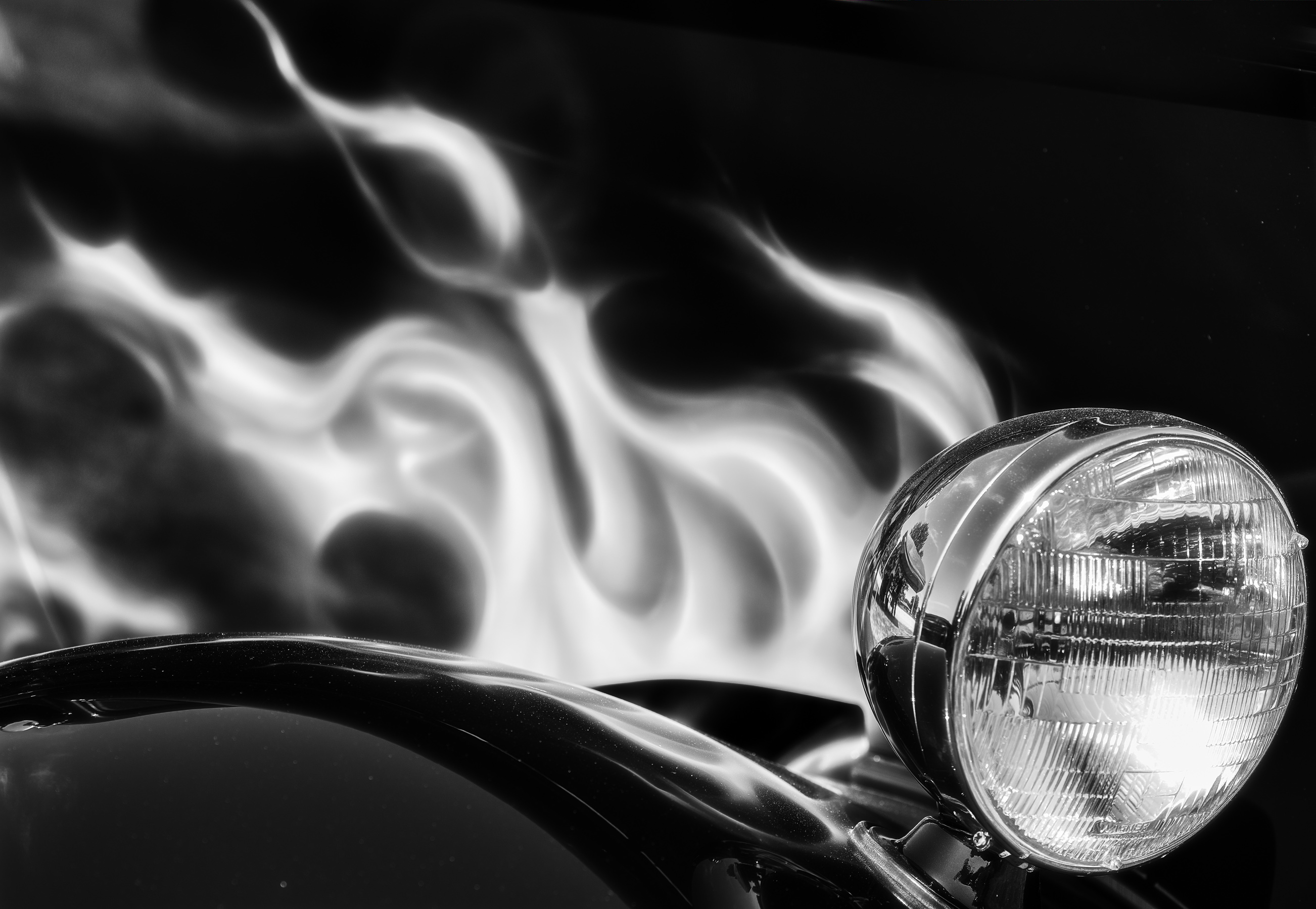
When I saw this I thought this image begged for motion. Kieu Hanh and I played around with some motion processing software that essentially creates a GIF which made the lanterns look as though they were spinning in a large circle. The color and arrangement / composition provide great contrast and balance. It feels like the image builds from a condensed base layer to a larger but more separated set of umbrellas. You have a good use of layers, contrast and symmetry. I like the fact that the dark background hides the structure supporting the lanterns. |
Jan 30th |
| 3 |
Jan 19 |
Comment |
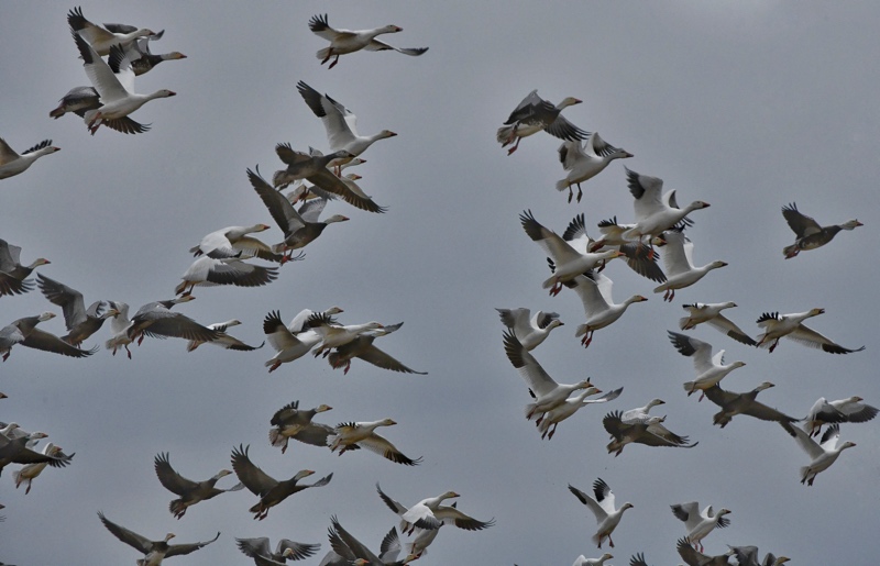
I like the cropped version you added. It draws all my attention to the bird. Great reflection, great motion, great texture and color contrast creating a catching outline of the bird against the dark background. |
Jan 30th |
| 3 |
Jan 19 |
Comment |
I like the lighting and composition of the cropped image. It is a fun story telling image. The focus isn't as sharp as it could be. |
Jan 30th |
| 3 |
Jan 19 |
Comment |
I enjoy this image. It takes my eye down the corridor and out the window but you involve enough texture and color and subject features that allow me to explore the image along the way. They perspective seems slightly shifted to the right and it throws off the symmetry just slightly. Seems like some negative space in the upper left corner.. |
Jan 30th |
6 comments - 0 replies for Group 3
|
6 comments - 0 replies Total
|