|
| Group |
Round |
C/R |
Comment |
Date |
Image |
| 3 |
Aug 18 |
Comment |
You have captured the juxtaposition and repetition of shape very well. I think the position of the brick building is good. The fact that the chimney does not extend past the roof line of the building behind is key. In fact keeping it at the roof line as you have adds to the juxtaposition. Any shorter and it would be a bit distracting - taller and it would feel visually loose or unresolved. Color, lighting, focus and texture are all good. You're right a few people would really add to the image. |
Aug 30th |
| 3 |
Aug 18 |
Comment |
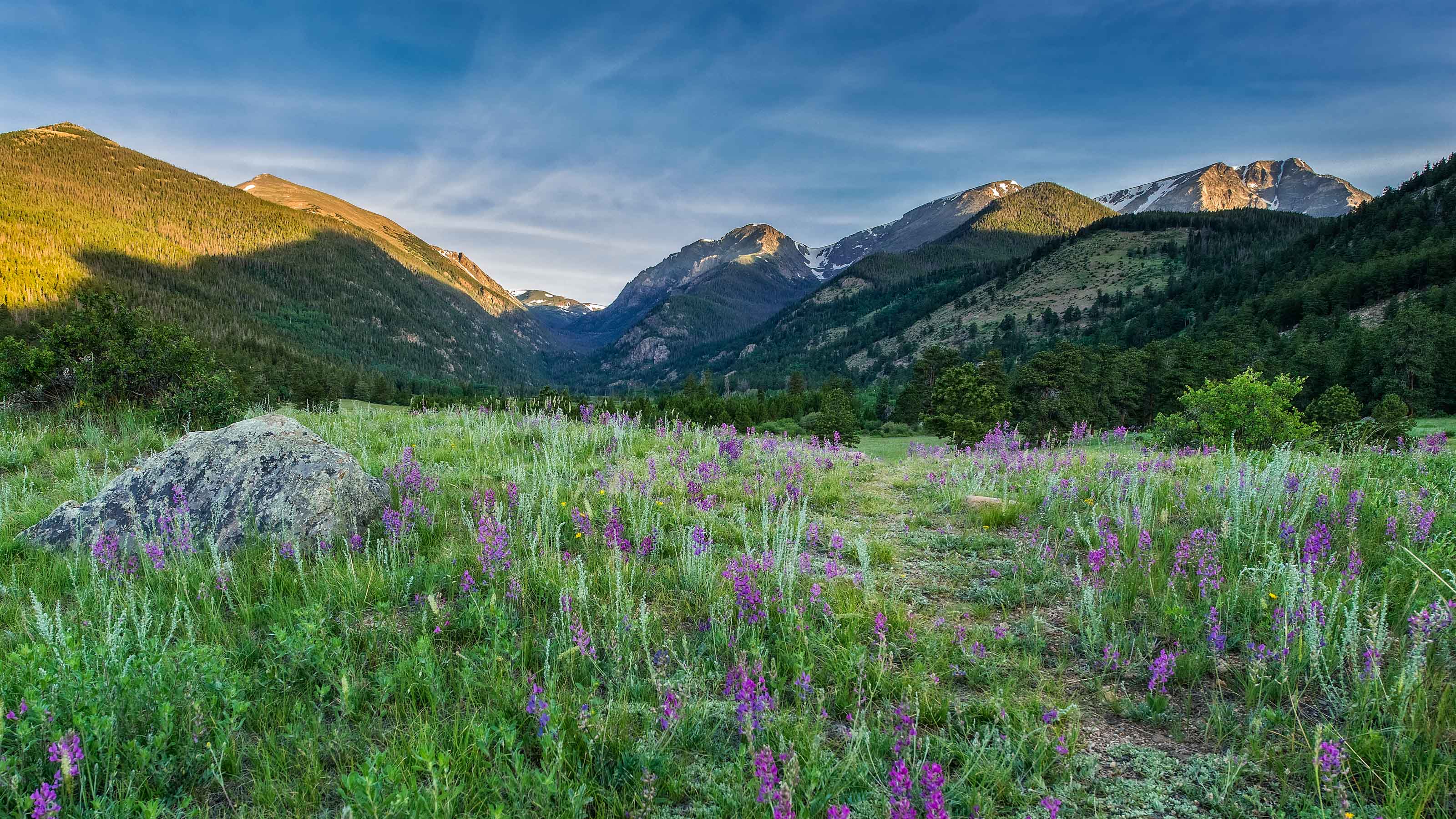
It is a good travel image.. The composition draws my eye to the center tower / steeple. I think the shadows could be lightened to reveal more detail and I'd increase clarity and saturation just slightly. There's a bit too much negative space in the top left corner. There's also a dust spot in that area of the image. While the gray clouds create a visual frame they feel like they lack texture. Again I wonder if clarity and saturation or an HDR enhancement in this area could help. |
Aug 30th |
| 3 |
Aug 18 |
Comment |
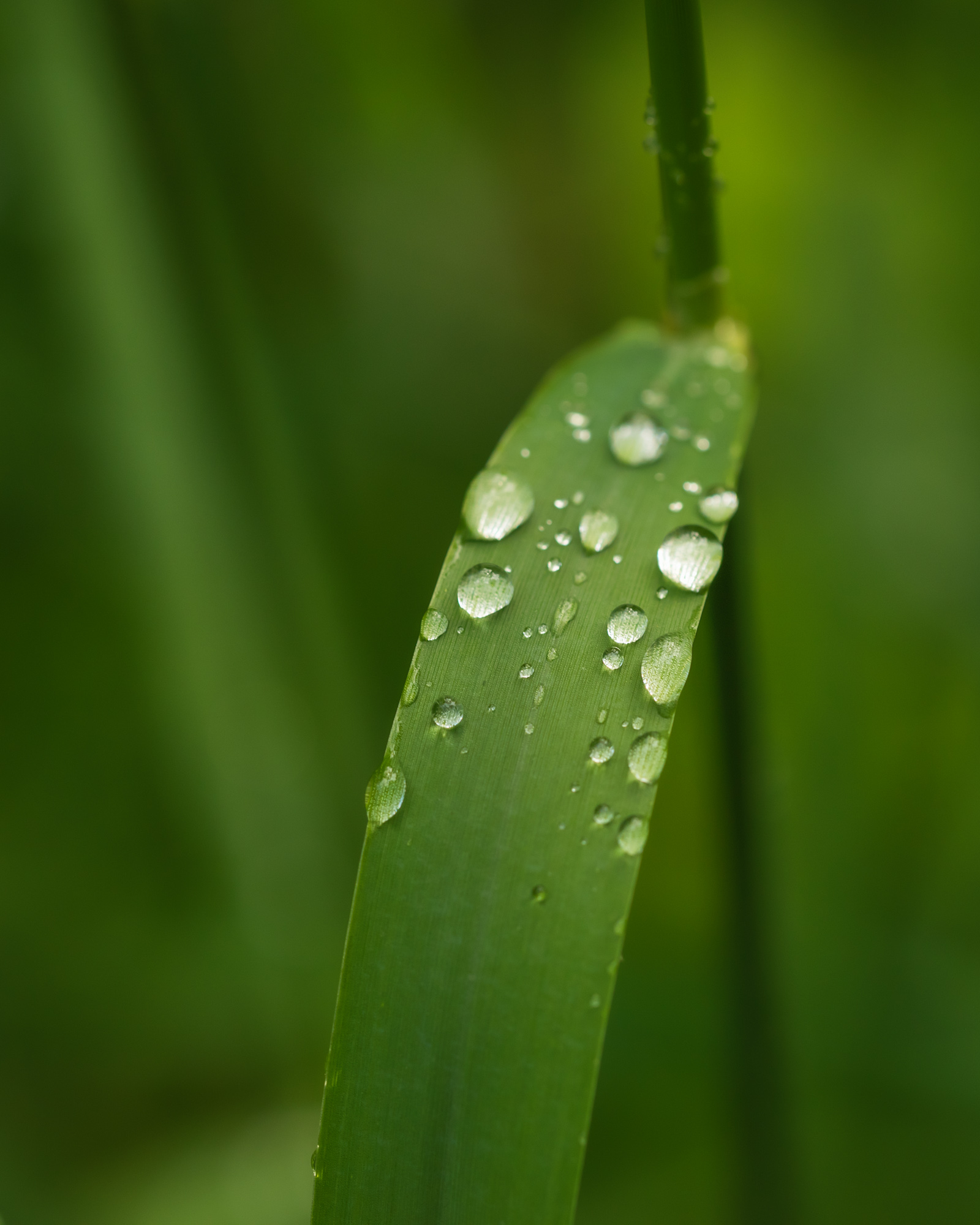
Ahh Ruth you beat me to it... I was paddling a northern lake this summer enjoying the water lilies. This image is composed very well. My eye moves upward beginning with the reflection of the flower then moving through and stopping at the small lilly pad at the top. The configuration of the lilly pads fill the frame well and create balance but allow space around the outside which maintains strength of the primary subject. Placement of your primary subject is good - almost a classic golden spiral. Focus, detail, shading and texture all come together very well in the B&W. The color image is a bit harsh and over exposed losing detail... |
Aug 30th |
| 3 |
Aug 18 |
Comment |
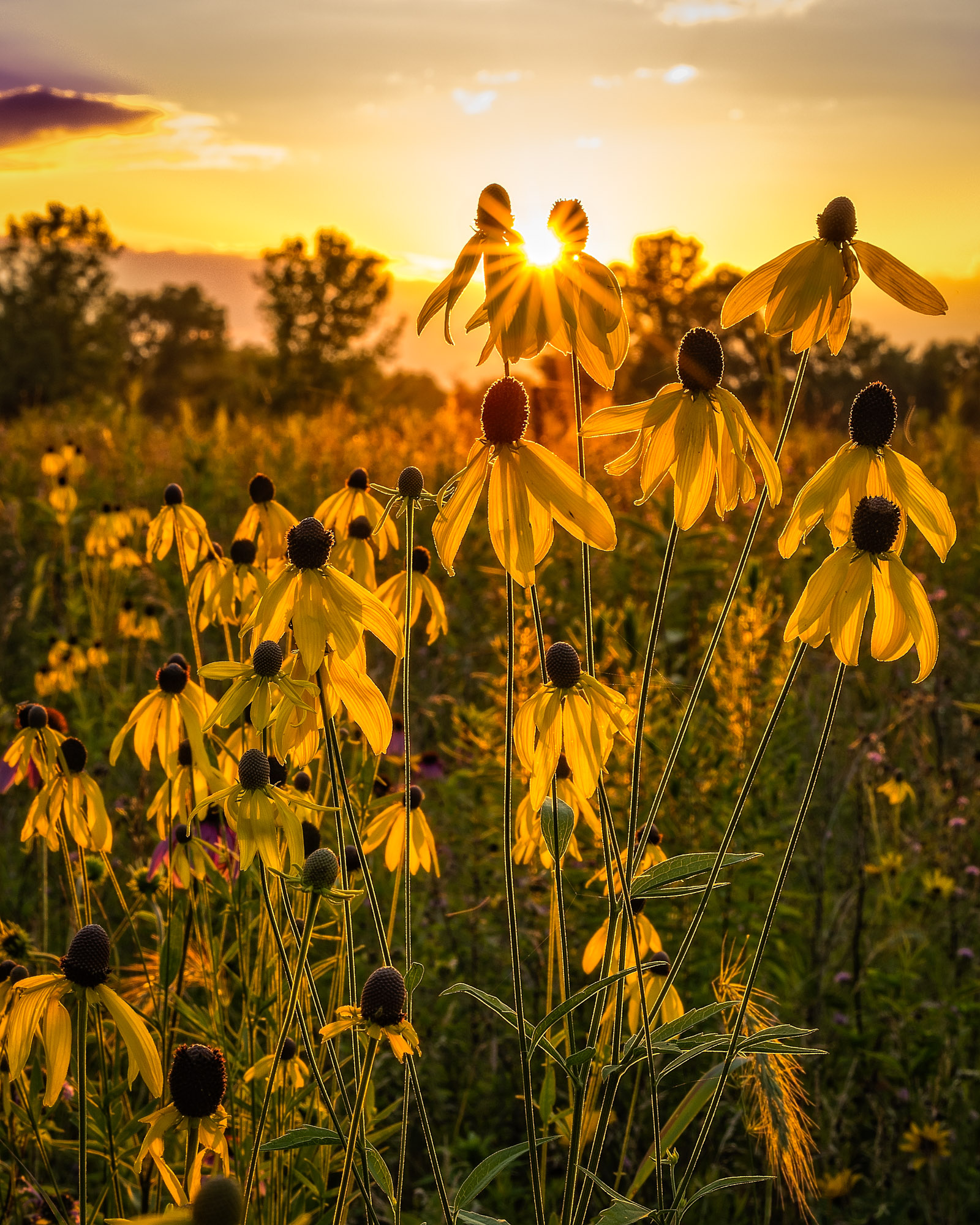
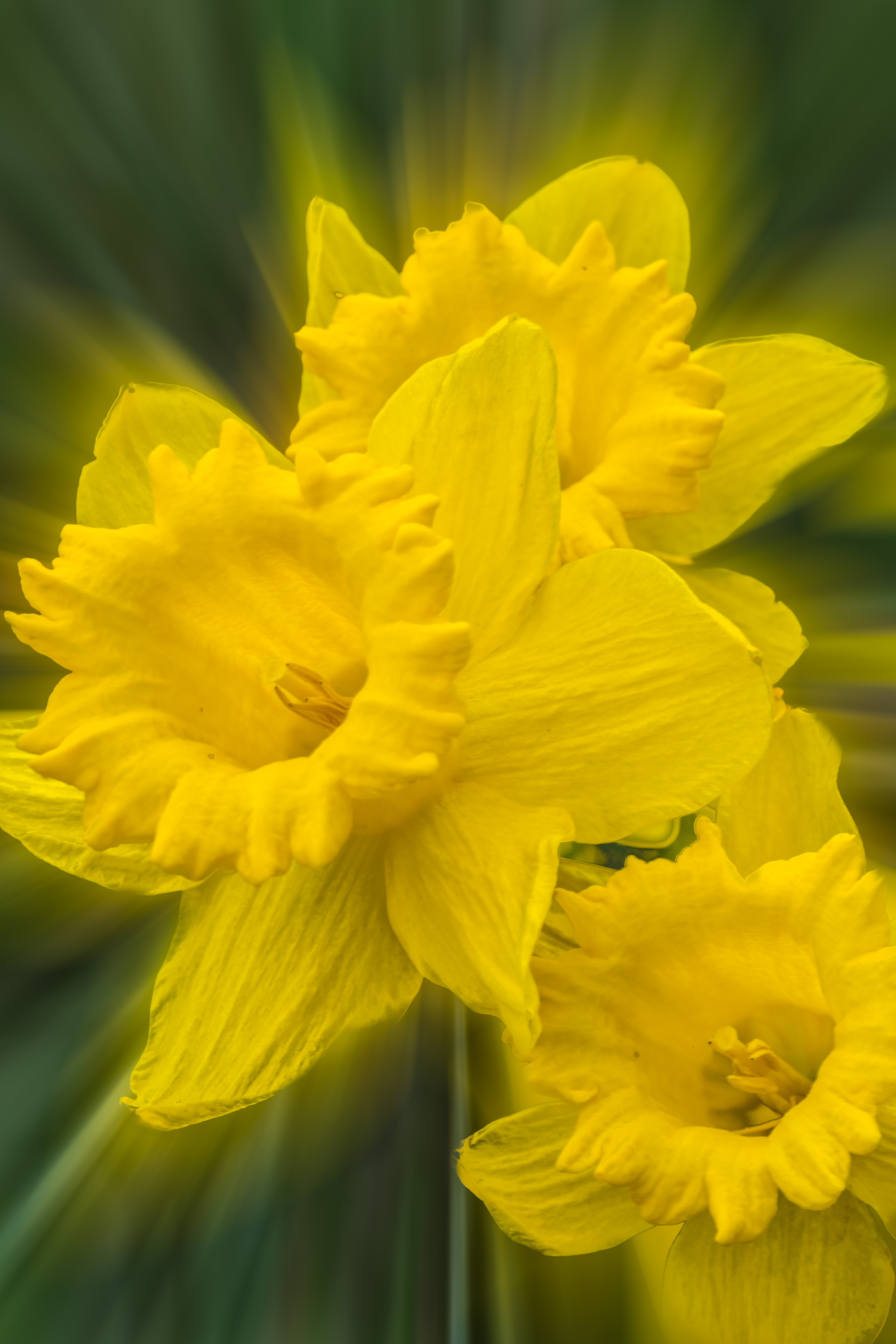
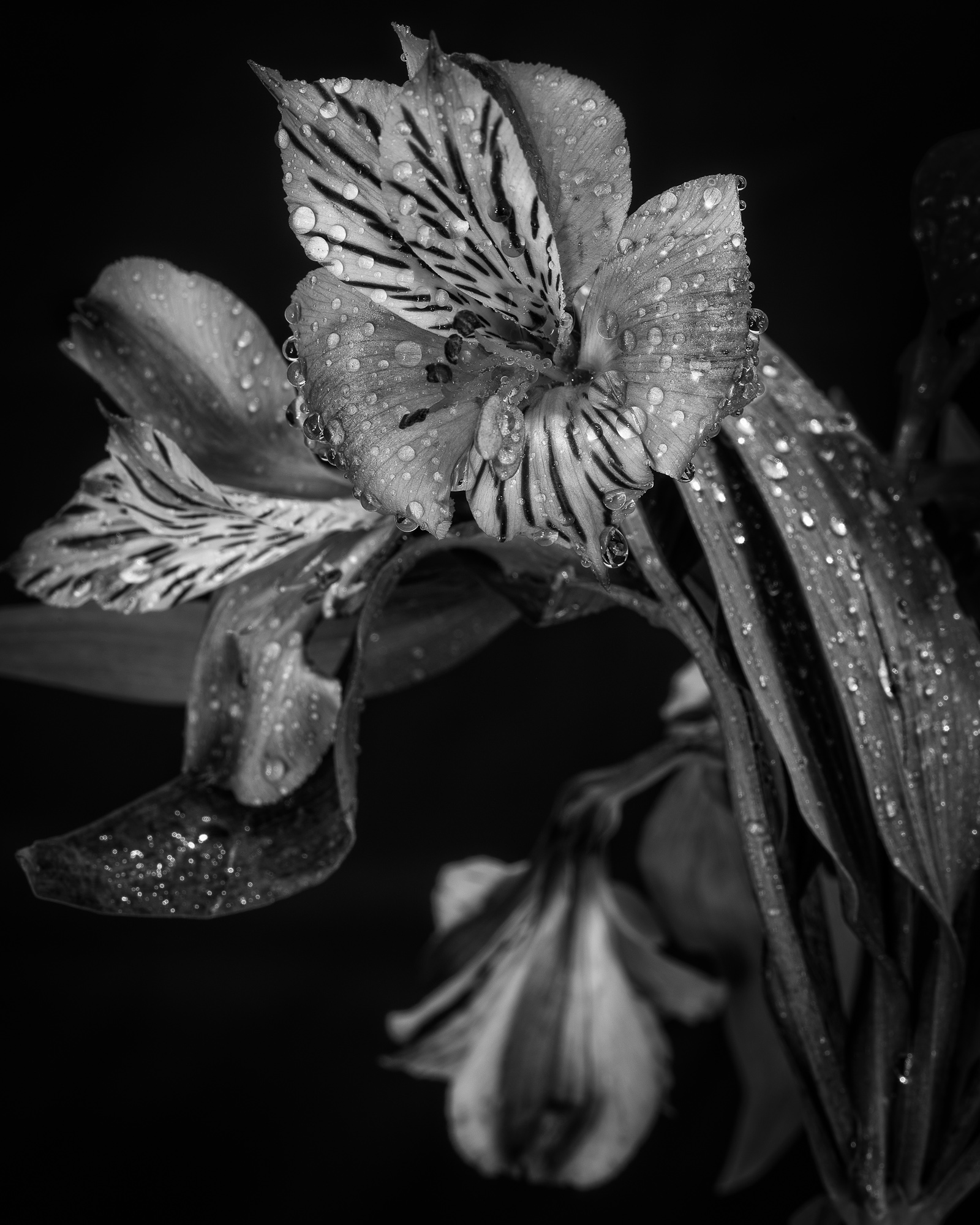
Focus and light are very good.. Depth of field is good because I can understand the environment but not distracted by the shapes of the background. I think the shadows in the blossom give balance. The alignment of the petal and stigma create symmetry. Very good image. |
Aug 30th |
| 3 |
Aug 18 |
Comment |
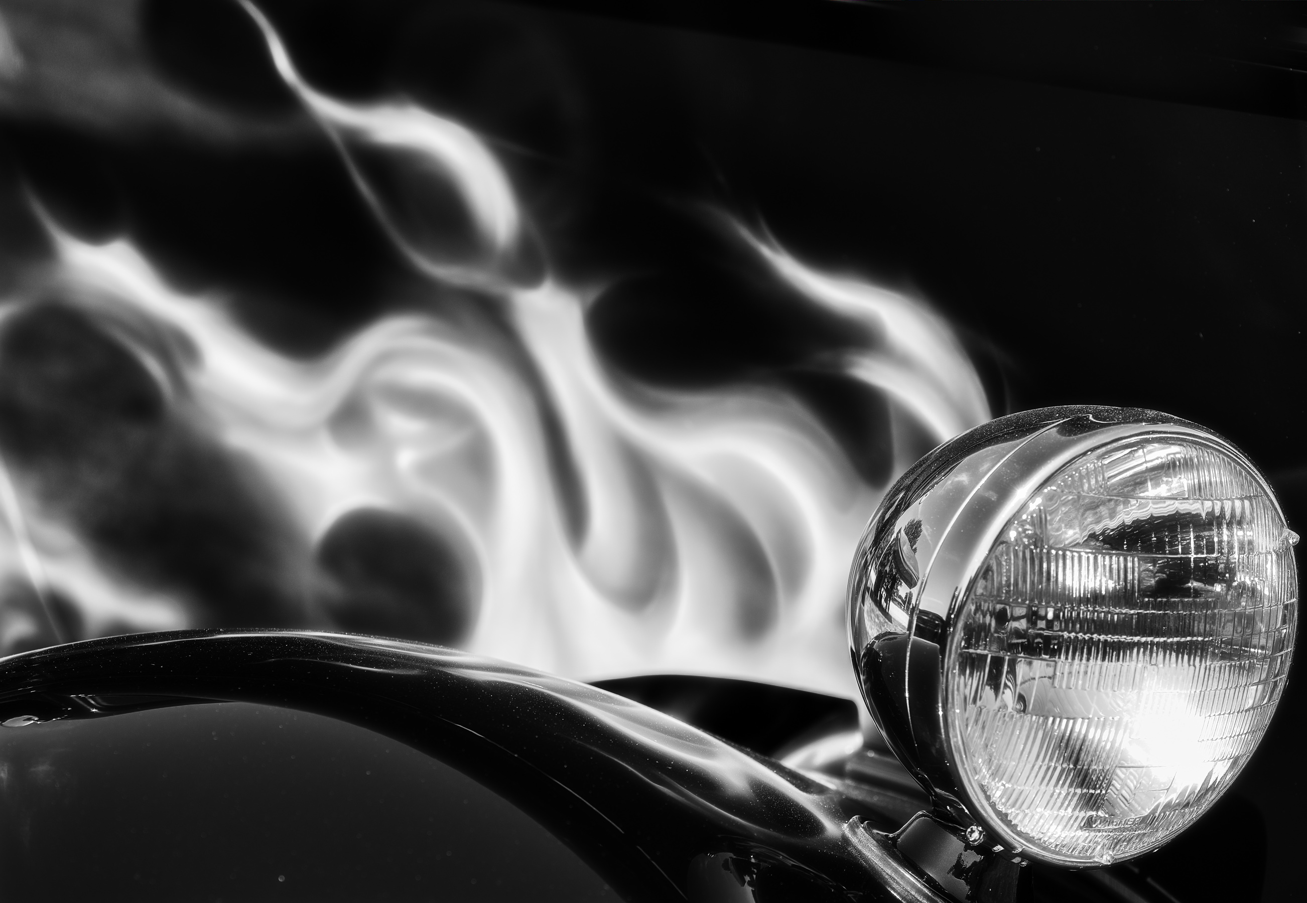
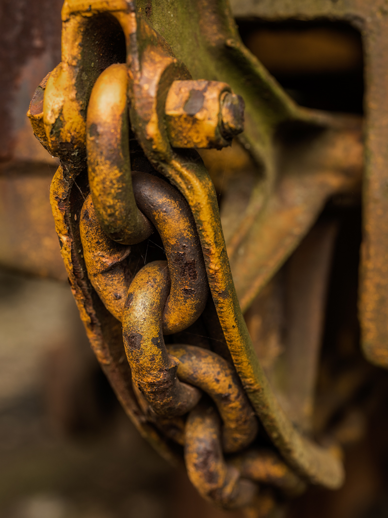
This is an intriguing image. The circular shapes increasing in size escalating vertically create visual interest first. The blue paint and reddish brown rust are opposite on the color wheel and complementary. The shape of the metal housing at the top of the frame creates a visual cap. Focus and lighting are very good. The partial circle at the left edge of the frame is a bit distracting. If it could be cloned out discreetly it would keep my eye centered in the image. |
Aug 30th |
5 comments - 0 replies for Group 3
|
5 comments - 0 replies Total
|