|
| Group |
Round |
C/R |
Comment |
Date |
Image |
| 3 |
Jun 18 |
Comment |
This is a cool image. I like the perspective. It is difficult to tell what it is and from what perspective it is created at first. Color, sharpness, composition and framing are good. While yes you can imagine kids playing, this would be amazing with a single young girl in a bright yellow or bright red shiny rain coat. I do agree the white elements cause some distraction. Really nice Lisa... |
Jun 27th |
| 3 |
Jun 18 |
Comment |
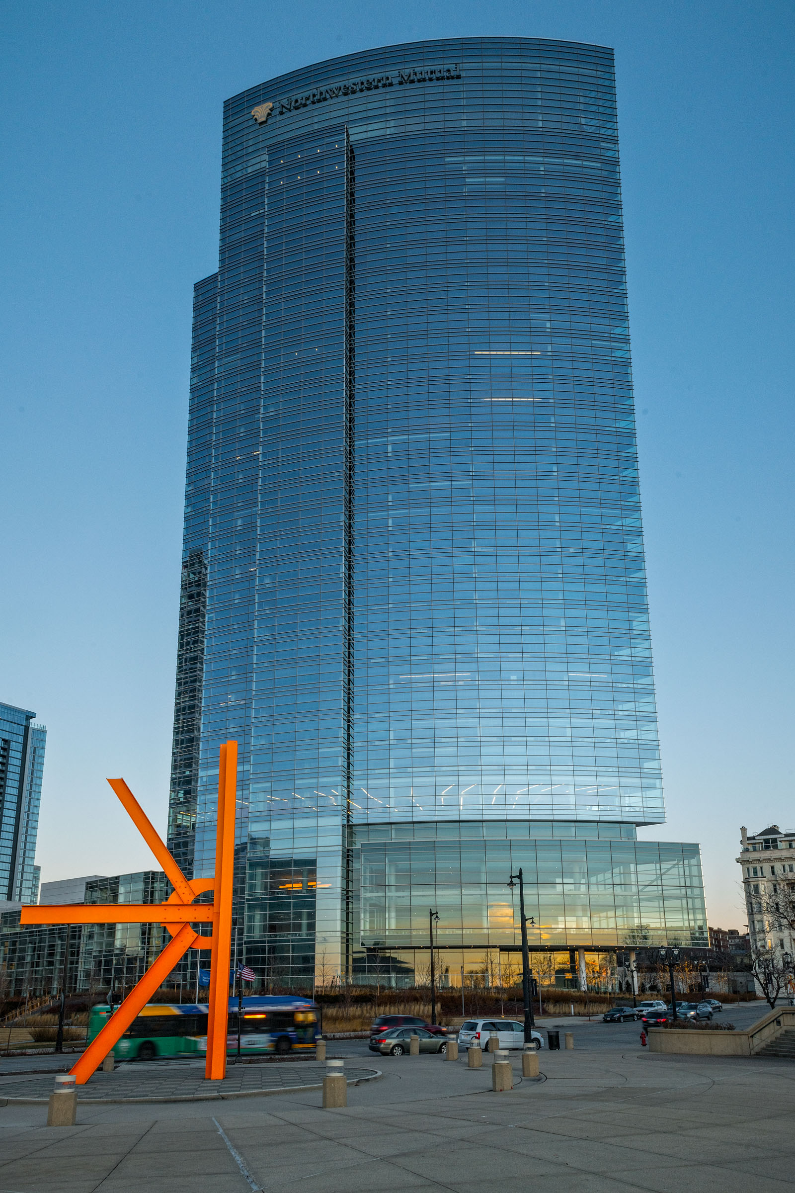
The composition is good. Focus seems a little soft. The lines of the bridge are good and the position of the tower is good as well. I think the white clouds create negative space and just don't add enough interest in color or texture. Could you have reduced exposure in the sky and perhaps add clarity or some HDR brushing..? |
Jun 27th |
| 3 |
Jun 18 |
Comment |
You capture wonderful Memorial Day images each year. I know that you have close emotional tie to the importance of Memorial Day. This is a good photo journalism image. It tells a significant story. The soldier is almost bowing as he places the flags. As a viewer I do get the sense of significant sacrifice because of the number of flags and tombstones. The shadows help with the dark, solemn sense of this image. I wonder if you could have caught him from the other side and included a more expansive perspective of Arlington. |
Jun 27th |
| 3 |
Jun 18 |
Comment |
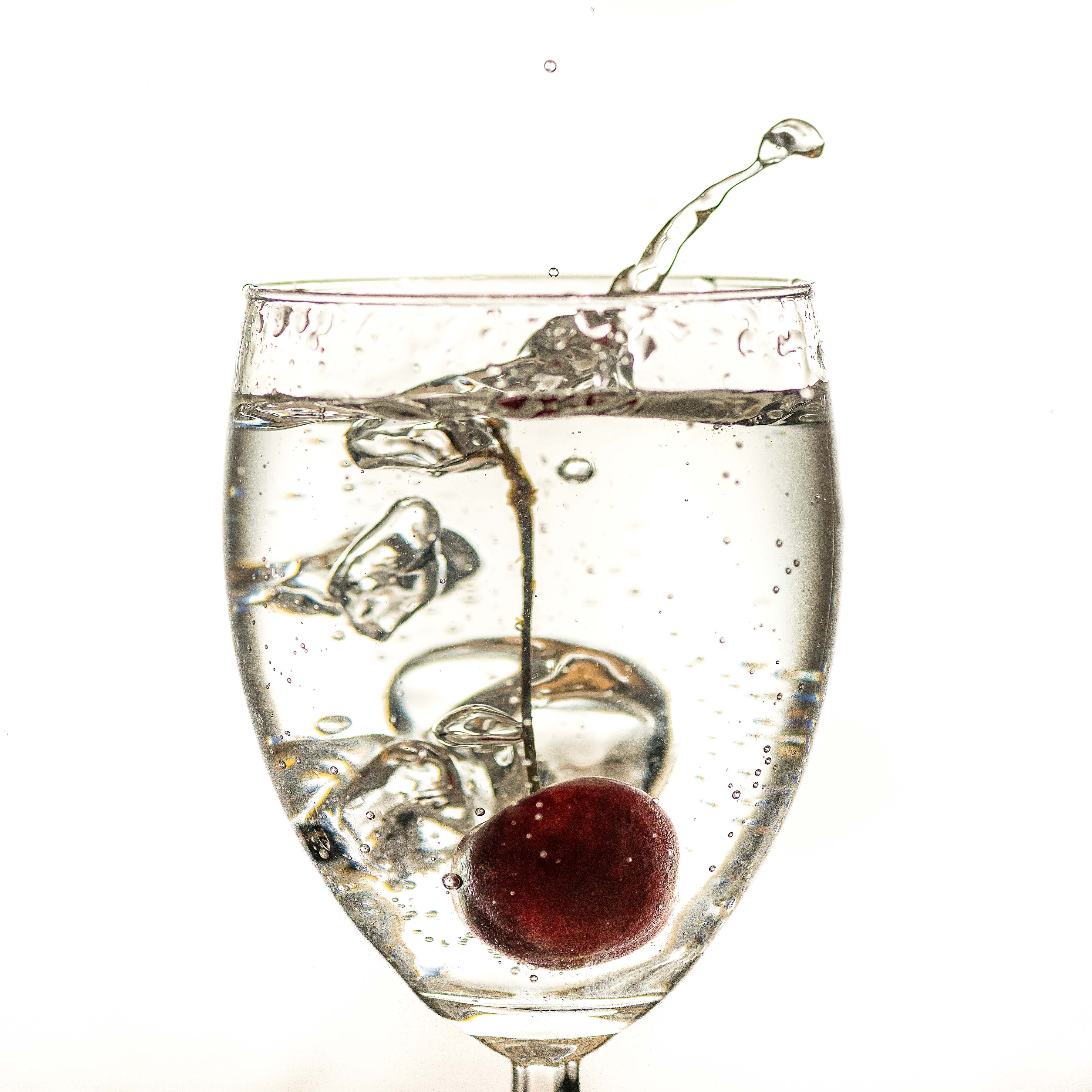
Yeah I tend to think the fork works. To me it creates a visual anchor and starting point in the image. It draws my eye upward into the frame. I don't think there would be a tendency to move through the image visually if the fork wasn't there. The color contrast is very good. The upward pointing lines at the bottom of the glass also align well with the fork. The frame has just enough color which accents or compliments the fork. The pink line bottom center and the highlights at the top are just a tad distracting to me. Good stuff Ruth. |
Jun 27th |
| 3 |
Jun 18 |
Comment |
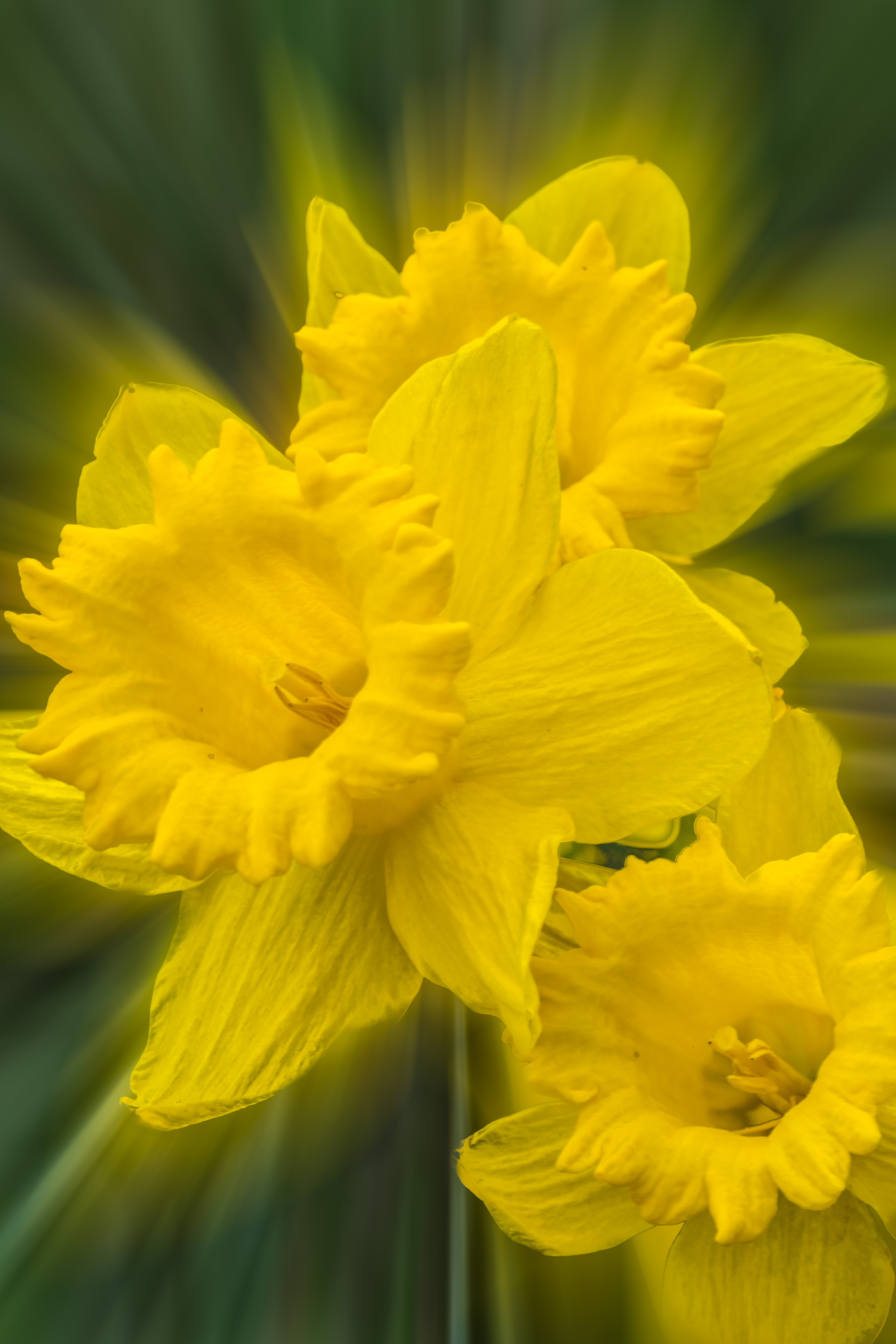
This is really interesting. The color and detail are great. It is a beautiful flower. Beverly is right you caught this at peak. |
Jun 27th |
| 3 |
Jun 18 |
Comment |
This almost appears UFO like... The color and sharpness are great. The blue hour night sky is a great contrast to the golds, reds and yellows.
The sense of motion and the offset angle at the top of the ride captures the excitement of the fair atmosphere. I feel like I want to see more of the bottom of the carousel. I like the secondary subject of the other ride in the background however the purist in me wants to see seperation between the two. I doubt it could be done while maintaining the drama of the main subject carousel. |
Jun 27th |
6 comments - 0 replies for Group 3
|
6 comments - 0 replies Total
|