|
| Group |
Round |
C/R |
Comment |
Date |
Image |
| 49 |
Aug 20 |
Reply |
The "keystone" effect occurs when you tilt your camera away from horizontal. This can be either up or down, but most usually up. And it generally is most prevalent when using a short focal length lens. I address this with the tools in the "Transform" panel of Lightroom. The "vertical" slider can be used to correct out the keystone effect making all vertical lines actually vertical. :-) The process will create unused (no longer containing any of your image) parts in your image canvas. The crop tool will be required to crop these out of your image.
This article gives a pretty good description of how to use these tools: https://digital-photography-school.com/how-to-use-the-lightroom-transform-tool/
|
Aug 18th |
| 49 |
Aug 20 |
Comment |
I think the best thing to do is to contact me via email: alankiecker@charter.net There is way too much to discuss here. I will be the first to say that I am no expert, but I have been following this for a few years now and am more than willing to share what I know and point you to some useful sources of information. |
Aug 18th |
| 49 |
Aug 20 |
Comment |
Do you subscribe to the forecasts provided by the US National Oceanic Atmospheric Administration (NOAA) Space Weather Prediction Center(SWPC)?
If not, they are free for anyone. Go to https://www.swpc.noaa.gov/ then to "Subscribe". There are many various predictions that you can get. I subscribe to the "27 day outlook 107cm radio flux and geomagnetic indices". This comes out every Monday and gives an outlook for the next 27 days. I have an event in my calendar with a link that reminds me to look at this.
I also subscribe to the "NOAA 3-Day Forecast". This is emailed to me several times a day.
With this information, and a regular weather forecast, I can plan when I should get in my car and head a couple hours north putting the light polution of the metropolitan area that I live in behind me :-) |
Aug 17th |
| 49 |
Aug 20 |
Reply |
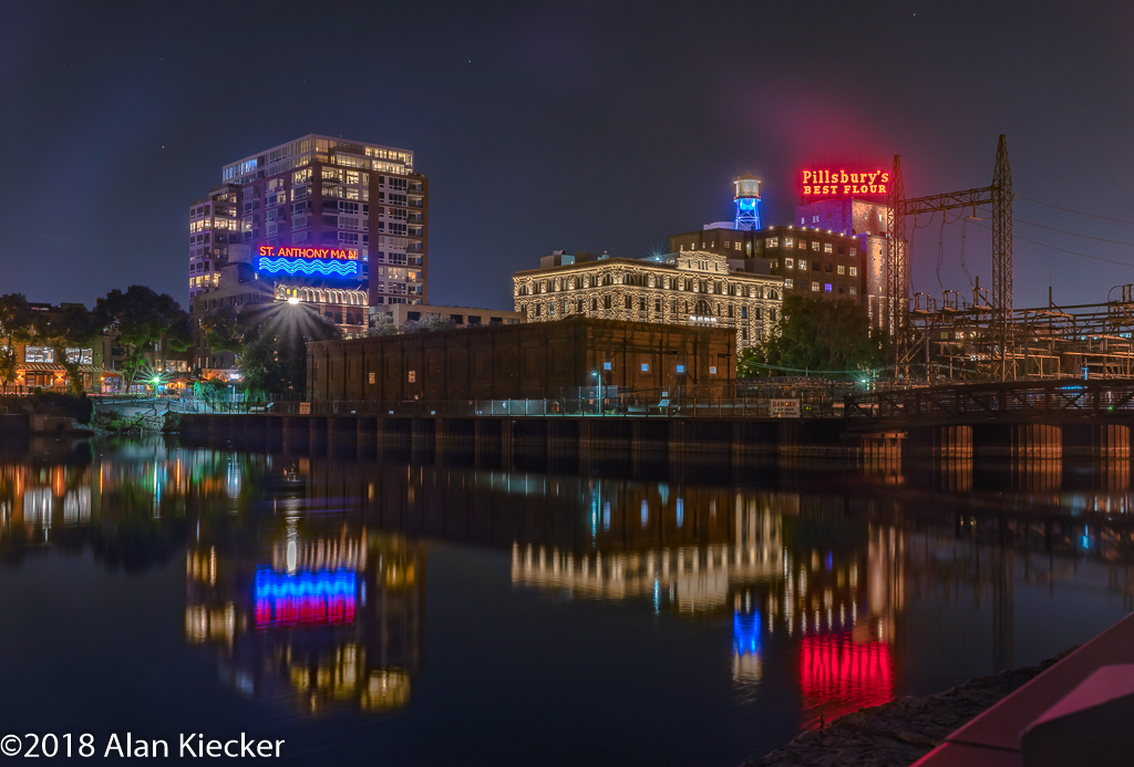
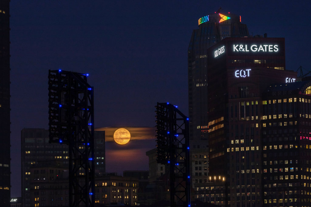
By definition I meant making the buildings stand out from the sky, i.e. enhance the contrast between them. I did this by taking the image into Photoshop, then creating a new adjustment layer for "levels". There will be three points on the slider. The one on the left will adjust the blacks, the one on the right will adjust the whites. The one in the middle will adjust the grey tones. I moved it to the left.
There are many articles on the internet that describe how to use levels in Photoshop. This is just the first one that I grabbed: https://digital-photography-school.com/using-levels-photoshop-image-correct-color-contrast/ |
Aug 17th |
| 49 |
Aug 20 |
Reply |
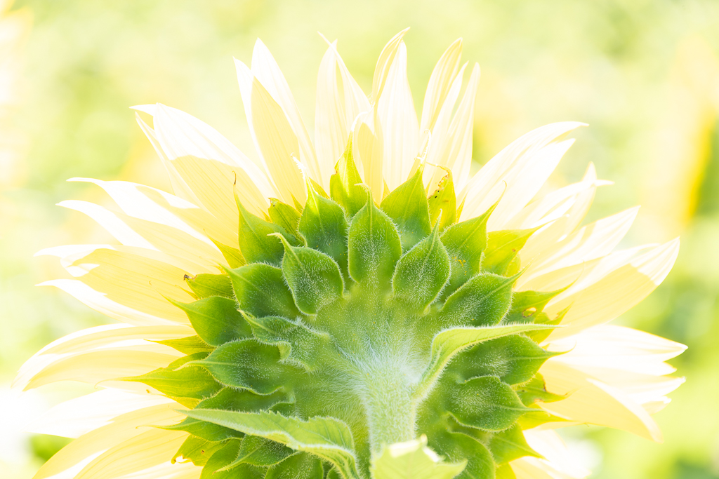
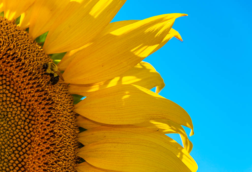
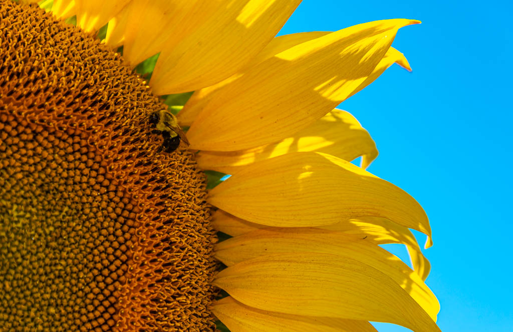
I felt that was too much flower, so I did another crop without restraining the aspect ratio (I make my own mats so the aspect ratio isn't really a concern). I'd appreciate your comments. |
Aug 17th |
 |
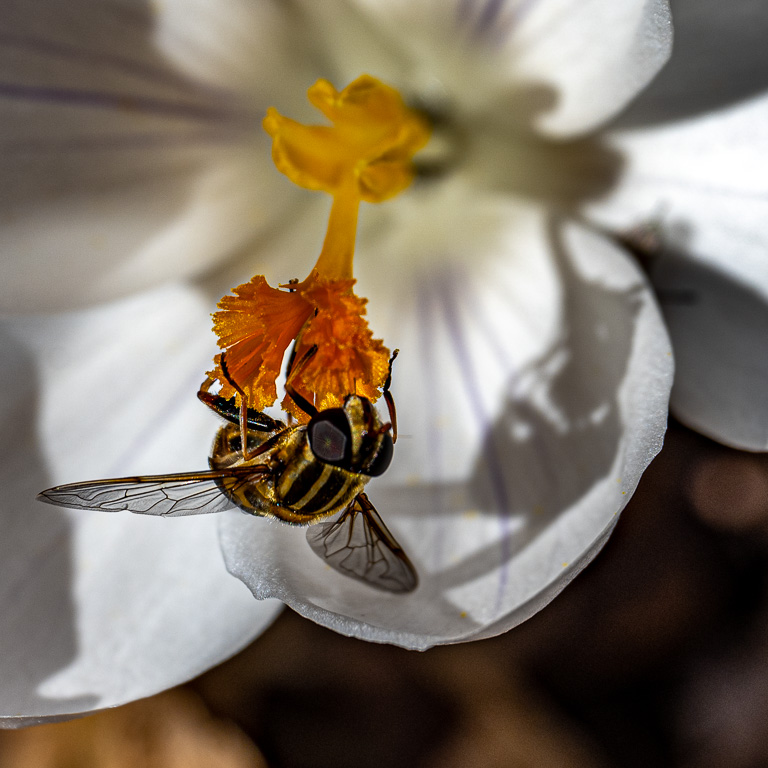
| 49 |
Aug 20 |
Reply |
Thanks Fred. I agree, the bee needs to be lightened. I also elliminated the bright spot toward the bottom. I have included two crops. This one is at an aspect ration of 17x11, the usual size that I make a print. |
Aug 17th |
 |
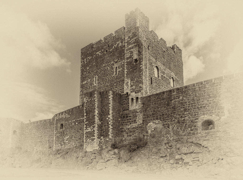
| 49 |
Aug 20 |
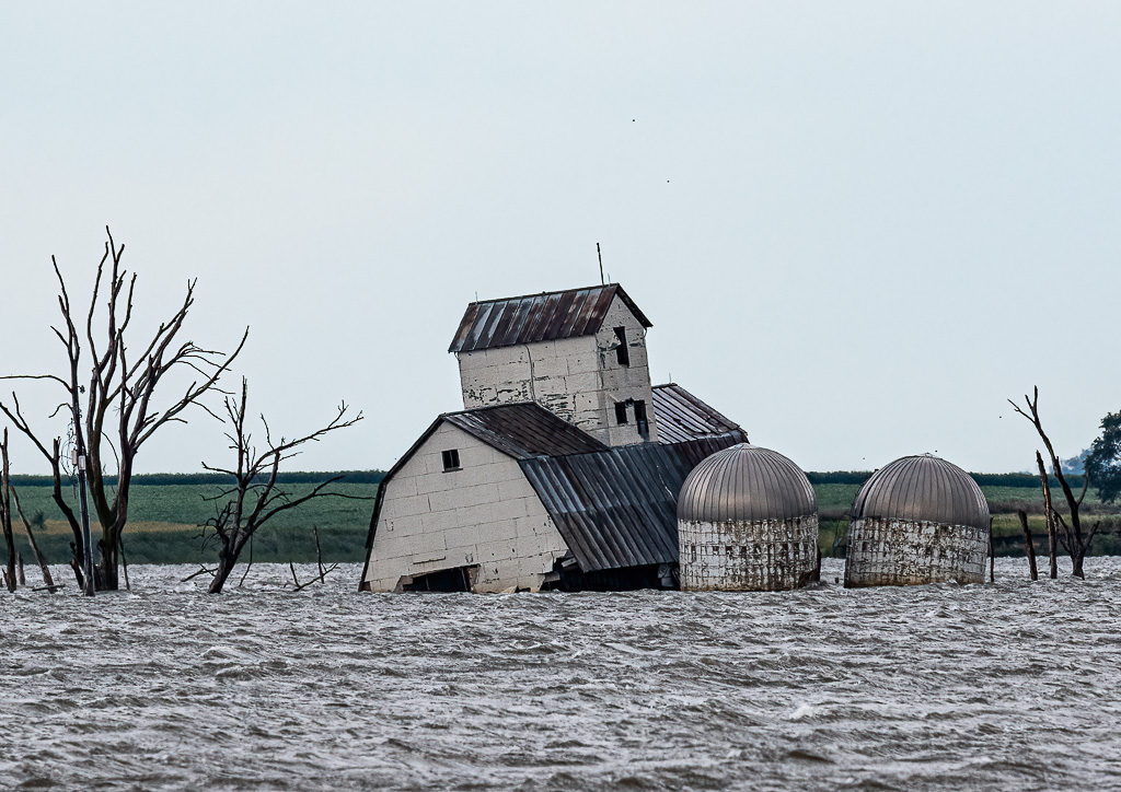
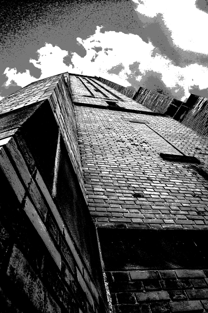
Comment |
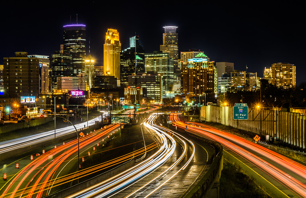
I too like the image. Capturing the moon between the buildings - excellent! I would increase the definition of the buildings a tad so that they stand out more from the sky. I used levels and masked the moon and cloud so that it wouldn't change. |
Aug 16th |
 |
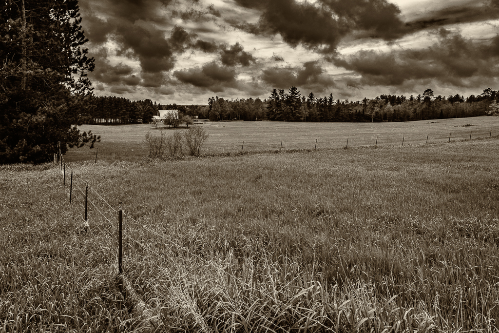
| 49 |
Aug 20 |
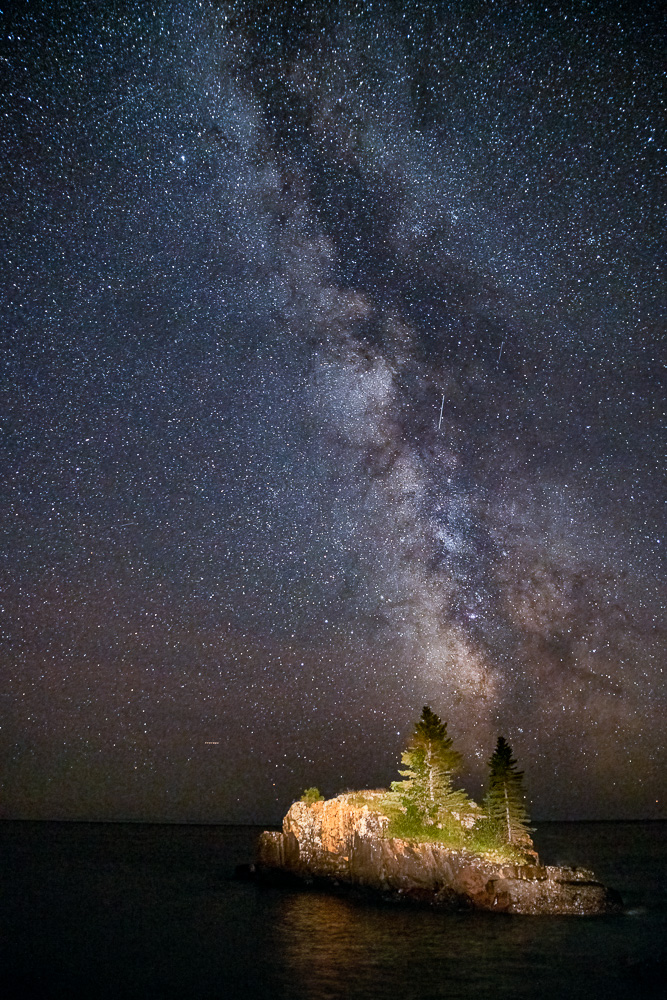
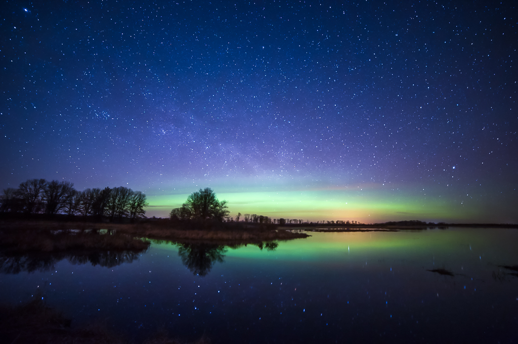
Comment |
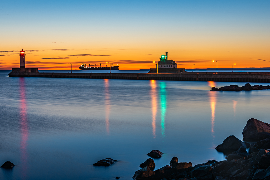
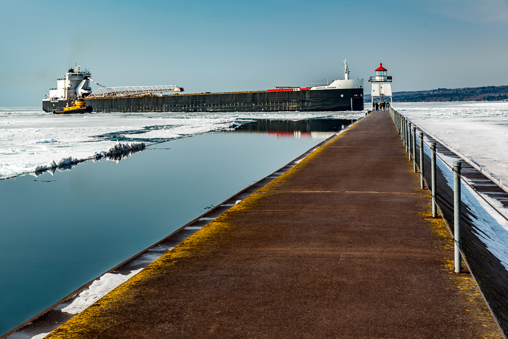
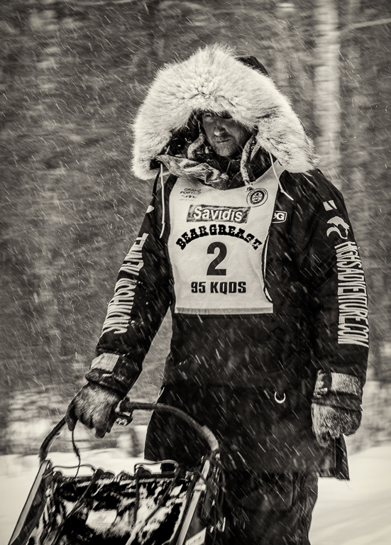
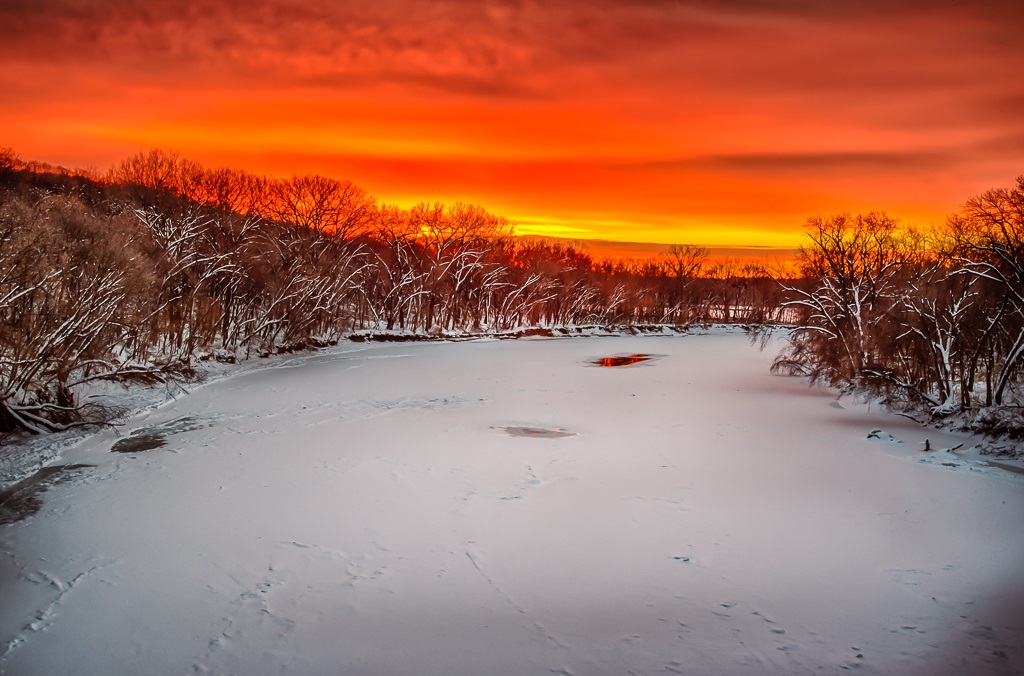
Very nice! Photographing the aurora requires a lot of luck. Both the terrestrial weather and space weather need to come together. I have made several trips to northern Minnesota to capture photos such as this. Only a few have I been successful. Well done! |
Aug 16th |
| 49 |
Aug 20 |
Comment |
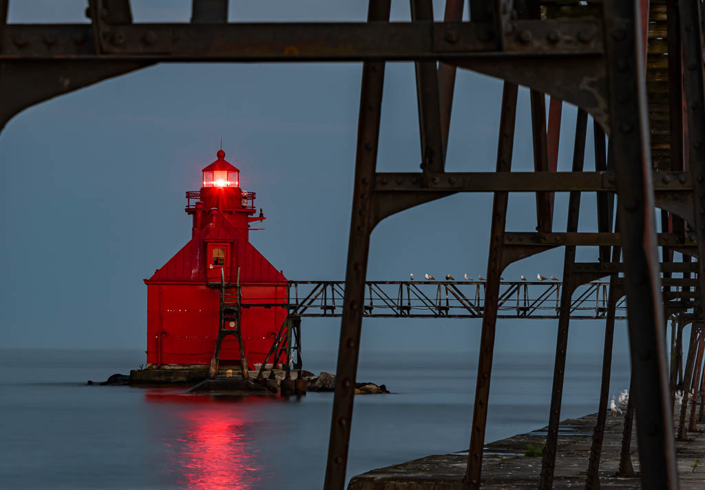
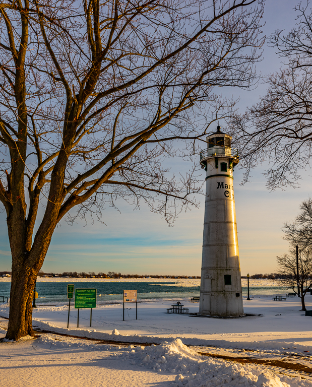
I wish I was there! I like your photo - my wife and I have been visiting and photographing lighthouses, currently 150+ in my LR catalog. Due to the pandemic, we had to cancel three trips this summer to visit lighthouses.
Although they form a nice frame, I do wish the bushes in the foreground were in focus. |
Aug 16th |
| 49 |
Aug 20 |
Comment |
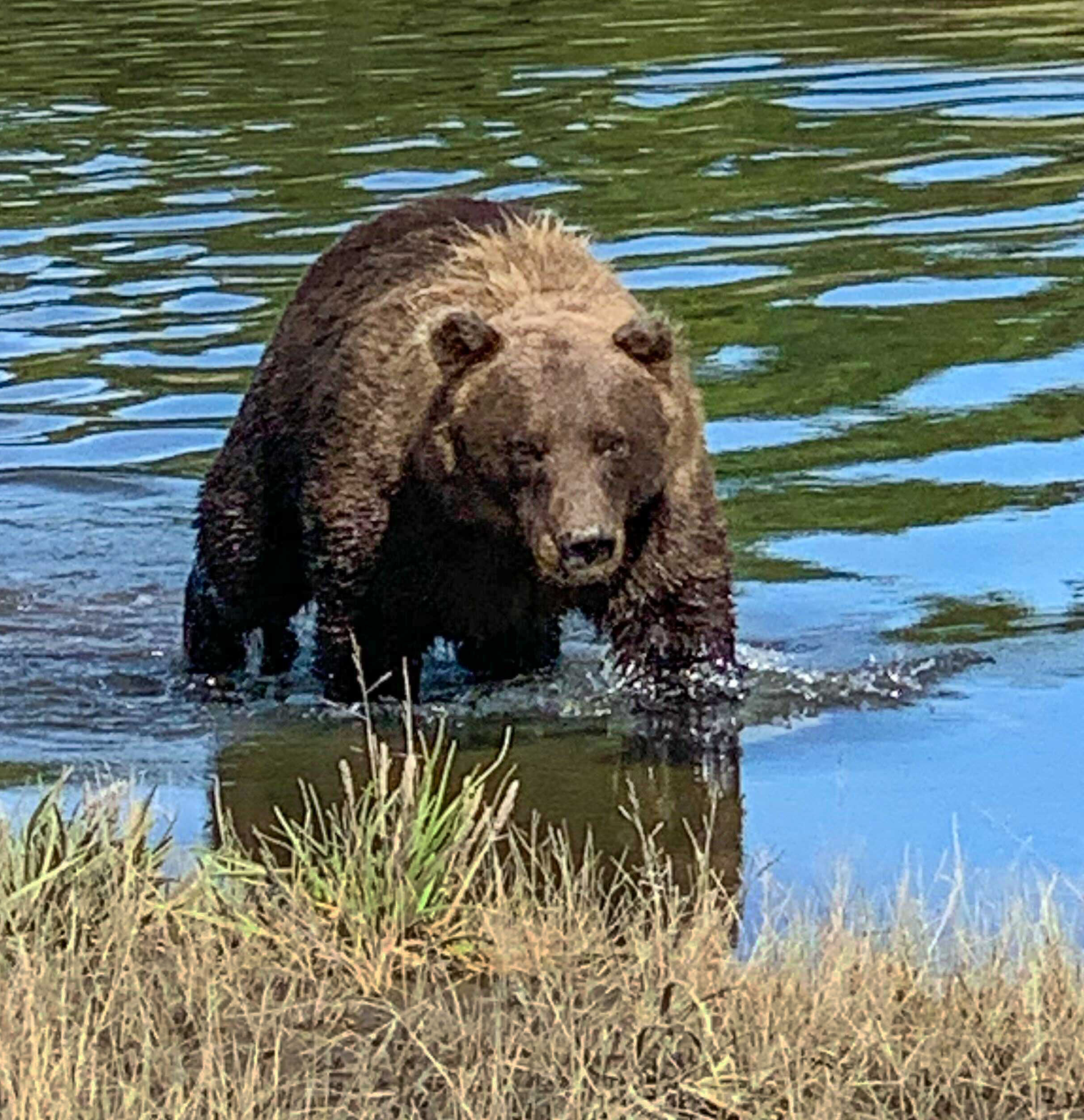
Too close for me!!
To convey that feeling to the viewer, I would crop in tighter and darken the foreground. |
Aug 16th |
 |
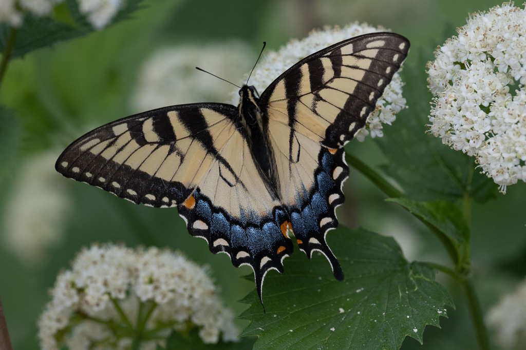
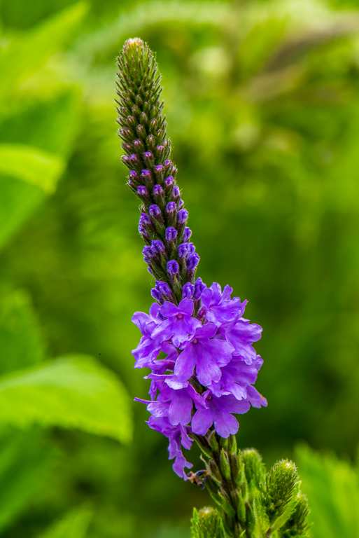
| 49 |
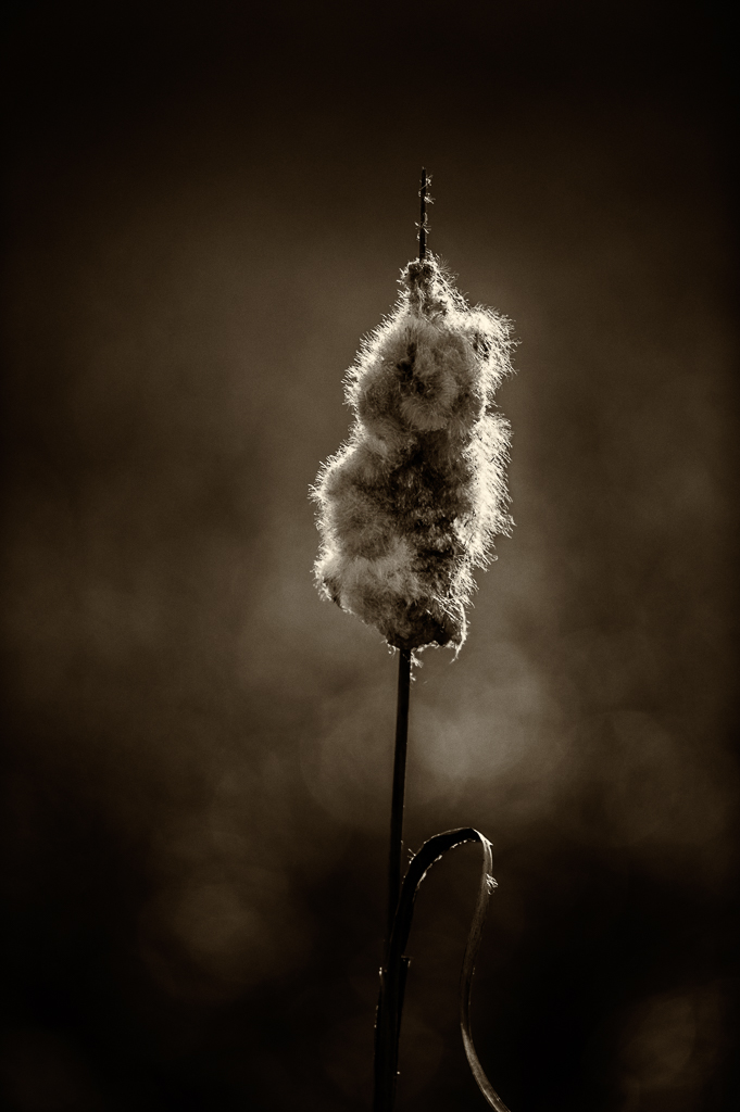
Aug 20 |
Comment |
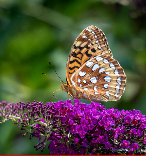
Yesterday I read an article that stated that that any detail in the background of a macro photo will distract the viewer away from the main subject. I thought that might be a bit too restrictive, but the statement rang true with me as something that I need to pay attention to myself.
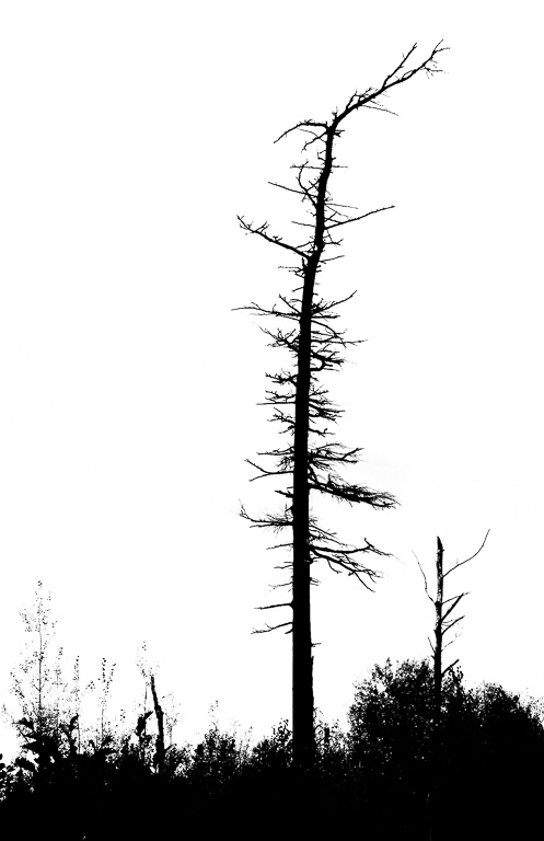
What distracted my eye was the flower itself disappearing into blurriness. I would suggest cropping in from the left to remove the out of focus portion of the flower. This would also remove the out of focus purple flowers which you mentioned. I also found the portion of the flower in the lower right of the photo to be distracting, so I suggest cropping in a bit from the right. The fritillary itself is nice and sharp - well done. |
Aug 16th |
 |
7 comments - 4 replies for Group 49
|
7 comments - 4 replies Total
|