|
| Group |
Round |
C/R |
Comment |
Date |
Image |
| 29 |
Nov 20 |
Reply |
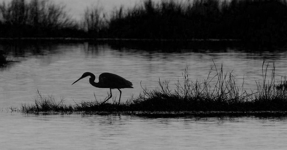
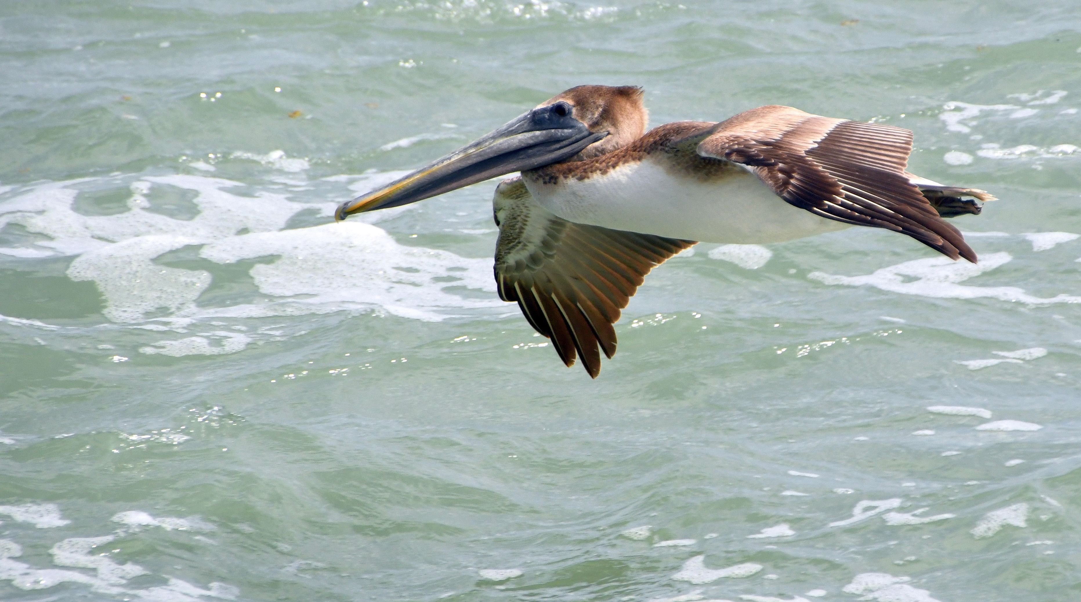
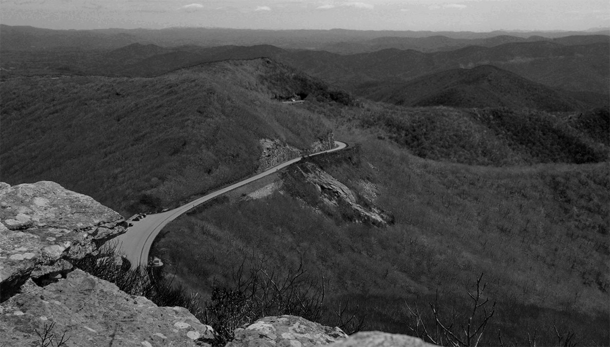
Thanks, Stephan. I could have gotten lower, but didn't think about that - my right elbow was on the track. Never noticed that line until you mentioned it here. I'm wondering if there's a wire there? I'll try to remember to look the next time I'm there. I think I'll give you motion blur a try just because I've never done that before. |
Nov 17th |
| 29 |
Nov 20 |
Reply |
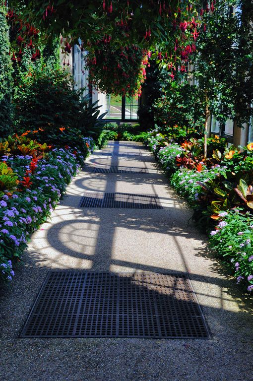
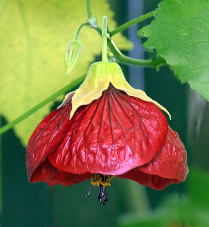
Definitely not crowded. Longwood issues a limited number of tickets for each hour, resulting in the most open space I've ever seen there. So, I didn't consider removing the flowers because the image was made in Longwood Gardens! Blurring the background is fine with me. |
Nov 17th |
| 29 |
Nov 20 |
Reply |
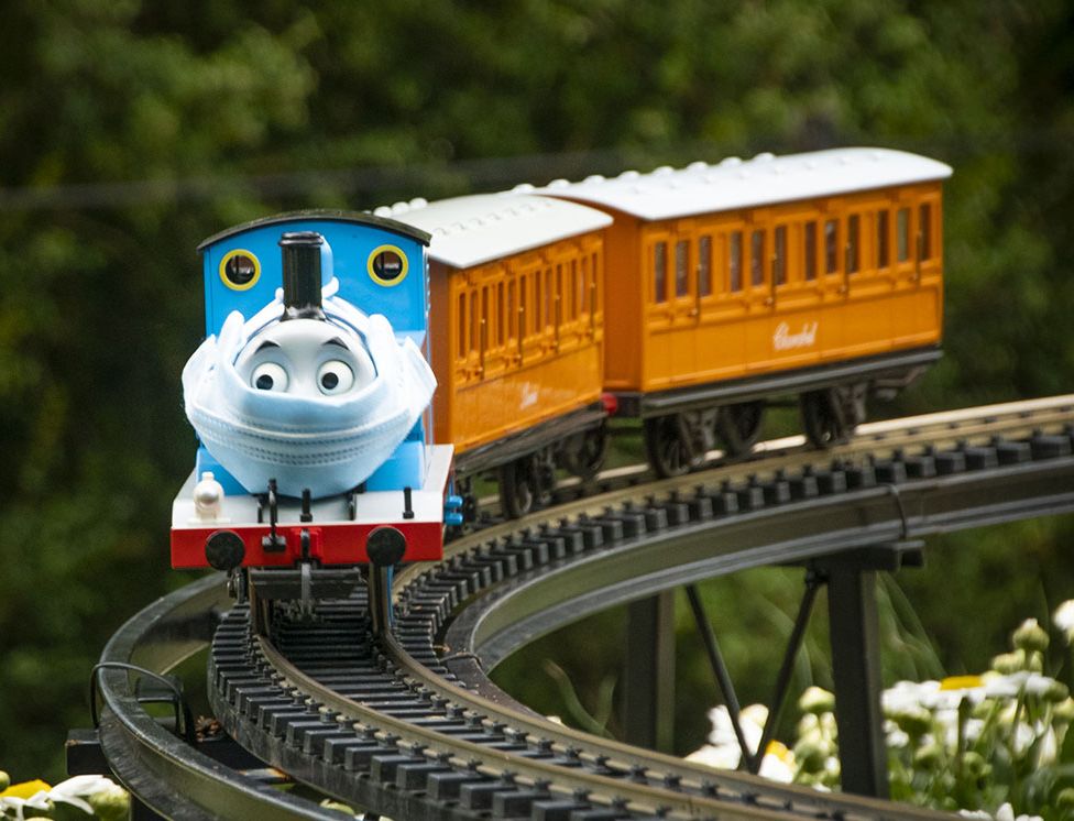
Thanks, Bob. I could have taken steps back, but not to the right as the track straightened at the point where I was standing. I didn't want to stop down because I wanted the background out of focus and blurring the train's cars was OK with me because I wanted the engine to the sharpest part of the image. |
Nov 17th |
| 29 |
Nov 20 |
Reply |
Thanks, Karen. |
Nov 17th |
| 29 |
Nov 20 |
Comment |
Really good image, Bob. Colors are eye candy! My only suggestion is to eliminate the space on the right to give the image more balance - plus, I don't think that space adds anything to the image and won't be missed. |
Nov 17th |
 |
| 29 |
Nov 20 |
Comment |
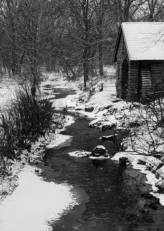
Very nice image, Tam. Very good composition and exposure. For me, the dark areas on left and right make this image all about the water, the beautiful snow-capped peaks and gorgeous sky. I wouldn't change a thing! |
Nov 17th |
| 29 |
Nov 20 |
Reply |
Judy, I don't know the answer to that since I have an IG account - @wherethehellisgdad
Try this - https://www.instagram.com/paulnicklen/ and
https://www.instagram.com/SeaLegacy/
Let me know if that works.
|
Nov 17th |
| 29 |
Nov 20 |
Comment |
A little bit of looking around can sometimes big a nice reward, like this image. I think it might be improved with a crop of maybe a 1/3 to 1/2 of the space above the deer. I also pulled it into PS and adjusted the brightness/contrast and shadows/highlights. What do you think? |
Nov 16th |
 |
| 29 |
Nov 20 |
Comment |
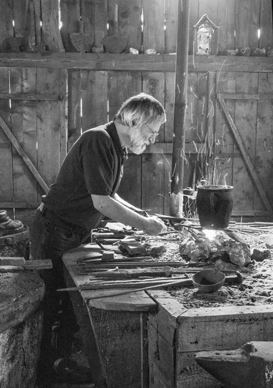
I like your composition, the colors are very good and it's very sharp. My only suggestion is to darken the bright spot above the blacksmith, which I assume is a light of some sort.
I like images of people at work and particularly those occupations that are hard to find anymore. I tried a quick monochrome conversion (just because) and it pushed everything into the background with the exception of the blacksmith, the pot and the fire. |
Nov 16th |
 |
| 29 |
Nov 20 |
Comment |
I think the sharpness and colors in this image are really good.
Stephan, I think we had a conversation about Underwater Photography which included my mentioning the Instagram account @sealegacy and the account of one of it's co-founders @paulnicklen. I have looked at A LOT of the images on those sites and there are whale pairings like this image in quite a few of the images. My suggestion would be that you move back and show the interaction between the whales in a wider view. It would show the difference in size as well as the vastness of the environment. |
Nov 14th |
| 29 |
Nov 20 |
Comment |
I think your image has nice coloring and clarity, but the composition could be better. I like the idea of this image but I have to agree with Karen that there's too much space between the bird and the people. I like the way Karen changed a "fly by" to a "fly over". |
Nov 14th |
6 comments - 5 replies for Group 29
|
| 74 |
Nov 20 |
Reply |
Thanks, Arne. |
Nov 10th |
| 74 |
Nov 20 |
Reply |
Thanks, Ying. |
Nov 10th |
| 74 |
Nov 20 |
Reply |
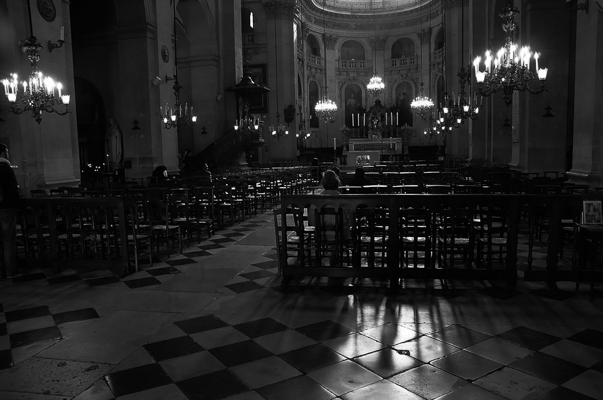
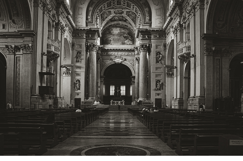
Thanks, Haru. My shooting technique when I am without a tripod is to press my elbows into my sides, take a deep breath, release a bit of it and slowing press the shutter so I don't know when the camera will capture the image. It doesn't always work. My recollection is that I'm standing in an area that separates the pews in the church. I guess I didn't think the space was very large and, obviously, still don't think it is or I would have cropped it. |
Nov 10th |
| 74 |
Nov 20 |
Comment |
For me, this is a very moody and foreboding image, which I like. The only change I would suggest is, in addition to Arne's suggestion of darkening the upper stream, also darken the vegetation on the upper right. |
Nov 10th |
| 74 |
Nov 20 |
Comment |
Ata, you continue to take us on a study of the faces of Turkey. I don't think I'd change anything in this image. The man's face draws the viewer's eyes and tells the story. |
Nov 10th |
| 74 |
Nov 20 |
Comment |
This is a great example of what can be accomplished in Minimalist Photography. A subject, the sky as background and the earth as foreground. You have made the most of the least. For me, I think Arne has described the changes that might be used to enhance your image. Beautiful! |
Nov 10th |
| 74 |
Nov 20 |
Comment |
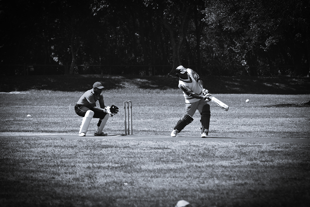
I think panning is fun, even though it can be really frustrating at times. Your composition is very good and you captured the motion very well. I would agree with Ata that you should give 1/60 a try - I'd like to see the blur of the wheel spokes remain, which might not happen at 1/60. |
Nov 10th |
| 74 |
Nov 20 |
Comment |
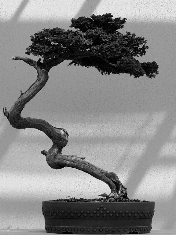
I like the vast majority of this image. All of the adjustments you've made to the main subject are well done and the result is very good. The detail and the range of black, white, and gray are really good. For me, the two flowers on the right are distracting and I think your image would be better without them. |
Nov 10th |
| 74 |
Nov 20 |
Comment |
I think there's no question about the subject in this really good monochrome image. The shadow grabs my eyes and pulls me forward to view the young gymnast. When I look around the image, I'm always draw back to that shadow. Very nice crop choice and good range of grays. |
Nov 10th |
6 comments - 3 replies for Group 74
|
| 80 |
Nov 20 |
Reply |
Thanks, Victor.
|
Nov 30th |
| 80 |
Nov 20 |
Reply |
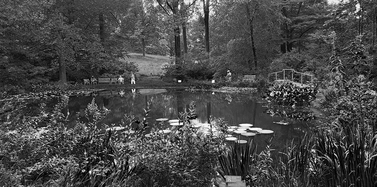
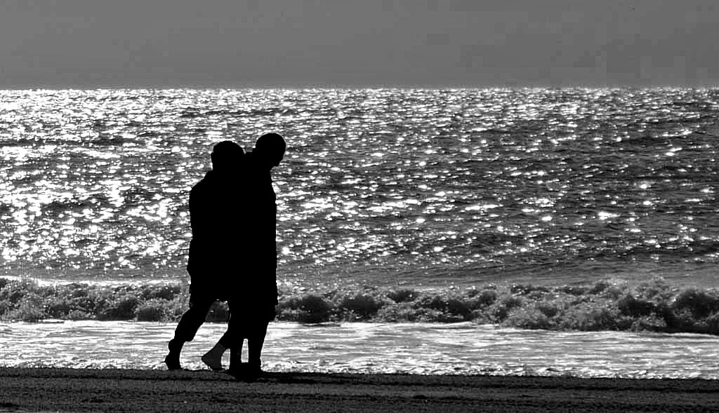
Thanks, Jim. Take a look at my replies to Ed and Karen. Until you just mentioned it, I never thought about a portrait image. The only thing that might have a prevented that, looking at this image, would be the distance between the couple and the swans. If I ever get into that scene again I'll be sure to shoot both landscape and portrait. |
Nov 17th |
| 80 |
Nov 20 |
Reply |
Thanks, Karen. You may have missed my mention of flipping the image horizontally, so I'd have had to move left, which would have made for more open space, not less. My other thought about your, and Ed's, comment about the open space is that the arboretum is a large space with a lot of wide open areas, as well as, tightly compacted ones. I looked for a picture online that would show the Swan Pond in it's entirety, but was unable to find one. |
Nov 17th |
| 80 |
Nov 20 |
Reply |
Thanks, Ed. What I can tell you about the composition is that these people where the only ones near the Swan Pond and followed the swans wherever they went in the pong. The couple were two of not very many in the entire arboretum. |
Nov 17th |
| 80 |
Nov 20 |
Reply |
Thanks, Bev. I don't know what their thinking was, but it was obvious to me that the guy wouldn't have been there with the woman. |
Nov 17th |
| 80 |
Nov 20 |
Comment |
My path through your image started with being drawn to the red/green mask/leaves area and the eye-grabbing plaid shirt, then to the yellow pot and the wrist strap/chain attached to what is assumed was a small dog and, finally, to the reflection.
I think it is a well-composed image, with really good color and clarity. I think I would try to find a way to remove the branch.
What surprises me most is knowing that you're doing these captures in Portland. |
Nov 17th |
| 80 |
Nov 20 |
Comment |
This might be my favorite of your Cuban images! The stage set by the dog's owner, I suppose, limits your composition options? I think your colors and clarity are pretty good. I am not bothered by having to Google "Viaje Cachito in english" to discover the meaning of the words. |
Nov 17th |
| 80 |
Nov 20 |
Comment |
As someone who is often annoyed by photography "rules", another reason to like Ansel Adams! I'm in agreement with Victor's crop. One of my favorite things about this image is the the humor provided by the boy's apparent struggle with toting the zebra. |
Nov 17th |
| 80 |
Nov 20 |
Comment |
I went to the Pike Place Market at least twice in the week I spent in Seattle after an Alaskan Cruise. The second time was to get a better image in this place - I'm not convinced that happened.
I like most of what Victor is recommending. The one exception is the crop. I think the "100% sustainable" sign needs to be included. |
Nov 17th |
 |
| 80 |
Nov 20 |
Comment |
I'm pretty much in agreement with Ed's assessment of this image. The first word that popped in to my head on seeing this was "voyeurism", followed by the thought that Street Photography IS voyeurism. The varied tones throughout the image make the choice of monochrome a good one. |
Nov 17th |
| 80 |
Nov 20 |
Comment |
Very nice street scene, Ed. I like your crop choice and the monochrome version is, in my opinion, more eye-catching than the color image. Looking at the faces of the man holding the container out and the "chef?", I see the story as a question or complaint about the contents of the container. |
Nov 17th |
6 comments - 5 replies for Group 80
|
| 95 |
Nov 20 |
Reply |
Bridge doesn't "build" anything. It merely takes what's in the folder you designate and displays it. Then you get the access to the elements of Bridge that you choose to take advantage of for your workflow. |
Nov 23rd |
| 95 |
Nov 20 |
Reply |
Lost the indenting when I posted, but you should be able to infer the structure in seeing Canada, Europe, USA followed by the same structure between them. |
Nov 23rd |
| 95 |
Nov 20 |
Reply |
My scheme looks like...
- Pictures
- Travel
- Canada
- Providences
- Cities
- Dates/Places
- Europe
- Countries
- Cities
- Dates/Places
- USA
- States
- Cities
- Dates/Places
- Photo Clubs
- PSA
- DD95
- Year/Month
- R@G
- Year/Month
And some other family/personal folders, as well as a few folders for things I'm working on, such as a Photoshop course where I can destroy pictures and get the original back to start again. All of this relates back to my days in IT and understanding the structure of databases.
I didn't have to change a thing with my file structure when I began to use Adobe Bridge recently. That's the primary reason I chose Bridge over Lightroom.
|
Nov 23rd |
| 95 |
Nov 20 |
Reply |
I'm with Tom, this is significantly better. Saving the good stuff for yourself??? ;-D |
Nov 20th |
| 95 |
Nov 20 |
Reply |
Thanks, Barbara. |
Nov 18th |
| 95 |
Nov 20 |
Reply |
Thanks, Carol. There are very few places in the Arboretum to use a beanbag. I have uni/tripod that I left in the car!! You're absolutely correct about trying that handheld, but there are few things of that nature that I'm unwilling to challenge. |
Nov 18th |
| 95 |
Nov 20 |
Reply |
Thanks, Stuart. Two things - first, that seed cover was in focus in my lens but I'm guessing the water drop changed that - second, that the blurring appears around the entire perimeter, so I left it as a kind of vignette - which, obviously, didn't work the way I wanted it to. |
Nov 18th |
| 95 |
Nov 20 |
Comment |
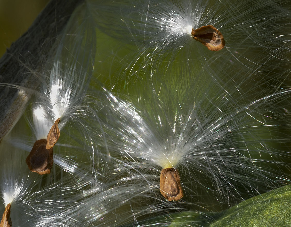
I agree with the beginning of Stuart's comments. I'm really curious about the size of the tomato?
Carol, before you begin to reply would you please click on the "Reply" button to keep the conversation(s) in context. |
Nov 18th |
| 95 |
Nov 20 |
Comment |
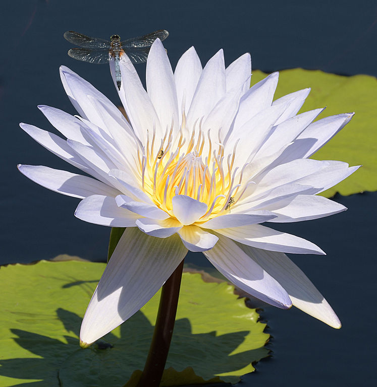
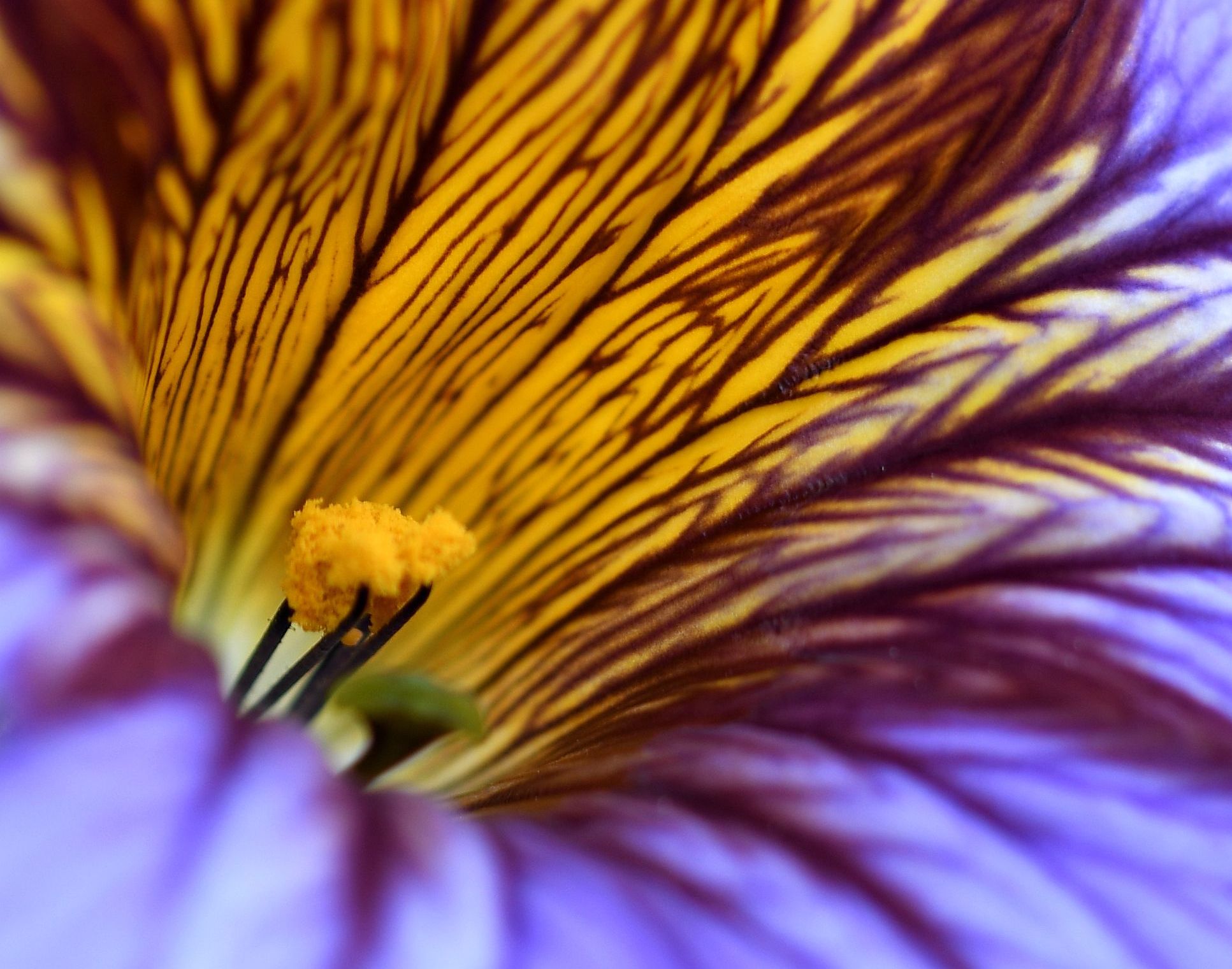
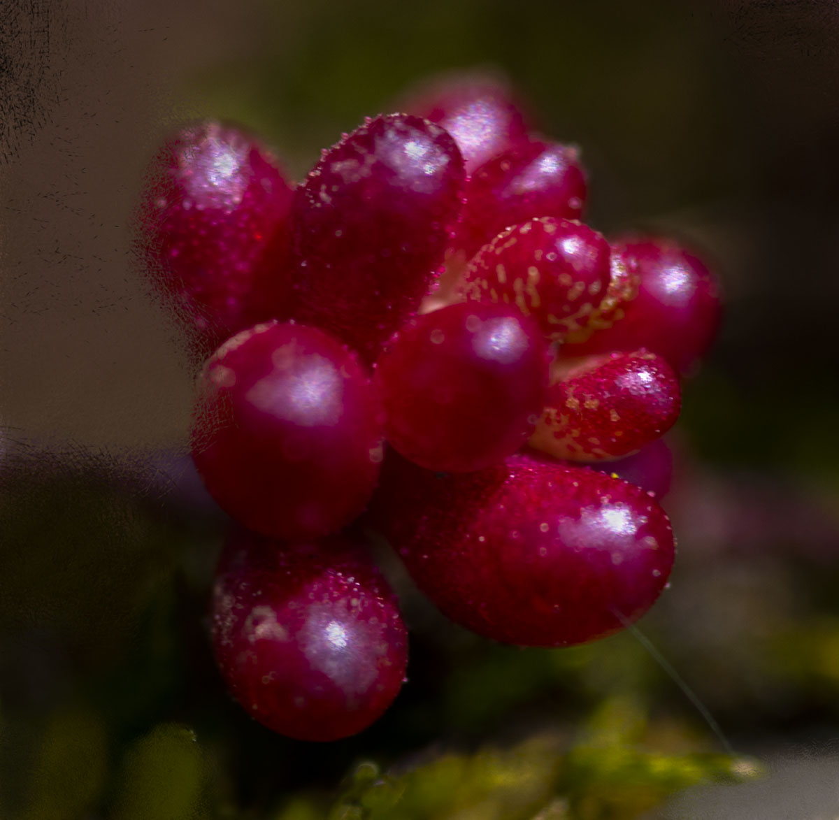
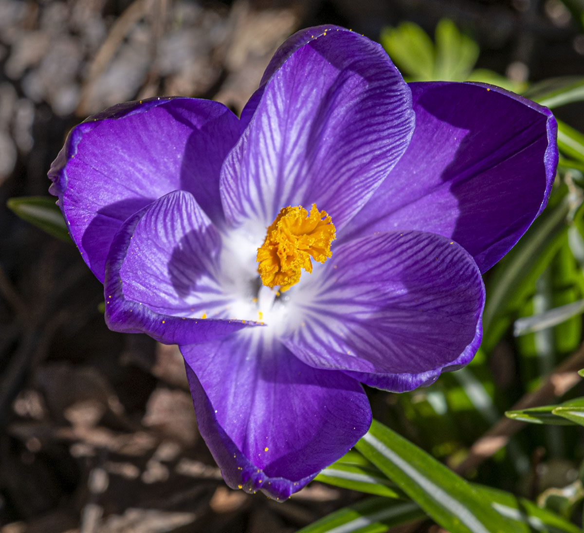
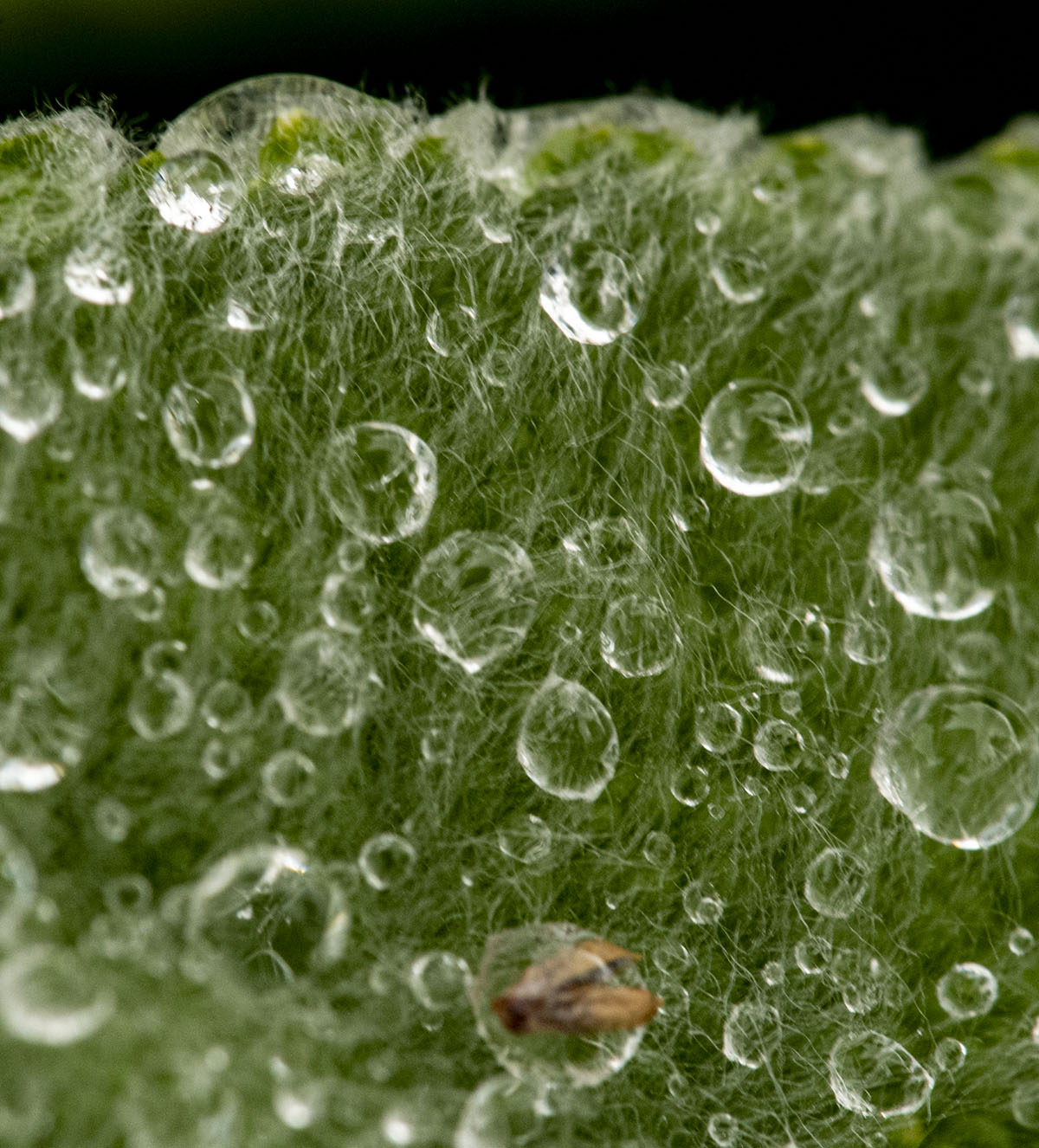
I suspect the blurry areas are caused by the flower not being level? I'm guessing the waterdrops were on the flower when you brought it into the house? I like that the two at the top resemble aliens. I think the colors are good, but the composition and sharpness need some tweaking. Good effort! |
Nov 18th |
| 95 |
Nov 20 |
Comment |
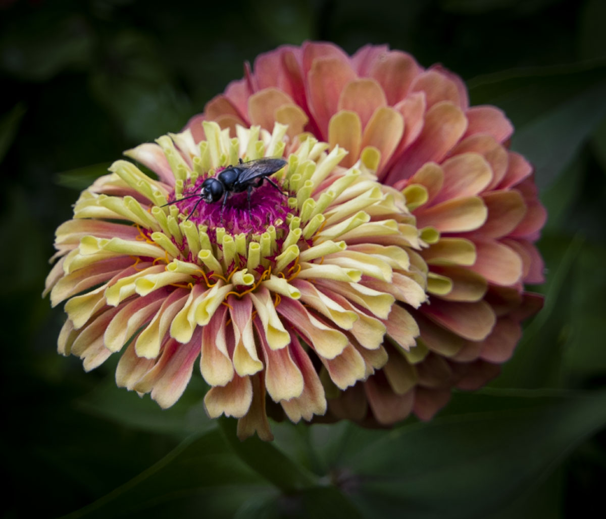
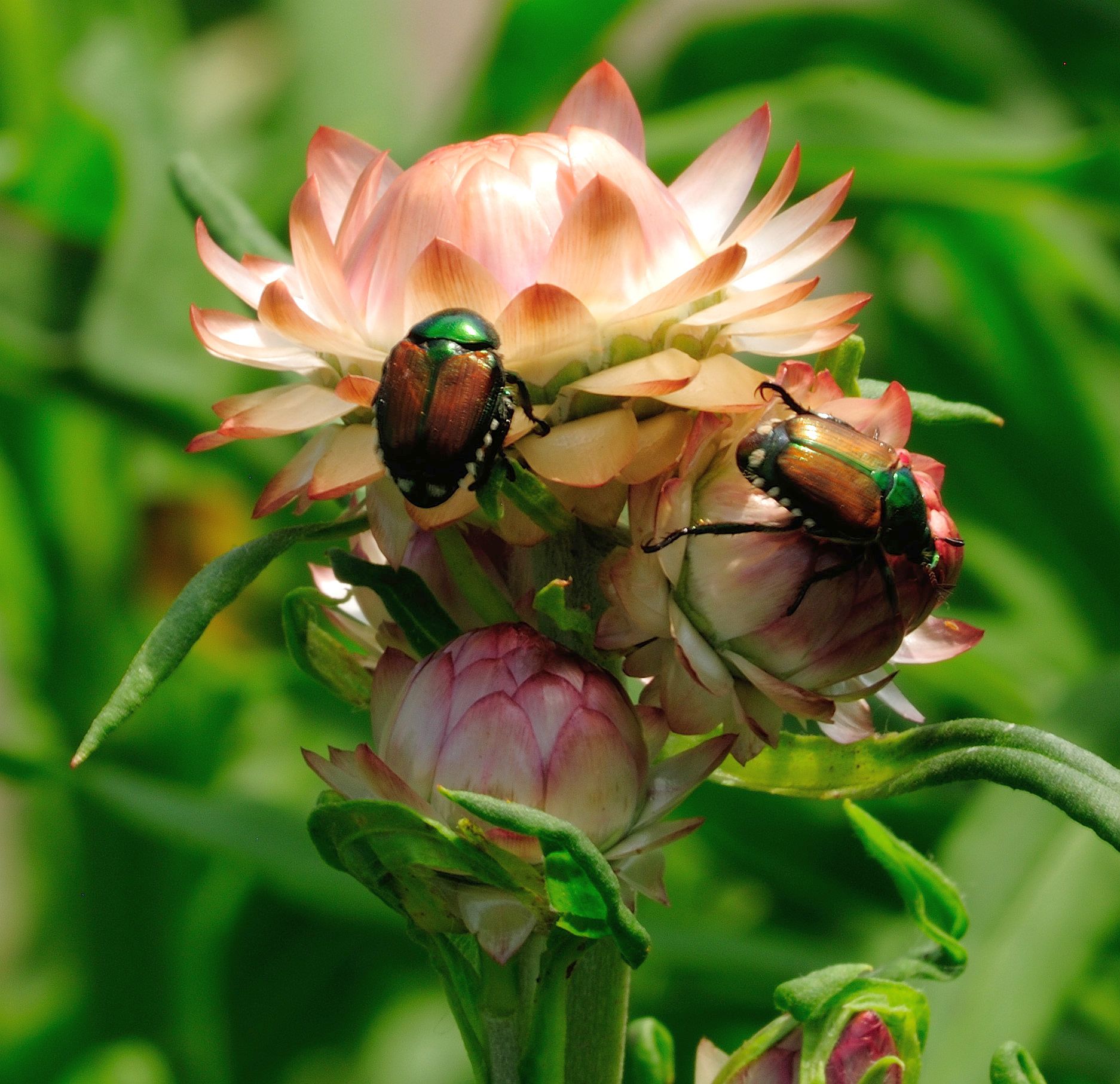
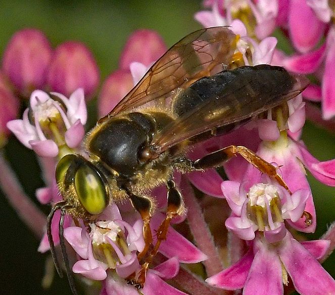
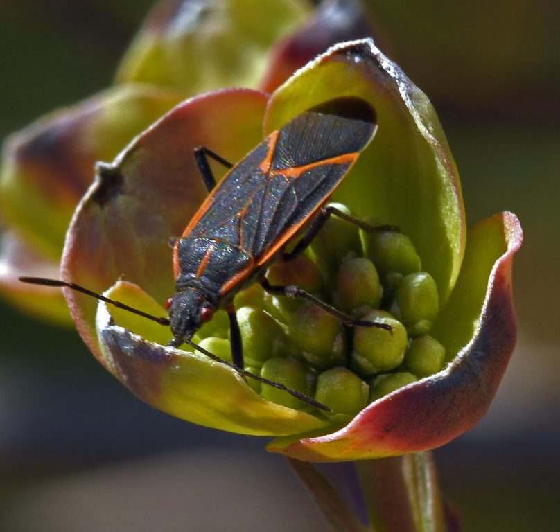
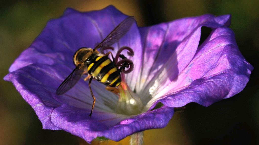
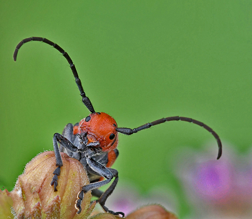
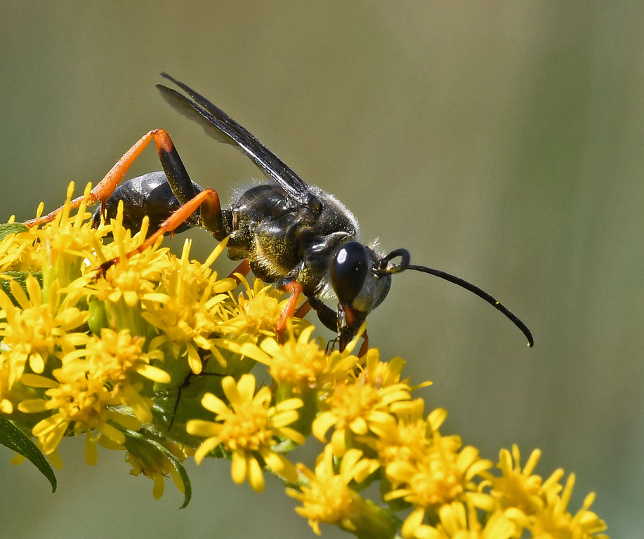
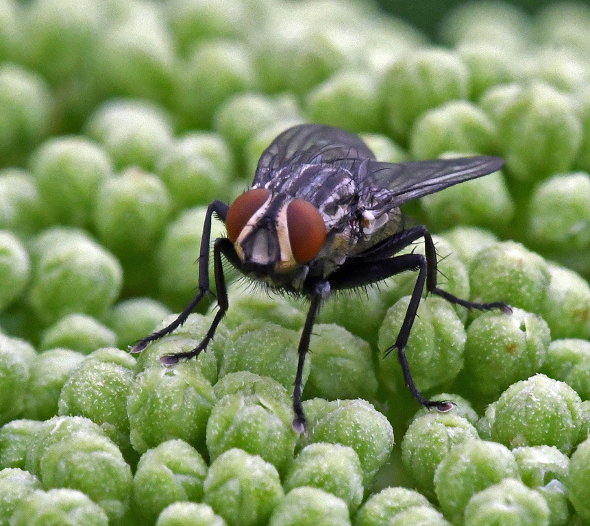
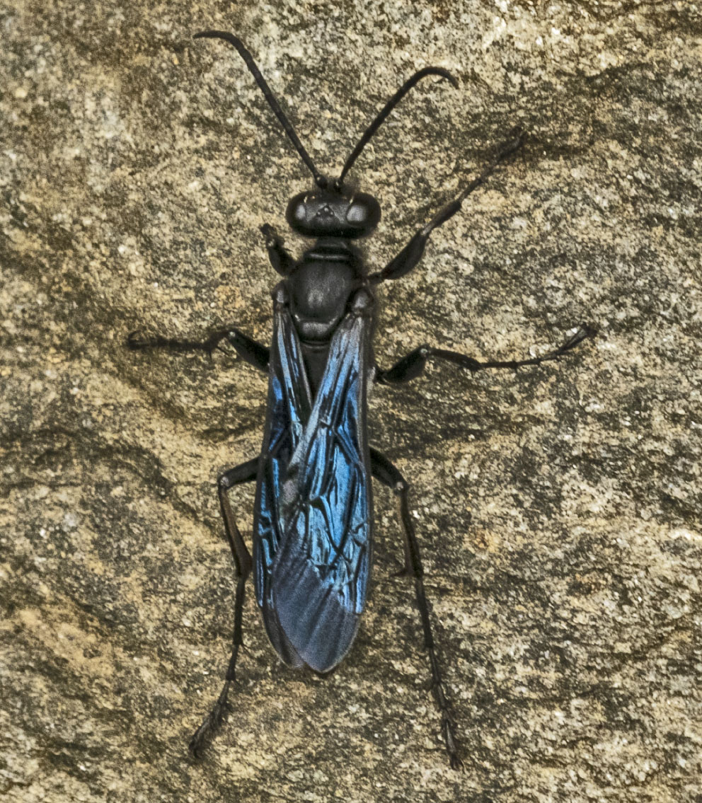
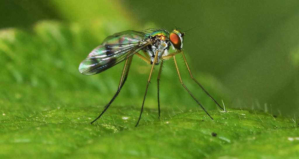
What? No forehead? No ear? No eye? Oh, wait! Amazing how close you can get with a $30 instrument. I like that you picked the eye for your subject, even though it doesn't have that honey-combed effect that so many insects seen to possess. It looks like the wasp has donned a vest with those yellow borders. |
Nov 18th |
| 95 |
Nov 20 |
Comment |
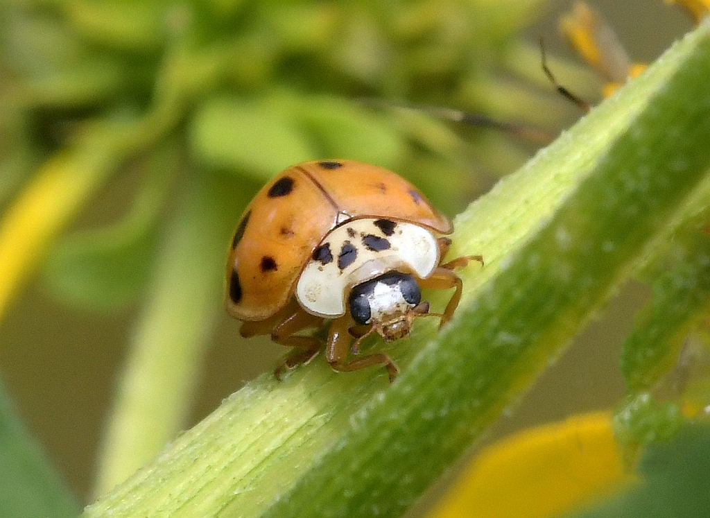
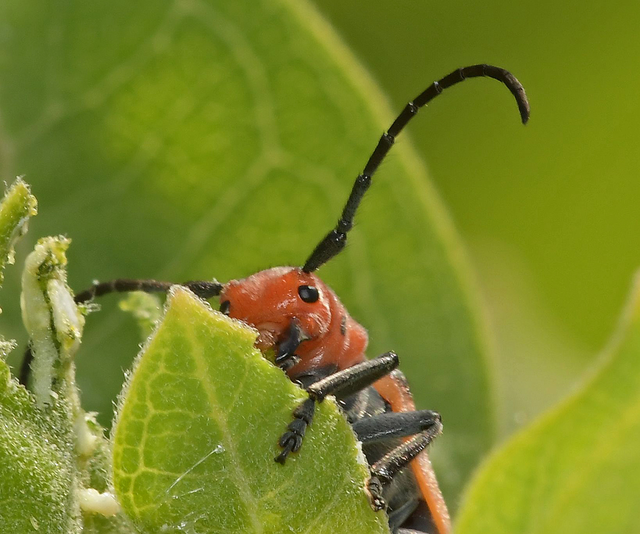
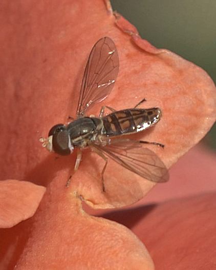
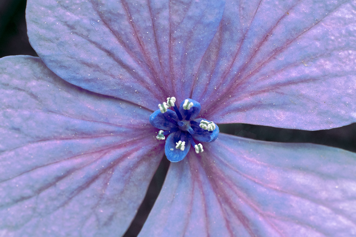
Really nice image all around - composition, colors, clarity. I have a suggestion and a question - the suggestion is to darken the lower right corner, and the question is do you use auto, or manual, focusing? |
Nov 18th |
| 95 |
Nov 20 |
Comment |
Ha! My first look I thought it was a miniature bun of some kind, with melted butter in the center!!
I like your composition, on the ground beans, and the colors are real, the bean sharp, but there's no aroma?? My suggestion is to put a bit of blur on the grounds.
|
Nov 18th |
| 95 |
Nov 20 |
Comment |
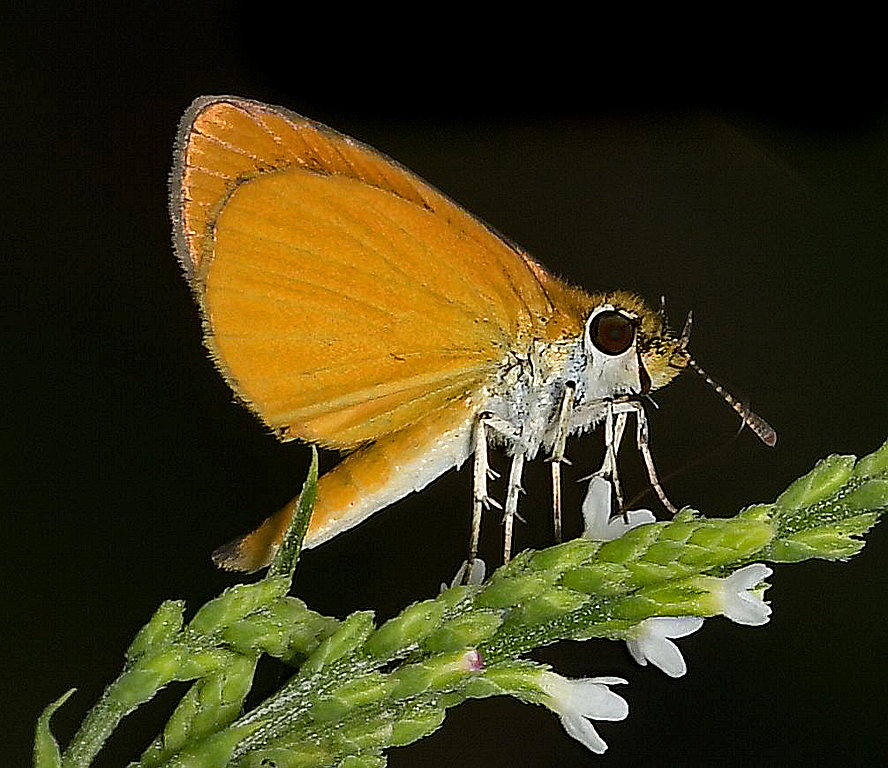
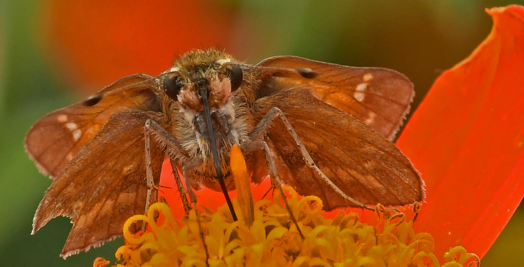
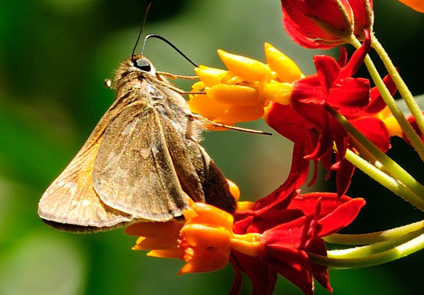
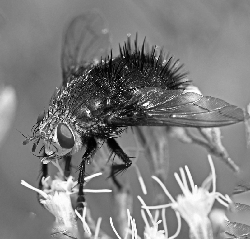
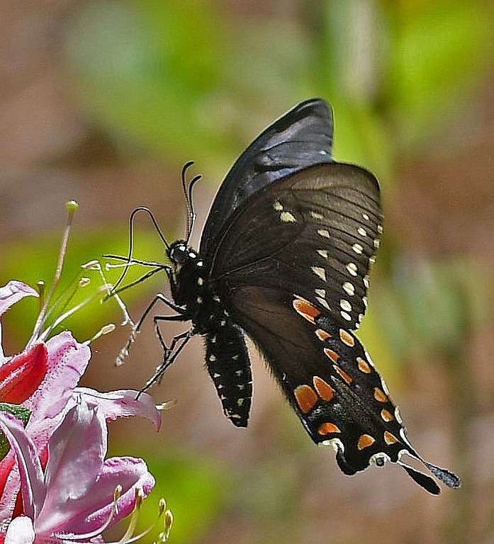
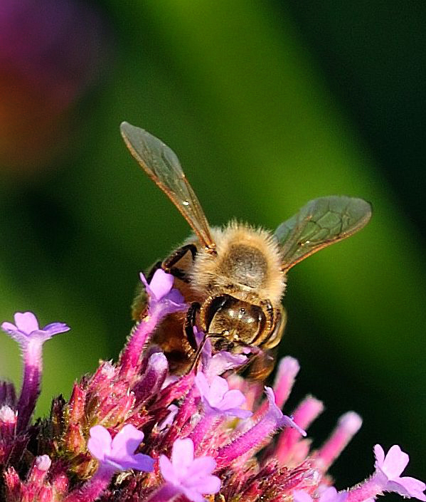
It appears to me that you were only able to get the head into focus, but you were able to get the entire butterfly and a bit of what it's standing on into the composition. This tells me you're shooting "close up", but not macro. Can you tell us more about your settings - what mode (M, S, A, P), what was your shutter speed, ISO, flash or not. |
Nov 18th |
6 comments - 7 replies for Group 95
|
24 comments - 20 replies Total
|