|
| Group |
Round |
C/R |
Comment |
Date |
Image |
| 29 |
Sep 20 |
Reply |
Funny! I, obviously, was mentally absent for the start of my comment. 🙄 |
Sep 18th |
| 29 |
Sep 20 |
Reply |
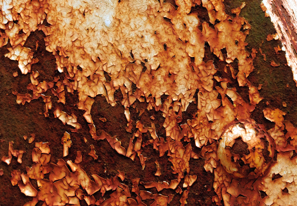
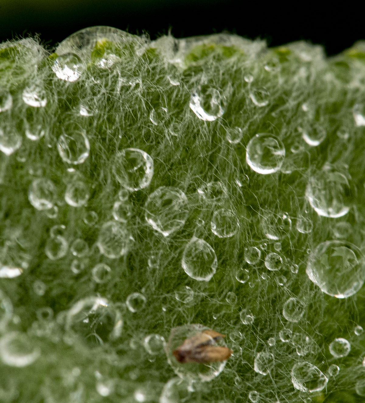
I went back and removed those vertical lines and a couple of other spots that I thought were unnecessary/annoying. |
Sep 14th |
 |
| 29 |
Sep 20 |
Reply |
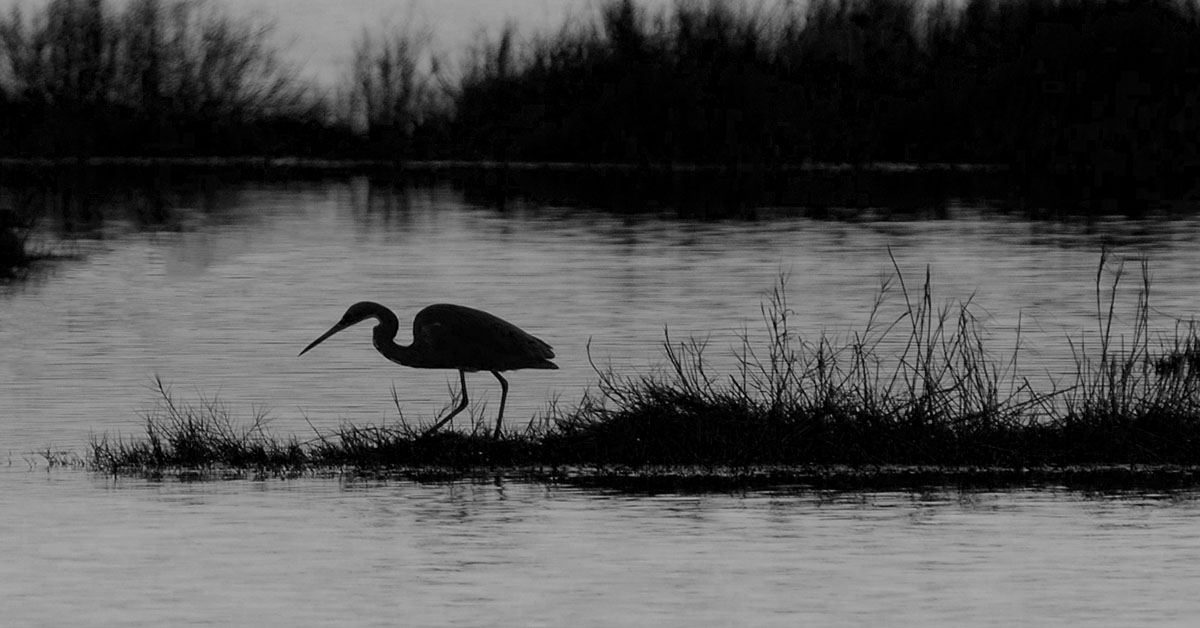
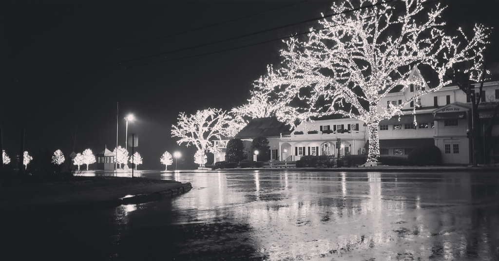
Bob, I thought those vertical lines were small waterfalls |
Sep 14th |
| 29 |
Sep 20 |
Comment |
Bob, I thought the title of your image intimated that the lightening was a distraction, not the subject of your image. For me the coloring of the clouds is the eye-grabber. I think looking at it this way, the lightening is intended to lead our eyes out of the image. I like it! |
Sep 14th |
| 29 |
Sep 20 |
Comment |
WOW! KAREN, I love this shot!! It's all about the EYE! Would not change a thing. |
Sep 14th |
| 29 |
Sep 20 |
Comment |
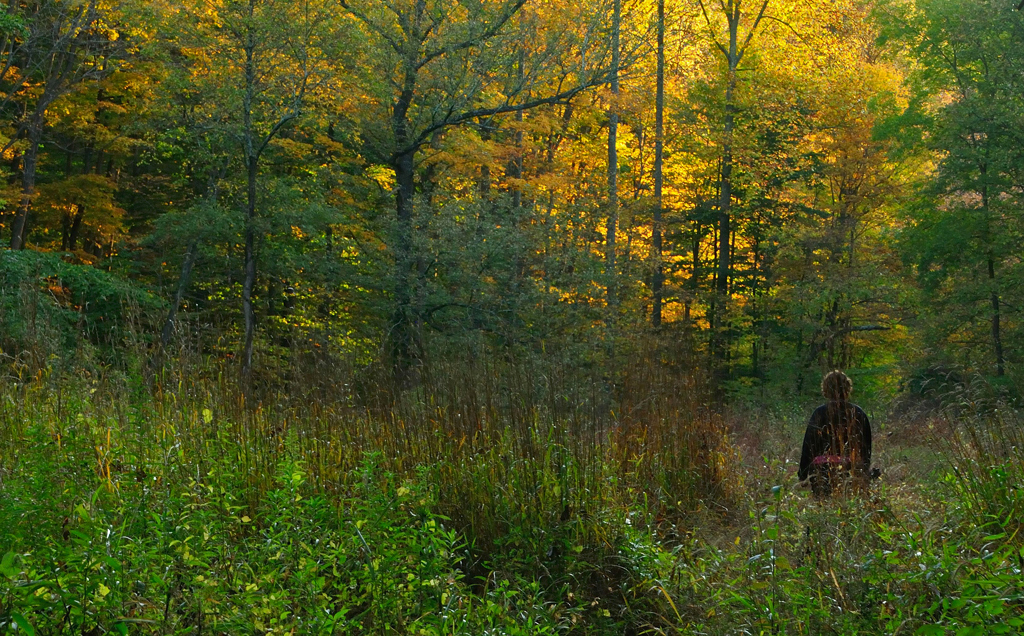
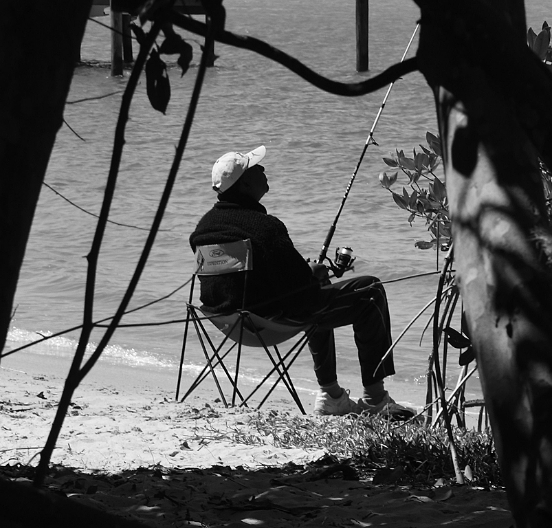
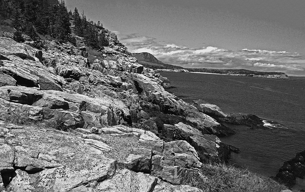
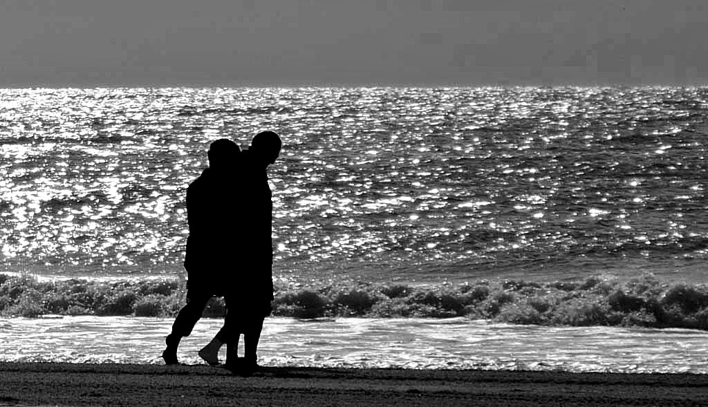
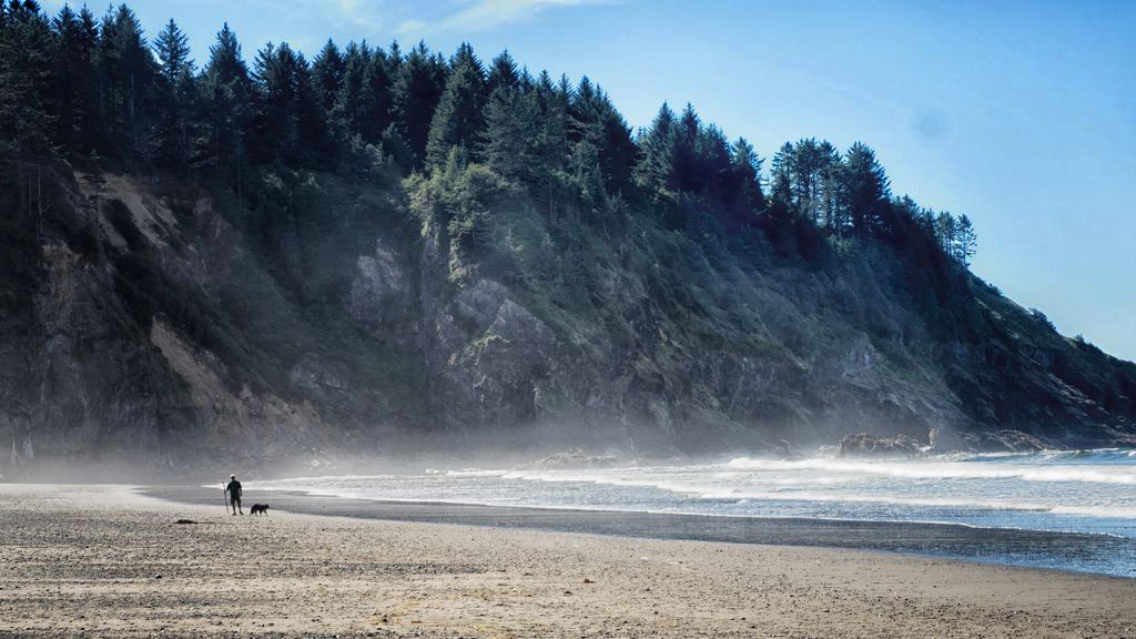
That's a really nice scene, Judy. I especially like the composition and, I don't think anyone would have known the position of the man if you hadn't mentioned it.
My suggestions would be to lighten the background so we can see the details of the coastline and the trees, and to darken the sky a bit. What do you think? |
Sep 14th |
 |
| 29 |
Sep 20 |
Comment |
Kat, first, welcome to the group.
I certainly agree with the compliments on seeing this photo op that I believe the vast majority of people would never see. And, of those who might have seen it, few would have dropped to it's level to capture this image.
I also agree with ditching the use of auto mode and moving to aperture and/or shutter priority. I'd suggest you go to aperture first. I also agree with the comments Bob and Lance made.
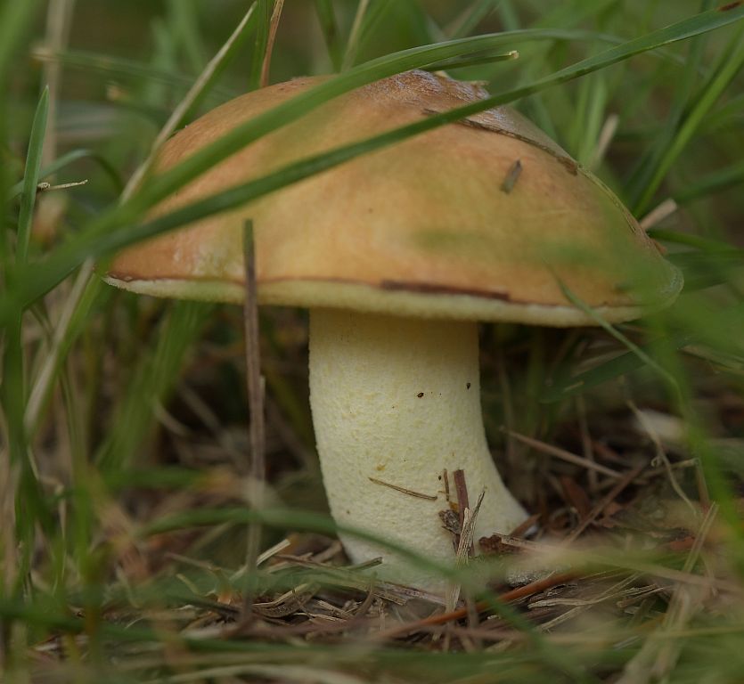
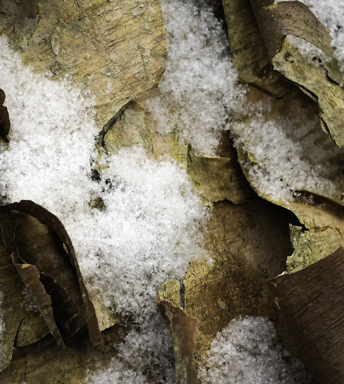
As a former user of PS Elements, I think this image is a good one for you to experiment with the Spot Healing Brush Tool. There's a lot of detritus, particularly on the mushroom and snails, that you can eliminate pretty easily with that tool. |
Sep 14th |
| 29 |
Sep 20 |
Reply |
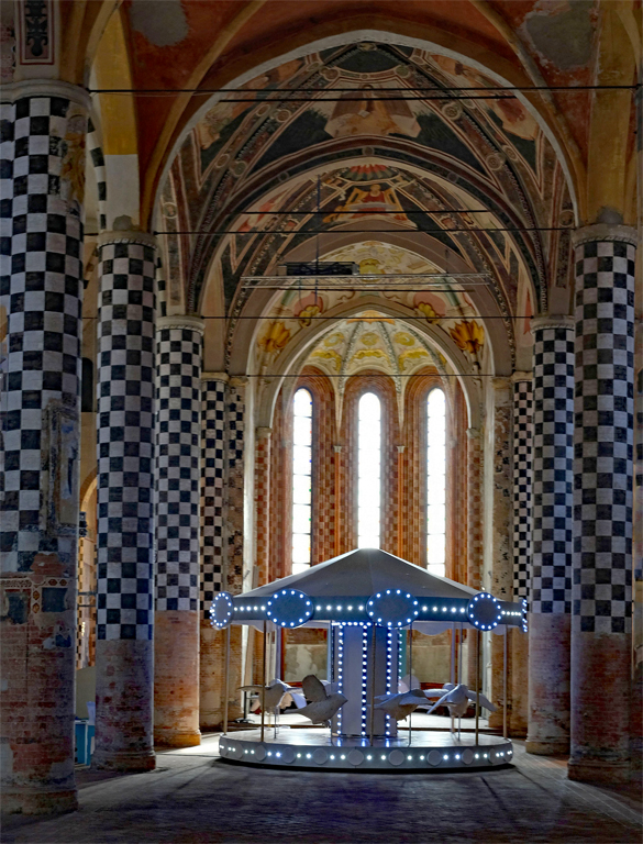
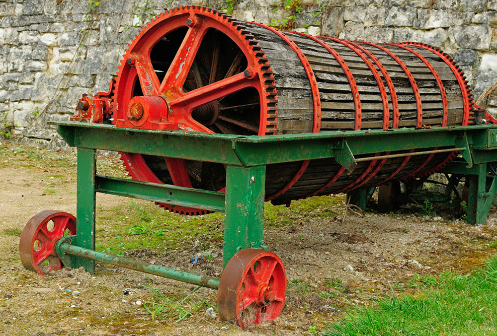
Looks like something from an old Flash Gordon serial when I was a kid. I |
Sep 6th |
4 comments - 4 replies for Group 29
|
| 74 |
Sep 20 |
Comment |
Ata, having lived in Istanbul and traveled in some parts of Turkey for 18 months, I definitely see the emotion and feel a sense of time/place in your images. For me the facial expressions of your images are something that takes me back to the mid-1960s. I can image this woman's voice and emotion as she tells you of her past.
I agree that lightening her face and scarf, along with darkening the background would improve the image. |
Sep 14th |
| 74 |
Sep 20 |
Comment |
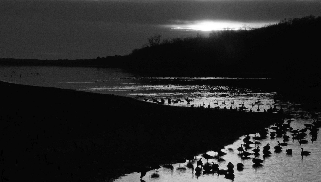
This image has a kind of surreal feel to it. As Arne mentioned the crossing diagonal lines are interesting. I think the monochrome version really makes it difficult to see a lake (even the color version, to me, doesn't resemble a typical lake image) and the birds are mere dots in the landscape. Nothing appears as what it is. I like it! |
Sep 14th |
| 74 |
Sep 20 |
Comment |
I, too, like your composition and flip of the image. I like the adjustments you made to the second image. I think they give the image a moody, lonely feel. |
Sep 14th |
| 74 |
Sep 20 |
Comment |
I like conversion and the texture you show. I have always liked moon shots but have not been very successful in getting any that I like. Tried about a week ago when the Moon, Jupiter and Saturn were in a nice triangle but deleted all of them. I'm going to use some of your suggestions next time - Thanks! |
Sep 5th |
| 74 |
Sep 20 |
Comment |
I like the conversion better than the original, and treating it as an abstract was a good choice. I don't know if it's a case of not enough sharpness or that the silos are old and weather-beaten? |
Sep 5th |
| 74 |
Sep 20 |
Comment |
Thanks, Arne. I think you're right about the people in the background. I need a bit more Photoshop education to learn how to get that done. |
Sep 5th |
| 74 |
Sep 20 |
Reply |
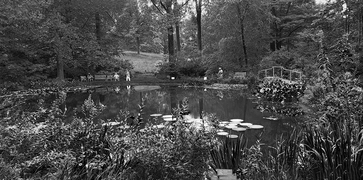
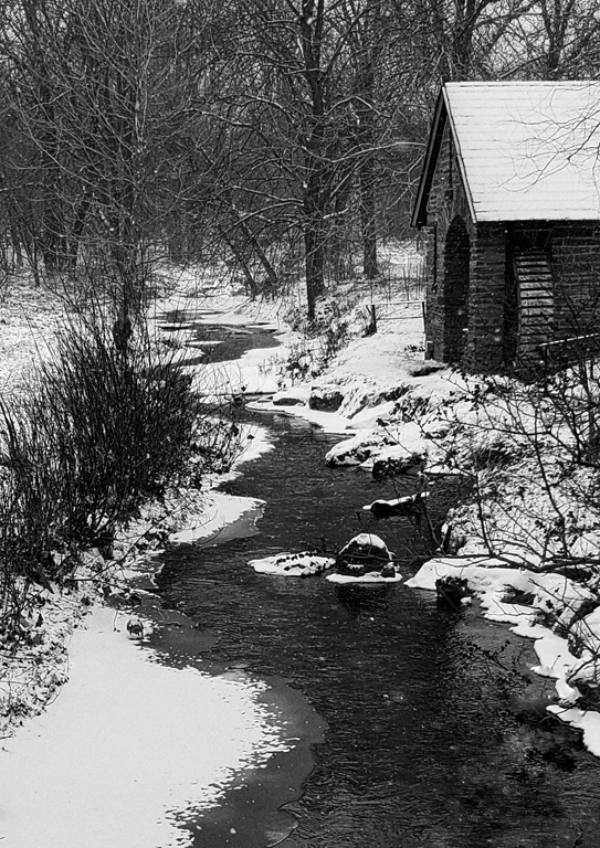
Thanks, Ying. You're correct, it is messy - color or B&W - because it's an Arboretum, not gardens. There is an area near the original house that is gardens, but the rest of the property is all about the trees and other native plants. |
Sep 5th |
| 74 |
Sep 20 |
Reply |
Thanks, Ata. You're correct - since it was a cell phone that I used, it was on AUTO.
As I mentioned this is from my first visit to Mt. Cuba Center. It is more arboretum than gardens, especially at this time of year. It's mission is the fostering of native plants/trees and educating the public on how to do the same in their own environments. I now have a membership, so I'm looking forward to going in the spring and seeing the gardens in bloom. |
Sep 3rd |
| 74 |
Sep 20 |
Reply |
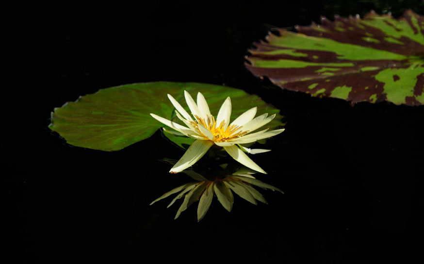
Thanks, Haru. I stood in the place with the lowest foliage to make this image. The Mt. Cuba Center (which is in the USA, not Cuba) generally lets things grow without interference. I, too, like the lily pads in the water but the only way to see them is from the opposite side of the pond and they appear very small from that viewpoint. |
Sep 1st |
6 comments - 3 replies for Group 74
|
| 80 |
Sep 20 |
Reply |
Forgot the image - mea culpa! |
Sep 23rd |
 |
| 80 |
Sep 20 |
Comment |
Thanks, Isaac. I think that does improve the image. |
Sep 23rd |
| 80 |
Sep 20 |
Reply |
Thanks, Karen. |
Sep 23rd |
| 80 |
Sep 20 |
Reply |
Thanks for the comments, Victor. Regarding the "sharpening halos, I didn't sharpen the image. I'm adding the original to this post so you can see that there were there in the original phone image. I'm curious about your process to remove halos, since that something I've never looked for/tried to correct. |
Sep 23rd |
| 80 |
Sep 20 |
Reply |
Thanks, Jim. |
Sep 23rd |
| 80 |
Sep 20 |
Reply |
Thanks, Carol. |
Sep 23rd |
| 80 |
Sep 20 |
Reply |
Thanks, Bev. |
Sep 23rd |
1 comment - 6 replies for Group 80
|
| 95 |
Sep 20 |
Reply |
First rule of DD participation....NEVER FLIP OFF THE HONORABLE WEBMASTER@PSADIGITAL.ORG!!!!!!!� |
Sep 18th |
| 95 |
Sep 20 |
Reply |
I like Tom's clean up, but prefer the horizontal image flipped. |
Sep 18th |
 |
| 95 |
Sep 20 |
Comment |
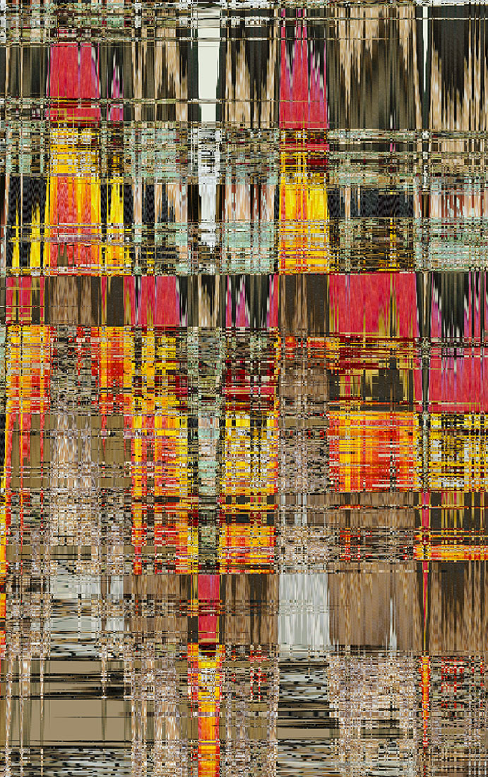
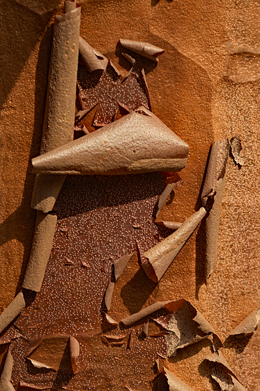
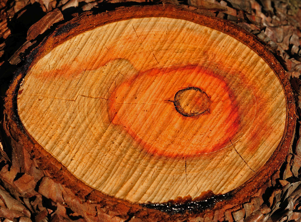
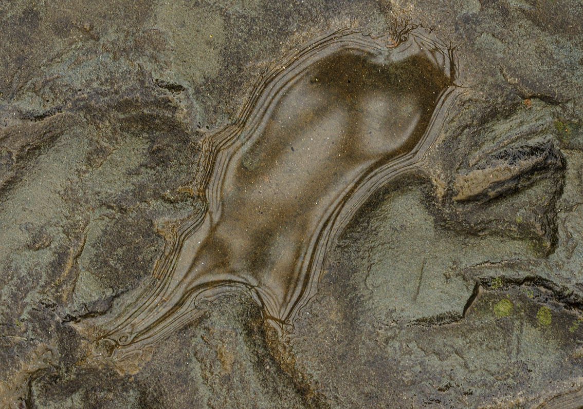
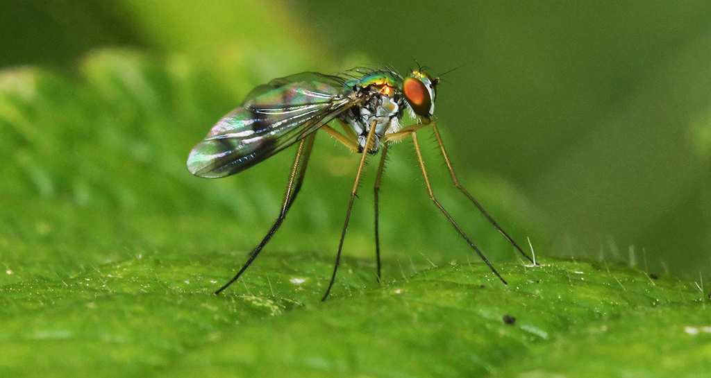
Tom, this makes me think of looking at a Google map with intersecting Interstates. I assume the lines are shadows? The color doesn't translate very well at that distance. I'm thinking your "toy" might be good for abstracts? |
Sep 17th |
| 95 |
Sep 20 |
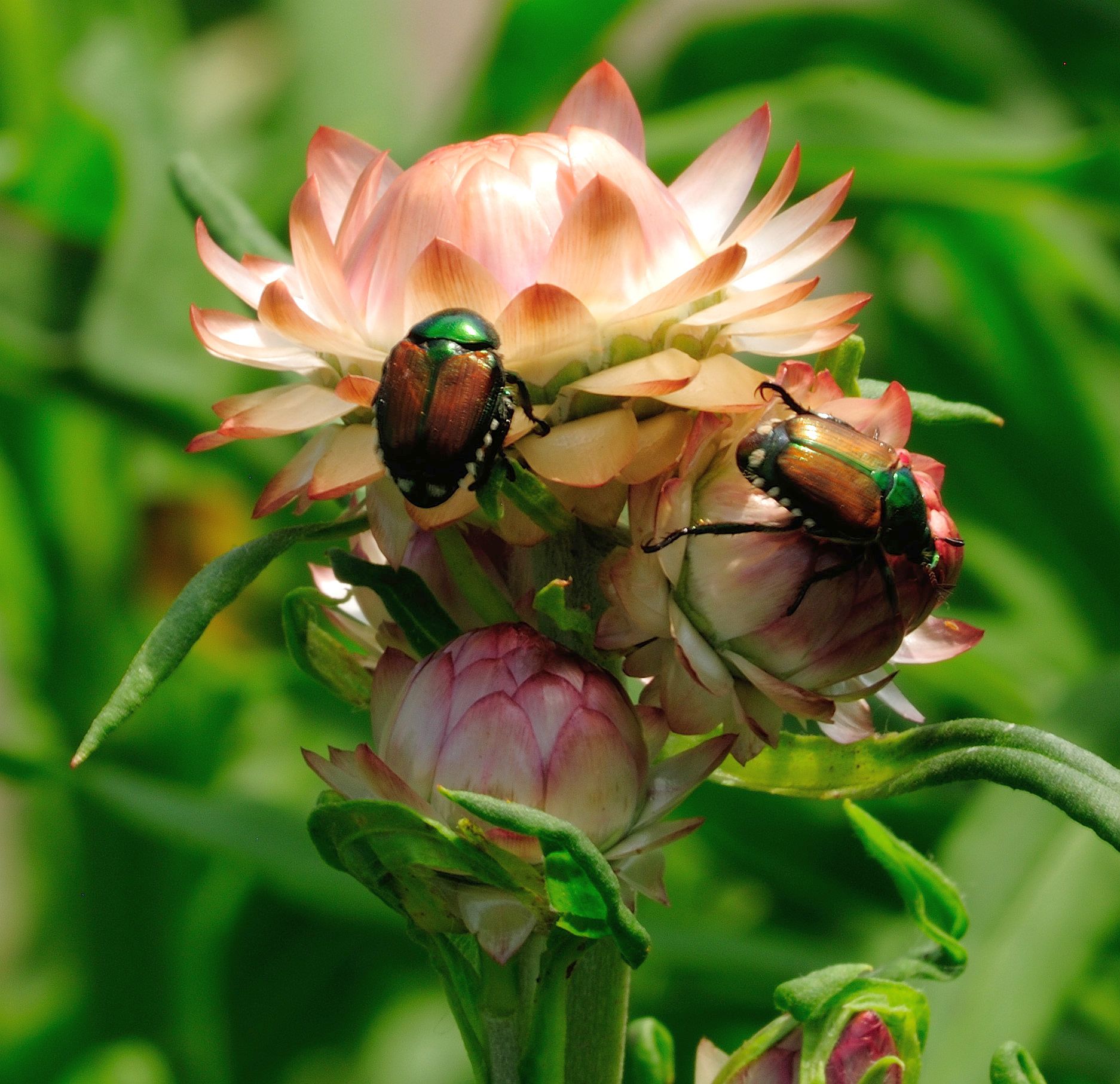
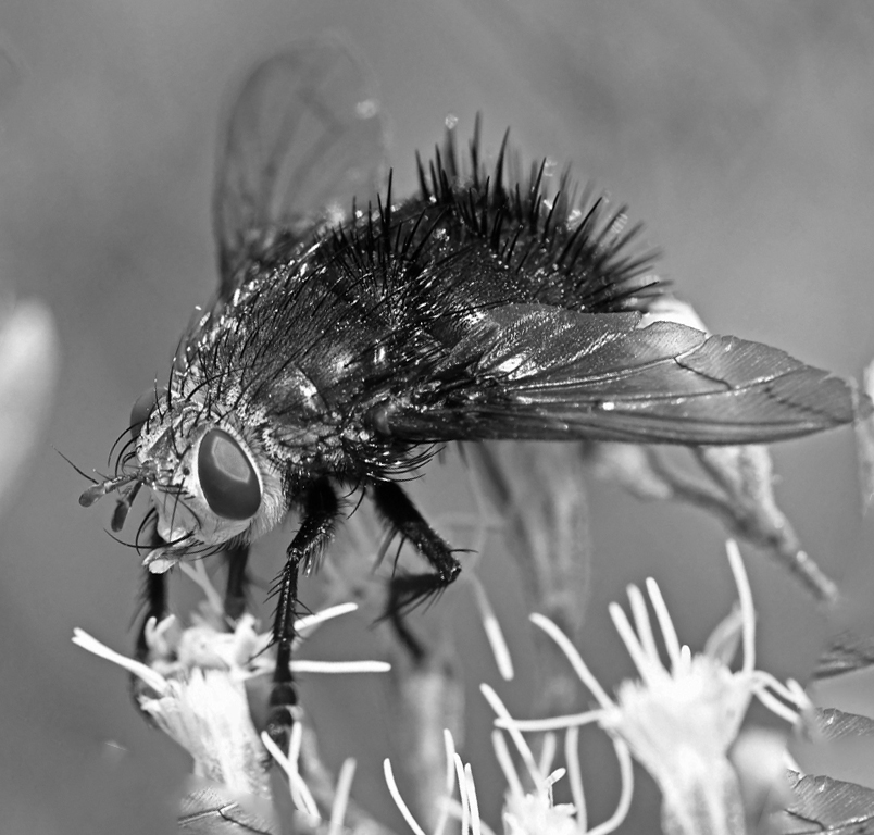
Comment |
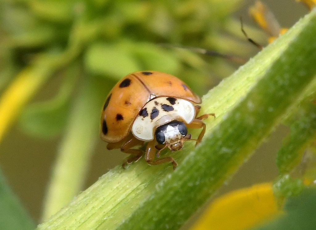
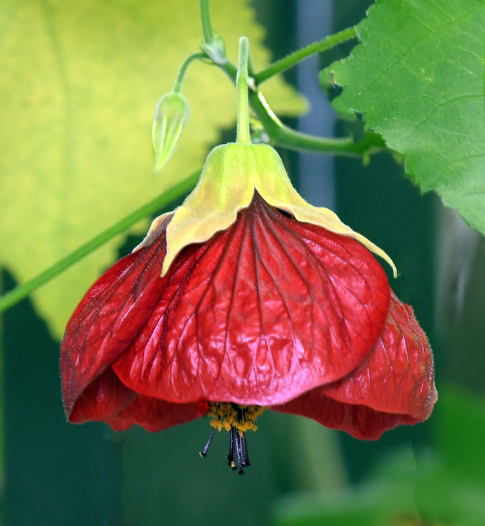
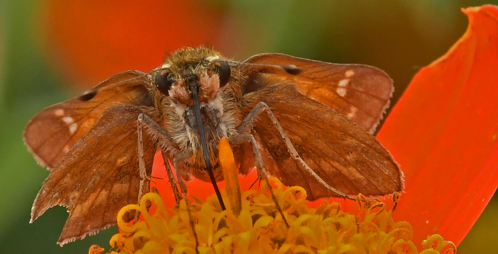
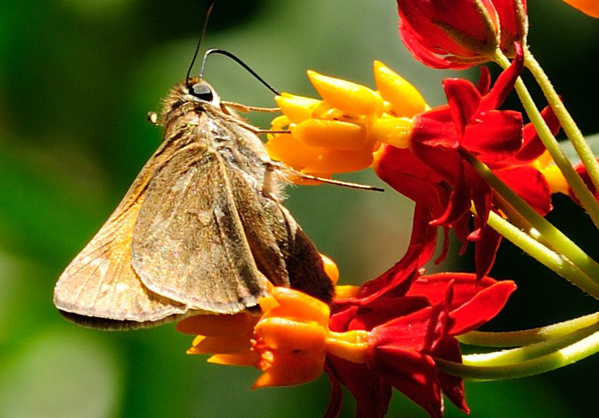
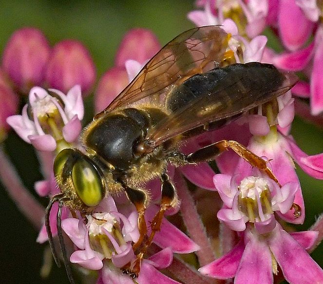
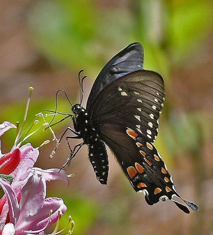
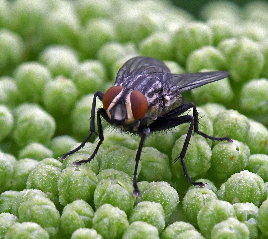
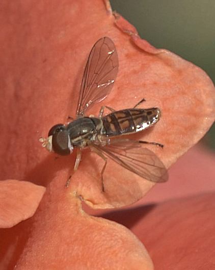
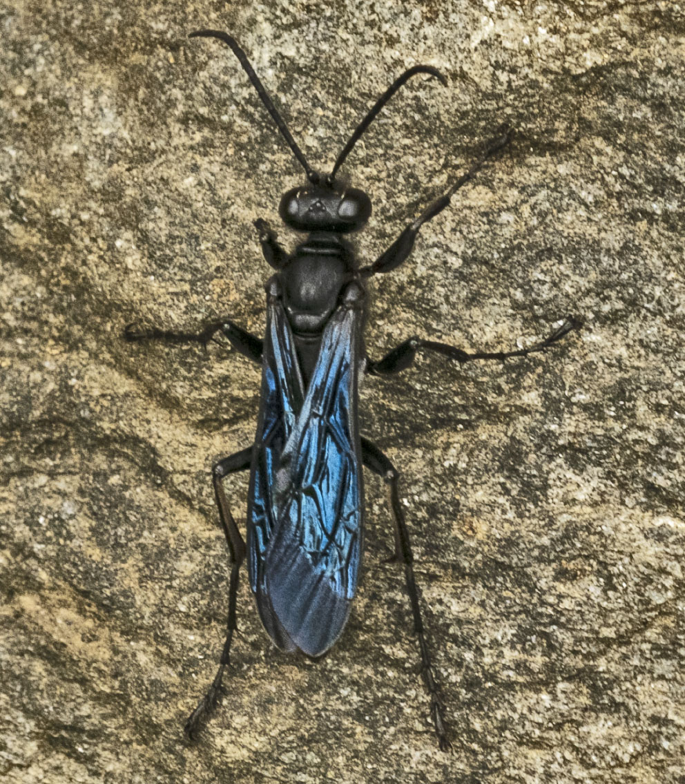
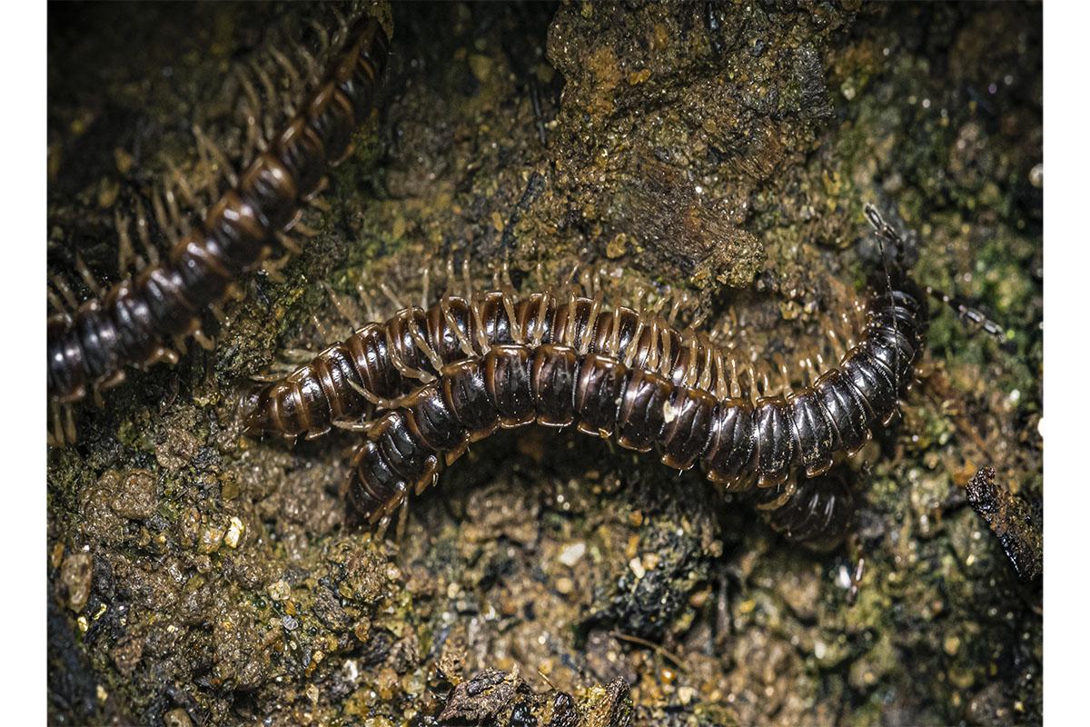
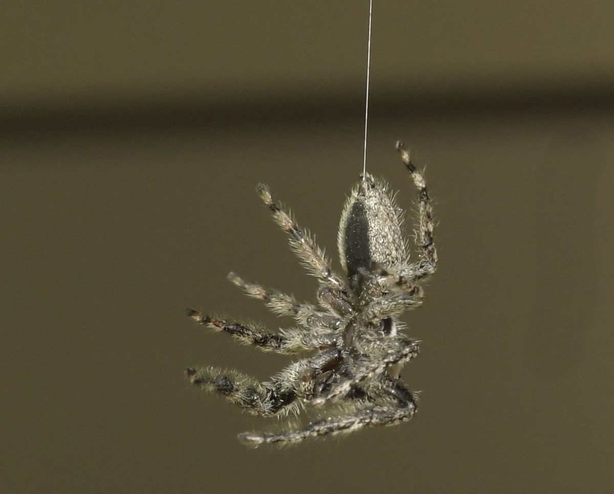
Interesting image - not the first time I've seen this insect mating/intruding behavior. I think the colors are very good. The image appears not quite sharp to me? Did you consider adjusting the composition to diagonal or horizontal? |
Sep 17th |
| 95 |
Sep 20 |
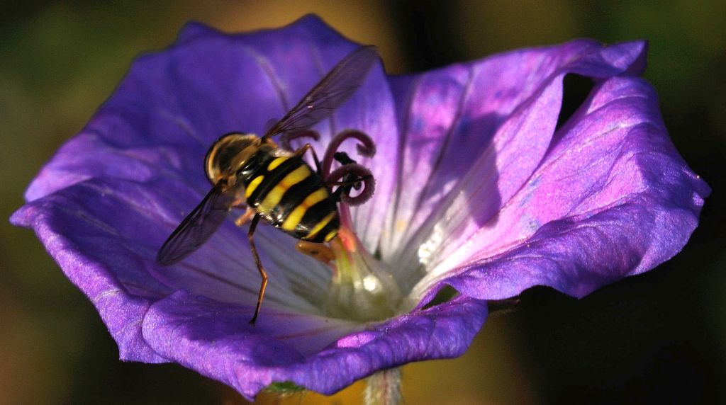
Comment |
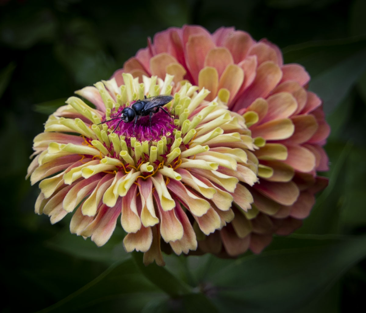
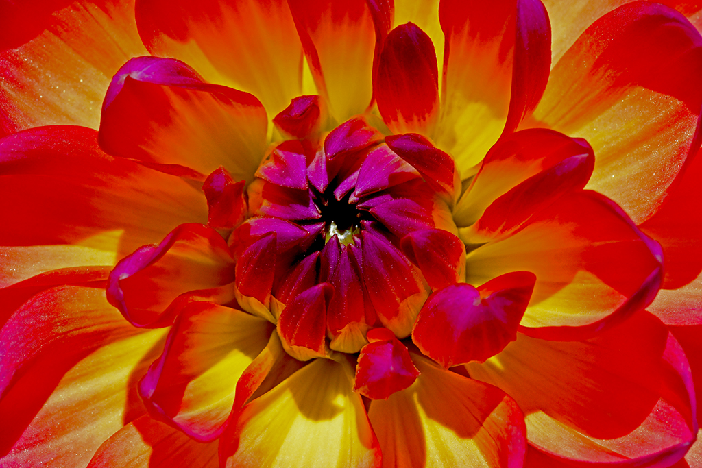
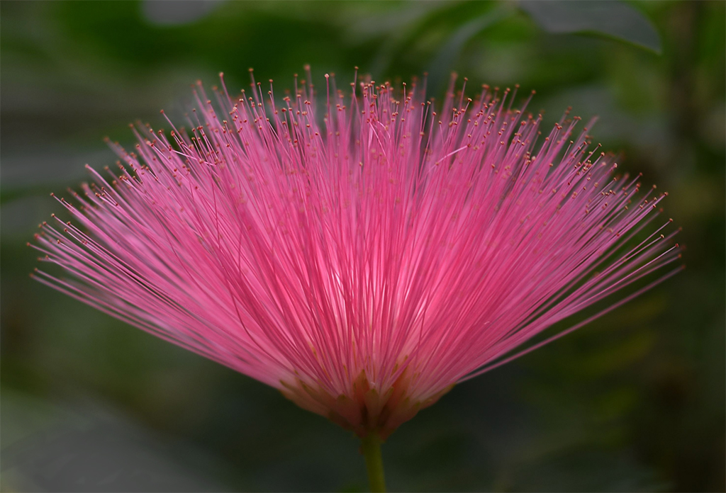
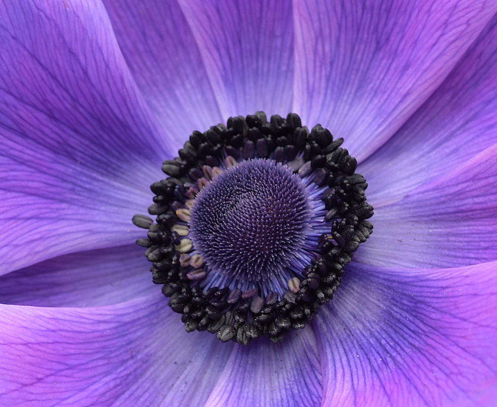
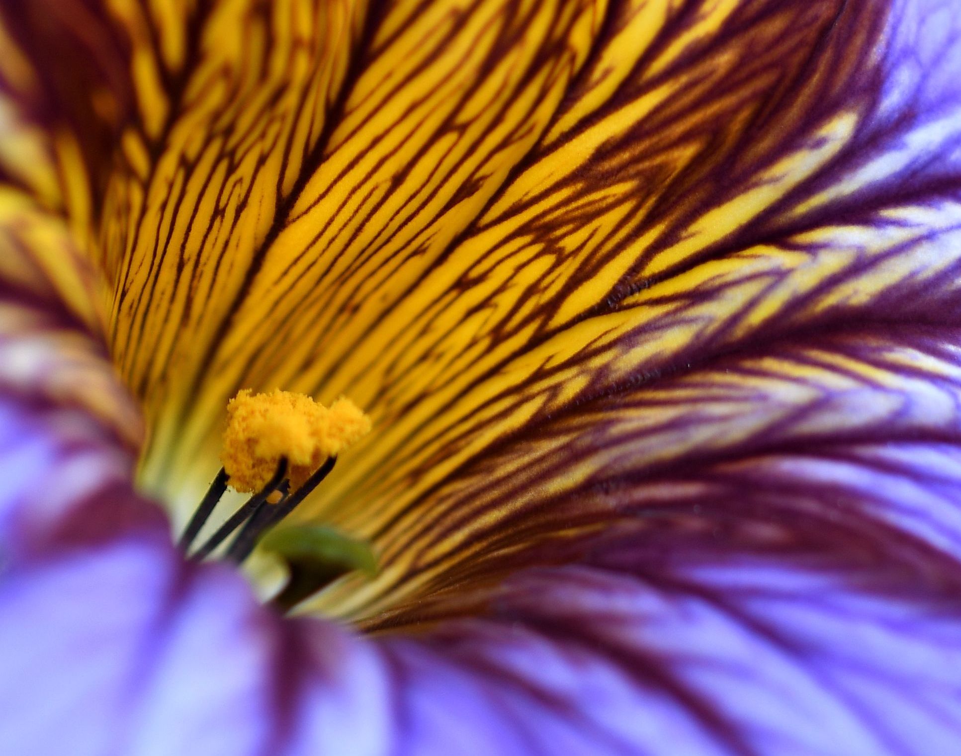
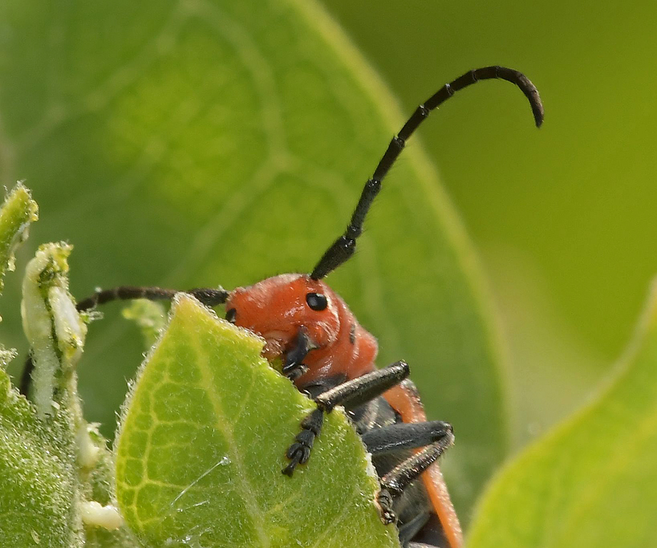
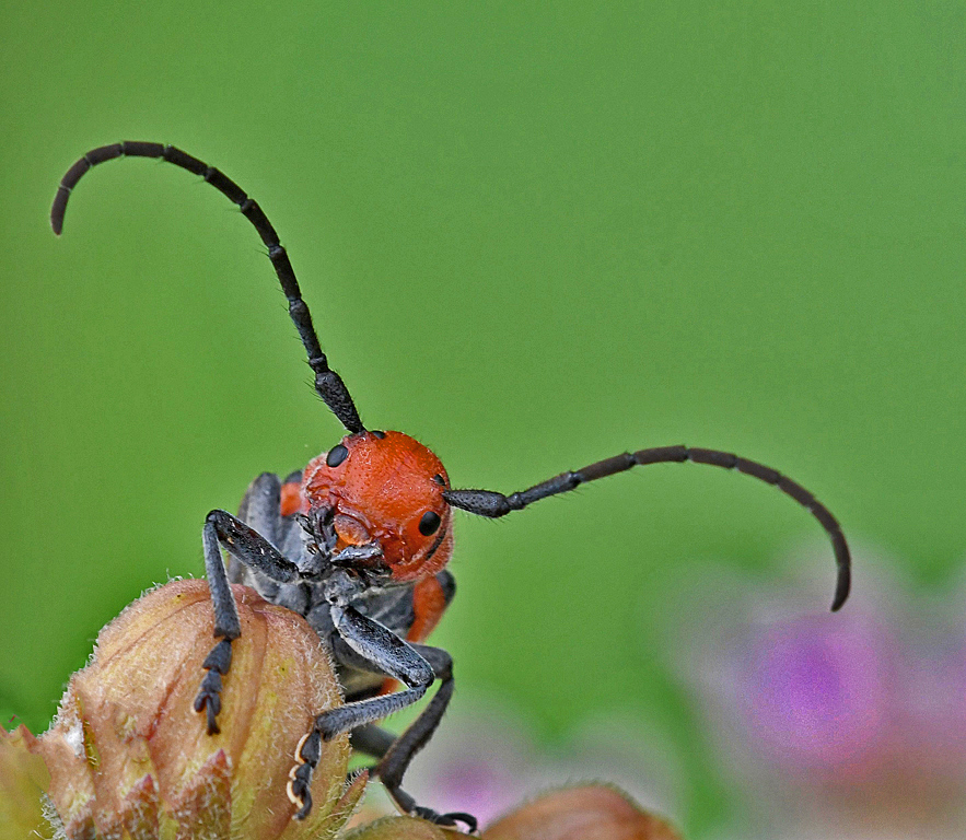
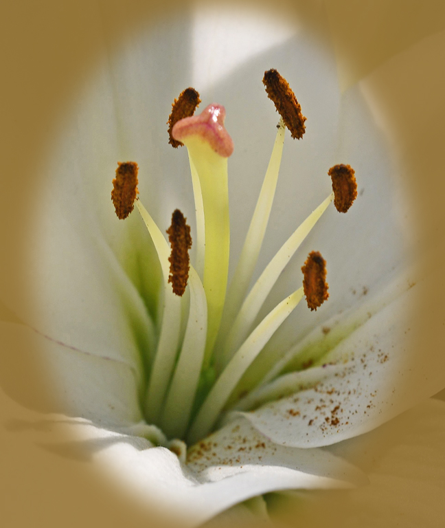
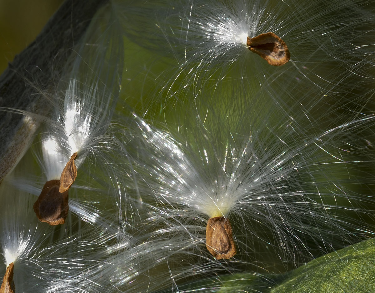
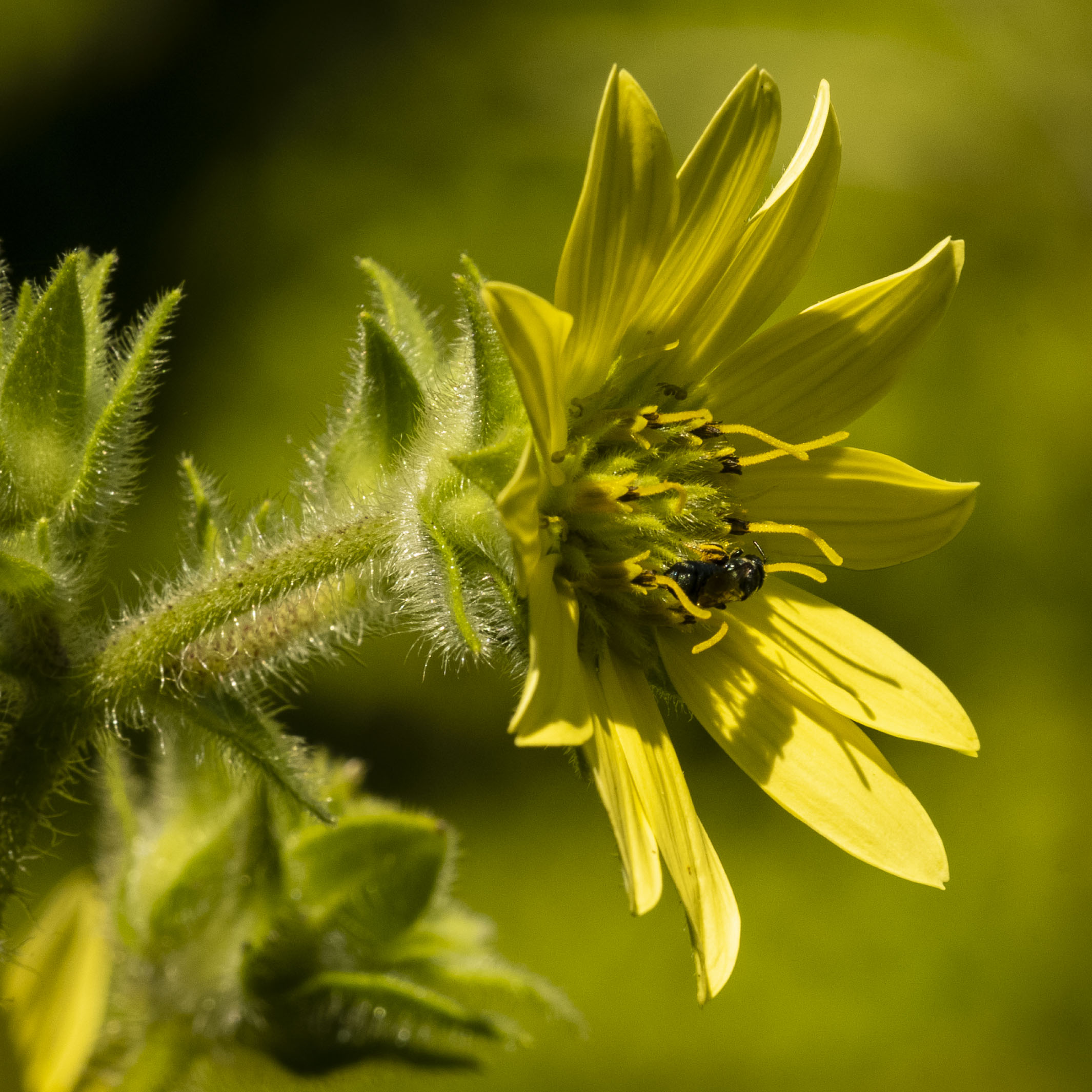
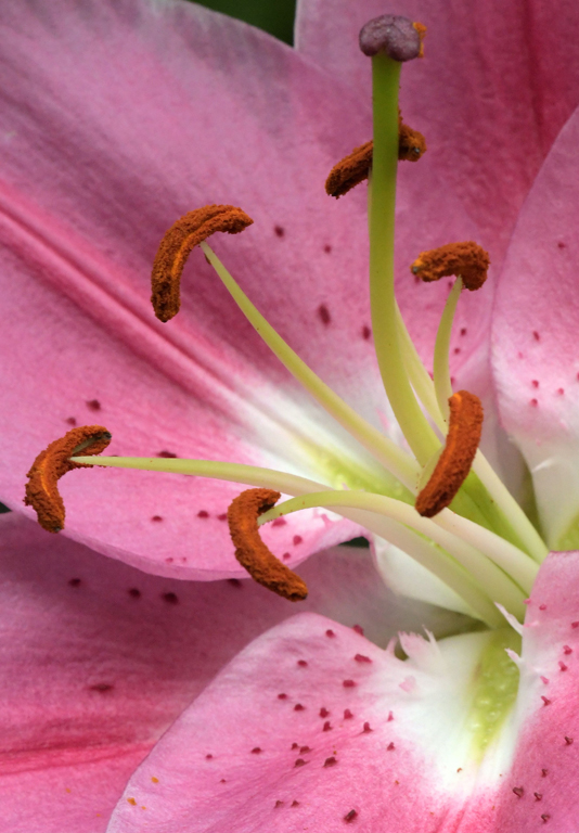
I like the crop, introduced repetition, and change of position. The colors are pretty vivid and the flower is sharp through it's core and on the downward left-center diagonal. I'm curious about it's 1:1 status? |
Sep 17th |
| 95 |
Sep 20 |
Comment |
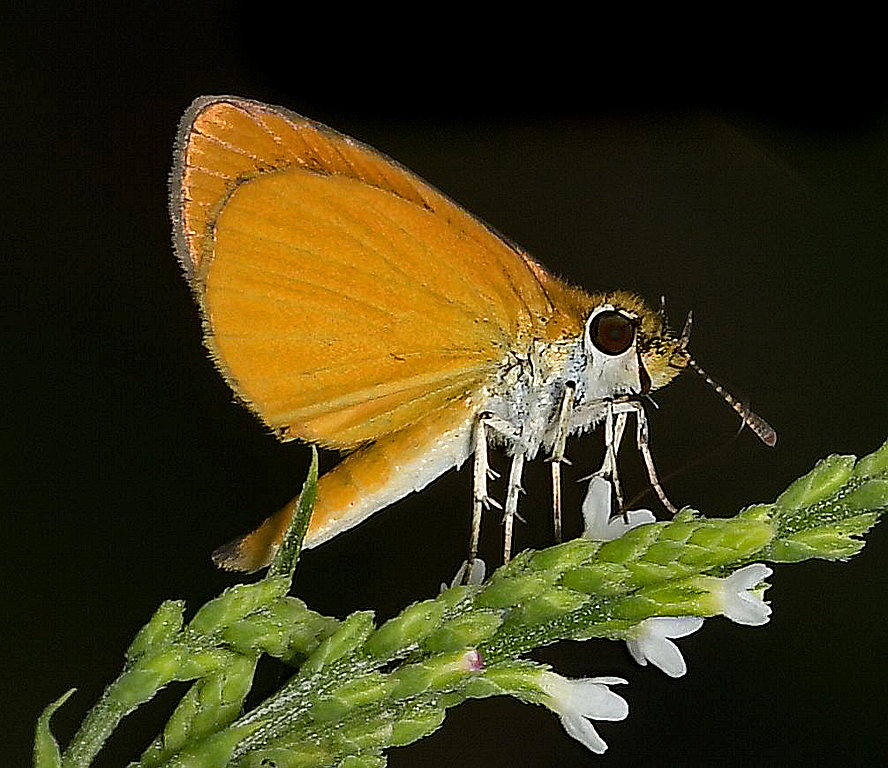
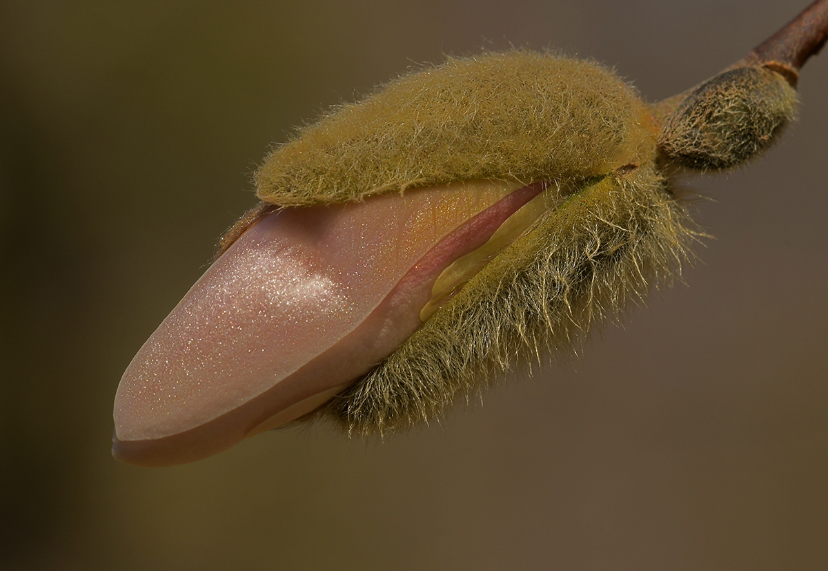
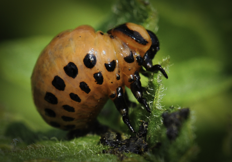
Welcome, Sarfaraz. Do you know the camera settings - your camera, reversing ring, extension tube size, f/stop, shutter speed, ISO, etc.? That is helpful to the members of the group as they review your image. Also, do you have a way of knowing how close to life-size ( 1:1 ) your image is? |
Sep 17th |
| 95 |
Sep 20 |
Reply |
Thanks, Stuart. I'm bothered by that same brightness but don't have enough Photoshop know-how to damp it down. I'm on Lesson 16 of a 30 Lesson course and I know enough at this point to be dangerous to my images!ðŸ˜�½ |
Sep 17th |
4 comments - 3 replies for Group 95
|
15 comments - 16 replies Total
|