|
| Group |
Round |
C/R |
Comment |
Date |
Image |
| 29 |
May 20 |
Comment |
Thanks, Karen. |
May 16th |
| 29 |
May 20 |
Reply |
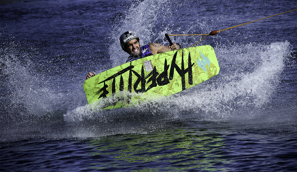
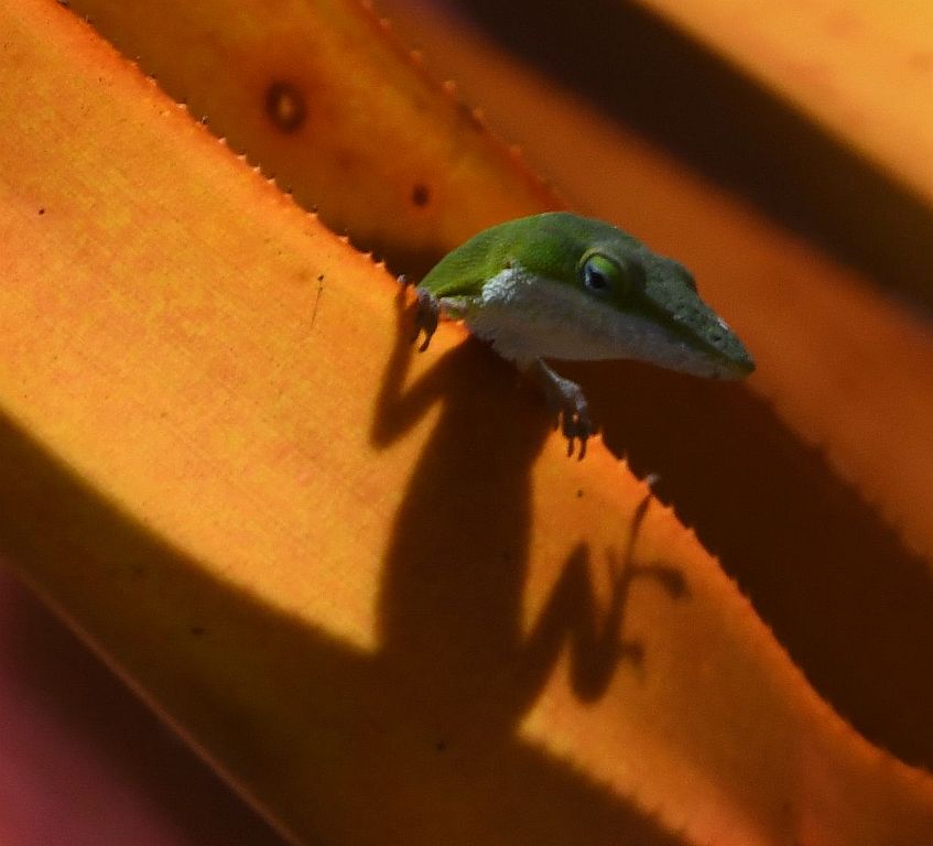
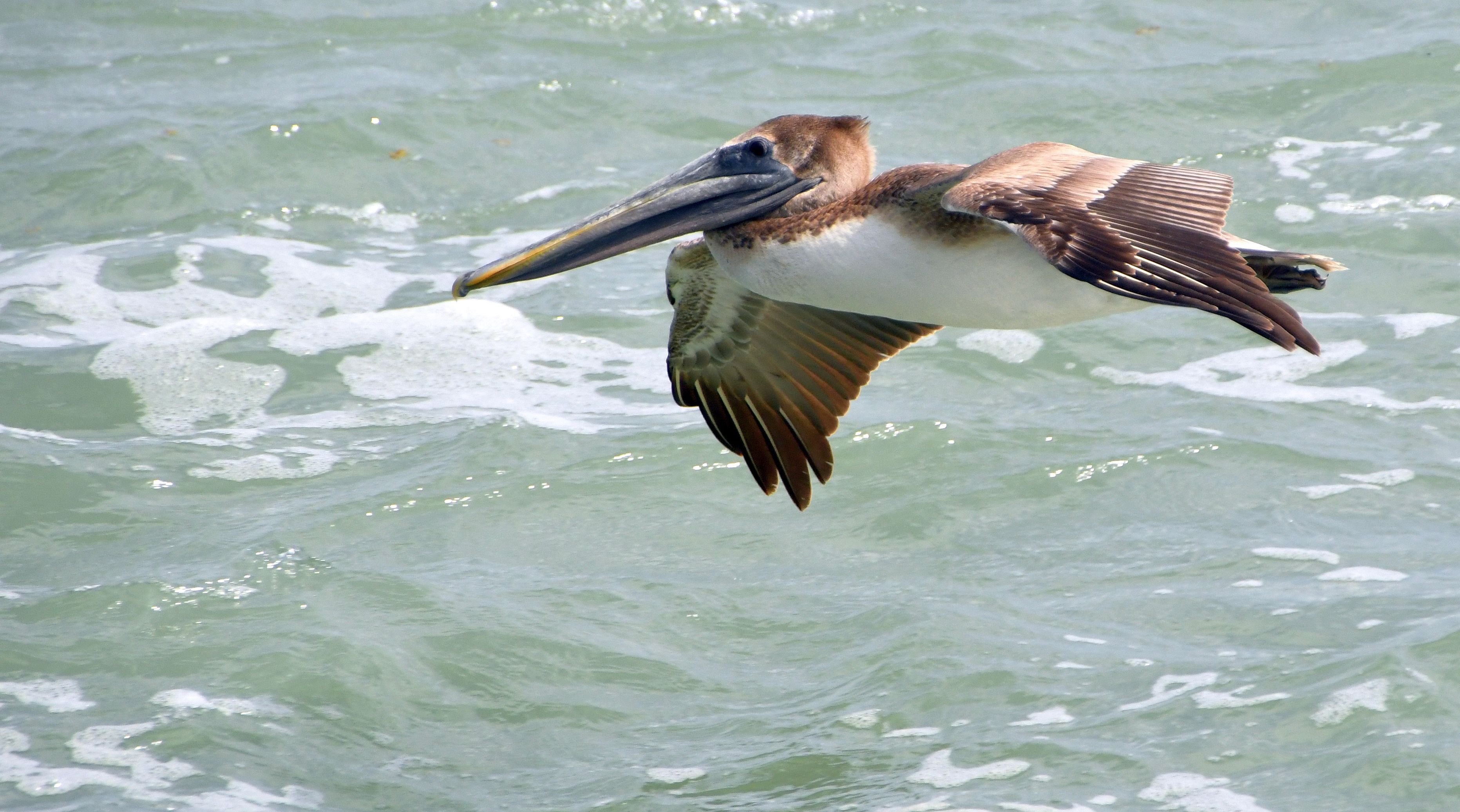
Thanks, Stu. I removed the buoys in the response to Bob Legg's mention of them. |
May 16th |
| 29 |
May 20 |
Reply |
Thanks, Judy. |
May 16th |
| 29 |
May 20 |
Reply |
Thanks, Stephan. |
May 16th |
| 29 |
May 20 |
Reply |
Thanks, Dorinda. |
May 16th |
| 29 |
May 20 |
Reply |
Thanks, Bob. For me, your background is way too dark for FL. I'm going to try the subject selection you used just to become familiar with it. |
May 16th |
| 29 |
May 20 |
Comment |
Very interesting. Learned something new - light painting. I'd never heard the term. I like the image a lot. Since I've never entered a competition and don't intend to, I have no idea what judges like and don't. I went searching for info on light painting and found this -
https://petapixel.com/2016/07/25/basic-guide-light-painting-photography/ |
May 16th |
| 29 |
May 20 |
Comment |
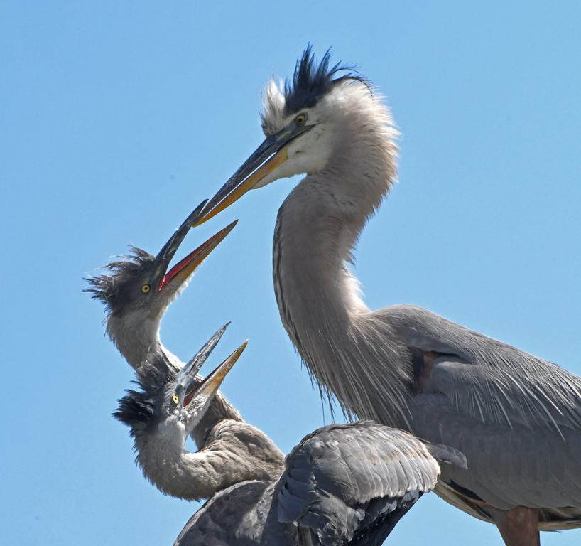
Tam, you have a nice capture here. I'm guessing you picked this nest and waited for some action, which is a good strategy for rookeries. I used shutter priority (1000-1500). I like Judy's treatment of the image. |
May 16th |
| 29 |
May 20 |
Reply |
I did a lot of this during the 6-7 years I was going to FL every winter. I had a D500 - 70-200 lens w/2x teleconverter - HEAVY. I found a monopod was much better than a tripod in that environment. |
May 16th |
| 29 |
May 20 |
Comment |
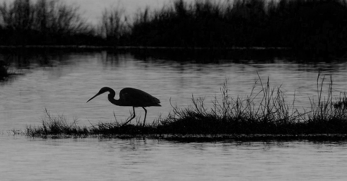
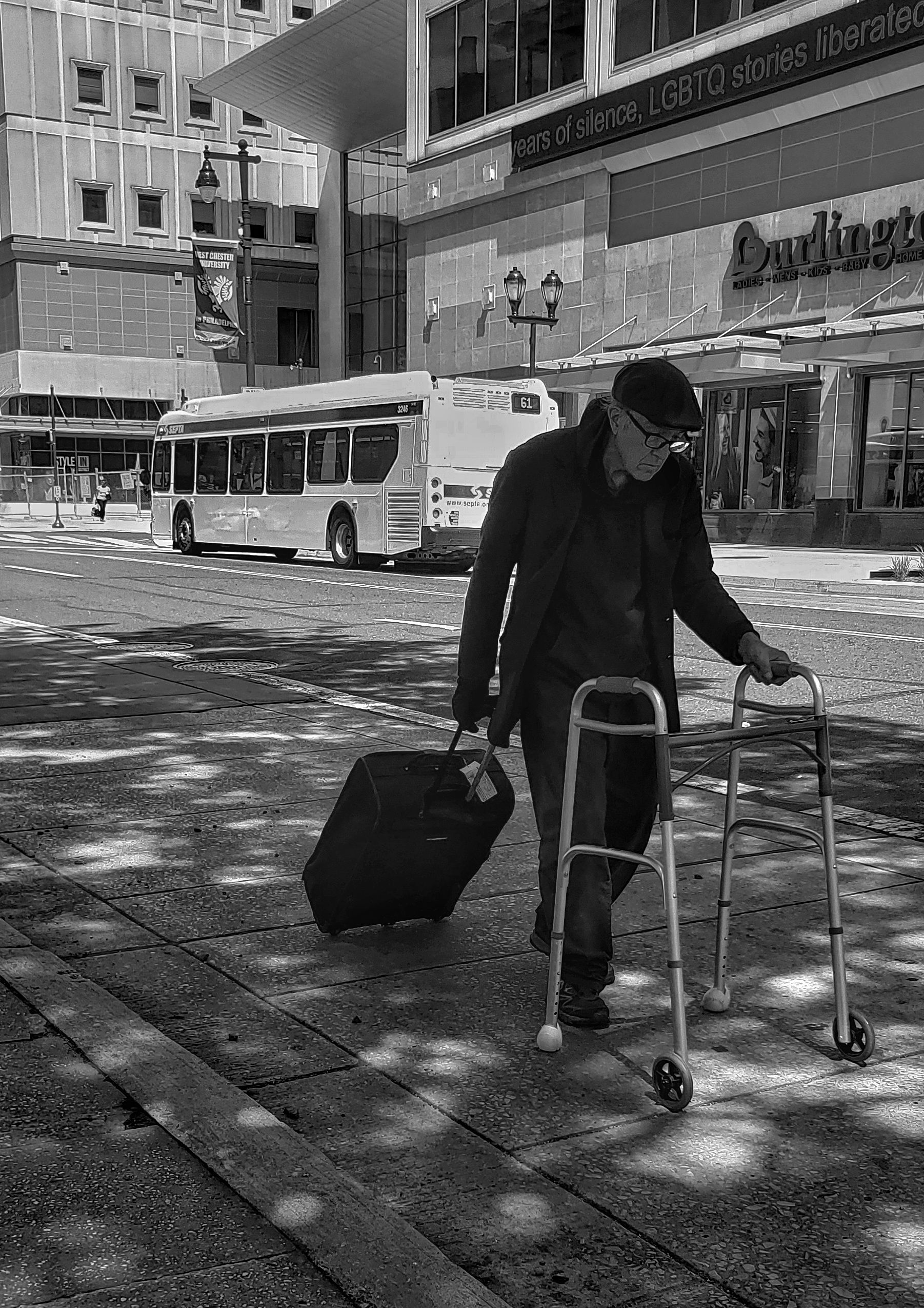
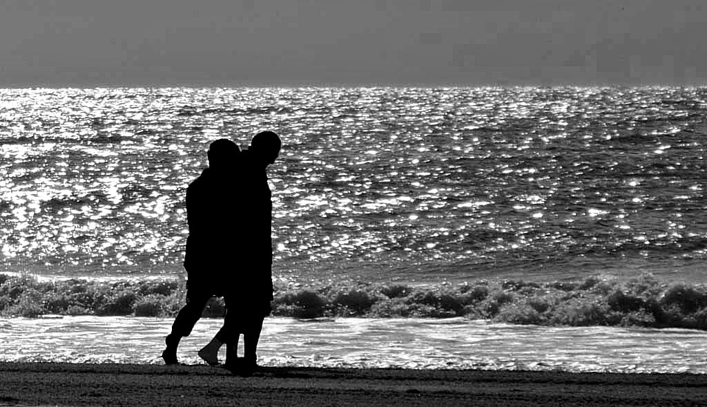
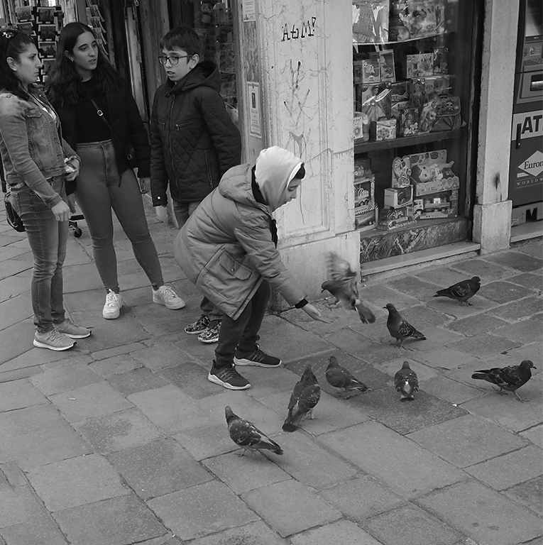
Our club just did a Silhouettes theme. People would have loved this shot! I have the same nit as Stephan re: the object by the person's leg. |
May 16th |
| 29 |
May 20 |
Comment |
Judy, first of all, I'm really impressed that you drove to Minnesota to find glass for your Maryland club! ;-D I like the minimalist composition. I think Bob's crop and yellow background both enhance the curve and bring out the color of the glass.
|
May 16th |
| 29 |
May 20 |
Comment |
Agree with the previous comments about composition, color, clarity - with Judy about the lines on the sharks and cropping the sky. |
May 16th |
| 29 |
May 20 |
Comment |
Very nice image, Mr. Wills, really sharp and nicely composed. I'm OK with sunrise in the winter, when it's later - summer, no way. I like the glow, but think you might have been better with the blue sky. |
May 16th |
| 29 |
May 20 |
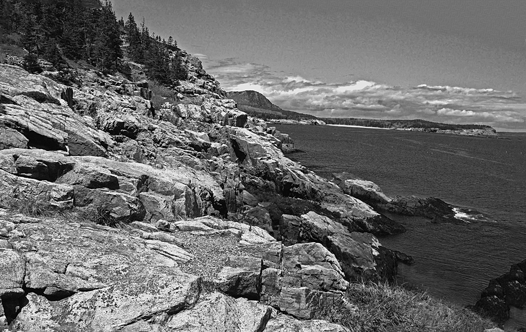
Comment |
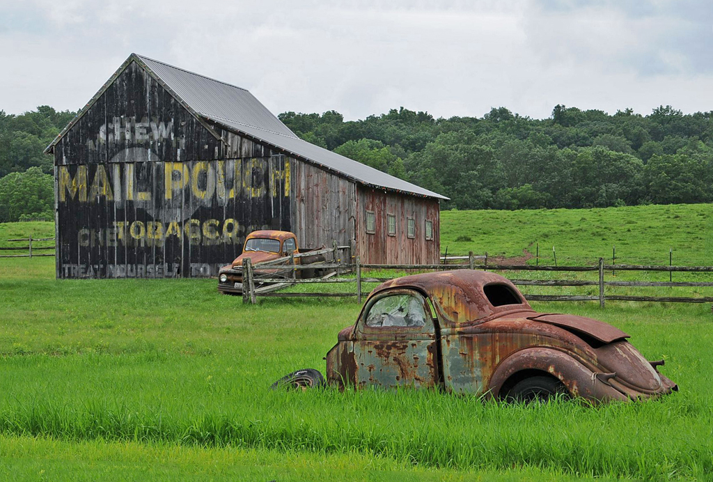
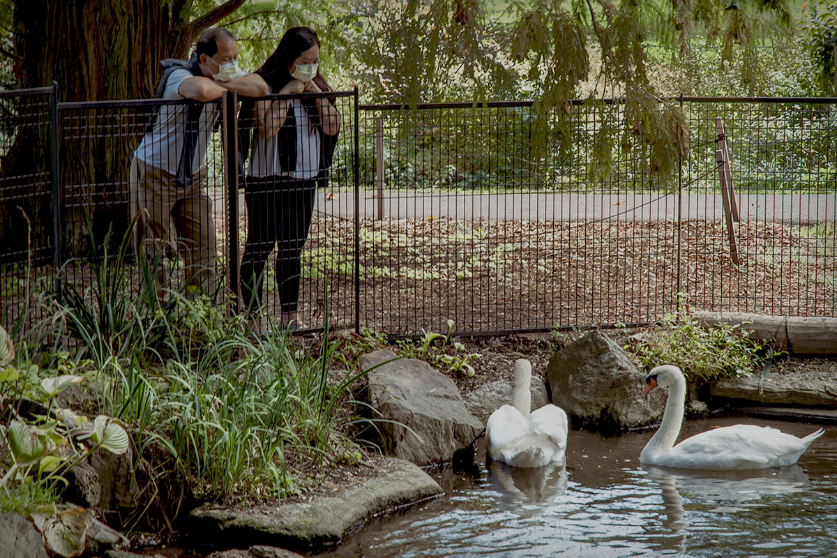
Thanks, Bob. You're right about the buoys. I was so focused on getting the traffic cones out of the background that I completely missed the buoys. |
May 6th |
 |
8 comments - 6 replies for Group 29
|
| 74 |
May 20 |
Comment |
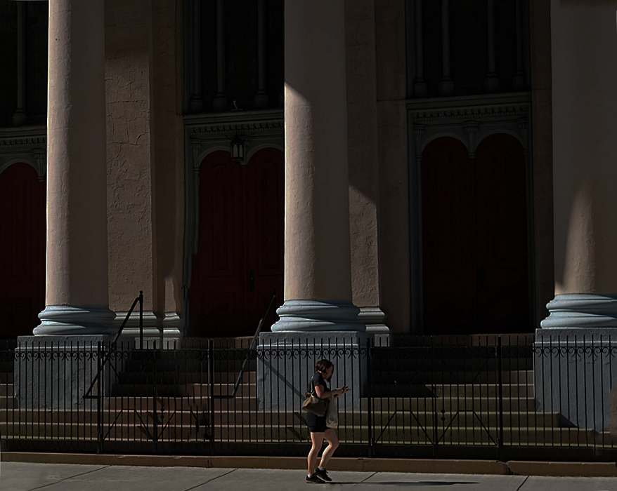
Thanks, Ying. I'm not convinced that the background needs to be the darker and the woman lighter in order to provide that contrast. |
May 18th |
| 74 |
May 20 |
Reply |
Thanks, David. I explain the crop in my response to Haru. I'll try lightening the woman's color and see what that brings. |
May 18th |
| 74 |
May 20 |
Reply |
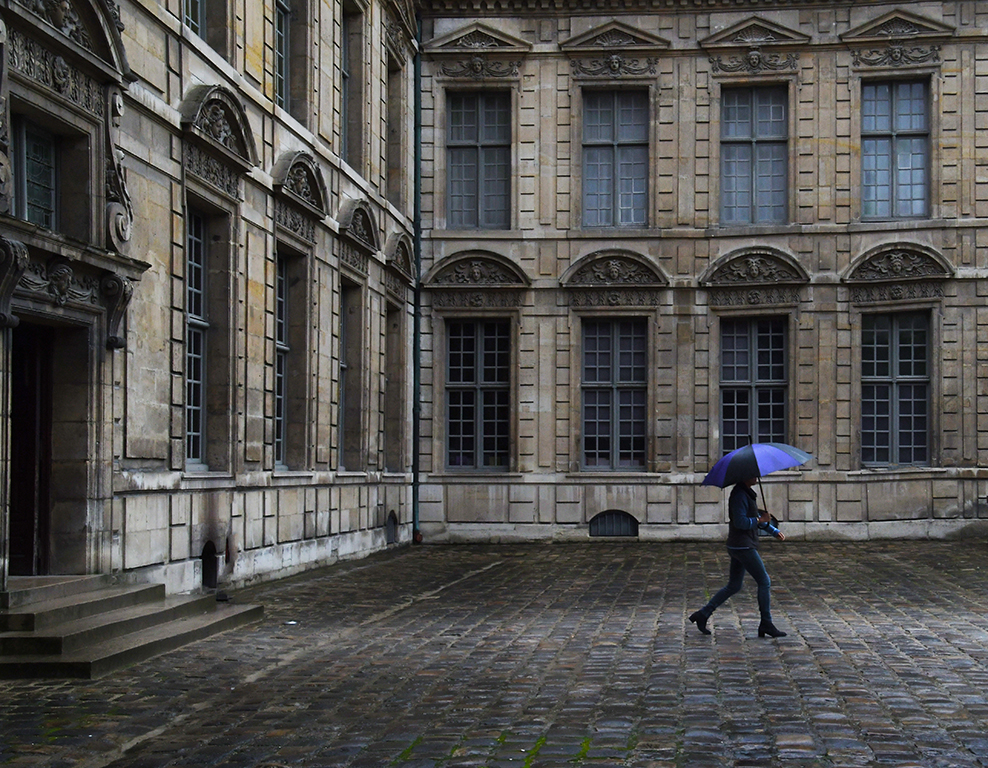
Thanks, Haru. The reason there is no more space on right is that a more modern section was added to the building and, I think, it detracts from the original. I was thinking of that when I chose the title - that the woman was walking away from the hotel and we have no idea where she's going. |
May 18th |
| 74 |
May 20 |
Comment |
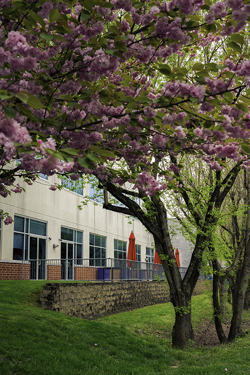
From someone who sees cherry blossoms every year, I think this is a very good image and like both the conversion and the crop. There are a lot of occasions where the only way to isolate the blossoms is to find a new branch on the trunk of the tree. |
May 18th |
| 74 |
May 20 |
Comment |
Another interesting individual to study. Every one of your images takes me back almost 60 years to my time in Istanbul. Thank you! I like that you found a way to get the image without getting permission and your composition is good in spite of that. Very nicely done. |
May 18th |
| 74 |
May 20 |
Comment |
The seemingly endless diagonal line of lions is kind of mesmerizing. I like the way your conversion has enhanced the view of the shadows on the bridge. |
May 18th |
| 74 |
May 20 |
Comment |
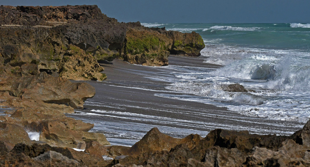
This is a terrific seascape composition and, I think, the monochrome version is the better of the two. I agree with Arne's observation of the contrast. |
May 18th |
| 74 |
May 20 |
Comment |
Very nice wildlife image and, I think, the conversion to monochrome and your cropping make it better than the original, which is also nice. I think darkening the white areas of the face of both wolves would make it better. |
May 18th |
| 74 |
May 20 |
Comment |
I think you achieved your aim. For me, the proof is that I was draw to the new building even though my personal preference is for older architecture. I think the darkened background and spotlight effect, combined with the dark left side of the lower building make this image work the way you envisioned. |
May 18th |
7 comments - 2 replies for Group 74
|
| 80 |
May 20 |
Comment |
Thanks, Carol. |
May 20th |
| 80 |
May 20 |
Reply |
Thanks, Karen. |
May 20th |
| 80 |
May 20 |
Reply |
Thanks, Victor. You, like Ed, are much more advanced that I when it comes to post-processing. I'll try your suggestions and see what happens. |
May 20th |
| 80 |
May 20 |
Reply |
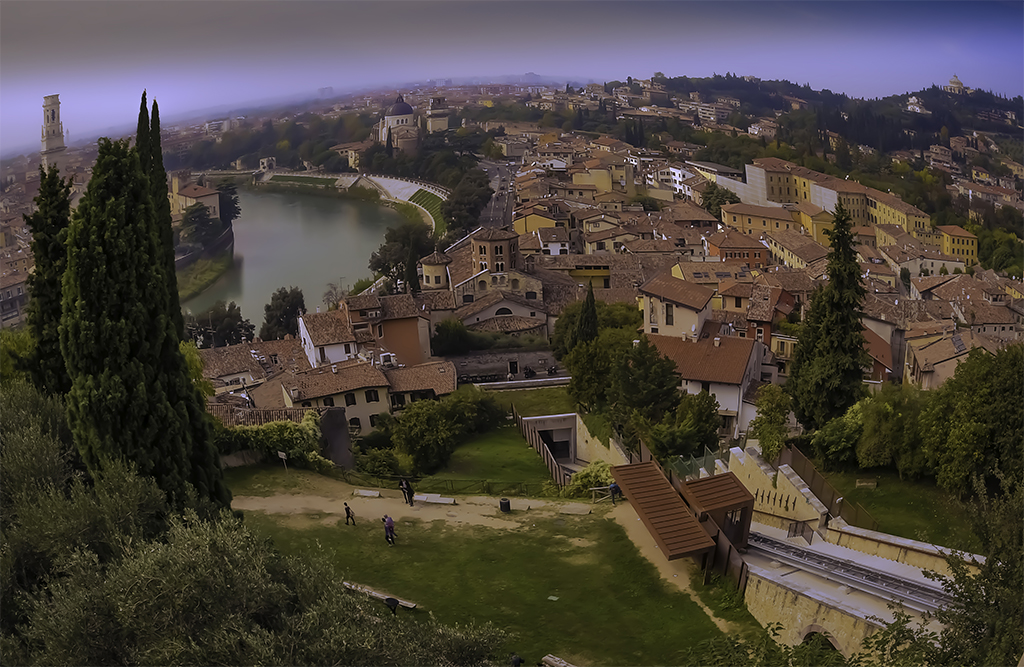
Thanks, Jim. The sky was blah and it wasn't too long after I left this area that the rains began. |
May 20th |
| 80 |
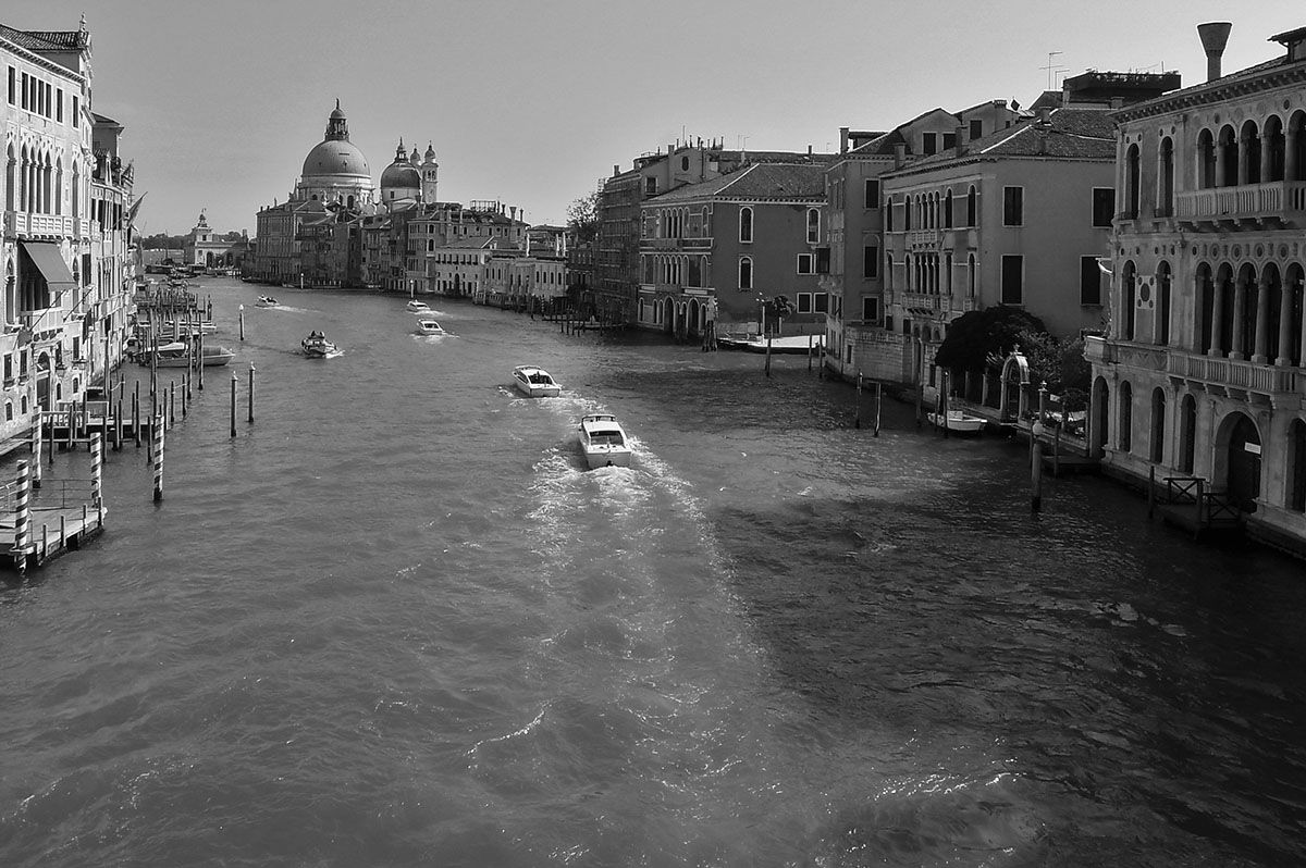
May 20 |
Reply |
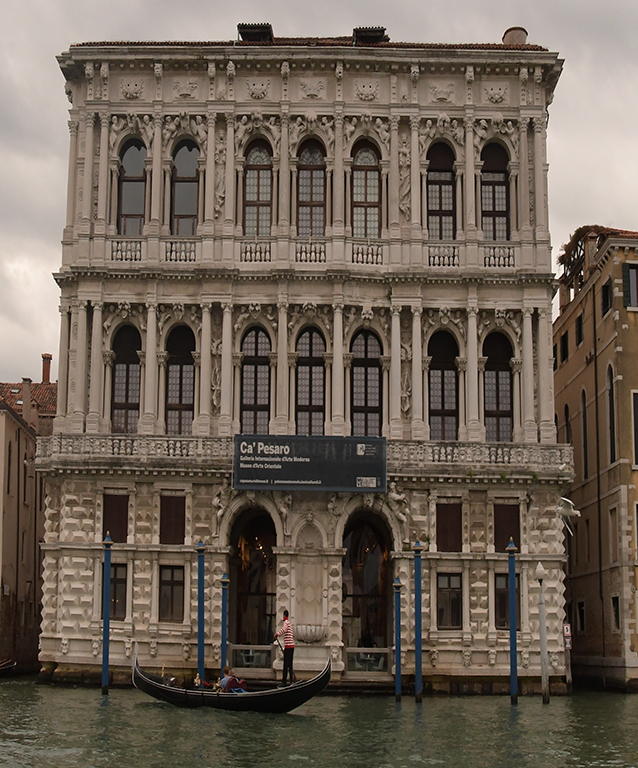
Thanks Ed. I've been to a lot of places in Italy and can't think of one that I wouldn't return to - Venice would be very high on the list (the bag's heavy but you're welcome to tote it!)
I'm going to give your suggestions a try and see what happens. I'm not anywhere near as accomplished with post-processing as you. |
May 20th |
| 80 |
May 20 |
Reply |
Bev, the reason for the wide view is because I felt the statue had to be included in the image. I positioned myself behind the artist to include it. |
May 20th |
| 80 |
May 20 |
Comment |
I'm in the camp of thinking this would be really good without the distraction of very prominent black lines.
I think your composition, colors and clarity are spot on. The sky is really good. I think the netting detracts from this otherwise really good image. |
May 20th |
| 80 |
May 20 |
Comment |
This is what I said in August: "I think I'm seeing a different story that everyone else. There are two people on the left - one's eating and the other's using a phone. There appear to be two people on the right, hidden by the building. And, there's another person with her(?) back to us. I'm not bothered by the apparent crookedness of the image. I think the colors are OK and the sharpness is about a good as can be expected given the condition of the window. Norman Rockwell? Perhaps the haziness might make one think that's true. I don't think so."
Looking at the image more closely, I now think the person with their back to us is at another table, the person beside your subject is a man and they're seated at a table for four. Perhaps she's simply lost in thought?
I think Carol is right about the blurring or fogginess being more of a distraction than an enhancement. I like Ed's suggest to ease the cropping. I think Victor's adjustments are good, with the exception of the baring of the woman's midriff. |
May 20th |
| 80 |
May 20 |
Reply |
Well, you definitely chose the right title for this image. I think the scene is captured very well, lots of color, sharp. I agree that the foreground bright area should be dimmed and, the people brightened just a bit. Personal taste puts me in the "crop out the top and legs camp". I've attached a cropped version - what do you think? |
May 19th |
 |
| 80 |
May 20 |
Comment |
I really like this kind of travel story photography. Getting a good image from an immediate scene is not the easiest thing to do, and I think you've captured this very well. The only nit I would pick is to crop out the right side up to the sleeve of the woman with the white cloth on her head. |
May 19th |
| 80 |
May 20 |
Comment |
Bev, I think if you'd have processed this image without using Topaz and, instead, focused on highlighting the desolation of the times, you might have a result you like. We've all seen pictures of empty streets, businesses, playgrounds, sporting arenas, etc., that capture that physical and emotional emptiness. |
May 19th |
| 80 |
May 20 |
Reply |
That's a bit harsh, Ed.
Here's a piece of an article by James Maher, a pretty well-known NYC street photographer. The article appeared in a Digital Photography School post.
Capture images without people
Usually the first thing that comes to mind when street photography is mentioned, is an image of an interesting looking person, walking down the street. That is a part of street photography, but there is so much more to it.
Capture environmental images in ways that still have the feeling of a traditional street photograph. Show culture and people in ways other than just capturing them directly. Figure out how to show stories, capture ideas, and foster feeling and mood in an image. Photograph in locations where others may not think to take pictures. |
May 19th |
| 80 |
May 20 |
Comment |
I think you selected a very good image for conversion to monochrome. I like the processing you've done that pulls me directly to the people and then gets me to examine their surroundings. I like that you didn't completely darken the background and allowed me to see inside the restaurant. I think Ed's crops further enhance your image. |
May 19th |
6 comments - 7 replies for Group 80
|
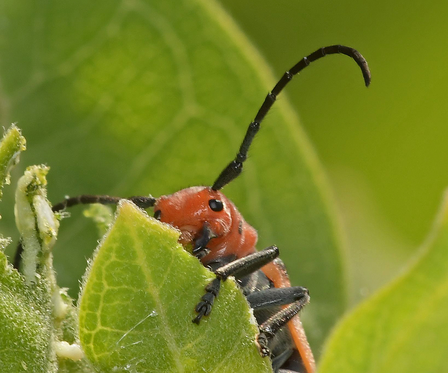
| 95 |
May 20 |
Reply |
Full Frame vs Micro Four Thirds in Macro Photography
Micael Widell
Magnification
1:1 magnification ratio is the gold standard when it comes to macro lenses. Almost every lens manufacturer offers a macro lens with 1:1 magnification, no matter if it is for full frame, MFT or APS-C. It means that the image of a subject on the camera sensor can be at most the same size as in reality. So if I am using a full frame camera (36x24 mm sensor) and a 1:1 magnification macro lens, it means that a bug that is 24mm long will just about cover the short side of my photo at the closest focusing distance.
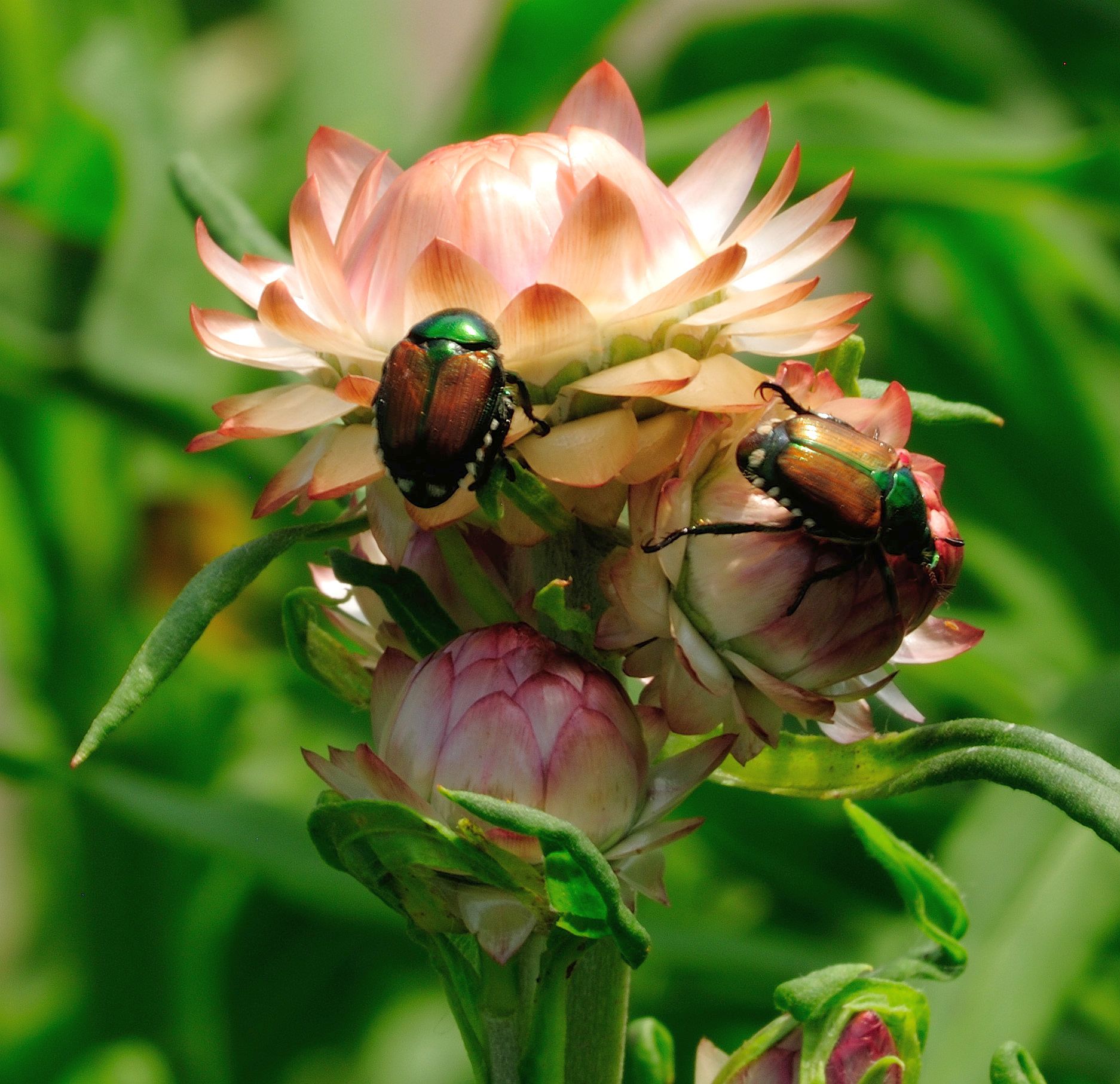
But what if you are using Micro Four Thirds? In that case the sensor is half as long on each side, meaning about 18x12mm. So if you are using an 1:1 magnification lens, then that bug will be twice as large on an MFT sensor, and you will effectively have the same image frame as you would with a 2:1 magnification macro lens on a full frame sensor. So to summarize, if you want greater magnification - use a smaller sensor. |
May 24th |
| 95 |
May 20 |
Reply |
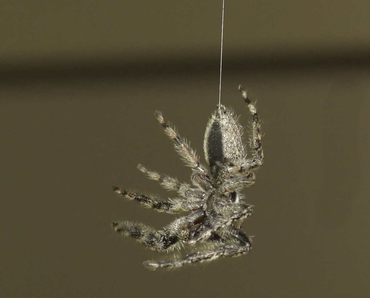
I think the result of your changes is what I imagined it should be - now I've got to see if I can duplicate your work. I like the 2x3 vertical. I'm always a bit fearful of adding too much contrast, but I think your adjustment is good. If I understood your comments to Barbara, I would have had an overall sharper result if I gone to f/16? |
May 23rd |
| 95 |
May 20 |
Reply |
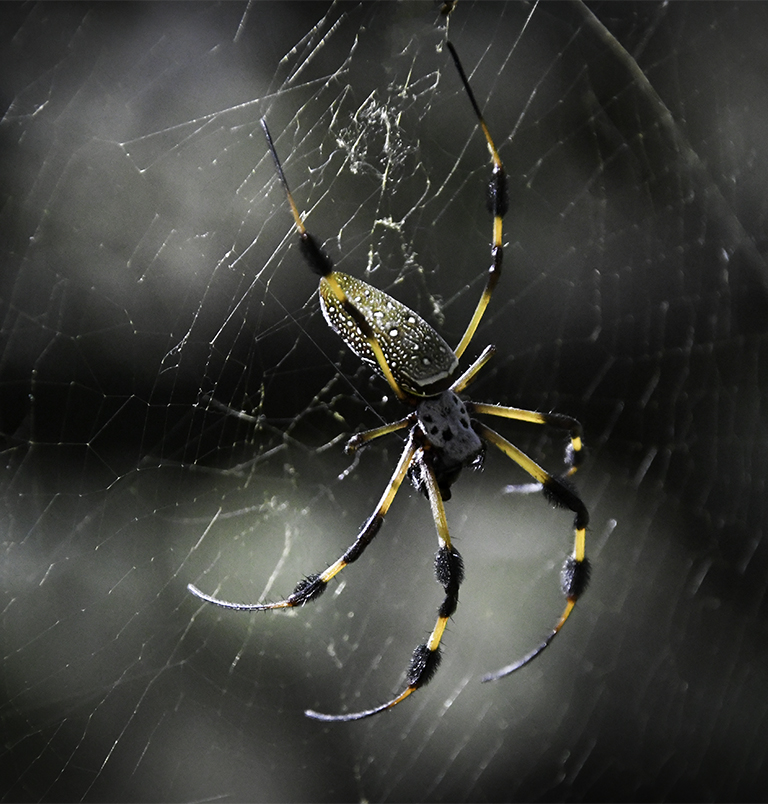
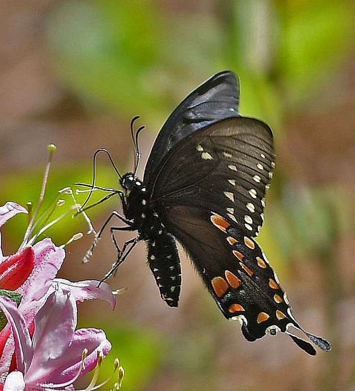
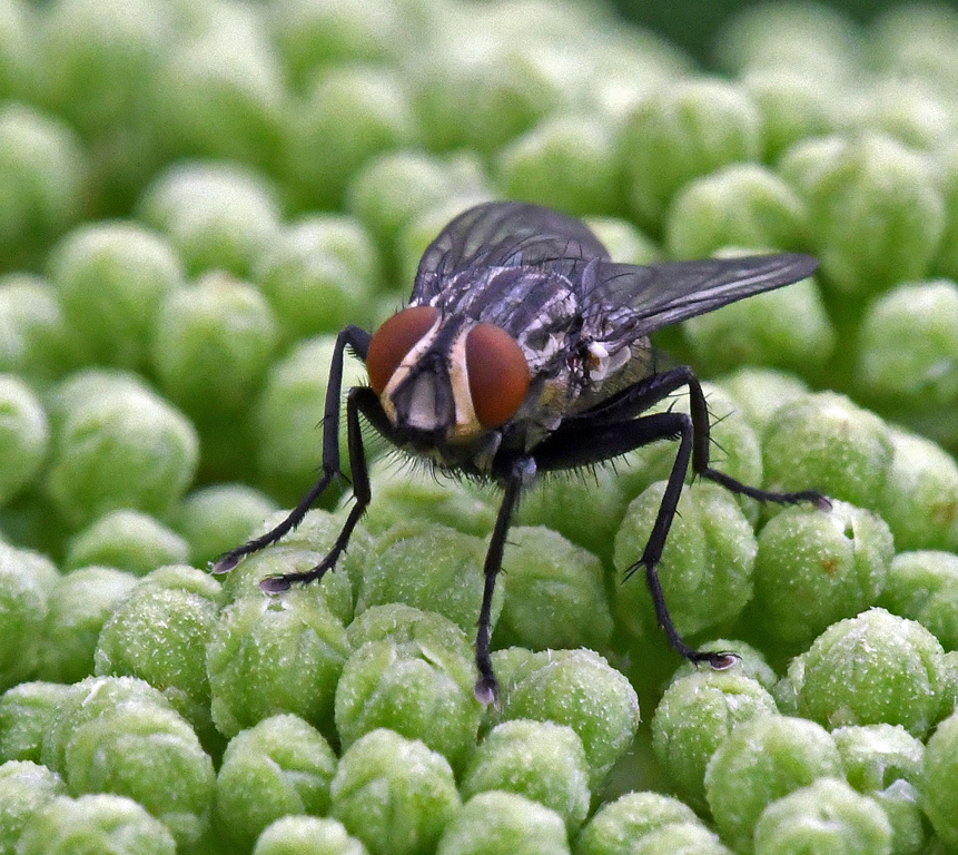
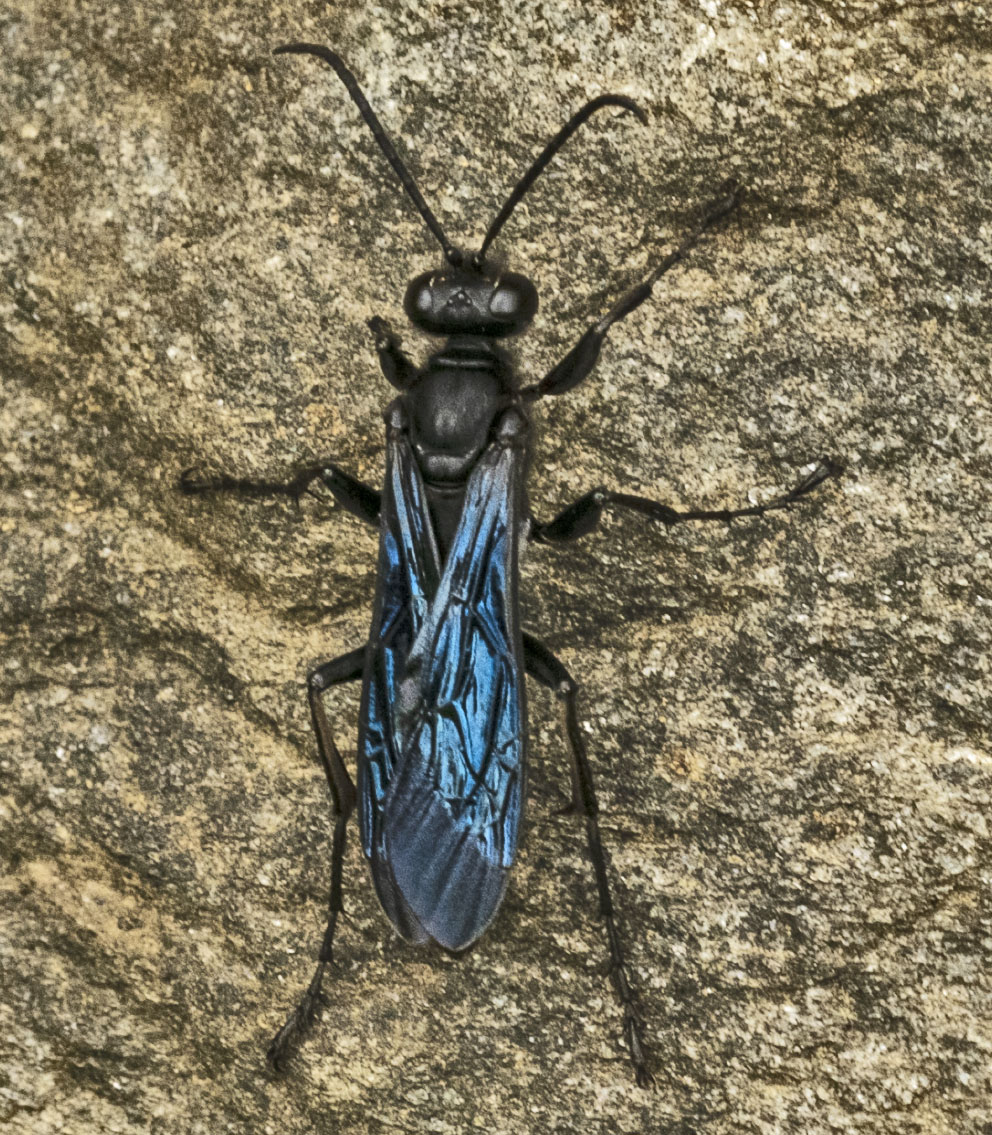
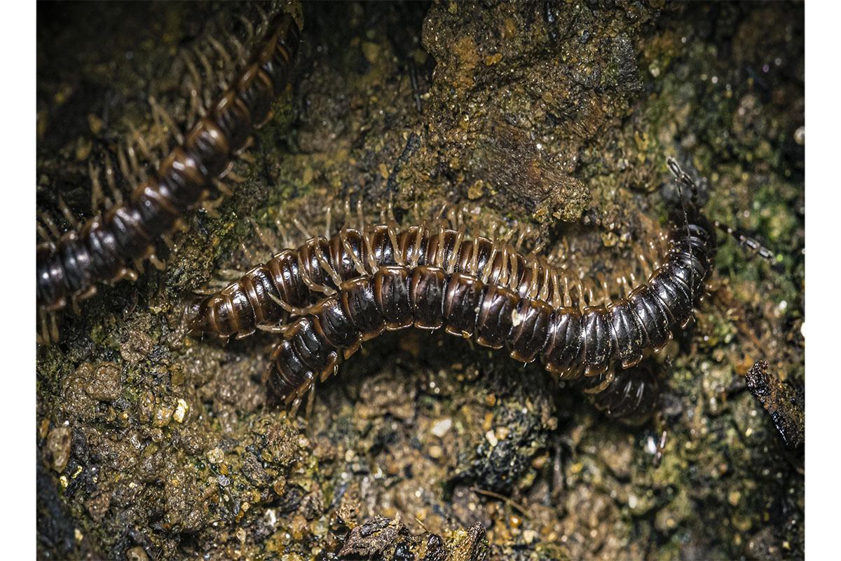
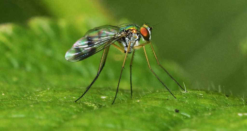
Tom, I have no idea what type of spider we're viewing and, as far as size, my estimate would be somewhere in the range of 3/4". |
May 23rd |
| 95 |
May 20 |
Reply |
Thanks, Stuart. I'm a Lightroom/Photoshop user, and I'm very new at it. I've never used Affinity. One of the main issues I had when I tried the cloning was the legs were being made a part of the cloned area and I didn't (and don't) understand how that was happening. |
May 23rd |
| 95 |
May 20 |
Reply |
Tom, thanks for the info, particularly the part on stacking. |
May 23rd |
| 95 |
May 20 |
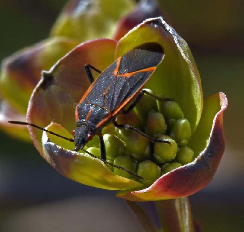
Comment |
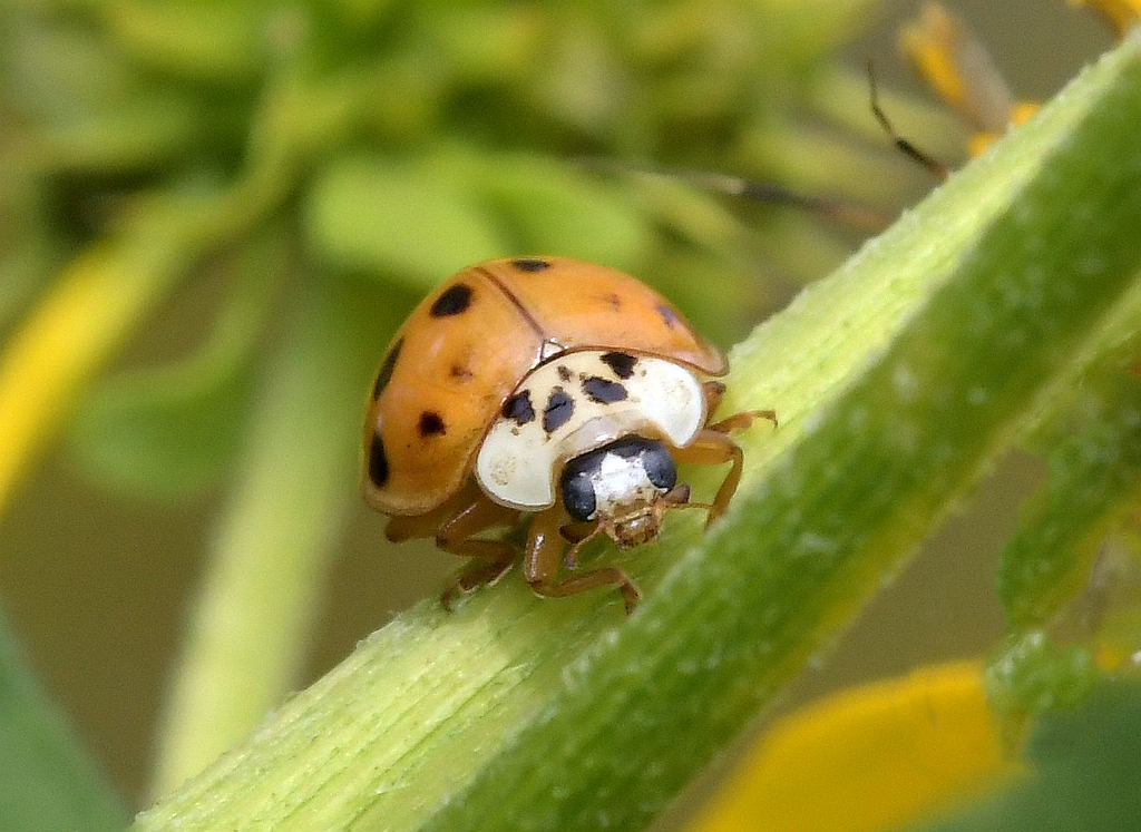
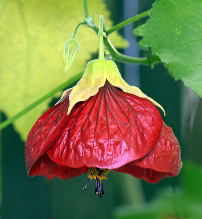
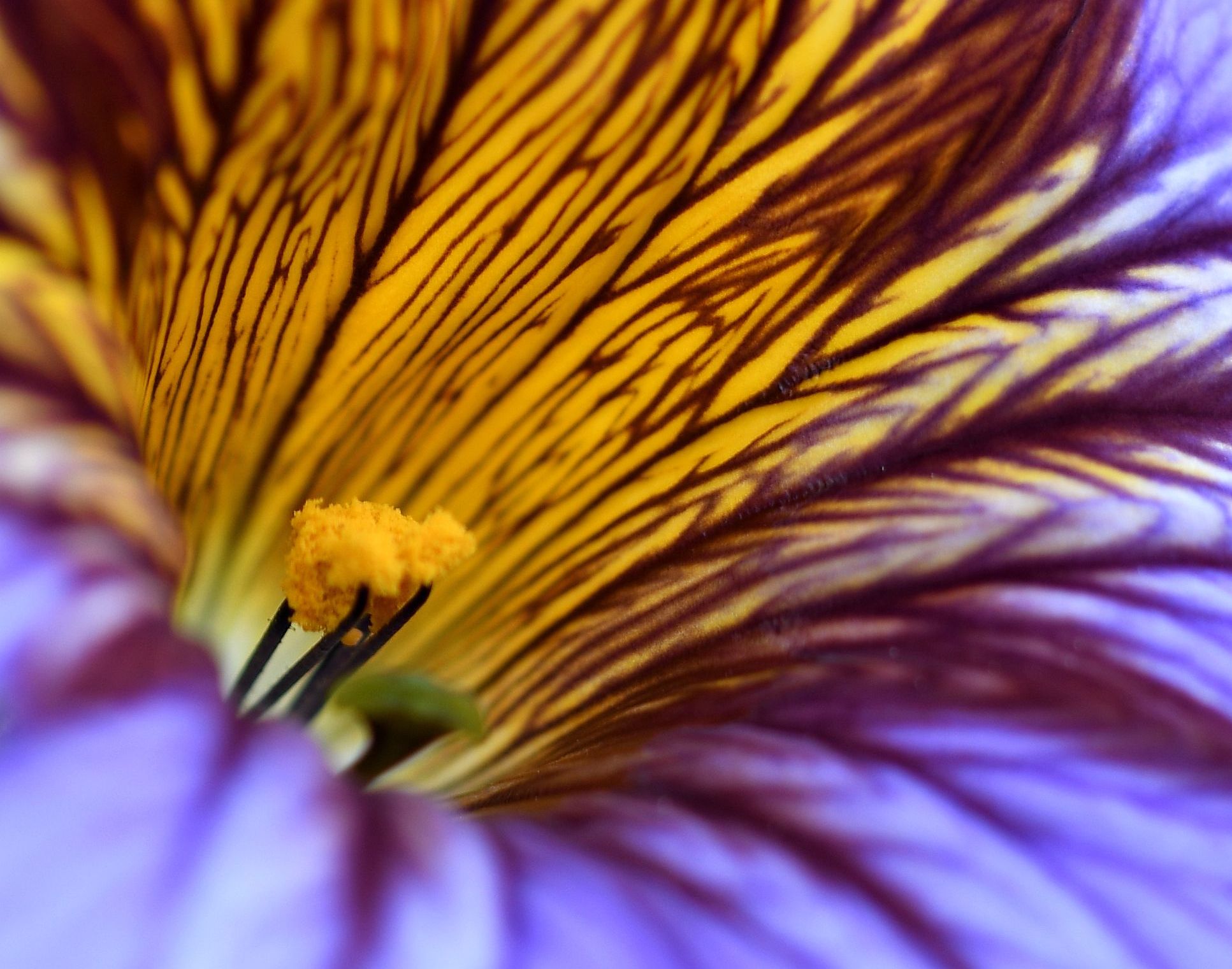
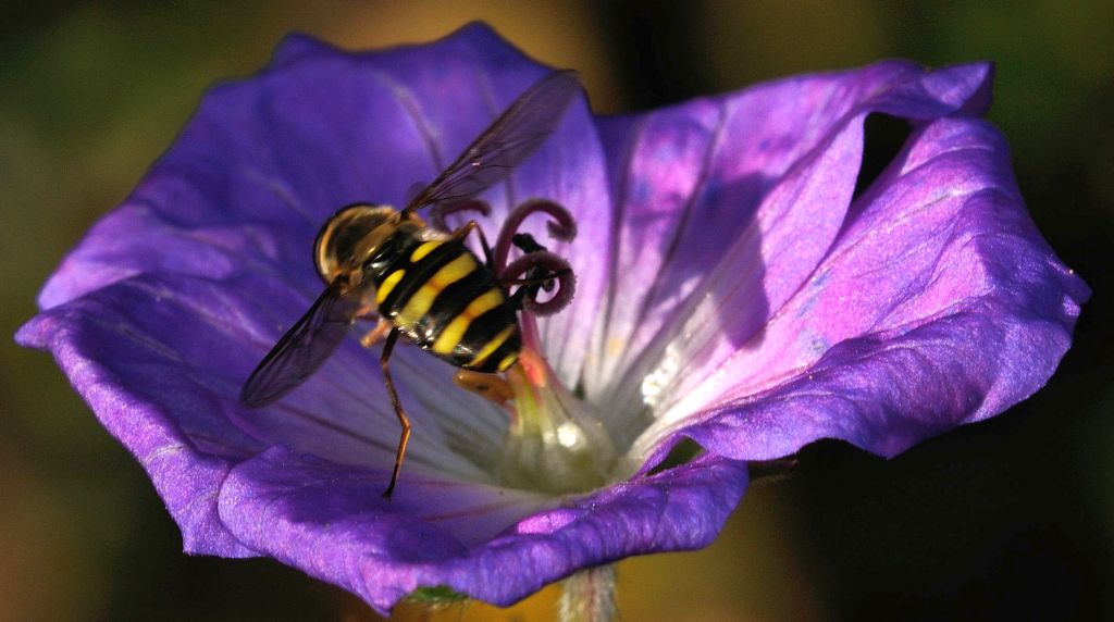
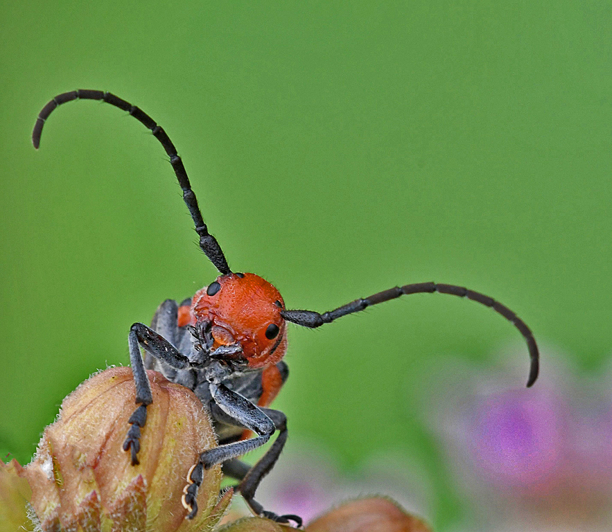
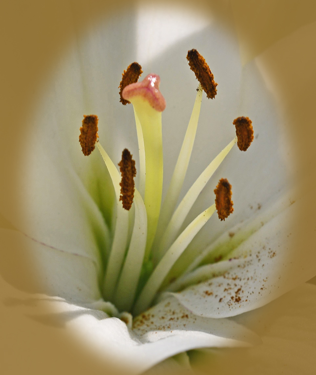
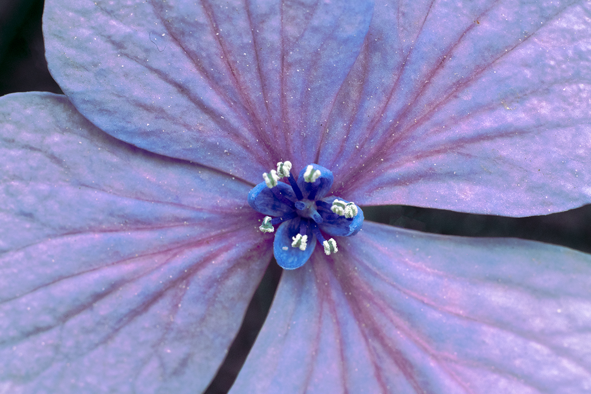
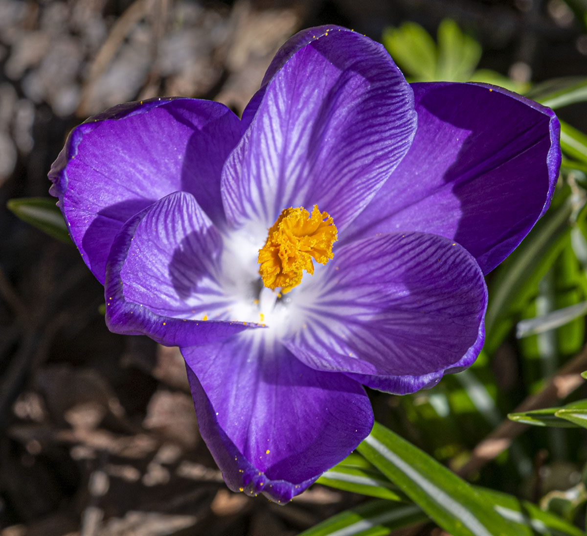
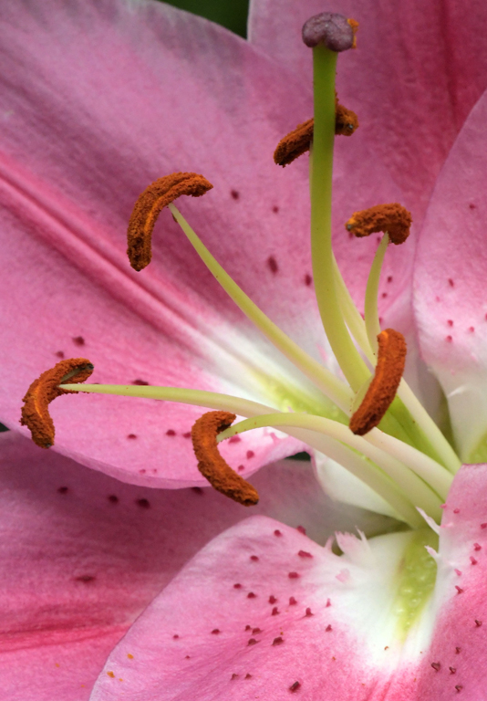
Barbara, I'm happy you chose this flower without knowing it would become a teaching tool for Tom. We learned something, which is what I think PSA is all about.
I like your composition and Tom's treatments. I have one really small nit - it's that small white area and even smaller black spot just above it on the right side, about at the middle of the flower. |
May 23rd |
| 95 |
May 20 |
Comment |
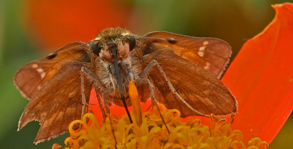
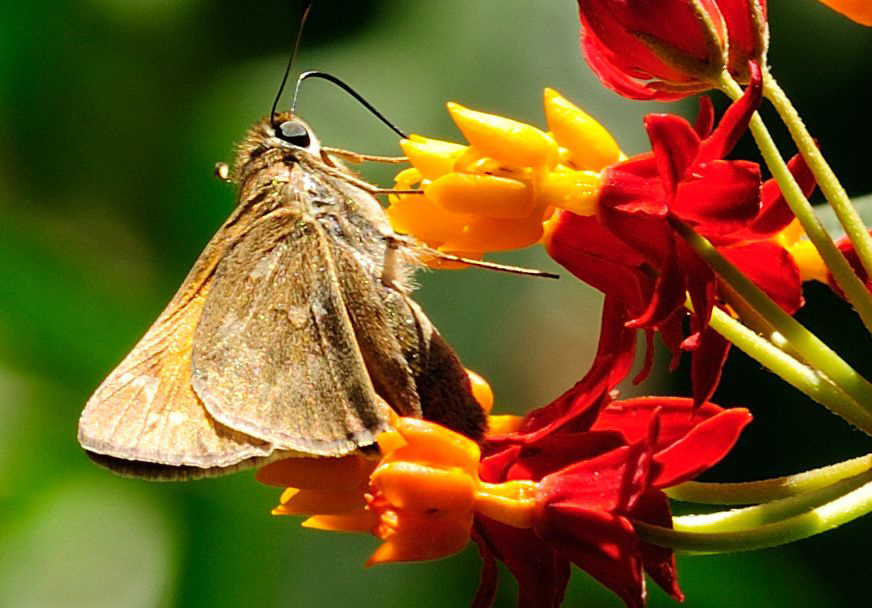
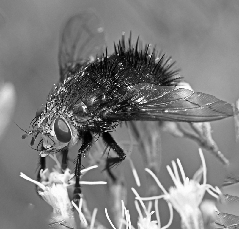
I have to agree with Barbara - there's nothing to be done to this image, just sit back and enjoy it.
I'm not nearly into macro photography as you and Stuart. I like it a lot and am trying to improve, but I also like Street - which is a real challenge, I'm trying to improve my B&W, and I enjoy the General group in which I'm a member. My method is to take a lens out of my bag, put it on the camera and walk out the door without that bag. That takes away the temptation of switching genre that outing. |
May 23rd |
| 95 |
May 20 |
Comment |
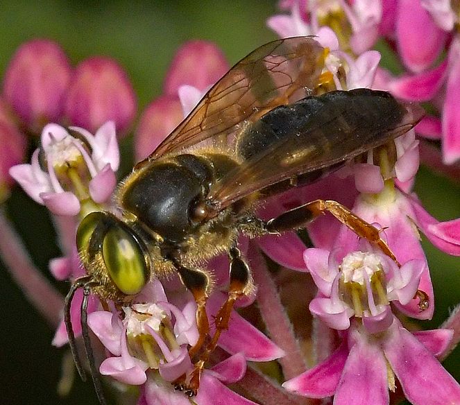
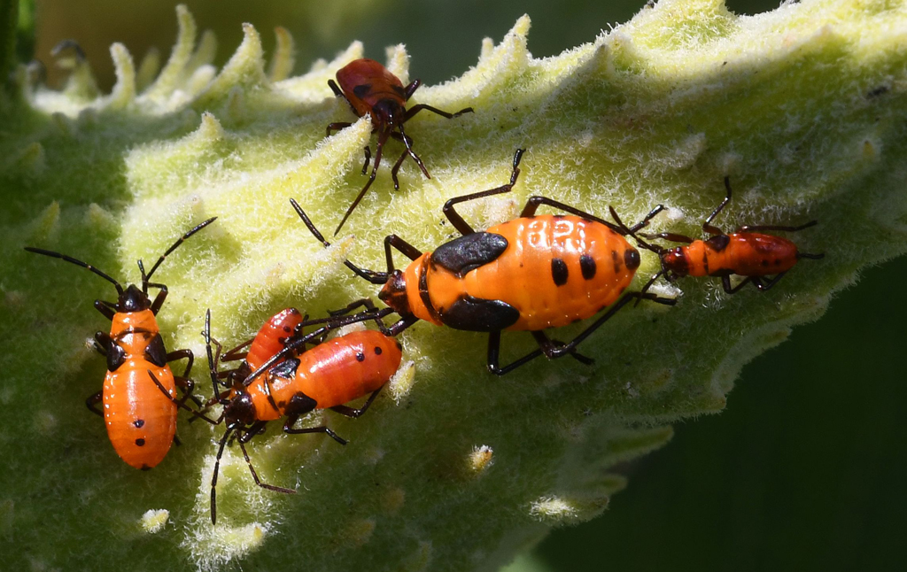
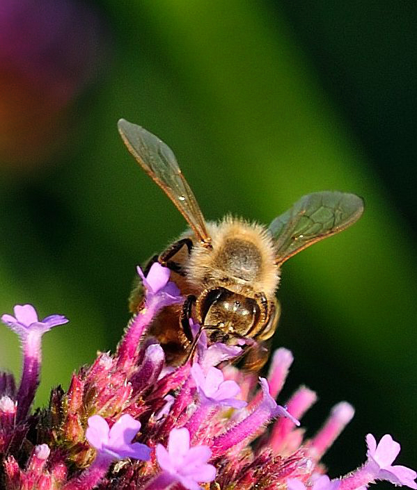
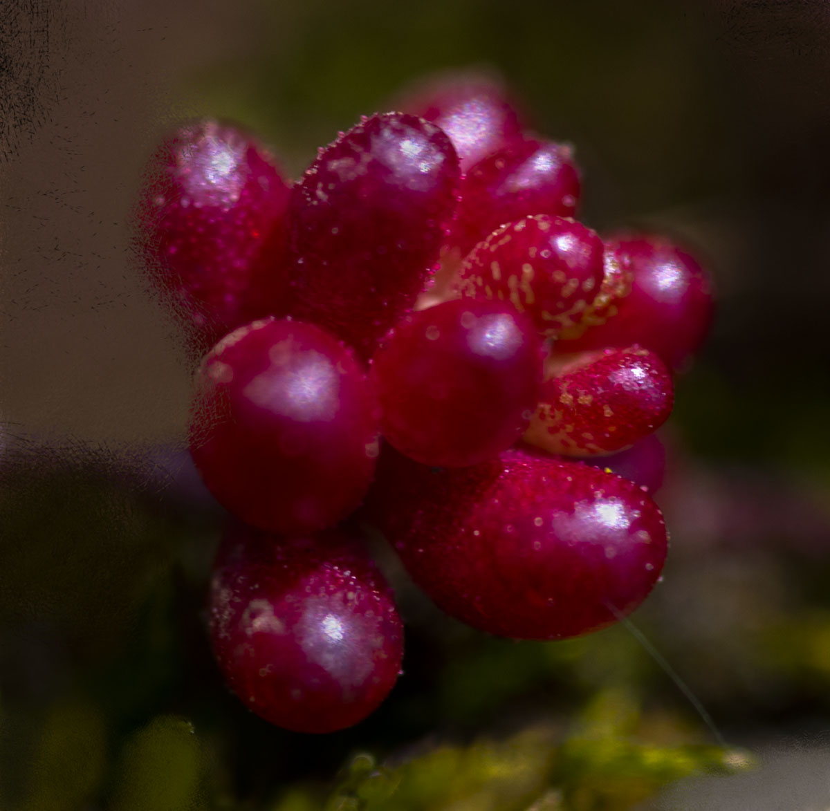
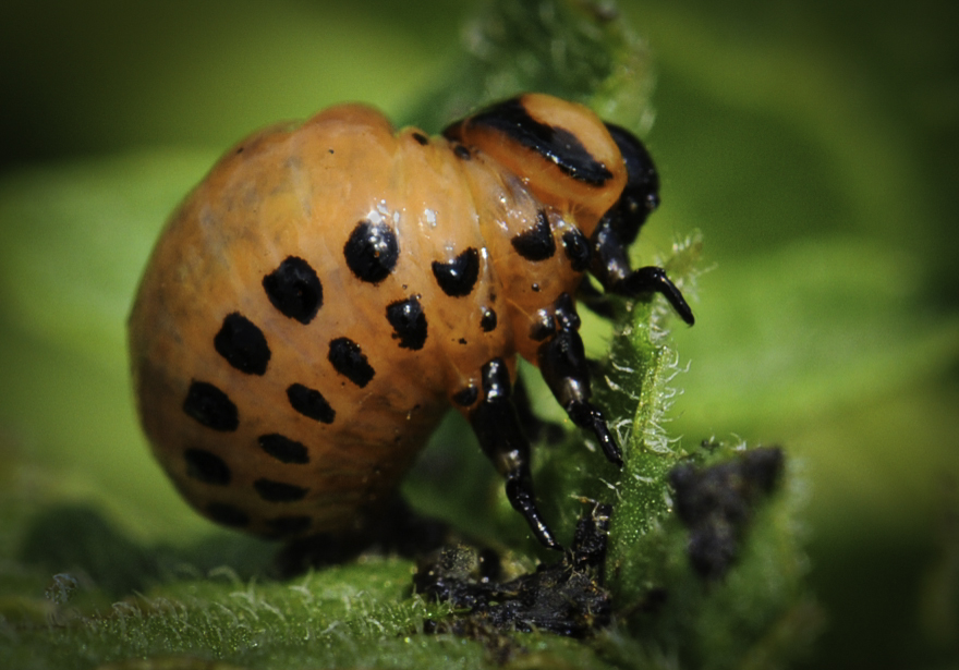
First of all, I like the mere idea that you considered this a good macro image candidate. I've only recently moved into that camp.
I like your composition, which lets us see everything about this egg. I think Tom's treatment really brings out the colors and texture. |
May 23rd |
3 comments - 5 replies for Group 95
|
24 comments - 20 replies Total
|