|
| Group |
Round |
C/R |
Comment |
Date |
Image |
| 29 |
Apr 20 |
Reply |
Thanks, Tam. |
Apr 16th |
| 29 |
Apr 20 |
Reply |
Thanks, Stephan. I'd bet more on Italian from South Philly. Check out "The Irishman" on Netflix! |
Apr 16th |
| 29 |
Apr 20 |
Reply |
Thanks, Judy. |
Apr 16th |
| 29 |
Apr 20 |
Reply |
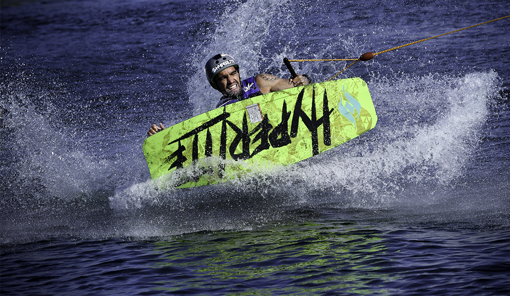
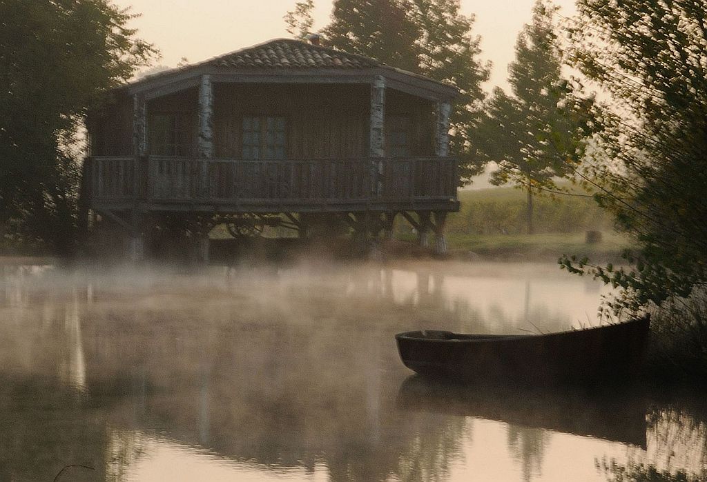
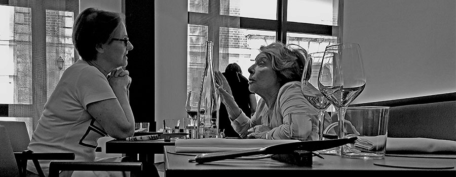
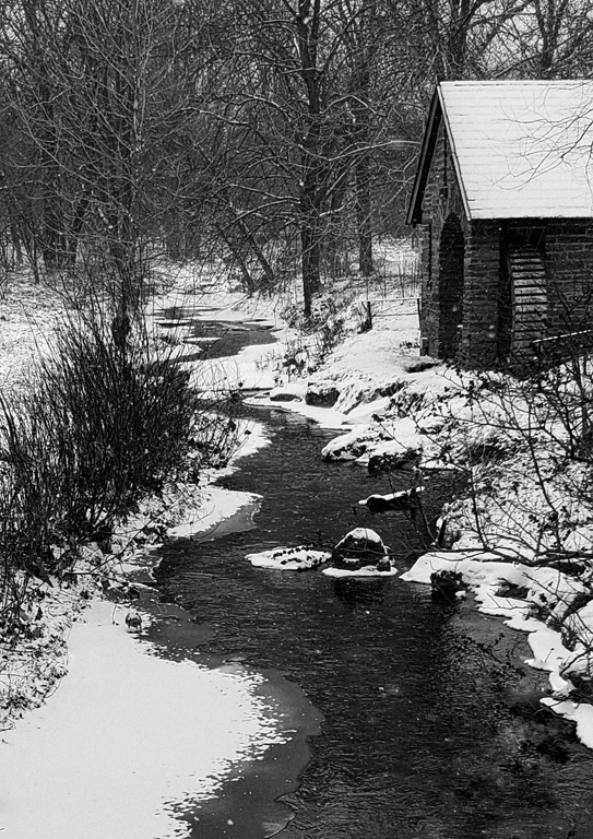
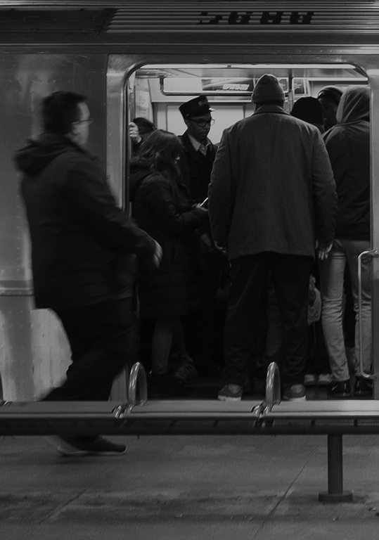
Thanks, Bob. I think I was there for a couple of hours and came back with around 500 images. It really is a place where you find a spot, set up shop and just keep shooting once you've decided what kind of shot you want and what camera settings are required to get it. |
Apr 16th |
| 29 |
Apr 20 |
Reply |
Thanks, Karen. Someday I'll learn to look for that! |
Apr 16th |
| 29 |
Apr 20 |
Reply |
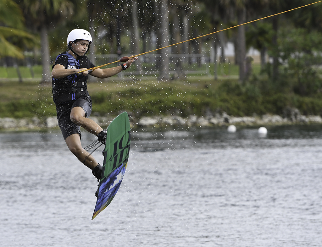
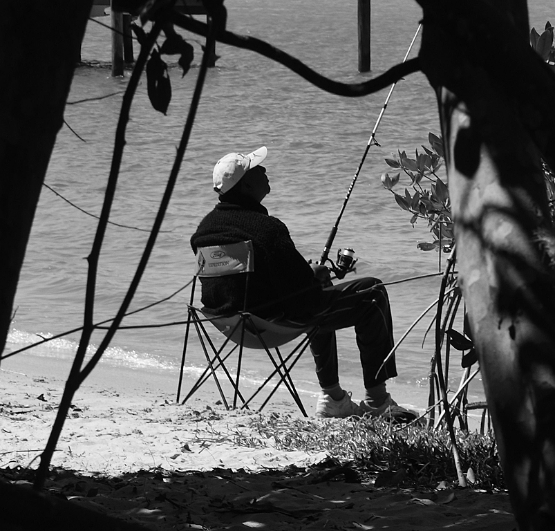
Thanks, Bob. Don't you think it's apropos that the rope is leading out of the image since that's where the Wakeboarder is going? |
Apr 16th |
| 29 |
Apr 20 |
Comment |
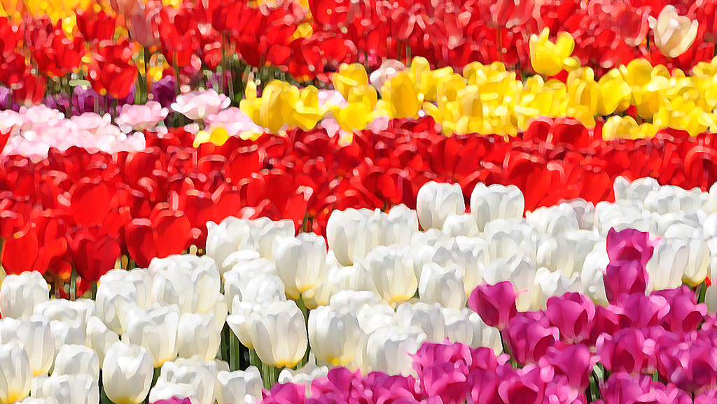
Very nice image. I like Judy's crop and Karen's recomposition. |
Apr 16th |
| 29 |
Apr 20 |
Comment |
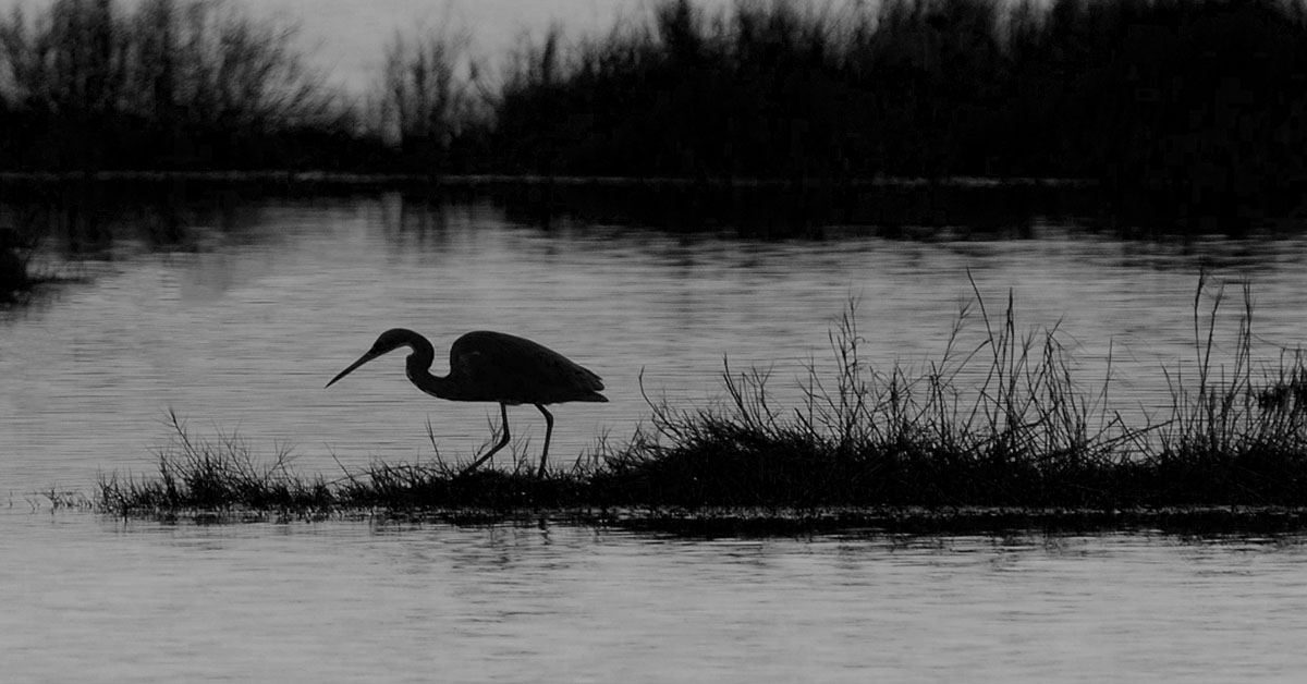
Great shot, Karen. Only thing I might change is to crop off a bit of the top to make the bird really appear to be heading down range. |
Apr 16th |
| 29 |
Apr 20 |
Comment |
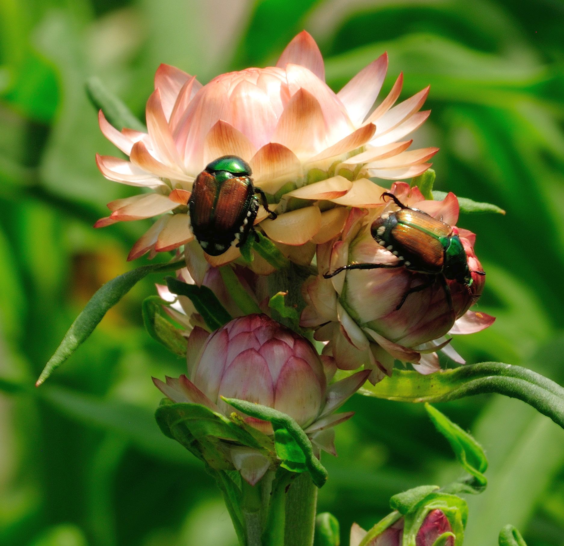
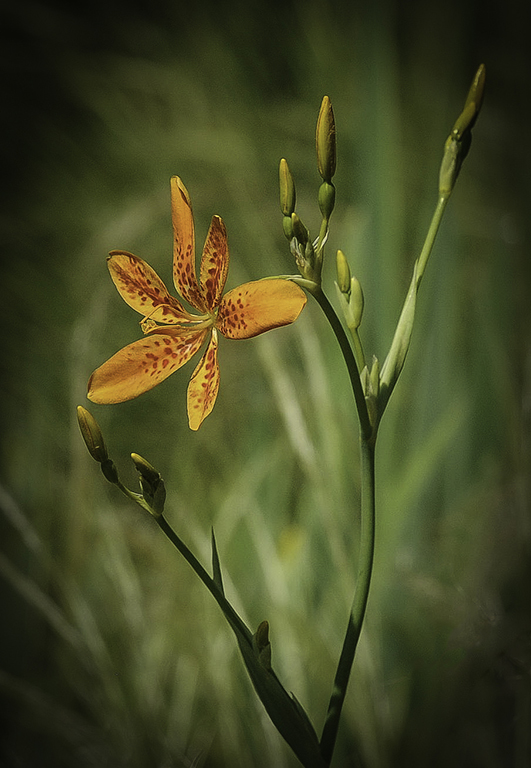
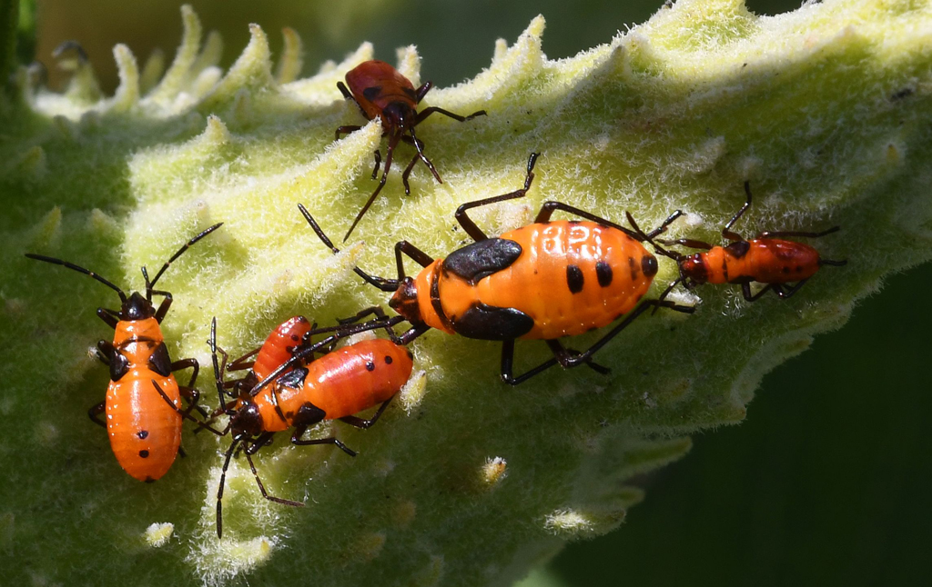
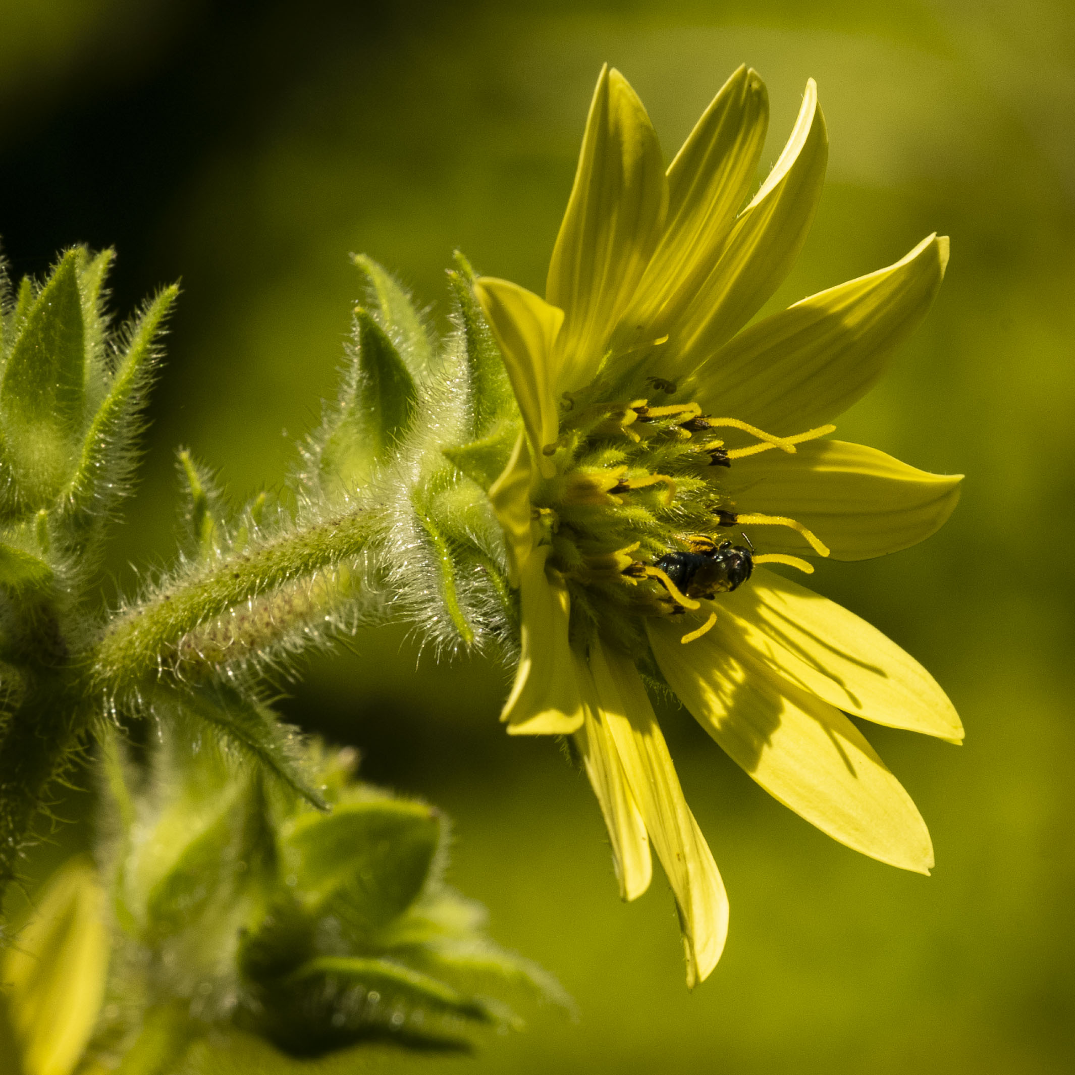
I have a lot of difficulty visualizing an abstract on cars, so I tend to avoid them. I like this, particularly Bob's conversion and crop. I also haven't tried Bob Legg's idea of using a macro lens - I love chasing insects, arachnids, etc., with my macro. |
Apr 16th |
| 29 |
Apr 20 |
Comment |
Like everyone else, I think this is a terrific image. The sky is great. Initially, I thought it was the only thing anyone would look at, but I find my eyes being pulled down to the boat. |
Apr 16th |
| 29 |
Apr 20 |
Reply |
HA! On first glimpse I also thought this would be a good puzzle. Puzzles are on my table now. I'm now working my third and gave myself a break and went down to a 500 piece. |
Apr 16th |
| 29 |
Apr 20 |
Comment |
To be redundant, this is a really good image - save for the sky. You know that I have zero knowledge about how to composite a sky with your really good composition, so you get no help from me. |
Apr 16th |
5 comments - 7 replies for Group 29
|
| 74 |
Apr 20 |
Reply |
Thanks, David. |
Apr 19th |
| 74 |
Apr 20 |
Reply |
Thanks, David. |
Apr 17th |
| 74 |
Apr 20 |
Reply |
Thanks, Ying. Would you tell me what adjustments you made? |
Apr 17th |
| 74 |
Apr 20 |
Reply |
Thanks, Haru. |
Apr 17th |
| 74 |
Apr 20 |
Reply |
Thanks for the suggestions, Arne. I will work on them. |
Apr 17th |
| 74 |
Apr 20 |
Reply |
Thanks, Ata. |
Apr 17th |
| 74 |
Apr 20 |
Comment |
I agree with David that the image is better with the sky and with Arne that there's too much to look at. It's difficult to see what you might pick as a focal point in the composition? The conversion is good with a wide range of white to black. |
Apr 17th |
| 74 |
Apr 20 |
Comment |
This image makes me wonder what the young man is thinking about - where he's going with his friends, or his girlfriend after work? Or, he should have listened to his father about doing better in school? Or a hundred other things. I like the both images, but I think the monochrome conveys the young man's mood better. |
Apr 17th |
| 74 |
Apr 20 |
Comment |
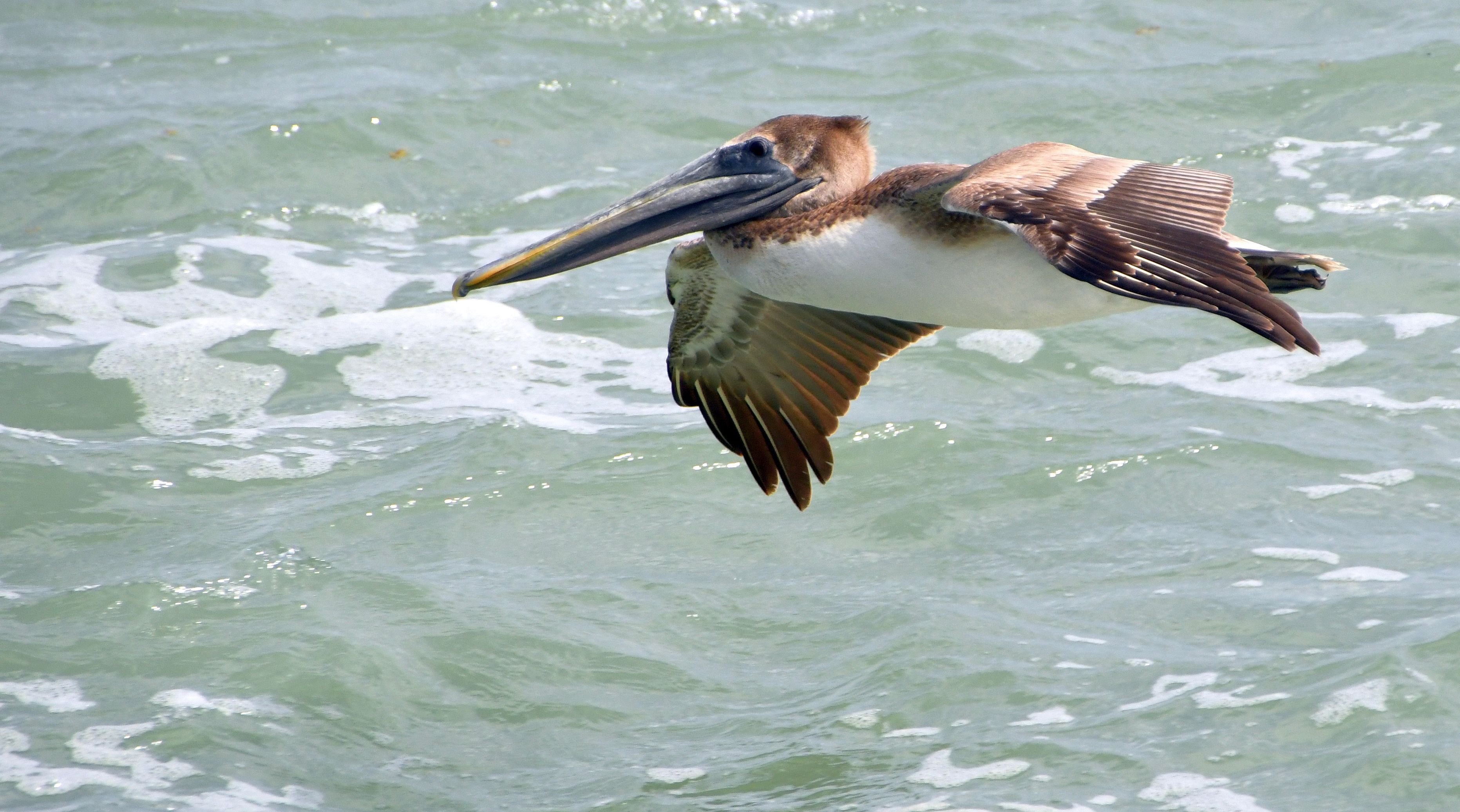
I like this in monochrome and think it's a good example of minimalist photography. The diagonal path of the bird adds to lure of the image. |
Apr 17th |
| 74 |
Apr 20 |
Comment |
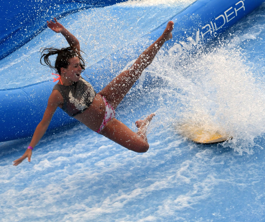
I think catching any water sport action is a combination of fun and frustration, but once you get the right camera settings, the frustration, mostly, goes away. You caught the surfer in one the better positions. I like the crop and conversion. |
Apr 17th |
| 74 |
Apr 20 |
Comment |
To me, the color image says, "Hope" and the monochrome says "Haunting". I like both images, but I think I prefer the monochrome. I agree with David on cropping on the left, but not for the Rule of Thirds. Rather, I'd like to see the compressed grouping on the far left eliminated to bring the left side more into balance with the right. |
Apr 17th |
| 74 |
Apr 20 |
Comment |
I see a very somber image of a place with a poor reputation regarding it's working class. This image really has a dark somber feel to it. It is, in my opinion, much better in monochrome, with tones that lead through the full spectrum of white to black. Coming in late, I understand why the ground level is not shown. |
Apr 17th |
6 comments - 6 replies for Group 74
|
| 80 |
Apr 20 |
Reply |
Victor, I've gone back and looked for the halos you mentioned and I don't see them? Can you give me an idea of what, specifically, you're seeing that's eluding me? Also, I did not use the Unsharp Mask. |
Apr 24th |
| 80 |
Apr 20 |
Reply |
Thanks, Ed. Can't believe I never saw the vignetting in the upper right until you mentioned it! |
Apr 16th |
| 80 |
Apr 20 |
Reply |
Thanks, Carol. |
Apr 16th |
| 80 |
Apr 20 |
Reply |
Thanks, Karen.
|
Apr 16th |
| 80 |
Apr 20 |
Reply |
Thanks, Bev. |
Apr 16th |
| 80 |
Apr 20 |
Reply |
Thanks for the tips, Victor. |
Apr 16th |
| 80 |
Apr 20 |
Comment |
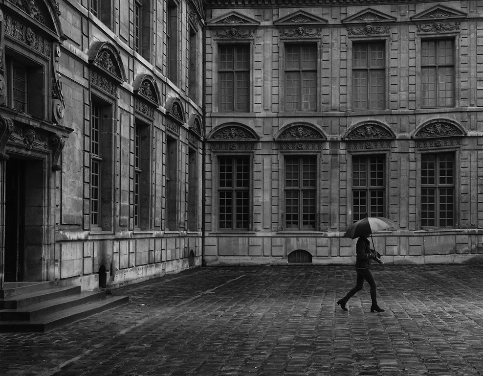
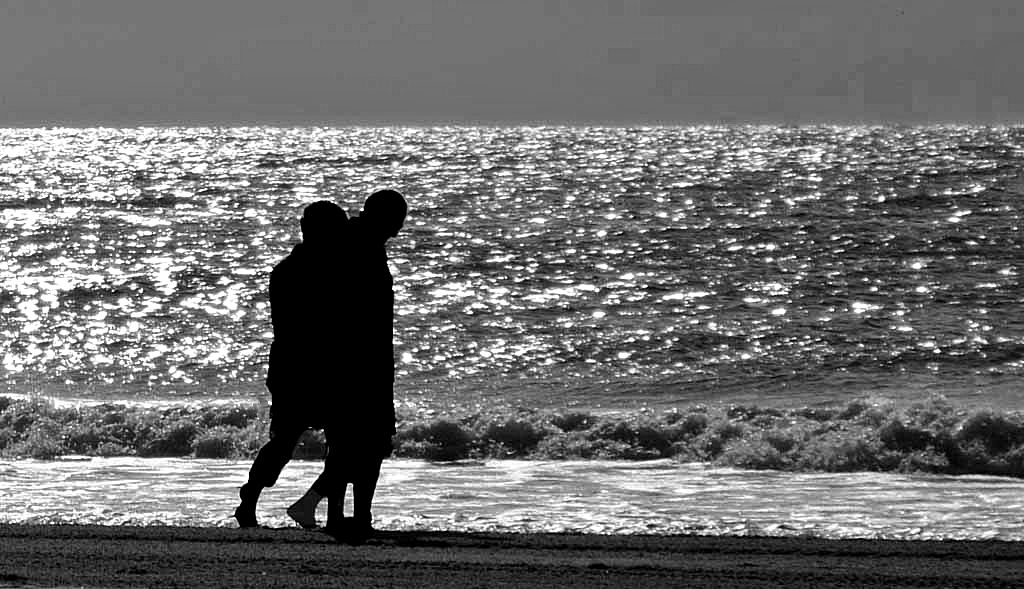
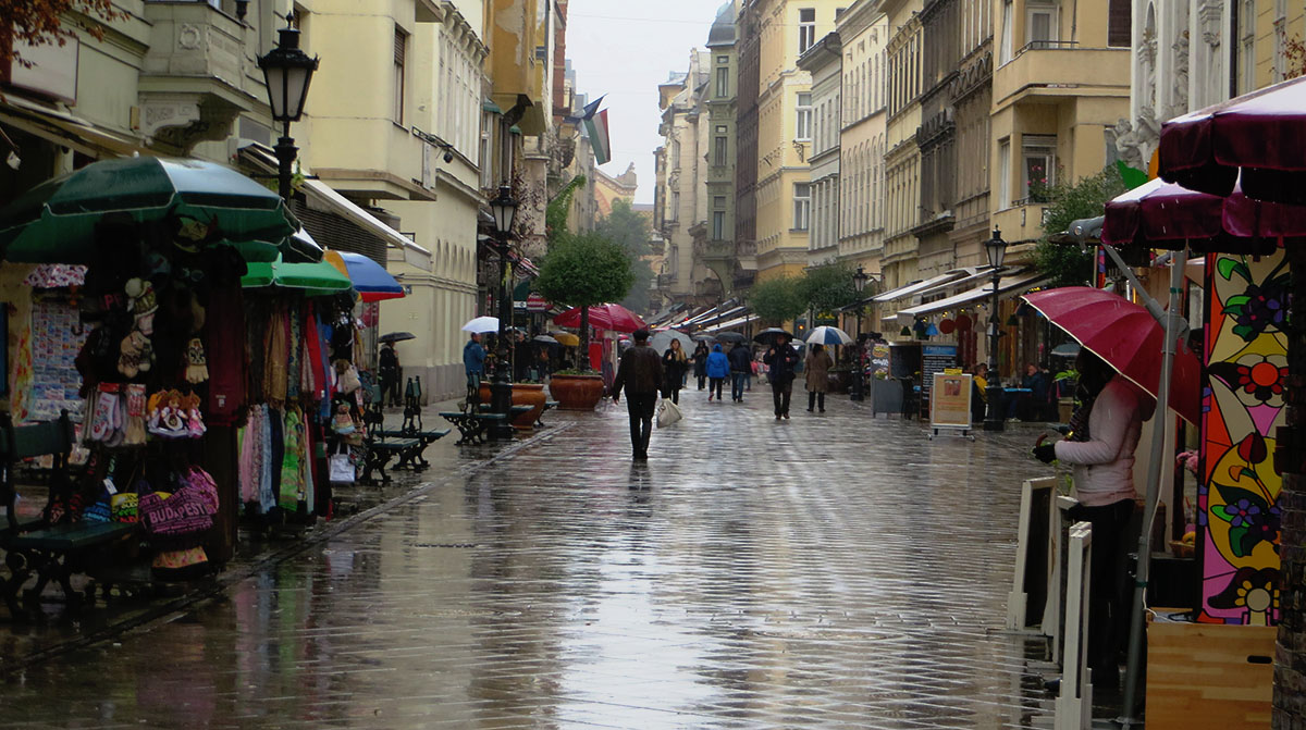
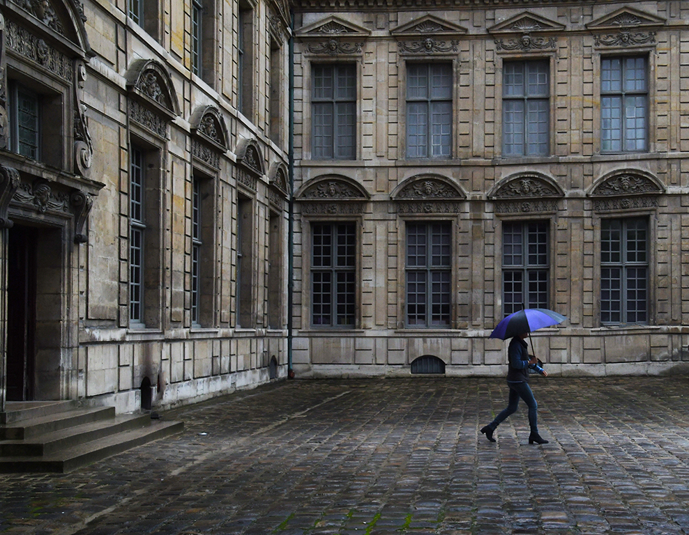
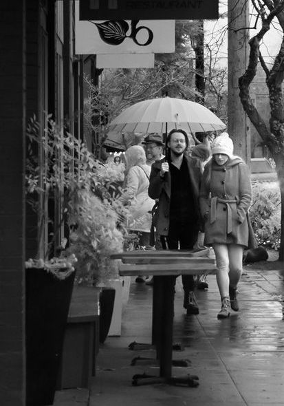
I don't know how long you stood waiting for this couple to walk into the scene, but it was certainly worth the wait. You've captured a quintessential rainy day street scene. I find the signboard and cars on the right to be distracting and have attached a cropped version of your image. I'm curious to hear your thoughts. |
Apr 13th |
 |
| 80 |
Apr 20 |
Reply |
And, Carol, I'm betting the umbrella belongs to her - it's a light color. |
Apr 13th |
| 80 |
Apr 20 |
Comment |
I like your composition, and the skies are great. I don't have an issue with the people in the image. In fact, I don't believe it's necessary to have people in every street image I make. I think St. Basil's, which I've seen a lot of this month ;-D, is over-saturated. |
Apr 13th |
| 80 |
Apr 20 |
Comment |
I like your composition. I like the cropped image in monochrome that Victor presents to us. I would love to know what the mime is thinking! |
Apr 13th |
| 80 |
Apr 20 |
Comment |
I like your concept of the image, it's colors and clarity, and I like Bev's crop (keeping the photographer). I agree with Karen's idea to "take a little more off the top" (instructions to an Italian barber?) |
Apr 13th |
| 80 |
Apr 20 |
Comment |
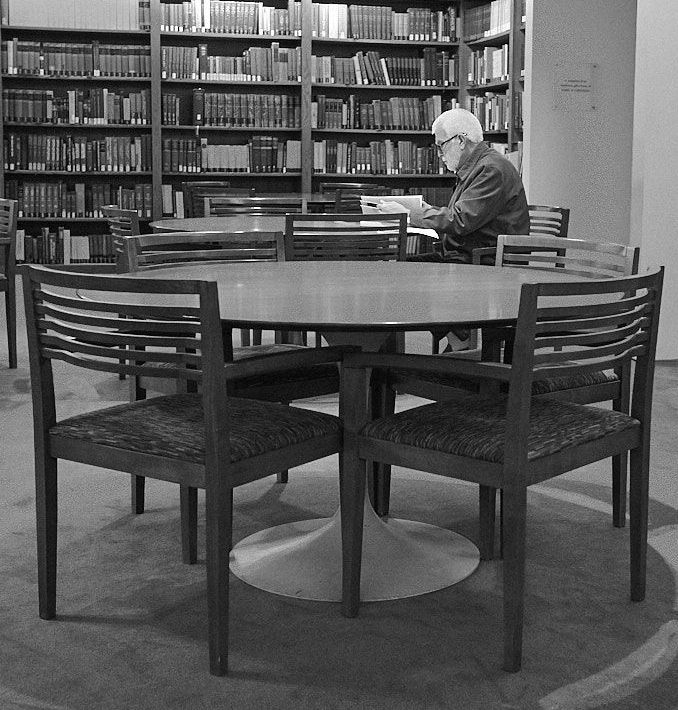
Ed, I like being lead into the reader, and your choice of monochrome for this image. I have to disagree with Carol and say I prefer the flat style with the highlights and shadows emphasized, rather than the contrast. The only suggestion I have is to crop out the small portion of bookshelves on the right and a bit of the bottom. I've attached a image that shows this adjustment. What do you think? |
Apr 13th |
 |
5 comments - 7 replies for Group 80
|
| 95 |
Apr 20 |
Reply |
Stuart, here's the crop. Like it? |
Apr 9th |
 |
| 95 |
Apr 20 |
Reply |
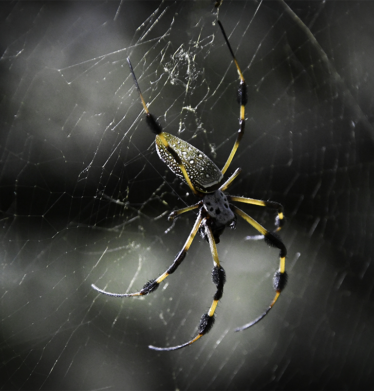
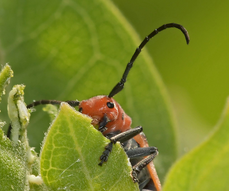
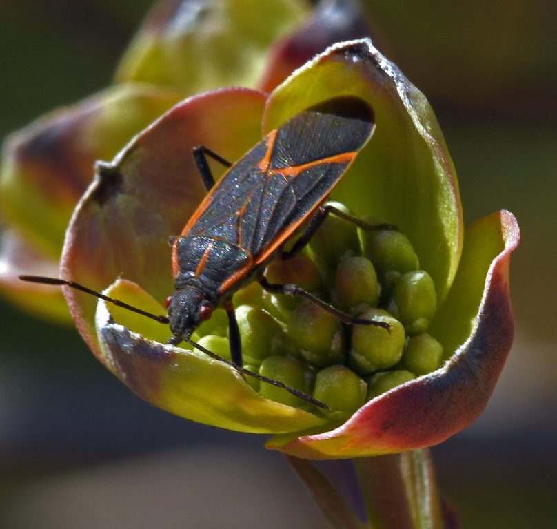
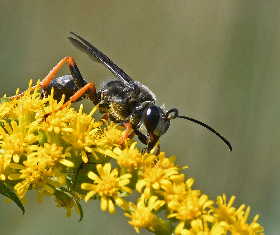
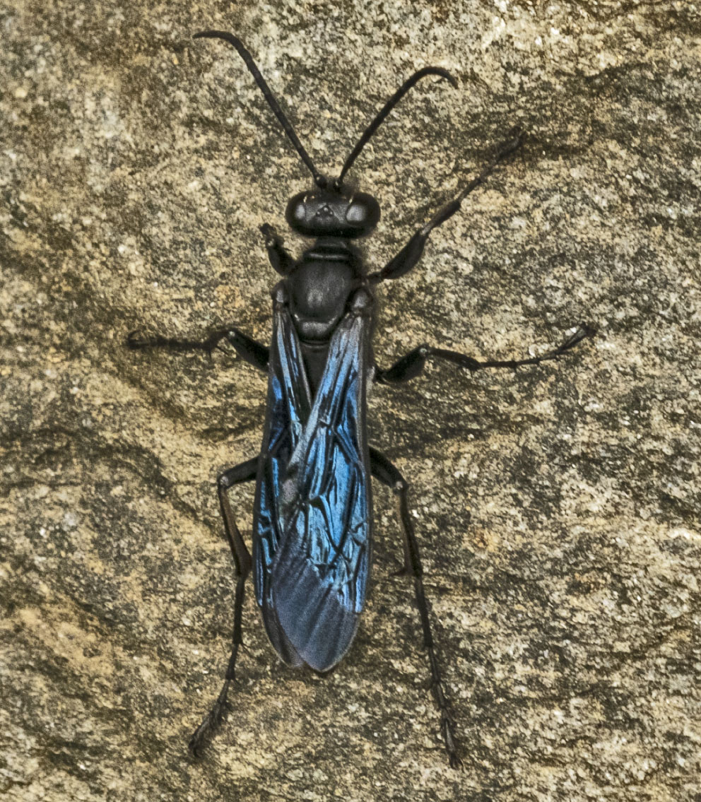
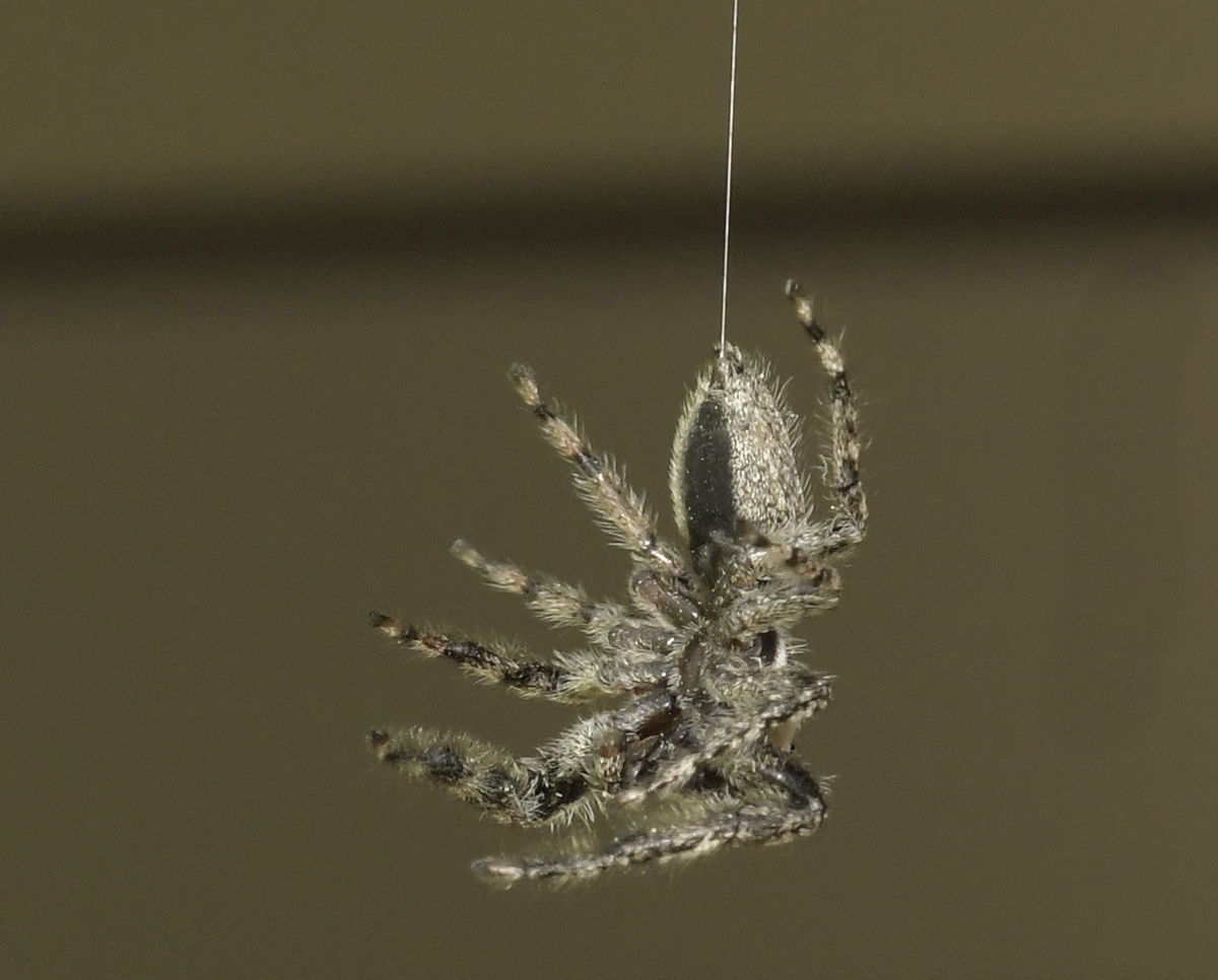
Tom, my curiosity sent me looking for the answer to how close I can get - not the same thing as how close I want to be - to the subject with my 150mm macro lens. I found that answer Thom Hogan has the answer for a lot of macro lenses. In my case the answer is seven inches.
https://www.dslrbodies.com/lenses/macro-information/macro-lens-working-distance.html |
Apr 9th |
| 95 |
Apr 20 |
Reply |
Thanks, Tom. I've never really thought about the distance I am from a subject unless a wasp was involved and then I'm very careful about not getting too close. I've found that being patient, keeping my shadow off the subject and not making sudden movements will allow me to get very close. I'll try to remember to be aware of the distance factor the next time I'm allowed in my favorite macro areas. |
Apr 7th |
| 95 |
Apr 20 |
Reply |
Thanks, Stuart. I like your suggestion about cropping left and bottom - neither area adds anything to the image and won't be missed. |
Apr 7th |
| 95 |
Apr 20 |
Comment |
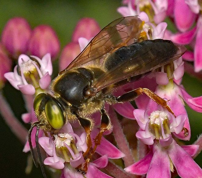
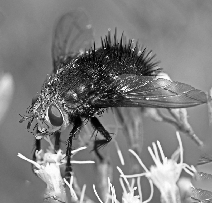
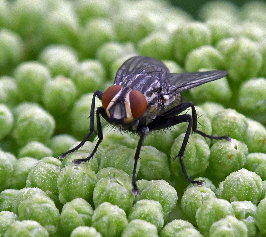
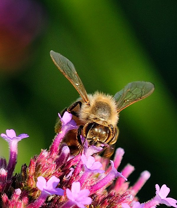
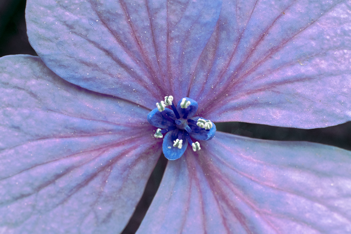
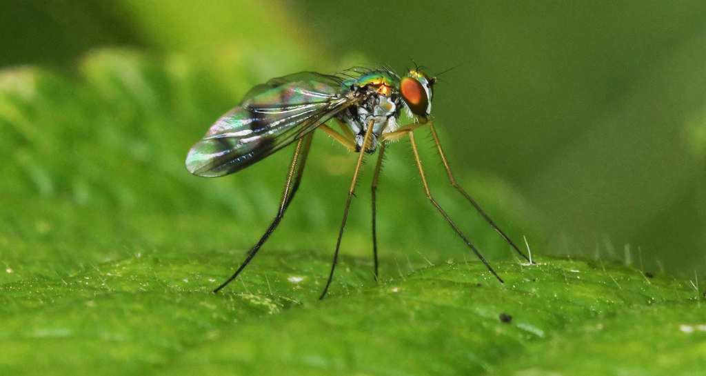
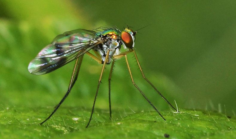
Welcome to the group, Barbara!
This is a very nice image, very sharp and the water spray was a good idea. I like Tom's suggestion for getting the RED right. |
Apr 7th |
| 95 |
Apr 20 |
Reply |
Stuart, I don't think it's necessary to state an image's magnification. I think it'd be pretty apparent if an image was "close up" vs. macro. |
Apr 7th |
| 95 |
Apr 20 |
Comment |
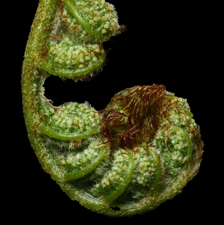
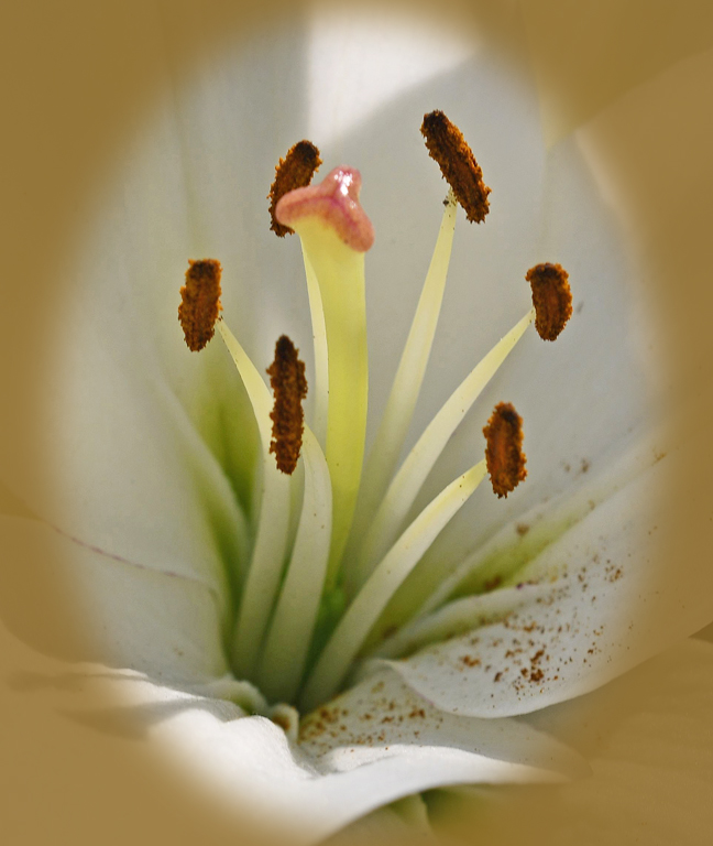
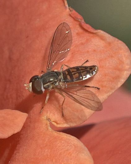
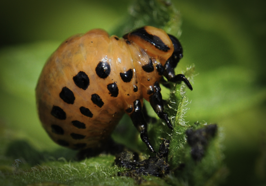
I was really curious about how you got the spider to model for a 15 image stack and then I read your response to Stuart and saw the postmortem comment. I don't find a thing not to like about this image, so no suggestions.
|
Apr 7th |
| 95 |
Apr 20 |
Comment |
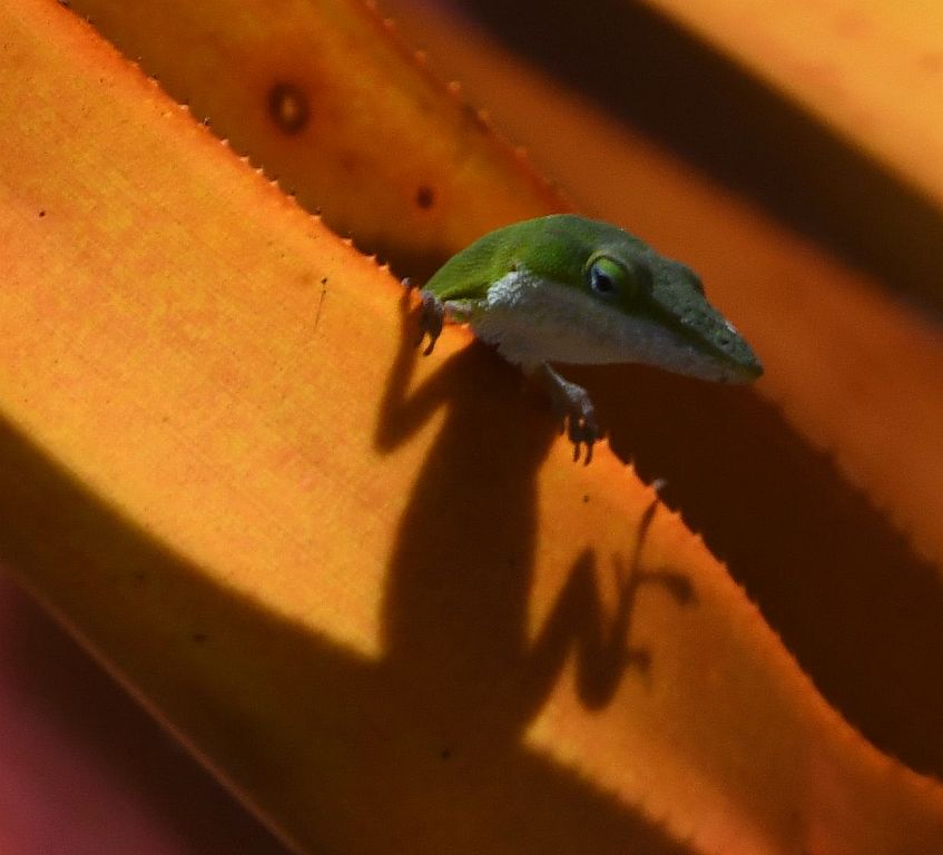
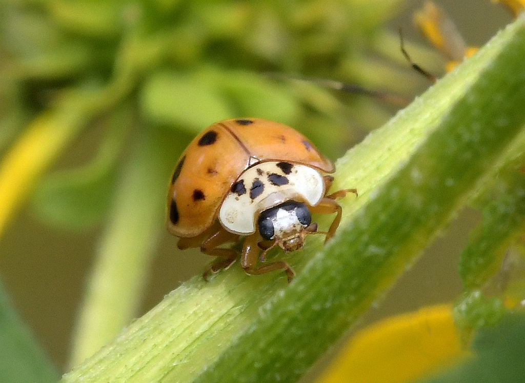
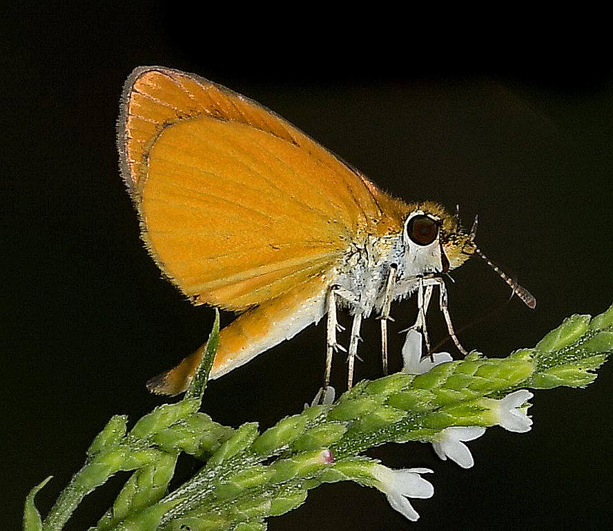
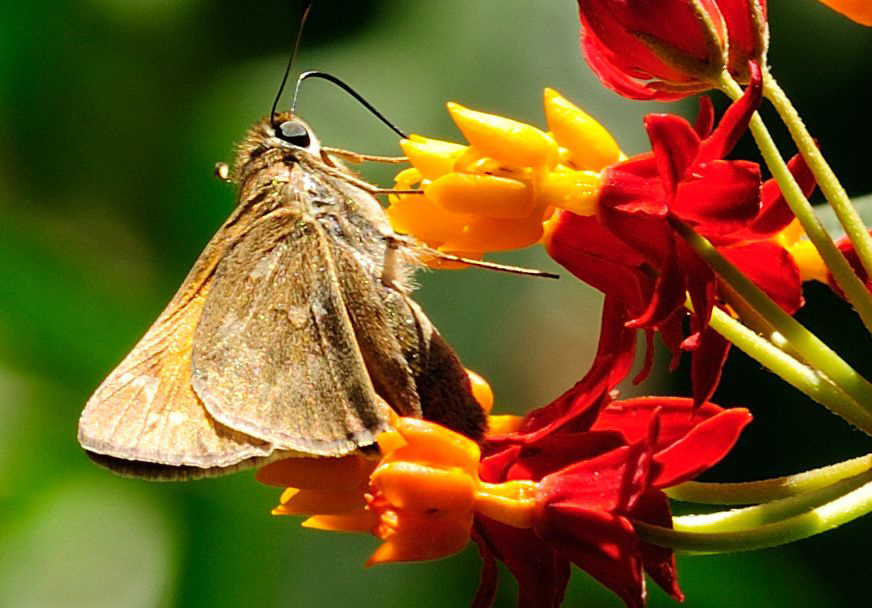
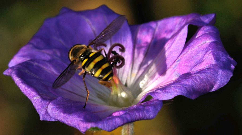
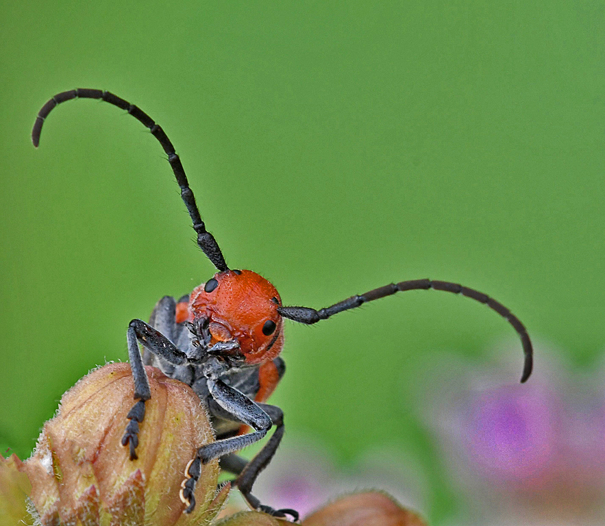
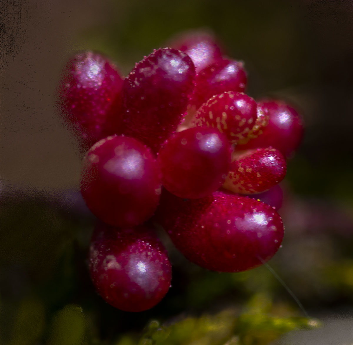
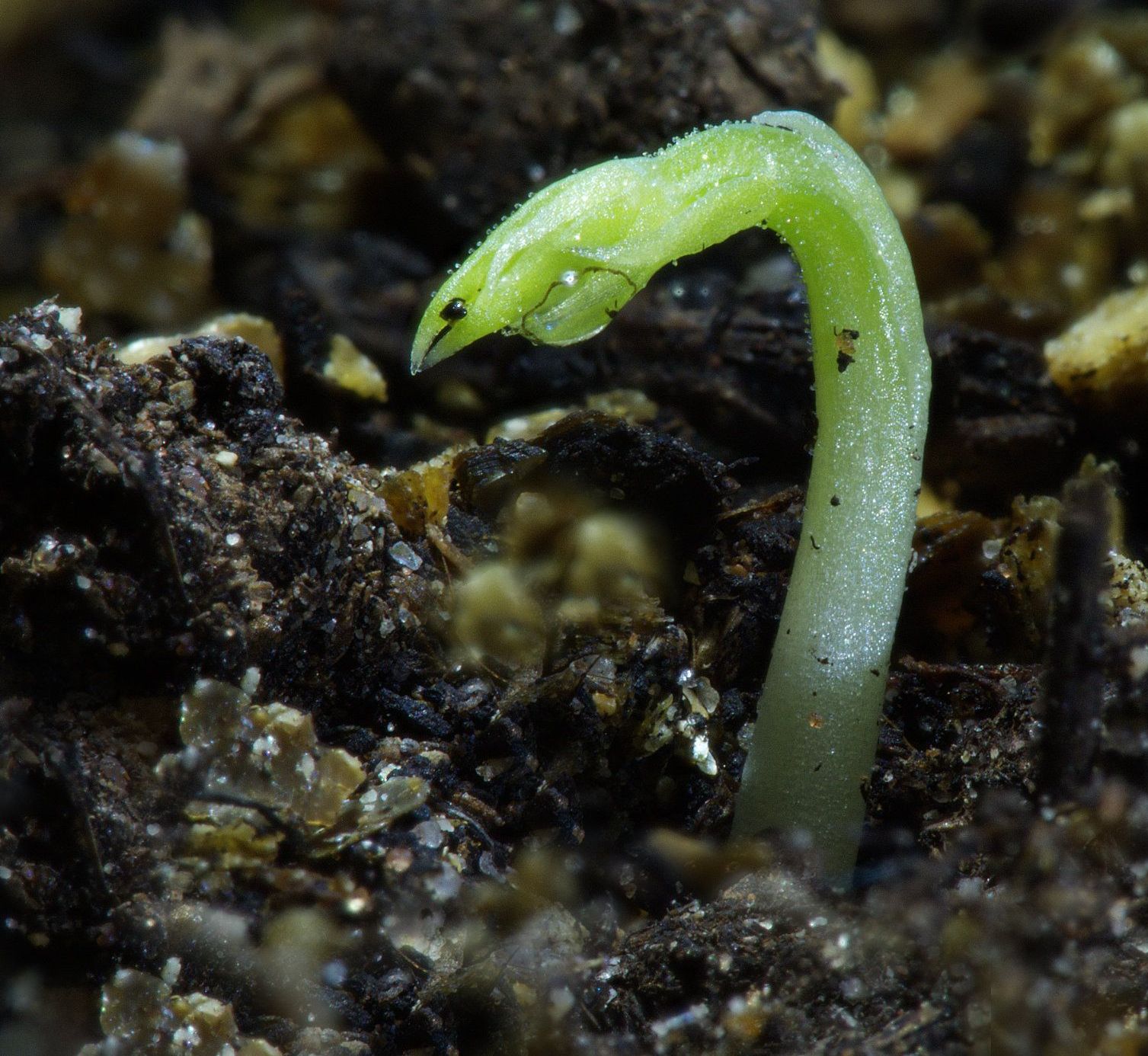
Stuart, you chose your subject well and, keeping the "eye" also was a good choice. The clarity and color of the subject are very good, as is the bokehed background. The only suggestion I have is that you might consider cropping some of the top and about 2/3 of the right to really bring the "snake" into prominence. I did that, and the image is attached. What do you think? |
Apr 7th |
 |
3 comments - 5 replies for Group 95
|
19 comments - 25 replies Total
|