|
| Group |
Round |
C/R |
Comment |
Date |
Image |
| 29 |
Mar 20 |
Comment |
Thanks, Bob. I'm gonna go back and try your Radial Filter (something I haven't touched yet), and the white-lowering techniques. I couldn't figure out how to get that background darker! |
Mar 15th |
| 29 |
Mar 20 |
Reply |
Thanks, Stephan. I don't remember for sure, but I don't think I tried the Remove Tool in LR, but went into PS and, as I mentioned in my reply to Bob Legg, used the wrong Healing Brush Tool. |
Mar 15th |
| 29 |
Mar 20 |
Reply |
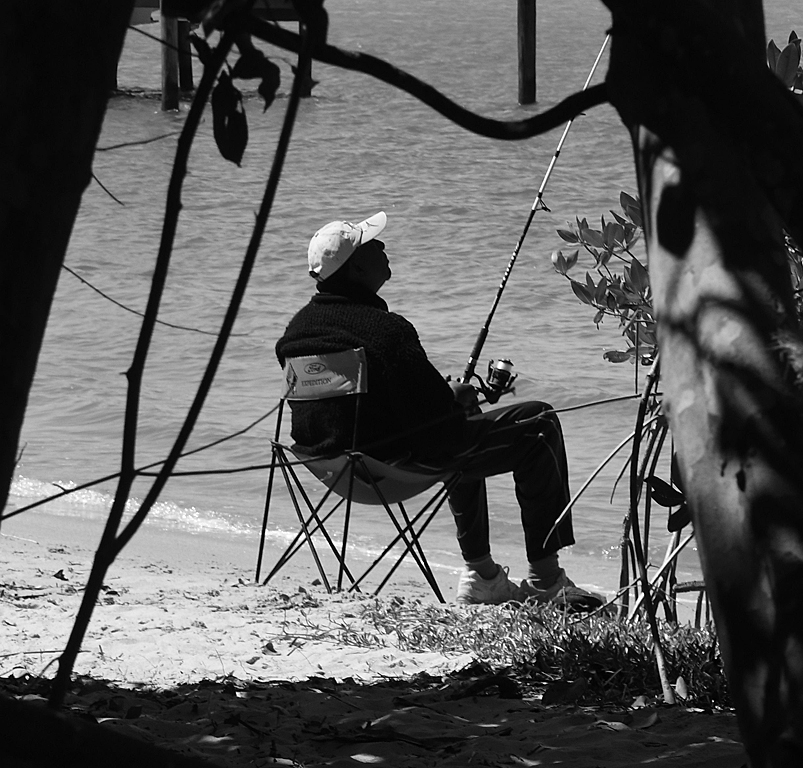
Thanks, Bob. I'm the last guy in the line of offended people. I'm trying to get better at this and will accept every bit of advice offered.
It's easy for me to image no auto focus, high ISO, etc., since I started shooting in the early 60's when I was in the USAF stationed in Istanbul, Turkey. How about shooting a roadside flower stand from a moving car?
I've played with this image a little since I submitted it and realized that I use the Spot Healing Brush Tool when I should have used the Healing Brush Tool in PS. |
Mar 15th |
| 29 |
Mar 20 |
Reply |
Thanks, Judy. To this point I haven't ventured into the "local" adjustments of LR & PS very much, so that's why the head didn't get any adjustments. |
Mar 15th |
| 29 |
Mar 20 |
Comment |
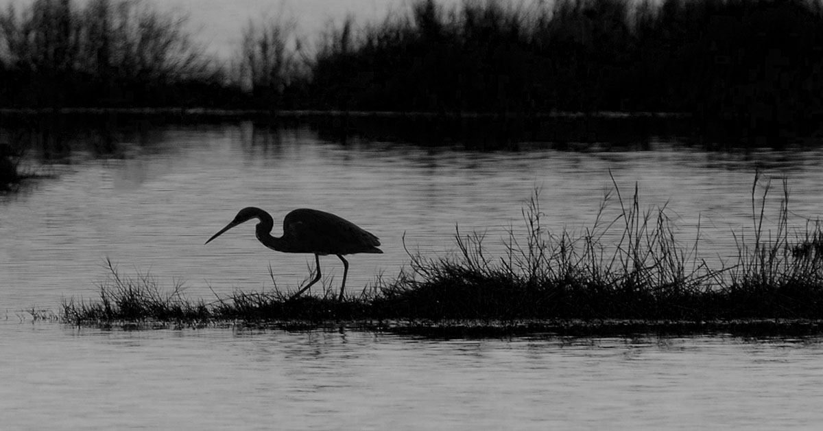
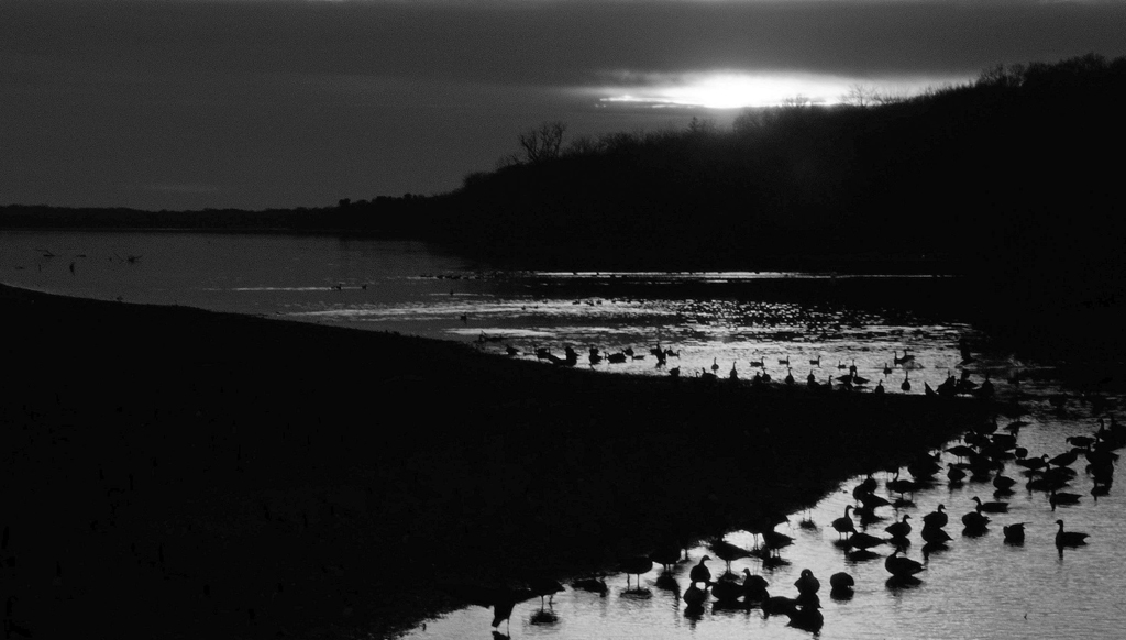
I think this is a captivating image. Very good snag silhouettes and a gorgeous sky are a nice reward for getting out of bed and venturing out in the dark, pre-dawn hours. |
Mar 15th |
| 29 |
Mar 20 |
Comment |
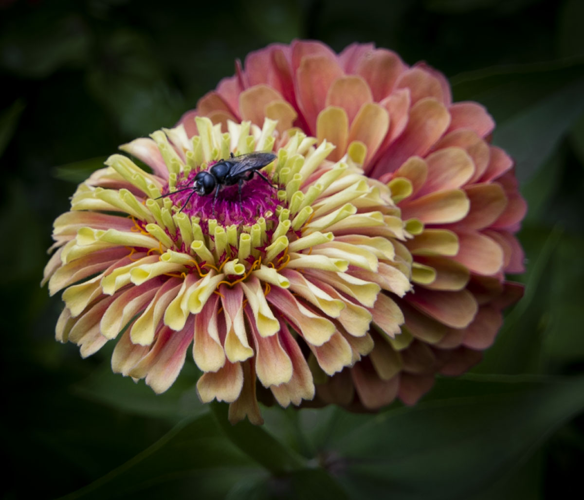
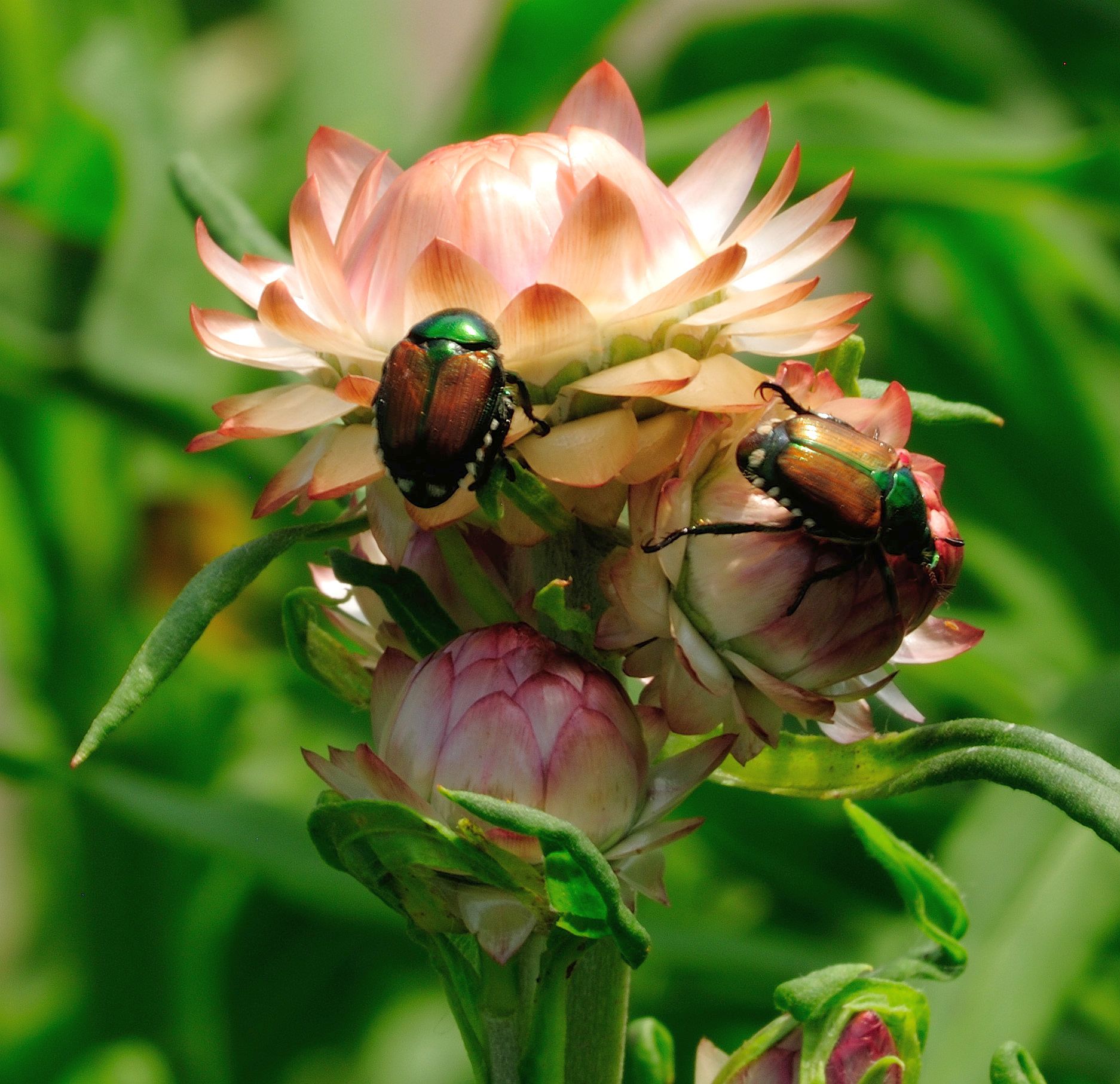
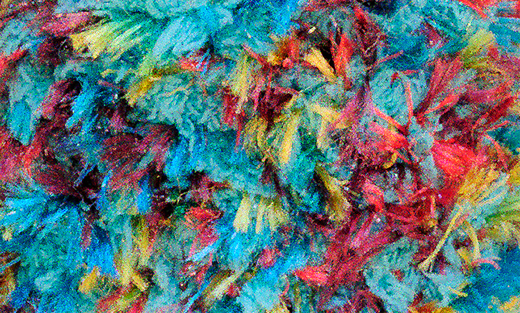
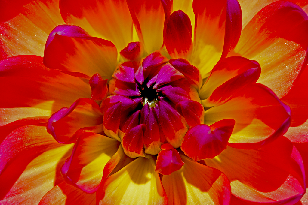
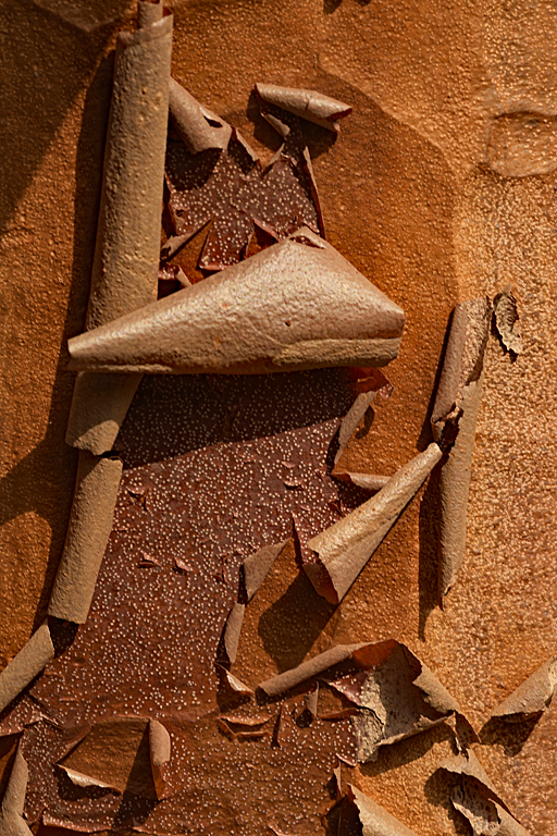
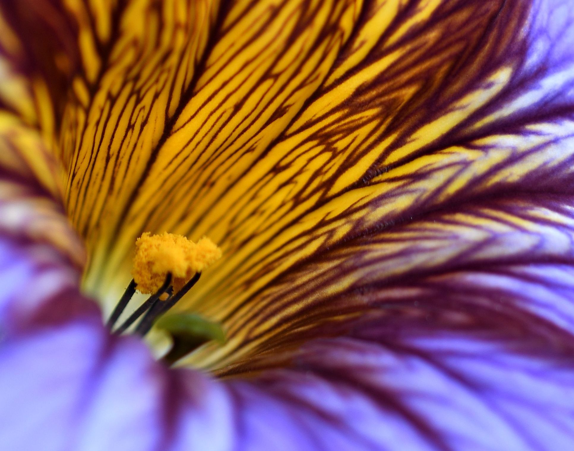
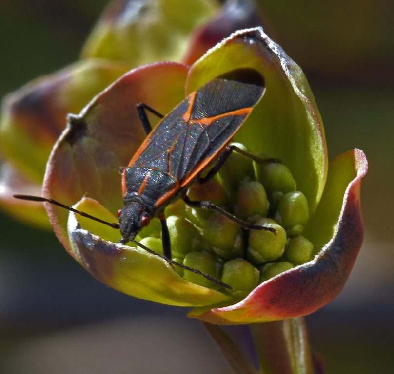
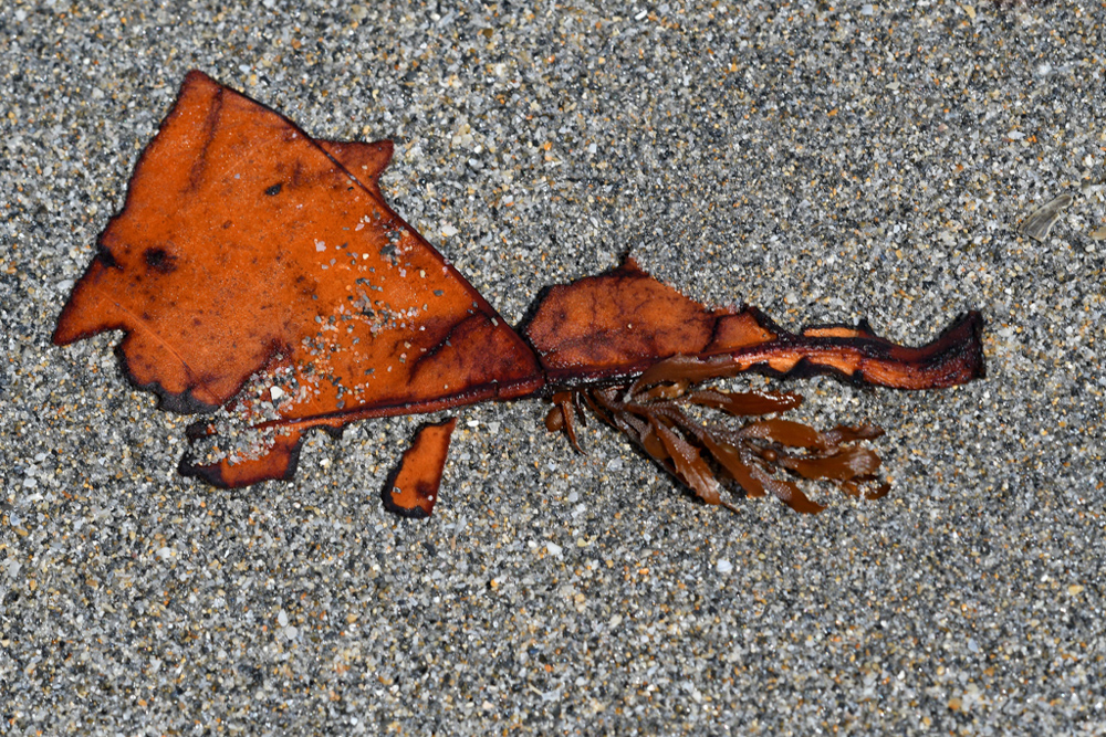
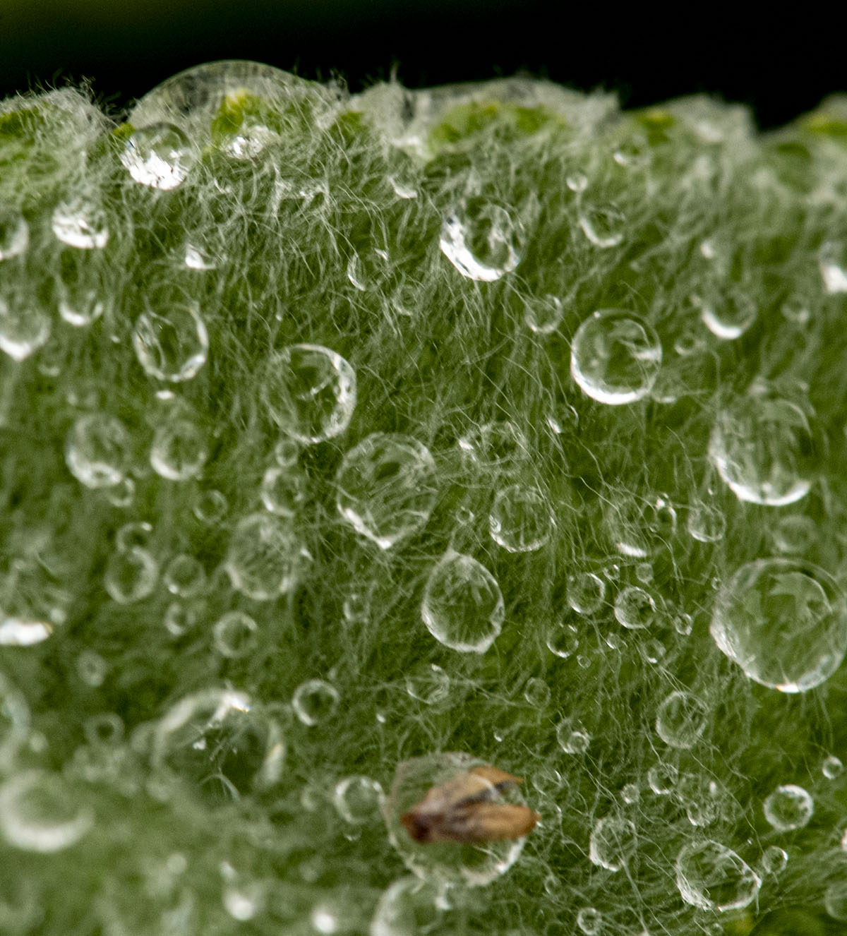
I, too, had some trouble seeing what the image is. Bob's adjustments definitely show the potential by bringing out the colors, lines, and textures of the various pieces of the flower and leaves. |
Mar 15th |
| 29 |
Mar 20 |
Comment |
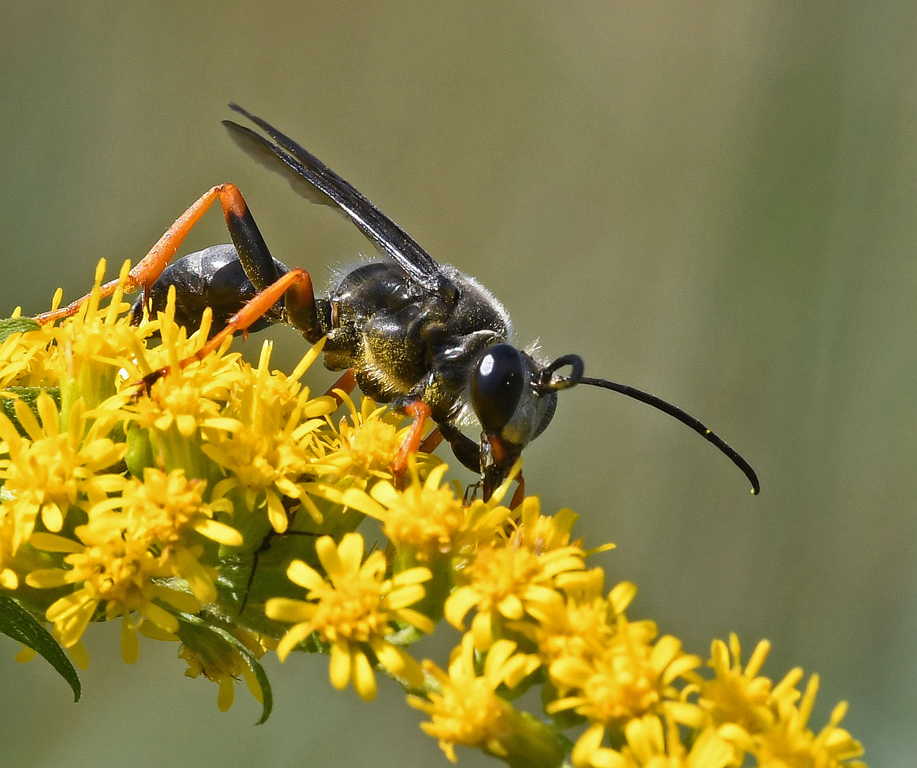
WOW, Karen. This is a National Geographic and/or Audubon cover-worthy image. |
Mar 15th |
| 29 |
Mar 20 |
Comment |
Judy, this looks like too much fun!! I'm going to go looking for an android version of the apps. I like the angles, lines and colors of the original, but the abstract is more interesting to me. I like the result of Bob's playing with the colors (hard to believe he didn't add contrast!). |
Mar 15th |
| 29 |
Mar 20 |
Comment |
I can imagine this as the image on the cover of a paperback mystery. This is a really intriguing image that I find eerie. It's difficult, looking at the model's face, to determine if she's "dead in the water?". Your use of the bubbles, I think, enhances the eeriness by drawing my eyes, along with the leading lines in the water, directly to her face. I really like your creativity with this image. |
Mar 15th |
| 29 |
Mar 20 |
Comment |
Bob, you've captured the sky about as well as any I've seen. I keep wondering, if the structure were out of focus, would it make any difference? |
Mar 15th |
7 comments - 3 replies for Group 29
|
| 74 |
Mar 20 |
Reply |
Thanks, Ying Shi. I thought about cropping or otherwise removing the stone but I didn't know if it was part of the game - like the bases are in baseball - and opted to leave it in the image. |
Mar 17th |
| 74 |
Mar 20 |
Reply |
Thanks, David. You're right about the cropping - the left side doesn't add anything to the image and wouldn't be missed. |
Mar 17th |
| 74 |
Mar 20 |
Reply |
Thanks, Arne. You're right lightening the faces. That's something I haven't gotten to in my LR/PS education. |
Mar 17th |
| 74 |
Mar 20 |
Reply |
Thanks, Ata. I don't know if I could have gone with a slower shutter speed and reduced the ISO because I never tried doing that? |
Mar 17th |
| 74 |
Mar 20 |
Comment |
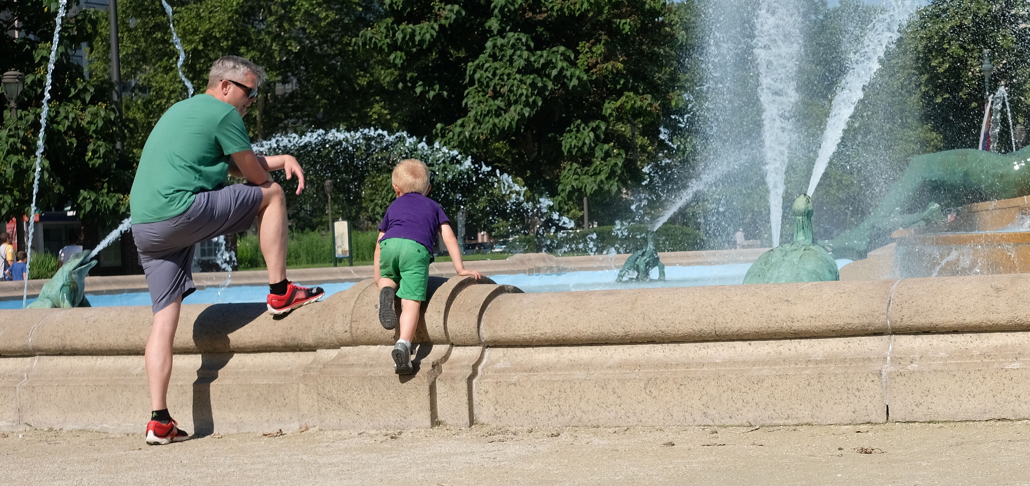
This is a really nice shot of this boy his water bottle toy. I like your crop, which draws the viewer's attention to your main subject(s).
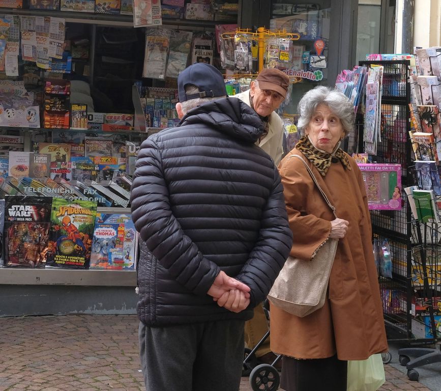
Is he pretending to drink from the wrong end of the bottle or is he pretending to play a musical instrument? Kids have great imaginations, regardless of where they are living or their station in life. I remember the gypsies from my time in Istanbul. I thought they were generally treated with contempt. |
Mar 17th |
| 74 |
Mar 20 |
Comment |
I also think both images are really impressive. I prefer the monochrome version. |
Mar 17th |
| 74 |
Mar 20 |
Comment |
The monochrome version is definitely the better option. Very good modeling job by the non-model. I wouldn't change a thing about this image. |
Mar 16th |
| 74 |
Mar 20 |
Comment |
This is definitely an image that shows best in monochrome. And Stephen Levitas is right that it belong in Barcelona. Very nice job on the post-processing Arne. |
Mar 16th |
4 comments - 4 replies for Group 74
|
| 80 |
Mar 20 |
Comment |
Thanks, Bev. |
Mar 18th |
| 80 |
Mar 20 |
Reply |
Thanks, Karen. |
Mar 18th |
| 80 |
Mar 20 |
Reply |
Thanks for the suggestions Ed. |
Mar 18th |
| 80 |
Mar 20 |
Reply |
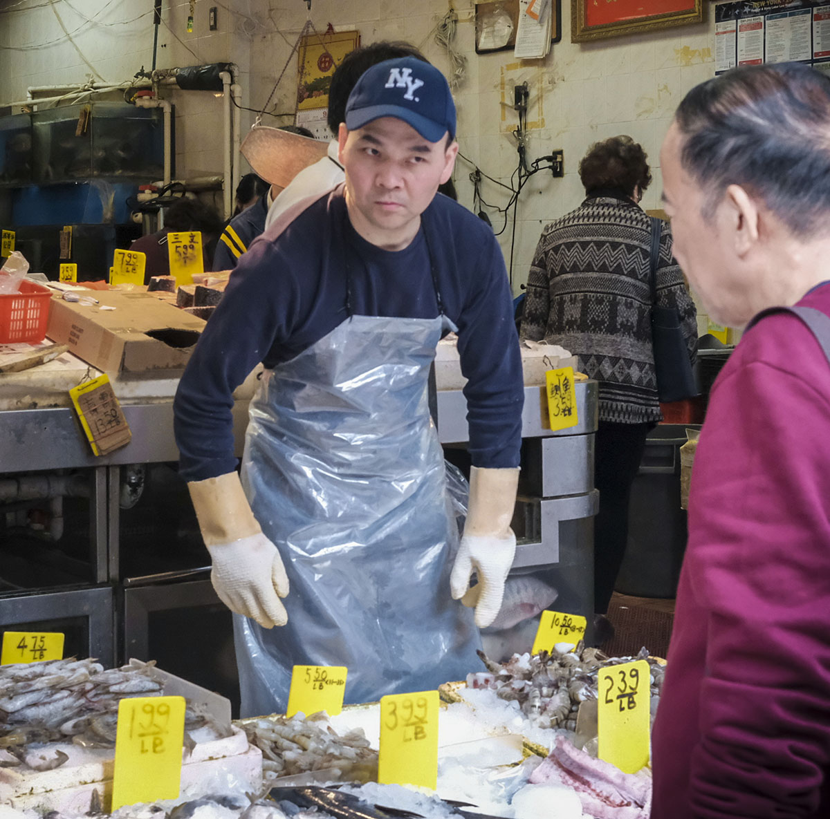
Thanks, Victor. I did not look at a monochrome conversion. To me, the colors of the market, as well as the characters, are a big part of it's allure. |
Mar 18th |
| 80 |
Mar 20 |
Reply |
Thanks for the explanation Victor. I don't think I'd have been nearly as informative as you are. |
Mar 18th |
| 80 |
Mar 20 |
Reply |
Thanks, Carol. |
Mar 18th |
| 80 |
Mar 20 |
Reply |
Thanks, Jim. |
Mar 18th |
| 80 |
Mar 20 |
Comment |
I really like this image. I think you've captured the "look at me" attitude really well. Agree with idea of a darker vignette. |
Mar 18th |
| 80 |
Mar 20 |
Comment |
I'm in agreement with eliminating a good portion of bottom of your image, Bev. I also like the non-Topaz version. |
Mar 18th |
| 80 |
Mar 20 |
Comment |
Can't count the number of times I've seen scenes like this. These guys are doing very hard work and they always seem to be in good humor. I think you captured that really well, the colors are very good and the only suggestion I have is to crop out the top to include the horizontal bar above the men's heads since it doesn't add anything to the image. |
Mar 18th |
| 80 |
Mar 20 |
Comment |
People on their hands and knees, displaying their artistry on concrete, tile, macadam, etc., are something I very rarely pass up when I'm taking my camera for a walk. I think you've captured this scene very well, Carol. You caught the man adding a frame to his art. The composition is very good (regardless of the legs/feet in the upper left), color and clarity are also very good. I like what Ed has done to improve the image. |
Mar 18th |
| 80 |
Mar 20 |
Comment |
The story you're trying to convey is interesting since, to me, you've presented a person who belongs in that environment as an interloper, and I think it works because of the changes you made. To me, you've made it appear that's its a rainy and/or foggy day and, there's some mystery about what's in the man's hand and what's crammed into the back of his jeans. Converting to monochrome also adds to the image. There are a few blown highlights that you might want burn, but other than that I think you've got a pretty good image. Will judges like it? Who knows? |
Mar 17th |
| 80 |
Mar 20 |
Comment |
I'm also part of the group thinking "what's up with that wreath?". After looking at the image for a bit and seeing the woman with her arm and hand extended to the wreath I got your story's idea. I think the monochrome version is the better of the two options and I'd have completely cropped out the white car at the bottom right. I think that crop would enhance the line from the photographer to the wreath and beyond. Like Victor, I did not find the overexposed sky an issue. Very nice image, Ed. |
Mar 17th |
7 comments - 6 replies for Group 80
|
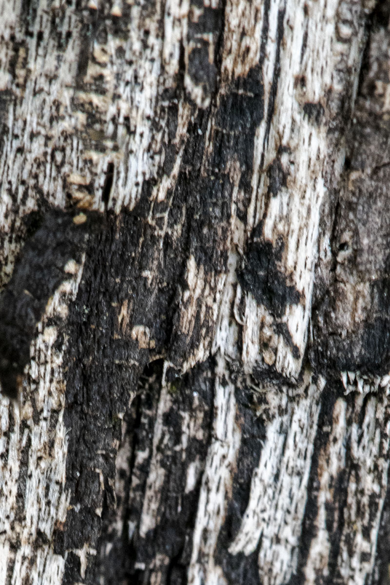
| 95 |
Mar 20 |
Reply |
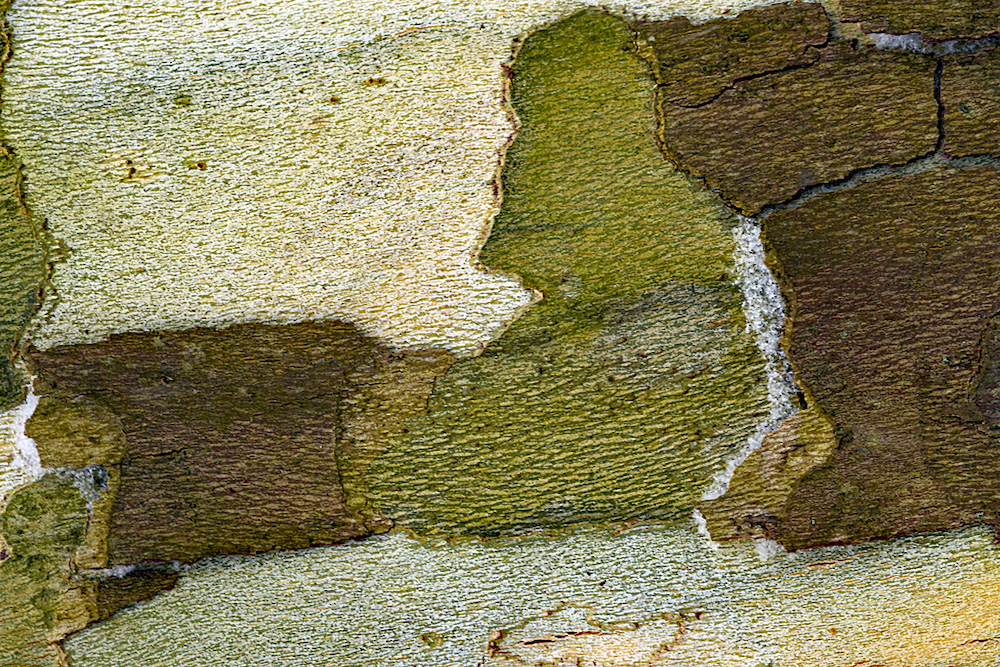
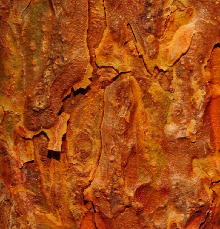
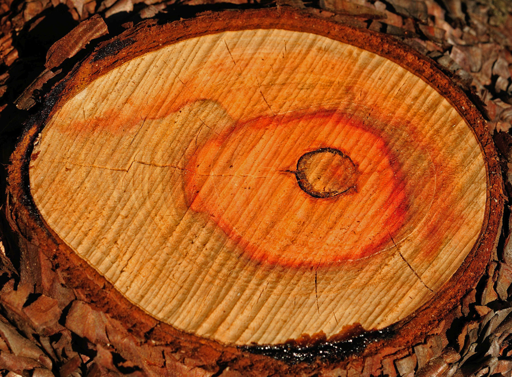
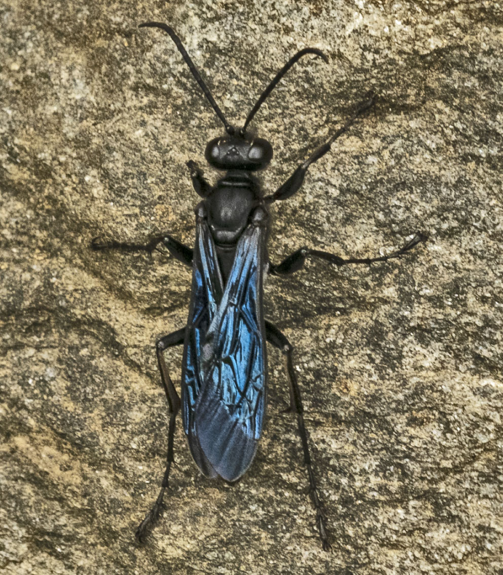
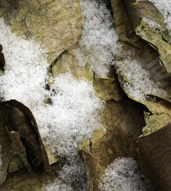
Thanks, Marti. I'm always on the lookout for bark. There are some really interesting trees that are just begging for a macro lens to be trained on them!!
I'm not a fan of dirty snow. With the exception of really bright, sunlit days, I really like to spend the time to get the snow's color the way I see it. |
Mar 19th |
| 95 |
Mar 20 |
Reply |
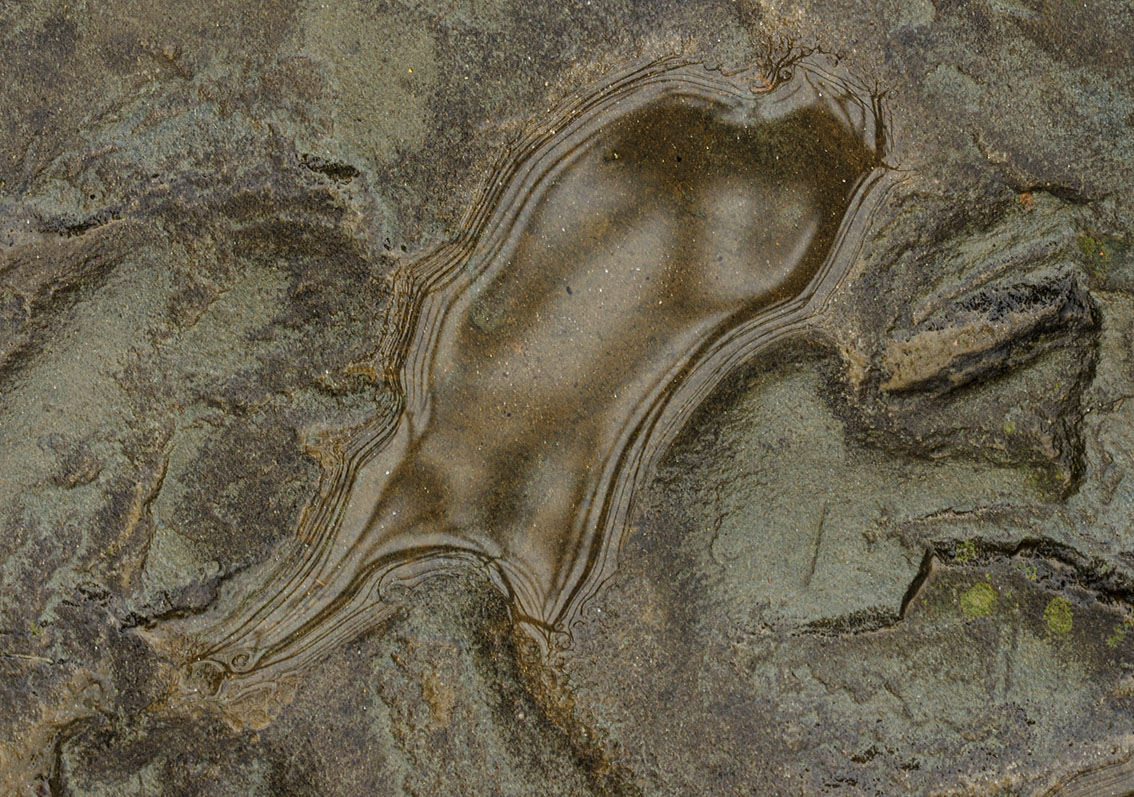
I think the planet creation from this image is pretty cool! Definitely not something I'd think about doing. I had to look at the planet a few times to see what you'd done. |
Mar 19th |
| 95 |
Mar 20 |
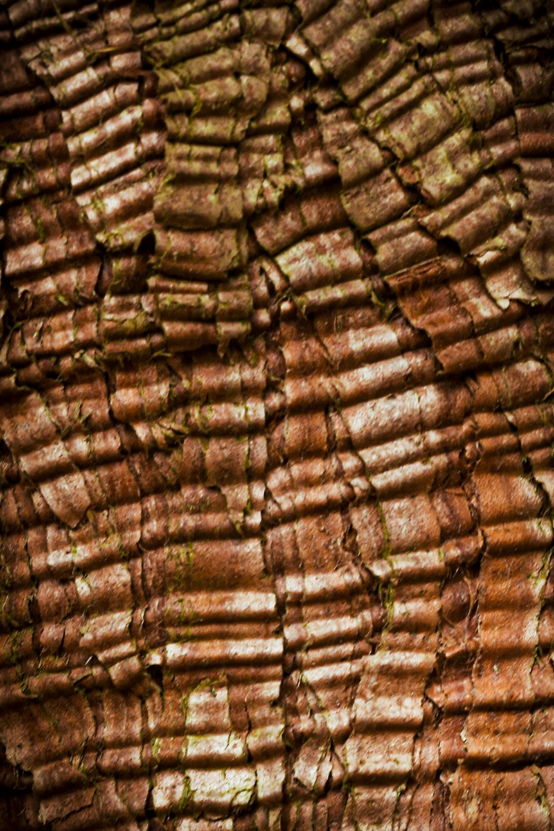
Reply |
Tom, I don't know the answer to your question about "what area this represents". I think it was where the tree trunk starts to separate into branches, but I'm not sure about that. I like your burn/dodge enhancements. |
Mar 19th |
| 95 |
Mar 20 |
Reply |
Hi Bob! I like Tom's application of your idea to burn/dodge the edges of the bark. |
Mar 19th |
| 95 |
Mar 20 |
Comment |
Beautiful image, Tom. I'm in agreement with previous commentary. My first thought was the image seems to jump off the screen at me.
Have not tried stacking and don't know that I possess the patience for 95 images.
|
Mar 19th |
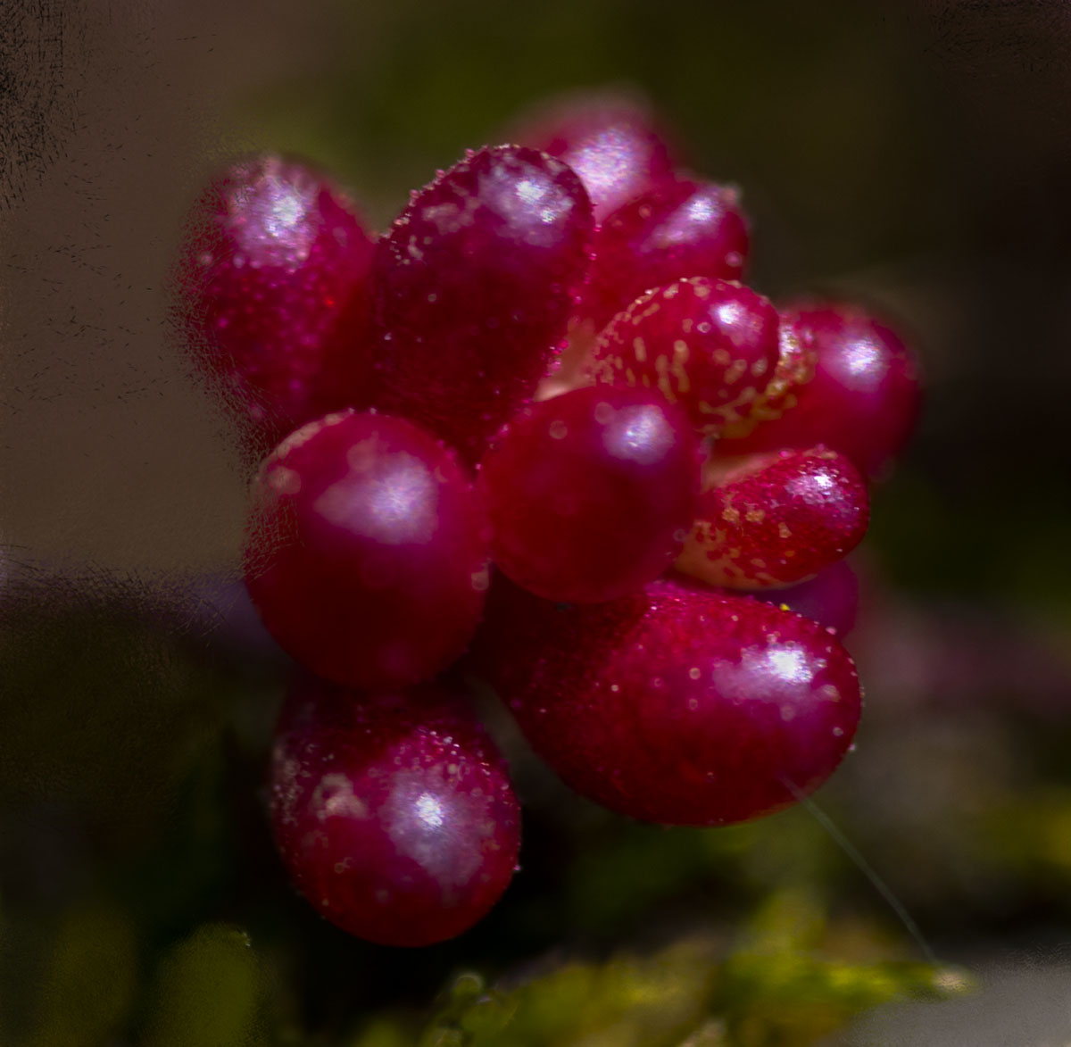
| 95 |
Mar 20 |
Comment |
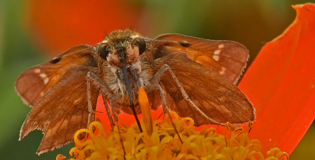
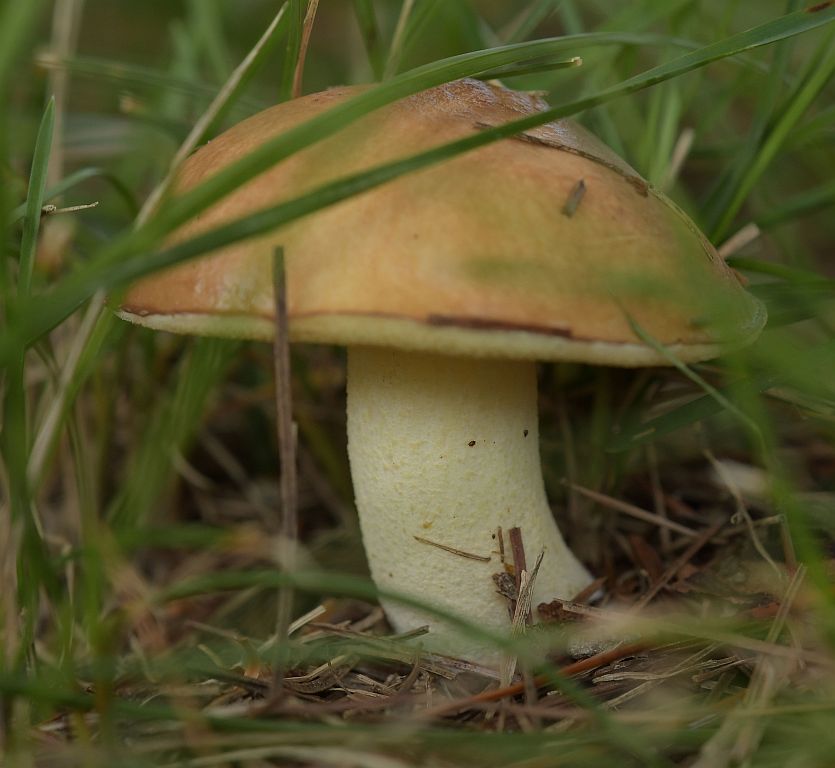
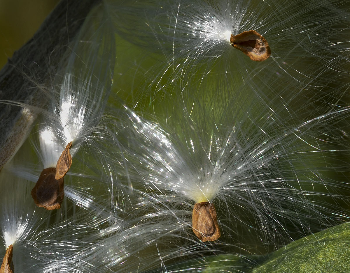
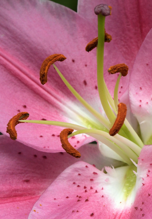
Wouldn't have occurred to me to add the rhododendron flower to those eye-catching funji. I like your inclusion of Tom's suggestions and you "bump" of the stamen in the modified image. The composition, color and clarity are all really good. |
Mar 19th |
2 comments - 4 replies for Group 95
|
20 comments - 17 replies Total
|