|
| Group |
Round |
C/R |
Comment |
Date |
Image |
| 60 |
Dec 19 |
Reply |
Interesting. The manual focusing part wouldn't bother me since I, more often than not, am manually focusing when I shoot macro images. And, come to think of it, my early cameras were only focused manually. |
Dec 16th |
| 60 |
Dec 19 |
Reply |
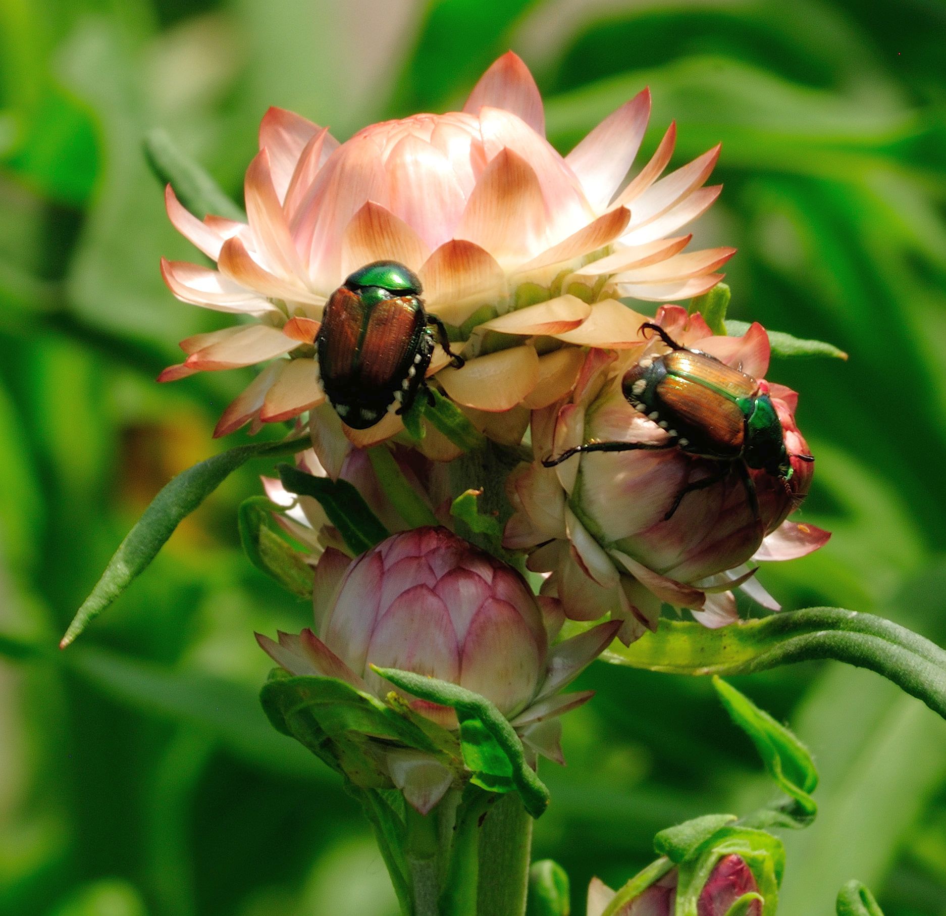
I'm not far enough into my Lightroom lessons to know how to apply a vignette, apply a gradient, or decrease/increase luminance. Instead I tried a couple of things in PhotoShop that I've messed around with before - burned the background to try to bring the flower out and dodged the stem to make it more visible. Do you think there's improvement in the attached image? |
Dec 16th |
 |
| 60 |
Dec 19 |
Reply |
I'm not far enough into my Lightroom lessons to know how to apply a vignette, apply a gradient, or decrease/increase luminance. Instead I tried a couple of things in PhotoShop that I've messed around with before - burned the background to try to bring the flower out and dodged the stem to make it more visible. Do you think there's improvement in the attached image? |
Dec 16th |
|
| 60 |
Dec 19 |
Reply |
I'm not far enough into my Lightroom lessons to know how to apply a vignette, apply a gradient, or decrease/increase luminance. Instead I tried a couple of things in PhotoShop that I've messed around with before - burned the background to try to bring the flower out and dodged the stem to make it more visible. Do you think there's improvement in the attached image? |
Dec 16th |
 |
| 60 |
Dec 19 |
Comment |
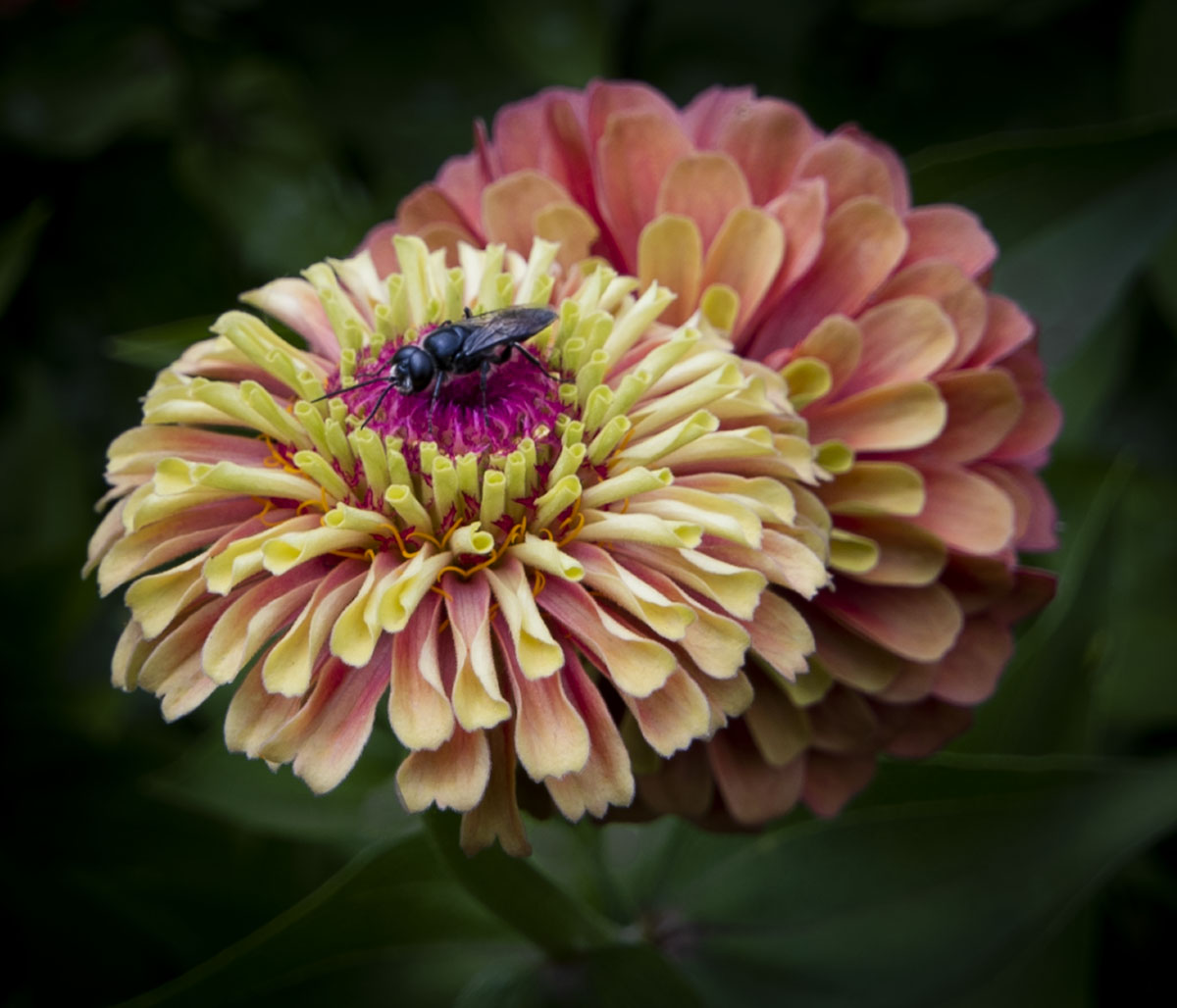
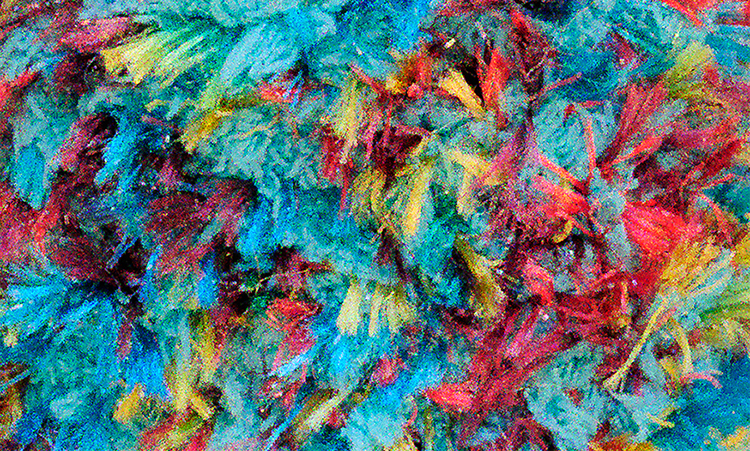
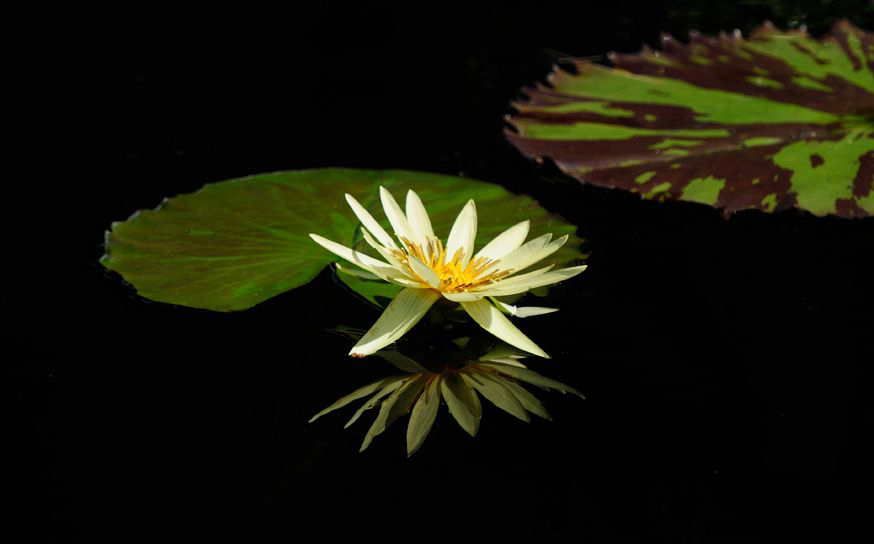
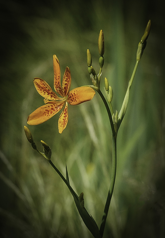
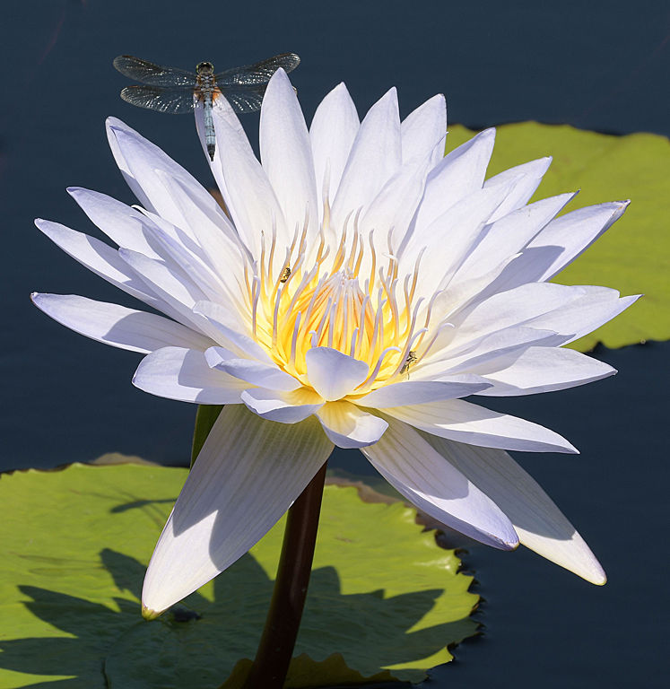
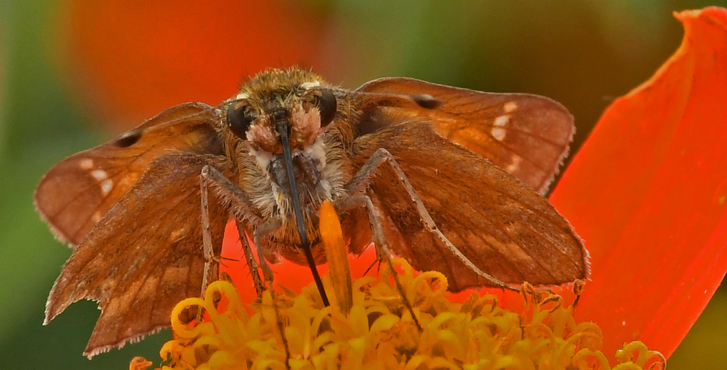
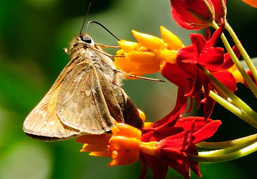
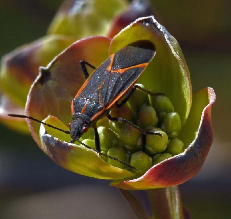
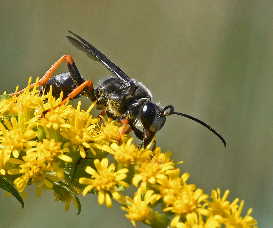
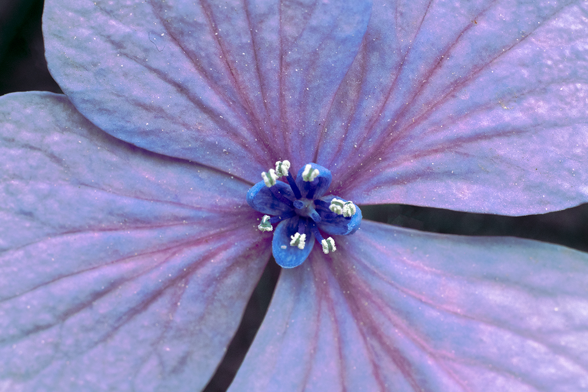
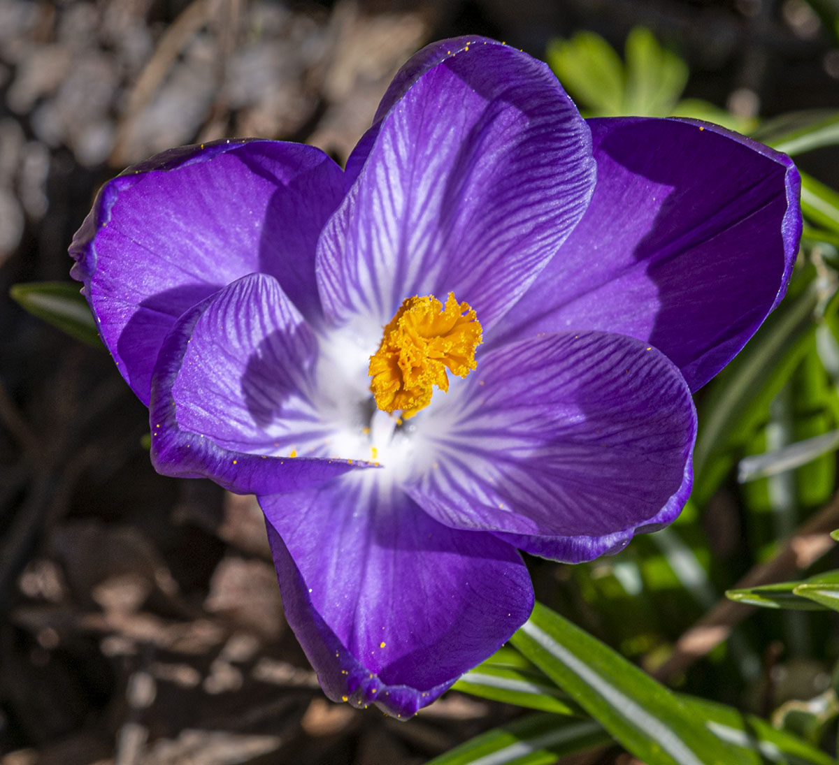
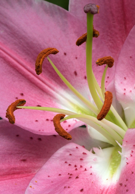
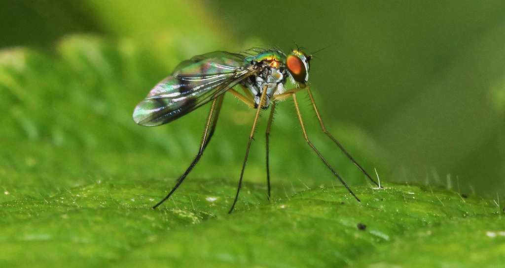
So, my first reaction to seeing the image, before reading your description, was, ha! Denise has another soft, pastel flower for us. Then I found out there's a Lensbaby in the mix. I know as much about Lensbaby as I know about NASA projects - nothing. So, to my unknowing eye, the image is another in a series of good flower images - interesting, nicely composed, pastel, with a focus that appears, to me, to be sharp in lower right and begins to become soft as my eye moves toward the top. I like it! |
Dec 16th |
| 60 |
Dec 19 |
Comment |
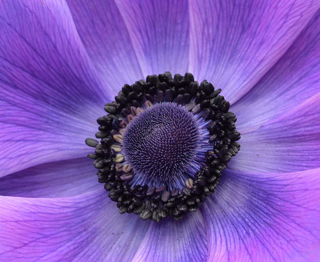
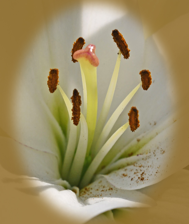
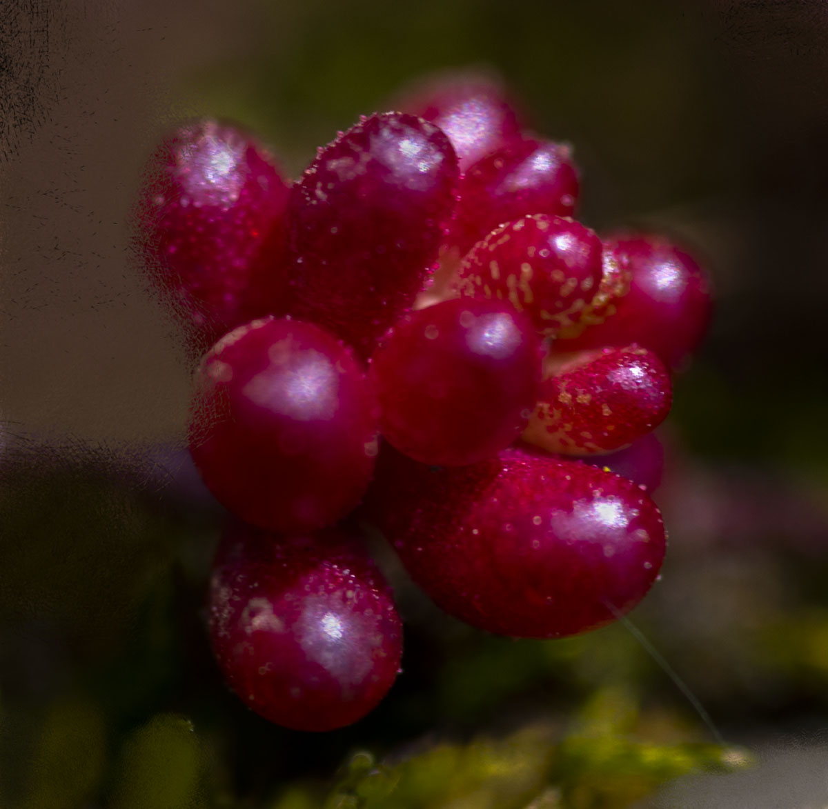
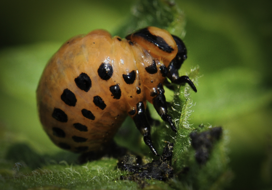
I like this image a lot. I have no idea how to accomplish this (yet), but I seem to remember someone in another PSA group I'm a member of doing some kind of copy and paste function that, for instance, would use the background color to overlay the white reflection. |
Dec 16th |
| 60 |
Dec 19 |
Comment |
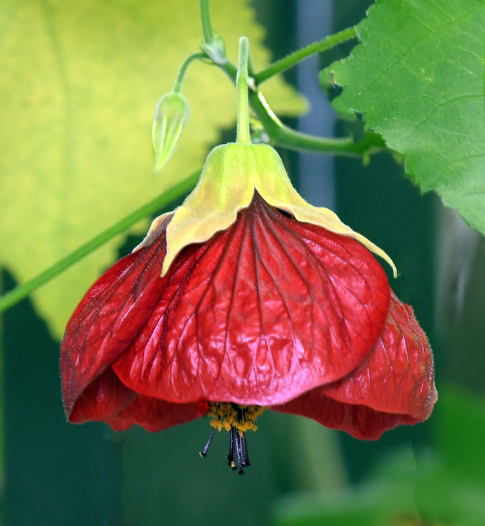
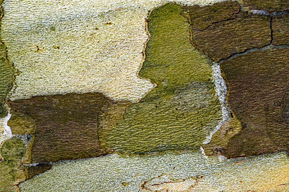
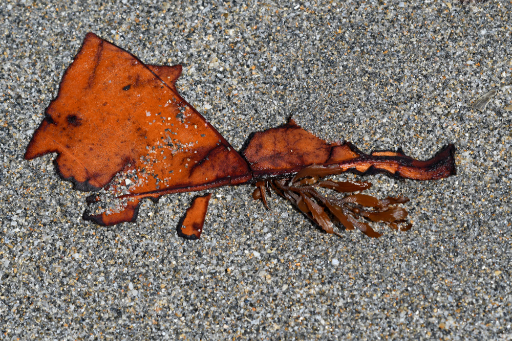
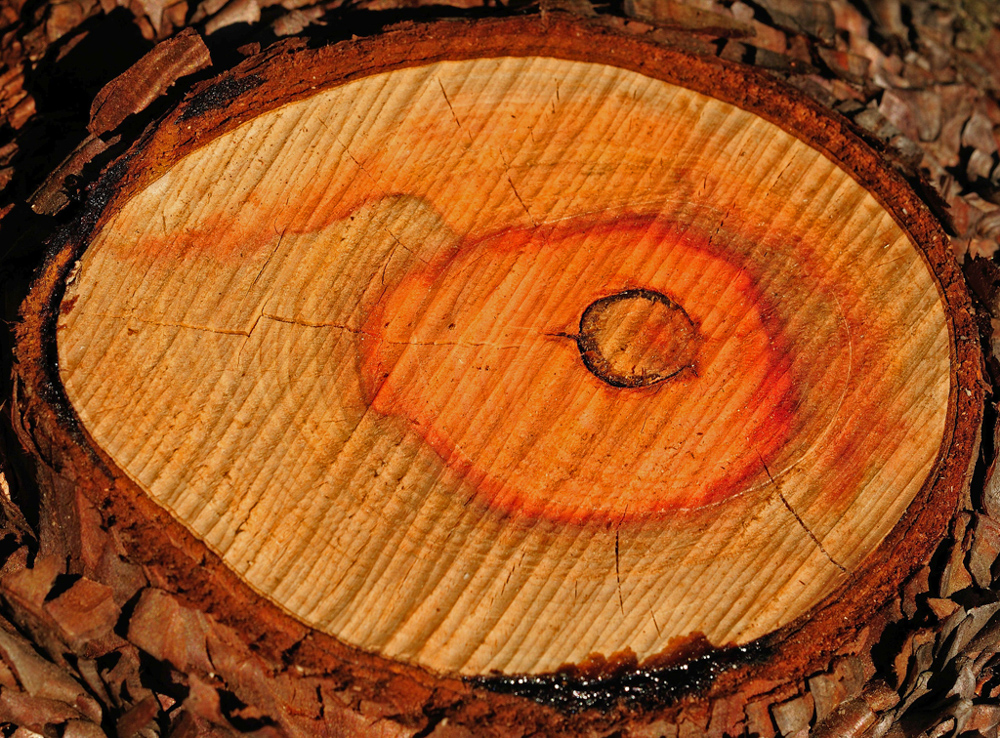
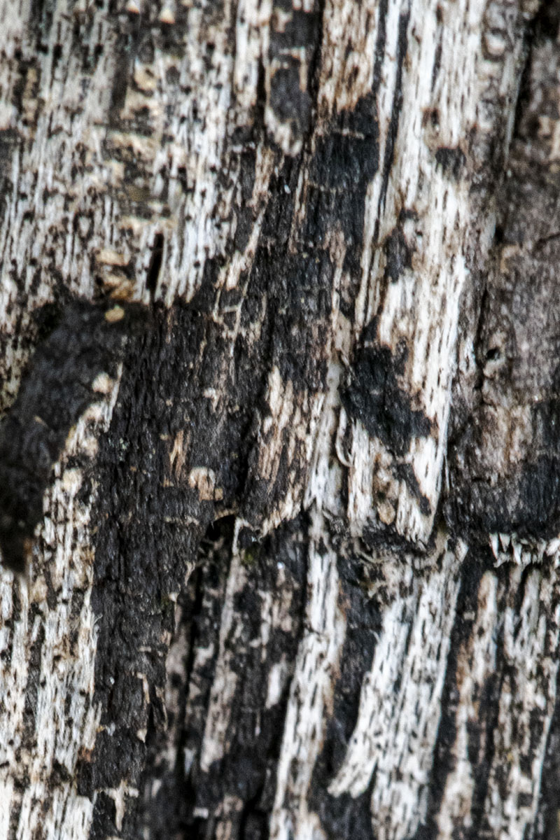
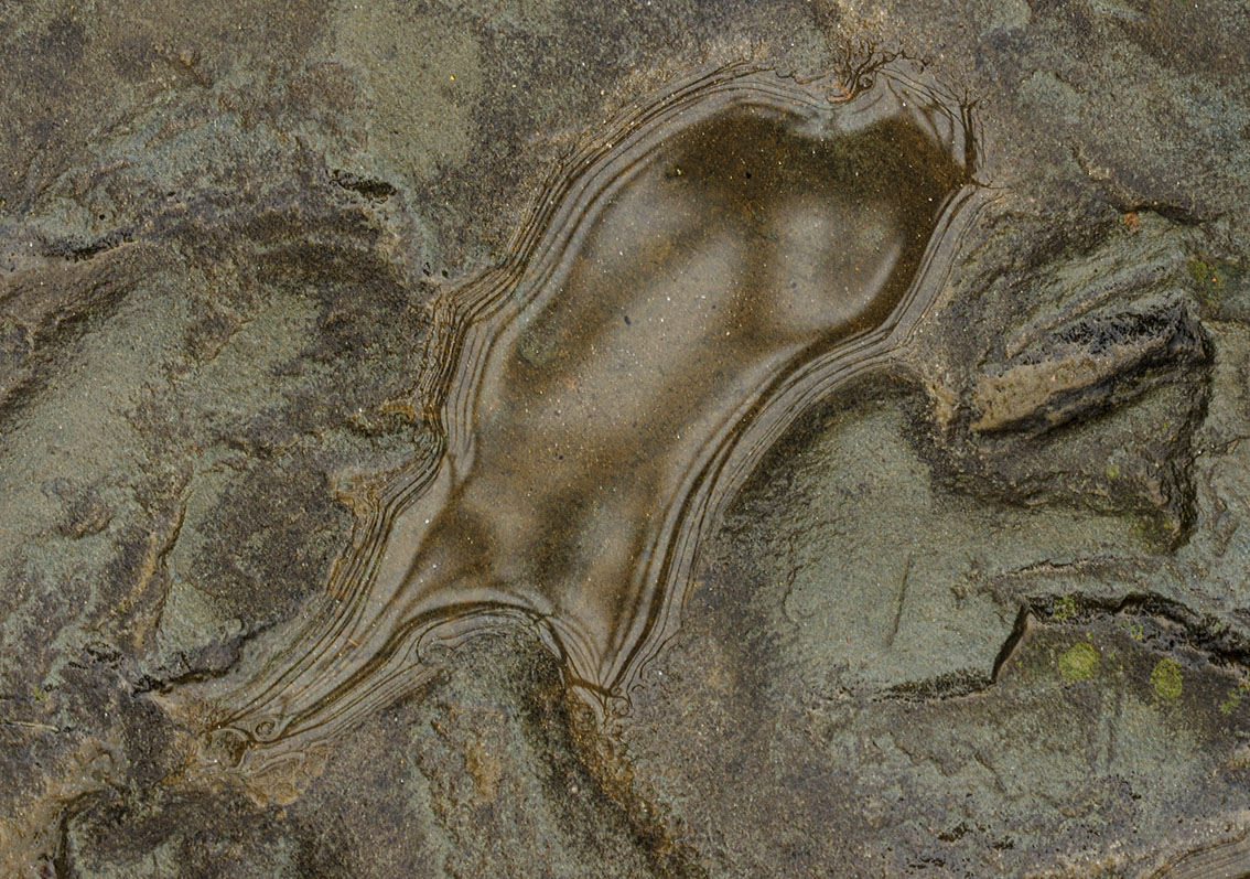
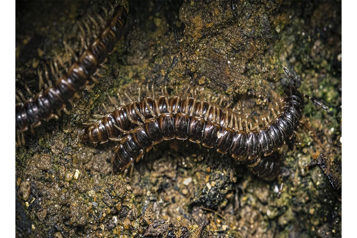
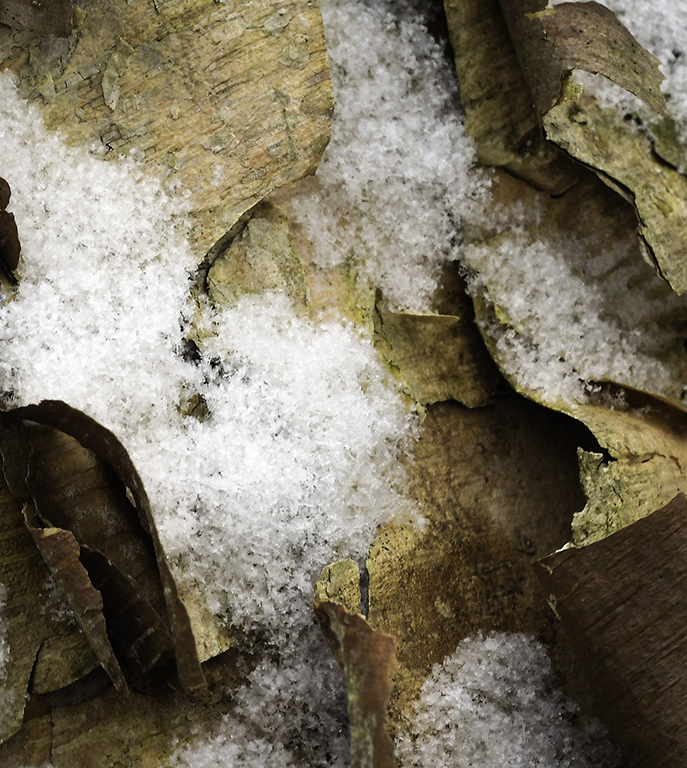
Great choice of background to make your leaves jump out at us. I like the composition, the color and the clarity of the image. Excellent treatment of dead and decaying leaves that most of us don't even look at, let alone think about photographing. |
Dec 16th |
| 60 |
Dec 19 |
Comment |
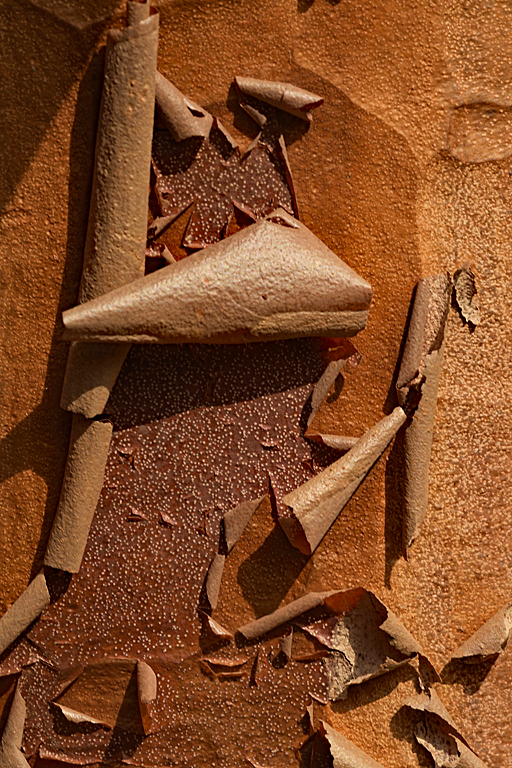
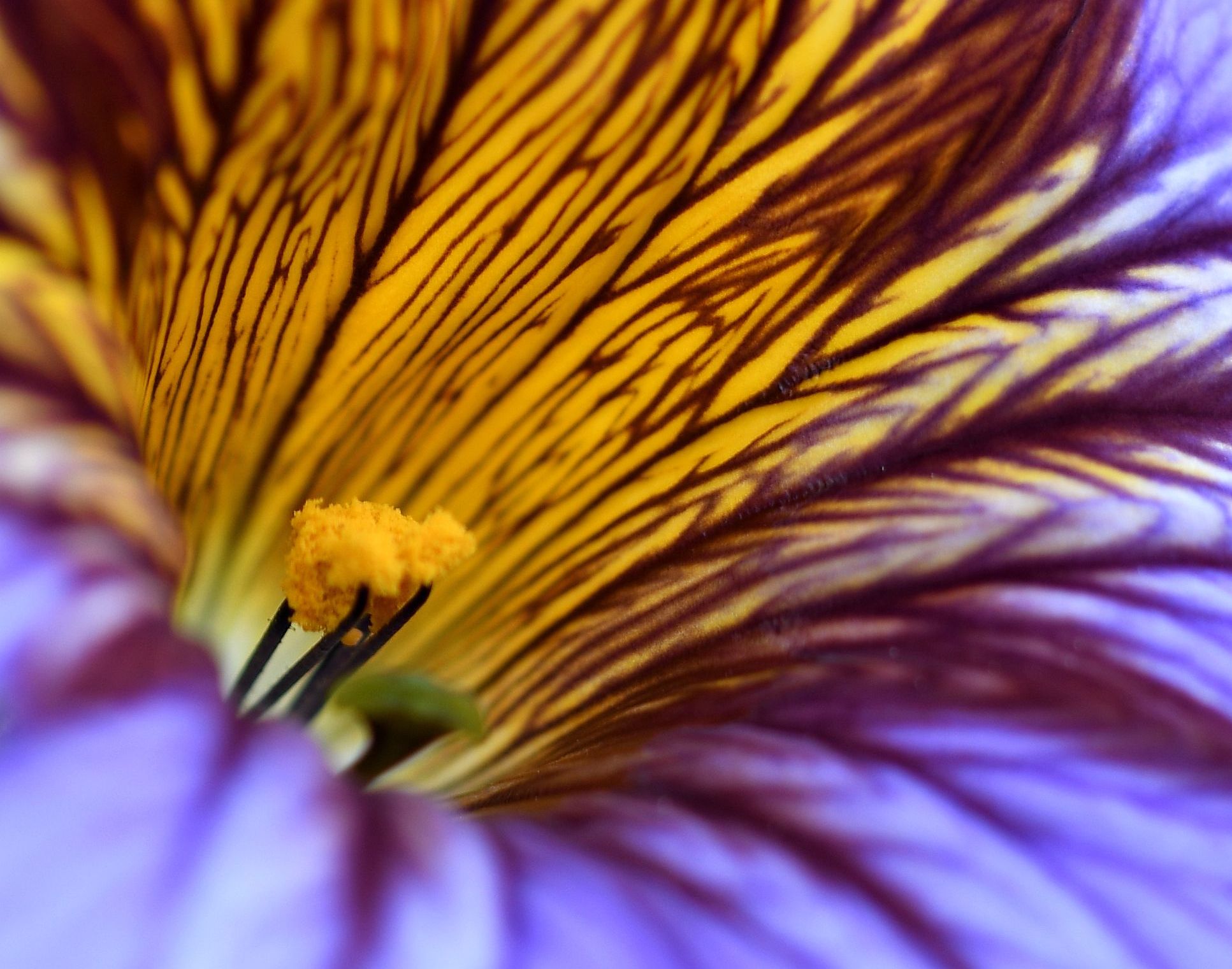
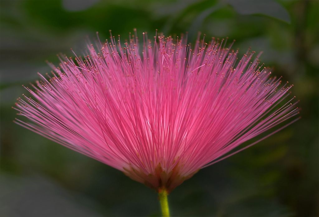
Well, there first thing I'll say is that I hope at some point in the future I can repeat your last sentence!
I'd really like to see the original for comparison purposes.
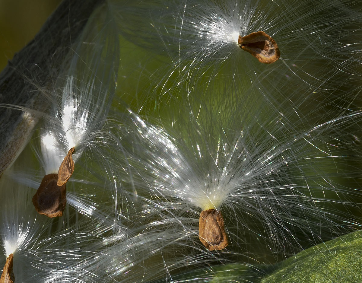
I like the composition and the image appears pretty sharp. The background is intriguing with the different colors that seem to match the subject they're closest to. The entire image seems very grainy to me, particularly on the underside of the flower's petals, where the colors are kind of strange. |
Dec 16th |
4 comments - 5 replies for Group 60
|
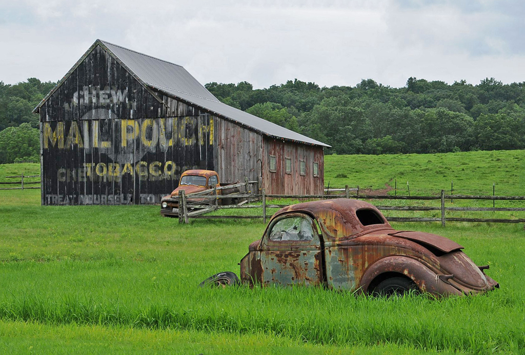
| 74 |
Dec 19 |
Comment |
I love finding old, abandoned vehicles. You've done a nice job with this one. I think the only change I'd make was one David mentioned - leveling the truck. |
Dec 16th |
| 74 |
Dec 19 |
Comment |
Merhaba Ata. The person in this image reminds of men I saw in Istanbul in the early 1960's when I was stationed there with other US Air Force personnel. I think our office was in Gayrettepe but I'm not positive of that.
I like the image as is - I wouldn't change a thing. |
Dec 16th |
| 74 |
Dec 19 |
Comment |
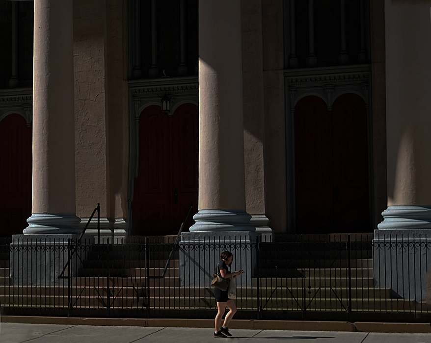
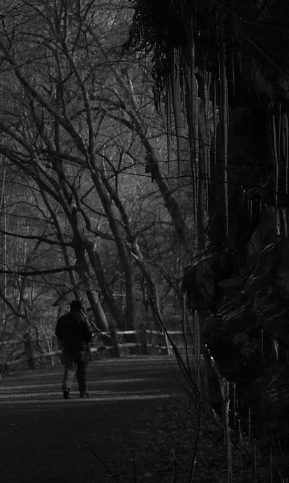
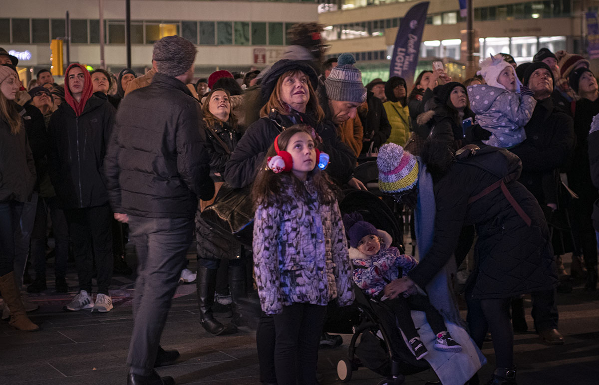
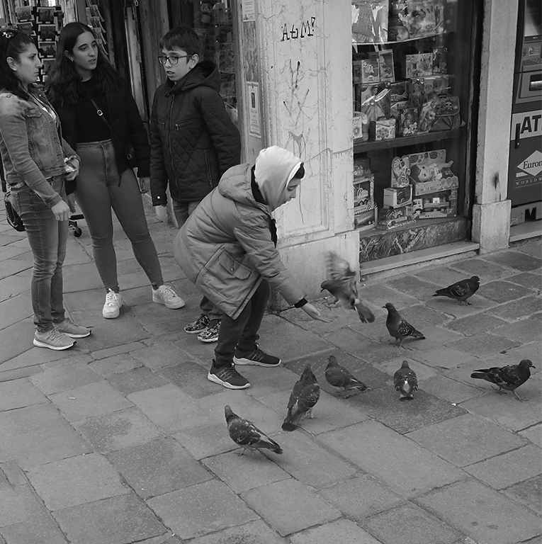
I think the problem with events of this type is getting into a place where you can isolate a participant, or small group of participants. As mentioned, there are just too many people to get a meaningful image. |
Dec 16th |
| 74 |
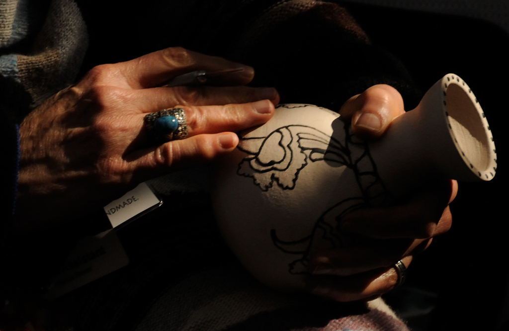
Dec 19 |
Comment |
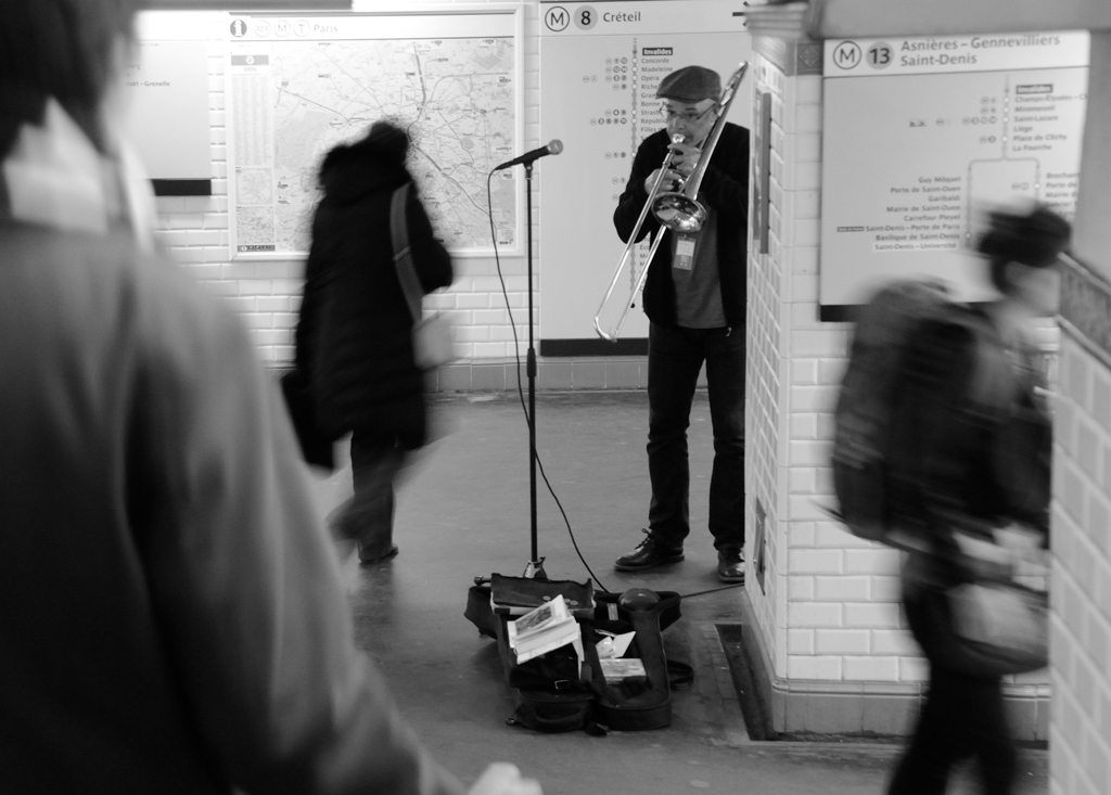
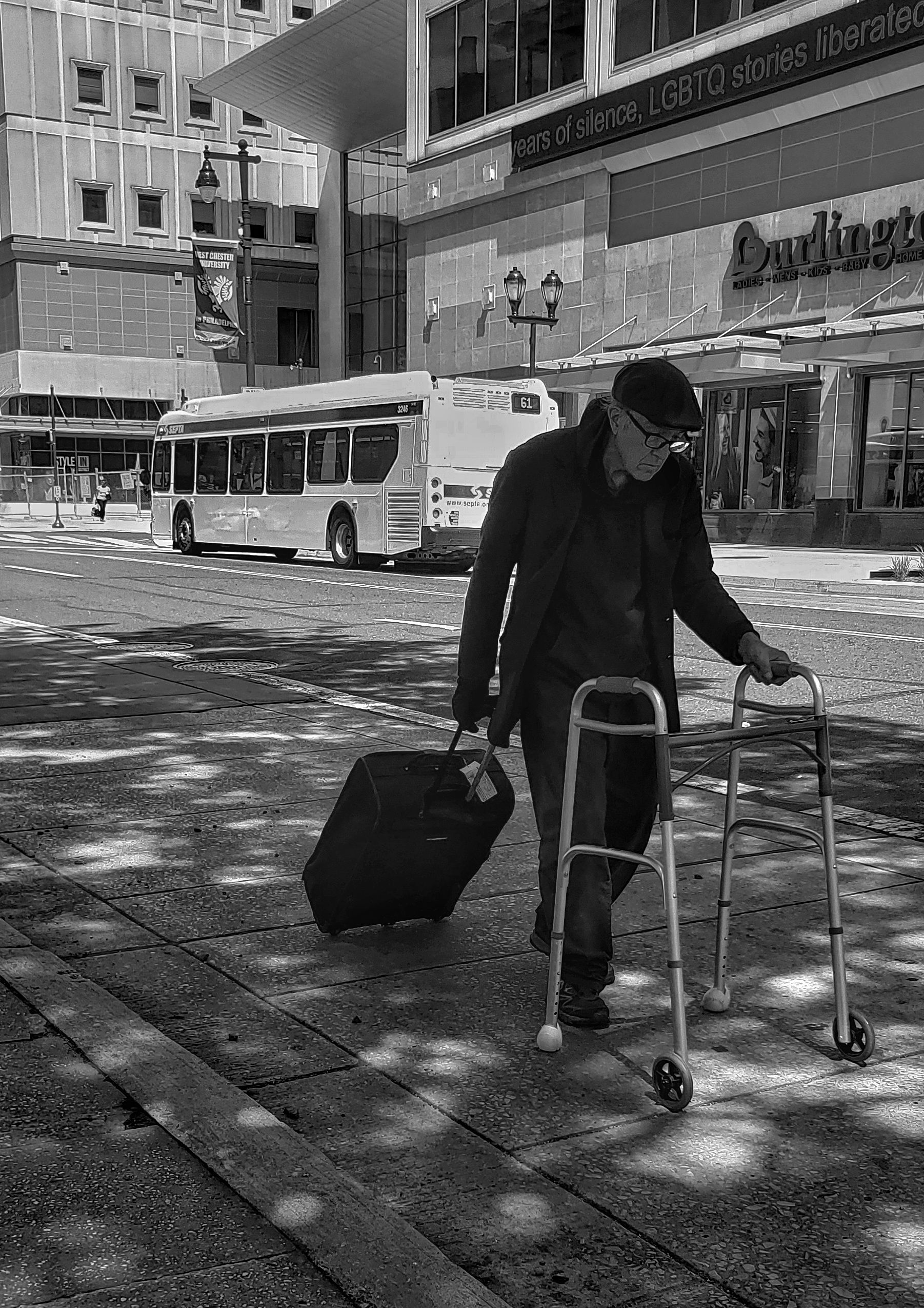
I think the woman's hands act as leading lines, drawing my eyes toward pencil and papers. Monochrome seems the better presentation. The image tells a nice story. |
Dec 16th |
| 74 |
Dec 19 |
Comment |
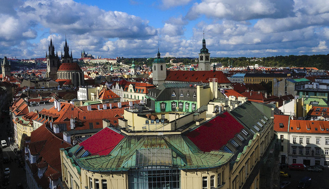
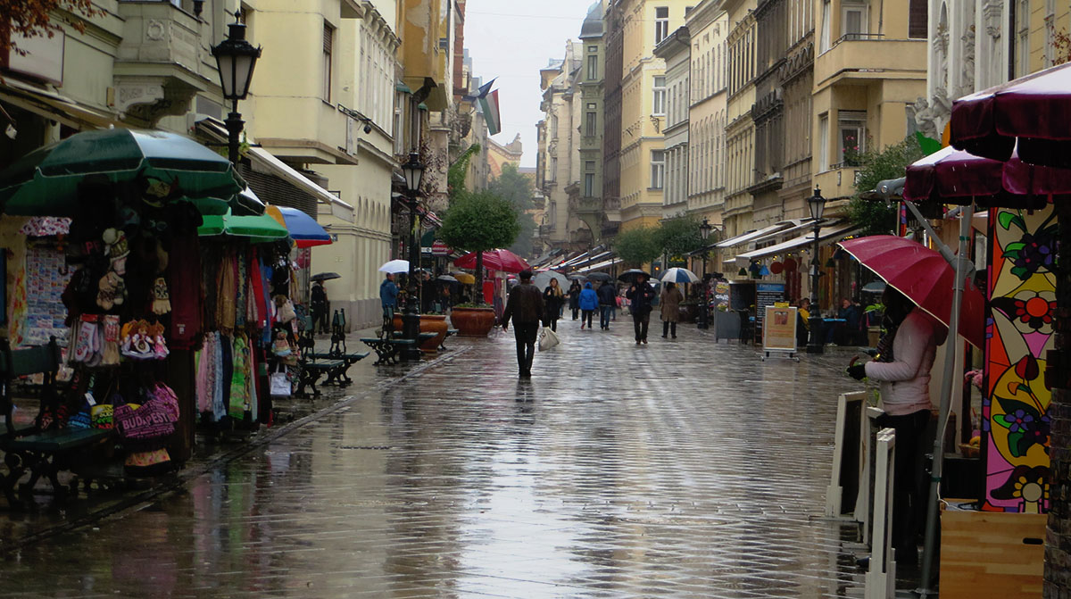
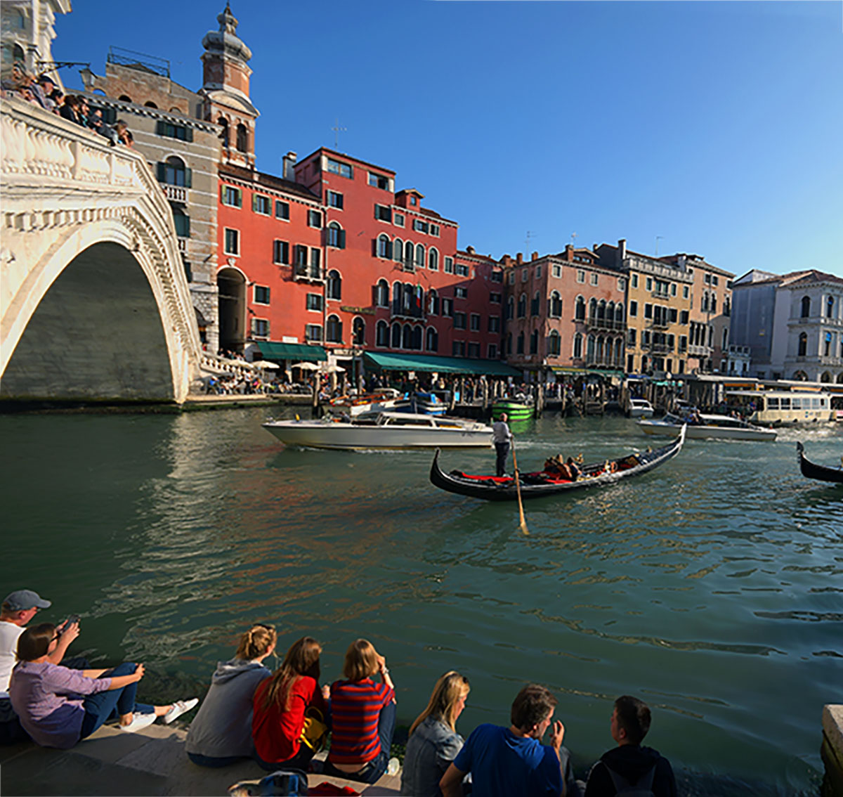
Definitely a different shot of the bridge. Seems to me that if you want to emphasize the city, you have to crop out a significant amount of the upper portion of the image. Agree with Pamela and David about the overall darkness. |
Dec 16th |
5 comments - 0 replies for Group 74
|
| 80 |
Dec 19 |
Reply |
Well I like the green. When I grow up I wanna be able to: a) change backgrounds and b) do it that quickly. Up to chapter 5 of my Lightroom course. |
Dec 17th |
| 80 |
Dec 19 |
Reply |
Thanks for considering me a "Gentleman"!!
I'm thinking a pale green background might be better? |
Dec 17th |
| 80 |
Dec 19 |
Reply |
Thanks, Karen. |
Dec 9th |
| 80 |
Dec 19 |
Reply |
Thanks, Carol. |
Dec 9th |
| 80 |
Dec 19 |
Reply |
Thanks, Jim. |
Dec 9th |
| 80 |
Dec 19 |
Reply |
Thanks, Ed. To me, there are a number of different colors throughout the image, which come from the walls that are multi-colored, diagonal, brick-like, tiles. I've seen that look so many times that I don't really "see" it any more - it's just part of the scenery. |
Dec 9th |
| 80 |
Dec 19 |
Reply |
Thanks, Ata. No, I did not try a wider aperture. |
Dec 9th |
| 80 |
Dec 19 |
Comment |
Gotta agree with Joe Kennedy - that's a ton of work, but the result is really good. I also agree that you might have picked a better background color. You definitely have a thing for Pirates at the Pirate Fest! |
Dec 9th |
| 80 |
Dec 19 |
Comment |
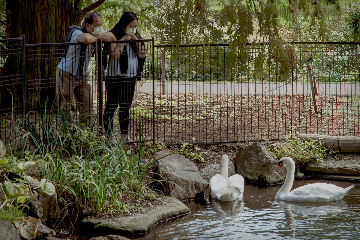
I like your composition, the color is good and, I agree that it could be a tad sharper. A very nice storytelling image, Karen.
There are two things that occur to me when I look at this image. First, that the Charles Bridge is not jam-packed with people. Except on very rainy days, I never saw the bridge when it wasn't packed from side-to-side and end-to-end. Second, how quiet these dogs are. I'm always surprised when I go to Europe, and regardless of the country, with how well behaved the dogs are - as opposed to the owners/walkers, who never pick up after them. |
Dec 9th |
| 80 |
Dec 19 |
Reply |
Ed, I think you took too much of her facial skin tone away. She appears pale to me. |
Dec 9th |
| 80 |
Dec 19 |
Comment |
Welcome to Group 80 Carol. Having seen your work in our Macro group, I knew this had to be an old shot before reading your explanation. Truth be told, it reminds me of my own images before I got serious about photography. I like the story.
One thing that may happen to you, now that you're in both Macro and Street Scenes groups, is you'll be out with your macro lens and see a street scene you'd like to capture. Do it! I've done it more than a few times. The results are interesting. |
Dec 9th |
| 80 |
Dec 19 |
Comment |
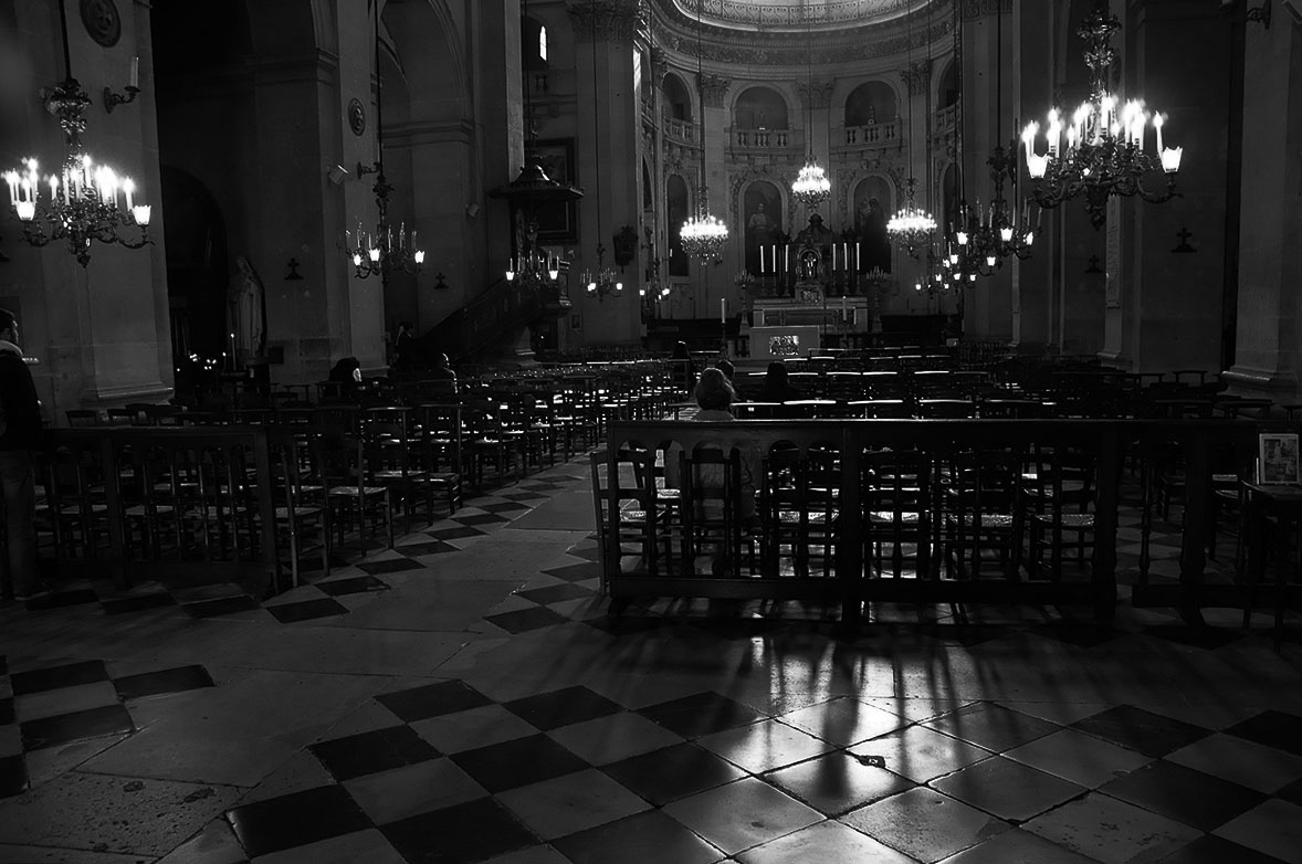
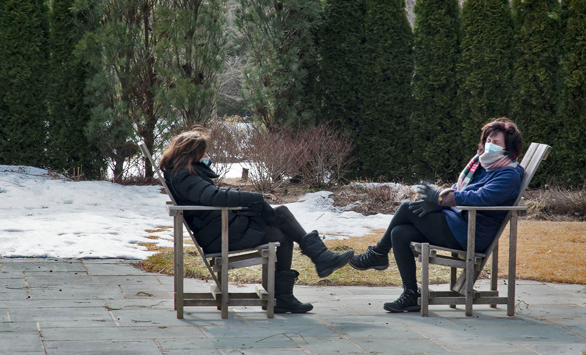
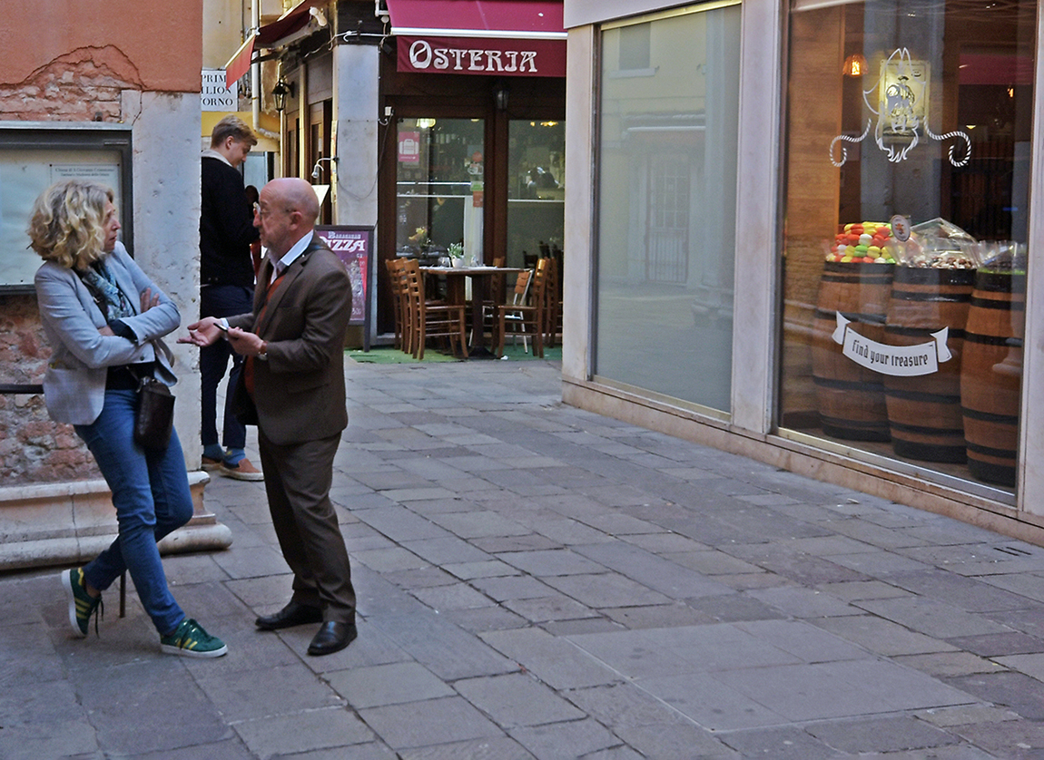
You nailed the composition, color and clarity on this one, Jim. If you hadn't mentioned it, I would not have guessed it was posed. Looks to me as though the women are having a conversation and the one on the right is speaking about the boots. I think Carol's right about cropping out that small bit of yellow at the top of the image. Neat shot! |
Dec 9th |
| 80 |
Dec 19 |
Comment |
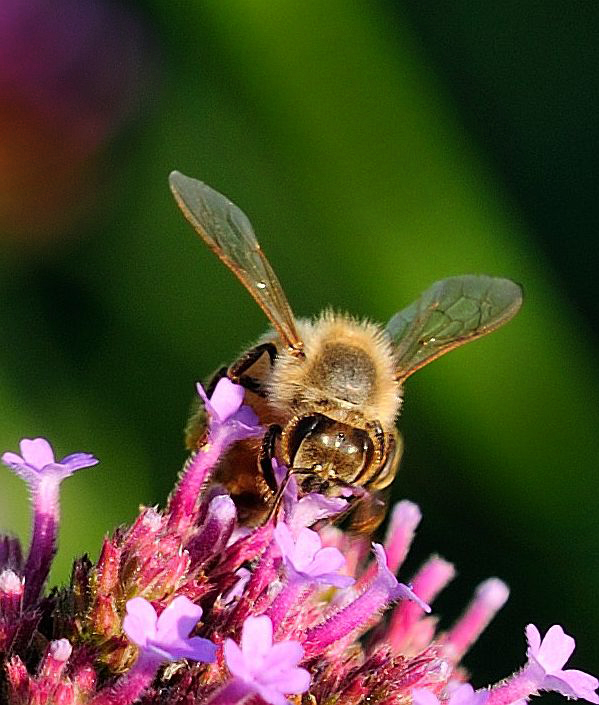
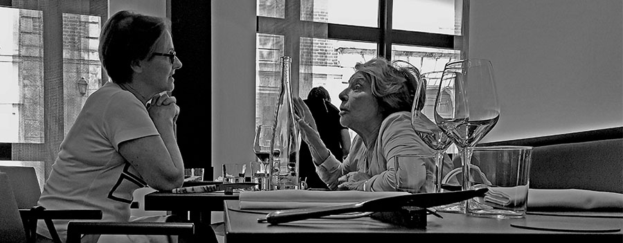
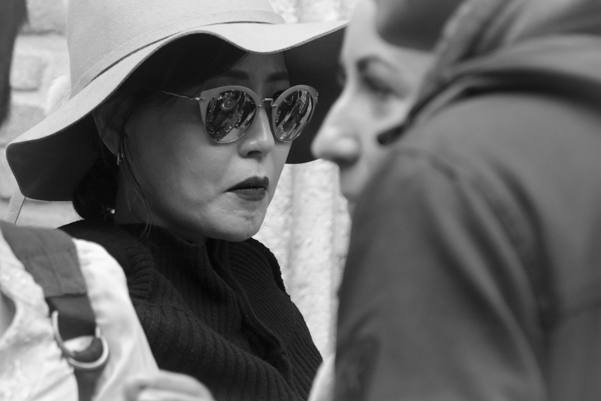
These shots are little tough to get "just" right. I go after them whenever they're available and, for me, it's always a question of "how close do I dare to go?". Could you have gotten as close as your crop shows? As Carol mentioned, an aperture wider than f/9 (f/2.8?) may have mitigated the background issue. It is distracting. Going with monochrome was, in my opinion, the right thing. I think it's much better option than the color image. |
Dec 9th |
5 comments - 8 replies for Group 80
|
14 comments - 13 replies Total
|