|
| Group |
Round |
C/R |
Comment |
Date |
Image |
| 29 |
Nov 19 |
Comment |
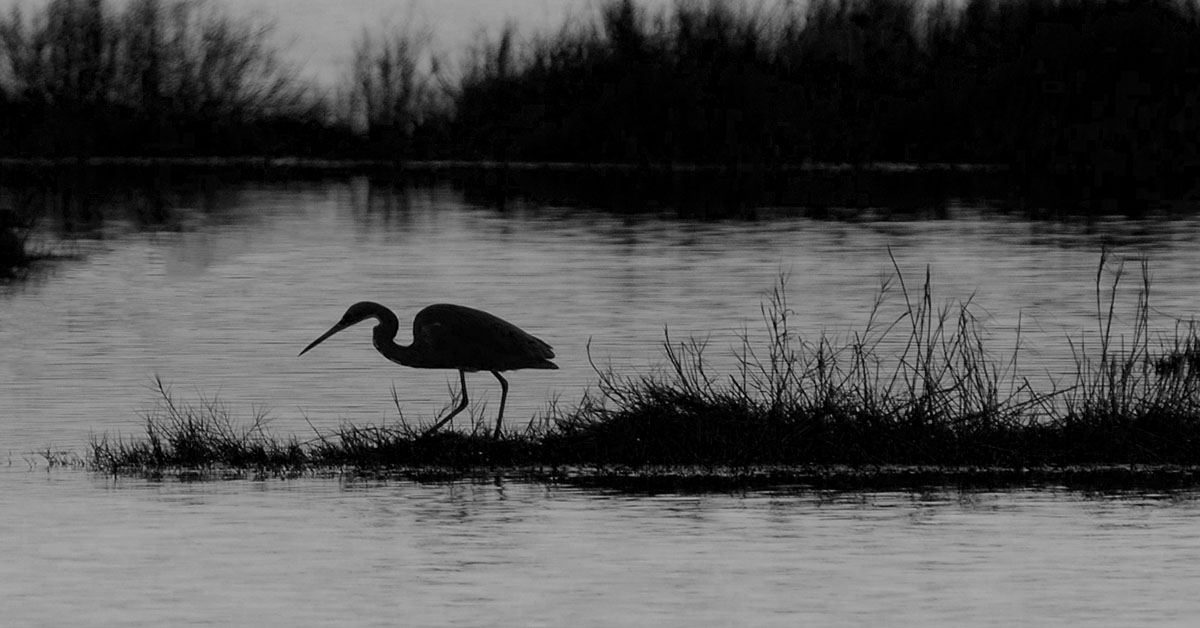
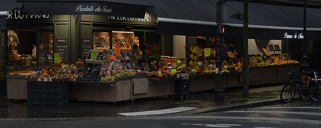
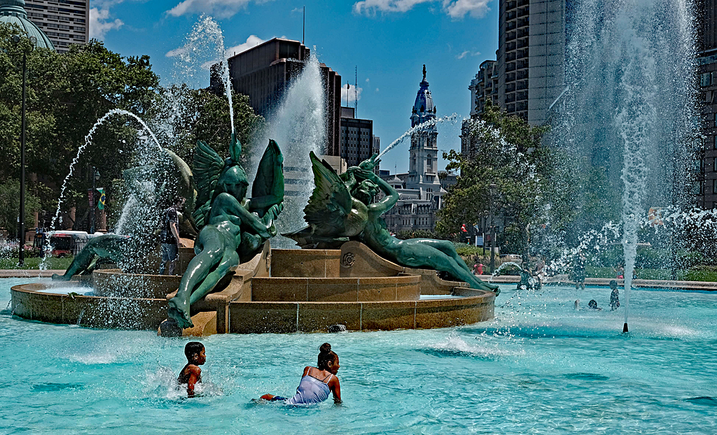
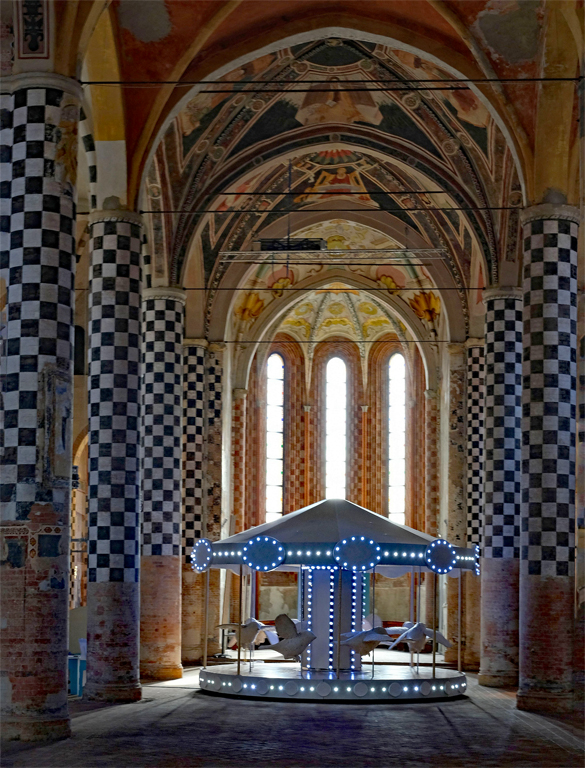
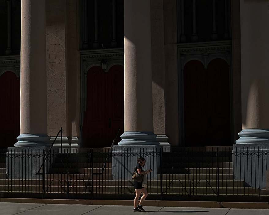
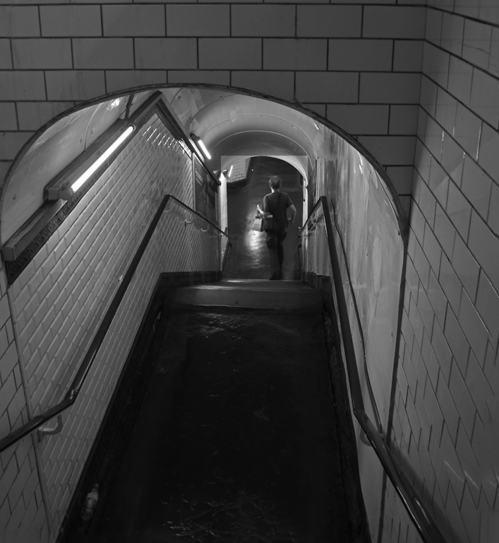
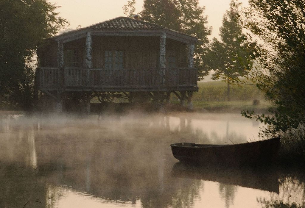
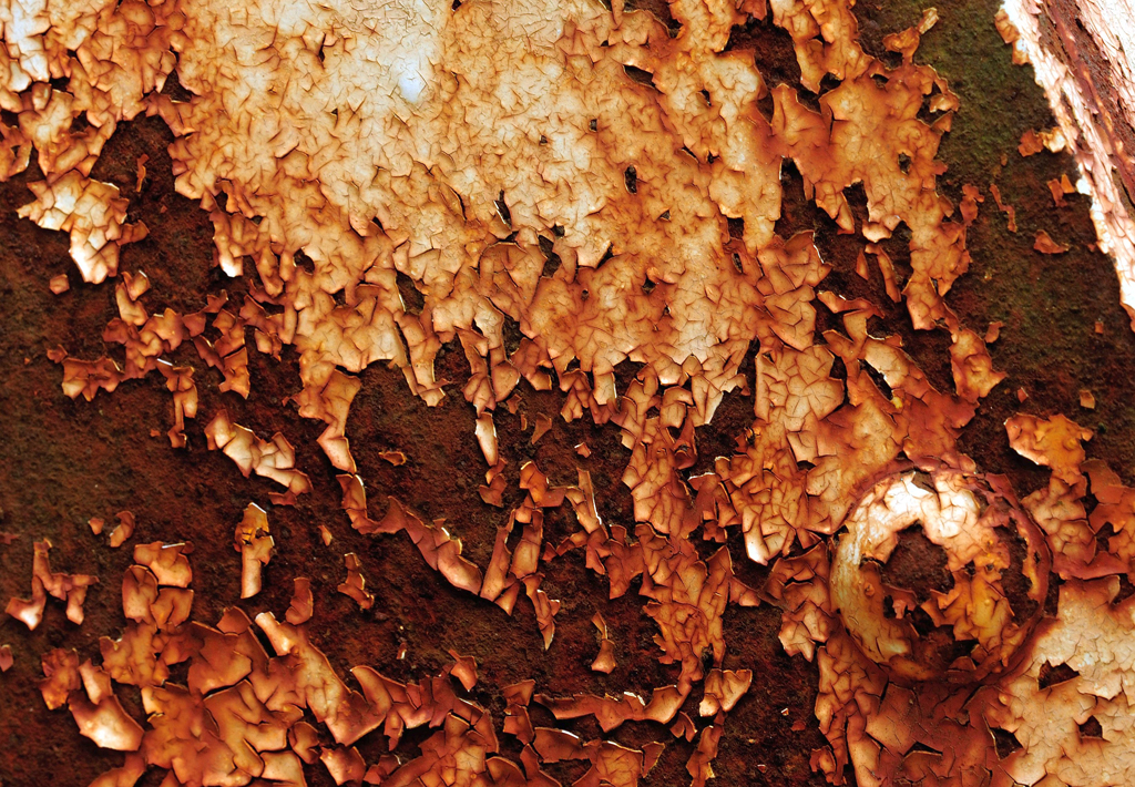
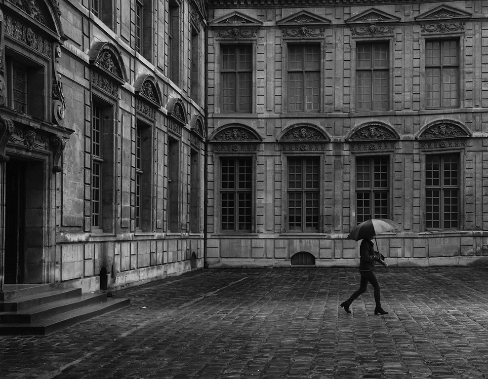
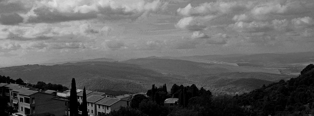
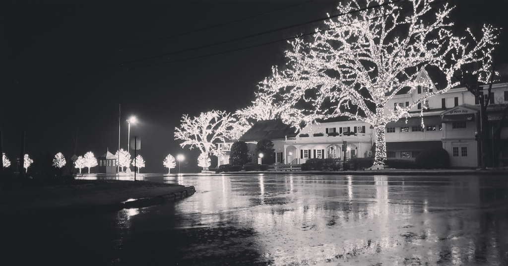
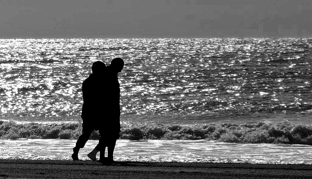
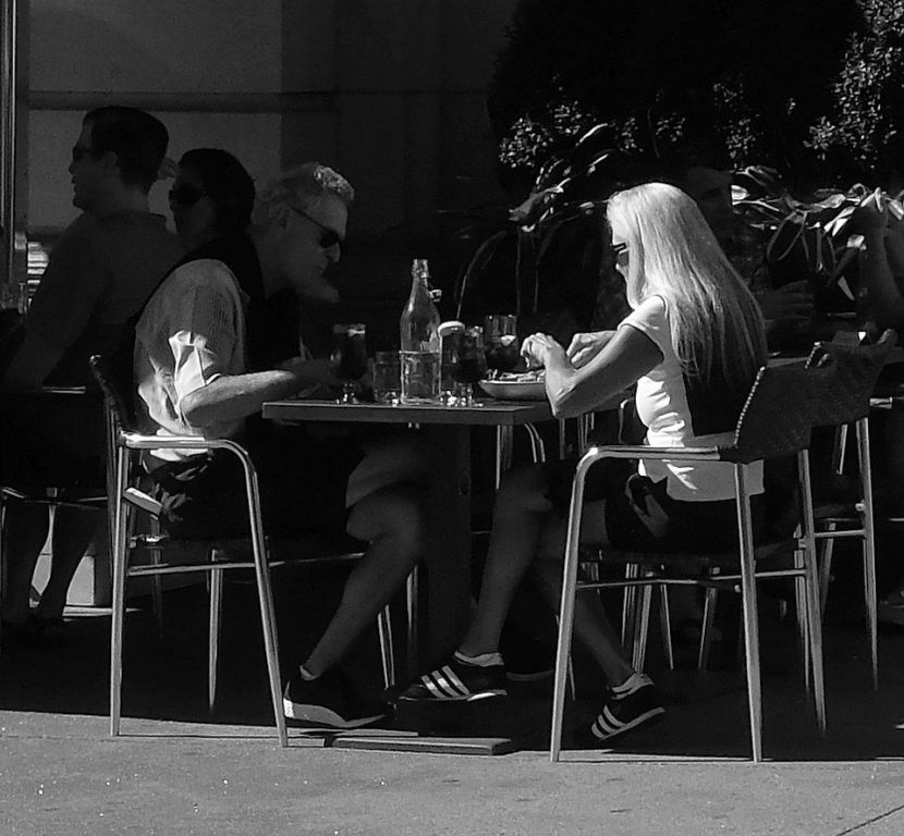
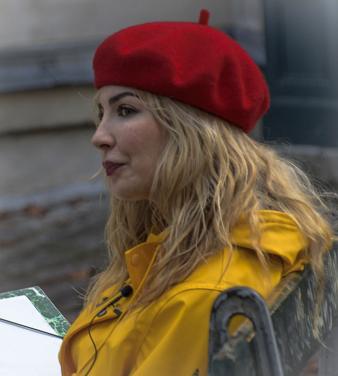
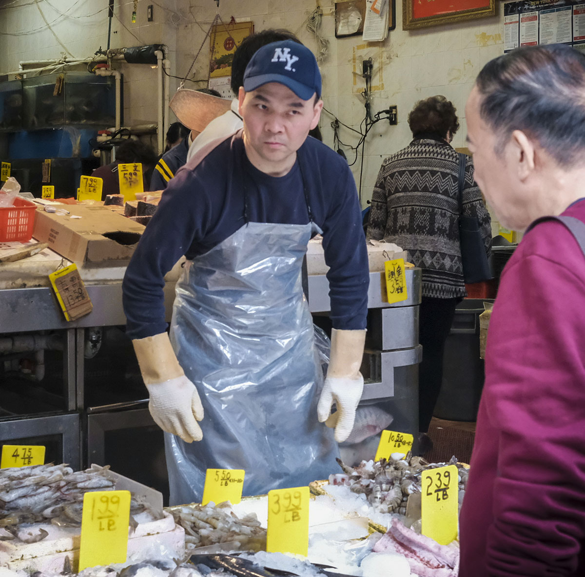
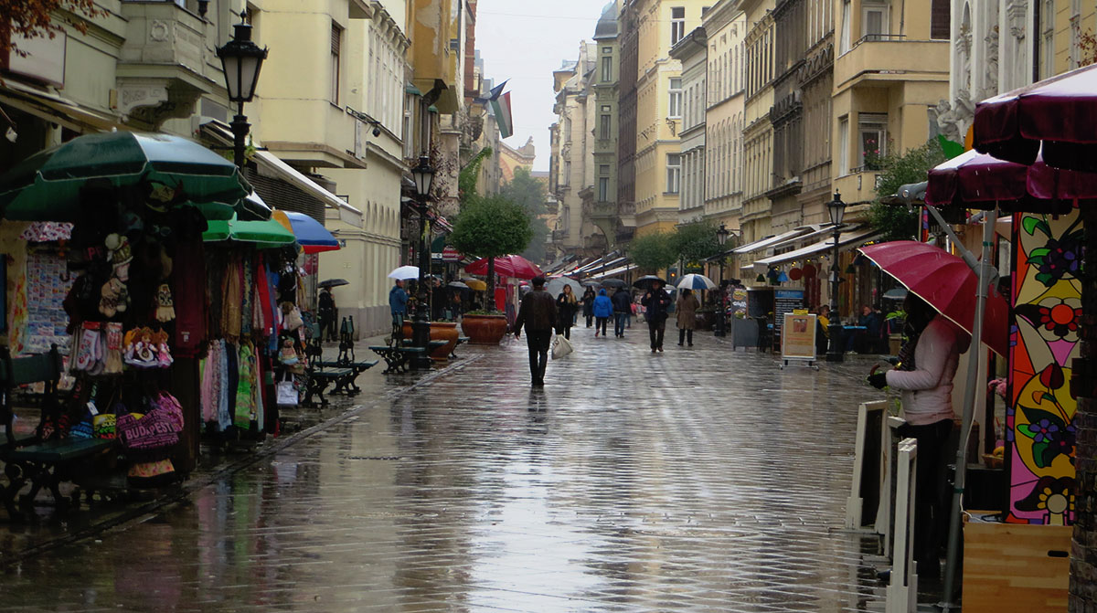
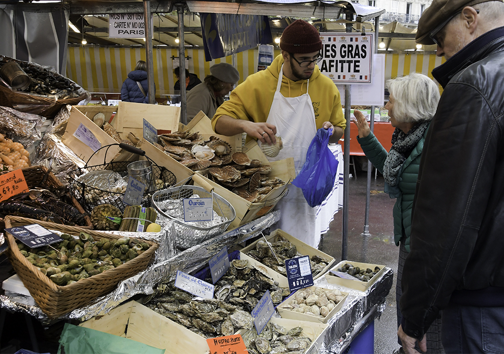
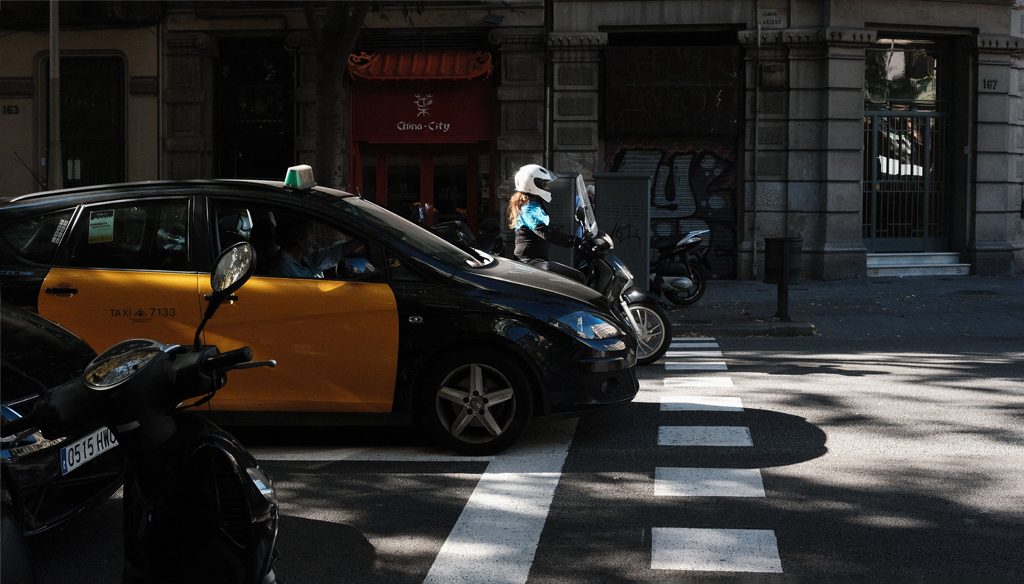
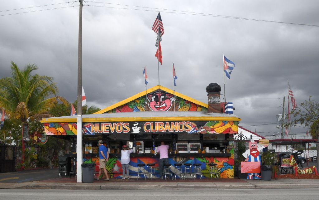
So, Bob Legg, Tam, Stephan and Judy all thought there should be more light. Question - why - what does it do for the image that makes it more acceptable? If you don't think the light as it is is acceptable, what was it like when the workers were loading those shelves? It was the same under the shelves, but darker outside.
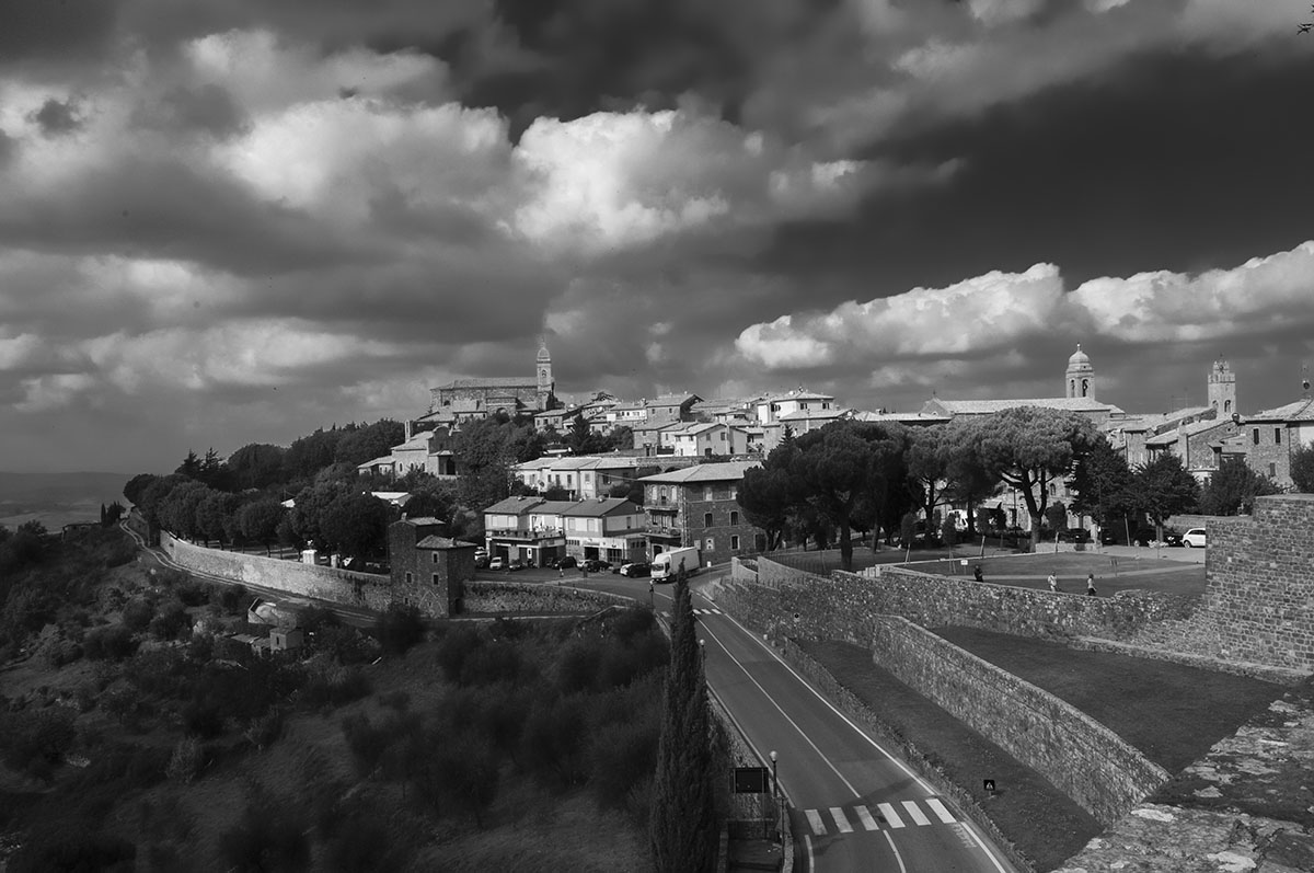
I thought about it - for a 1/2 second or so - and knew I was not going to change it. I wanted the viewer to experience the early morning hours of the Marais, one of my favorite areas in Paris. On another trip, I hope to make an image of a similar nature in Montmarte, another favorite area. |
Nov 22nd |
| 29 |
Nov 19 |
Reply |
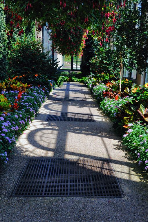
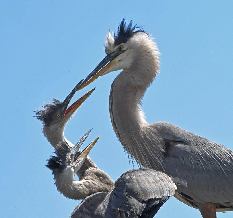
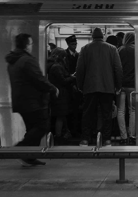
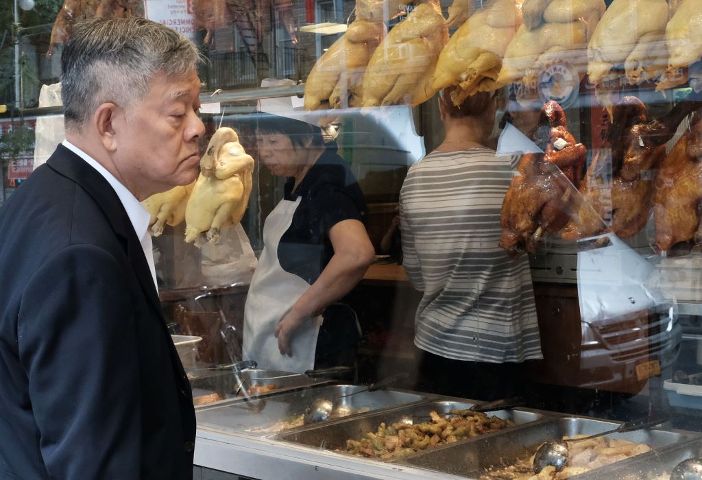
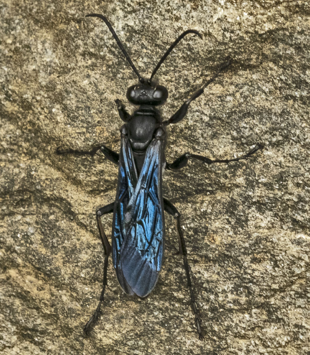
It is a grate - perhaps for the Metro? I mentioned that person behind the window. I decided not to remove him to see (1) who would notice and (2) who would think he ought to go. |
Nov 22nd |
| 29 |
Nov 19 |
Reply |
Just because...INDEED! Thanks, Bob. |
Nov 22nd |
| 29 |
Nov 19 |
Reply |
!Je t'aime Paris en effet. Merci, Tam. |
Nov 22nd |
| 29 |
Nov 19 |
Reply |
Thanks, Karen. |
Nov 22nd |
| 29 |
Nov 19 |
Reply |
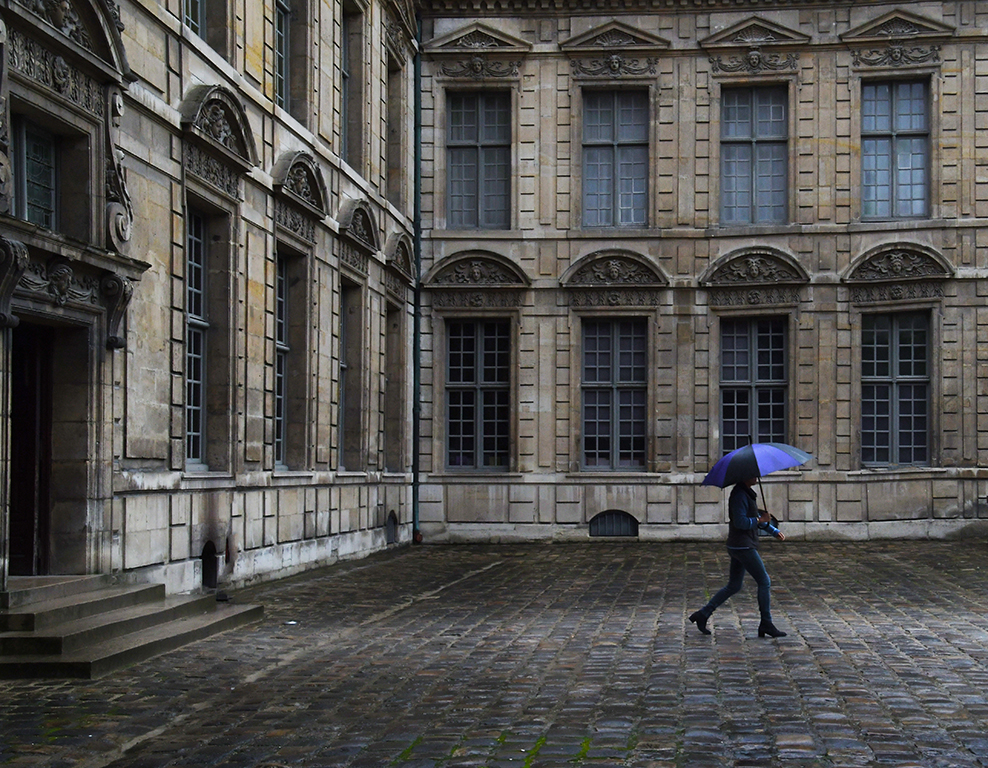
Welcome, Bob. I wasn't avoiding the rain at the time I made this image, I was standing in a light drizzle, which became a downpour a couple of hours later, and that's what drove me back into the apartment. Thanks for your comments. I didn't want any more light on the market than the light I saw. I wanted to present an early morning Paris market as it is. |
Nov 22nd |
| 29 |
Nov 19 |
Comment |
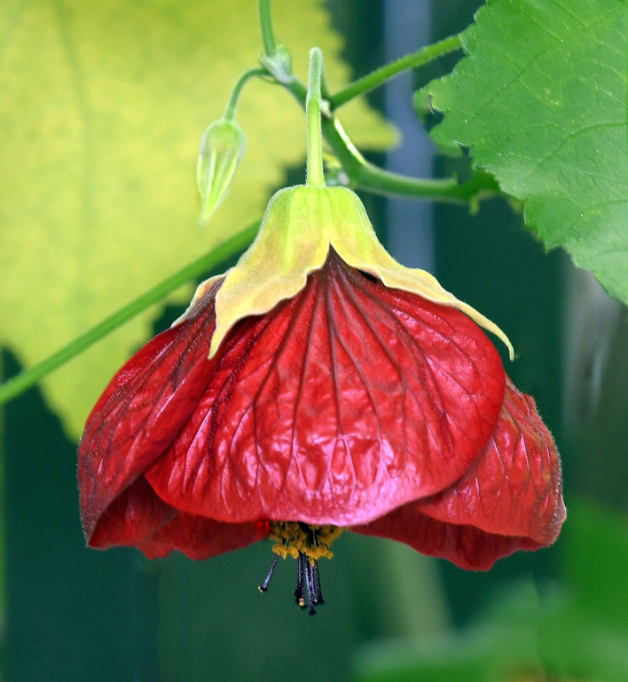
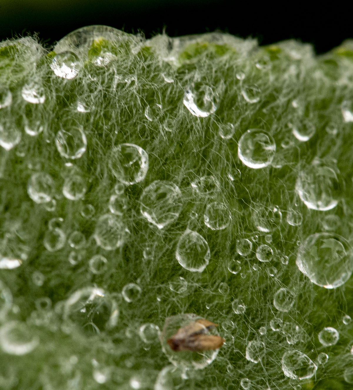
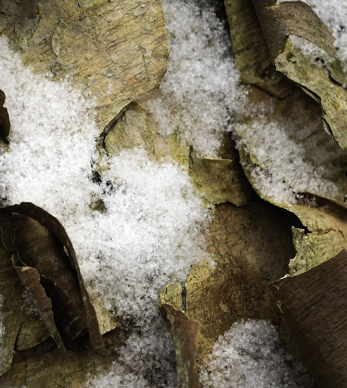
Beautiful image, Bob. I'm always looking for swirling leaves in the fall - waterfall or not. I have a question - what is the light that, to me, appears to be "ghosting" in the center-left bottom of the second image, and in the bottom right of the third image? |
Nov 22nd |
| 29 |
Nov 19 |
Comment |
I, too, think this lacks Tam's usually water image WOW factor. I like Stephan's crop, combined with Judy's contrast bump. |
Nov 22nd |
| 29 |
Nov 19 |
Comment |
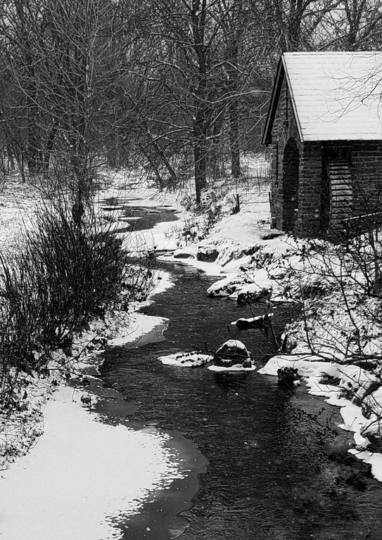
Karen, this is way beyond TOO COOL! I go walking in snowy woods (excuse me Robert Frost) looking for this kind of thing. I get snow and red leaves, but never combined this well. Great find. |
Nov 22nd |
| 29 |
Nov 19 |
Comment |
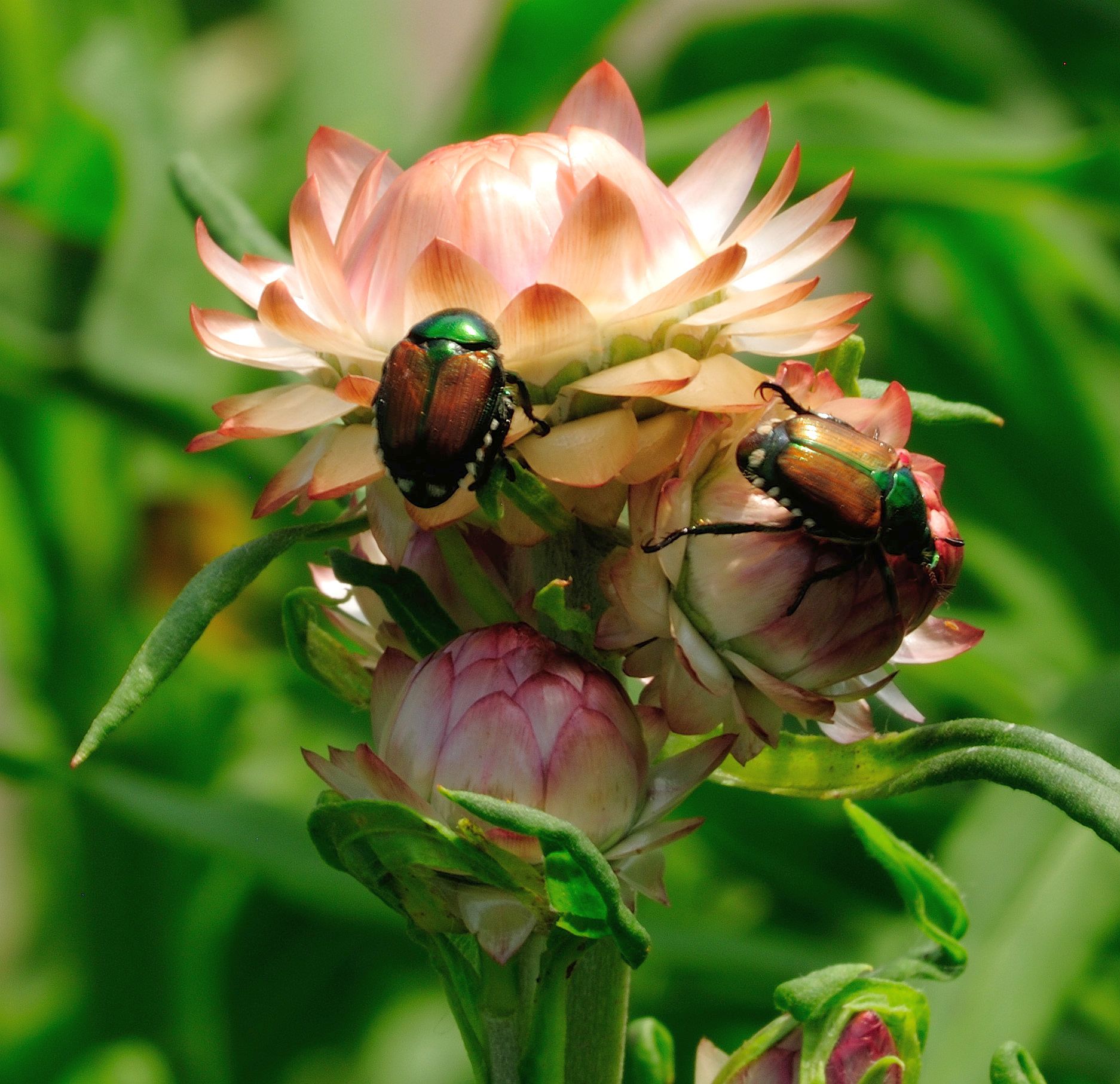
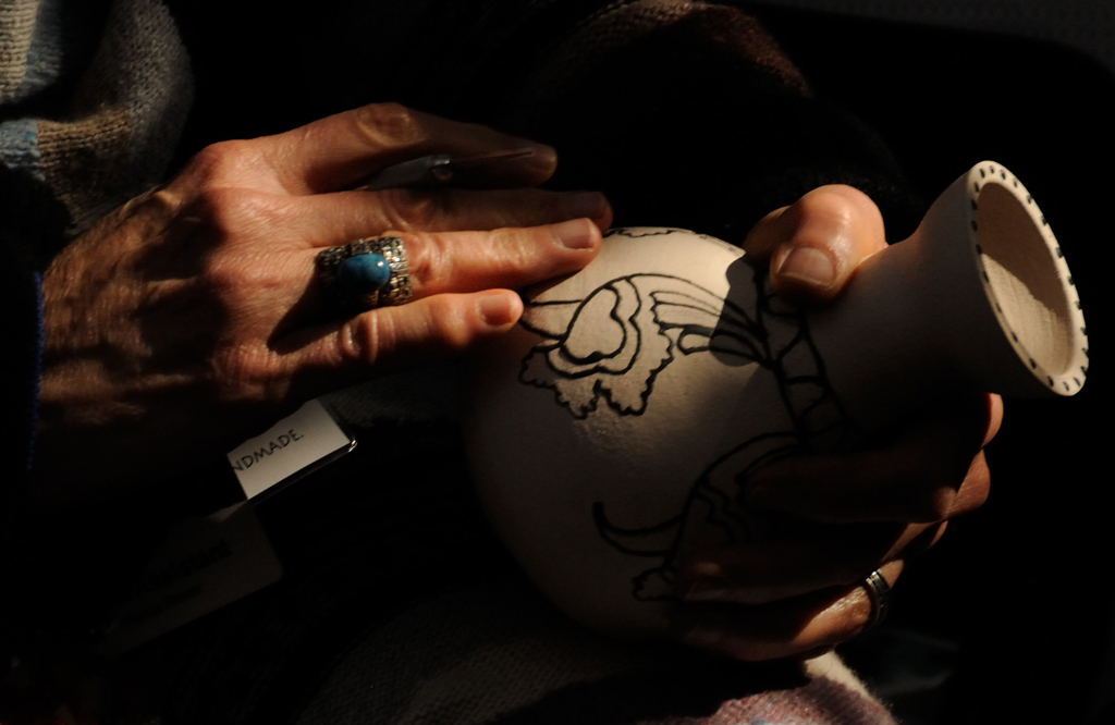
Picking something out of a pile of stuff reminds of a saying of a guy I worked many years ago, "...it's like trying to pick flys___ out of pepper." I have that problem with a "regular" lens in those kinds of places, but eliminate it almost entirely by using my macro lens.
I really like the color change and I think Bob's vertical treatment is a good option. |
Nov 22nd |
| 29 |
Nov 19 |
Comment |
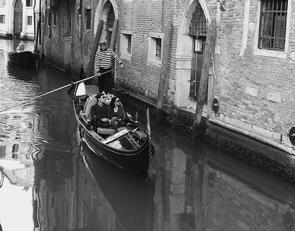
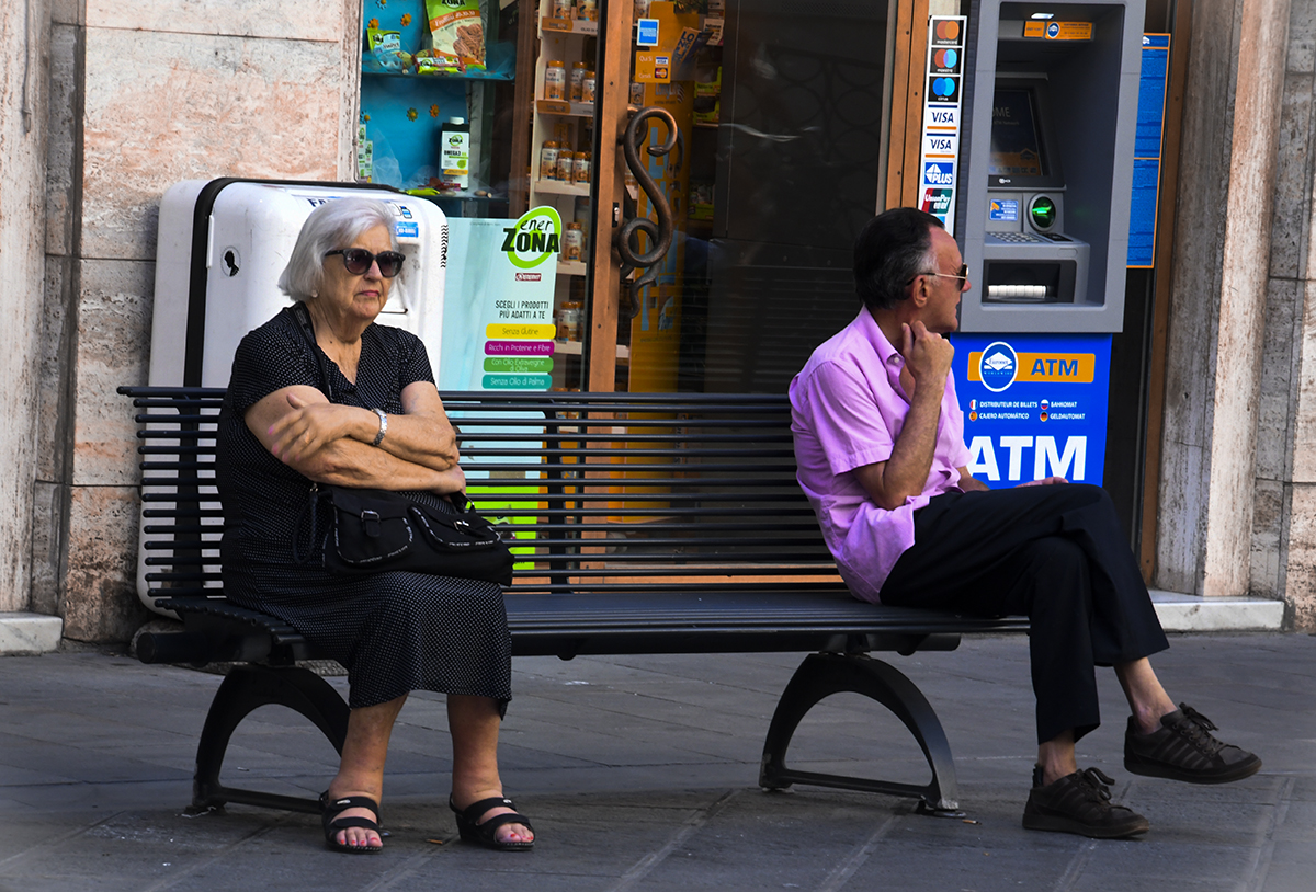
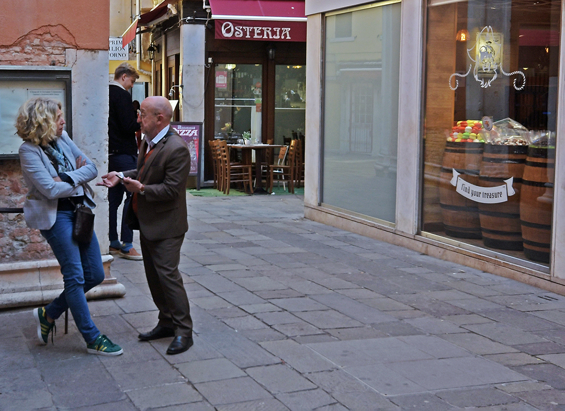
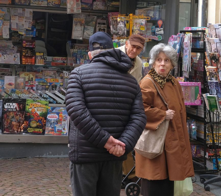
The composition and colors are really good. I agree with Judy about adding a fill flash to brighten up the couple. |
Nov 22nd |
| 29 |
Nov 19 |
Comment |
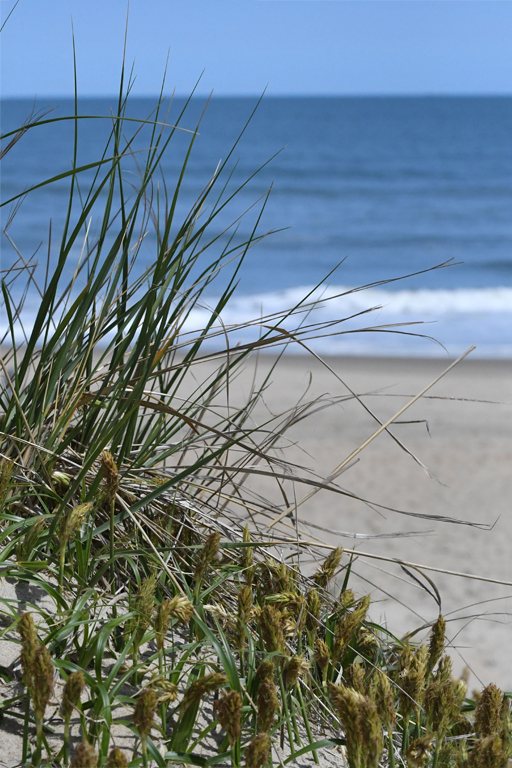
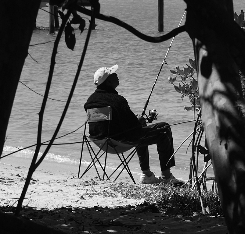
I agree on the eye-catching part. For me, it's the longer lens and the spacing that makes it not lens-worthy, except to pull out my macro lens and get up close and personal and thereby eliminate the spacing. I don't plan to stop going to the ocean with a camera slung from neck any time soon. Keep shooting, Bob! |
Nov 22nd |
7 comments - 5 replies for Group 29
|
| 60 |
Nov 19 |
Reply |
Thanks, Denise. Gave your suggestion a try. Do you think it's an improvement? |
Nov 22nd |
 |
| 60 |
Nov 19 |
Reply |
Thanks, Carol. |
Nov 22nd |
| 60 |
Nov 19 |
Comment |
I think you really nailed the three "C"'s, Denise. The composition, color and clarity are really good. The (to me) pink leaf really stands away from the contrasting dark green ones in the background. You must be running out of wall space! |
Nov 22nd |
| 60 |
Nov 19 |
Comment |
Very interesting group of colors and leaves that appear to have been dipped in the sugar bowl. I think the background distracts a bit and you might give Carol's idea a try to take it as dark and invisible as possible. |
Nov 22nd |
| 60 |
Nov 19 |
Comment |
A definite attention-grabber, Carol. Slipper orchids are one of my favorites and you've done a nice job with this. The composition is very good and the colors are beautifully complementary. Like what you've done with the background. Wish the light extended just a bit more toward the tip of the left leaf. |
Nov 22nd |
3 comments - 2 replies for Group 60
|
| 74 |
Nov 19 |
Reply |
Thanks, David. |
Nov 24th |
| 74 |
Nov 19 |
Reply |
Thanks, Arne. |
Nov 24th |
| 74 |
Nov 19 |
Reply |
Thanks, Pamela. |
Nov 24th |
| 74 |
Nov 19 |
Comment |
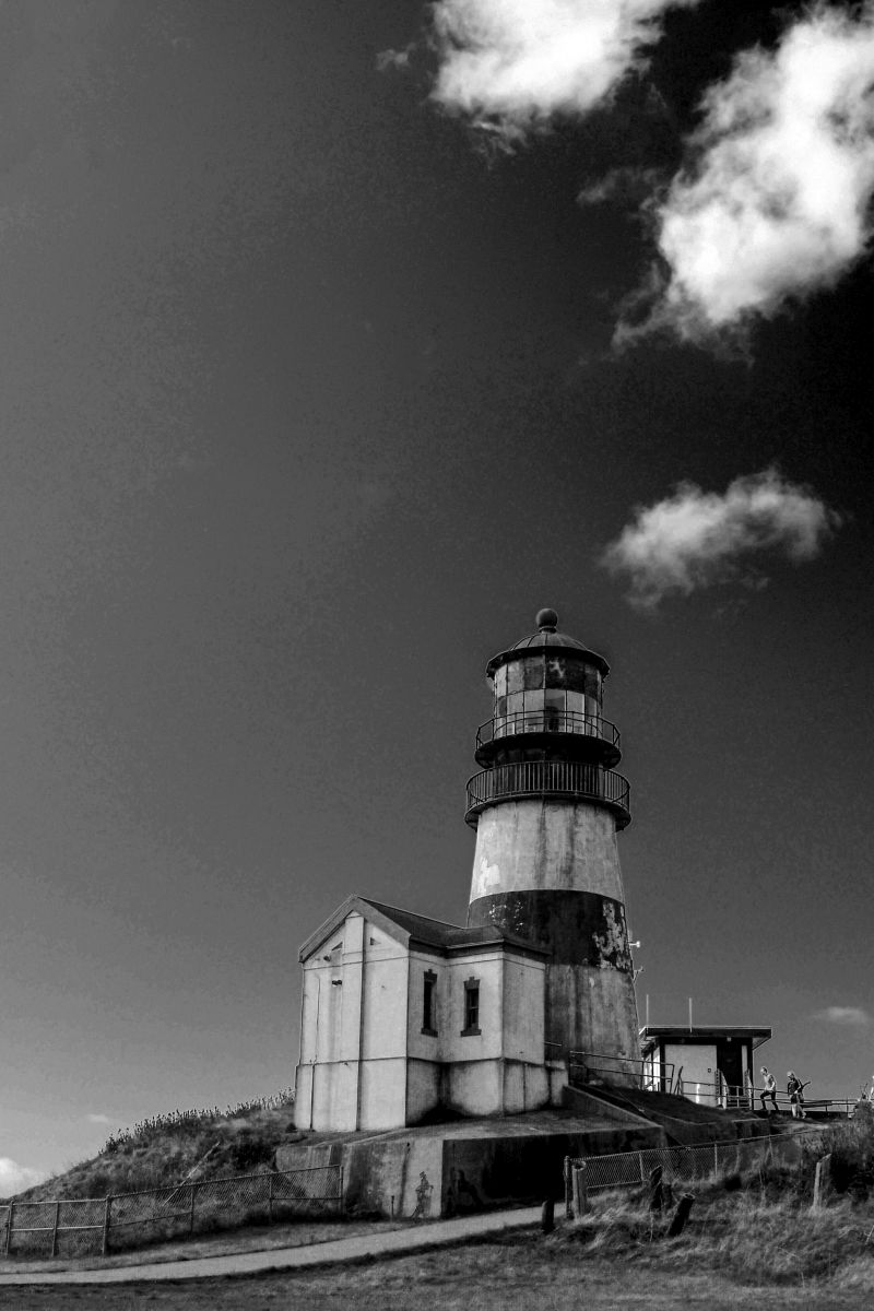
Great composition. Like that you didn't consider darkening the sky and went with high key instead. I agree with Arne & David about the wire. |
Nov 24th |
| 74 |
Nov 19 |
Comment |
My first thought was Florida. I've walked in quite a few places in Florida that resemble this scene. Really good conversion to monochrome. |
Nov 24th |
| 74 |
Nov 19 |
Comment |
I like this image much better than last month's. I agree with Arne & David about the contrast and cropping on the left. I might have taken a bit out of the bottom also. |
Nov 24th |
| 74 |
Nov 19 |
Comment |
Interesting image with the group of rectangles of various sizes set against the stormy skies. I think your composition is excellent and the conversion is well done. I think David's suggestion to lighten the sculpture a bit might have some merit. |
Nov 24th |
4 comments - 3 replies for Group 74
|
| 80 |
Nov 19 |
Reply |
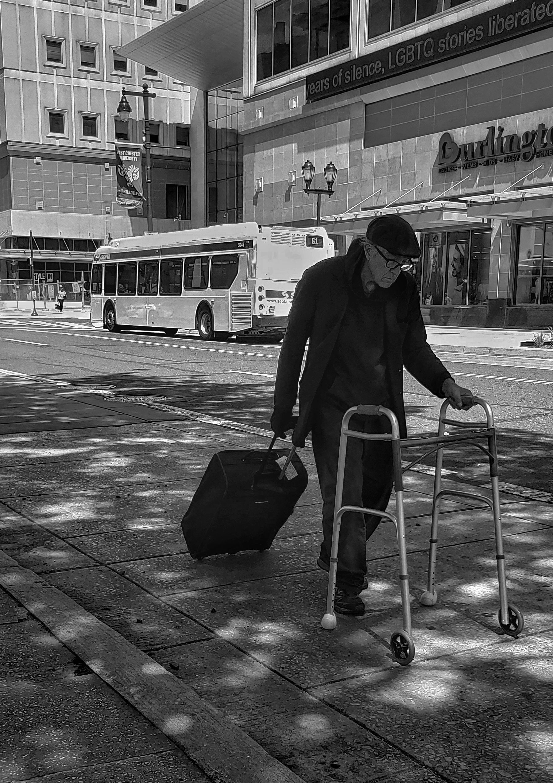
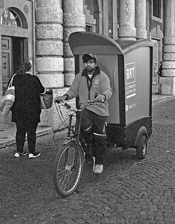
Thanks, Isaac. That image is the original size. I was standing in the street as he approached and barely had time to focus and shoot. |
Nov 22nd |
| 80 |
Nov 19 |
Reply |
Thanks, Karen. I don't know if he was upset. He just kept pedaling the cart. |
Nov 22nd |
| 80 |
Nov 19 |
Reply |
Thanks, Ed. That was my feeling on the red. |
Nov 22nd |
| 80 |
Nov 19 |
Reply |
Thanks, Bev. |
Nov 22nd |
| 80 |
Nov 19 |
Reply |
Thanks, Jim. My take on the red vs. monochrome was that there was too much red and the monochrome kind of calmed the image. |
Nov 22nd |
| 80 |
Nov 19 |
Reply |
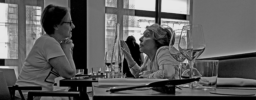
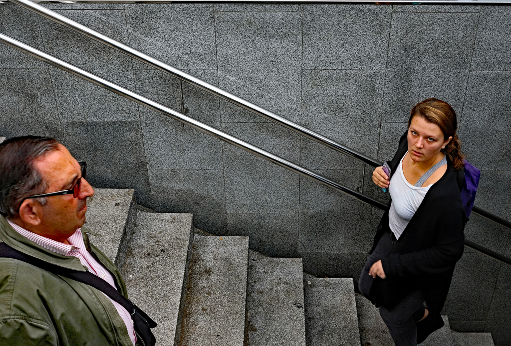
Jim, as I mentioned, I understand the story as you presented it but, to me, without the child it's just a woman aiming a camera at something in front of the man that's not present for me to see. Just one of those things that makes us different people. Regarding the choice of monochrome, to me that's not something that's right or wrong. It's your image and if you like monochrome, go for it. For me, this particular image doesn't have the range of shades/tones to make a good monochrome image. I think our comments are not to be made with the thought that we're trying to convince a member of our group to change what they do but, rather, to, perhaps, see another way that they might try. I've ignored lots of comments in the PSA groups I belong to. I've also tried and adopted some. That's why I keep renewing my membership. |
Nov 16th |
| 80 |
Nov 19 |
Comment |
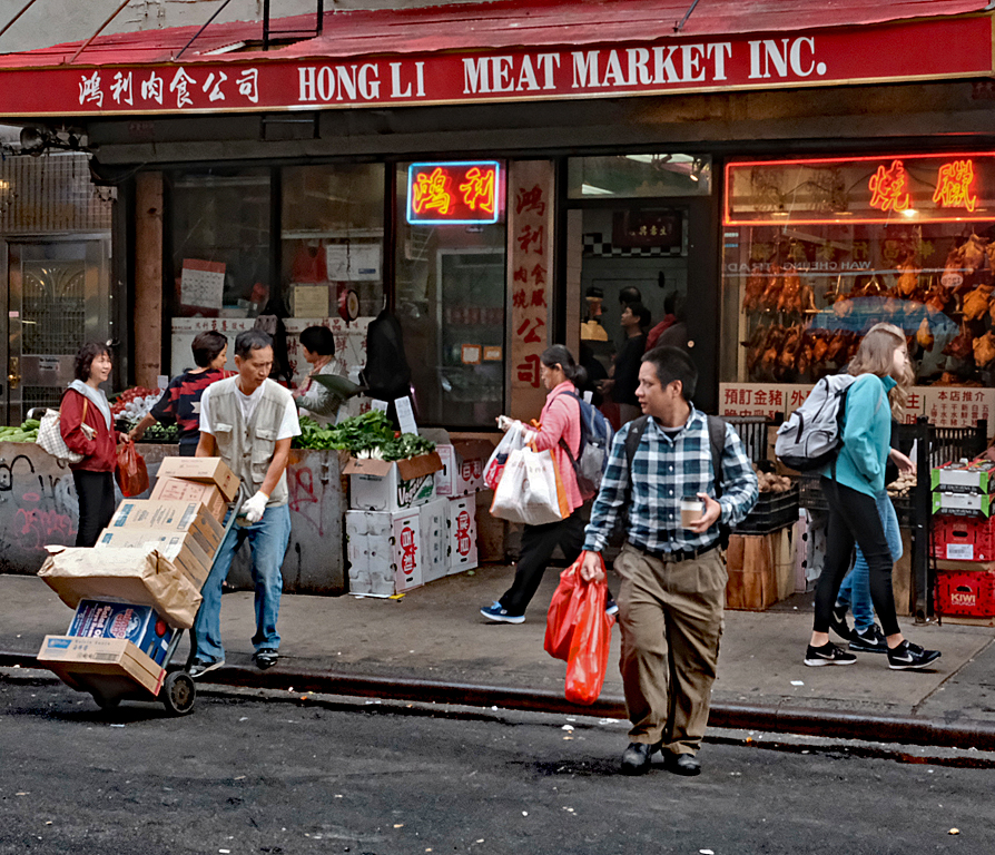
My first thought on looking at this image was that it's out of focus. Then I saw that you did that on purpose, probably with one of your many filters? Like what you did with the background. |
Nov 11th |
| 80 |
Nov 19 |
Comment |
This is a very good street photograph. These guys are deep in conversation and oblivious to whatever's going on around them. You've captured good colors and clarity. I think blurring out the background a bit would be a good enhancement. |
Nov 11th |
| 80 |
Nov 19 |
Comment |
I get the story angle, but not having any meaningful look at the child kind of destroys the image for me. The other thing, for me, is that there aren't enough dark sections of the image to warrant a monochrome conversion. |
Nov 11th |
| 80 |
Nov 19 |
Comment |
I like your composition with the photographer as a border. I also like that you converted to monochrome. I think you've got enough very dark pieces, and a composition that leads my eyes to the lower portion of the image, to overcome any issues with the background. |
Nov 11th |
4 comments - 6 replies for Group 80
|
18 comments - 16 replies Total
|