|
| Group |
Round |
C/R |
Comment |
Date |
Image |
| 29 |
Jun 19 |
Comment |
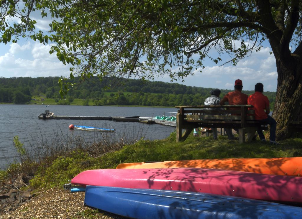
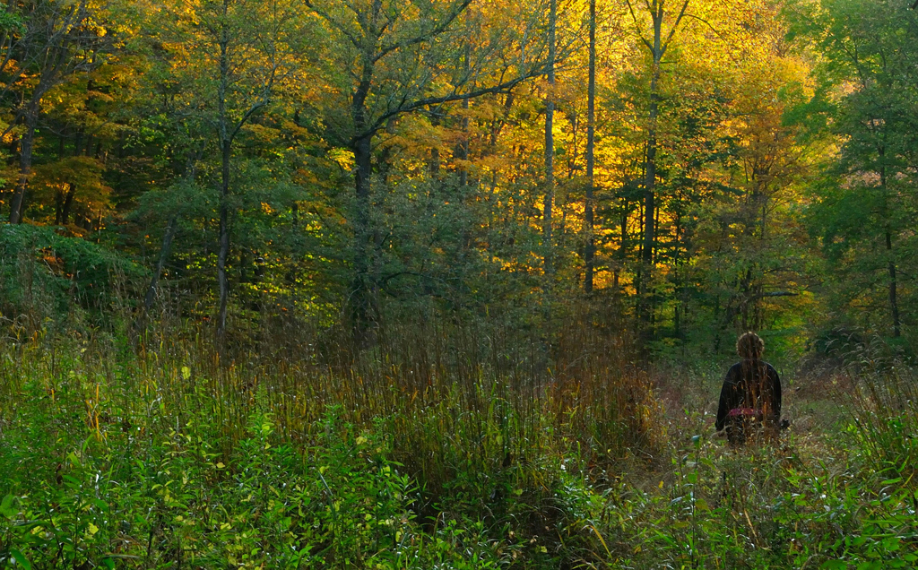
Bob's right, I said I expected some, if not all, of you would not like the darkness on the right side. You all need to peruse Street Photography. I might submit this to my Street Scenes group and see what kind of responses I get. |
Jun 17th |
| 29 |
Jun 19 |
Comment |
Why I always have my camera in the car - never know when you're going see a photo op. I like Bob's crop, but not texture and clarity changes. It also makes the image conform to the "RULE" of odds (did he just say that??). |
Jun 17th |
| 29 |
Jun 19 |
Reply |
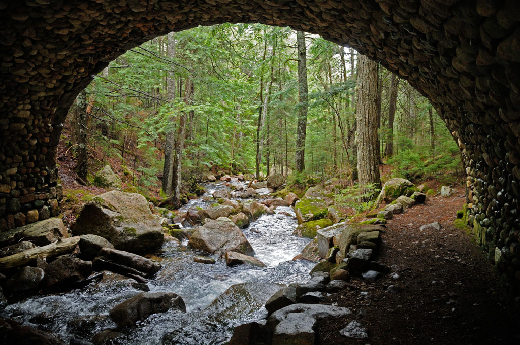
I think your crop is too severe Bob. You could get most of what you're after by cropping the flora above the falls, but I think you need the rocky area at the top of the falls in this image. |
Jun 17th |
| 29 |
Jun 19 |
Comment |
Curious about your camera settings Tam. This is really sharp for hand held and using an ND filter. |
Jun 17th |
| 29 |
Jun 19 |
Comment |
I like the heck out of this image. The color and bokehed background are really good. Looks like your focus is on the leaves in front of the flower because that's where I see the sharpness. The flower appears a bit soft. Was that your intent? |
Jun 17th |
| 29 |
Jun 19 |
Comment |
Everybody wants to mess with this image! I do too. I like Bob's version and for the reasons he stated. I don't like Karen's suggestion to eliminate the black mess in the ceiling. It's an old abandoned structure. It's part of the story. |
Jun 17th |
| 29 |
Jun 19 |
Comment |
I like Karen's crop, but not her suggestion about the eyes (maybe because I do so much Street Photography?).
I like Bob's blur.
|
Jun 17th |
| 29 |
Jun 19 |
Reply |
Little did I know when I joined PSA that I'd be getting help not only with my photography skills, but I'd also be getting French lessons. Thanks, Tam! |
Jun 17th |
| 29 |
Jun 19 |
Comment |
Echoing Judy, my first thought when I was this image was about the old steel plant we toured during the Pittsburgh conference.
This is a really good shot and the post processing made it so much better (did he really just say that???). I tried a B&W conversion with it, but there isn't enough contrast to make it interesting to me. Nice shot & PP Bob! |
Jun 17th |
7 comments - 2 replies for Group 29
|
| 33 |
Jun 19 |
Comment |
Powerful image Bob. Since I was in the USAF, my late wife is buried in Washington's Crossing National Cemetery. This image had the same gut punch effect as going to WCNC. |
Jun 28th |
1 comment - 0 replies for Group 33
|
| 60 |
Jun 19 |
Reply |
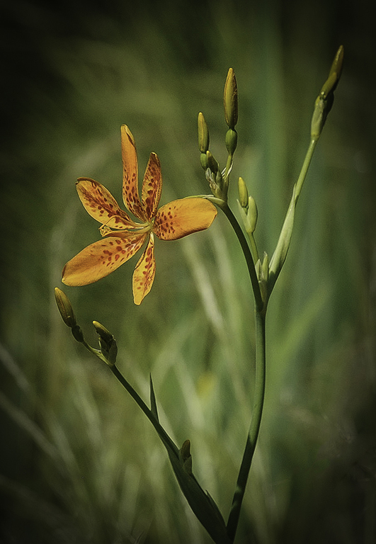
Thanks, John. As I mentioned to Carol, a vignette never crossed my mind. |
Jun 19th |
| 60 |
Jun 19 |
Reply |
Thanks, Bill. |
Jun 19th |
| 60 |
Jun 19 |
Reply |
Thanks, Carol. I use PhotoShop Elements for PP. Never considered a vignette. |
Jun 19th |
| 60 |
Jun 19 |
Reply |
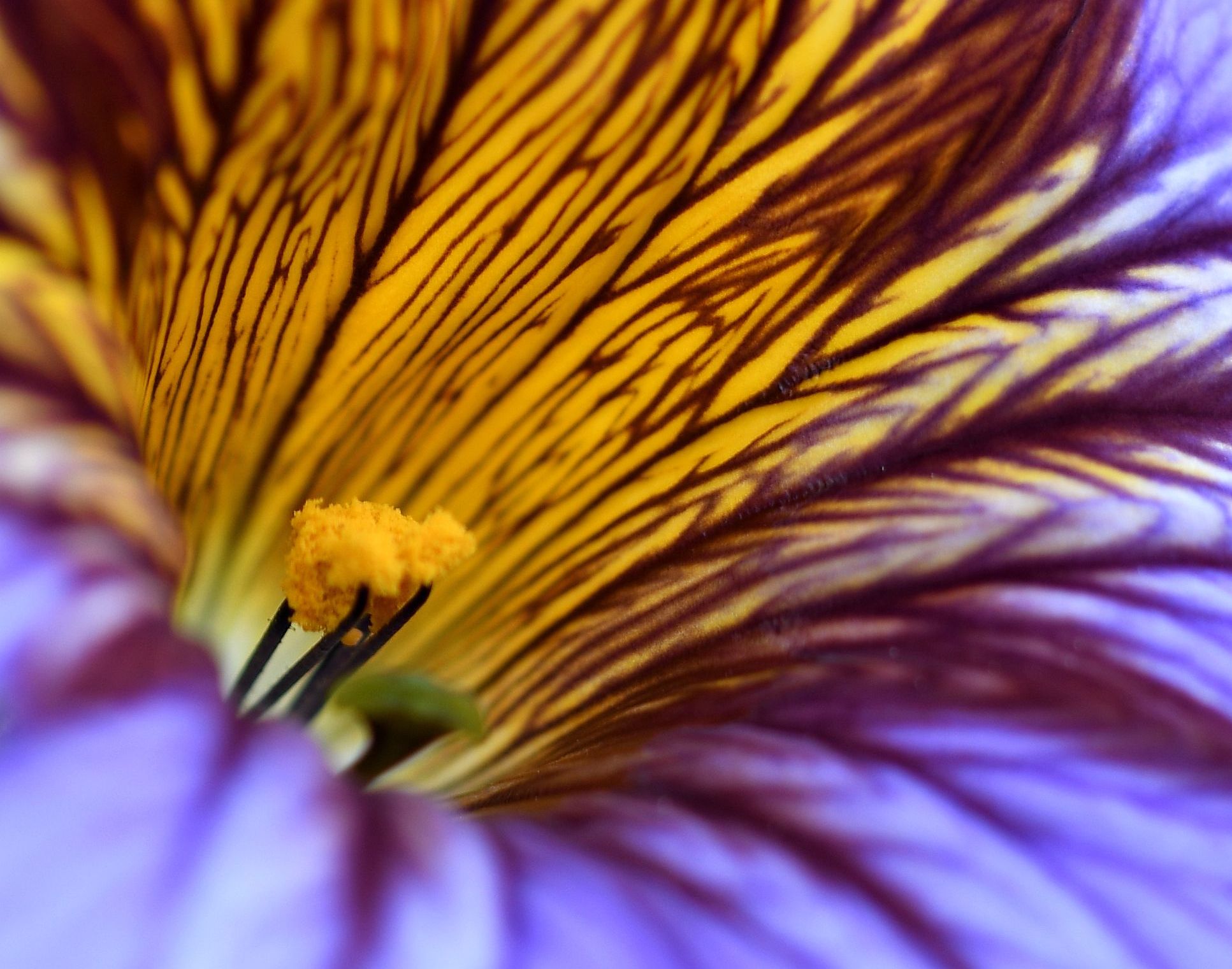
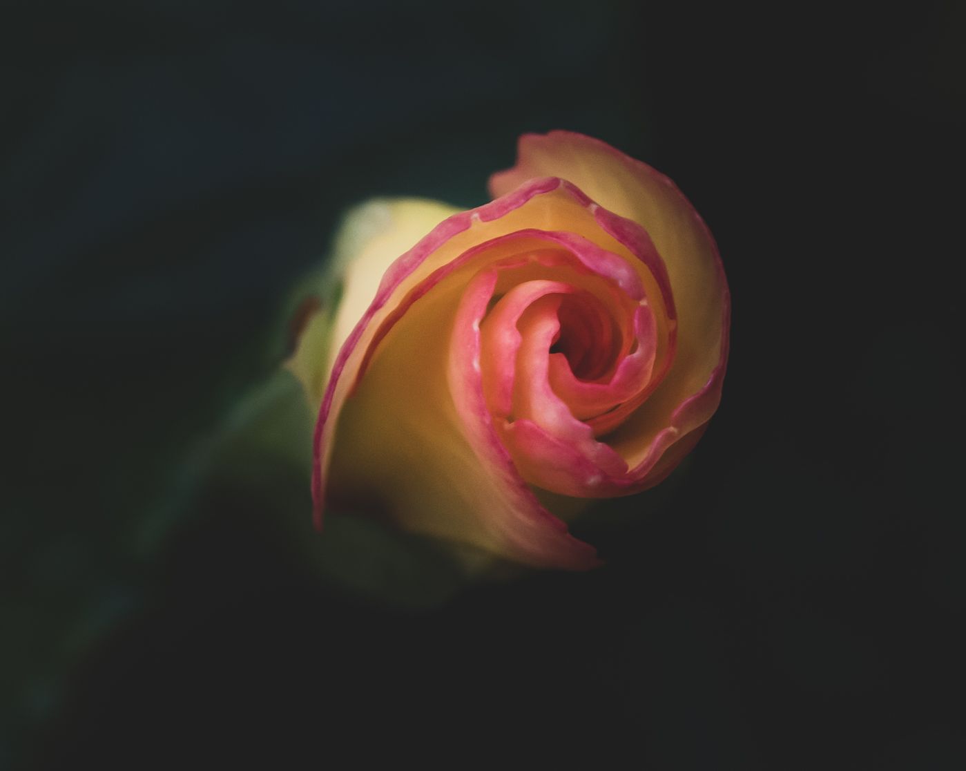
Thanks, Denise. I had done some burning of the lower portion of the petals and, frankly, was afraid to do much more. I tried taking out that stem but the results were less than pleasing, so it stayed. Didn't mess around with the yellow leaf at all. |
Jun 19th |
| 60 |
Jun 19 |
Reply |
You're right about the leaves at the top, Bob. I couldn't figure out what to do with them and I did not want to crop them out. You may have figured out that I'm not much for post-processing. |
Jun 19th |
| 60 |
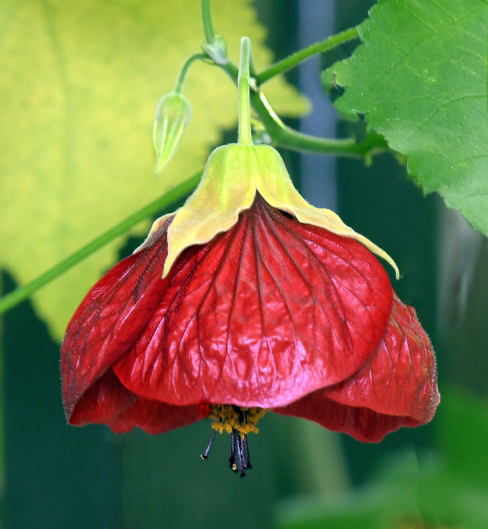
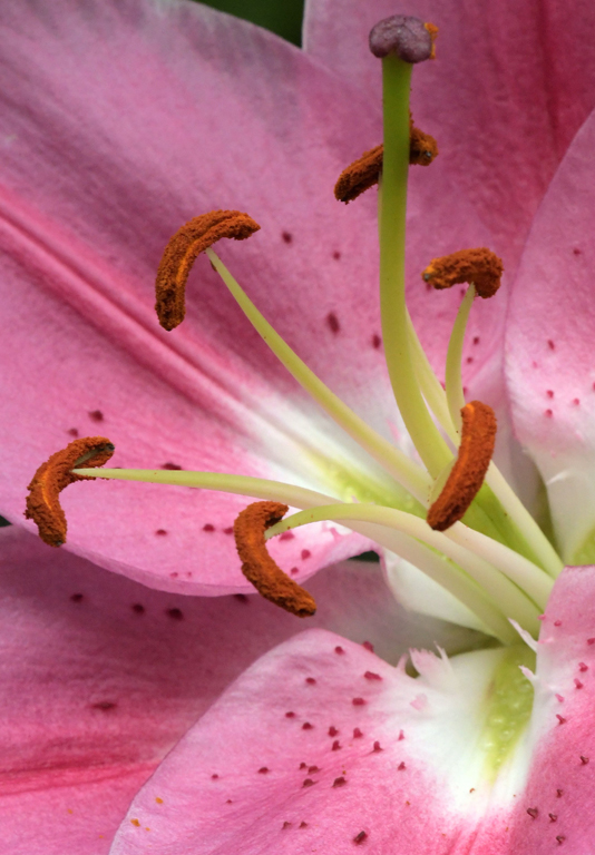
Jun 19 |
Comment |
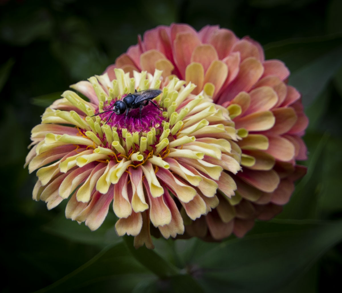
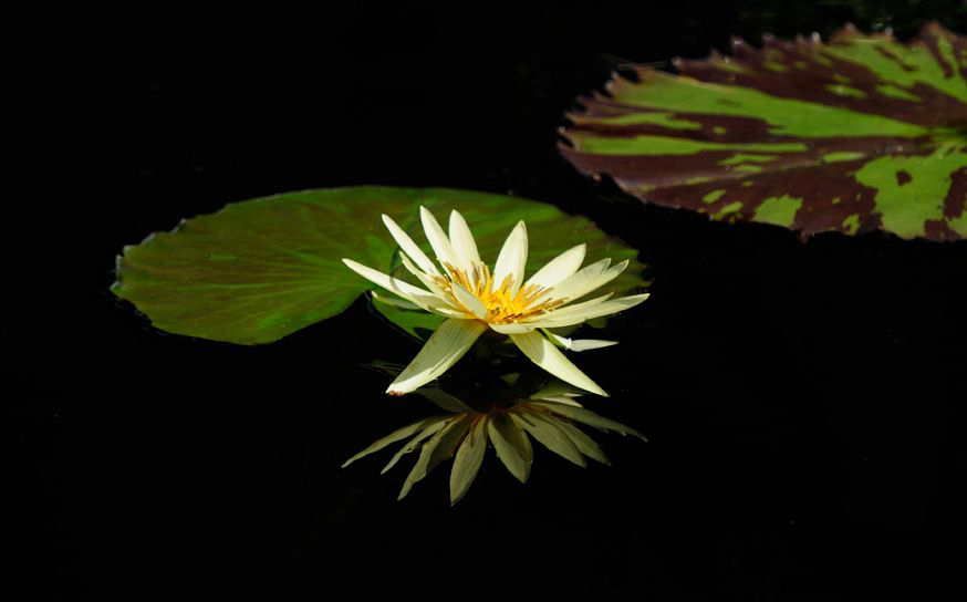
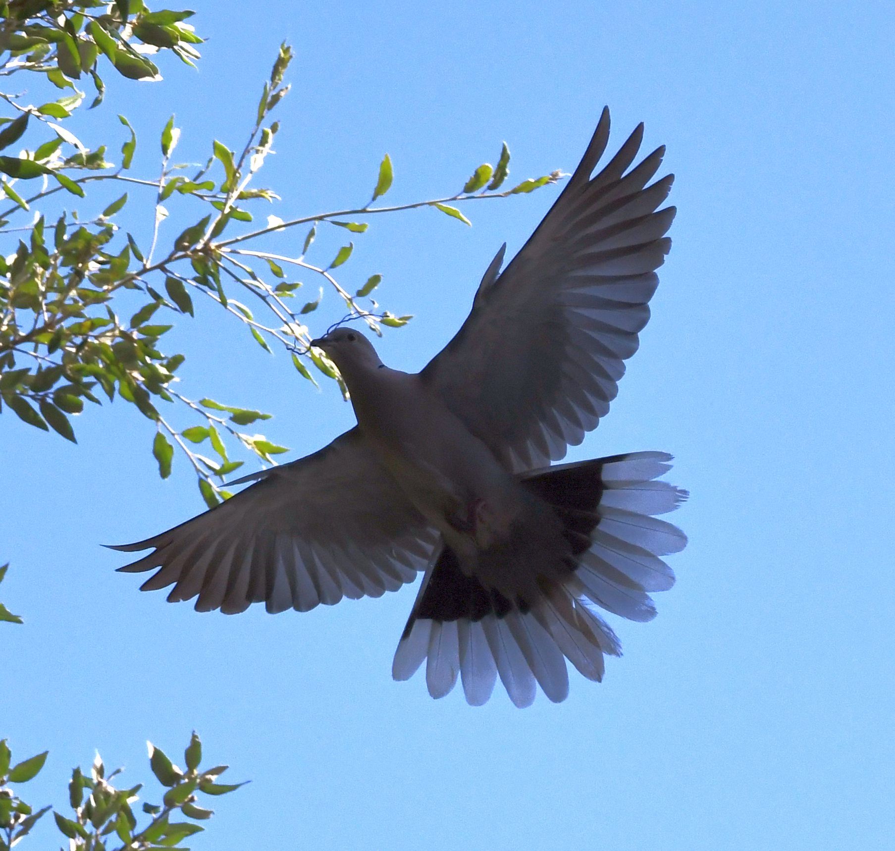
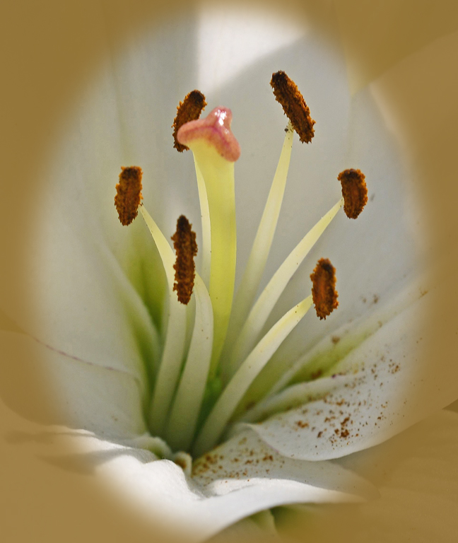
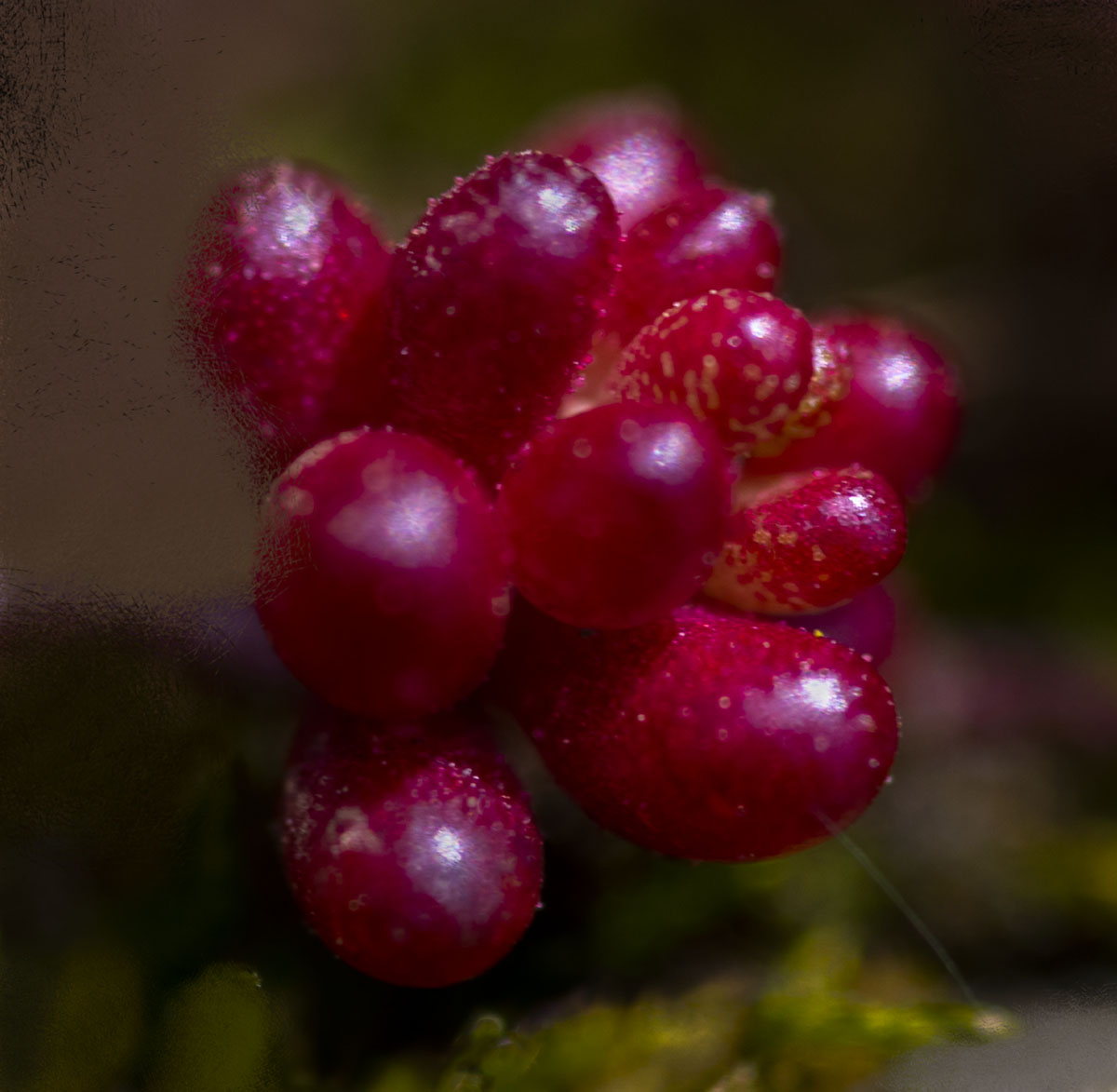
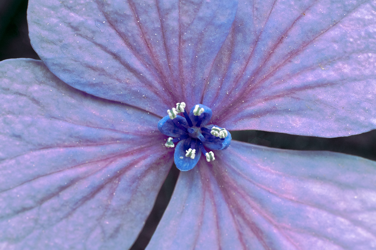
This is really good, Denise. I really like the sharpness in the center of the flower - it holds my eyes - combined with the softness of the rest of the flower and it's stem. The only nit I have is I can't help but see the whiteish or blueish area in the upper left corner. Perhaps a little bit of burn would tone it down sufficiently? I played with a crop that makes the flower more prominent, but it doesn't eliminate the area in the upper left that I mentioned. Regardless of the nit, I love the flower! |
Jun 19th |
 |
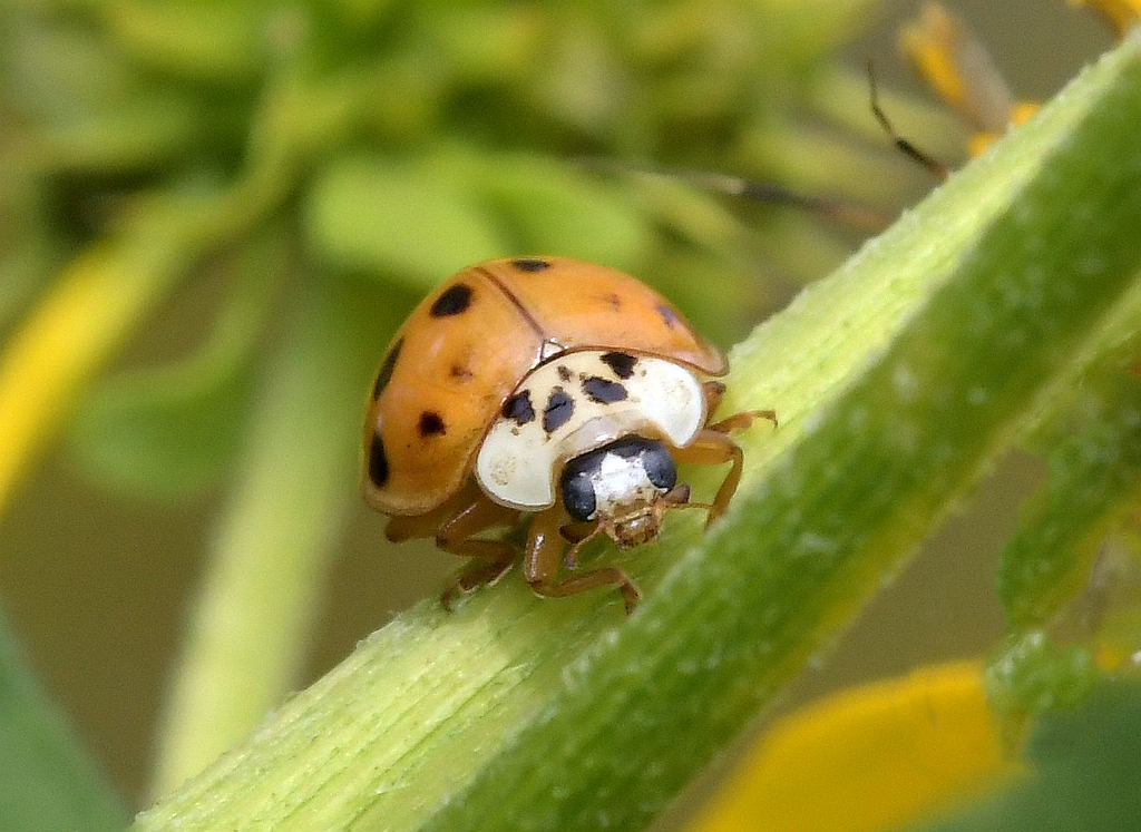
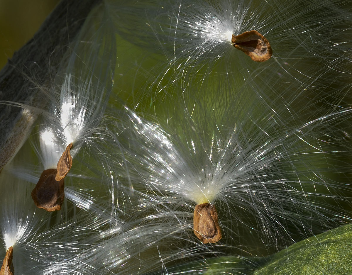
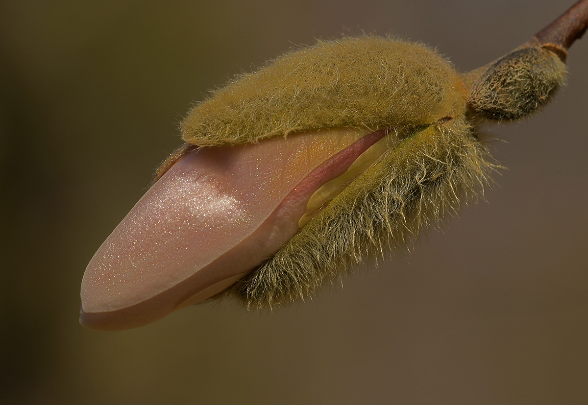
| 60 |
Jun 19 |
Comment |
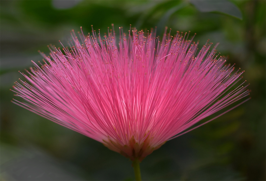
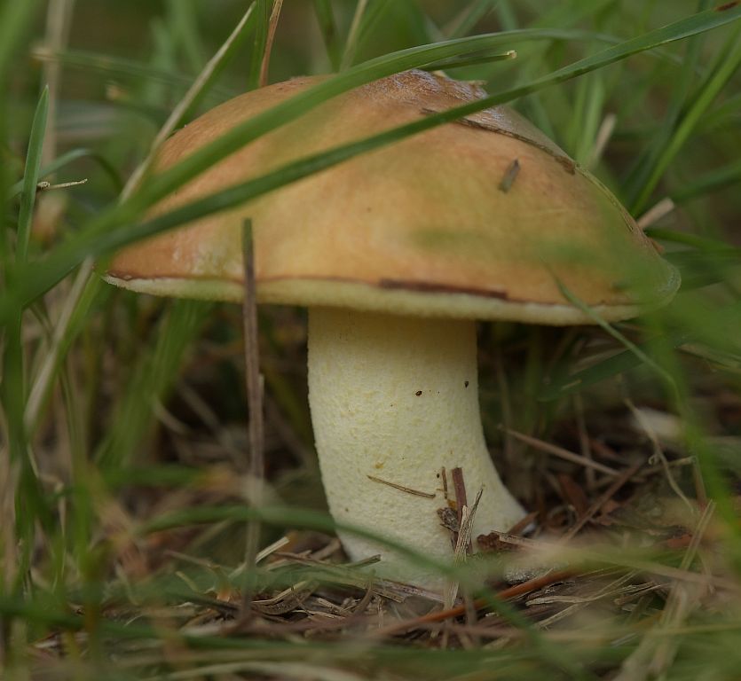
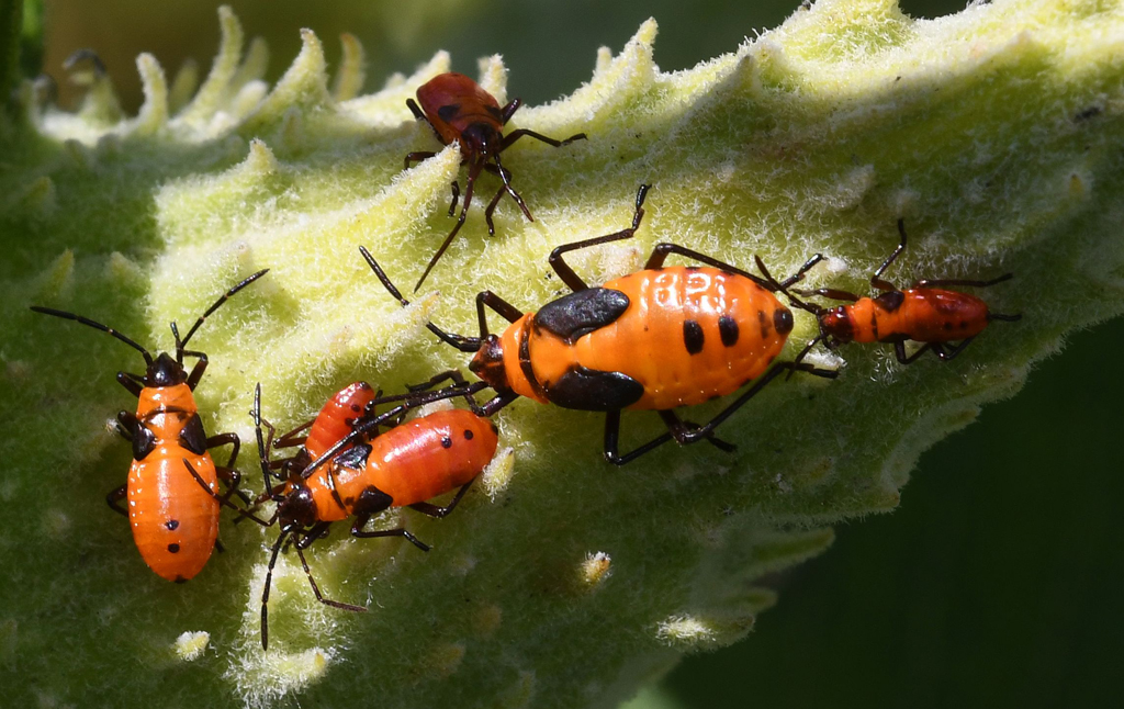
Very interesting plant. If you're like me and want to know what you've captured, look for someone who works at the place or, if no one's around, check the website and contact them, including a picture with the question. I've always gotten a reply.
I like your composition and exposure. Colors are good, as is the sharpness. |
Jun 19th |
| 60 |
Jun 19 |
Comment |
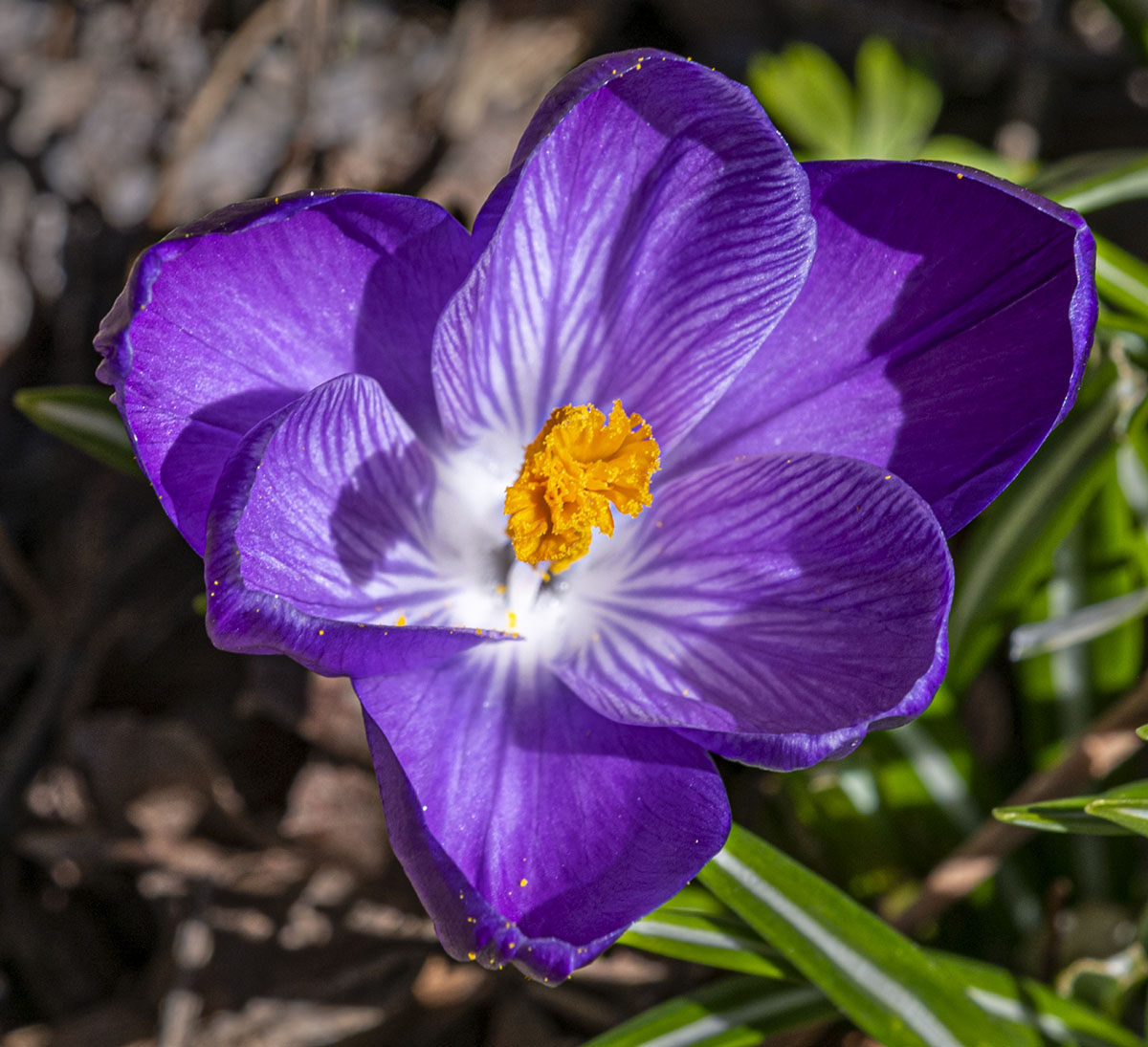
Hope you've saved a spot on a wall for this image, Bill. I think there is nothing not to like about the shot. The greens and black are a great background to this beautiful flower. Great shot! |
Jun 18th |
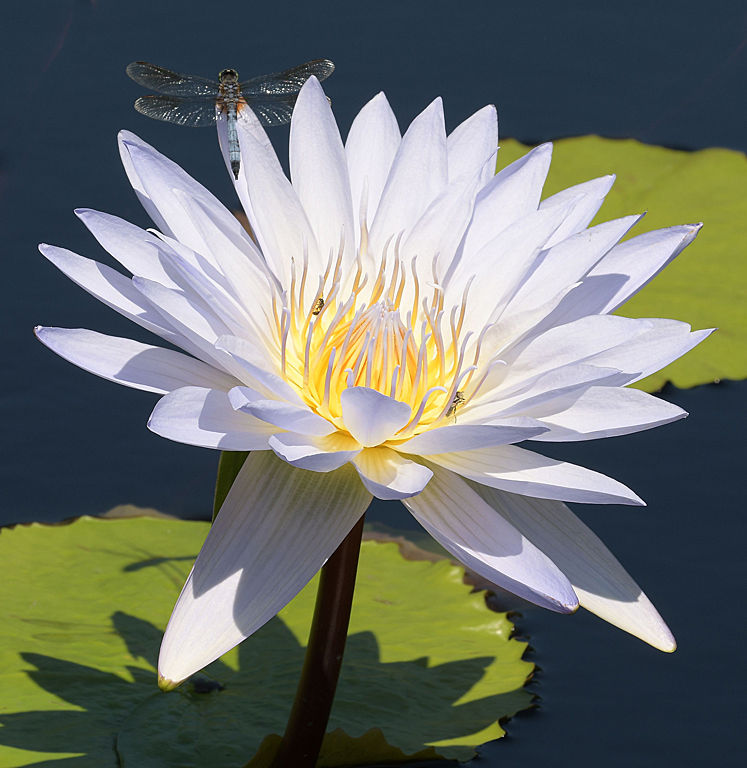
| 60 |
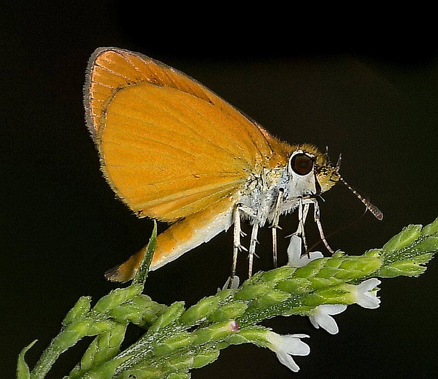
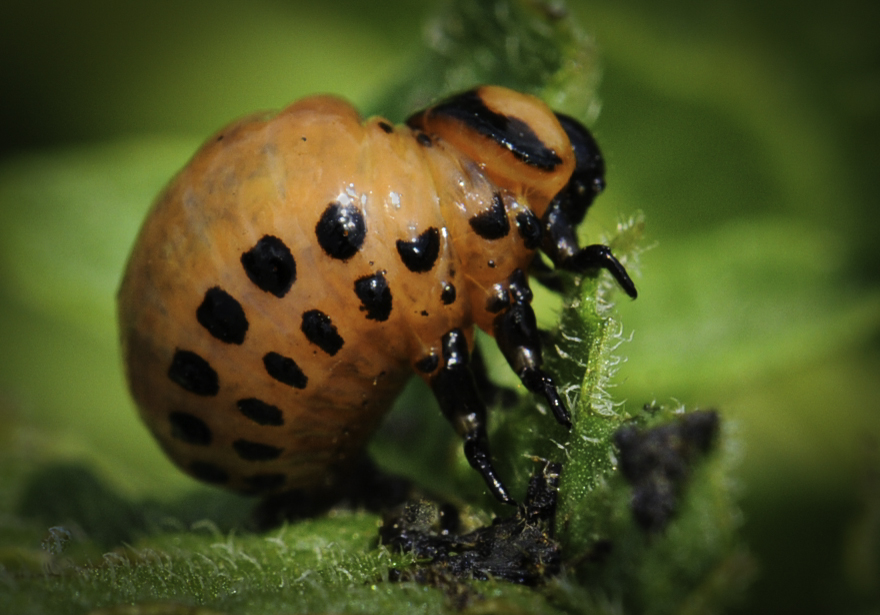
Jun 19 |
Comment |
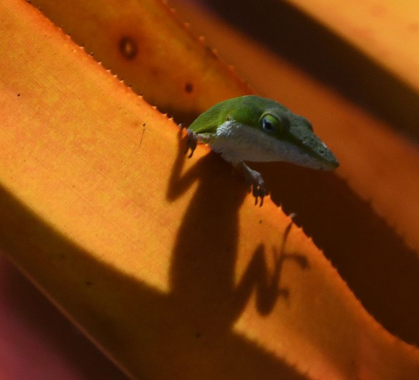
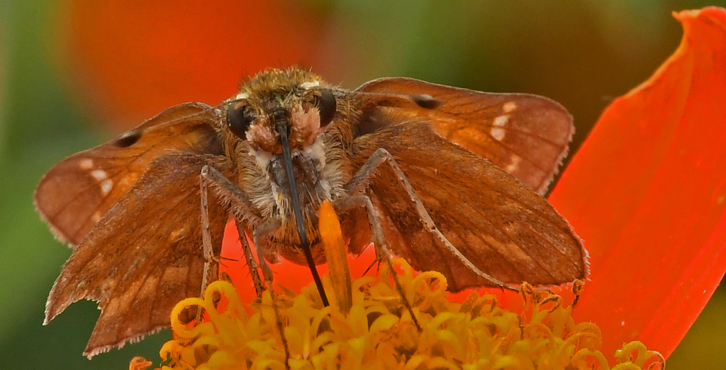
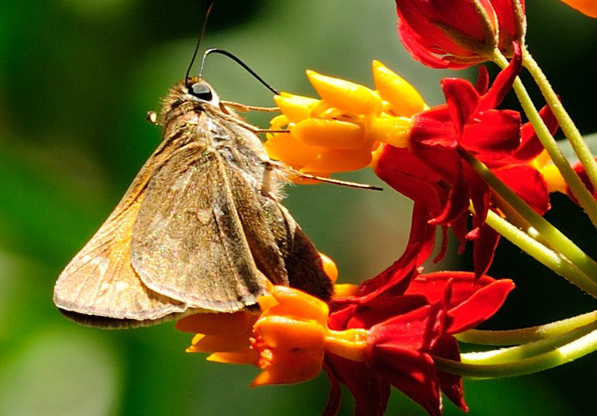
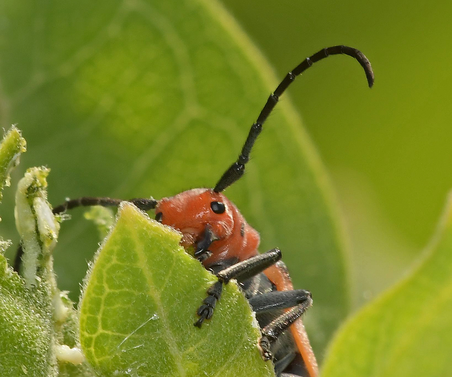
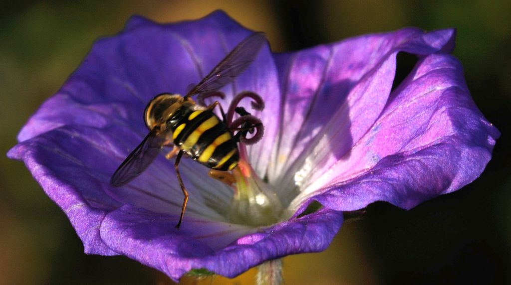
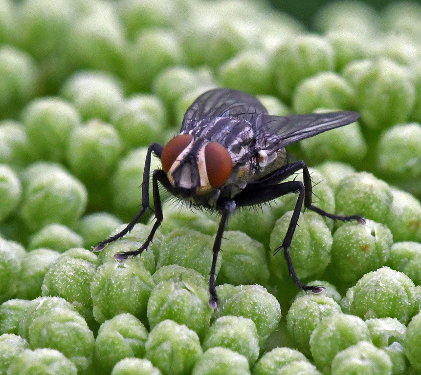
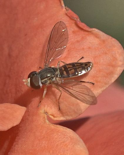
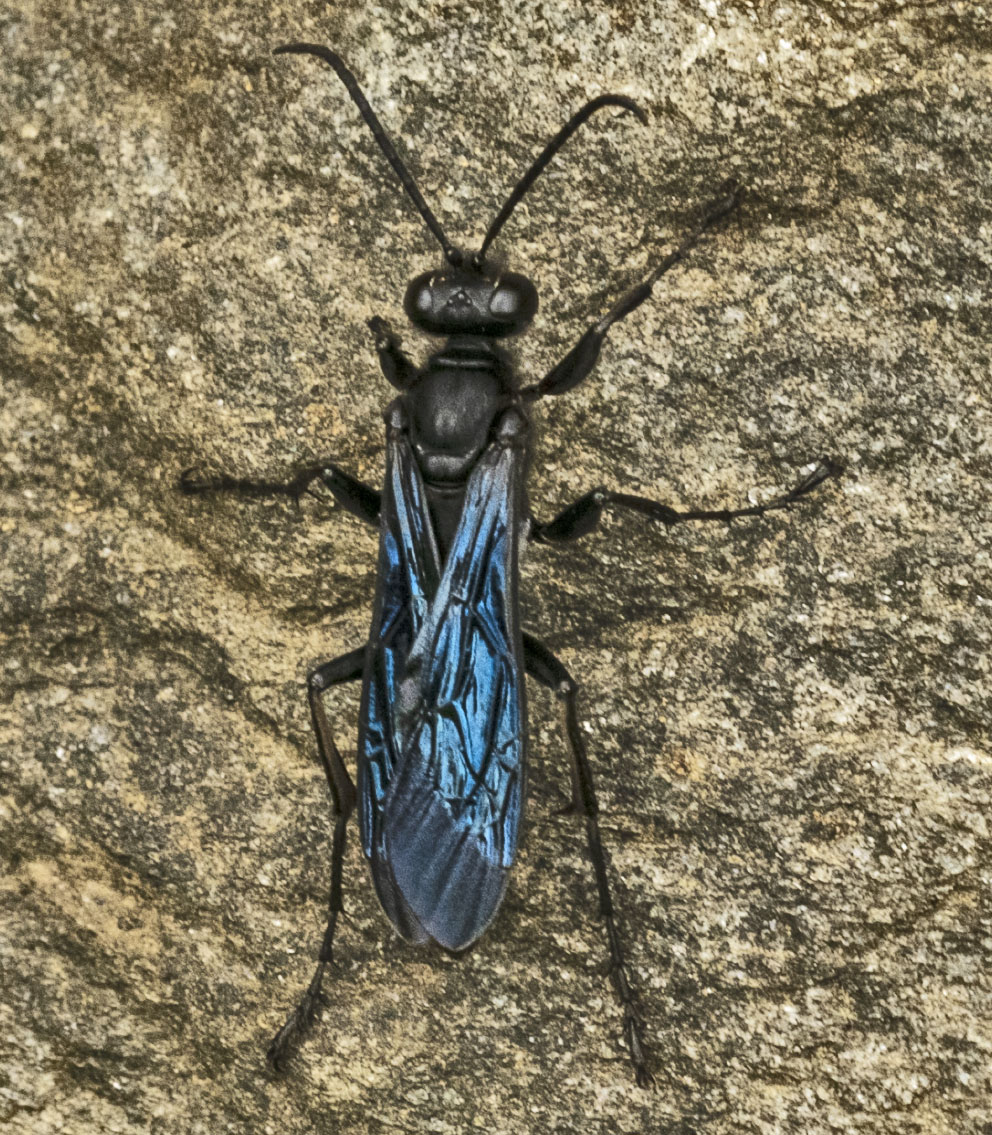
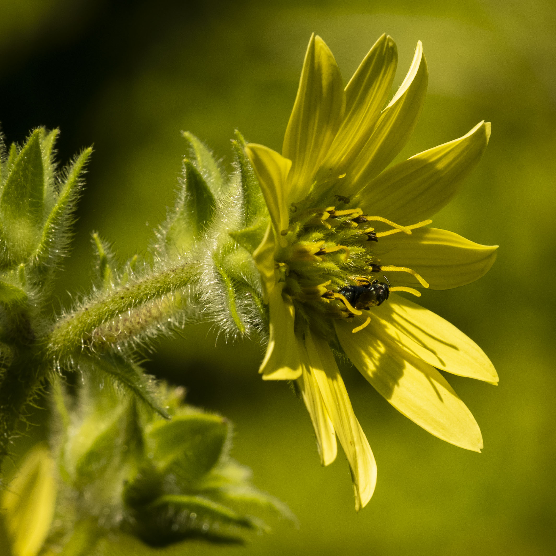
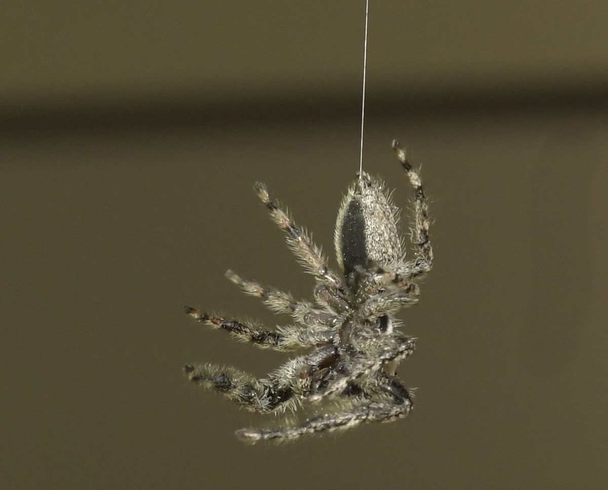
Well, John, it looks like you've learned the first lesson of chasing insects - patience. Something I've learned chasing dragonflies is they seem to come back to the same resting spot quite a few times which gives us multiple opportunities to photograph them. Your image is really sharp in the head, body and leg areas. I have two suggestions if you're going after insects - (a) don't shoot lower wider than f/11 and you should find the entire insect in focus, (b) use a diffused flash to bring out the parts of the insect that are facing the lens. |
Jun 18th |
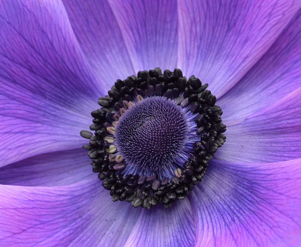
| 60 |
Jun 19 |
Comment |
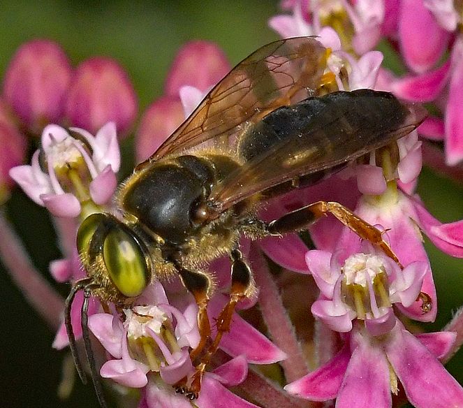
Another really good flower image Carol. Sure looks sharp enough to me and it stands out well against your blurred background. The only nit I have to pick (and it is a nit) is the small tan spot to left of the right petal. |
Jun 18th |
5 comments - 5 replies for Group 60
|
| 74 |
Jun 19 |
Reply |
Hi Alicia, wasn't thinking enough - Cape Coral vs. Cooper City. Guess it was the alliteration! |
Jun 19th |
| 74 |
Jun 19 |
Comment |
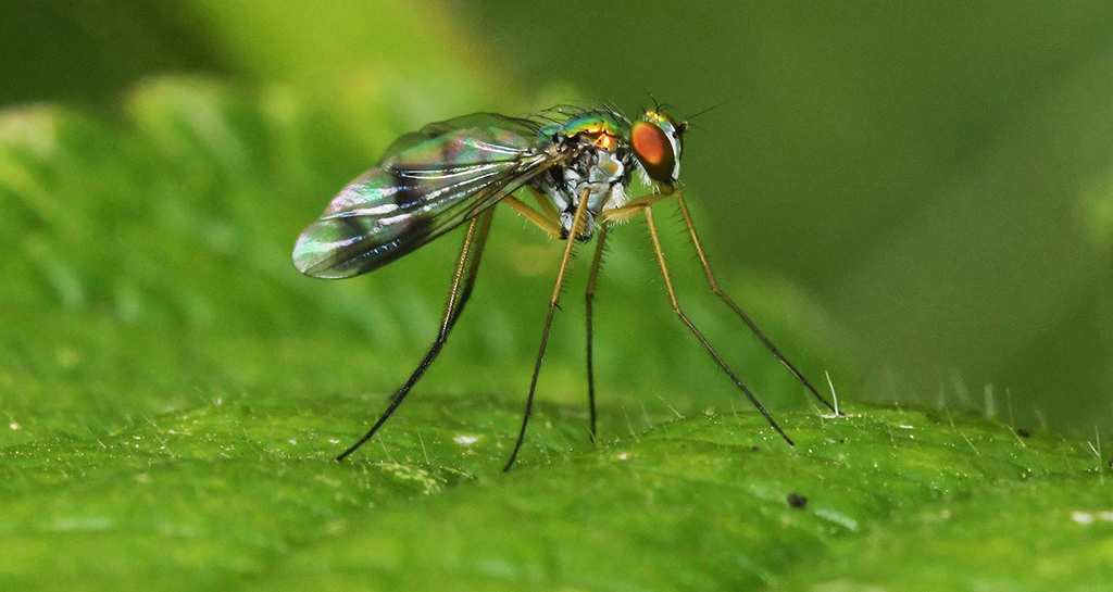
It's generally not easy to shoot through glass and avoid reflections, so you did a nice job on that. You captured the texture of the fur very well. Agree with Arne about the smaller aperture. |
Jun 19th |
| 74 |
Jun 19 |
Comment |
I like this sharp image. I definitely think this is better as monochrome, without the red wall. Agree with Arne about more blur in the background and Pamela about more space on the left and bottom of the image. |
Jun 19th |
| 74 |
Jun 19 |
Comment |
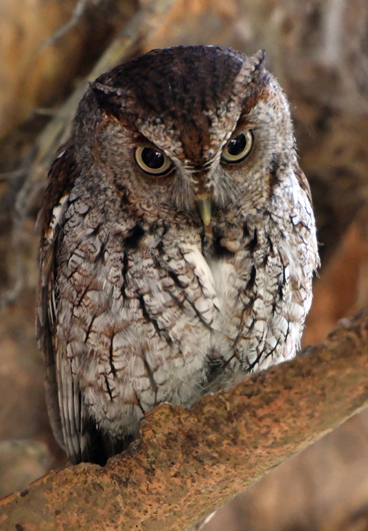
I like this a lot. The eyes are captivating. Your image is very sharp and I like the crop from the original. I agree with the other comments about boosting the contrast of the owl.
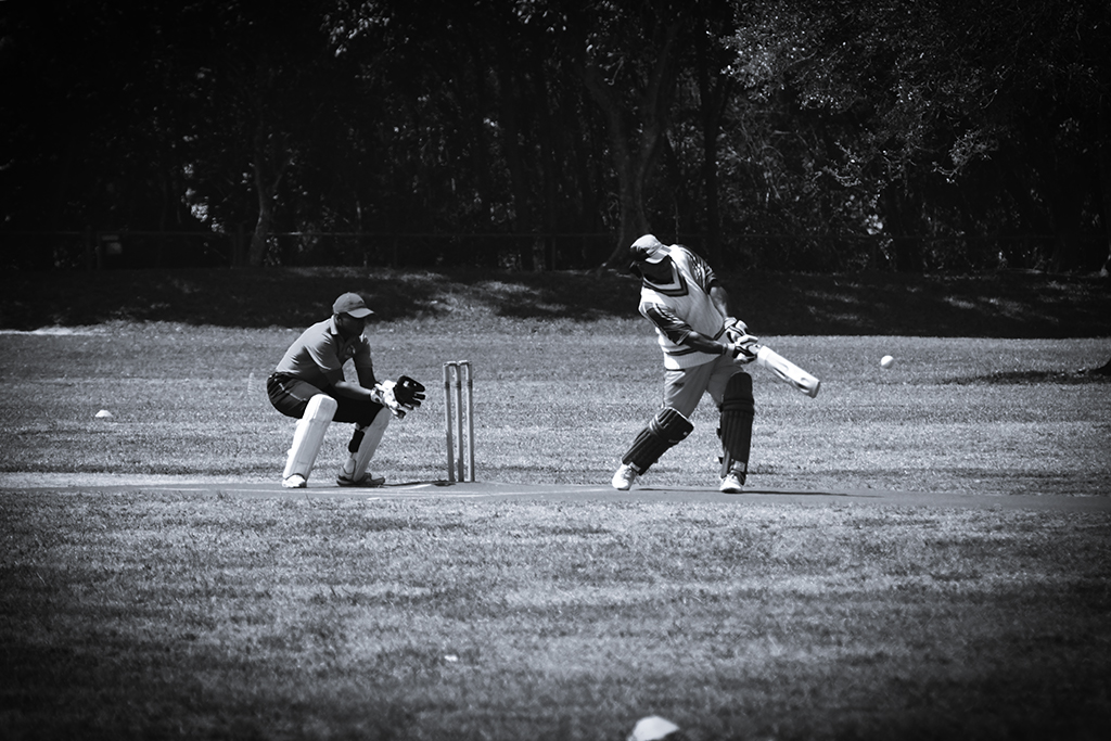
I think you were at Brian Piccolo Park? I've been there a few times and gotten images of these little owls. Another thing to look for there are the cricket games which offer some nice photo ops with a long telephoto lens. |
Jun 19th |
| 74 |
Jun 19 |
Comment |
I think you did a good job of catching the dancer in mid-air and avoiding blurs. I'm guessing you did the post-processing to the original and then converted to monochrome? I think that is true because, other than the color, the images appear identical to me. And, I'm guessing that the distortions in the arms and legs, and the line that was mentioned, appear in both images. I think the dancer's face could be darkened just a bit. |
Jun 19th |
| 74 |
Jun 19 |
Comment |
Good choice for monochrome conversion. Agree with Raquel that the poles in the water are a distraction since they're situated directly in the center of the image. |
Jun 19th |
5 comments - 1 reply for Group 74
|
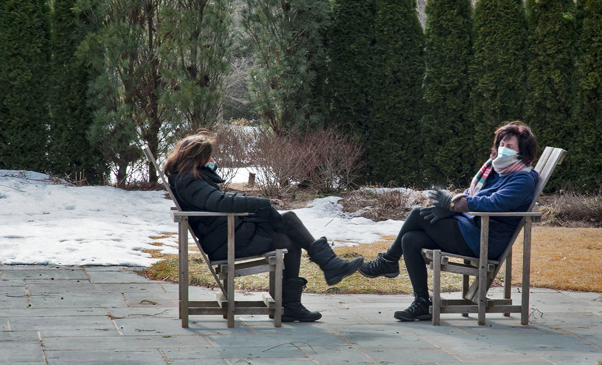
| 80 |
Jun 19 |
Reply |
Dan,
I think it's about the shutter speed, but anything you do outside of PP is going to effect the entire image, not just the bright area(s). You could have increased the shutter speed a bit to see what you'd get, or you could have left it as it was and played with the exposure compensation dial. The gray areas would also be impacted by doing that, so it may have helped a little before the grays became to dark? |
Jun 25th |
| 80 |
Jun 19 |
Reply |
That's a helluva a compliment! Thanks Dan |
Jun 25th |
| 80 |
Jun 19 |
Reply |
Bev, check my response to Jim. |
Jun 17th |
| 80 |
Jun 19 |
Reply |
Thanks Jim. What would say if I told you she broke out in a loud laugh a few seconds after I made this image? That is what happened next. |
Jun 17th |
| 80 |
Jun 19 |
Comment |
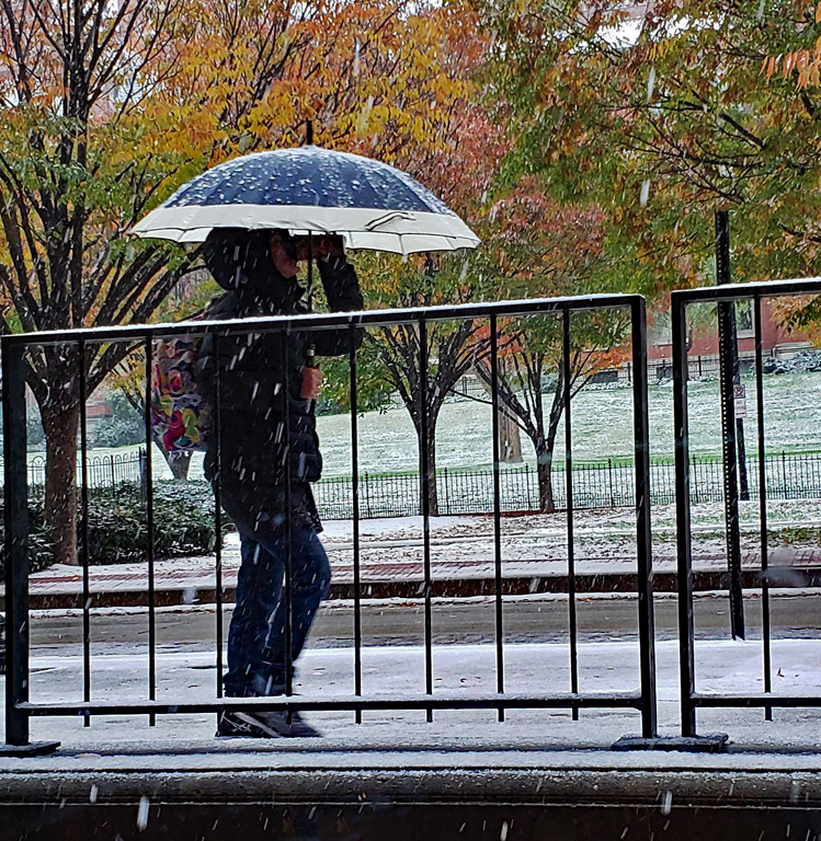
My brother has lived in Hoboken for about 40 years and I've seen my share of days like this one when I was there. Wish the white were a little less bright but, other than that, I think you captured a nice image. |
Jun 17th |
| 80 |
Jun 19 |
Comment |
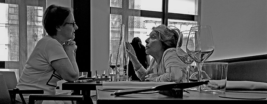
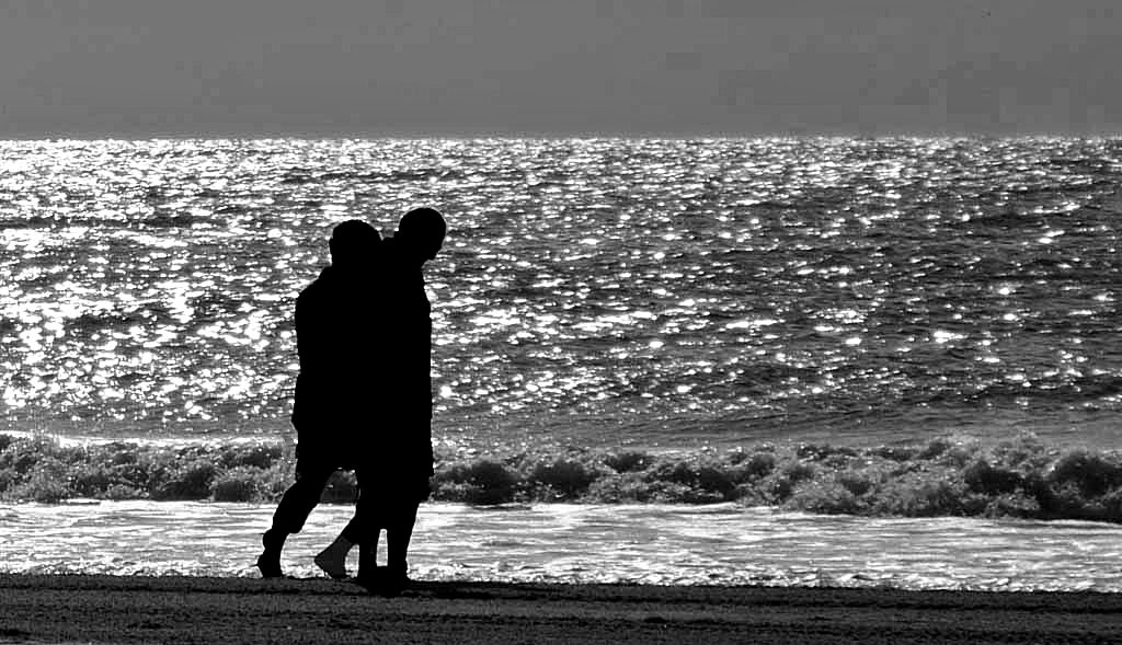
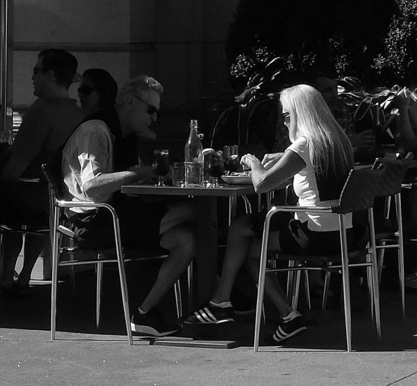
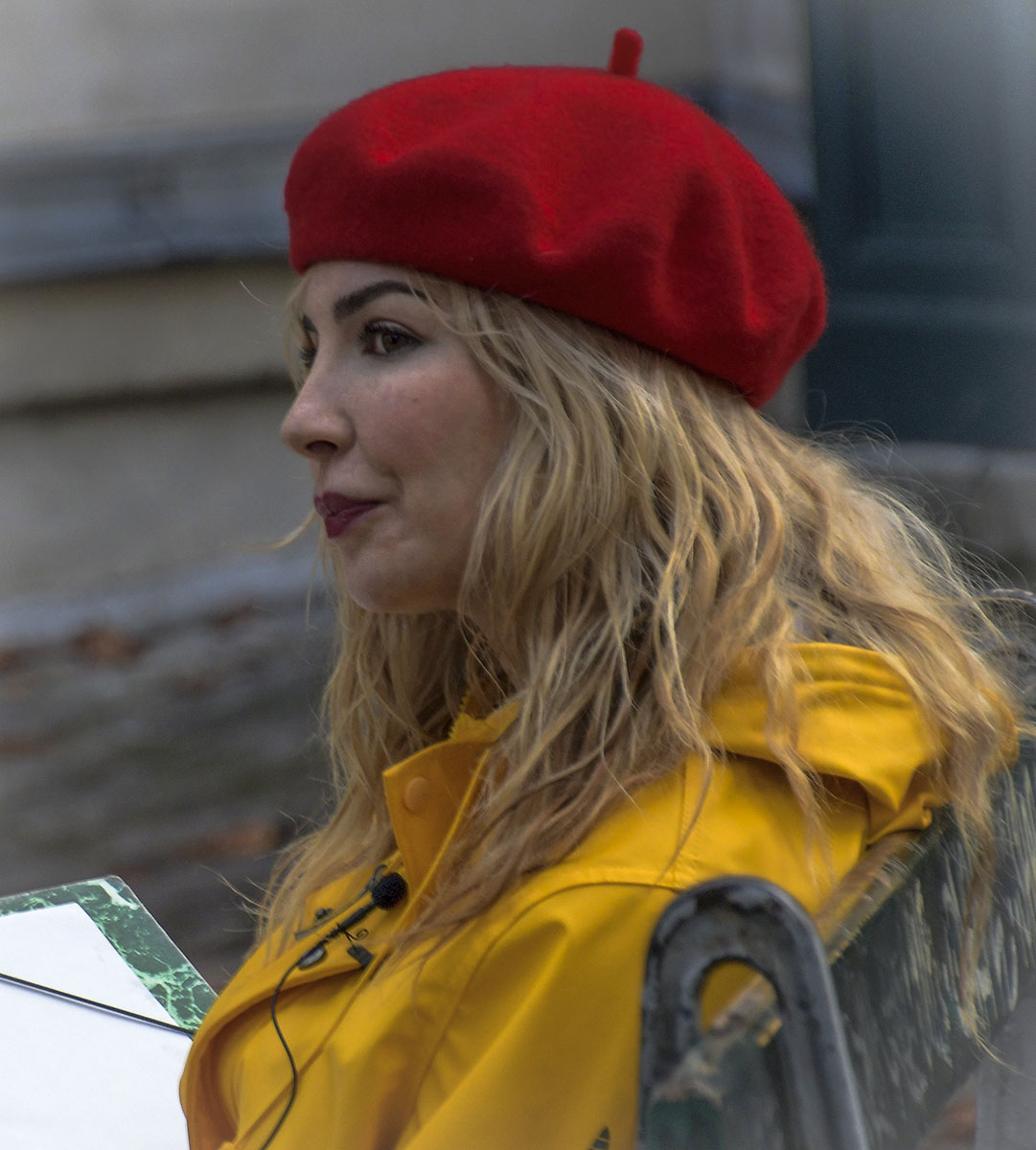
Wow! This image may contain more lines - vertical, horizontal, diagonal and curved - than any I've seen in my five PSA groups. I like the heck out of this. I agree with Jim that women seem to be both the focal point and a bit soft. |
Jun 17th |
| 80 |
Jun 19 |
Comment |
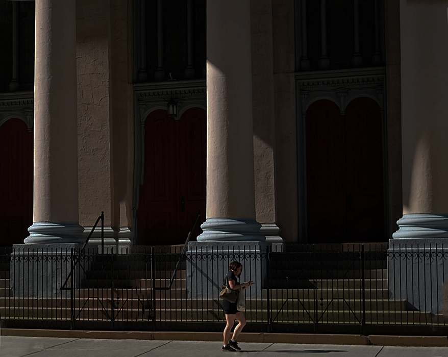
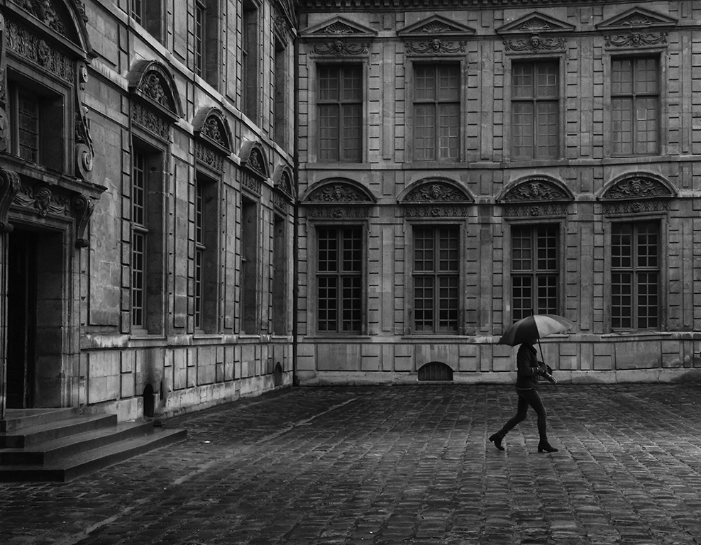
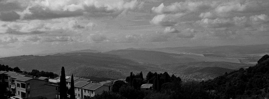
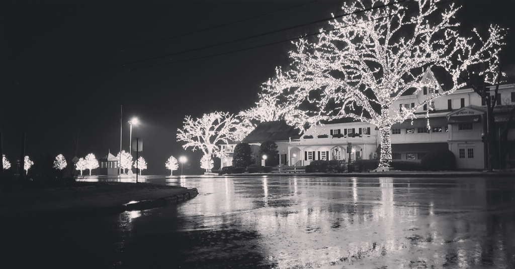
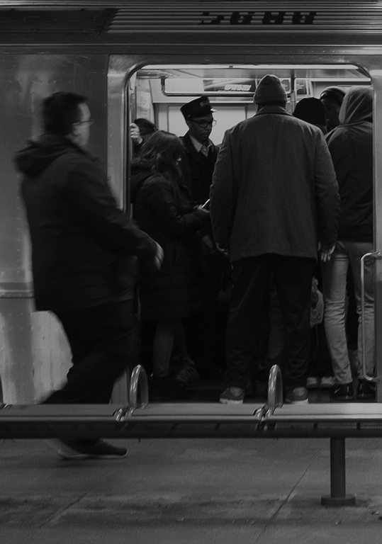
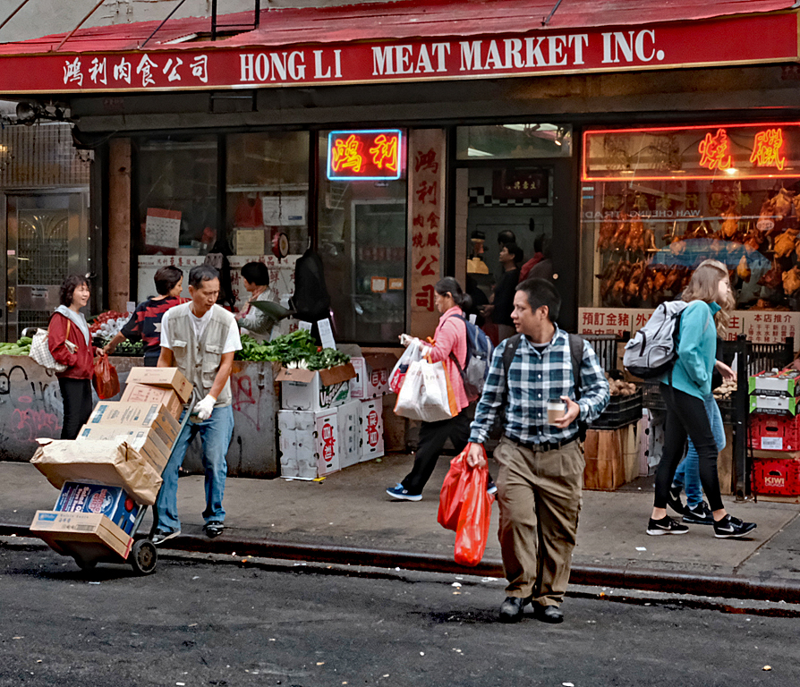
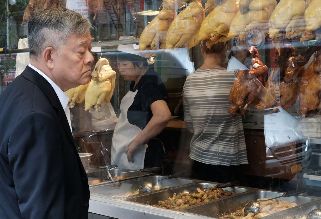
I like this for exactly what you presented as - A Sense of Scale. I've seen a number of these larger murals around Philly - and would like to get some shots of them but there are always cars or busses/trucks blocking a lot and I wouldn't get anything close to what you've captured. Thinking about Jim's suggestion to crop the top of the image, I think his suggestion is too severe. I think cropping at the point where the horizontal purplish line meets the man's hair would give the perspective you want and eliminate a section of the image that doesn't add anything to it. |
Jun 17th |
| 80 |
Jun 19 |
Comment |
Colin, I don't think this image is up to your usual standards. For me, it's too much open space and too much white. I think Bev's idea of cropping it down to highlight a specific individual (or individuals) makes for a better presentation. |
Jun 17th |
| 80 |
Jun 19 |
Comment |
I think you pretty well nail this one Jim. If I wanted to pick a nit, it would be that I'd like to see the foreground as in focus as the rider. |
Jun 17th |
| 80 |
Jun 19 |
Comment |
I'll have to go against the grain here and say that I like the image as Ed presents it. If I did anything, I'd crop it closer on the right to eliminate some of what I think is a distraction there. No question that the B&W conversion works better also. |
Jun 7th |
| 80 |
Jun 19 |
Reply |
Thanks Ed. I got the impression that the woman was not buying whatever her friend was selling. I don't remember for sure, but I think she might have been working up a guffaw right about then. |
Jun 4th |
6 comments - 5 replies for Group 80
|
24 comments - 13 replies Total
|