|
| Group |
Round |
C/R |
Comment |
Date |
Image |
| 29 |
Nov 18 |
Reply |
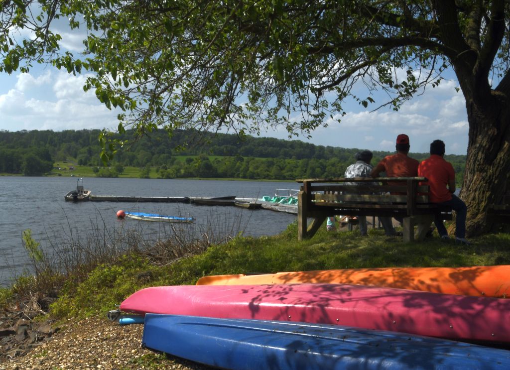
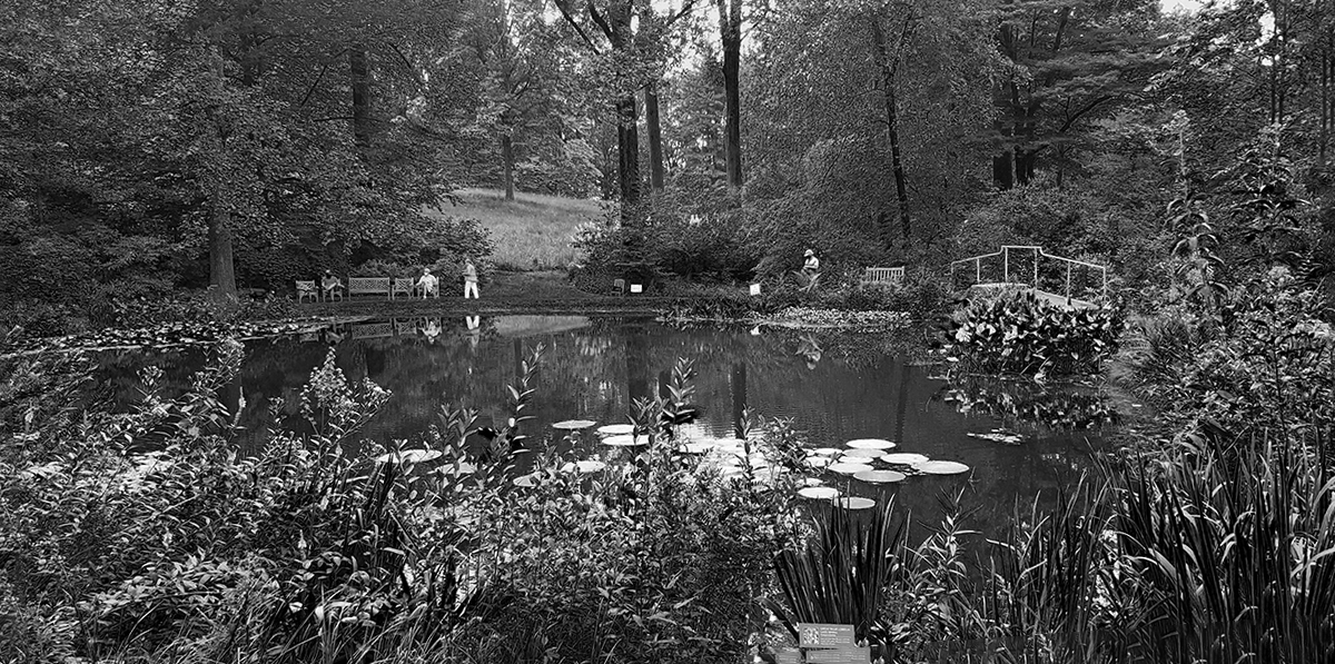
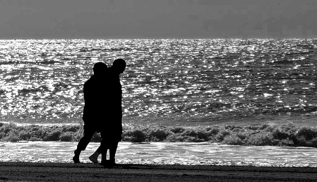
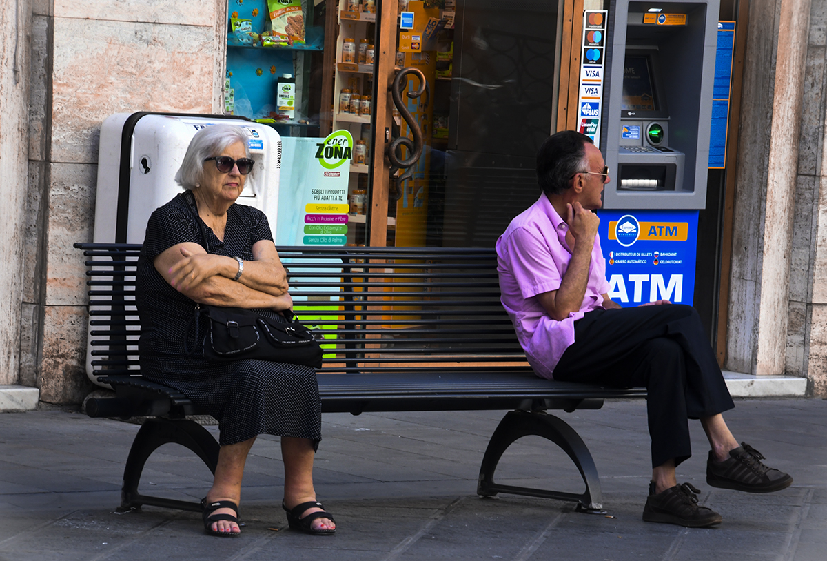
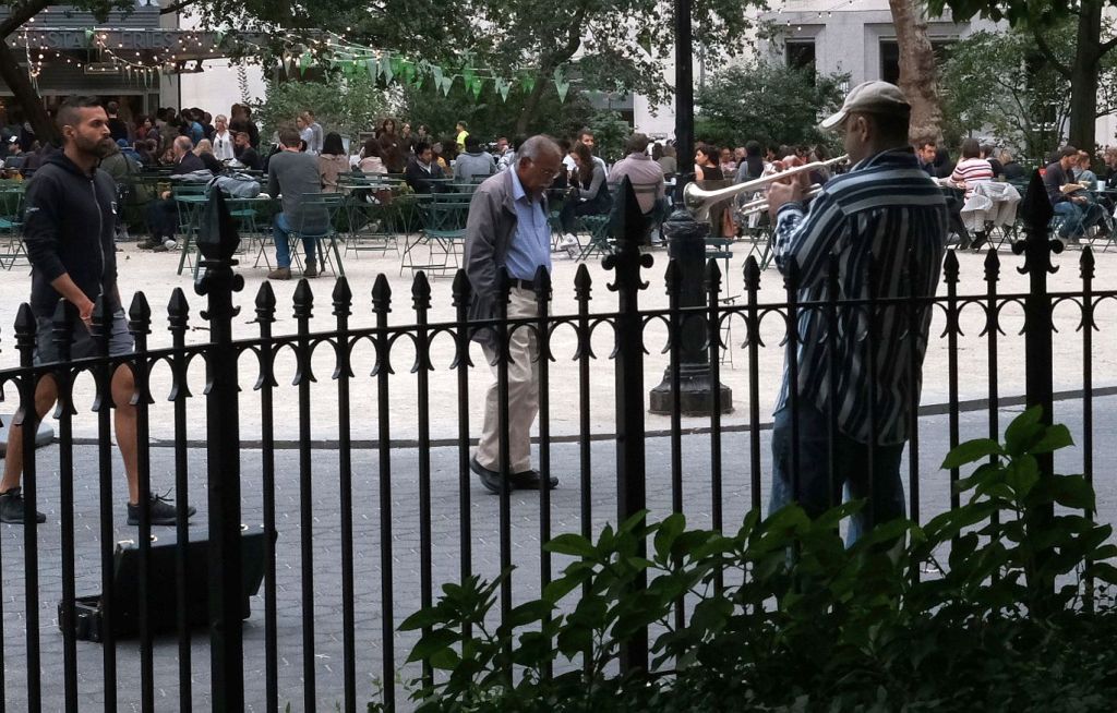
Bob, for me it's about the three guys on a bench in a park enjoying a beautiful spring day. I wouldn't have composed the shot or pressed the shutter button if they hadn't sat down.
I posted this shot to a DSG group and got pretty much the same comment about not knowing where to look. |
Nov 16th |
 |
| 29 |
Nov 18 |
Reply |
Thanks Tam. |
Nov 16th |
| 29 |
Nov 18 |
Reply |
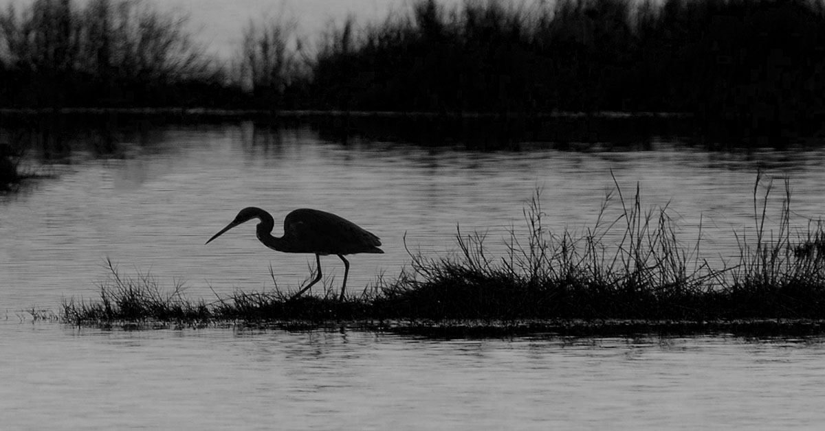
Thanks Judy. Very large Bucks County, PA park. Tons of photo ops with boating for about 8-9 months of the year, lots of birds, for us macro folks there are lots of insects, reptiles, etc. And, yes, those are kayaks. |
Nov 16th |
| 29 |
Nov 18 |
Reply |
Thanks Karen. |
Nov 16th |
| 29 |
Nov 18 |
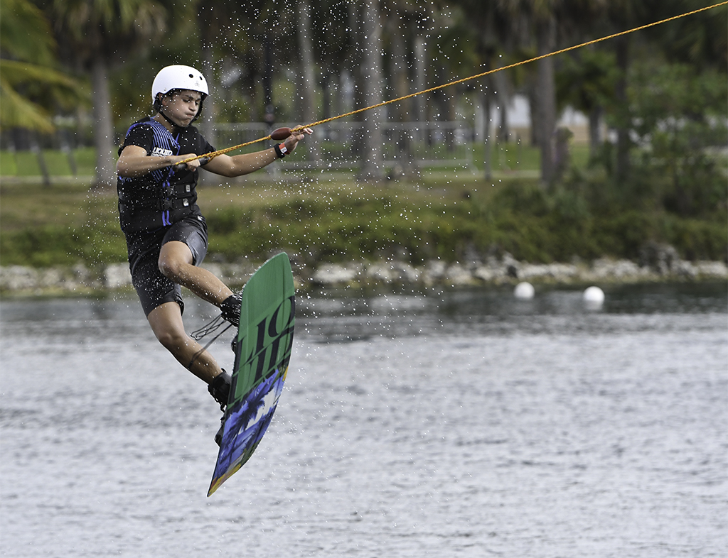
Comment |
Off we go, into the wild blue.....
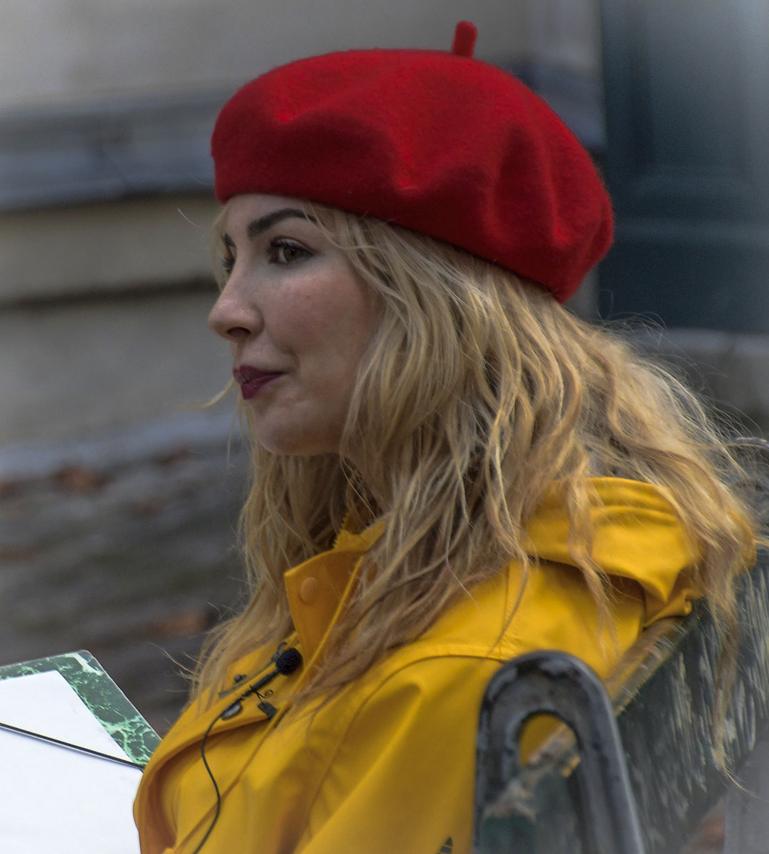
Like the image. Very sharp, good USAF blue color. Bob, I'm a USAF veteran and have never seen those guys without the tan cover. Guessing some 4 star decided that's what they were gonna wear and no one's countermanded. Agree with Karen's crop.
|
Nov 16th |
| 29 |
Nov 18 |
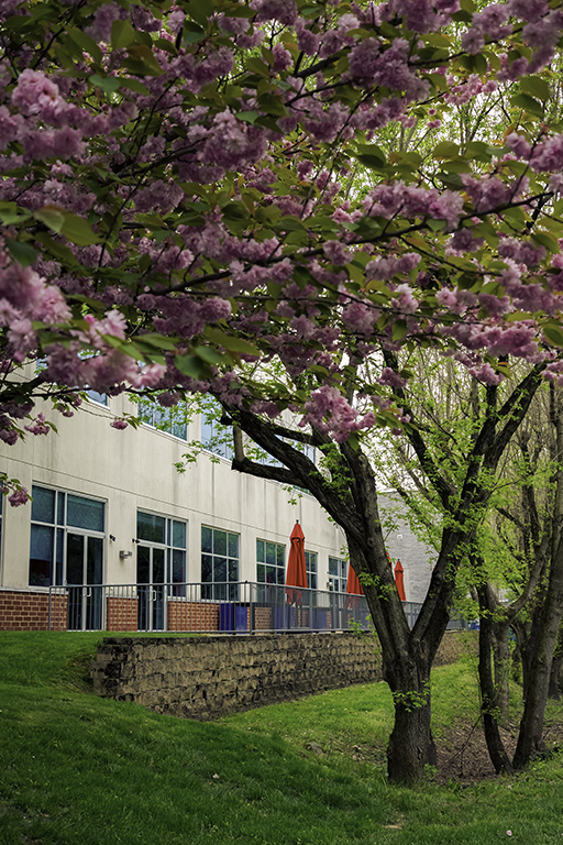
Comment |
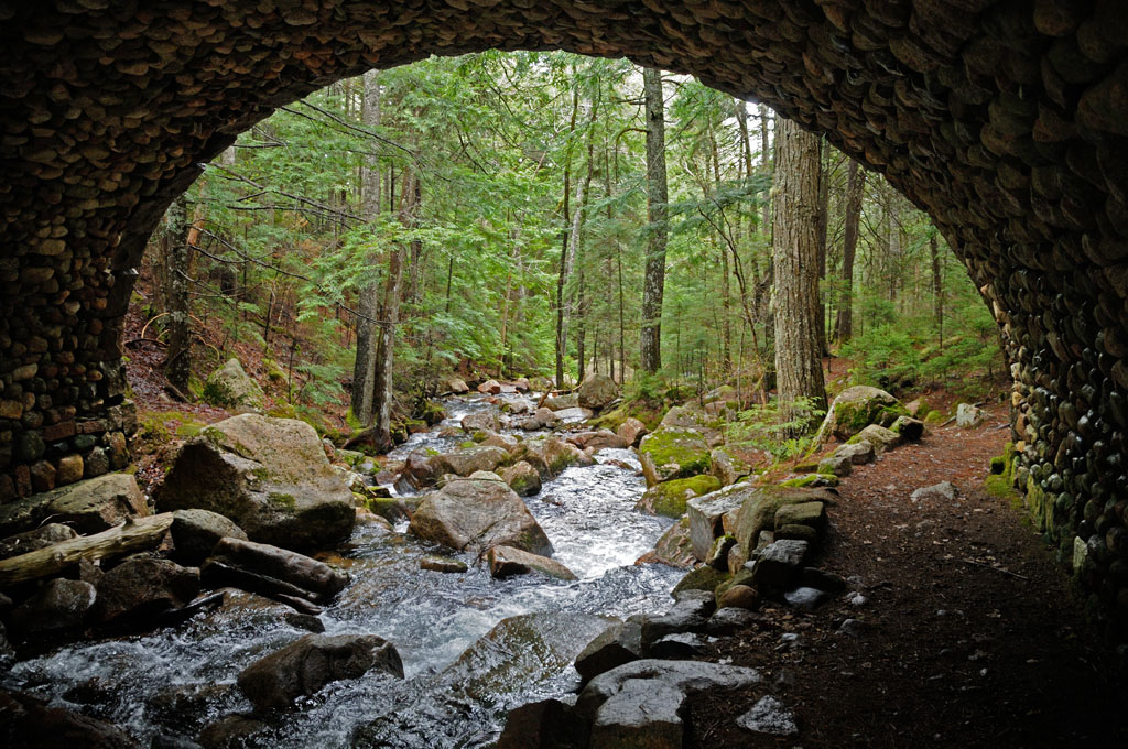
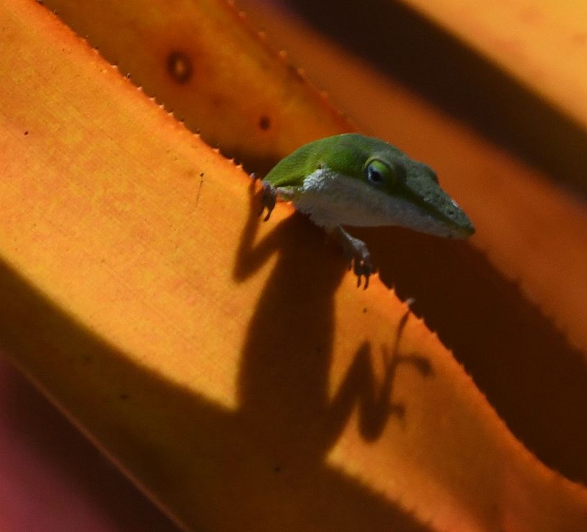
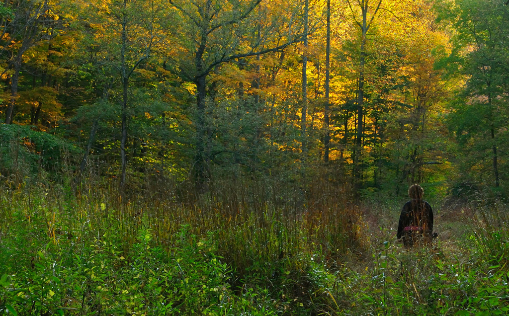
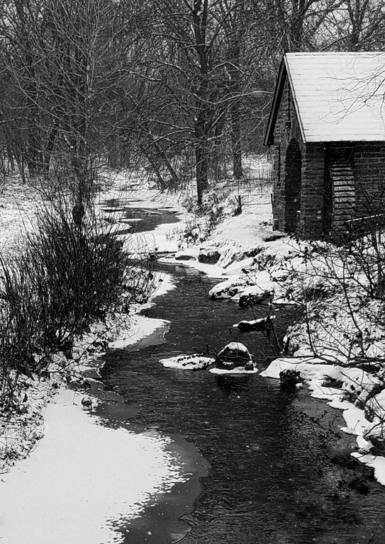
Great fall image. Composed well, really good colors, with some greens and yellows mixed in, very sharp. Love the water. |
Nov 16th |
| 29 |
Nov 18 |
Comment |
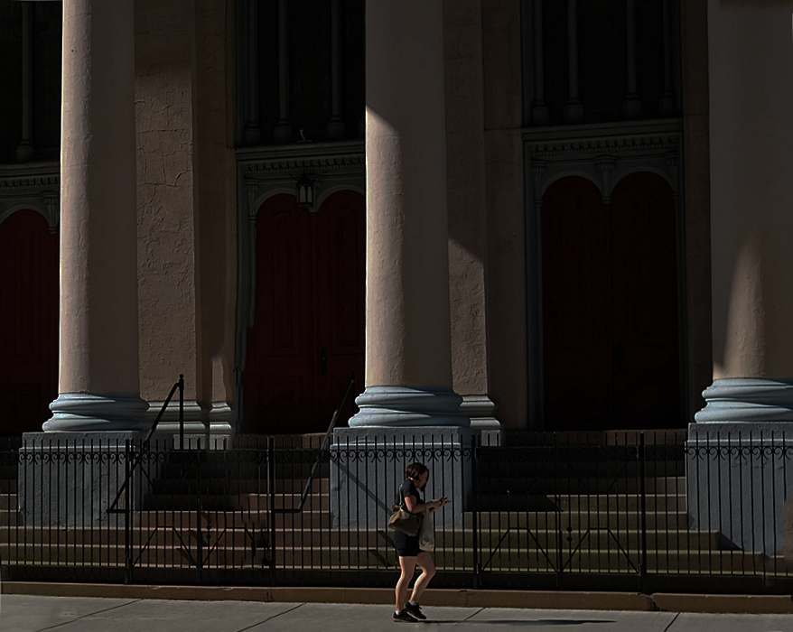
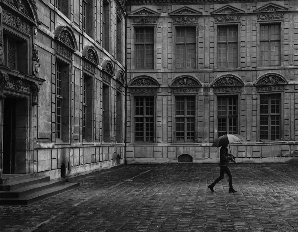
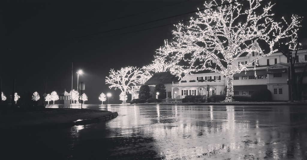
I'm pretty much with Bob on this - I think the image works well in color and is improved with the removal of the lamp peeking out from behind the post. The building is also OK with me since I think it fills out the bottom of the image and it's better that it's there. |
Nov 16th |
| 29 |
Nov 18 |
Comment |
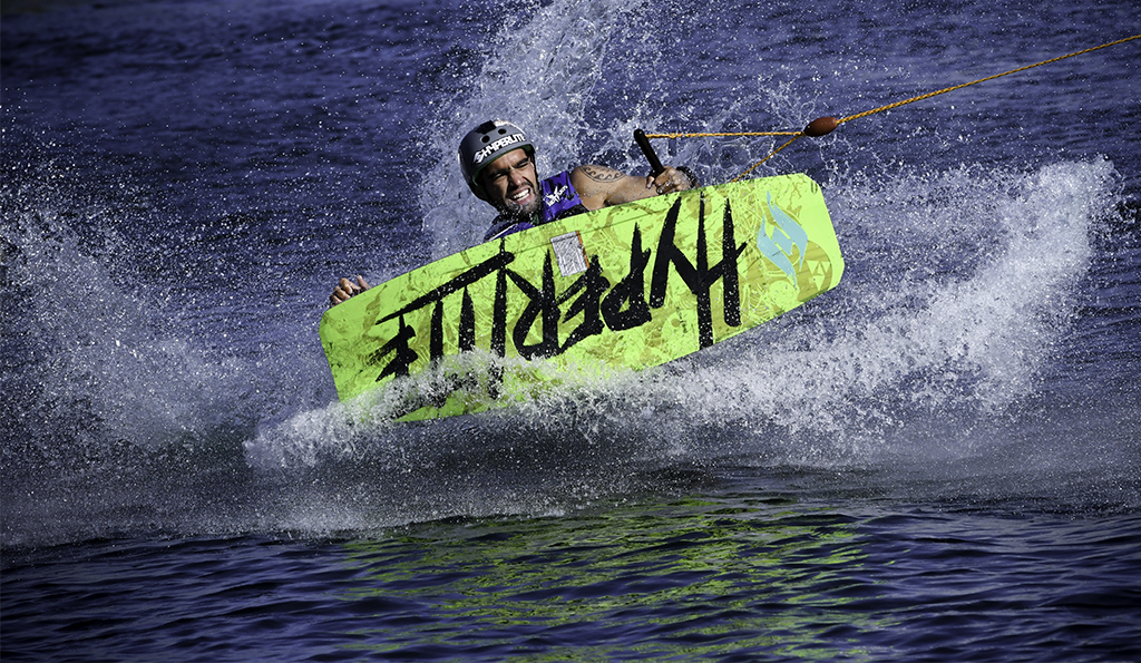
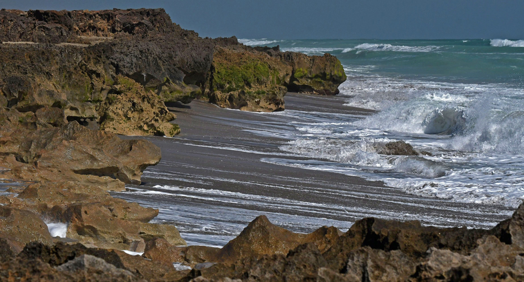
Very intriguing image. Wondering if it's a composite? The break between the underwater part and the wave behind it is pretty stark. Is that normal? The clarity is really good, as are the colors. |
Nov 16th |
| 29 |
Nov 18 |
Comment |
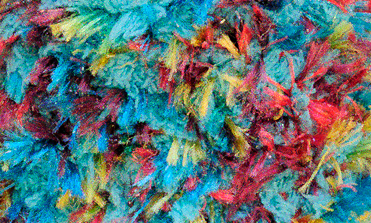
First, hope Dorinda gets LOTS of TLC from her chauffeur.
I like your composition. The textures and clarity are good. I don't play with this stuff, but I like some of what you've done - it's definitely an improvement on the original, makes the image more interesting. I think the blue/green/teal(?) doesn't work very well - maybe there's just too much of it. And the orange is, for me, pretty distracting - I think if you dialed it back it would work with all the other colors. |
Nov 16th |
5 comments - 4 replies for Group 29
|
| 60 |
Nov 18 |
Comment |
I really like this but it's something I'll probably never attempt. I like the bear blowing the snowman bubbles over the mountains. Wondering if you darkened the bear's sweater it would fit better with the rest of the image? |
Nov 27th |
| 60 |
Nov 18 |
Comment |
Very nice image. Like the pink and polka-dotted spoons on top of the pink and polka-dotted cloth. The handles of the spoons provide the right level of contrast to make the image interesting.
This reminded me of a shirt I bought when I was a teenager and my mother refused to iron it because it made her eyes "go goofy". |
Nov 27th |
| 60 |
Nov 18 |
Comment |
Very nice image. Like your composition and the colors are really good. |
Nov 27th |
| 60 |
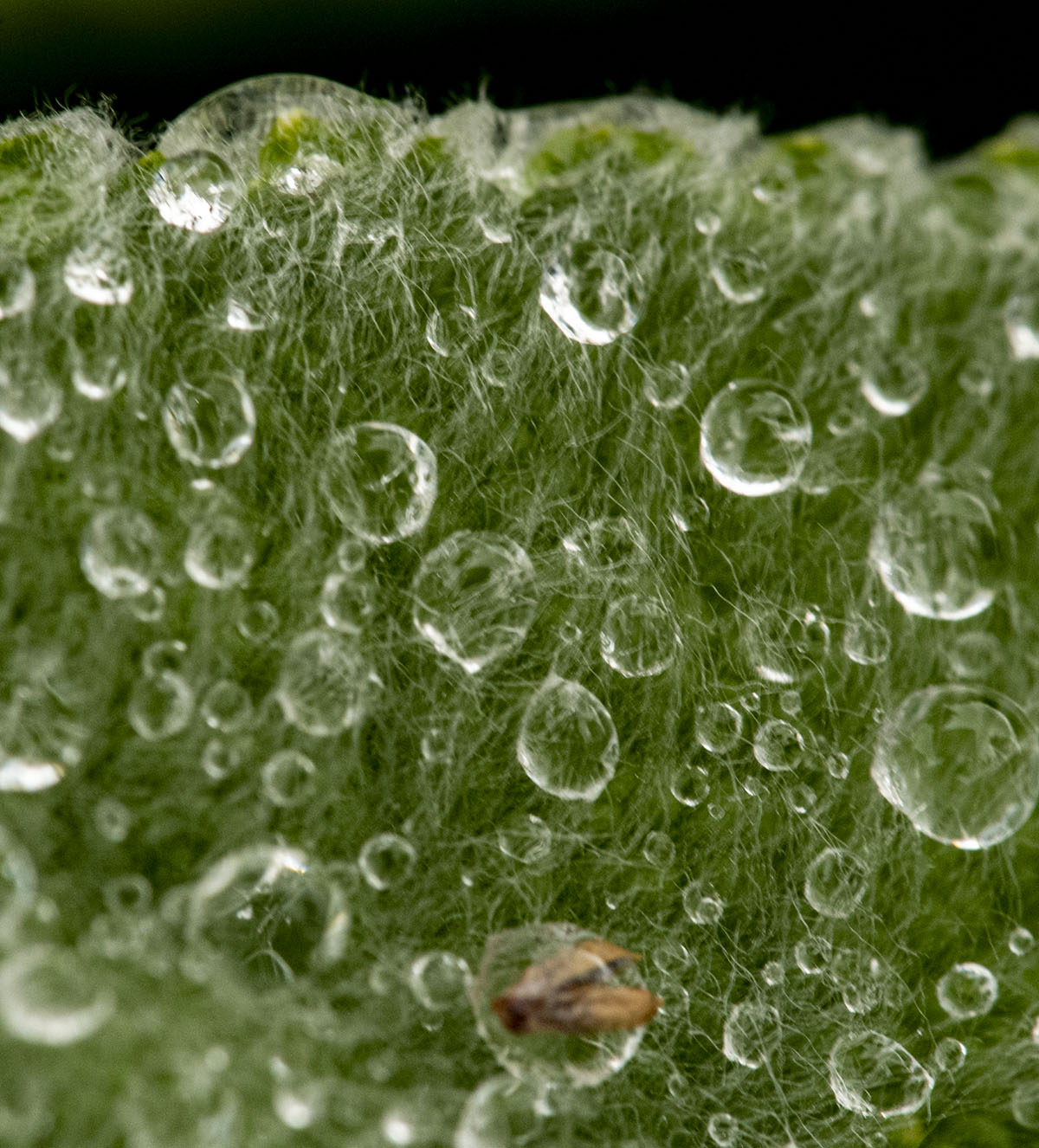
Nov 18 |
Comment |
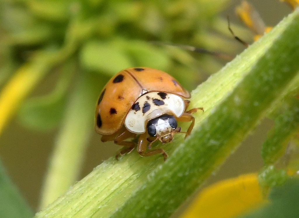
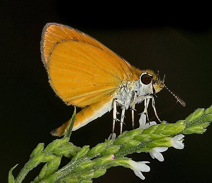
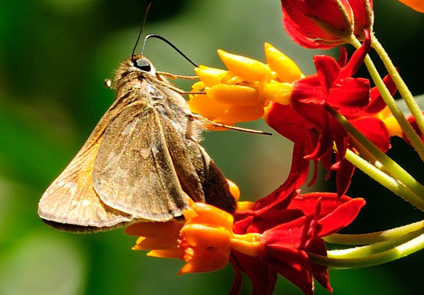
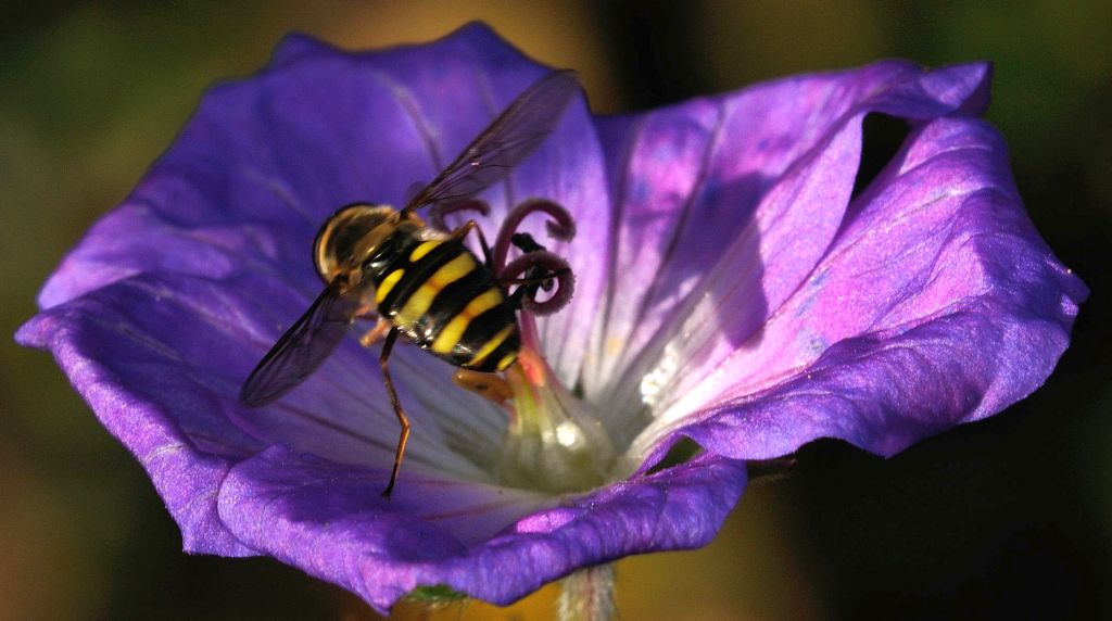
I've taken a lot of shots of jellyfish at the aquarium in Camden, NJ and have never been able to isolate one, even with a crop. This is a really nice shot, with the light highlighting the jellyfish and background almost entirely black.
A tip - when you respond to a previous comment, if you click on reply at the end of that comment, your response will be tied to it, rather than creating a separate block. |
Nov 27th |
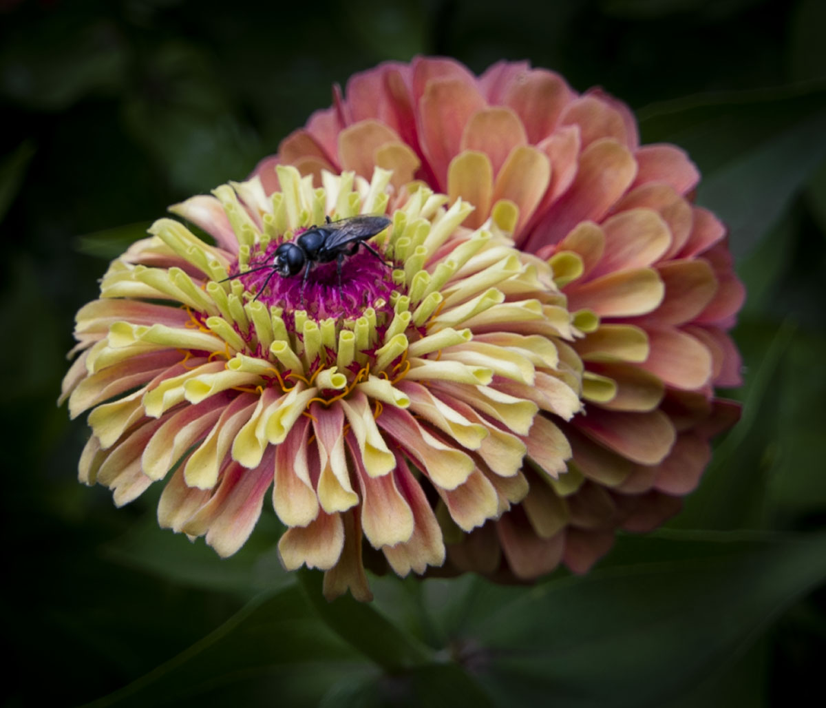
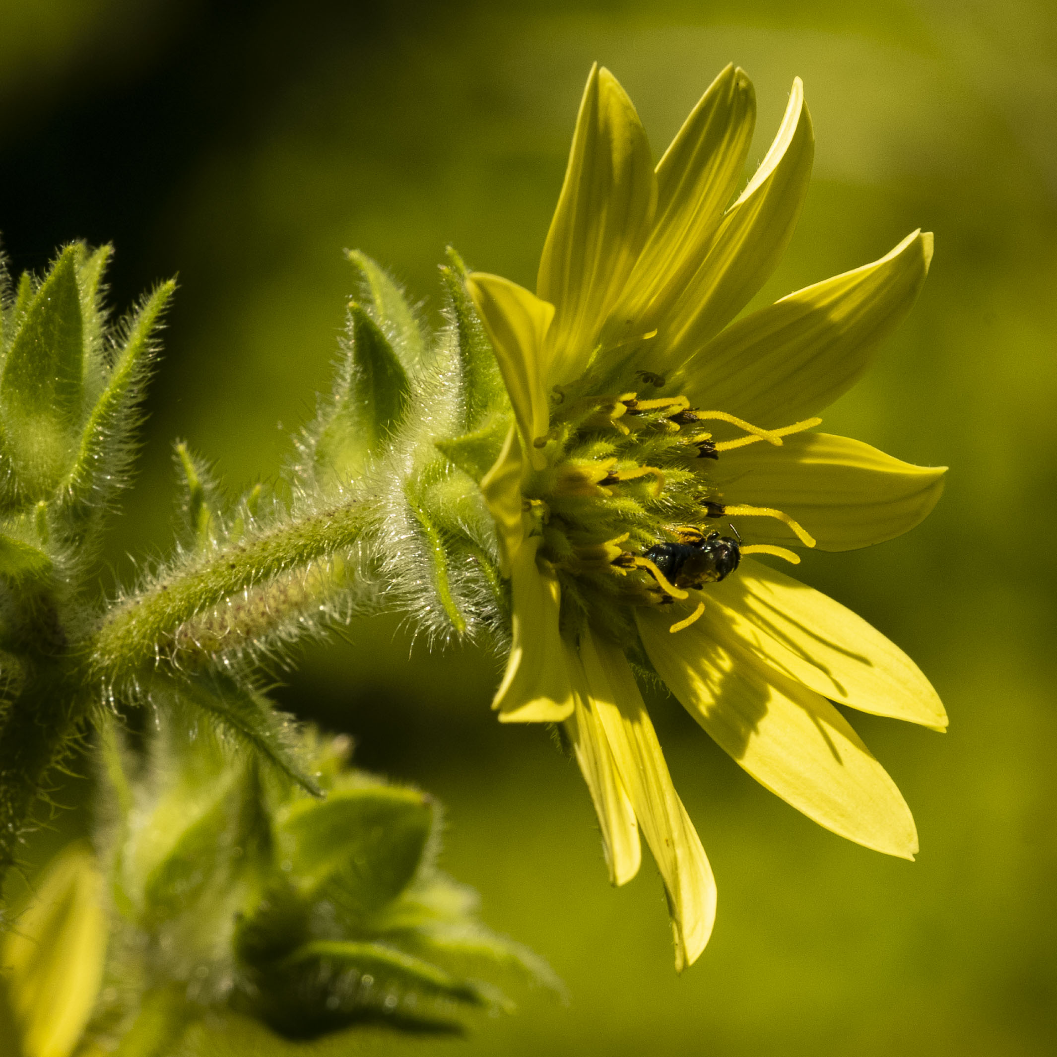
| 60 |
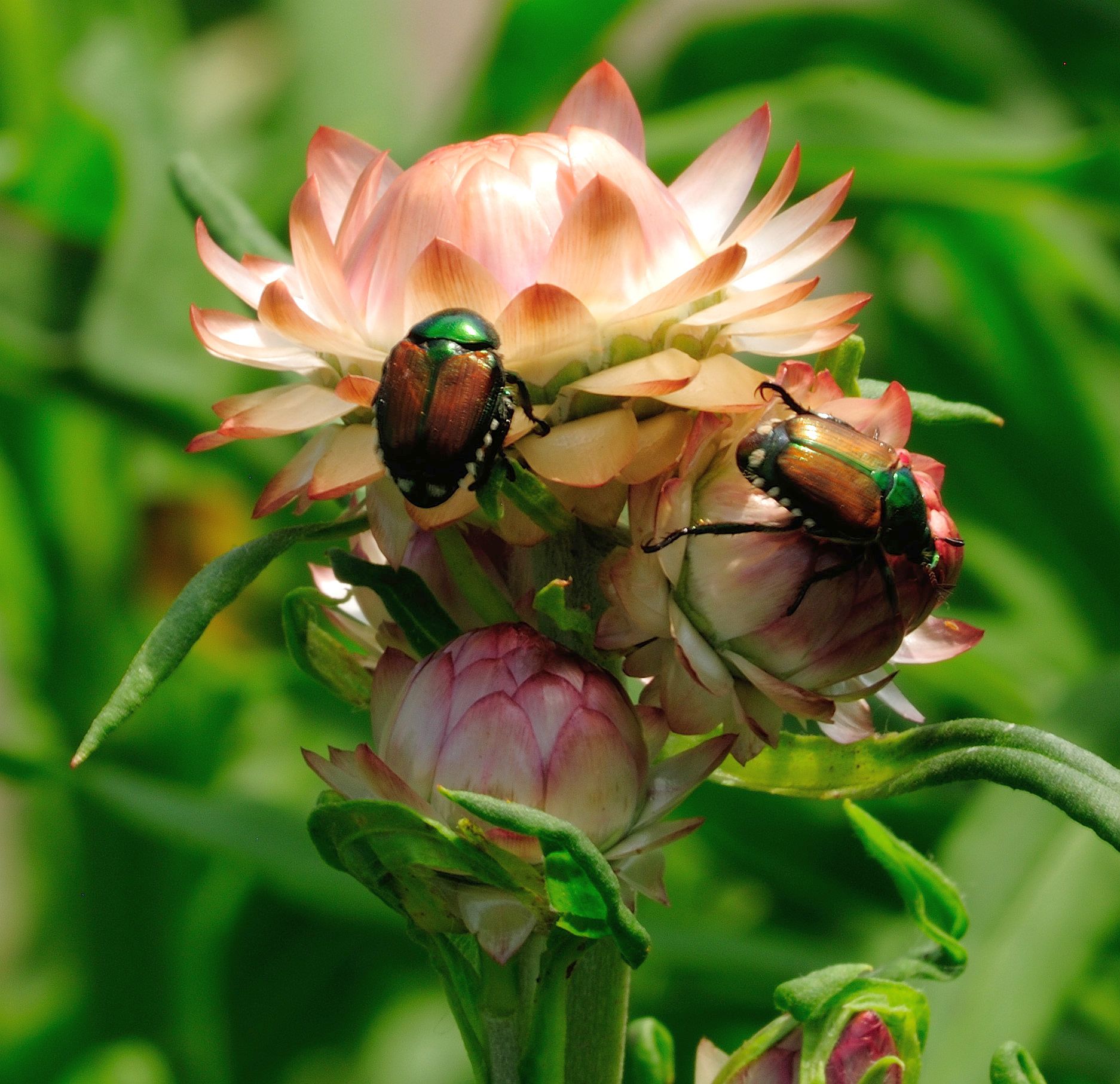
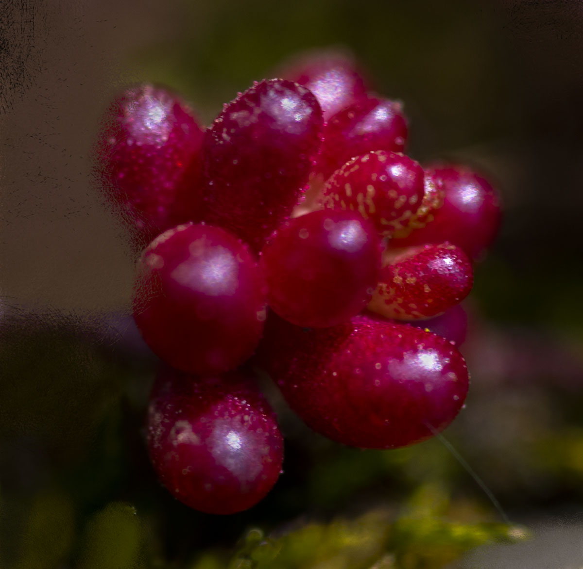
Nov 18 |
Comment |
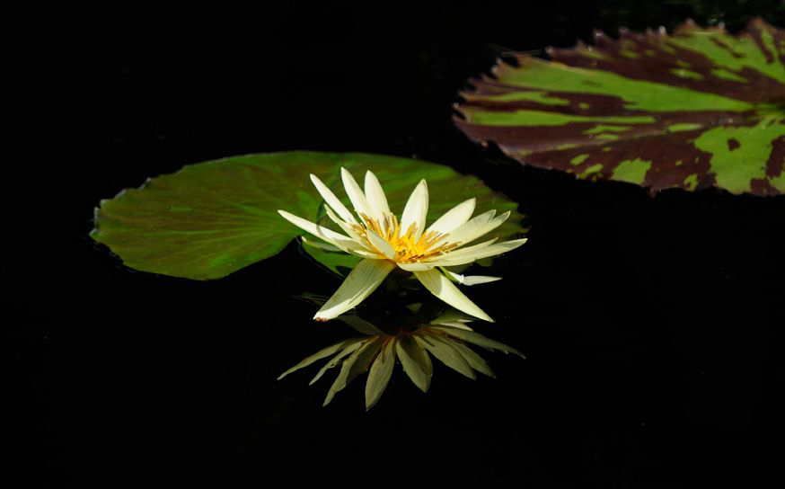
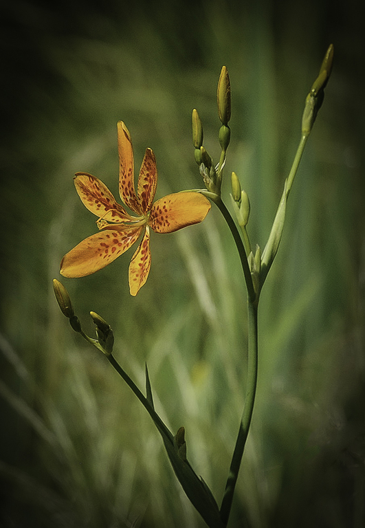
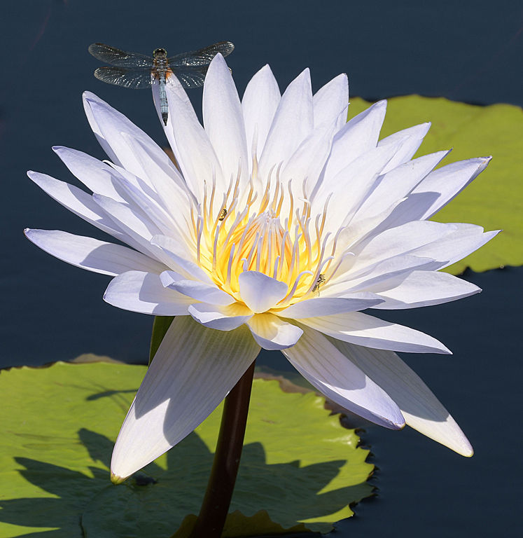
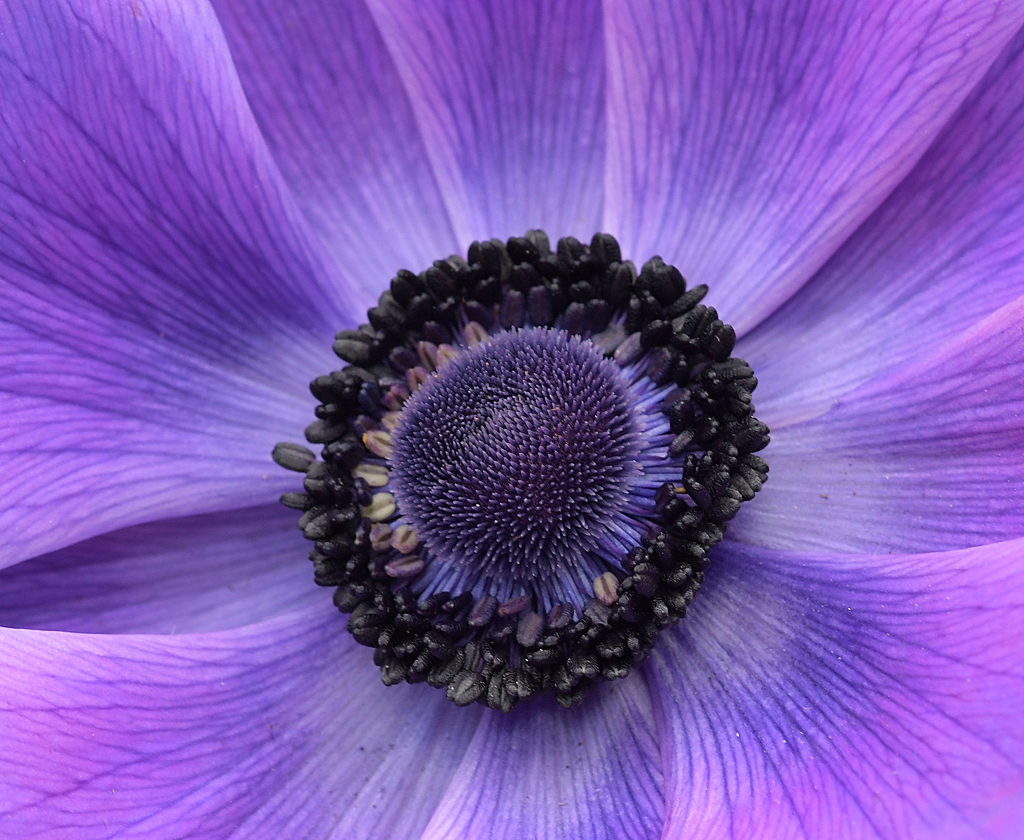
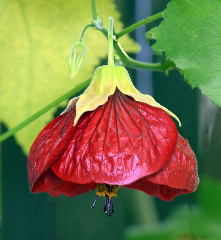
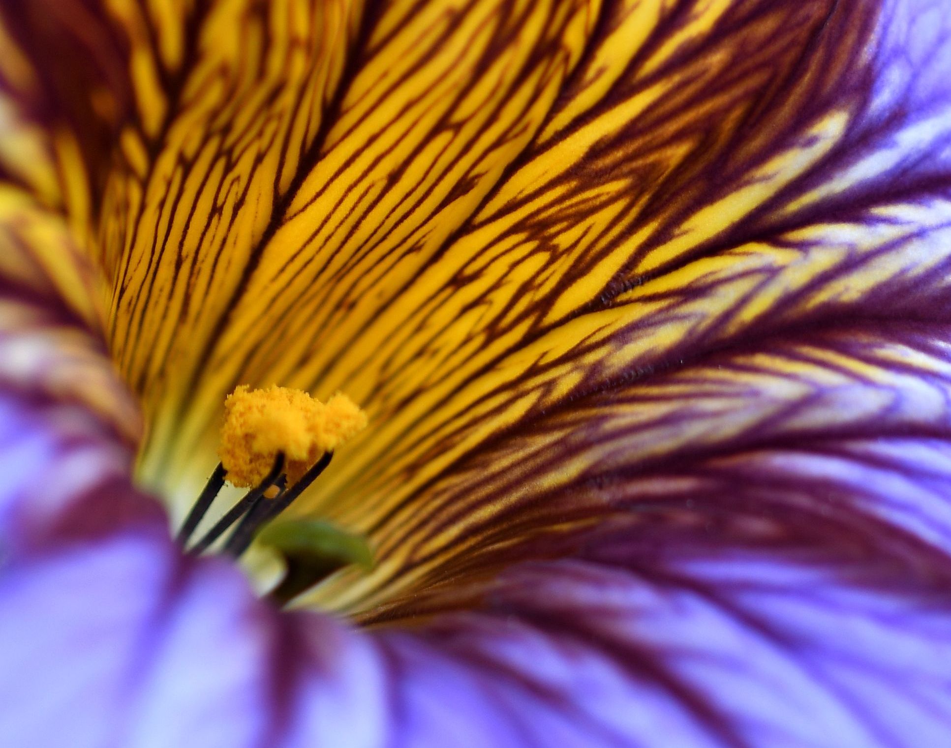
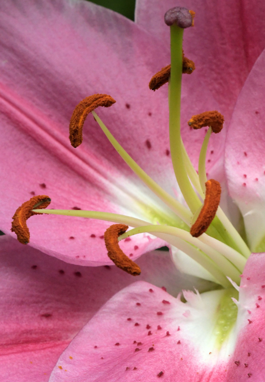
Looks like you caught the flower at the peak of perfection. That just might describe your capture and treatment of it also. Great shot! I really like the composition, particularly the white on black. |
Nov 27th |
5 comments - 0 replies for Group 60
|
| 74 |
Nov 18 |
Comment |
Military cemeteries images are always a bit emotional for me. I'm a veteran and my late wife is buried in a military cemetery. This particular cemetery is a little strange in that it appears the rows are arced, rather than the typical formation that shows rows and columns regardless of one's viewing angle.
I agree with Arne's comment regarding the aperture, it's perfect for setting the MOH grave above and apart from the others. I also think the image is much better in B&W. Very well done. |
Nov 14th |
| 74 |
Nov 18 |
Comment |
Thank you for the explanation. My first thought was that I was looking at something that's rather common here is the US - street art. I like that you told me that's not what's happening and exposed me to your culture. I really like the conversion to B&W and the composition. |
Nov 14th |
| 74 |
Nov 18 |
Comment |
Thanks for explaining what goes into making your art so special. The difference between original and "finished product" is definitely "eye opening". I particularly like the black background which eliminates any distractions from the portraits. |
Nov 14th |
| 74 |
Nov 18 |
Comment |
I like your composition, and while I understand Arne's point about the busy foreground, I'm so deficient in cloning skills that I'd never consider removing those bushes.
I really like this image in B&W and agree with the comments about lowering the contrast in the sky. |
Nov 14th |
| 74 |
Nov 18 |
Comment |
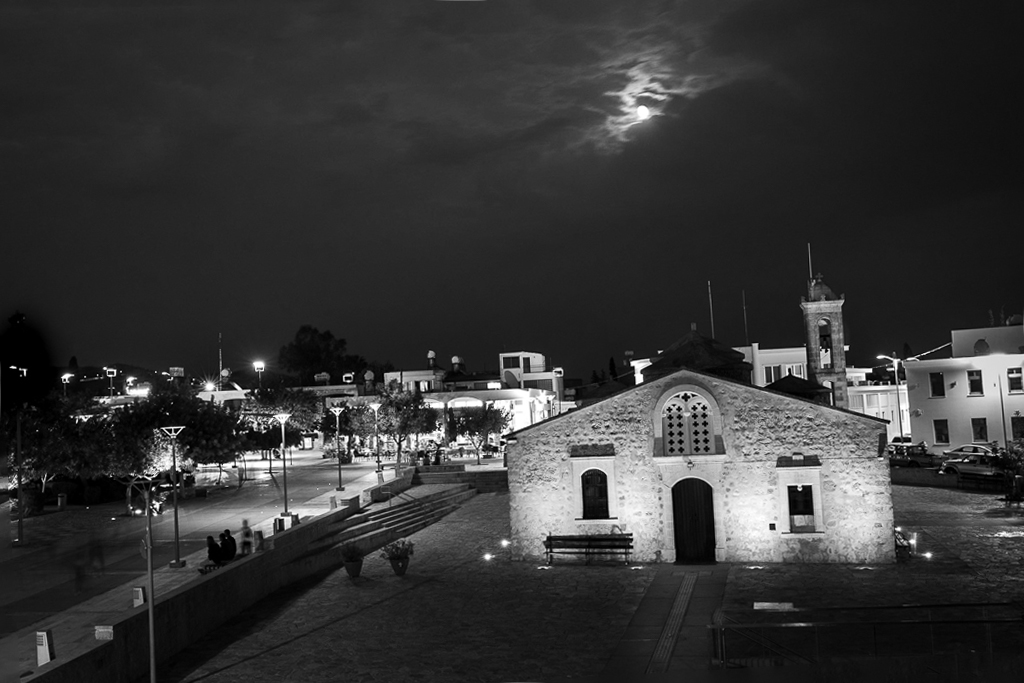
I like your composition, and cropping. This image, for me, is much better in B&W. I, too, like the moon peeking out of the clouds. The only thing I have suggestion for is straightening the building in the foreground. What do you think of this? |
Nov 14th |
 |
5 comments - 0 replies for Group 74
|
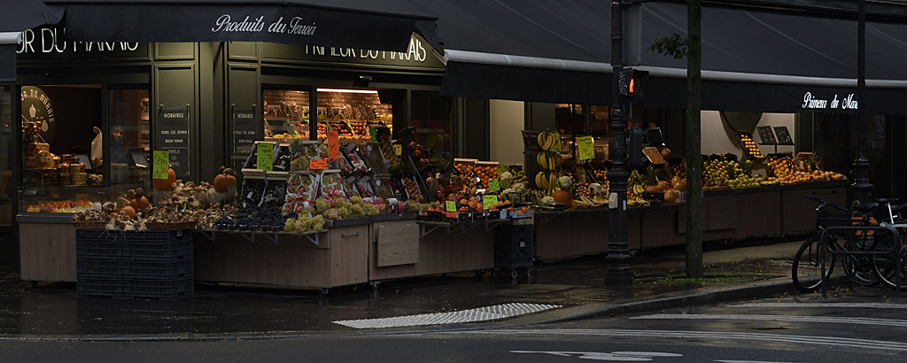
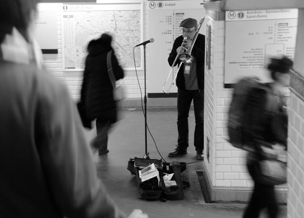
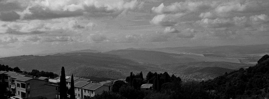
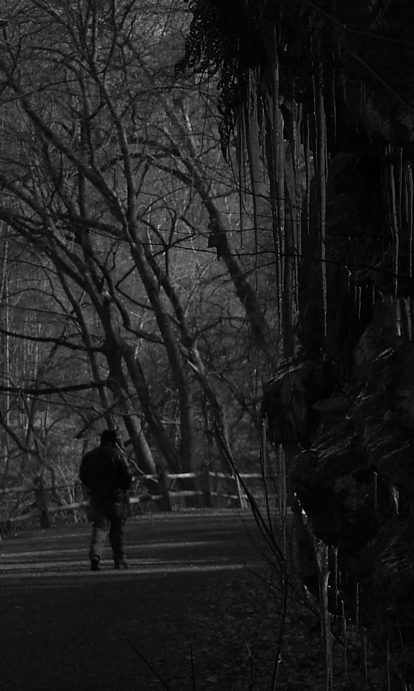
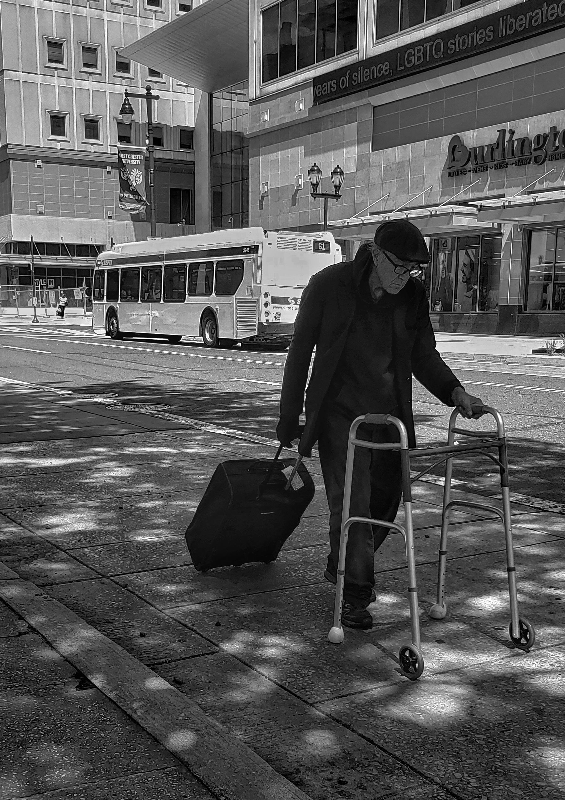
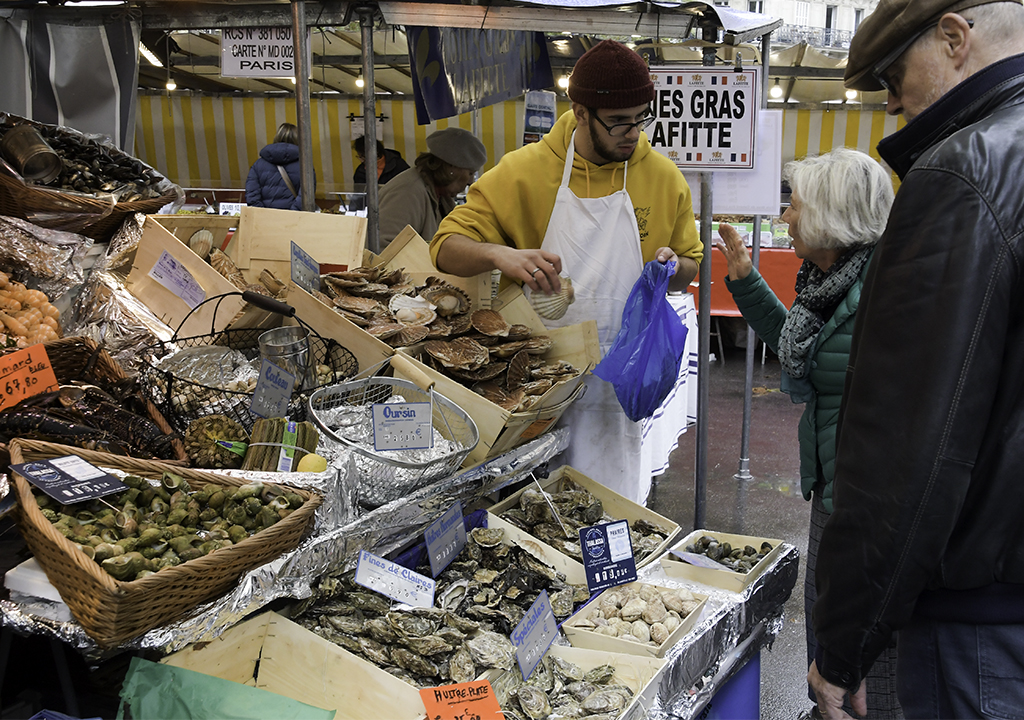
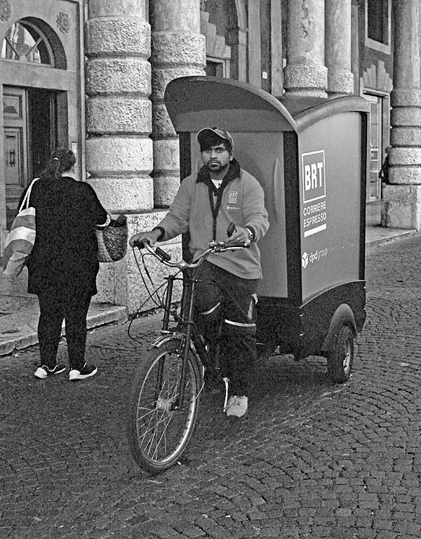
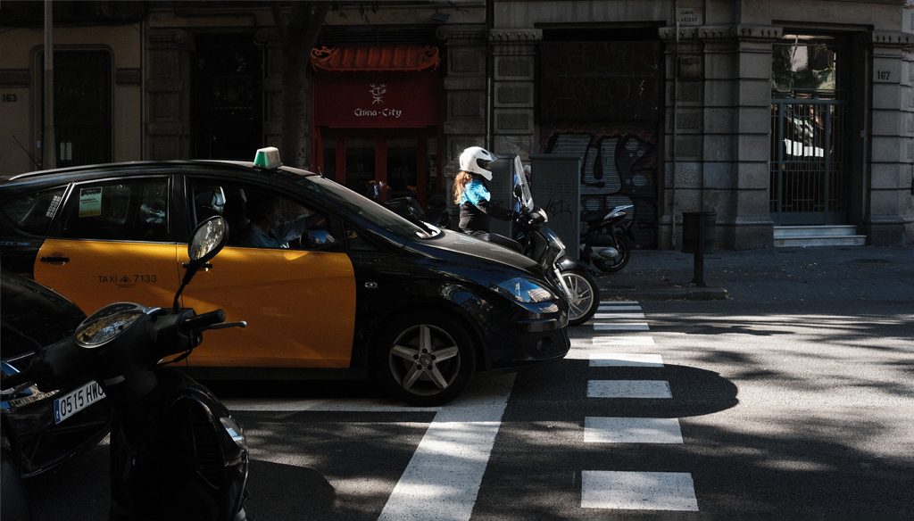
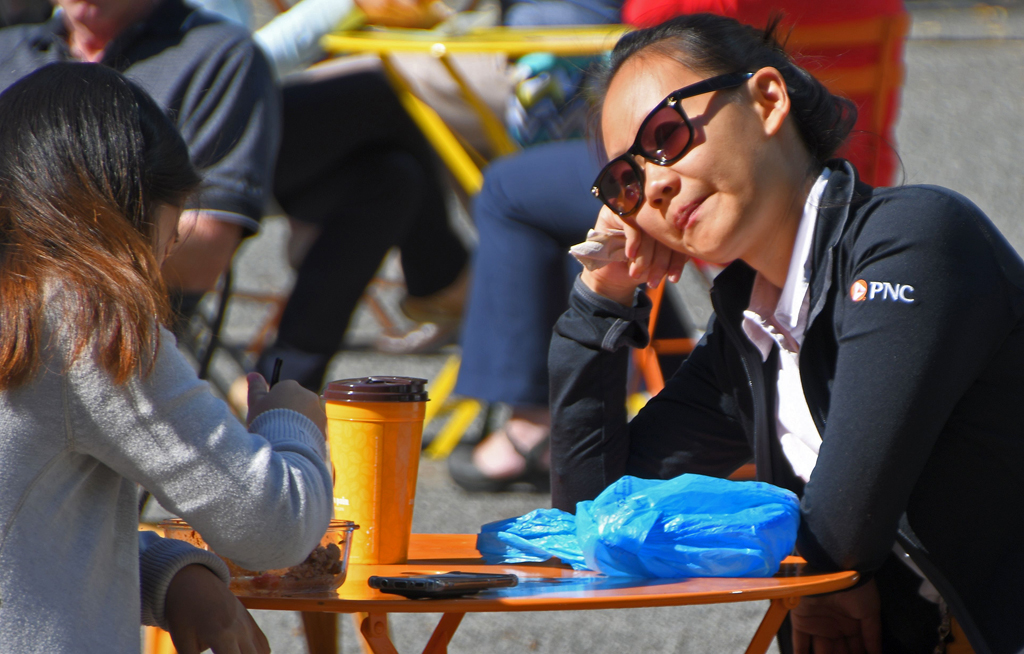
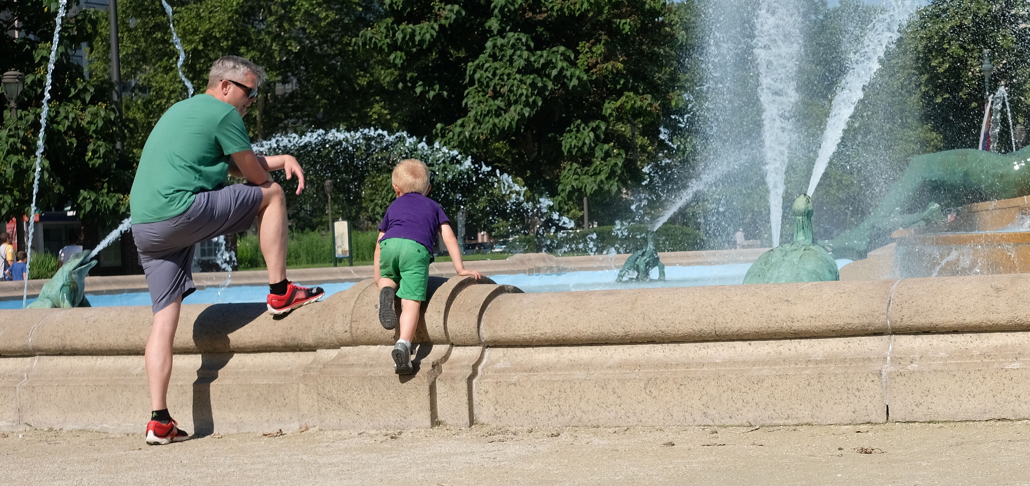
| 80 |
Nov 18 |
Comment |
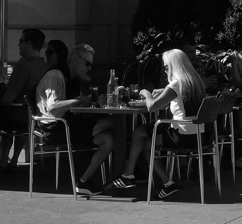
Interesting image. I'm generally reluctant to approach homeless people because you simply don't know what their reaction may be. Then again, I'm one of the people who NEVER asks permission to take someone's picture. I really like your composition. Agree with Hattie that it's heavy on highlights and think her darkening make it more interesting. I like the reason that you're fond of the image and I'd be inclined to keep it for the same reason. |
Nov 14th |
| 80 |
Nov 18 |
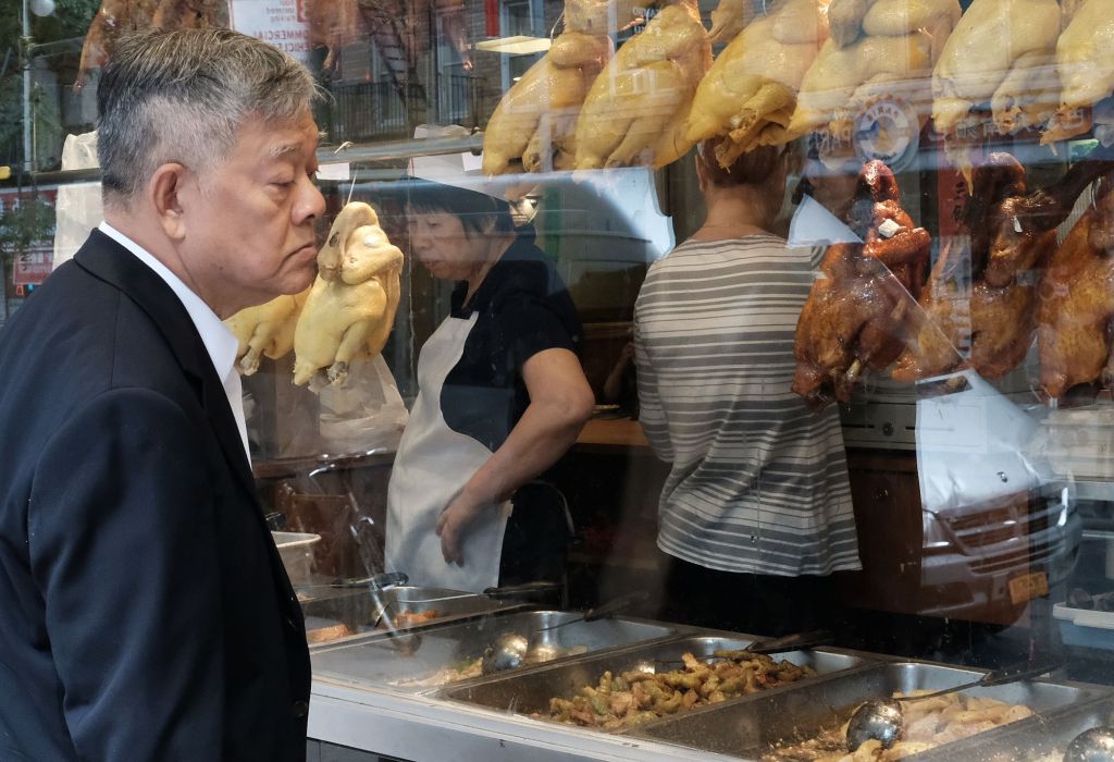
Comment |
I like that you waited for what you wanted to capture in the image. I think too many of us are too impatient to do that. Getting good shots through windows that show reflections is one of my favorite things and I really like this image - nice composition, good color and sharpness, and story-telling. |
Nov 14th |
| 80 |
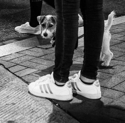
Nov 18 |
Comment |
I agree with Bev & Hattie that it's all about the dog, who you've captured with really good clarity. I also agree with Hattie about the distraction of the legs, but I think cropping out most of the image and really putting the emphasis on dog works best for me. What do you think? |
Nov 14th |
 |
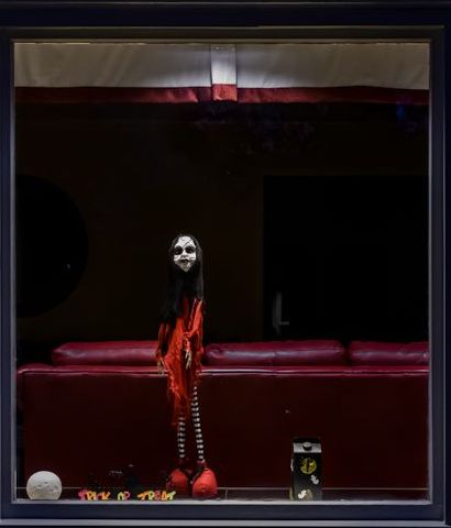
| 80 |
Nov 18 |
Comment |
I think you definitely captured the spirit of Halloween. Really like the light and colors. Wonder what you think of this cropping, which eliminates the side window and frames the scene with the window frame? |
Nov 14th |
 |
4 comments - 0 replies for Group 80
|
19 comments - 4 replies Total
|