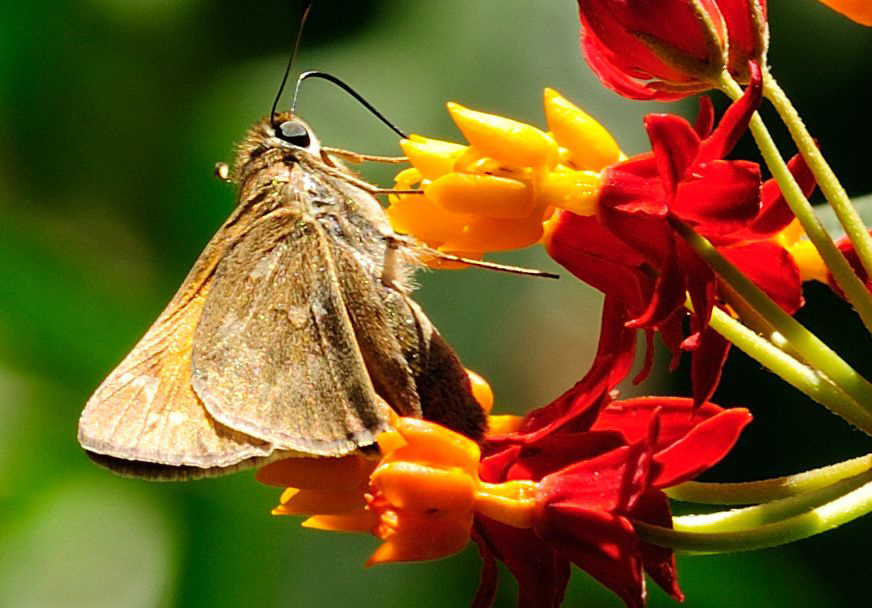
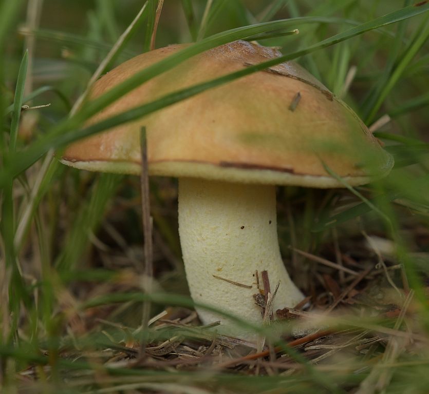
|
| Group |
Round |
C/R |
Comment |
Date |
Image |
| 29 |
Sep 18 |
Reply |
Suffice to say that our definitions of "FUN" are pretty different! |
Sep 17th |
| 29 |
Sep 18 |
Comment |
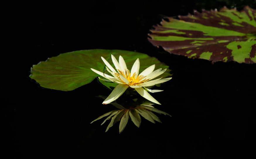
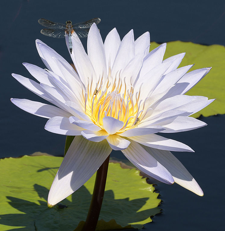
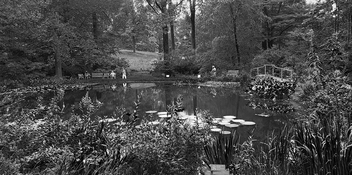
I've taken hundreds of water lily shots and I'd sure be happy with this one. Very nice shot. As you might suspect after seeing my shot this month, I like Judy's 2nd option. |
Sep 16th |
| 29 |
Sep 18 |
Reply |
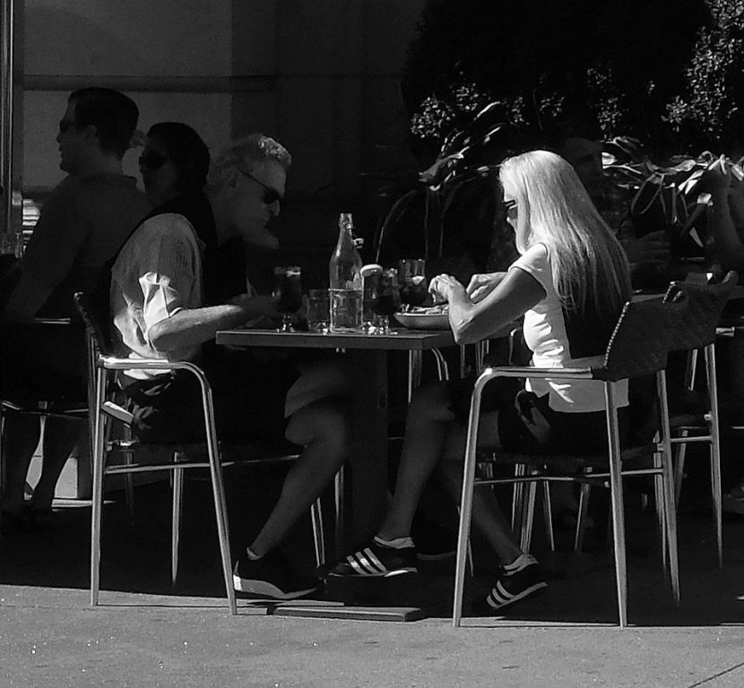
Not only is Longwood not free, but with the makeover of the fountains the single membership is now almost $100. It's still worth it to me. I try to get there monthly. |
Sep 16th |
| 29 |
Sep 18 |
Comment |
This is a very nice image Tam. I like Judy's crop and color adjustments. |
Sep 16th |
| 29 |
Sep 18 |
Comment |
Like this shot a lot, for all the reasons Bob mentioned. It always bothers me to see those ladders. |
Sep 16th |
| 29 |
Sep 18 |
Comment |
Place looks to be in pretty good shape for an abandoned mental hospital (we seem to have a bunch of those in PA?). I'll join the eye comments - it definitely makes the shot for me. Like the sharp composition and colors. |
Sep 16th |
| 29 |
Sep 18 |
Comment |
I think you got a nice color and sharpness for a "grab & shoot" image. Agree with the glare issue. I think the fact that Lucas has that "what are they doing" looking on his face makes his looking past the camera the correct pose. I also like the juxtaposition of the emblem on his shirt and the "love locks" on the grid of the fence (or maybe it's the typical bridge locks?). |
Sep 16th |
| 29 |
Sep 18 |
Comment |
Like the shot. Like Judy's mods, particularly the crop. I think the B&W conversion is a little too grainy. |
Sep 16th |
6 comments - 2 replies for Group 29
|
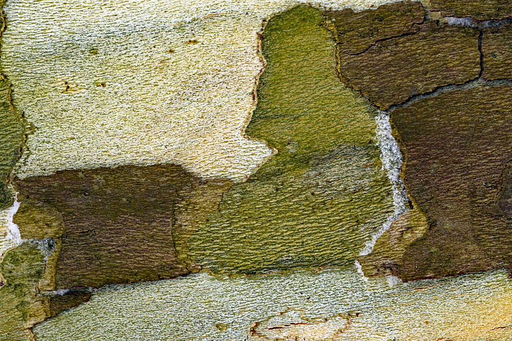
| 60 |
Sep 18 |
Comment |
Hello Will! I'm in agreement with the rest of the group that it's the dark leaf that makes the image and that the crop that Bob suggested really brings that out. |
Sep 25th |
| 60 |
Sep 18 |
Comment |
Neat shot Bob! Nice composition with a couple of "eyes" looking at us. Color is not what I'm used to seeing in Swiss, but your explanation is good. Nice texture and it does have an abstract feel as Carol mentioned. I'm really wondering if this real Swiss...or a shot of the "hat" you wear on Sundays during the fall? :-D |
Sep 25th |
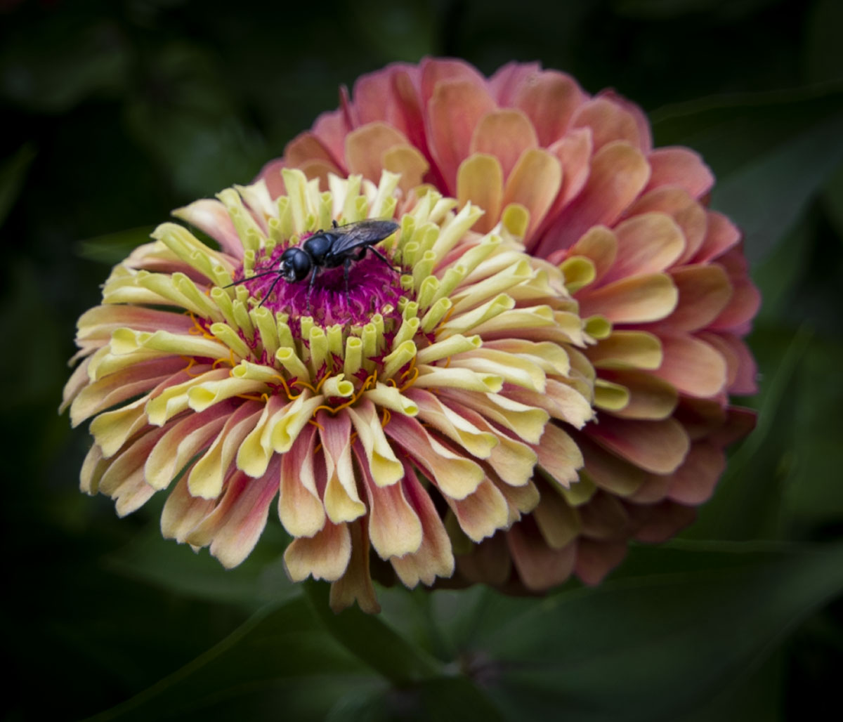
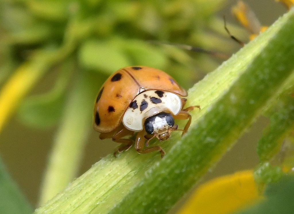
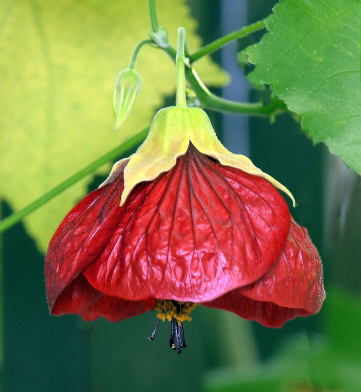
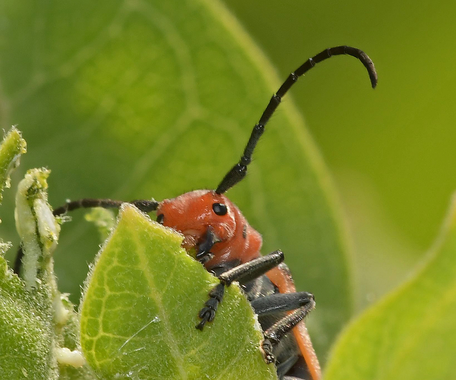
| 60 |
Sep 18 |
Comment |
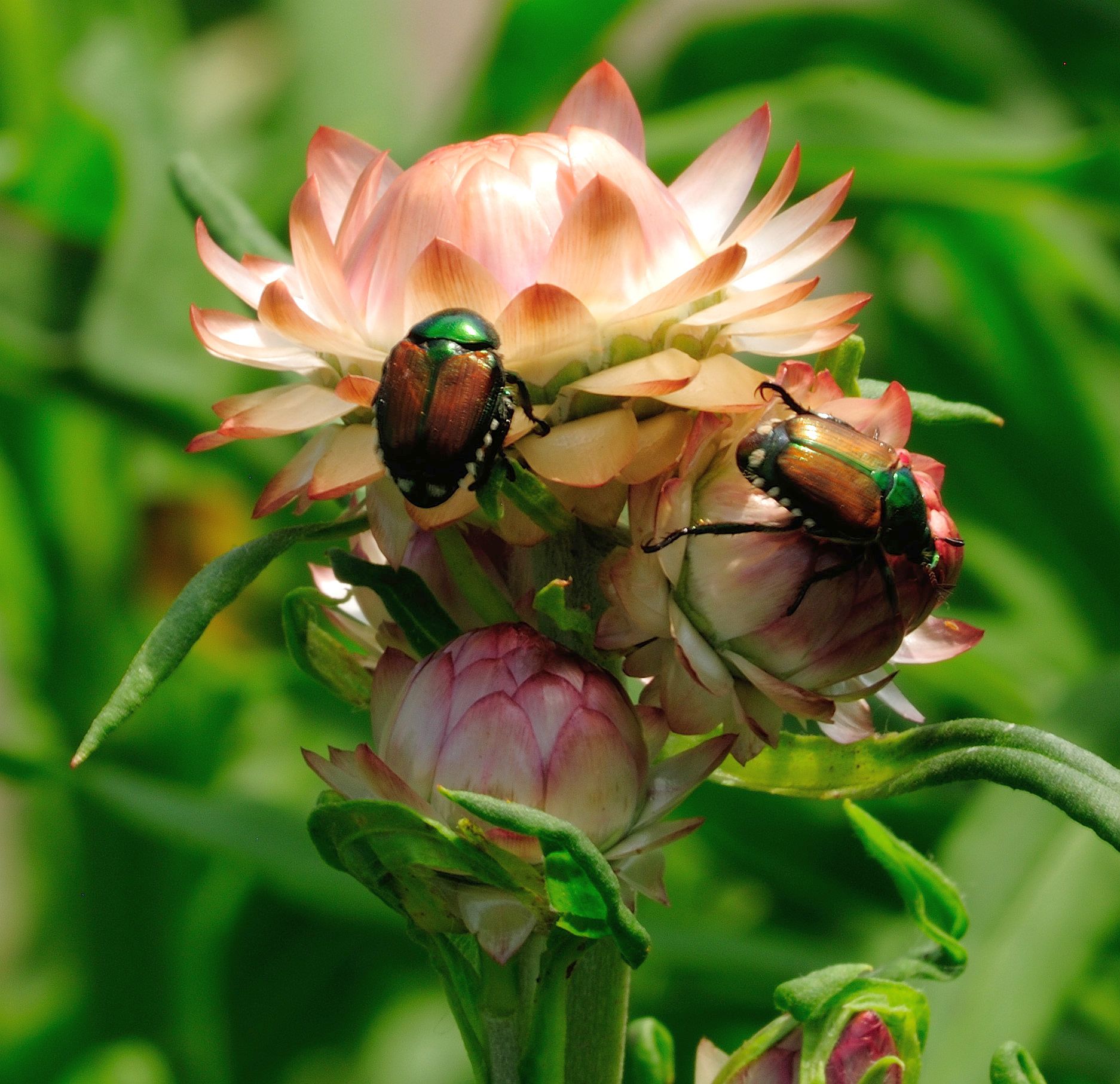
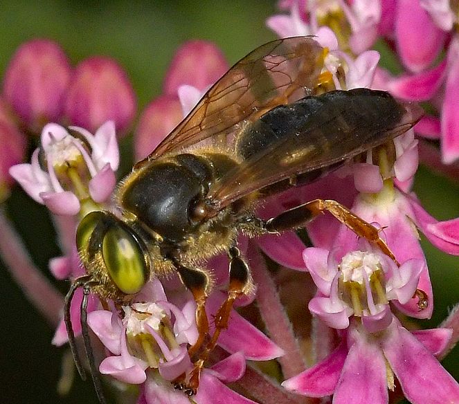
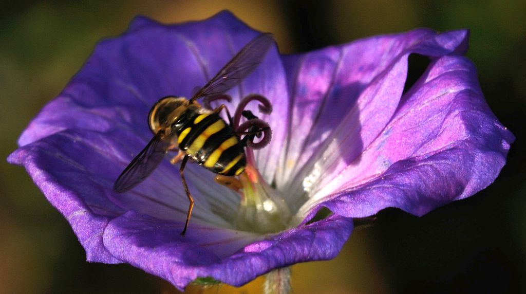
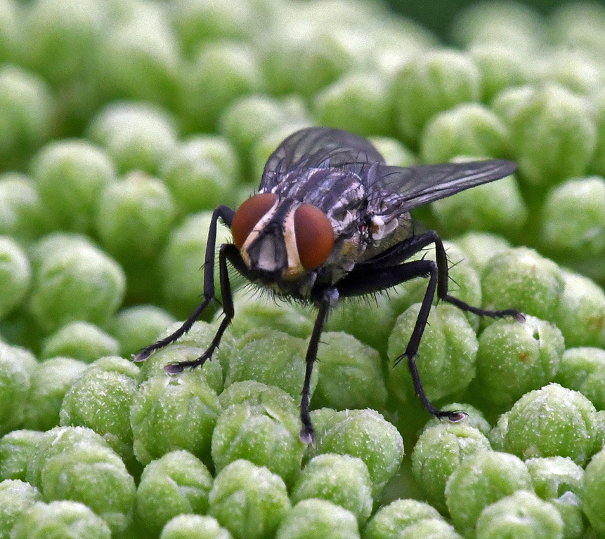
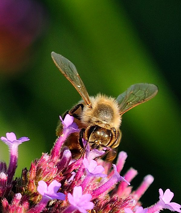
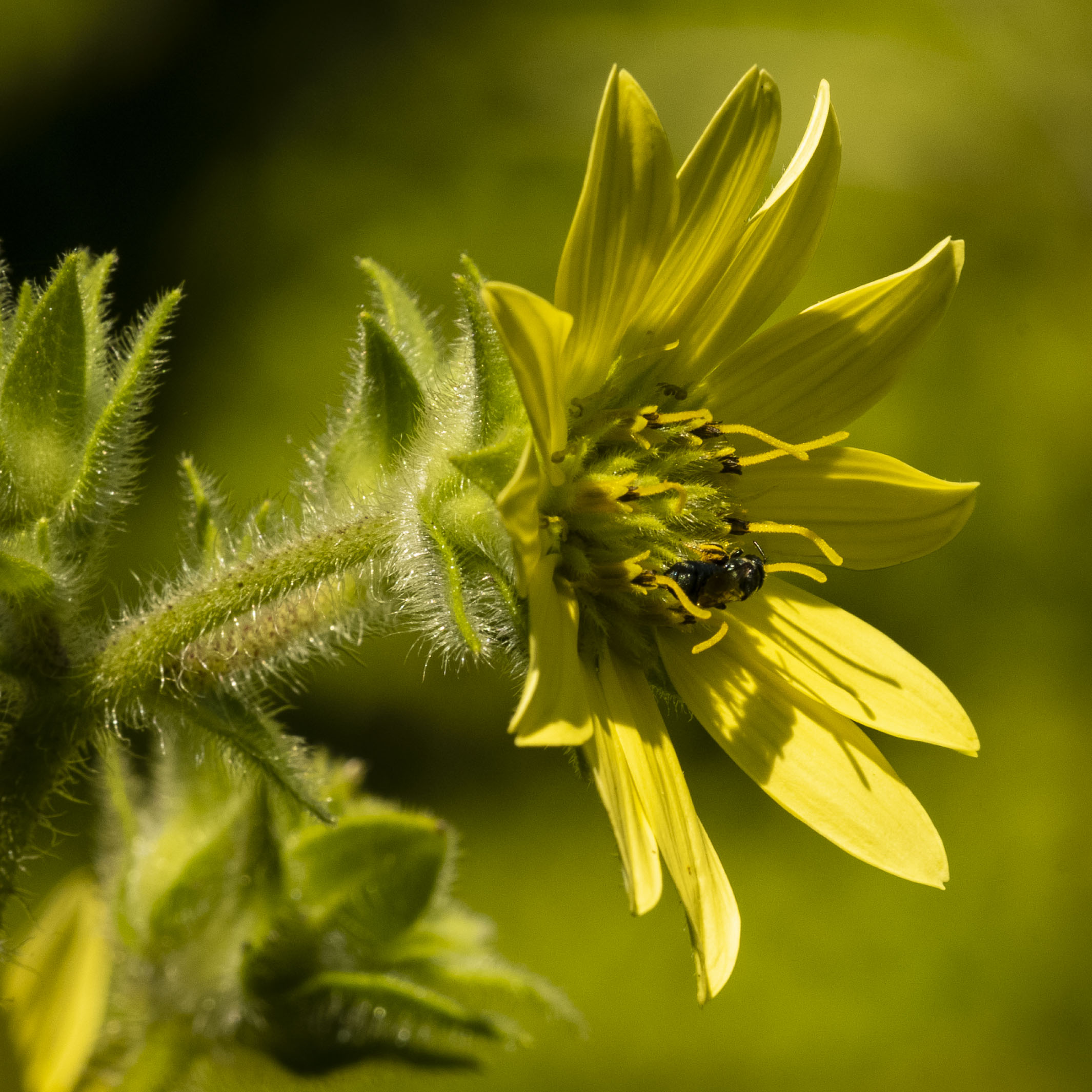
I think is a great shot Nadia. I would be very happy to have this in my insect image collection. Maybe because I spend so much time "insect hunting", I'm really drawn to the bee's head and, particularly, it's eye. Not that I'm not conscious of the red pollen sac, but it's the eye that grabs mine. Really good colors and great sharpness. Almost feels like it should have a yellow frame and the words "National Geographic" at the top! |
Sep 25th |
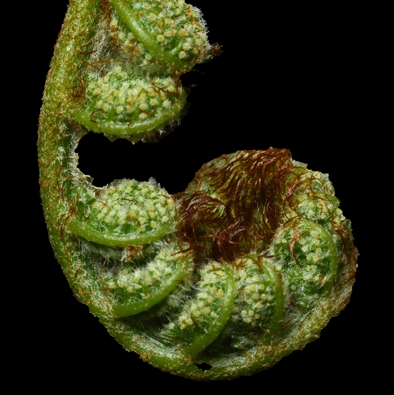
| 60 |
Sep 18 |
Comment |
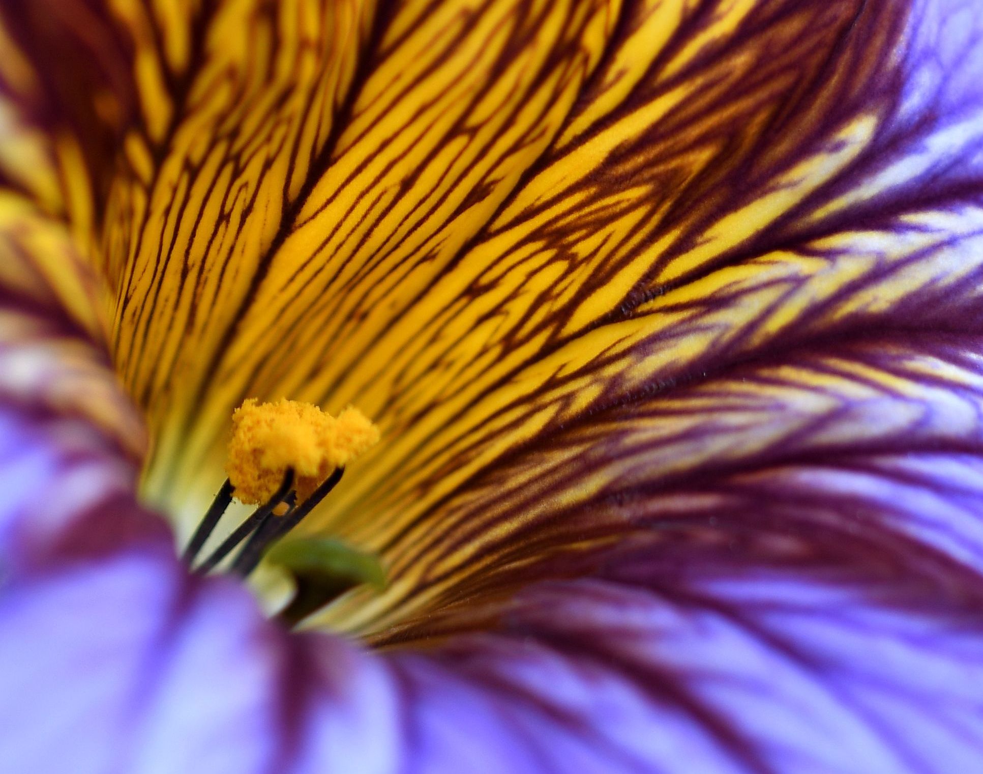
Spent the past weekend in NYC, where it's beginning to feel like fall, although the colors haven't arrived there just yet.
I like the composition of your image and the range of colors that reminds us of what's coming. I agree with Nadia about the two red stems, very eye-catching and lead directly into the great colors of the main leaf in the composition. I also agree with those who aren't fans of white vignetting. |
Sep 25th |
| 60 |
Sep 18 |
Comment |
Thanks Carol. The image under Bob's reply is not cropped. It's the untouched image as it comes from the camera. It's slightly brighter than what my eye saw looking at the leaves, which is why I darkened it a bit in PSElements. |
Sep 17th |
| 60 |
Sep 18 |
Reply |
Bob, this is a portion of comment made about an image in another group I belong to: "It is funny, having read some of your comments in which you flip the image. East reads right to left, and west reads left to right. Our eyes are trained to see images in the same manner.". I don't know that I agree with the idea that our eyes are "trained" to see that way. |
Sep 17th |
| 60 |
Sep 18 |
Reply |
Thanks Bob. Here's the original image with nothing done to it but resizing. |
Sep 8th |
 |
| 60 |
Sep 18 |
Reply |
Thanks Will. |
Sep 8th |
| 60 |
Sep 18 |
Reply |
Hi Nadia, thank you!
Yes, the speed is definitely 1/15.
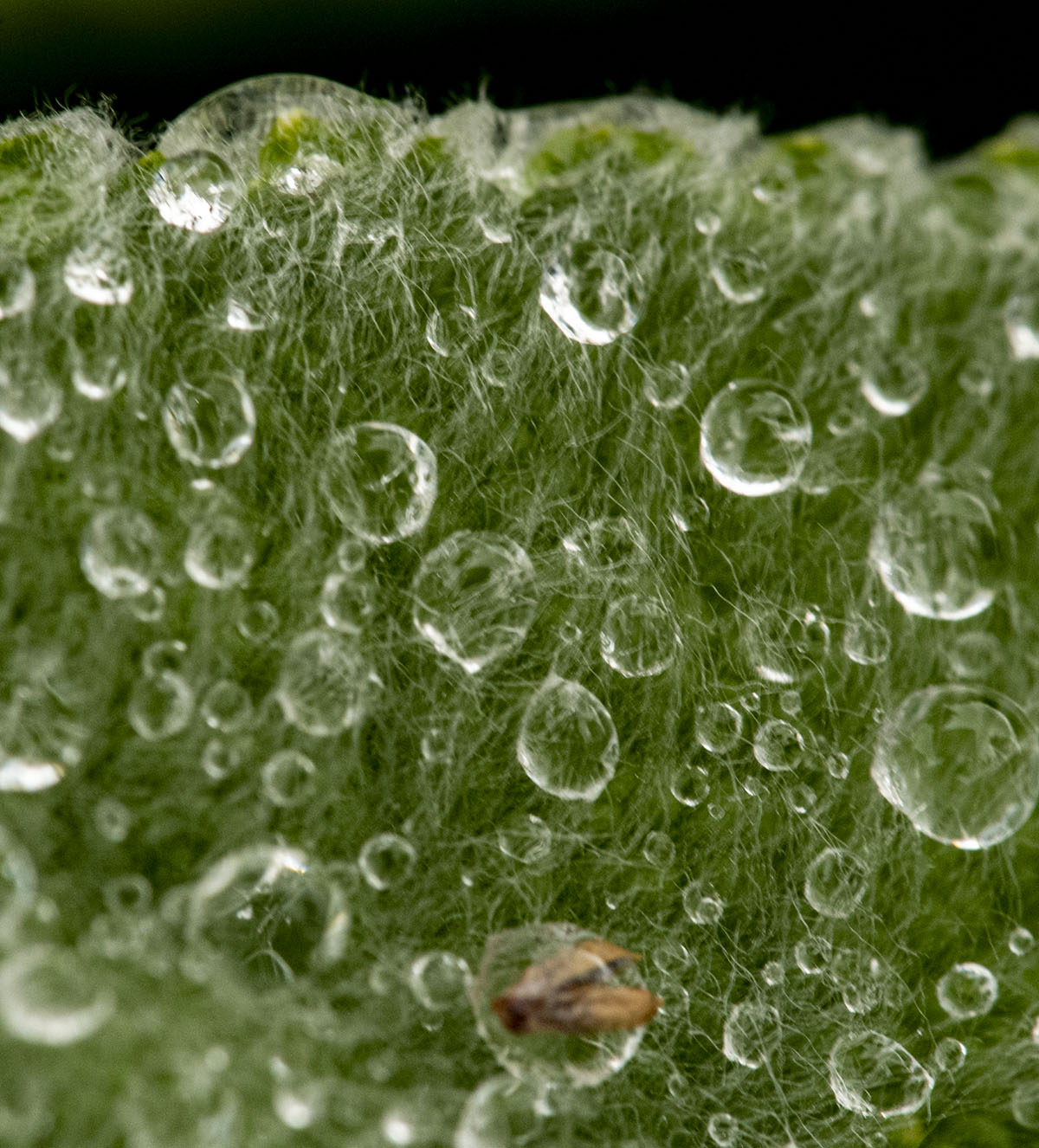
I don't see the "little black spot on the back leaf" that you mentioned. There are some small darker areas, but those are simply depressions in the leaf which the light is not penetrating. |
Sep 4th |
5 comments - 4 replies for Group 60
|
| 74 |
Sep 18 |
Comment |
I'm in agreement with the bright upper area and that it can be cropped in it's entirety and it will enhance your interesting image of your son. I also agree with not needing to see his eyes, since the story of the image is his being in the act of drawing and, therefore, looking at his work. I think you've made a very good image with the centered portrait of your son. |
Sep 16th |
| 74 |
Sep 18 |
Comment |
Angela, I like everything about this image. Very good composition and sharpness. Your composition shows us not just the water, but the surrounding area of interesting rock formations and foliage.
I'm always looking for waterfalls and agree with you about not taking chances. |
Sep 16th |
| 74 |
Sep 18 |
Reply |
Thanks David.
I tried dehazing the picture and didn't like the results. I think that process and your addition of the Silver EFEX treatment make it appear too unnatural for me. I haven't, yet, tried the sky-darkening you and Arne have suggested, but I'll get to that. I do think that would be an improvement.
|
Sep 4th |
| 74 |
Sep 18 |
Comment |
Also just noticed something strange-looking with the bottom left side of the framed area - your friend's right arm/hand? |
Sep 3rd |
| 74 |
Sep 18 |
Comment |
"What is she doing there?" Definitely presents a surprise when you open the image on the monitor. In the monochrome realm, I'd say the only thing that you might change is to darken up the background behind your friend.
To answer you "it never really made me very happy" comment, I wonder how this would play if you had inserted the frame and it's contents in color? I'm sure it would be more dramatic, but I'm not sure it would be better? It would definitely emphasize the "Look Out" theme. |
Sep 3rd |
| 74 |
Sep 18 |
Comment |
It's interesting how much more dramatic the image is when it's cropped and converted to B&W. The locomotive almost looks menacing. I like the composition, which emphasizes the front of the locomotive and gives just enough on the right to let us know there're really rail cars behind it. |
Sep 3rd |
| 74 |
Sep 18 |
Reply |
Thanks, Arne.
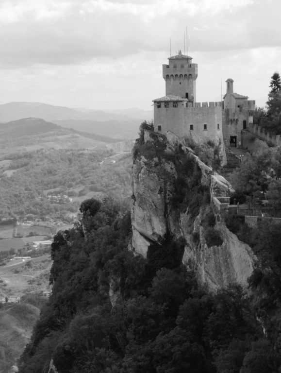
I remember using the "Grid" option in Photoshop Elements because I didn't trust my eyes when I had the original on the monitor. I just checked it again. It appears to show the fort as level. I think there's a bit of an optical illusion going on that might be caused by the curvature of the towers and, perhaps, the rock that the fort is built upon.
You may be right about darkening the skies in the background. |
Sep 3rd |
| 74 |
Sep 18 |
Reply |
Thanks Megan. It's a pretty amazing sight, regardless of the direction you look, when you're peering out into the distance from atop San Marino. |
Sep 3rd |
5 comments - 3 replies for Group 74
|
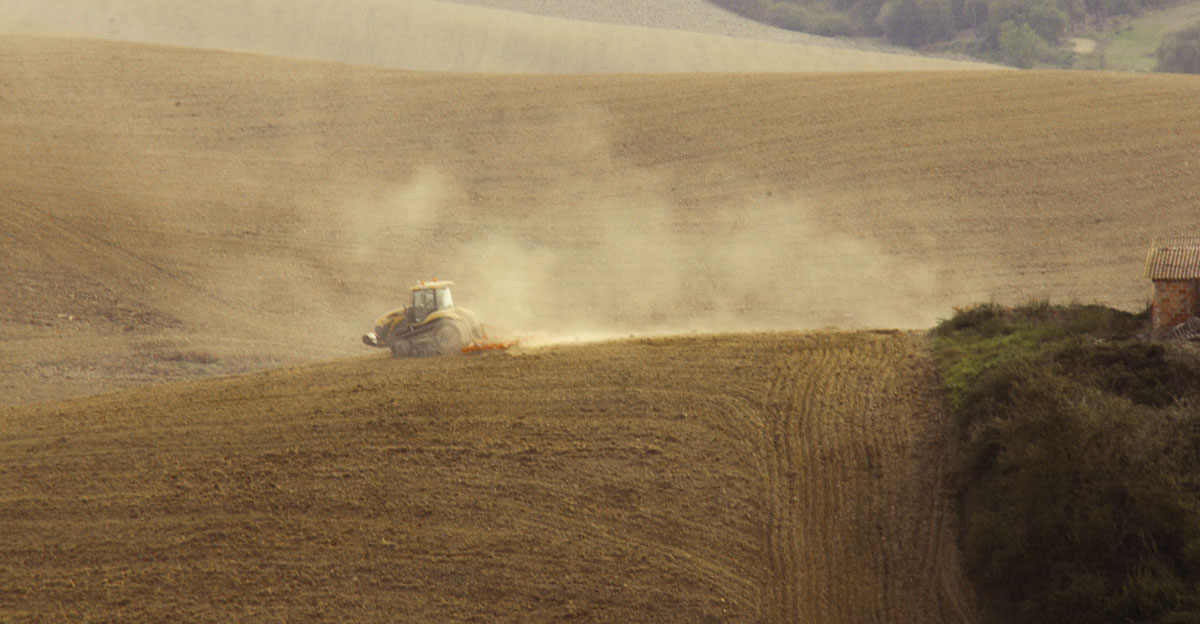
| 80 |
Sep 18 |
Comment |
Hello Hema! Welcome to a great group. A golden hour shot doesn't get more golden that this image. The dust adds to story. Sounds as if you (like me) always have your camera with you? Great spur of the moment image.
|
Sep 25th |
| 80 |
Sep 18 |
Comment |
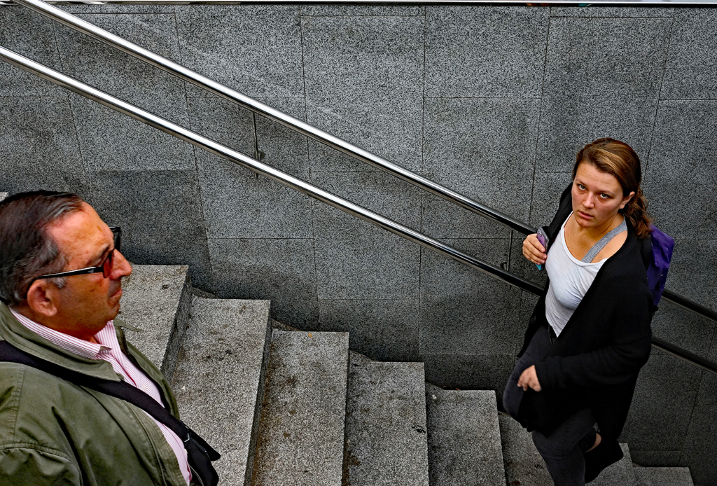
Intriguing portrait. Interesting that a kid in Cuba is wearing a US flag shirt! Really like the kid's stare. Wonder what he's seeing? I like Hattie's straightening, crop and using the darkened doorway, which, I think, puts the emphasis on the boy. Paper on or off the pole seems immaterial to me. |
Sep 25th |
| 80 |
Sep 18 |
Comment |
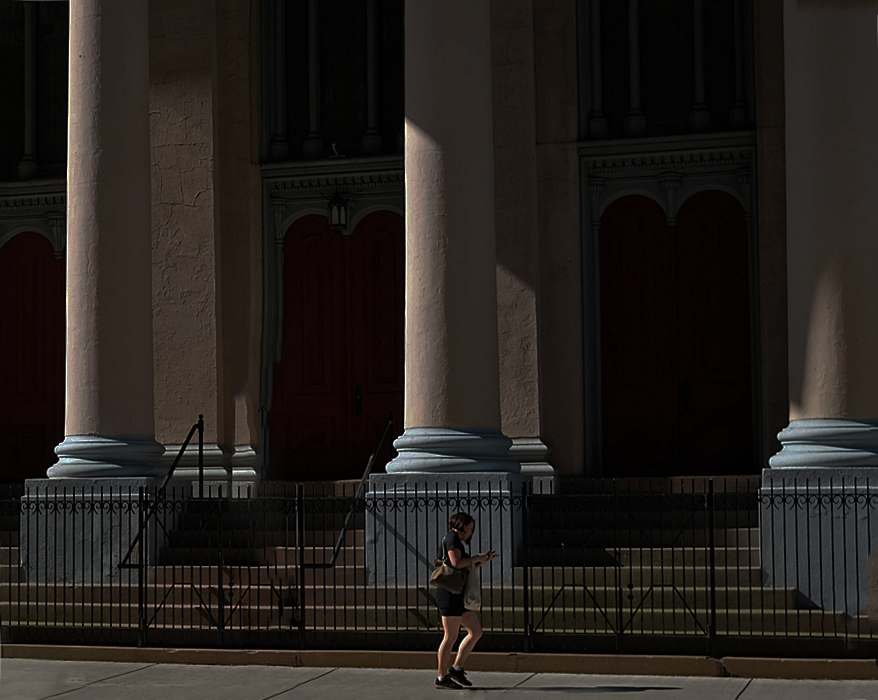
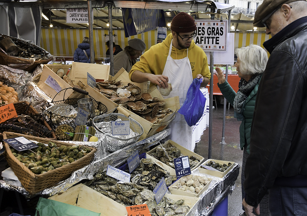
The big white apple is calling the faithful to the $1,200 XS (excess?)! Very nice image. Good composition with lots to see, nice colors, lots of action. |
Sep 25th |
| 80 |
Sep 18 |
Comment |
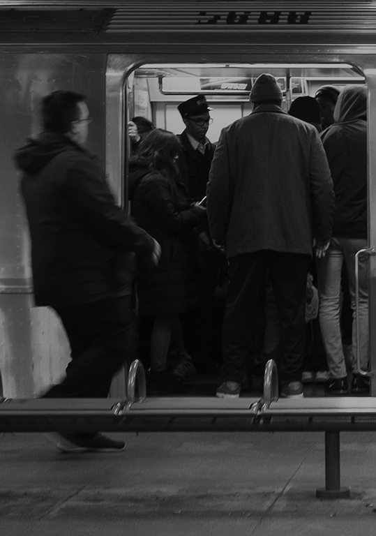
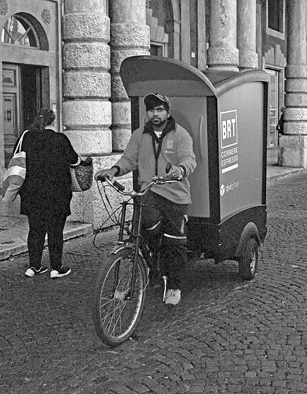
Very nice image Colin. Good composition - my eye is immediately drawn to red of the man's shoes and bag. I like the inclusion of the clock. The image is sharp and the coloring is very good. |
Sep 25th |
| 80 |
Sep 18 |
Reply |
Colin, what PSA requires in terms of deletions and additions and what ever other alterations a person might want to try is not something that applies to "Street Scenes". Those strict rules of no changes except very minor things and conversion to B&W is, for the most part, limited to Photojournalism and Nature photography. Barbara Miller reviewed that in your image last month after Hattie started a conversion suggesting some changes to your image. So, what that means is that Bev's removal of the that post is in no way a violation of PSA's rules. Get your eraser out and start fixing those images before you submit them! :-D
|
Sep 25th |
| 80 |
Sep 18 |
Comment |
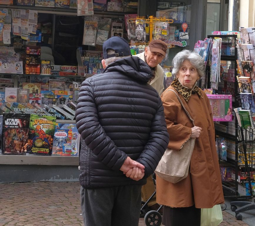
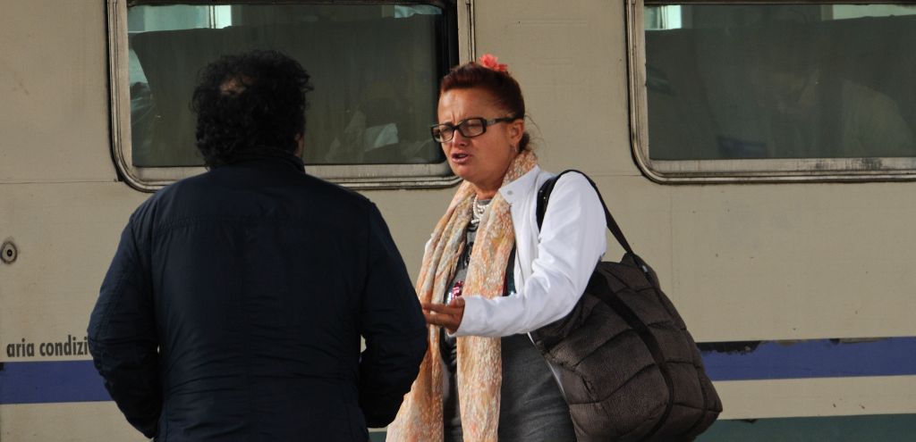
Rich, I like the capture of the lady's enjoyment with the moment. I agree with the idea of cropping that Hattie provided. Very nice B&W image. |
Sep 25th |
| 80 |
Sep 18 |
Comment |
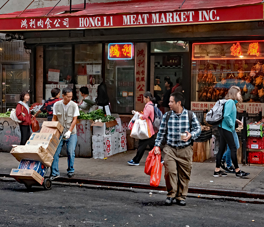
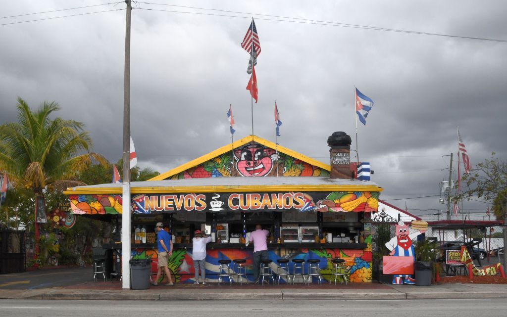
It is an interesting image. I think showing more, not necessarily all, of the building would tell us more about the story of the image. For instance, I'd like to see the entire menu board on the right. I like the colors and the image is very sharp. |
Sep 25th |
| 80 |
Sep 18 |
Comment |
Thanks Richard. |
Sep 8th |
| 80 |
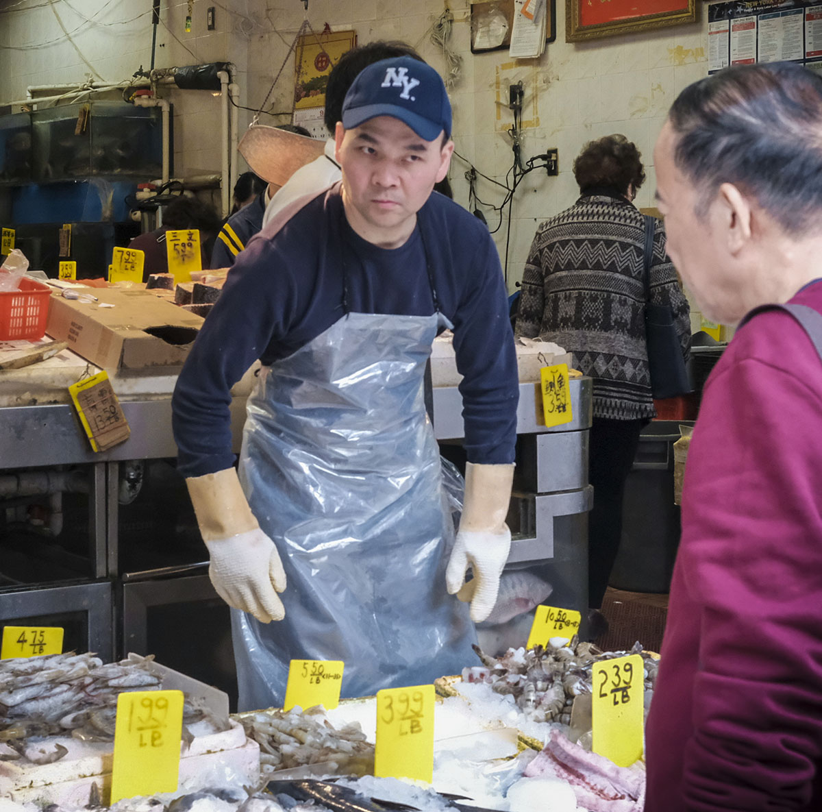
Sep 18 |
Reply |
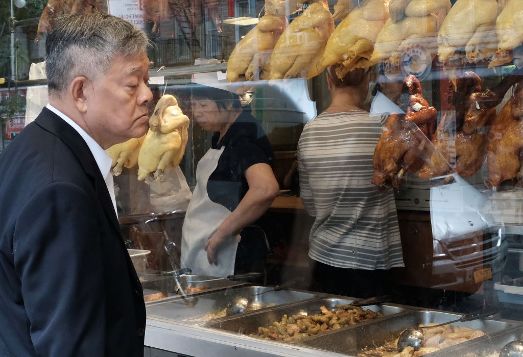
Thanks Colin. You picked another issue I had getting an acceptable image - the subject entering the frame. As you might imagine, Saturday afternoon in NYC is a shopping madhouse. |
Sep 5th |
7 comments - 2 replies for Group 80
|
23 comments - 11 replies Total
|