|
| Group |
Round |
C/R |
Comment |
Date |
Image |
| 3 |
Jan 26 |
Reply |
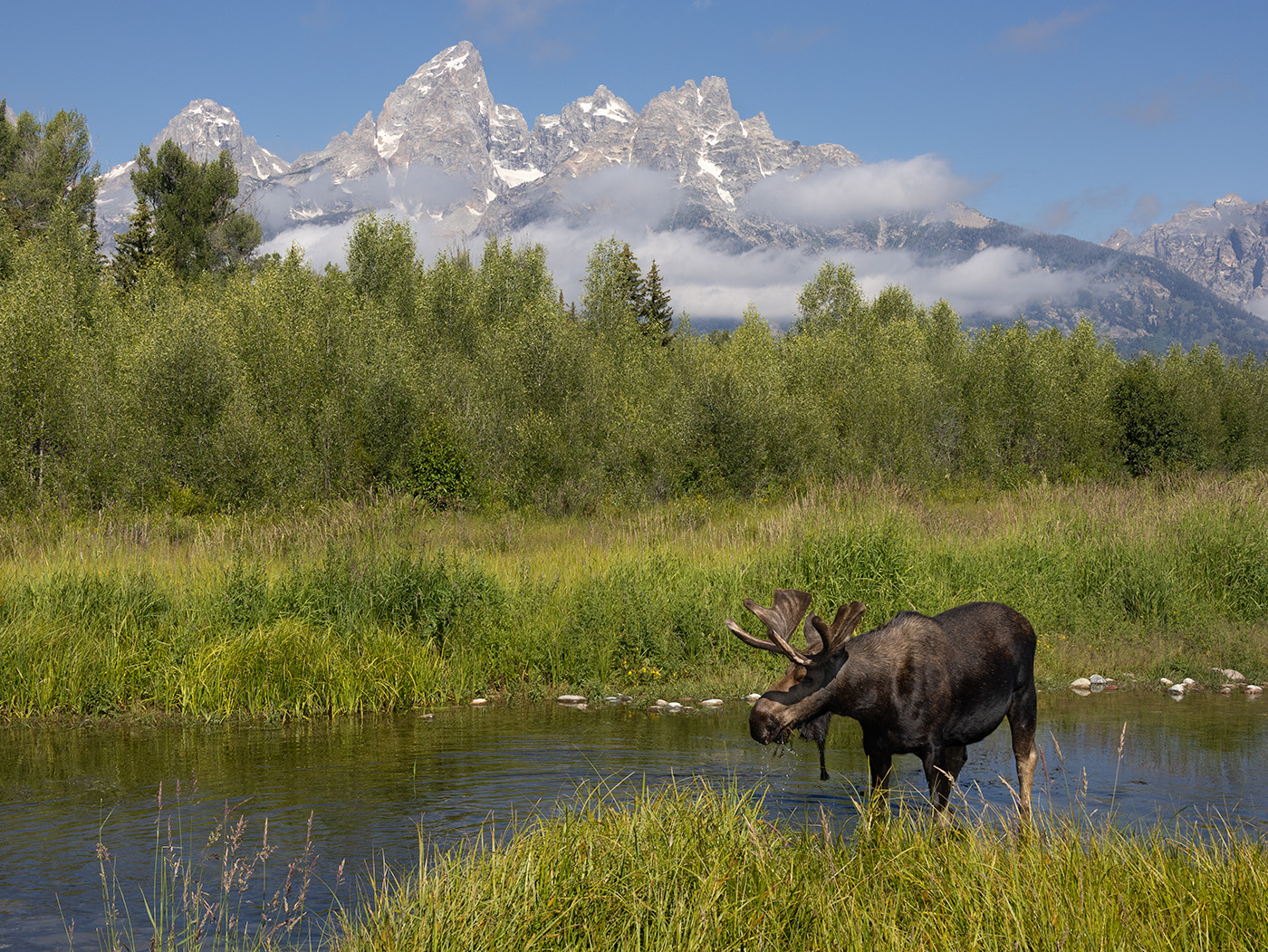
Thanks for your comments, Mary Ann. I agree that it's always fun to see moose mothers with their calves. We are fortunate to have a lot of moose living in the mountains in Colorado, but the babies are often back in the brush. I was excited that this shot was more in the open. |
Jan 20th |
| 3 |
Jan 26 |
Reply |
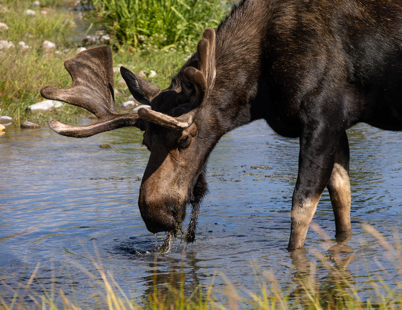
Kieu-Hanh, I'm reconsidering my cropping after reading your comments. Keeping more of the environment can be helpful. You're right that both the moose mother and calf are not fat. The young calves always have thin, wobbly legs. This one is probably 4 or 5 weeks old. That may explain why the mother hasn't been eating as much as usual either. |
Jan 18th |
| 3 |
Jan 26 |
Reply |
Andres, I like the cropping that you did on my image. You've eliminated some of the distractions and brought the moose a bit closer. Having more of a setting for the moose has benefits for telling the nature story. |
Jan 17th |
| 3 |
Jan 26 |
Reply |
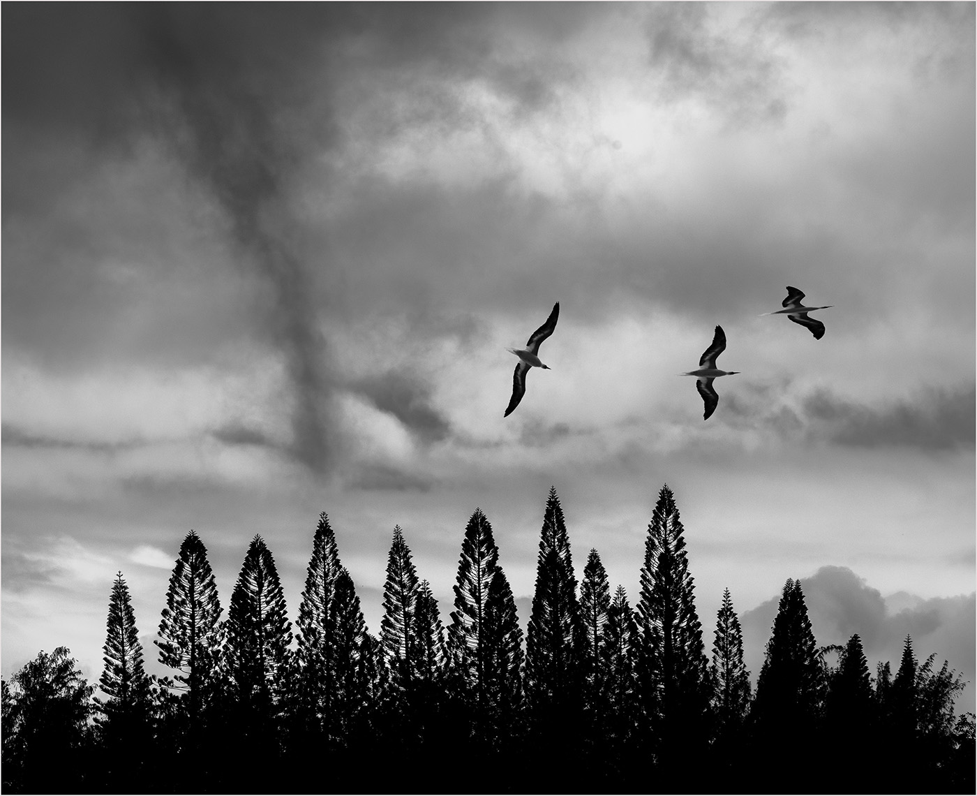
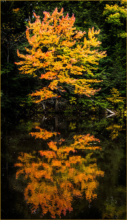
I think it's fabulous that different members can envision slightly different variations on your photo, Robert. I agree with Andres that the tree is the star. Whether in color or black and white, the tree's silhouette is striking. |
Jan 17th |
| 3 |
Jan 26 |
Reply |
Mary Ann, I can see the benefits of the Hue/Saturation adjustment in the colors of the Milky Way. I appreciate the extra information about the 2.8 lens. Thanks. |
Jan 17th |
| 3 |
Jan 26 |
Reply |
Thanks for your comments, Joan. I agree that moose tend to look rather awkward. Please read my response to Robert about the clump of grass. You must have visited Yellowstone a lot to know where they frequent. |
Jan 13th |
| 3 |
Jan 26 |
Reply |
Robert, thanks for your comments. Yes, I did consider removing the grass clump, which is distracting. However, I planned to use the photo as a "Nature" entry in competition. For Nature photos, I can't remove anything out of the photo unless I crop it out (PSA rules). So I had to leave it in, since cropping it didn't work. |
Jan 13th |
| 3 |
Jan 26 |
Comment |
Joan, I can see why the patterns and lines of the airport ceiling caught your eye. It has a very geometric look. The image works well in back and white. If you wanted to tame some of the "confusion", you could darken some of the pillars and beams, while leaving others with less contrast. However, your photo is interesting as is too. |
Jan 8th |
| 3 |
Jan 26 |
Comment |
Mary Ann, your photo of the Milky Way is gorgeous. The water and trees in the foreground add balance and a sense of place. You've obviously adjusted the exposure and lightened the scene a lot. I'm curious about what other edits you did. I'm also interested why you rented this particular lens. Mary Ann, you may not take many Images of the Milky Way, but this one turned out very well. |
Jan 8th |
| 3 |
Jan 26 |
Comment |
Kieu-Hanh, I agree that the building has the look of a temple with the embellished balcony lines. The signage for the bar is therefore a surprise and makes the building more interesting. Because of the angle of you shot, there's distortion as the upper stories appear to move inward. Trying to fix the distortion will cut off the interesting curves of the roof though, so I appreciate your decision to leave it. I think cropping off a bit of the sky would perhaps help minimize the look of distortion. Kieu-Hanh, what a fascinating place to visit! |
Jan 8th |
| 3 |
Jan 26 |
Comment |
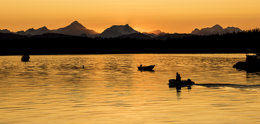
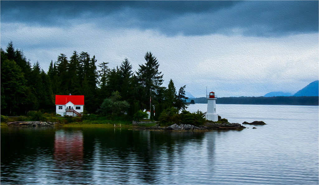
Robert, the unique shape of the tree works well centered with the island in the background. I especially like the drifting clouds over the island. The way you lightened the tree helps me see the color and details of the needles. It's a peaceful scene. |
Jan 8th |
| 3 |
Jan 26 |
Comment |
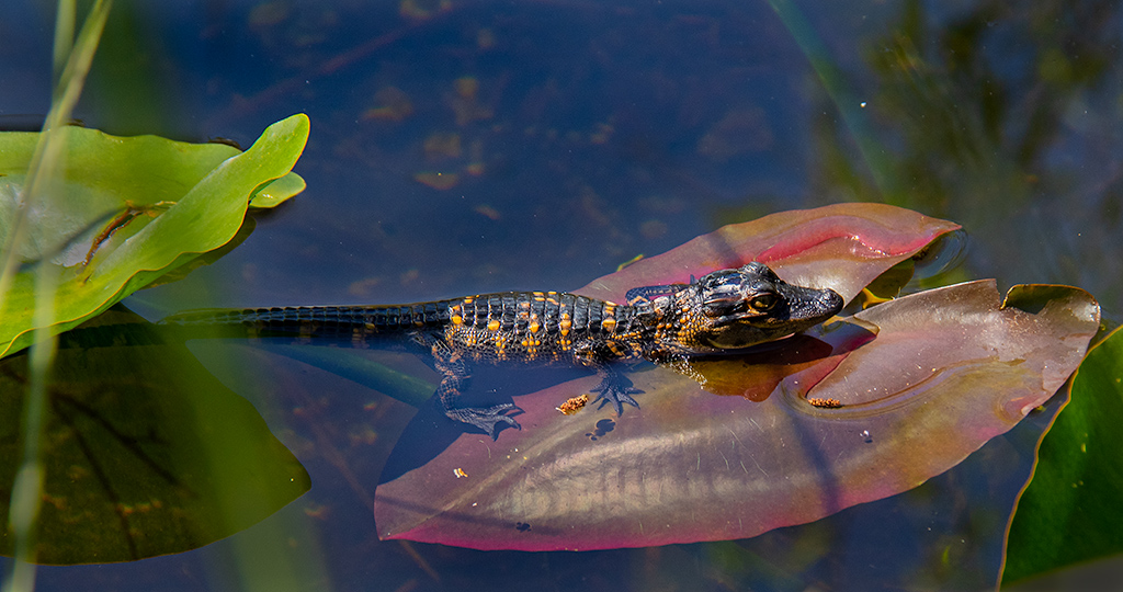
Andres, I'm impressed that you took such a detailed close-up of the cicada. The iridescence and color of the cicada's wings are beautiful. I like how your adjustments sharpened the image and created a compelling composition. Well done, Andres. |
Jan 8th |
5 comments - 7 replies for Group 3
|
5 comments - 7 replies Total
|