|
| Group |
Round |
C/R |
Comment |
Date |
Image |
| 3 |
May 24 |
Reply |
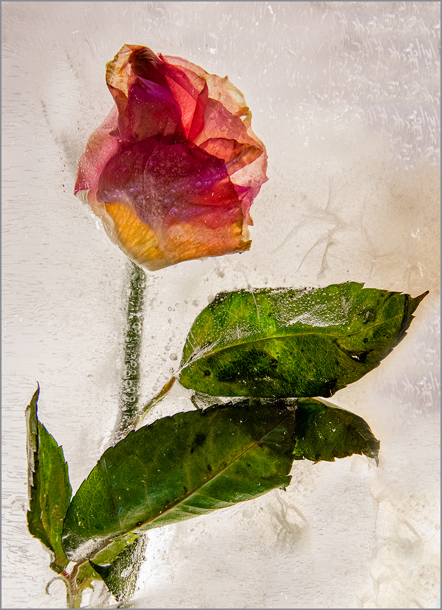
Mary Ann and Kieu-Hanh, I took heed of the comments about needed a more obviously blurred section of a photo to qualify as an impressionistic image. So I didn't use this photo in that category, but submitted it as an "Open" category photo. It worked out fine. |
May 29th |
| 3 |
May 24 |
Comment |
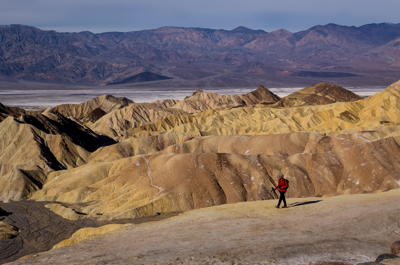
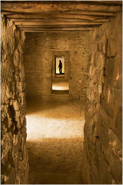
Joan, your photo of Zabriskie Point shows the beautiful golden light of early morning. I like the sharpness you captured of the rock layers. You've also included the more reddish, purple of the background ridge, which is a beautiful contrast to the golds. We visited Zabriskie Point this February in morning hours. It's a lovely view with all the layers of rock. You made some great edits to transform what an appeared first as over-exposed, to a beautiful image. Well done, Joan! |
May 7th |
| 3 |
May 24 |
Comment |
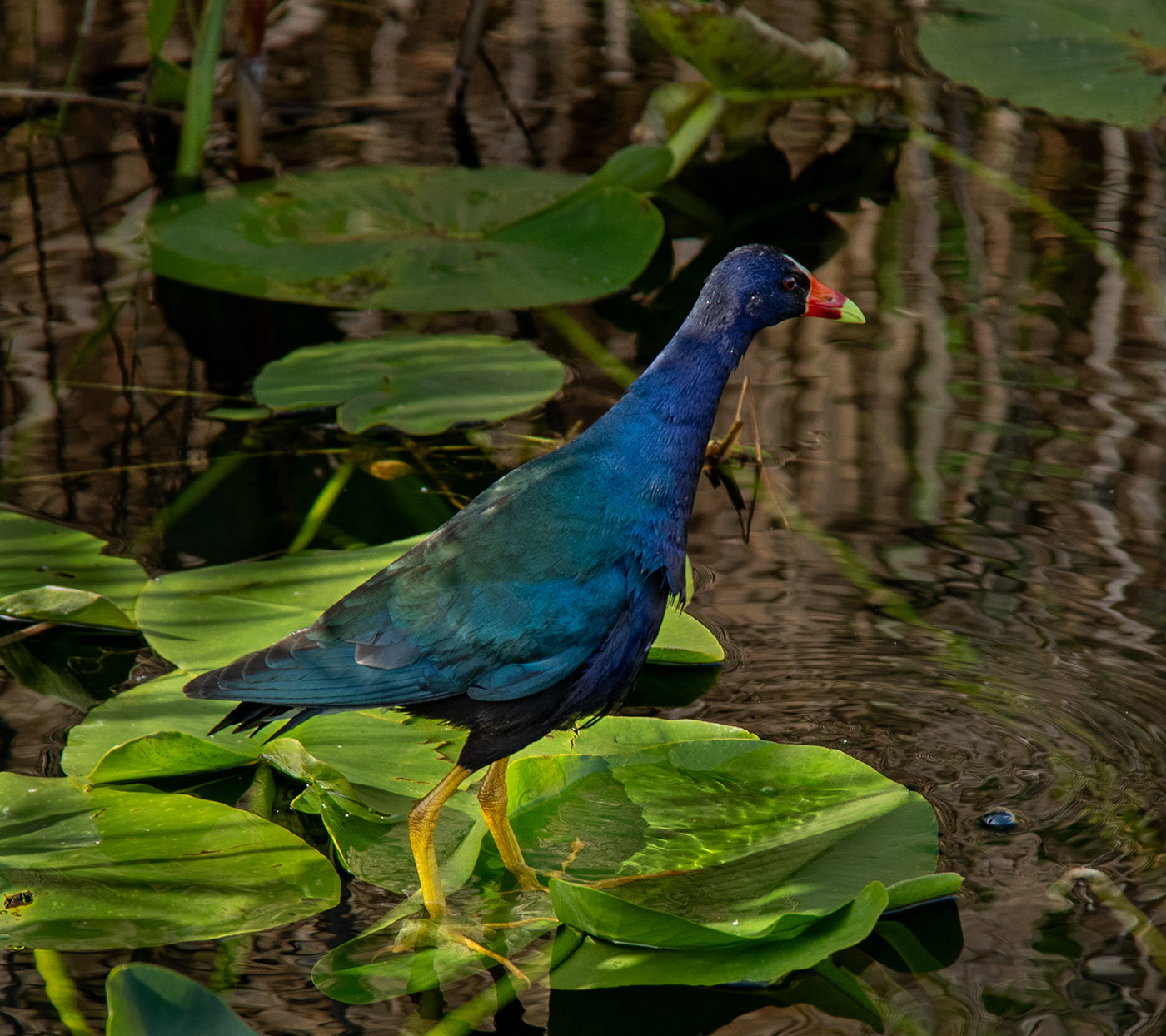
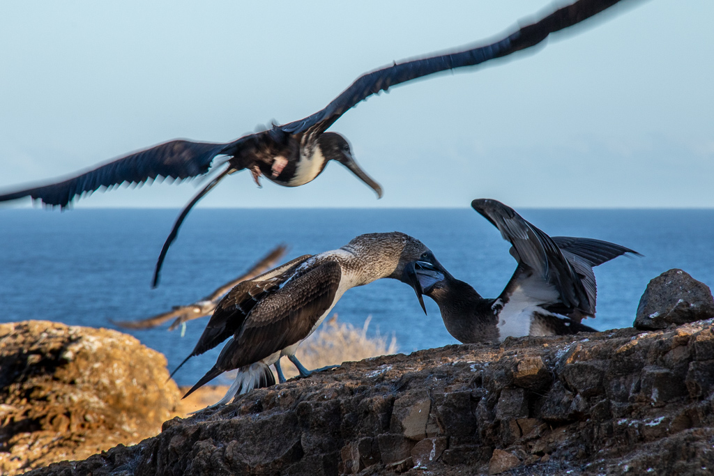
Mary Ann, I love that you captured the action of the tern landing in the nest. I know what you mean about taking lots of shots and hoping for the one that captures the action. Your closer crop and straightening of the horizon help bring the attention to the landing tern. Your soft background gives a sense of place without distracting. It sounds like an enjoyable fieldtrip to a beautiful location. |
May 7th |
| 3 |
May 24 |
Comment |
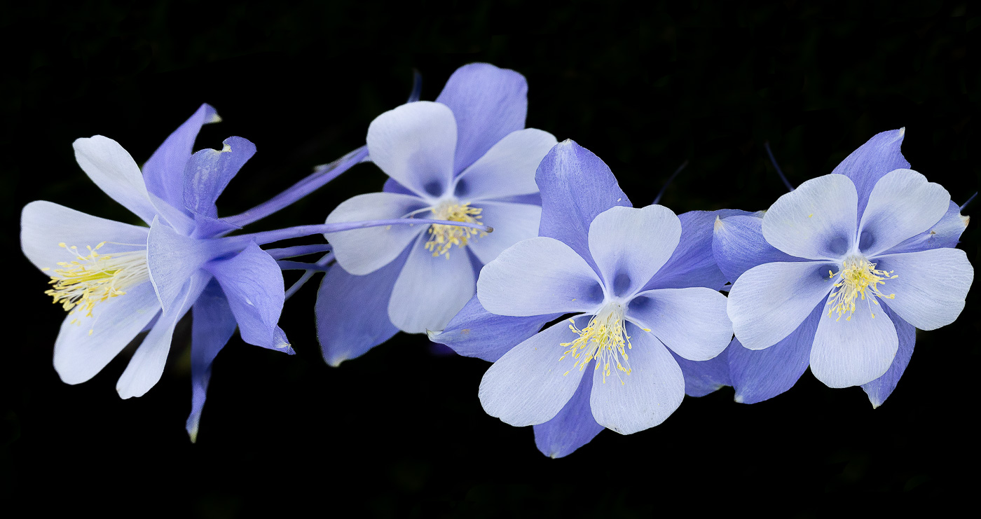
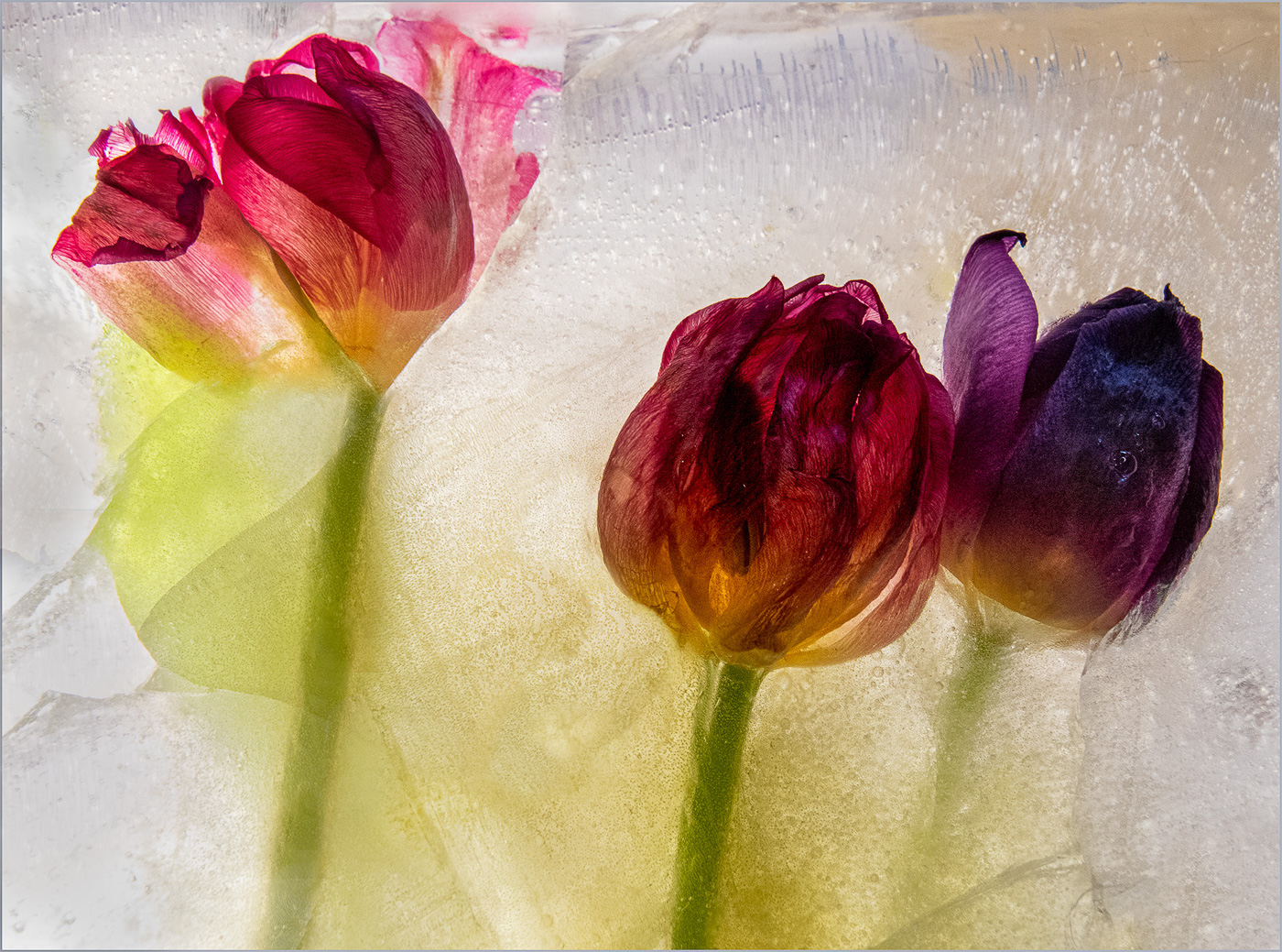
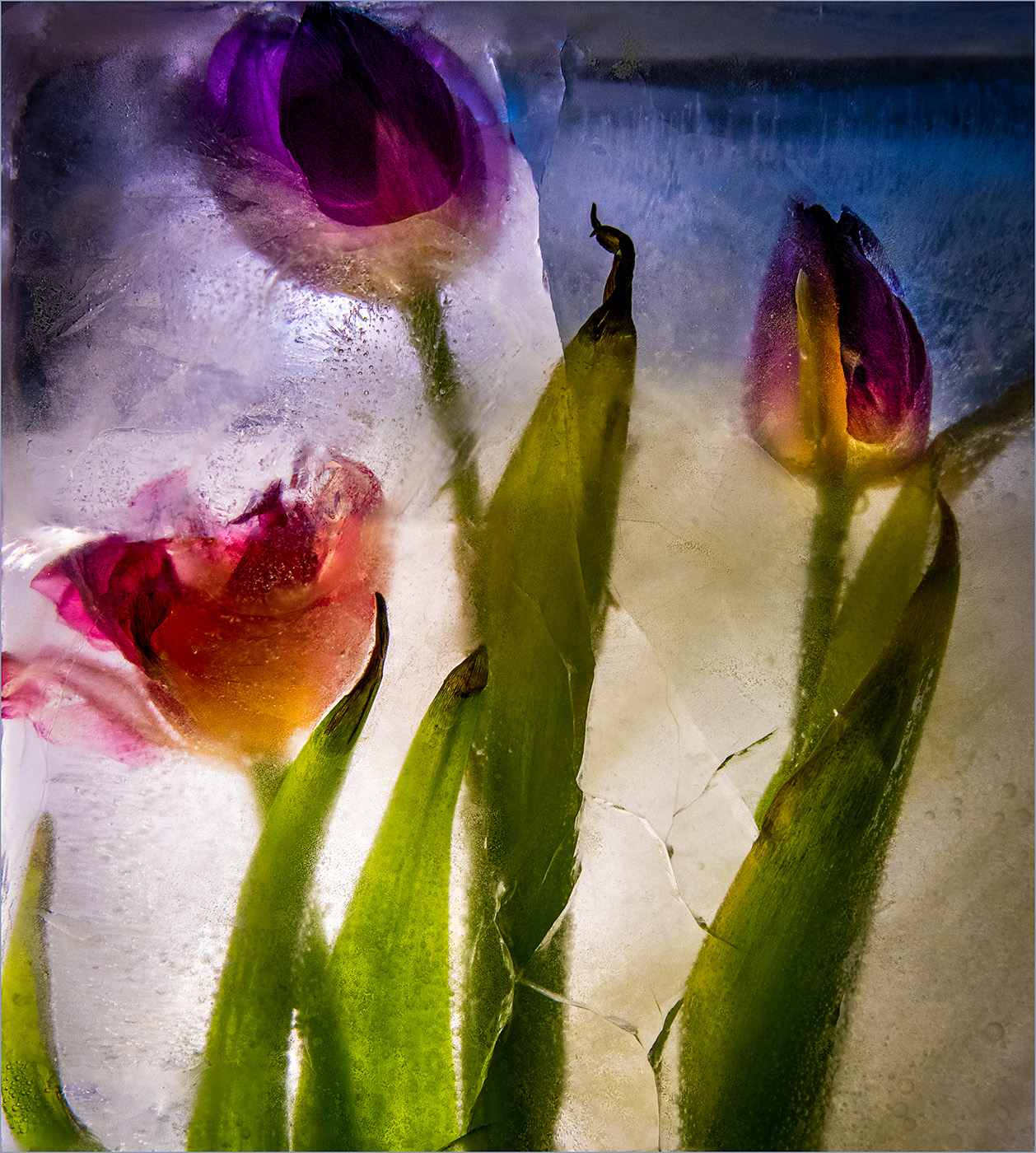
Kieu-Hanh, I enjoy the colors and lighting on the tulips. The curves of the garden display help move my eye through the image. You have nice sharpness throughout the image. I'd prefer cropping to just above the bright green tree on the left. That would emphasize the tulips and eliminate the rust colored trees in the background. Lovely springtime photo, Kieu-Hanh. |
May 7th |
| 3 |
May 24 |
Comment |
Robert, what an exciting experience! Being in a small airplane during the eclipse makes the experience even better! Thank you for sending the second photo of the airplanes wing. The light on the horizon is gorgeous. You are so fortunate to be in a location of totality. The memories that go with this image are what make it special. |
May 7th |
| 3 |
May 24 |
Comment |
I like how you turned this photo of the window into an abstract. The vivid colors and textures work well for this abstract style. I especially like what you did to enhance the blue rectangle to drawn my eye and create interest. The one item I wonder about is the black rectangle with the orange print. Even with the blur, my eyes identify it as print. Would some cloning disguise the lettering more, so it became more of an artistic element? Or did you intentionally leave it as print? |
May 7th |
| 3 |
May 24 |
Comment |
Andres, the items in your photo have interesting shapes, textures, and colors. Especially the dried chili has an amazing wrinkled texture. I can see why your eye noted this pile of spices as having potential for a still life. I do agree with the others that an intentional placement of the items may improve the composition of the image.
That's actually a wonderful challenge for a still life: Arrange a group of spices to create an interesting still life. The advantage of arranging the items yourself is that you can try different lighting and different set-ups to see which ones you like. Thank you for bringing up a subject matter (still life photos) that can be a challenge for us all. |
May 7th |
| 3 |
May 24 |
Reply |
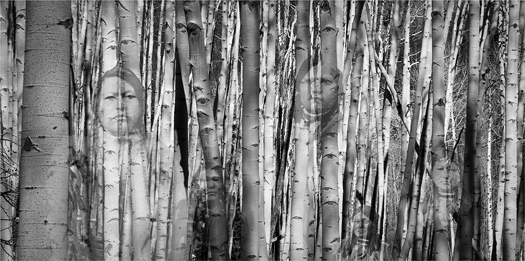
Thanks for your comments, Andres.
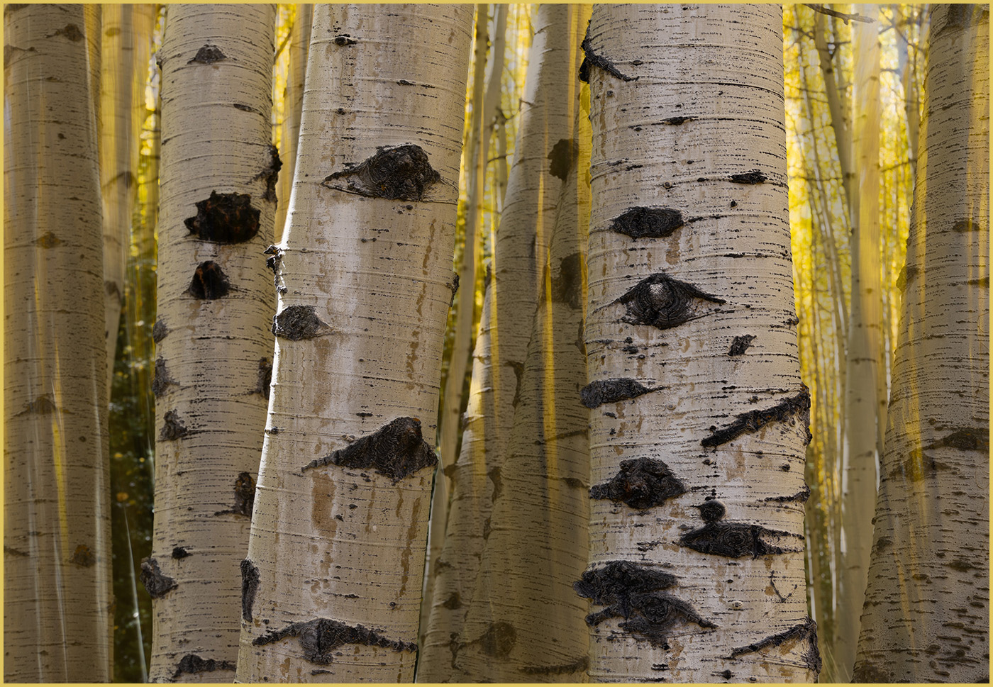
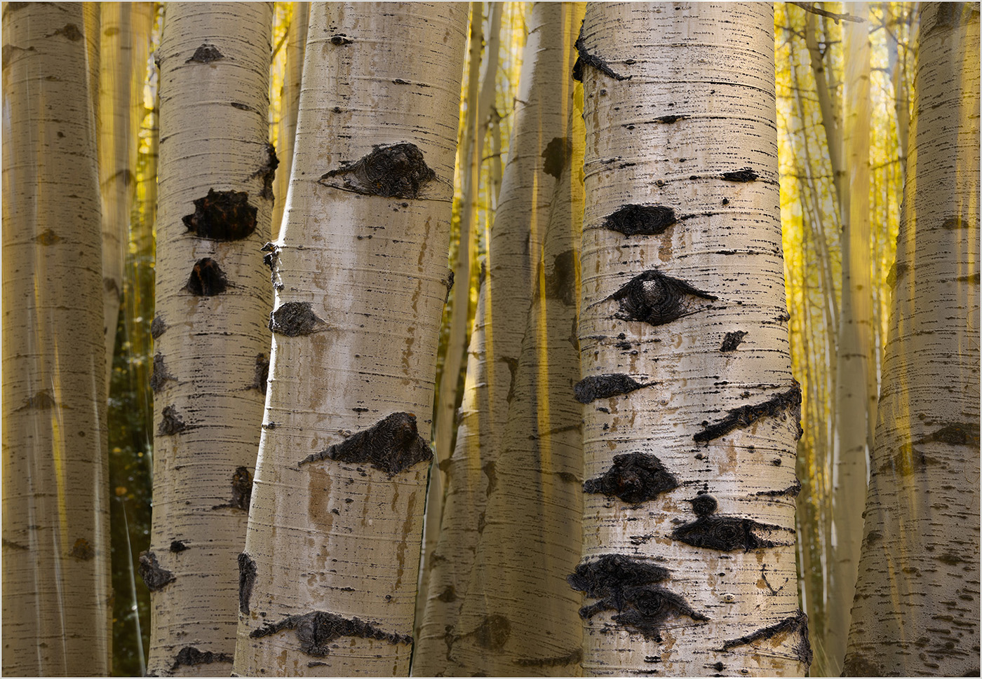
I used a cropped version of Original 2 as my background. Then I put Original 1 on top of the background using PhotoShop, lowering the opacity to maybe 60%. Next, I selected the trunk to the right in PhotoShop and made it into a mask, putting it on top of the image to match the location of that trunk. I did the same process with the trunks in the center and left, but lowered the opacity to about 87%. So the Original 2 blur shows through wherever the three trunks aren't pasted. Hope that explanation makes sense to you. |
May 7th |
| 3 |
May 24 |
Reply |
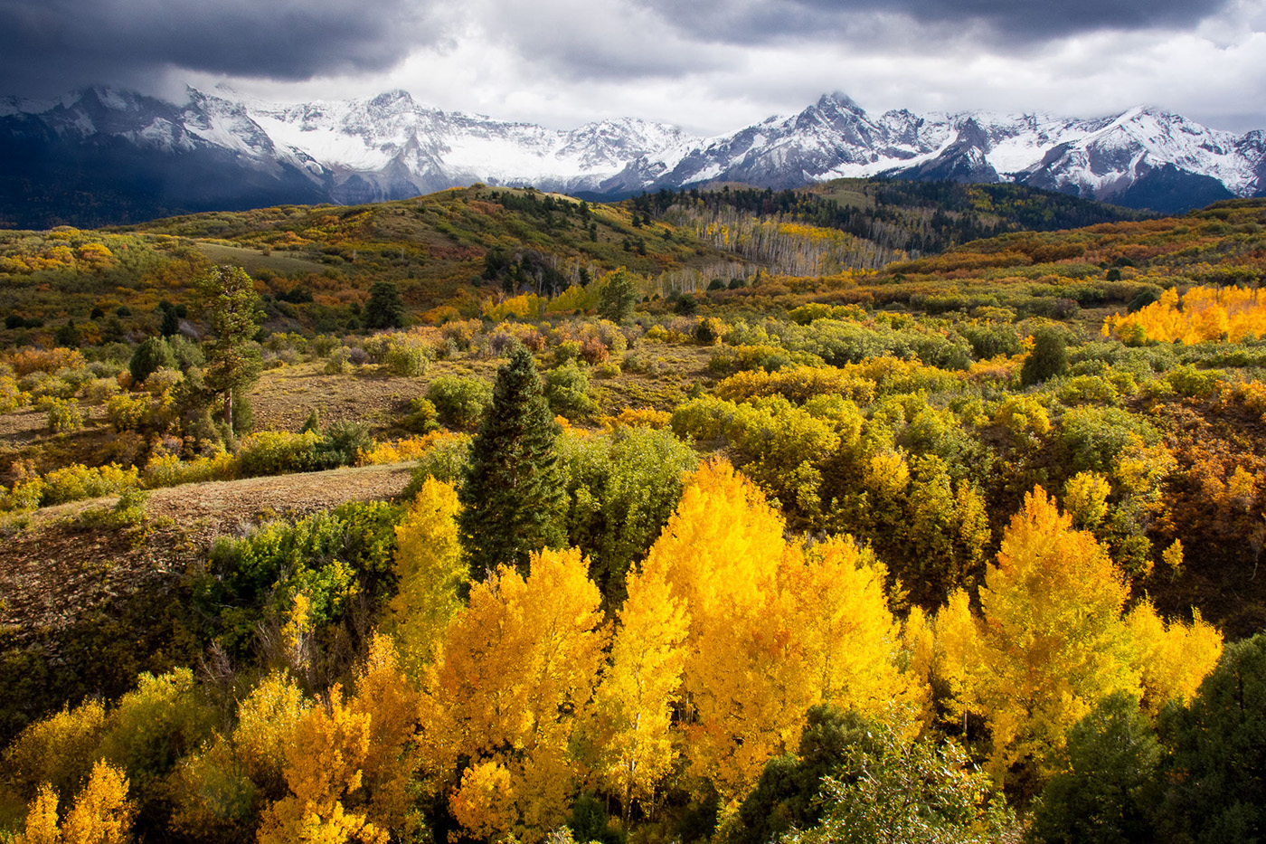
Michael, I greatly appreciate your comments and suggestions. I did have a composite in mind when I took the intentional movement image.
I agree that the image needed more contrast on the aspen trunk in front. So I did additional dodging and burning on just the trunk to the right. I also changed the border to a gray to make it more subtle. I'm curious about what technique you used to edit the image. |
May 7th |
 |
| 3 |
May 24 |
Reply |
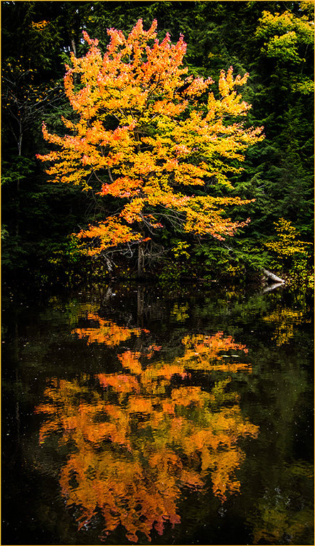
Joan, I really appreciate your comments. You are right that my image didn't look impressionistic enough to fit that category. So I decided to enter this photo in the "Open" category instead. I created a different image that much more impressionistic. Thanks for helping me consider the options. |
May 7th |
6 comments - 4 replies for Group 3
|
6 comments - 4 replies Total
|