|
| Group |
Round |
C/R |
Comment |
Date |
Image |
| 3 |
Aug 22 |
Comment |
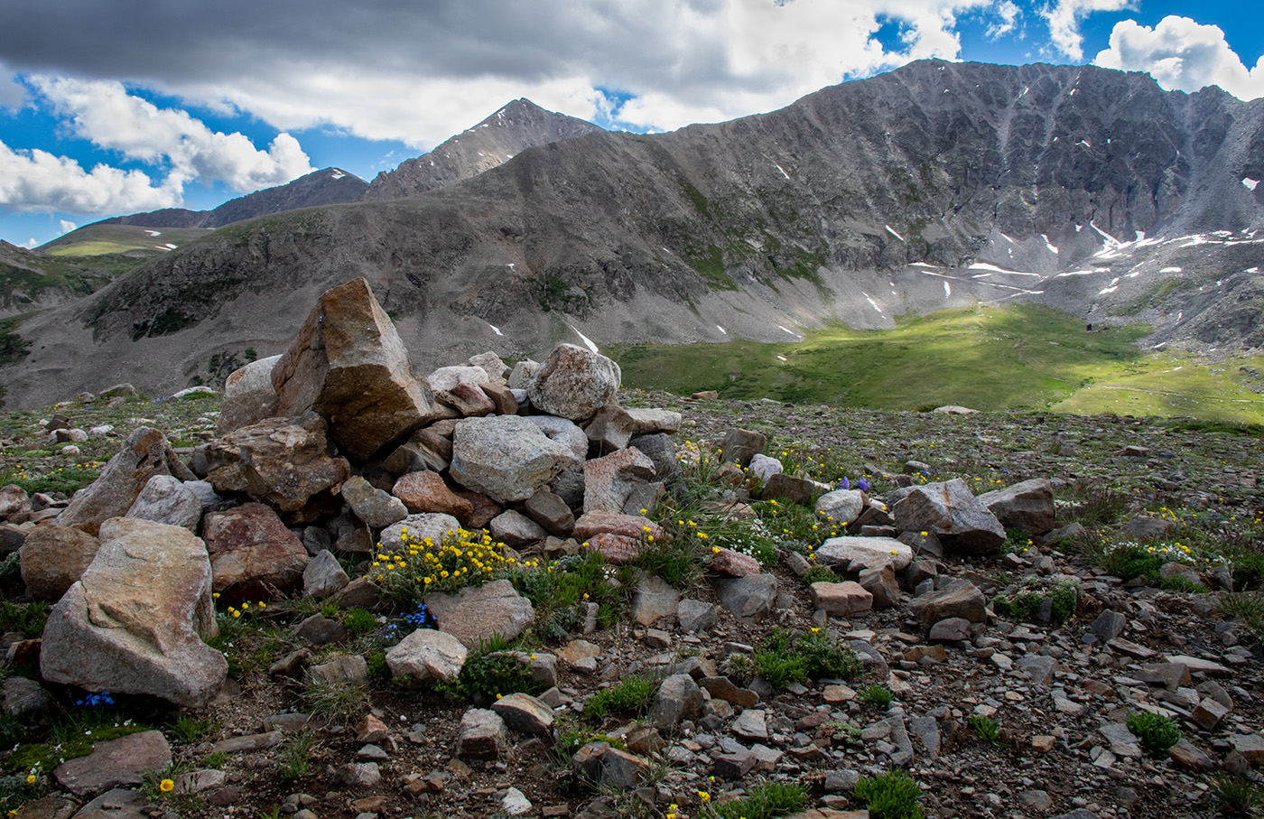
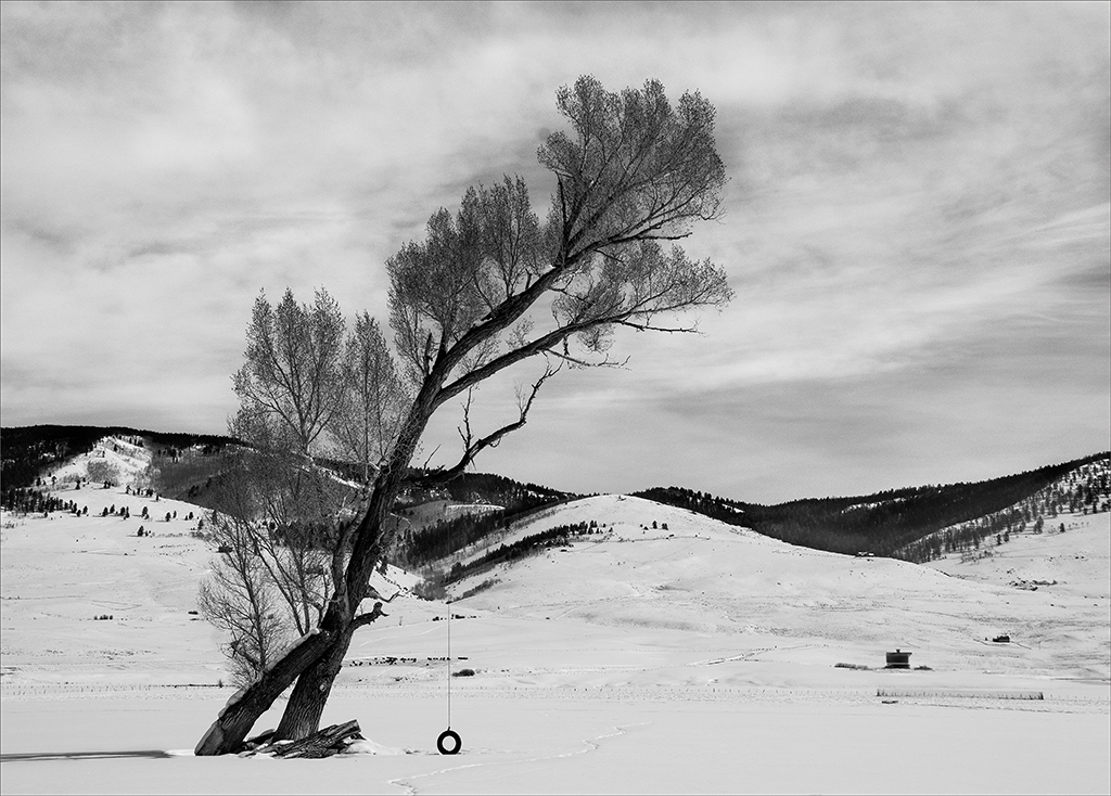
Tom, thank you for your comments and for visiting our group. I appreciate your input on the depth of field, since that was my biggest question with this particular shot. I agree that the location is gorgeous. It's a 1-1/2 mile hike to the cabins, then a mile further to an upper ridge with an amazing view of the valley surrounding mountains. It's a wonderful hike in any season. |
Aug 19th |
| 3 |
Aug 22 |
Reply |
Thanks for your comments and suggestion, LuAnn. I'll try out the tonal adjustment. |
Aug 19th |
| 3 |
Aug 22 |
Reply |
Thanks for your comments, Mary Ann. |
Aug 19th |
| 3 |
Aug 22 |
Comment |
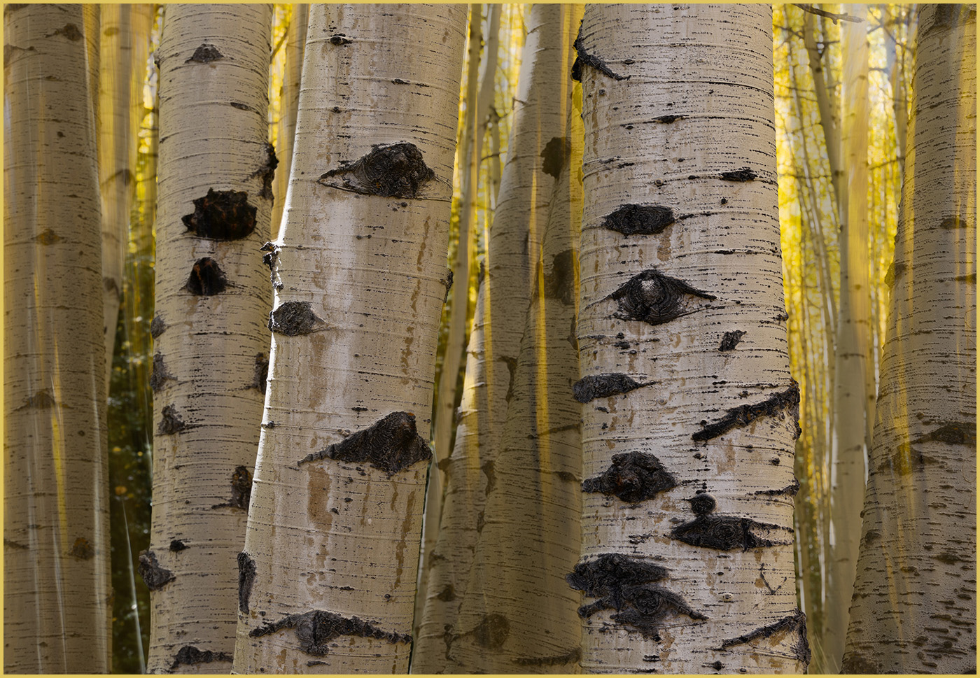
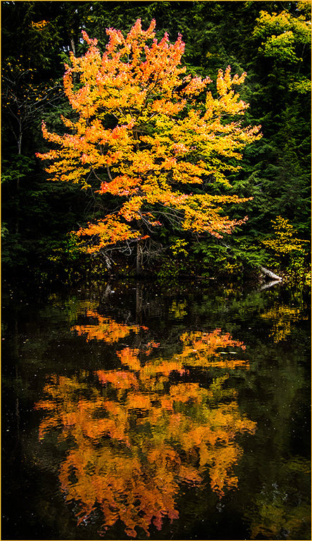
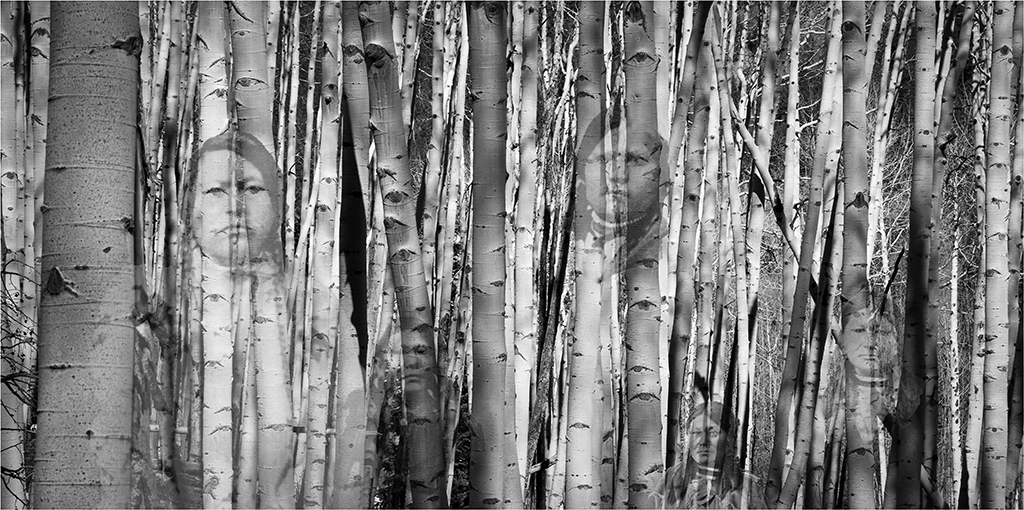
LuAnn, I appreciate you trying some new editing techniques with your image. The texture on the birch bark works especially well. I agree with Mary Ann that the texture is on the heavy side for the leaves. I wonder what your image would look like with a border that was maybe half as wide. When I first looked at your photo, my eyes went first to the border. With a slightly narrower border, I think my focus would go to the tree first instead. I think your use of a textured paper would work well for printing. Enjoy your new print! |
Aug 19th |
| 3 |
Aug 22 |
Reply |
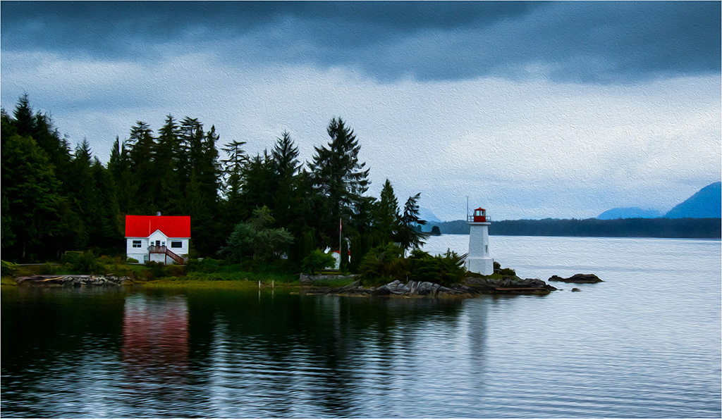
Michael, thanks for your comments. I find your suggestions helpful. Yes, I usually use a line around my images, but in this case I entered it as a travel photo in club competition. Lines around travel images are discouraged, although thin lines are allowed. So I could have utilized a narrow line to separate the image from the dark background. It was probably a good idea in this case. |
Aug 18th |
| 3 |
Aug 22 |
Comment |
Mary Ann,
I think your composite works, and that the moon adds to the scene. The evening fog gives the city a feeling of peacefulness. I like the repositioning of the moon that you used for your edited version. In this version, it looks like the moon has a thin black line around it that doesn't appear natural. The line wasn't in your original image. It looks like your PhotoShop skills are growing! Kudos, Mary Ann! |
Aug 18th |
| 3 |
Aug 22 |
Comment |
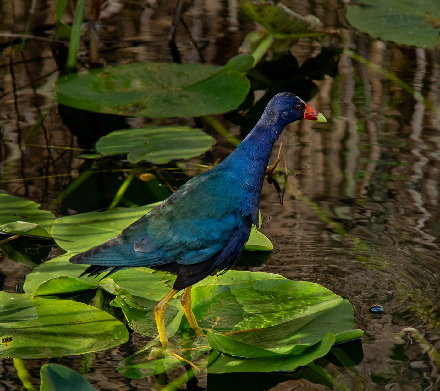
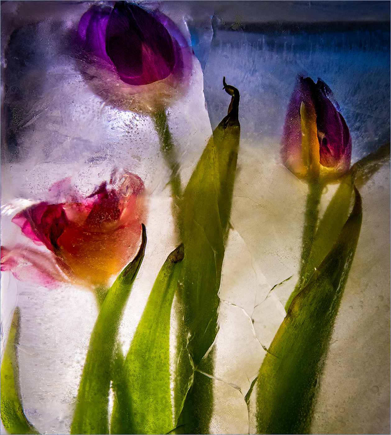
Kieu-Hanh, the butterfly and lily are a lovely combination. The angles of both against the blurred background are striking. I agree with the comments about sharpness and find the blurriness of the butterfly's head especially distracting when the lily is so sharp. I agree with LuAnn that the hybrid of the lily might be a disqualified in the Nature category, but I'd encourage you to enter the image in an Open category. What a pretty butterfly to find in a garden! |
Aug 18th |
| 3 |
Aug 22 |
Comment |
Michael, I enjoy your unusual flower image especially for the techniques you used. The separate flower photos with the treasured background would make a terrific poster. You were so wise to use the matte board for a consistent, plain background. I often don't plan ahead to do that and am stuck with a much tougher job when I want to do a composite. As far as club scoring, I've learned from experience that judges don't always reward me for the efforts I take in creating an unusual altered image. However, I think an image like this would be useful as part of photo class on how to use Lightroom and its Print Module. Kudos on trying a new technique! |
Aug 17th |
| 3 |
Aug 22 |
Comment |
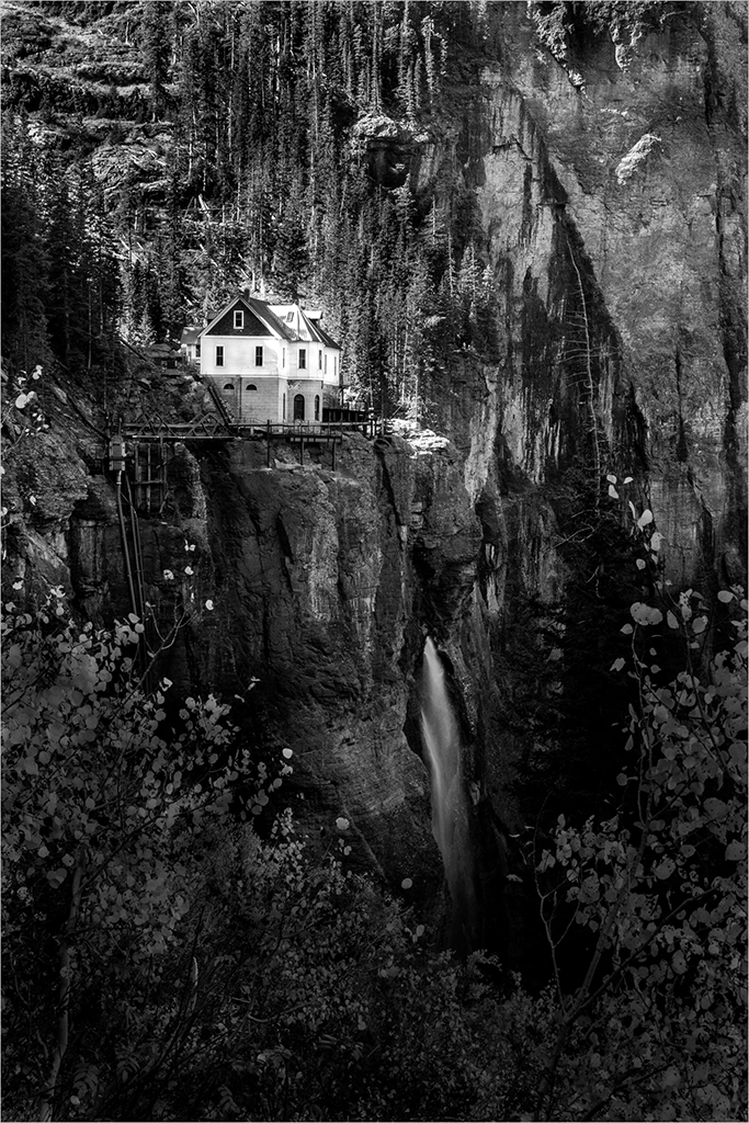
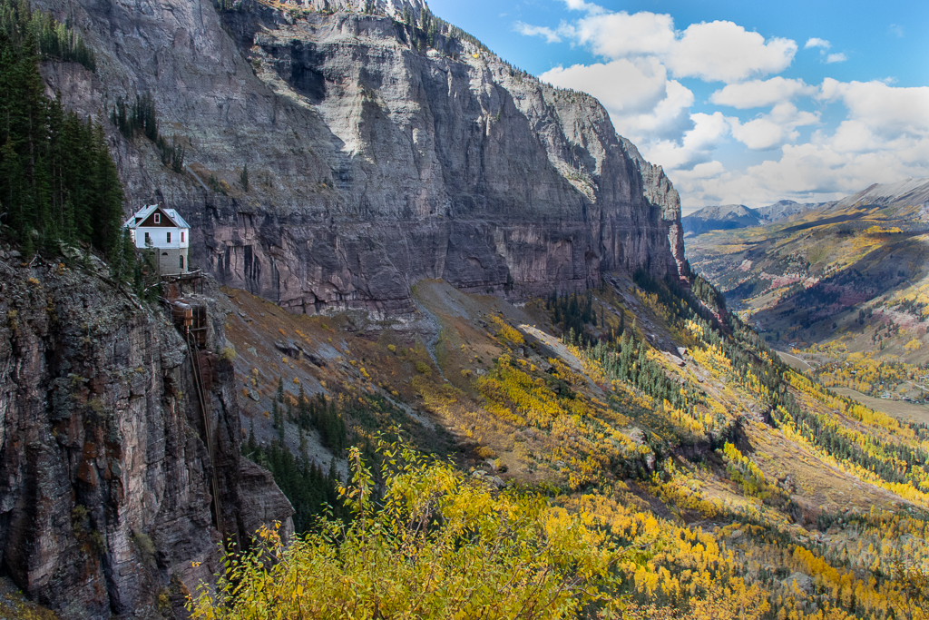
Hi Christine! Welcome to Group 3! It's wonderful that you've travelled and had the chance to take photos in the many places that you've visited. I enjoy that you've captured the island, bridge, and gondolas under the bridge all in one image. The dark framing helps the colors of the scene to pop. For a quick travel photo, you've done well with sharpness and composition. I agree that a tighter crop would let more of the scene of Venice show. I love Italy, including Venice and Cinque Terre too. I look forward to seeing more of your photos. |
Aug 17th |
6 comments - 3 replies for Group 3
|
6 comments - 3 replies Total
|