|
| Group |
Round |
C/R |
Comment |
Date |
Image |
| 3 |
Jun 22 |
Reply |
I really like the second edit that you did. It focuses my eye on the rose without other distractions. Well done! |
Jun 23rd |
| 3 |
Jun 22 |
Reply |
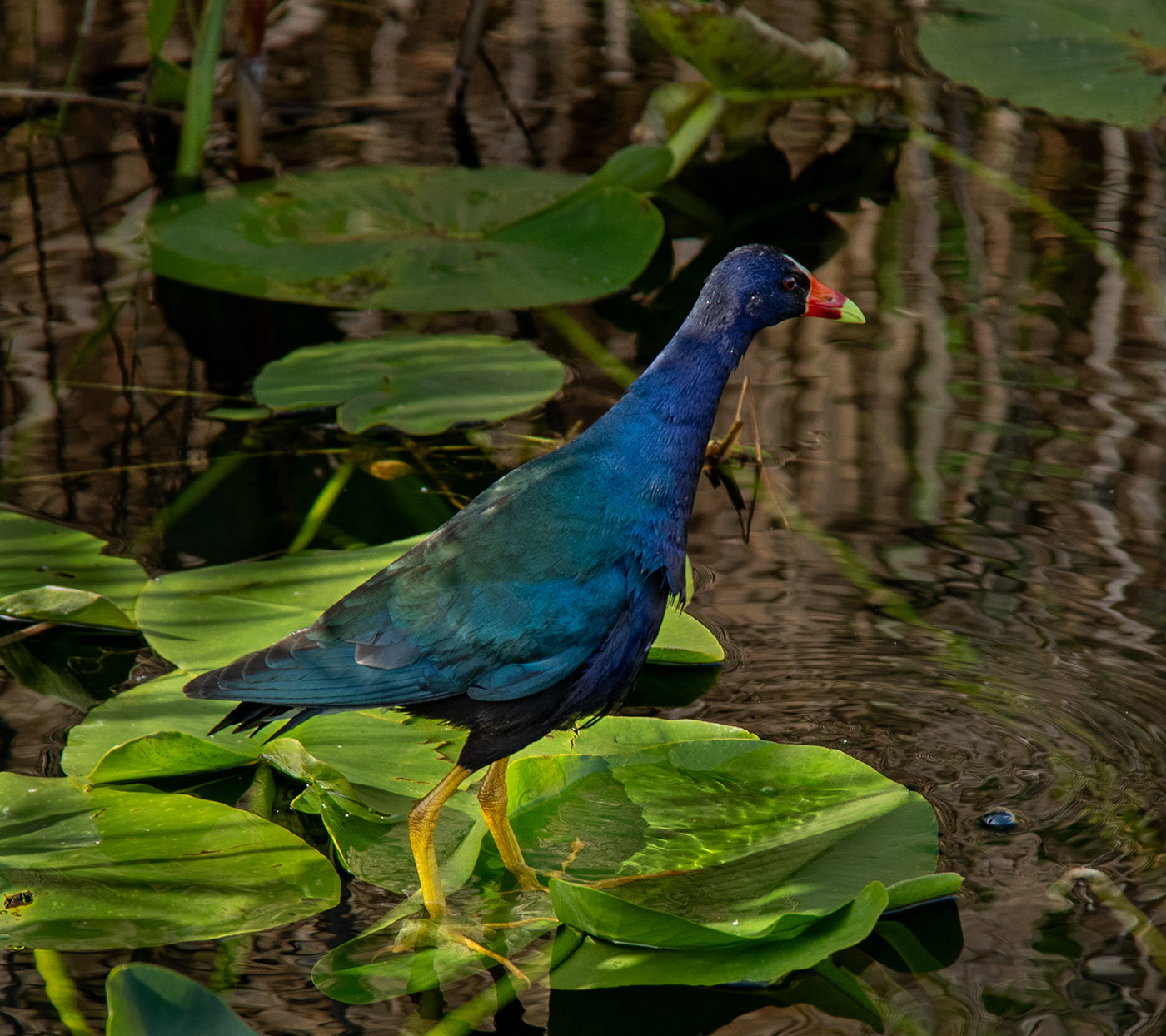
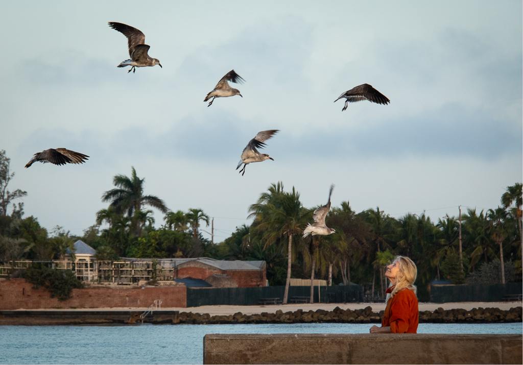
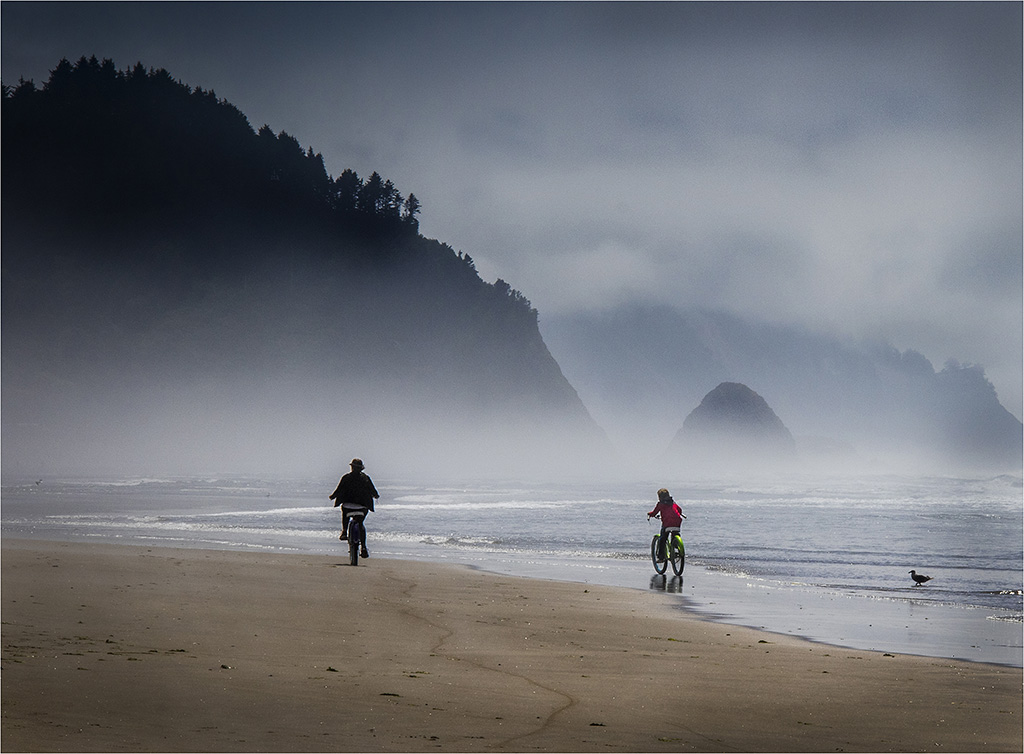
You asked whether the woman was feeding the birds. Yes, she had fed them earlier. So the birds were still hanging around.
Thanks for your comments about how many birds to include. I guess I have lots of options. |
Jun 23rd |
| 3 |
Jun 22 |
Reply |
Michael, thank you for your comments. |
Jun 14th |
| 3 |
Jun 22 |
Reply |
Thanks for your comments, Mary Ann. |
Jun 14th |
| 3 |
Jun 22 |
Reply |
Thanks for your input, Kieu-Hanh. |
Jun 14th |
| 3 |
Jun 22 |
Reply |
John, I like your suggestion of cropping out the bird on the left, which is in an awkward position. Slight cropping on the right balances out the view, however I like the dimensions of my first version better (more horizontal). I brought down the highlights in the sky while I was editing as well. What do you think? |
Jun 10th |
 |
| 3 |
Jun 22 |
Comment |
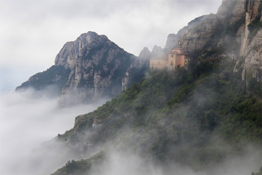
The setting for your photo is beautiful with lovely, soft fog that adds a magical quality. It's interesting to read the opinions of the others about your original and edited versions. I think that the softness of the fog in the original is what gives it such a dreamy look (which I like). However, I like the sharpness and greater contrast that you've used in your edited version. They're both lovely photos! |
Jun 10th |
| 3 |
Jun 22 |
Reply |
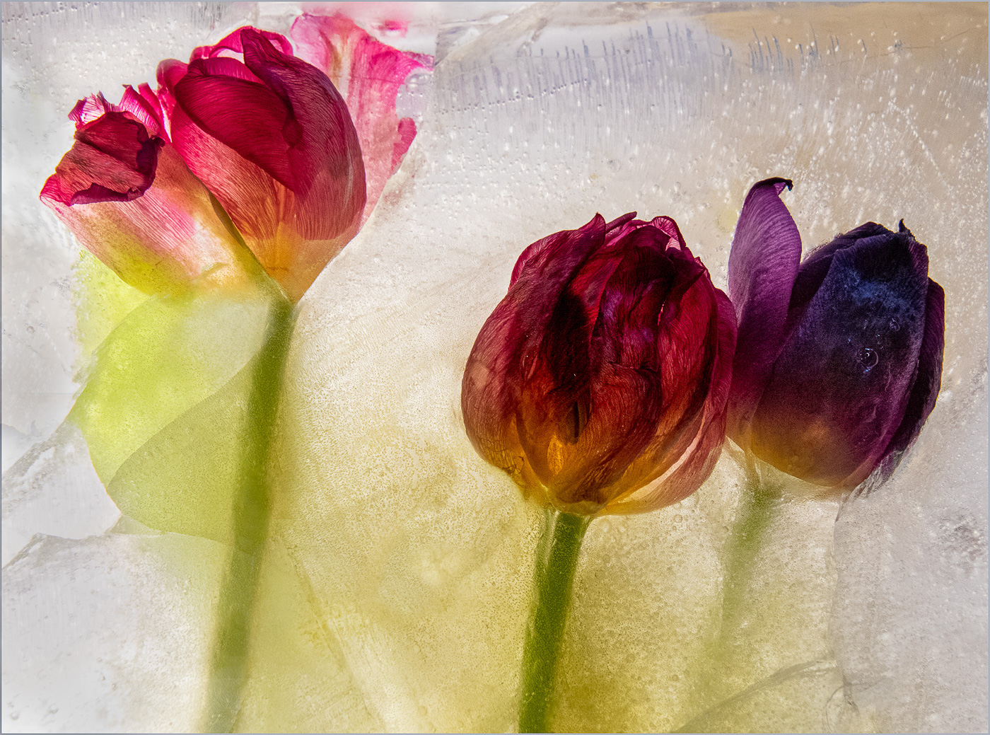
LuAnn, the class you're taking sounds intriguing and practical. I think your cloning on the background of this image improves Mary Ann's image. On the left side close to the base of the blossom, I'd prefer a cloning tool that gets closer to the base. I've found that I often need to enlarge the photo in order to get those close in details. I agree with you that Mary Ann's image really lend itself to this cloning technique. Kudos for looking for ways to improve your images! |
Jun 10th |
| 3 |
Jun 22 |
Comment |
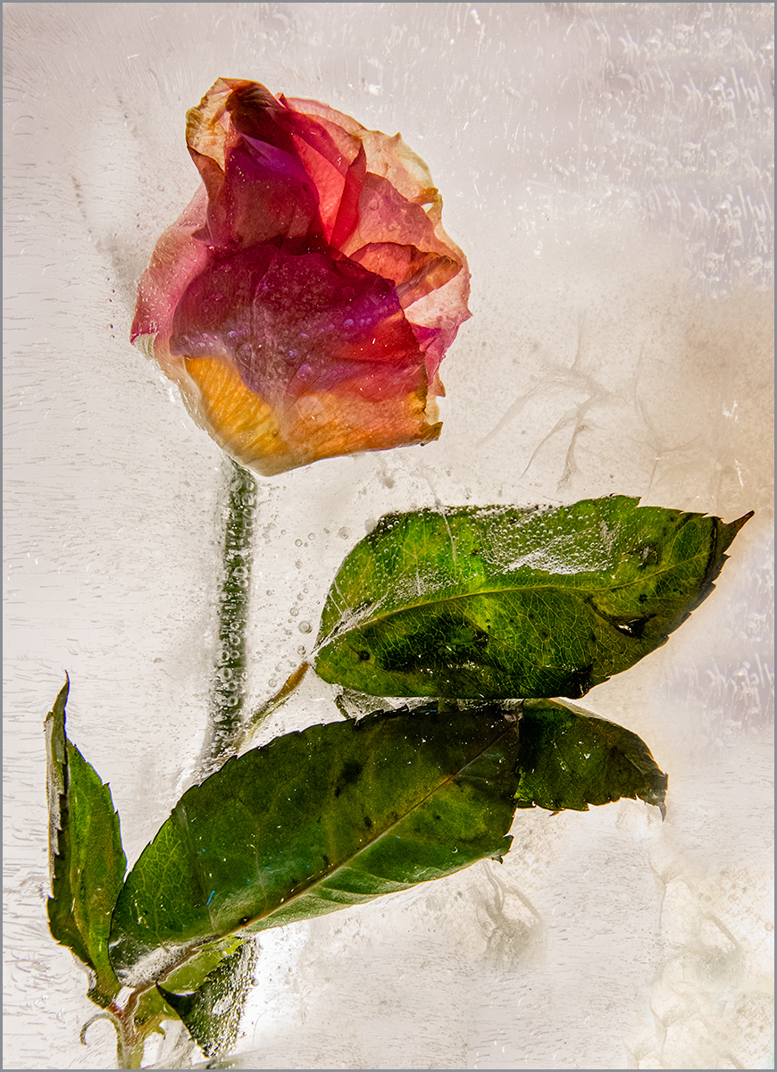
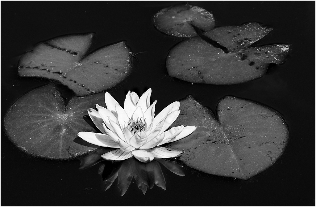
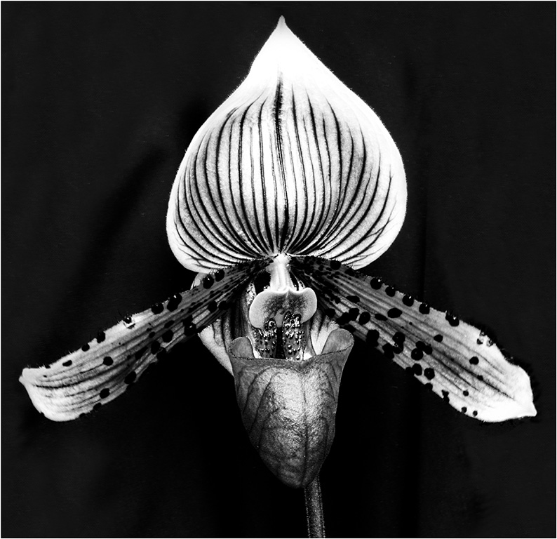
Mary Ann, the color of the rose is especially eye catching. You've captured the creaminess of the petals and small hairs on the base of the petals. Your cropping improves the image. I do like what LuAnn did with simplifying the background too. If you want to take Michael up on his challenge, I do think that removing the orange on the right and old blossom remains on the left side would improve your image. |
Jun 10th |
| 3 |
Jun 22 |
Comment |
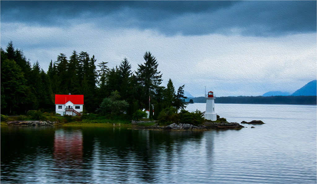
John, welcome to the group! I'm impressed that you took the first few suggestions and responded with a significantly improved version. Kudos! The improved sky and straightened tower make a huge difference. In your second version, I'd prefer more contrast on the lighthouse tower itself. Maybe some burning or darkening the blacks would help. |
Jun 10th |
| 3 |
Jun 22 |
Comment |
Kieu-Hanh, you've captured a moving photojournalism image. The timing is perfect to catch the flag going into the ground. I agree with John's suggestion of slight cropping on the right. Well done photo, Kieu-Hanh. |
Jun 9th |
| 3 |
Jun 22 |
Comment |
John, this is definitely a scene from the past. I like your second version with the tighter crop. The dark bottom and center boards let the bright cord colors pop. The one item that I find distracting is the white cord on the left that goes out of the frame. I'd prefer that the cord would be darker, so it's not as distracting. |
Jun 9th |
| 3 |
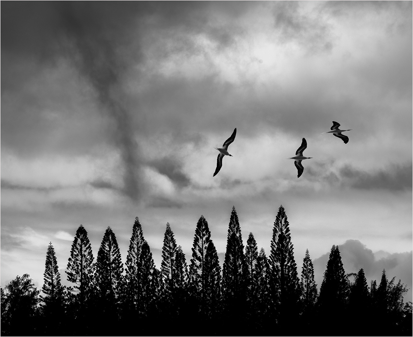
Jun 22 |
Comment |
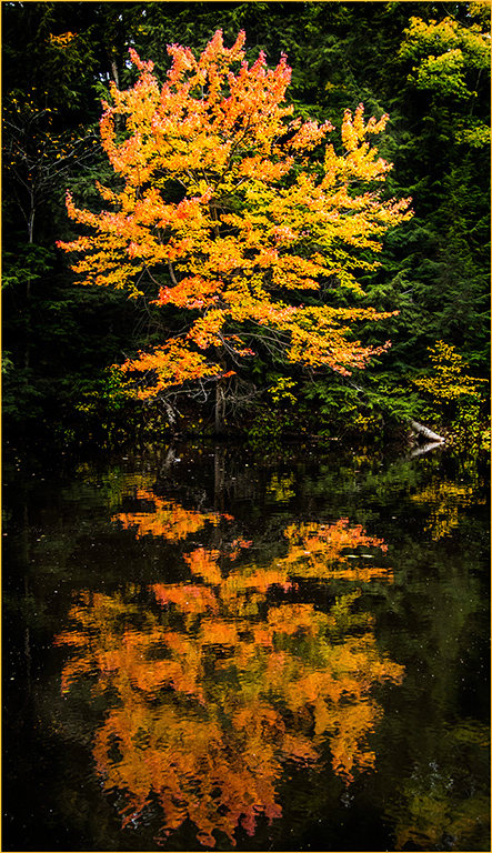
I really like the reflection of clouds in the water and find that the dark boat garages draw my eyes forward and upward to the sky. Your second version with less yellow is an especially restful and peaceful view. I agree with your choice of leaving the boats dark, so the focus is on the water and sky. Lovely! |
Jun 9th |
6 comments - 7 replies for Group 3
|
6 comments - 7 replies Total
|