|
| Group |
Round |
C/R |
Comment |
Date |
Image |
| 3 |
Sep 21 |
Reply |
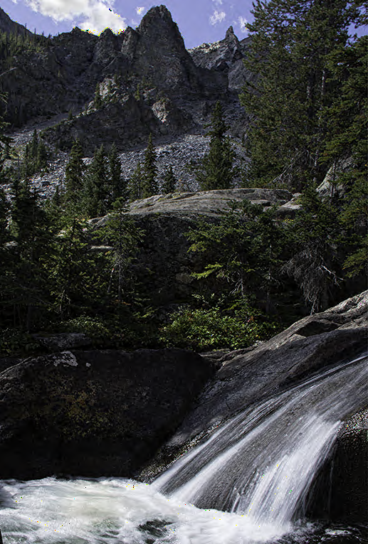
Michael, I tried radial filters like you suggested. What do you think? |
Sep 28th |
 |
| 3 |
Sep 21 |
Reply |
I agree that lightening the middle section would help. Thanks, Lisa. |
Sep 28th |
| 3 |
Sep 21 |
Reply |
Kieu-Hanh, I hadn't considered taking multiple shots and stitching them together. You're right that this might help. I'd have to be careful to match the lighting to some degree, since the water was so bright compared to the middle of the image. |
Sep 28th |
| 3 |
Sep 21 |
Reply |
LuAnn, thanks for your comments. If I hike back to this falls (which is a 8 mile jaunt), I should remember to bring my mini tripod. That might solve the softening of the image. |
Sep 28th |
| 3 |
Sep 21 |
Reply |
Thanks for your comments, Michael. I'll try the radial filter that you suggest. |
Sep 28th |
| 3 |
Sep 21 |
Reply |
Thank you, Mary Ann. |
Sep 28th |
| 3 |
Sep 21 |
Comment |
I really like how the angle of the bridge brings my eye into your image. Showing buildings from the downtown through the bridge supports works well. Taking your photo at night lets the lights give a glow and vitality to the city. Nice colors on the water too! |
Sep 28th |
| 3 |
Sep 21 |
Comment |
Mary Ann, the variety of colors in the tomatoes adds to the appeal of your image. I agree that cropping the top of your photo eliminates the overly bright yellow tomato as well the printed bag in the background, which is also somewhat distracting to me. It's interested to see the different versions that others suggest. |
Sep 28th |
| 3 |
Sep 21 |
Comment |
I enjoy the story of your image, Kieu-Hanh. The deluxe gear used by the man for metal detecting is quite amusing to me. Your use of vertical composition allows me to see the colors in the early morning sky and incoming waves. I agree with Michael and LuAnn that the image looks over-sharpened, which could be more noticeable as your changed file sizes as you noted. |
Sep 28th |
| 3 |
Sep 21 |
Comment |
Randolph, your subjects appear very relaxed. Their bright swimsuits add nice pops of color. I like you change of color balance that makes the girls look more golden tan. Yes, the edge of the red blanket would help. I'd also suggest a subtle vignette, since the sand is so bright. |
Sep 27th |
| 3 |
Sep 21 |
Comment |
Michael, I like how the contrast and slight change of color balance on the old house has made it more of a focal point for me. I agree that the sky replacement adds needed moodiness to your image. Oliver's idea of flipping the sky would work in my opinion to put light on the left side to match the shadows. |
Sep 27th |
| 3 |
Sep 21 |
Comment |
LuAnn, I like the bluish tones that you achieved in the spoon and background to coordinate with the blueberries. Thank you for the explanation that you gave to Kieu-Hanh about the original dark image and position of the spoon in a vertical position. I wondered the same thing about your original being so dark and can see the benefits of erring to the side of dark. With every element having a bluish cast, I wonder if you considered adding a hint of some other color. For example, the blueberry in the left side of the spoon has a purplish cast that could be emphasized. What do you think of this idea? |
Sep 27th |
6 comments - 6 replies for Group 3
|
6 comments - 6 replies Total
|