|
| Group |
Round |
C/R |
Comment |
Date |
Image |
| 3 |
Mar 21 |
Reply |
LuAnn, that's certainly a creative version of Lisa's photo. Definitely an upbeat, retro look. You've turned the photo into a piece of graphic artwork. |
Mar 30th |
| 3 |
Mar 21 |
Comment |
Using textures is a great idea. Currently I don't use textures, because my older version of PhotoShop doesn't have that as an option. As I mentioned, I processed this photo as a "minimalistic" image. So I purposely used a simple, bigger than usual sky. Otherwise I would have cropped most of the sky out as Lisa suggested. |
Mar 24th |
| 3 |
Mar 21 |
Reply |
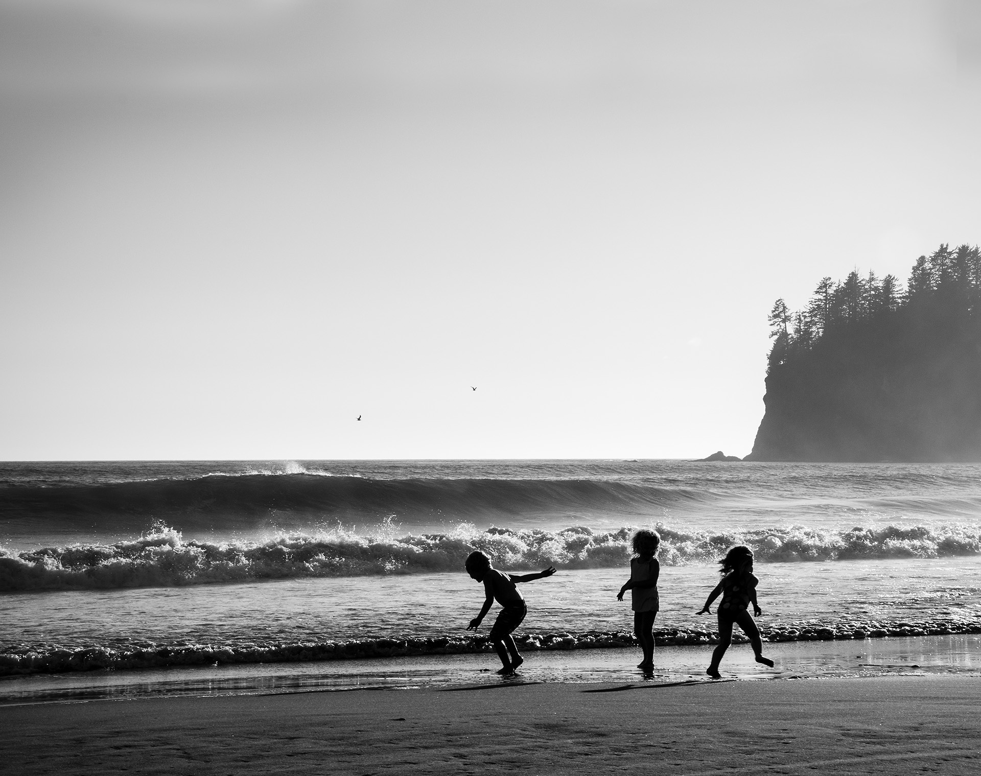
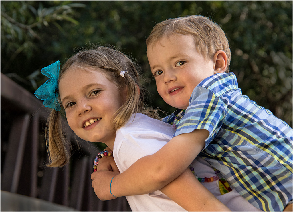
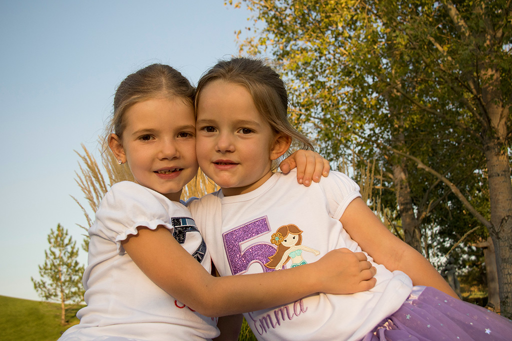
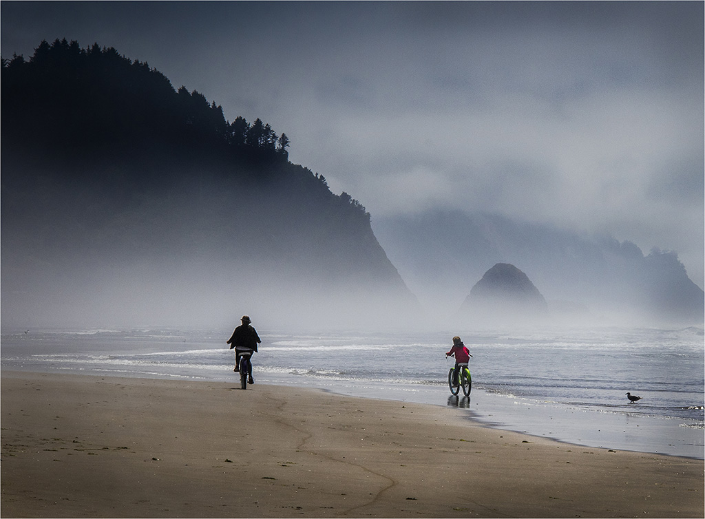
Mary Ann, I like the silhouette of the children too. Their romping around in the surf reminds me of the joy and beauty of the coast. |
Mar 20th |
| 3 |
Mar 21 |
Reply |
Randolph, I love that you noticed the waves. My husband did too when I showed him the image. How wonderful that you used to surf! |
Mar 20th |
| 3 |
Mar 21 |
Reply |
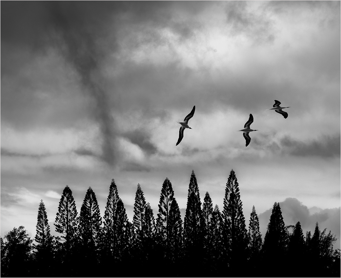
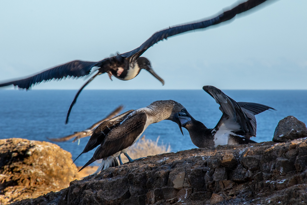
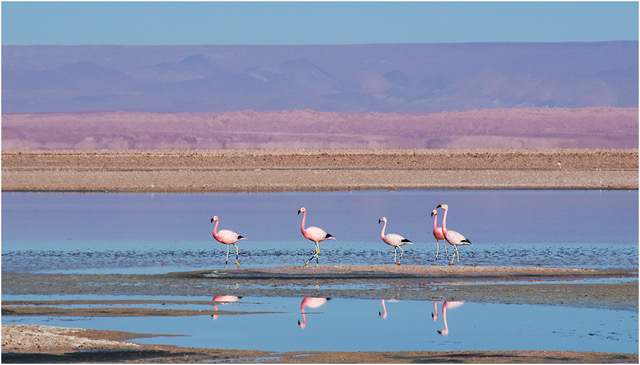
I agree that adding a third bird balances out the sky and I would typically enlarge them too. Since I was aiming for a minimalistic look, I used a lot more sky than usual. From everyone's comments, the extra sky wasn't successful. |
Mar 20th |
| 3 |
Mar 21 |
Comment |
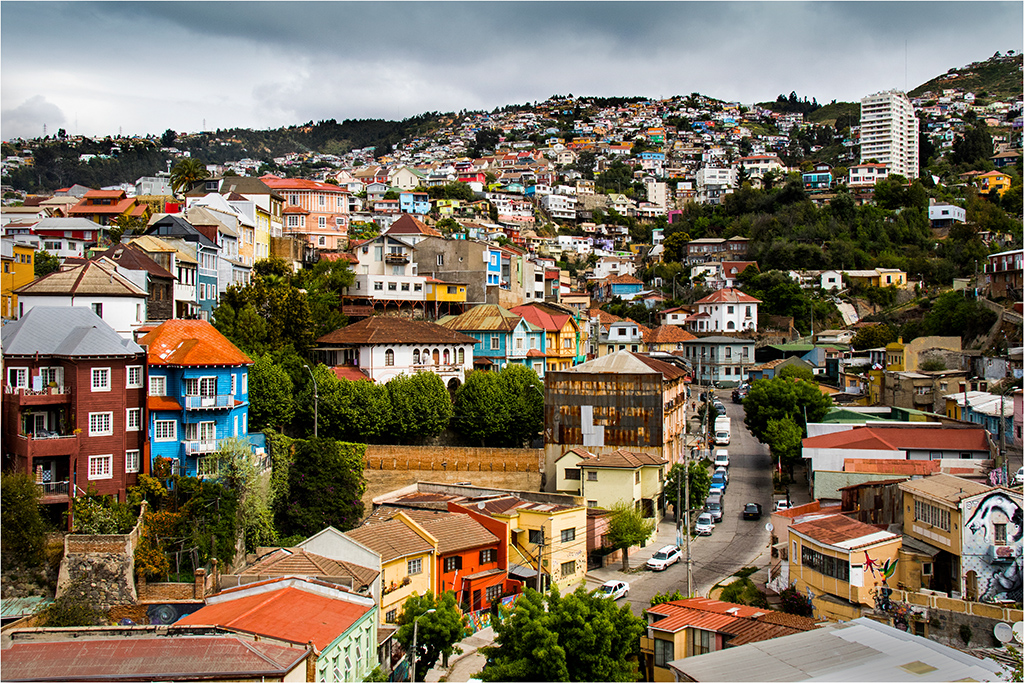
Lisa, you've got a good eye for unusual architecture. The photo works well in black and white, especially with the threatening sky. Cropping the image tighter and opening up the shadows like Michael suggests works well. |
Mar 20th |
| 3 |
Mar 21 |
Comment |
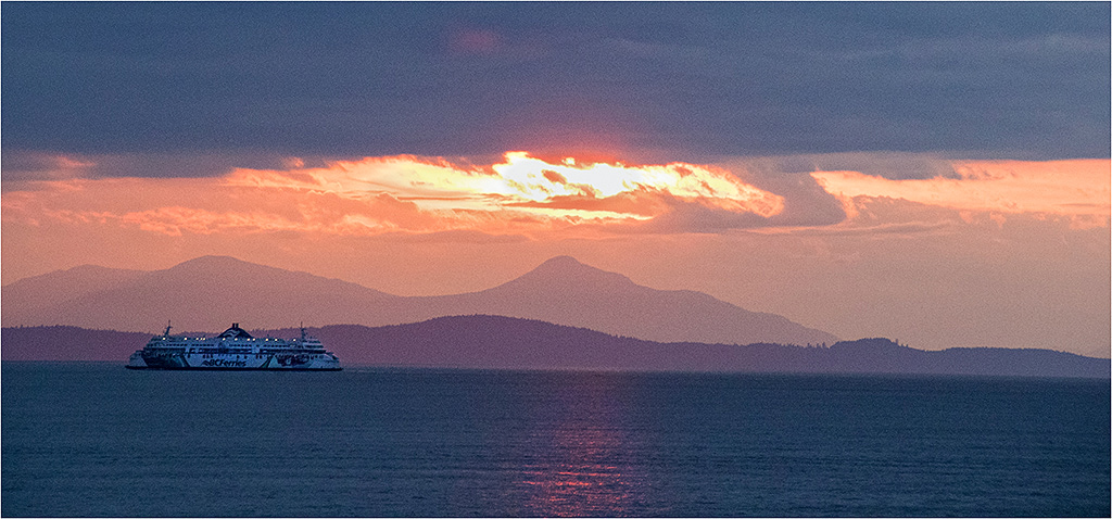
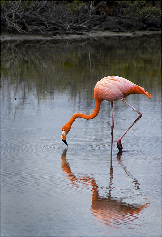
To me, the reflection gives your photo the peacefulness of evening. I like that you added a bit of saturation, but kept the image realistic. Taking out the antennae keeps those from being a distraction. That's awesome that you're taking a PSA PhotoShop class. PhotoShop offers so many tools to enhance images. Have fun! |
Mar 20th |
| 3 |
Mar 21 |
Comment |
Kieu-Hanh, what a fascinating instrument! I like that you've captured the man's concentration, but have allowed blurring of his hands. I like the editing that Michael did on the man's shirt to define it on the black background. |
Mar 20th |
| 3 |
Mar 21 |
Reply |
Michael, I like your editing on the man's shirt. It provides the differentiation that's needed to help us see where the shirt ends and background begins. |
Mar 20th |
| 3 |
Mar 21 |
Comment |
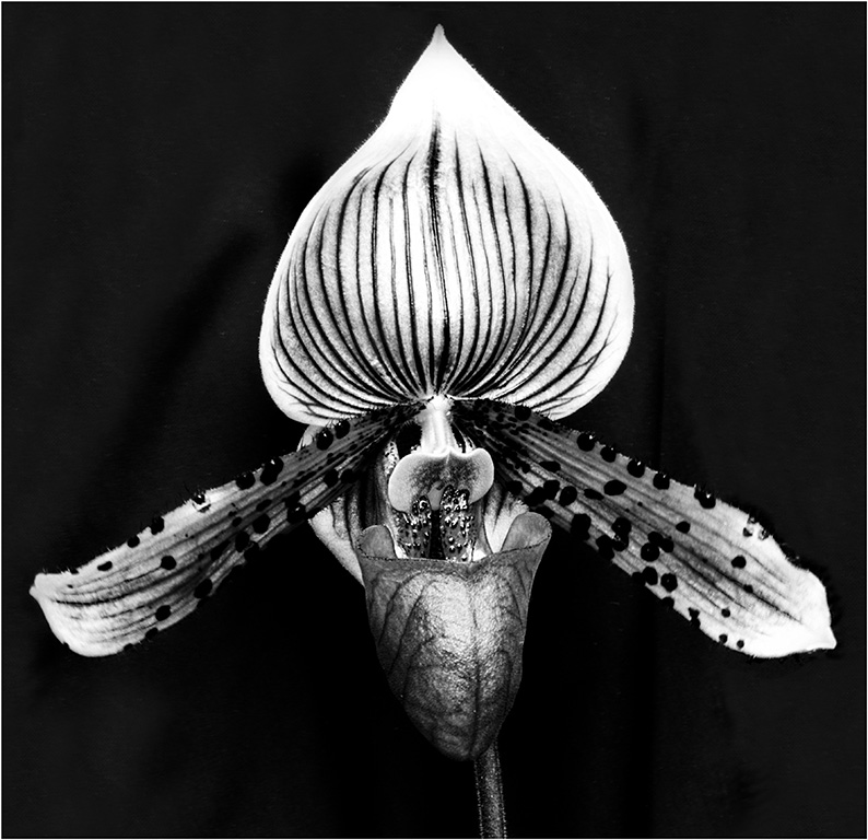
I find your subject quite interesting, since I'm not familiar with the process of growing orchids. I wonder if a crop that's not so tight (yes, I know I rarely say that to you) might give details that tell more of the story. Personally, I was glad that the orchid worker wasn't a female, because the below chin and up the nostrils view is unflattering, as Lisa suggested. I think this photo has potential as a journalistic photo. |
Mar 20th |
| 3 |
Mar 21 |
Comment |
Hi Michael, I really like the bright colors and wonderful lighting in your photos. LuAnn's suggestion for a flashlight or lamp with a diffuser is an excellent one if the window light is fleeting.
I personally like your version from March 11 that eliminates the book and blue pot on the left. With a still life, the hardest thing in my opinion is getting the composition just right. I'd prefer a simpler set-up with maybe only 5 items. Playing with different heights and distances from the camera can give you choices for composition. |
Mar 20th |
| 3 |
Mar 21 |
Reply |
Lisa, I like your exploration of using a reflection with this still life. The second one especially is interesting because it's just a bit different. |
Mar 20th |
| 3 |
Mar 21 |
Comment |
LuAnn, I like your choice of egg for this still life. The tan color and specks add more details than white eggs that I've seen in this set-up before. The foam core works well as a background. I've used it for years too. However, I appreciate that you have different colors to choose from to coordinate with your subject.
Well done still life, LuAnn. |
Mar 20th |
7 comments - 6 replies for Group 3
|
7 comments - 6 replies Total
|