|
| Group |
Round |
C/R |
Comment |
Date |
Image |
| 3 |
Feb 21 |
Reply |
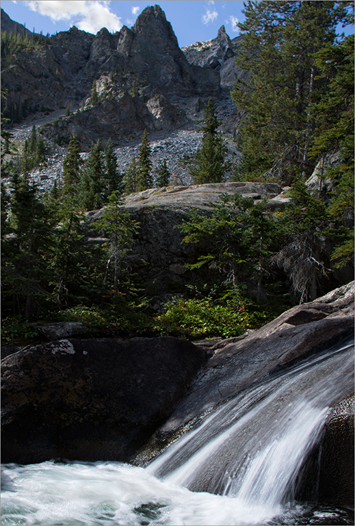
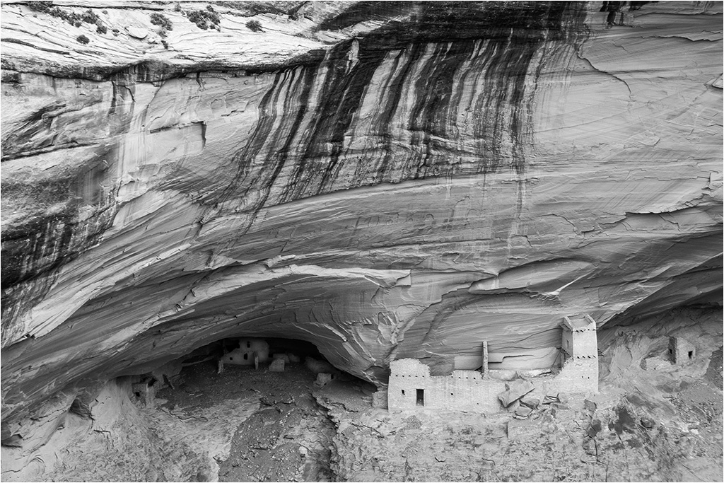
Thanks for your comments, Randolph. You're right that I shouldn't overdo the darkening of the rock. I just didn't want that big rock in the lower right to detract from the person by the creek. |
Feb 27th |
| 3 |
Feb 21 |
Reply |
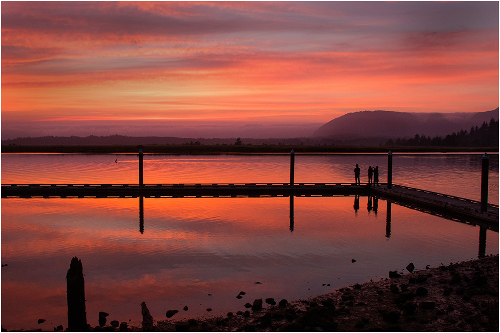
Thanks for your comments, Kieu-Hanh. Your comment about the saturation of the top part made me relook at the graduated filter I used on the sky. That filter probably caused the more vivid blue. I realized that the green of the trees was brighter that usual because it was springtime with new leaves on the trees. |
Feb 27th |
| 3 |
Feb 21 |
Comment |
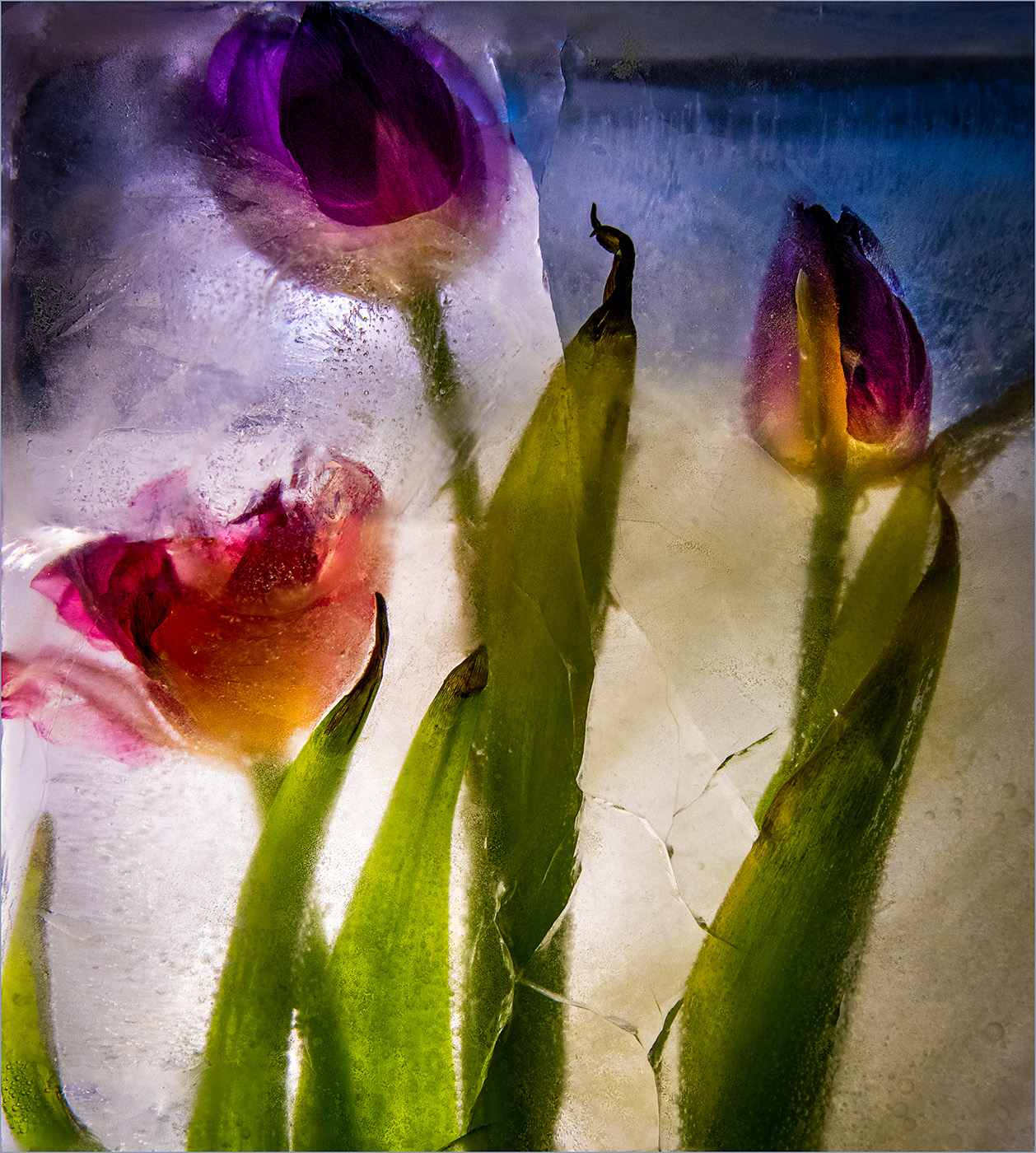
I like the color adjustment that you did from the original with more of a bluish purple for the allium (ornamental onion). I'm surprised that with a f/2.4, the background foliage isn't more blurred. I'm not sure what the brown pile in the center background is (maybe rocks?). I find myself focusing on the brown pile, since I don't know what it is. |
Feb 21st |
| 3 |
Feb 21 |
Comment |
I like the way black and white gives a rustic look to this country scene. The texture of the barn wood is especially interesting. The wispy clouds add to the look and brighten the view. I prefer that either the windmill(s) be either eliminated or fully in view, instead of part in/part out. |
Feb 21st |
| 3 |
Feb 21 |
Comment |
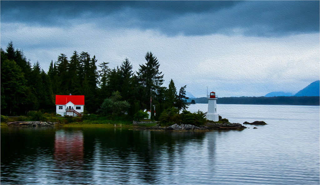
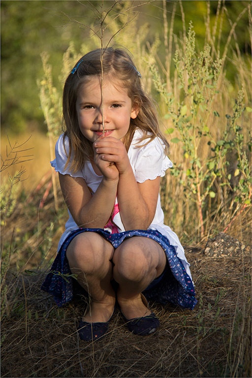
Kieu-Hanh, I hope you had a wonderful Valentine's Day. The garden is lovely and brings a sense of peace. I like your second edited version with the straightened bricks, even though the bars aren't quite level. I agree that the sky might benefit from a graduated filter to bring down its brightness. |
Feb 21st |
| 3 |
Feb 21 |
Comment |
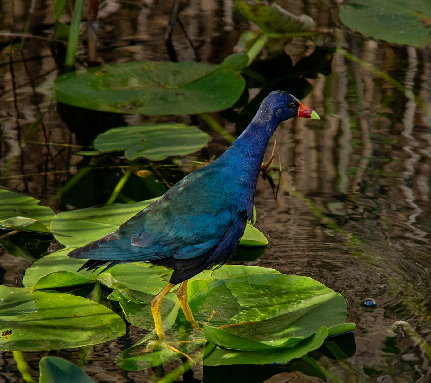
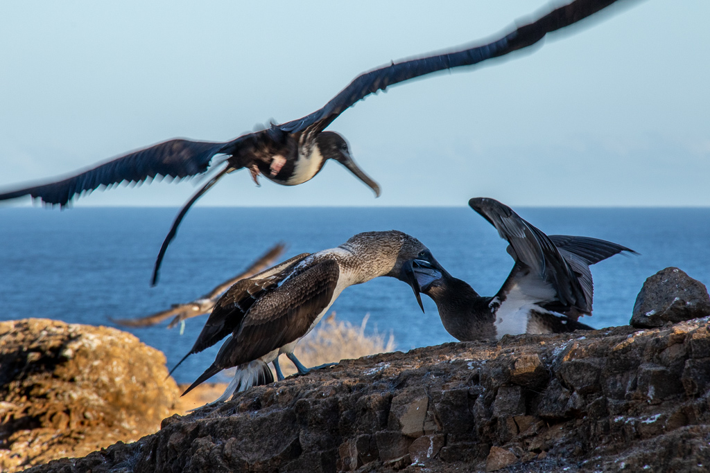
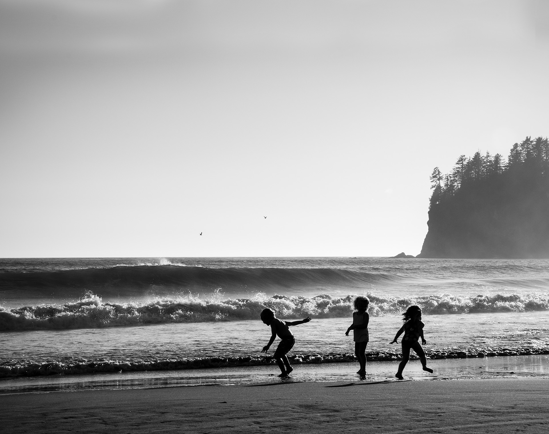
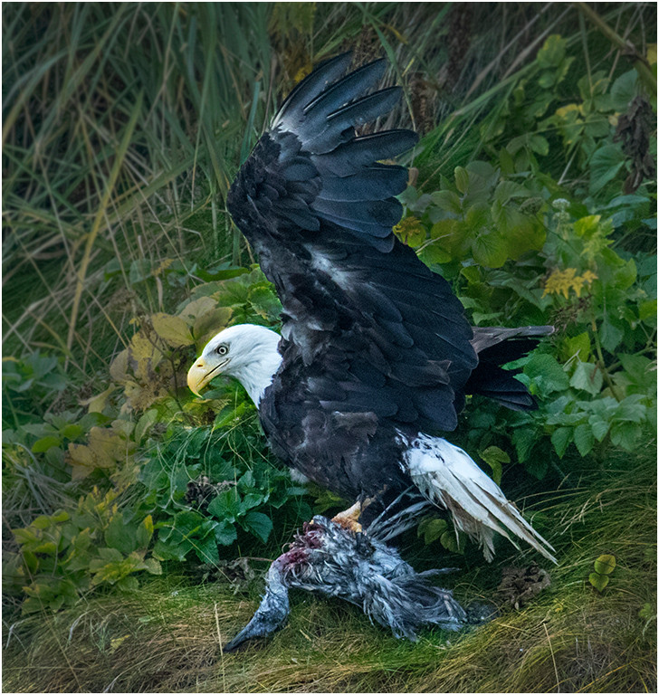
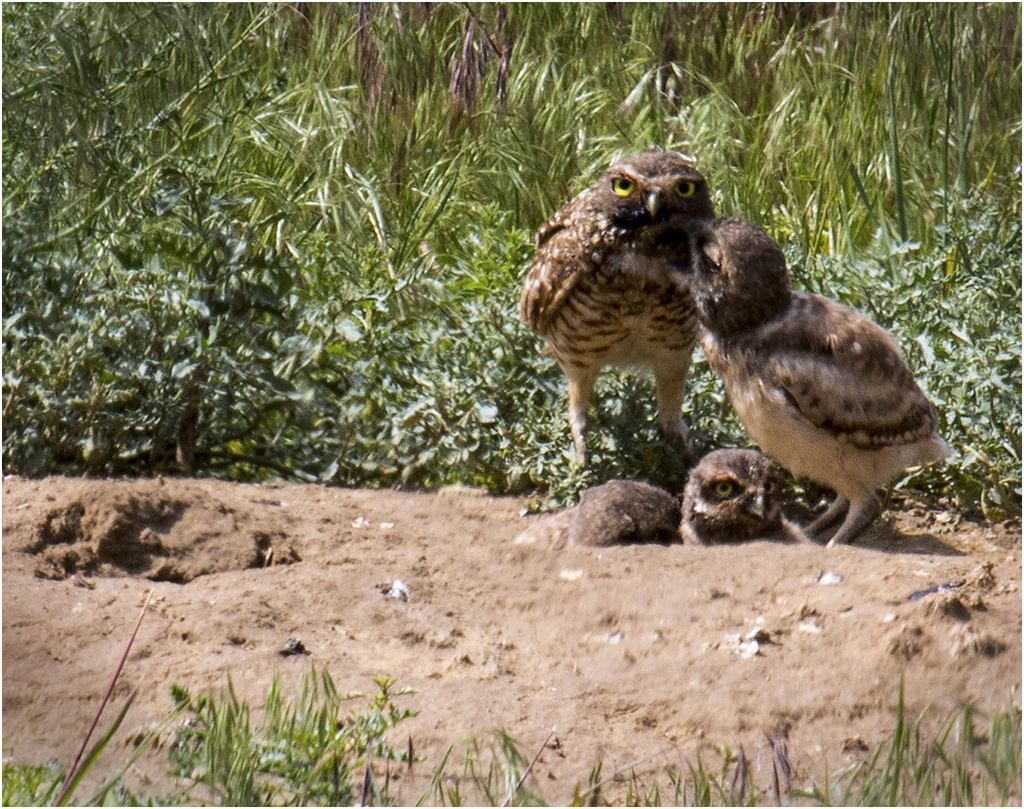
What an interesting bird! The back lighting has highlighted some of the feathers, so I can see their texture. I'd prefer that the shadows on the bird be brightened more. Plus, I agree with Michael and LuAnn that a tighter crop would improve the impact of the image. |
Feb 21st |
| 3 |
Feb 21 |
Comment |
Michael, I like the drooping branches of the greenery. The textured background works well, since it adds texture that coordinates with the wilted flowers. I agree with LuAnn that the highlights on the flowers can be toned down a bit. |
Feb 19th |
| 3 |
Feb 21 |
Comment |
The arrangement of your still life pears works well for me. The subtle colors give the image an antique, oil painted look. I like the texture and sharpness that you added to the finished photo. The hint of green in the background contrasts nicely with the reddish hue of the pears. Overall, your image appears dark, so the mood is a bit gloomy. Is this what you intended? |
Feb 19th |
| 3 |
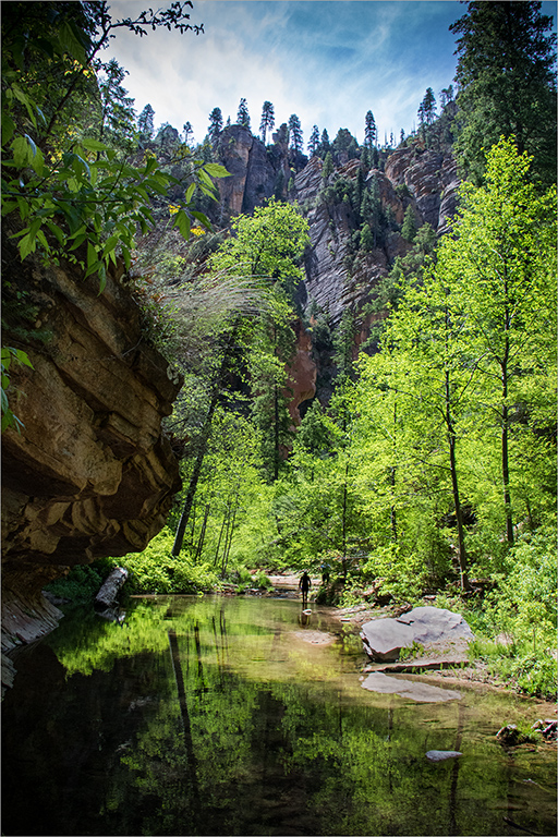
Feb 21 |
Reply |
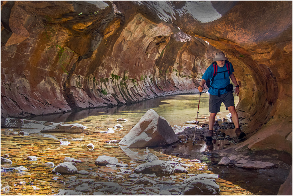
Mary Ann, thanks for you comments. I waited til the hiker ahead of us walked in the brighter clearing, so she would be visible. I agree that she adds scale in contrast to the towering canyon walls. I appreciate your comment about saturation. I'll relook at that. |
Feb 12th |
| 3 |
Feb 21 |
Reply |
Hi Michael! Thank you for your comments. I agree that Sedona and the trails in that area are beautiful. You are right about the horizon line. I can fix that. |
Feb 12th |
| 3 |
Feb 21 |
Reply |
Sharon, thank you for visiting our group and for your kind comments.
Yes, I've seen the February PSA journal and am very appreciative of your fabulous article on my volunteer work for PSA. A number of my friends and family have noticed the article and commented about it. I'm especially pleased that so many of my photos were included. |
Feb 12th |
6 comments - 5 replies for Group 3
|
6 comments - 5 replies Total
|