|
| Group |
Round |
C/R |
Comment |
Date |
Image |
| 3 |
Nov 19 |
Comment |
What a unique way to set up a portrait. In my opinion, the colors of the background set off the orange of the pumpkin well. I agree that a bit of cropping keeps the focus more on the child. |
Nov 27th |
| 3 |
Nov 19 |
Reply |
Kieu_Hanh and Randy, I used both of your suggestions to further saturate and crop my image. I like this version too. |
Nov 25th |
 |
| 3 |
Nov 19 |
Comment |
I like the composition of your photojournalistic image. The position of the yellow mail bins makes a strong center of interest. I too am saddened to see graffiti in such public place in Paris. |
Nov 25th |
| 3 |
Nov 19 |
Comment |
I like the owl's penetrating glare and sharply focused eyes. The blurred, warm-toned background sets off the owl nicely. Sounds like a fun opportunity to take photos of the raptors. |
Nov 25th |
| 3 |
Nov 19 |
Reply |
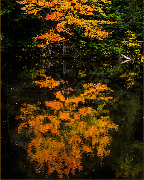
I find it interesting that the colors look more vivid in the dark river, even though I added saturation to the real tree's leaves. |
Nov 25th |
| 3 |
Nov 19 |
Comment |
I like that you've captured both the details of the font as well as the environment of stained glass windows. To me, the verse connects well with the message of baptism. You've done a nice job of centering the window frames behind the font. |
Nov 25th |
| 3 |
Nov 19 |
Comment |
The bright leaves are gorgeous against the snow. In my opinion, you made a smart choice to shoot the company sign in such a pretty setting. Congrats, on having them use the photo for their social media! |
Nov 22nd |
| 3 |
Nov 19 |
Reply |
Donna, thanks for visiting our group. I appreciate your comment. |
Nov 22nd |
5 comments - 3 replies for Group 3
|
5 comments - 3 replies Total
|