|
| Group |
Round |
C/R |
Comment |
Date |
Image |
| 3 |
Sep 19 |
Comment |
I like the strong diagonal composition of your image. The reflection of the dock supports and clouds in the distance add to the mood of the scene. Nicely done. |
Sep 30th |
| 3 |
Sep 19 |
Comment |
I love your title. Placing the meter right between the bright red doors works well. Nice job of cropping neatly to include the doorways without unneeded other building features. Sometimes an iPhone is all you need. |
Sep 22nd |
| 3 |
Sep 19 |
Comment |
I appreciate the pattern of arches and shadows in your image. You've captured the rough texture of the stone and brick for me. The few plants on the side add color. Your photo communicates the feeling of being in the mission. |
Sep 22nd |
| 3 |
Sep 19 |
Comment |
I find your photo carries a pointed message about the reasons for protest. I agree that cropping out most of the road strengthens your image. The words on the signs and restaurant are sharp and clear. |
Sep 22nd |
| 3 |
Sep 19 |
Comment |
I agree with Marion that the position of the man works for the composition of your image. To me, the lighting gives pleasant skin tones as well as great contrast between the blacktop and white chalk. I would prefer the top edge of the heart be complete on the right side. More contrast between the pink and green chalk would made it easier for me to see the cars. |
Sep 22nd |
| 3 |
Sep 19 |
Comment |
I find the combination of the headlight and flames intriguing. Changing the scene to b&w puts the attention on the headlight instead of the flames. Were the flames a background for the car? I'm not sure the reflection on the side of the headlight which shows the outdoor setting of the car show fits with the tone set by the flames in the background. You could consider adding a white frame around your image to define the black edge on the right. |
Sep 22nd |
| 3 |
Sep 19 |
Comment |
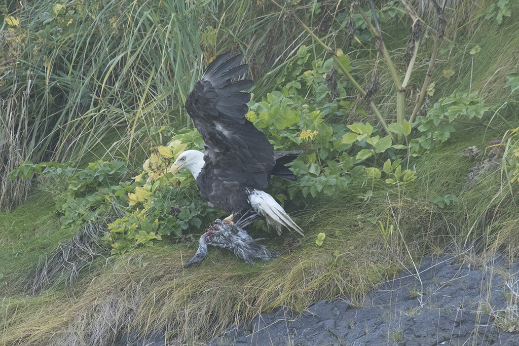
Marion and Randy, I should have submitted my original image, so you can see how I did or didn't enhance this image. When I looked back at my original, I could see that I did add contrast. I used a long lens in an open ocean setting and my original does look hazy. |
Sep 19th |
 |
7 comments - 0 replies for Group 3
|
7 comments - 0 replies Total
|